Using the TinyMCE rich text editor in Bryntum Gantt
We strive to keep posts updated, but code samples may sometimes be outdated. Humans, see the Bryntum documentation; agents, https://mcp.bryntum.com for the latest info.
TinyMCE is a widely used WYSIWYG rich text editor that brings Microsoft Word-style editing to web applications. The basic open-source version is free to use. You can add more features by purchasing a TinyMCE subscription, which includes extras like an AI assistant, math equation support, and revision history.
Explore TinyMCE integration across our Bryntum component suite through these interactive demonstrations:
Tutorial outline
This tutorial demonstrates how to add the TinyMCE rich text editor to a Bryntum Gantt, which is a project management component for building interactive Gantt charts. We’ll work with the standard iframe-based TinyMCE editor throughout the guide. You can try out the inline version in the Bryntum Gantt TinyMCE task editor demo.
You’ll learn how to:
- Create a Bryntum Gantt
- Create a custom TinyMCE input widget
- Use the TinyMCE input as a custom editor for cells of a column
You can find the code for the completed tutorial on the complete-gantt branch of this GitHub repository.
Getting started
Clone the starter GitHub repository.
This repository uses the development server and JavaScript bundler, Vite. You need Node.js version 18+ for Vite to work.
Install the dependencies by running the following command:
npm installThen, run the local dev server as follows:
npm run devFinally, open https://localhost:5173. You should see a blank white screen.
The src/public folder has two example data files that contain information about project tasks:
- Simple Tasks: The data in
tasksSimple.jsonincludes simple text data in thedescriptionfields. - Tasks: The data in
tasks.jsonincludes rich text HTML data in thedescriptionfields.
Creating a Bryntum Gantt component
Let’s start by creating a Bryntum Gantt to display the Simple Tasks data. We’ll install the Bryntum Gantt, configure it, and style it.
Installing Bryntum Gantt
If you’re using the free trial, install the public Bryntum trial package:
npm install @bryntum/gantt@npm:@bryntum/gantt-trialIf you have a Bryntum license, refer to our npm Repository Guide and install the licensed package:
npm install @bryntum/ganttWe’ll use the RichTextField widget to create a custom TinyMCE input field.
Configuring and rendering the Bryntum Gantt
Replace the console log in the src/main.js file with the following lines of code:
import { Gantt } from '@bryntum/gantt';

const gantt = new Gantt({
    appendTo : 'container',

    columns : [
        {
            text  : 'Name',
            field : 'name',
            width : 200
        },
        {
            text  : 'Start Date',
            field : 'startDate',
            type  : 'date',
            width : 120
        },
        {
            text  : 'Duration',
            field : 'duration',
            width : 80,
            align : 'right'
        },
        {
            text     : 'Description',
            field    : 'description',
            flex     : 2,
            minWidth : 334
        },
        {
            text  : 'Progress',
            field : 'percentDone',
            type  : 'percent',
            width : 80
        }
    ],

    project : {
        transport : {
            load : {
                url : 'tasksSimple.json'
            }
        },
        autoLoad : true
    },

    startDate  : '2025-01-01',
    endDate    : '2025-02-15',
    viewPreset : 'weekAndMonth'
});
Here, we create an instance of the Bryntum Gantt and set the following configuration properties:
- The
appendToconfig appends the Gantt component to thedivwith anidofcontainer. - The
columnsconfig creates a column for each field in the Simple Tasks data. - The
projectloads task data from an external JSON file using thetransport.load.urlconfiguration andautoLoadproperties. TheautoLoadproperty tells the Gantt to automatically fetch the data when the component initializes. For simplicity, in this guide, we set the URL to thetasksSimple.jsonfile in thesrc/publicfolder.
Styling the Bryntum Gantt
Now that we have a component, we can style it.
By default, the Gantt component is configured to occupy 100% of the parent DOM element and has a min-height of 10em.
In the src/styles.css file, make the Gantt take up the full height of the screen by adding the following styles to its parent div element:
#container {
    margin         : 0;
    display        : flex;
    flex-direction : column;
    height         : 100vh;
    font-size      : 14px;
}
Import the Bryntum Gantt Stockholm theme by adding the following line of code to the top of the src/styles.css file:
@import "../node_modules/@bryntum/gantt/gantt.stockholm.css";The Stockholm theme is one of five themes available for Bryntum Gantt. If you want to create a custom theme or use multiple themes, check out the Bryntum Gantt styling documentation.
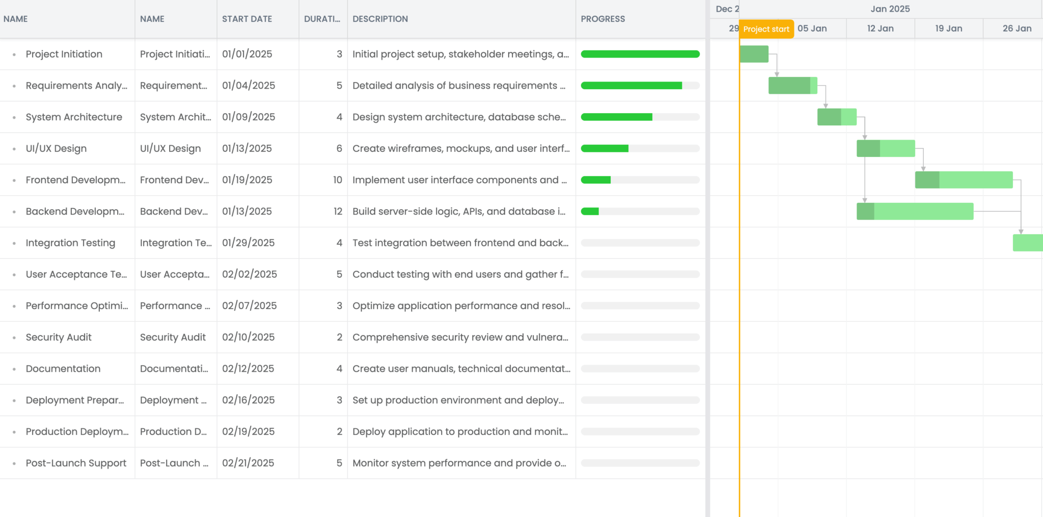
Run the local dev server using npm run dev. You’ll see a Bryntum Gantt component displaying the Simple Tasks data:
Adding TinyMCE to your app
Before we can build our custom TinyMCE input field for the Description column cells, we need to set up TinyMCE in our application. This will enable rich text formatting and image insertion capabilities for description content.
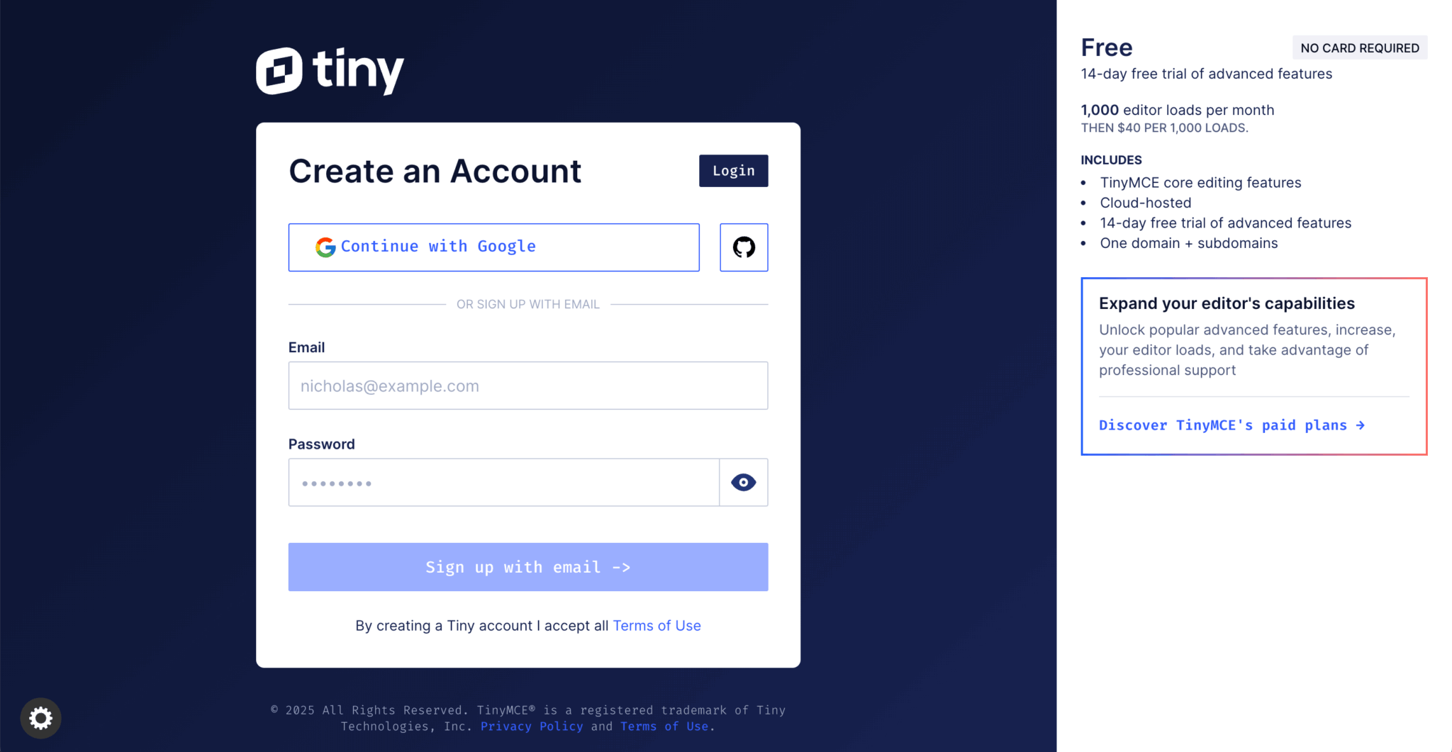
First, you’ll need a TinyMCE account. Register for a free account that comes with a 14-day trial of premium features – no credit card required.
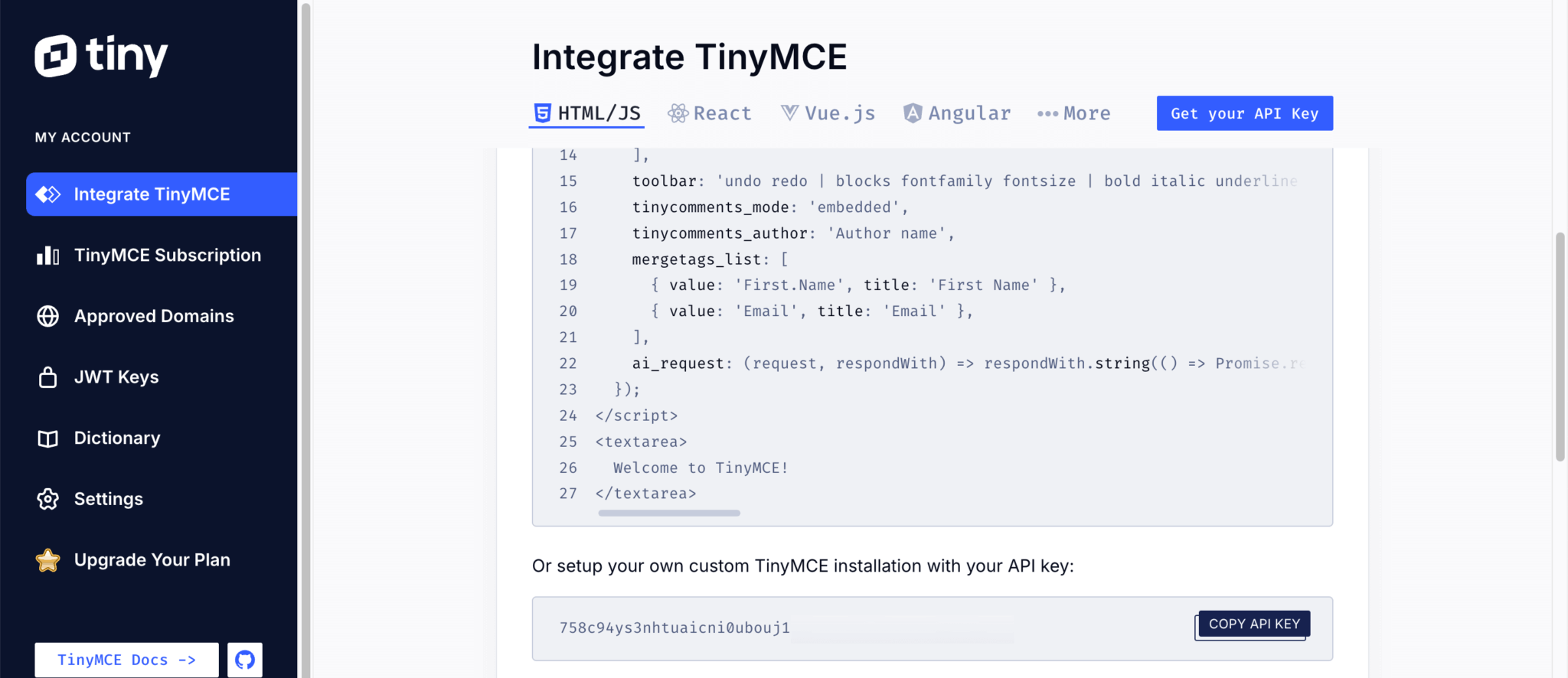
After logging in, you’ll see the Integrate TinyMCE page in your dashboard. TinyMCE offers several installation options: using Tiny Cloud, package managers, or self-hosted downloads. For this tutorial, we’ll use the Tiny Cloud method.
Locate and copy your API key using the Get your API Key button.
In the src/index.html file in your Bryntum Gantt app, add the following script below the div with id="container". Replace your-api-key with your TinyMCE API key:
<script src="https://cdn.tiny.cloud/1/your-api-key/tinymce/7/tinymce.min.js" referrerpolicy="origin"></script>TinyMCE requires at least one approved root domain to load the script successfully. The localhost domain is pre-approved by default. When you’re ready to deploy, remember to add your production domain through the Approved Domains section in your Tiny Cloud dashboard.
Keep in mind that API keys are used to load TinyMCE from Tiny Cloud. If you choose to self-host TinyMCE instead, use a license key rather than an API key.
Creating a custom TinyMCE input field widget
Let’s create a TinyMCE input field widget.
Create a lib folder in the src folder. In src/lib, create a TinyMceField.js file and add the following lines of code to it:
import { DomHelper, GlobalEvents, RichTextField } from '@bryntum/gantt';

export default class TinyMceField extends RichTextField {
    static $name = 'TinyMceField';
    static type = 'tinymcefield';

    tinymce = null;

}

TinyMceField.initClass();
Here, the TinyMceField class extends the RichTextField class. We define the widget’s unique $name and type, and create a property for storing the TinyMCE instance. The initClass() method connects the widget to the base Widget class, allowing us to instantiate the TinyMceField widget by its type.
Configuring the widget
Add the following static configurable property below the tinymce = null property, making sure to replace 'your-api-key' with your TinyMCE API key:
static configurable = {
    tinyMceConfig   : {},
    apiKey          : 'your-api-key',
    inline          : false,
    resize          : false,
    menubar         : false,
    autoFocus       : true,
    rootBlock       : 'div',
    inputAttributes : {
        tag : 'textarea'
    }
};
This configuration prevents widget resizing and hides the drop-down menu bar. We’ll use the standard iframe-based TinyMCE editor to populate the tinyMceConfig when the widget appears.
Handling the editor lifecycle
Add the following construct method below the configurable property:
construct(config = {}) {
    super.construct(config);

    const me = this;

    GlobalEvents.ion({
        theme   : 'destroyEditor',
        thisObj : me
    });

   me.up(w => w.isPopup)?.ion({
        hide    : 'destroyEditor',
        thisObj : me
    });

    me.ion({
        paint   : '_onPaint',
        thisObj : me
    });
}
The construct method processes the configuration settings. When the global theme switches or a parent popup closes, we trigger destroyEditor, and we execute _onPaint during each paint event.
Understanding Bryntum widgets
Bryntum components feature UI elements known as widgets that you can add to your project interface. These widgets, including Button, DatePicker, and RichTextField, are class instances that extend the base Widget class.
The RichTextField widget functions as an interface class designed for rich text field editors like TinyMCE. It uses a div as the input field, which also serves as the target element for rich text editors. Instead of implementing RichTextField directly, we’ll use it as a foundation for building a class specific to the rich text editor.
Editor initialization and event handling
Add the following _onPaint method below the construct method:
_onPaint() {
    const me = this;

    if (me.editor) {
        me.destroyEditor();
    }

    if (!me.editor) {
        const html = me.value ?? '';
        me.input.value = html;

        globalThis.tinymce.init({
            ...me.tinyMceConfig,
            apiKey            : me.apiKey,
            auto_focus        : me.autoFocus,
            inline            : me.inline,
            forced_root_block : me.rootBlock,
            menubar           : me.menubar,
            resize            : me.resize,
            height            : me.height,
            target            : me.input,
            skin              : DomHelper.themeInfo?.name
                ?.toLowerCase().endsWith('-dark')
                ? 'oxide-dark'
                : 'oxide',
            ui_mode : 'split',

            setup : editor => {
                editor.on('init', () => editor.setContent(html, { format : 'html' }));

                editor.on('NodeChange', () => {
                    if (me.isDestroying) return;

                    const newVal = editor.getContent();
                    if (newVal !== me.value) {
                        me.richText = newVal;
                        me.triggerFieldChange({
                            value      : newVal,
                            oldValue   : me.value,
                            userAction : true
                        });
                    }
                });

                editor.on('blur', () => {
                    const gantt = me.up('gantt');
                    gantt.finishEditing();
                });
            }
        }).then(editors => (me.editor = editors[0]));
    }
}
The onPaint method triggers when the widget or its elements become visible. The above _onPaint executes when the TinyMCE cell editor launches in our Bryntum Gantt.
In it, we begin by destroying the current editor (if there is one), then initialize a fresh TinyMCE editor instance with our configuration. The TinyMCE setup option allows us to define a callback that executes before the TinyMCE editor renders.
Inside the setup option, we register three event listeners:
- On editor initialization, we load its content with the Bryntum Gantt cell value via the
setContentmethod. - The
NodeChangeevent fires when editor content changes, syncing the Bryntum Gantt cell with the editor’s updated content. - The
blurevent occurs when the editor loses focus, triggering the Bryntum GanttfinishEditingmethod, which saves the cell value and hides the editor. We need this because we’ll disablemanagedCellEditingfor manual control over TinyMCE editor closure.
Managing widget ownership and cleanup
Add the following owns method below the _onPaint method:
owns(target) {
    return super.owns(target) || Boolean(target?.closest('.tox-tinymce'));
}
The owns method returns true if the widget controls the provided element, event, or widget. We use this to declare that the TinyMCE floating toolbar element is part of this widget.
Add the following destroyEditor method below the owns method:
destroyEditor() {
    this.editor?.destroy(); // Destroy the existing instance
    this.editor = null;
}
We use this method in _onPaint to destroy the editor object and ensure proper cleanup.
Adding the TinyMCE editor to the Description column
In the src/main.js file, import your custom TinyMCE input field widget:
import './lib/TinyMceField.js';Add the following properties to the 'Description' column object in the Gantt columns config array:
type               : 'template',
template           : ({ value }) => value,
autoHeight         : true,
revertOnEscape     : false,
managedCellEditing : false,
cellEditor         : {
    // The rich text editor is allowed to overflow the cell height.
    matchSize : {
        height : false
    }
},
editor : {
    type   : 'tinymcefield',
    inline : false,
    height : 400
}
We change the column type to template, allowing us to use a template for the cell content, so we can render rich HTML content, like image tags, in the cell. We use the editor config object to create the input field for editing cells in the Description column and set its type to the TinyMCE input field.
In the project config, replace the Simple Tasks data with the rich text data in the Tasks JSON file by changing the url as follows:
- url: 'tasksSimple.json'
+ url: 'tasks.json'
Add the following styles to the src/styles.css file:
.b-grid-cell[data-column="description"] {
display : block;
padding-block : .75em;
h3 {
margin-block : 0 .5em;
}
}
.b-tinymcefield {
.tox.tox-tinymce {
width : 100%;
border-radius : 2px;
&:not(.tox-tinymce-inline) {
border : 1px solid #d0d1d2;
}
&.tox-edit-focus {
border-color : rgba(254, 172, 49, 0.6);
}
.tox-edit-area::before {
border : none;
}
}
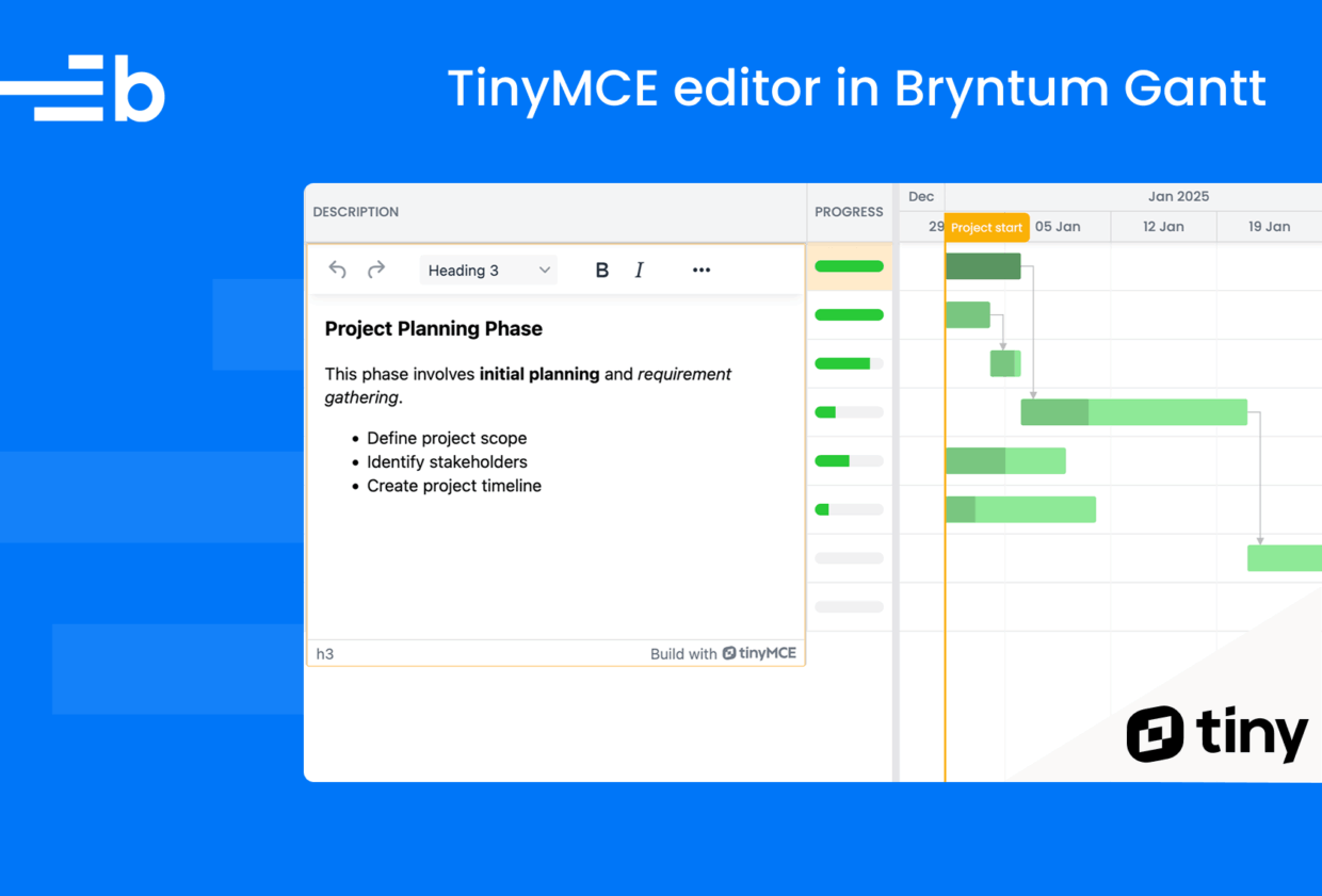
}At this point, you can test the integration by reloading the server and double-clicking on any Description cell to see the TinyMCE editor open:
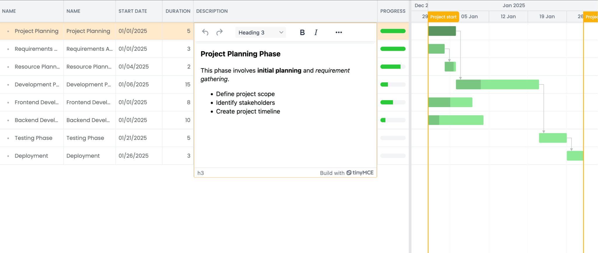
After starting the development server, the Description column will display formatted rich text content. You can now apply text formatting and insert images in Description cells.
Next steps
Take a look at the TinyMCE editing demo on the Tiny Cloud homepage to see the advanced features that you can add to your editor, such as the Microsoft Word import and export functionality.
Visit the Bryntum Gantt demo page to see some of the other features you can add to your component, such as: