How to visualize your Google Sheets data with Bryntum Gantt
We strive to keep posts updated, but code samples may sometimes be outdated. Humans, see the Bryntum documentation; agents, https://mcp.bryntum.com for the latest info.
When it comes to project management, there can be a lot of moving parts. Coordinating multiple tasks and resources, all while keeping track of the progress of each task toward its unique deadline can be dizzying. A timeline tool is a great way to keep track of your project data while giving you an intuitive, visual representation of the work ahead of you.
You can use a timeline to update and track your project data. It’s also a great tool for sharing your project data and progress with your team in an easily understandable way. But how do you decide which tool to use? While there are a lot of timeline tools out there, not every tool will meet your project’s unique needs.
In this article, we will walk you through setting up and using two timeline tools with different benefits to help you understand how to use these tools and decide which is best for you. By the end of this article, you will be able to add data to a Google spreadsheet and get a timeline view of the data rendered by either Google Sheets or a Bryntum Gantt chart.
Choosing between Google Sheets and Bryntum
When considering which tool to use for your project management needs, it is important to weigh the benefits and limitations of both Google Sheets and Bryntum.
Google Sheets:
- Simple and easy to use.
- Affordable, as it is included in Google Workspace plans.
- Limited customization options.
- No ability to track project progress.
- Cannot be integrated as a web component.
Bryntum Gantt:
- More robust and customizable.
- Advanced project tracking capabilities.
- Integrates as a web component.
- Extremely customizable
- Requires a license.
It is important to assess the specific needs and requirements of your project before deciding which tool to use. If your project is small and you are on a tight budget, Google Sheets may be a good option. If you need advanced project tracking and customization, Bryntum Gantt may be a better choice.
Now let’s take a look at setting up a simple timeline in Google Sheets.
Create a timeline with Google Sheets
Google Sheets recently released a timeline feature that provides users with a basic way to create a Gantt chart from their data.
The timeline is really easily set up and is great for getting a visual representation of simple projects quickly. Let’s take a look at setting up our own timeline.
Set up your project data
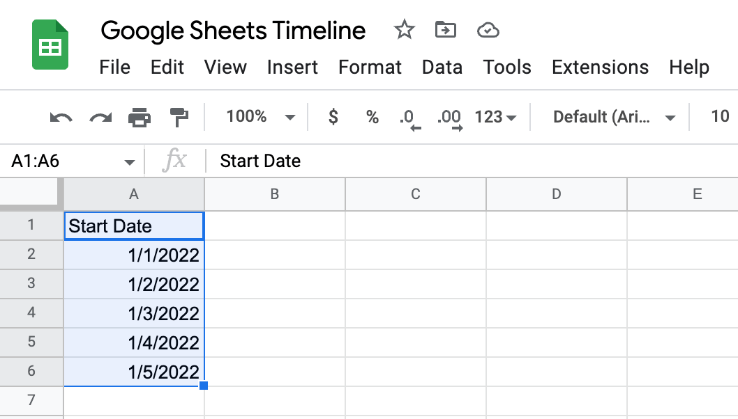
A timeline in Google Sheets needs at least one column of data in date format.
To create a timeline from this data, follow these steps:
- Create a new Google sheet and create a single column of data in the date format.
- Highlight all the data applicable to your timeline, along with the headings.

3. In the toolbar at the top of the page, click “Insert” and then “Timeline”.
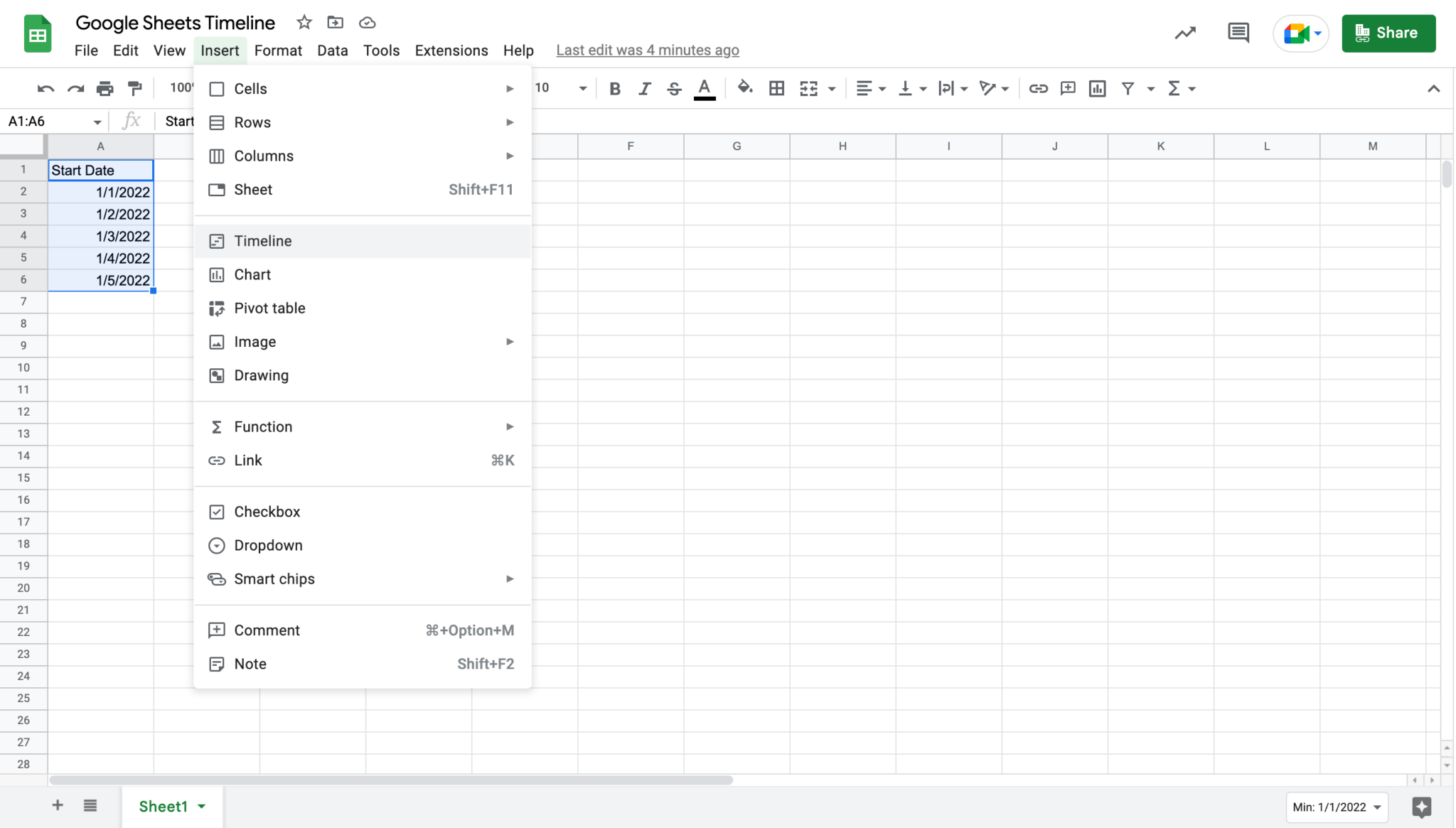
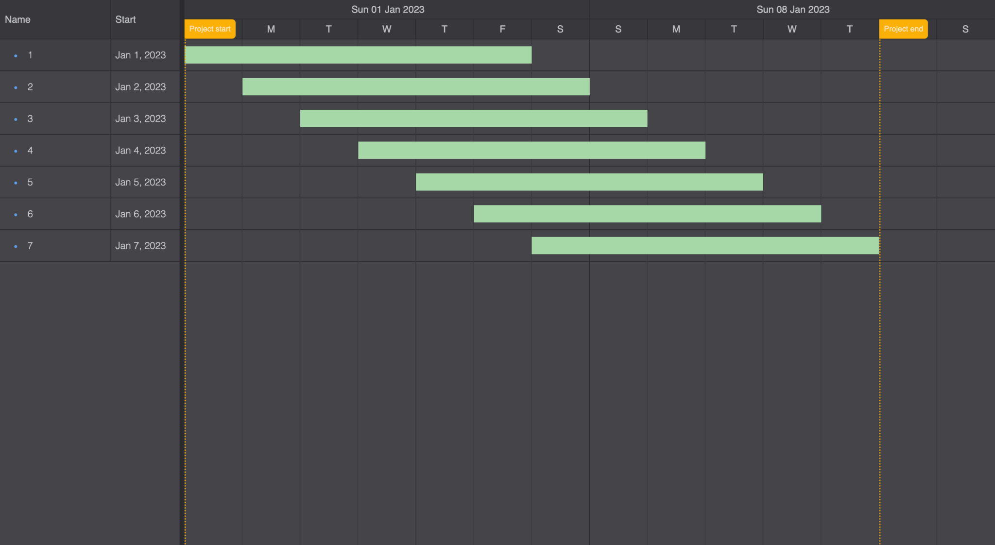
4. After clicking “Okay” on the prompt, you will see your data rendered in a timeline view.
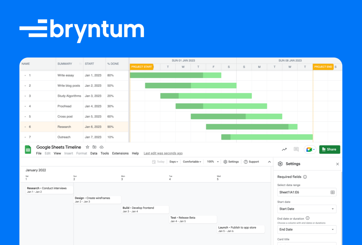
Now this is a Google sheet timeline in the most basic form it can be. In order to make a complete timeline, we need to add more data to represent the name of each task, its start date and end date, and a text summary and duration of each task.
To create a full timeline in your Google sheet, follow these steps:
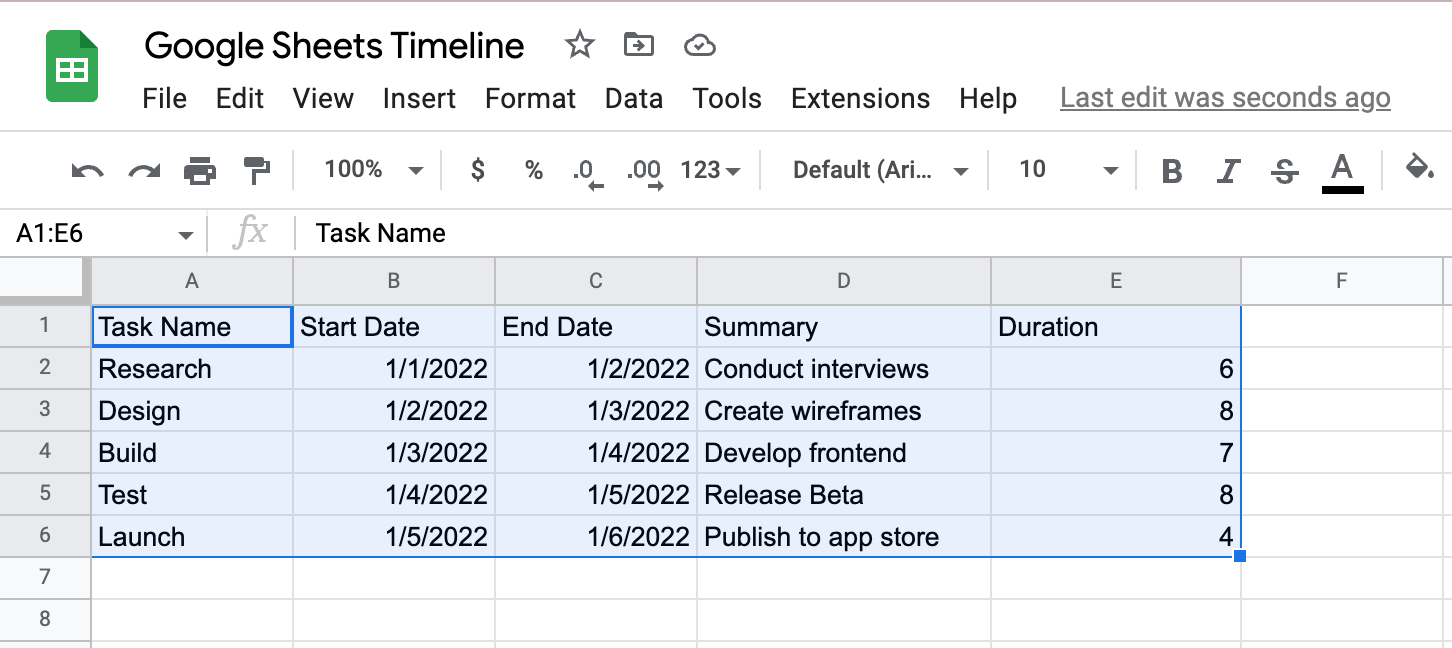
- Create five columns with headers in your sheet like in the image below.
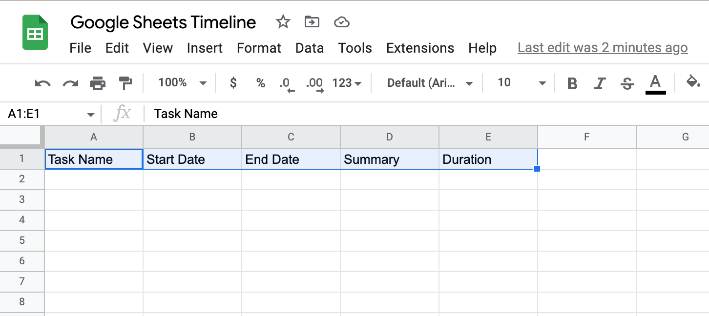
2. Now populate your sheet with your task data.
- Once populated, highlight all the relevant data and the headings, click “Insert” in the toolbar, and select “Timeline”.
- After clicking “Okay” on the prompt, you will see your more complete timeline.
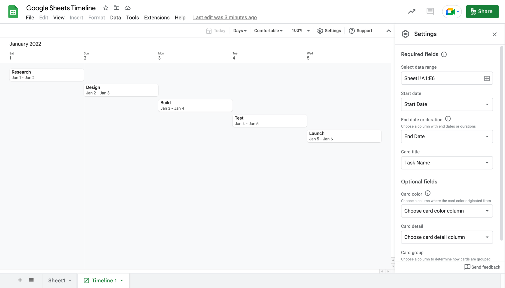
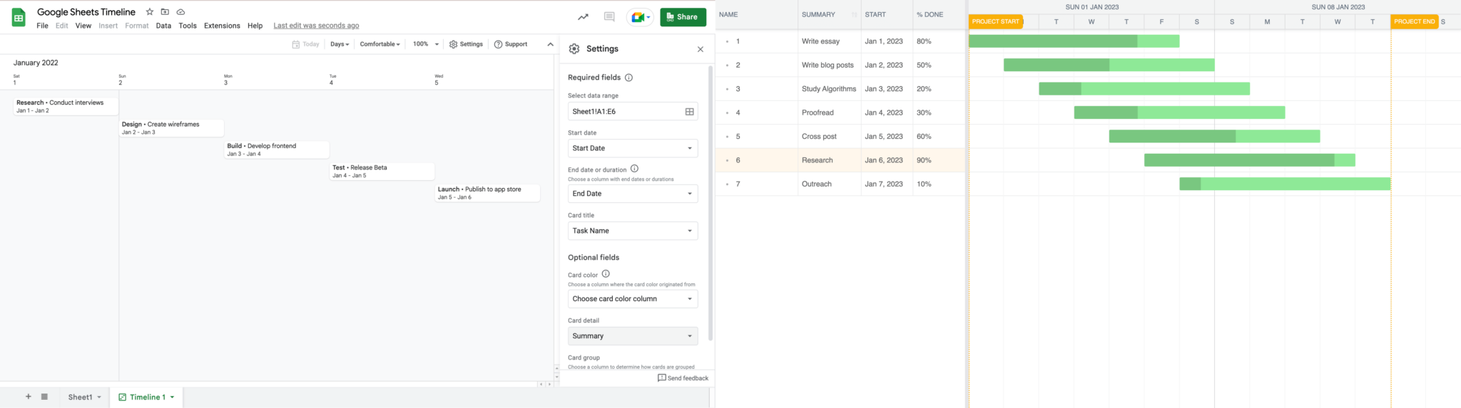
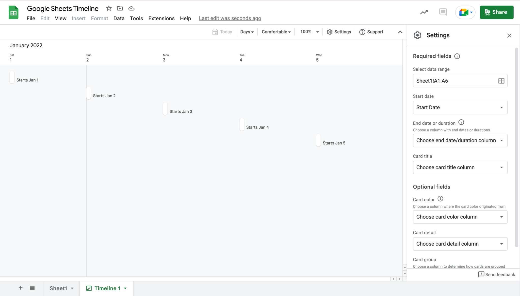
Now you may notice the “Settings” menu on the right-hand side of your timeline.
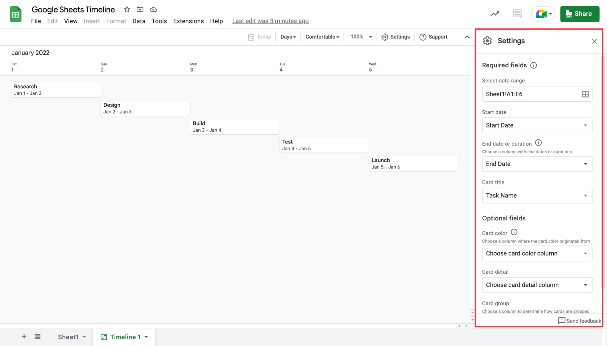
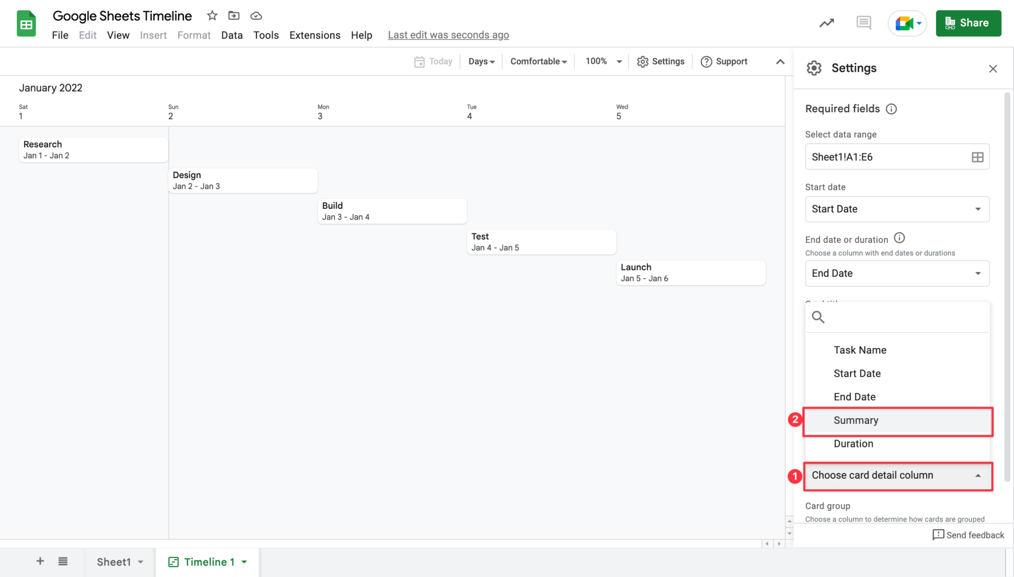
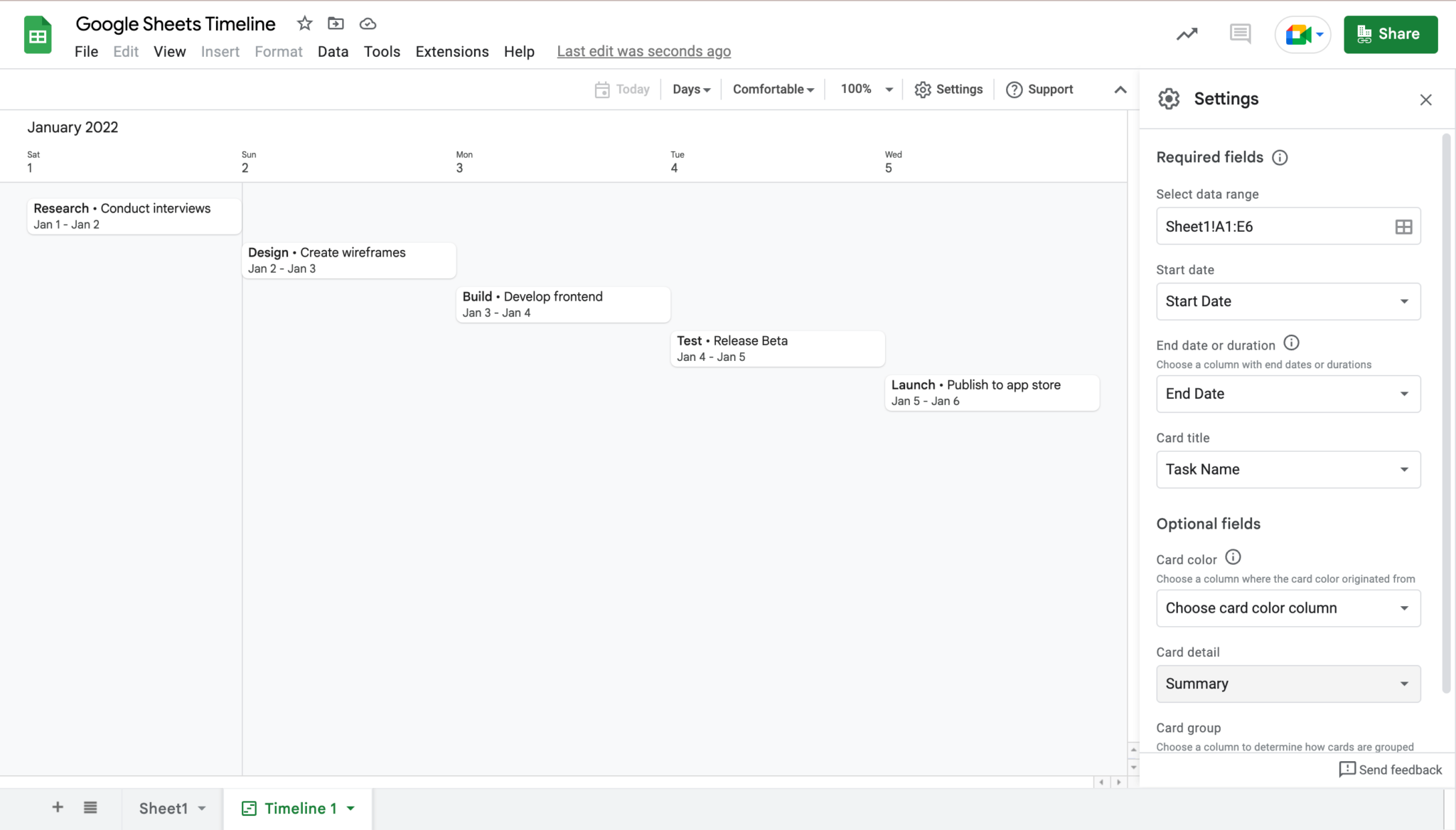
This menu gives you options to configure and customize your timeline to some extent. For example, the summary data we added to our timeline hasn’t shown up in the visual representation yet. To add this data to our view, select the “Card detail” dropdown and select the heading for your summary data (in this case “Summary”).
Now your summary data will appear in your timeline view.
Now you know how to create a simple timeline view from your project data in Google Sheets. It’s fairly easy, but if we poke around we quickly find that this simplicity comes with a trade-off: customization. Customization is crucial in project management because as project data grows, more data needs to be visualized and relations between the data become more complex.
The Google Sheets timeline is simple to set up and can quickly visualize your data, but it can’t do many of the things that a more powerful Gantt chart can do. For example, it’s not possible to track the dependencies between tasks or assign resources to specific tasks.
Bryntum Gantt: Powerful and simple
The Bryntum Gantt is the best of both worlds. It provides the power and functionality you need for complex projects, but it’s also easy to use. With the Bryntum Gantt, you can easily track the progress of your project, see the dependencies between tasks, and assign resources to specific tasks.
Let’s take a look at how you can configure a Bryntum Gantt to retrieve and display data stored in a Google sheet, as well as some ways you can customize your Gantt chart. At the end of this tutorial, you will have a new, powerful Gantt chart to display your Google Sheets data and some insight into how you can manage your projects with the Bryntum Gantt.
What you’ll need
We will work from starter code hosted on GitHub to create our app. You’ll need a few other tools too:
Write the frontend code (Bryntum)
To get started, you can download the starter code from either the main branch or complete-gantt branch in our repository.
If you would like to get straight to using a completed version of the Gantt, download the code in the complete-gantt branch and skip to the “Prepare your Google sheet” section of the tutorial.
If you would like to learn about downloading data and setting up the Gantt chart, clone the code from the main branch and follow from this point on.
Open the downloaded code in VSCode. You will see a few files already set up for you.
The index.html file contains the HTML our Gantt will be appended to later on. It also contains a link to the Bryntum theme that will style our Gantt for us.
<!DOCTYPE html>
<html lang="en">
  <head>
    <meta charset="UTF-8" />
    <meta http-equiv="X-UA-Compatible" content="IE=edge" />
    <meta name="viewport" content="width=device-width, initial-scale=1.0" />
    <link
      rel="stylesheet"
      href="node_modules/@bryntum/gantt/gantt.stockholm.css"
      id="bryntum-theme"
    />
    <link rel="stylesheet" href="main.css" />
    <title>Bryntum Gantt</title>
  </head>
  <body>
    <script type="module" src="gantt.js"></script>
  </body>
</html>
There is also a main.css file that will ensure our Gantt is styled correctly.
body,
html {
  margin: 0;
  display: flex;
  flex-direction: column;
  height: 100vh;
  font-family: Poppins, 'Open Sans', Helvetica, Arial, sans-serif;
  font-size: 14px;
}
Both of these files are provided as part of the Bryntum Gantt chart set up process.
Install Bryntum Gantt
Now we need to install some packages we need for the tutorial. Do this by running this command in your terminal:
npm installTo install Bryntum Gantt, access the npm registry by following this step on the Bryntum website.
Then install the component by following this step.
Now that we have our component installed, we can configure our Gantt chart. In the gantt.js folder, paste the following code:
import { Gantt } from './node_modules/@bryntum/gantt/gantt.module.js';
const gantt = new Gantt({
  appendTo: document.body,
  project: {
    tasksData: [
      {
        id: 1,
        name: 'Write docs',
        expanded: true,
        children: [
          {
            id: 2,
            name: 'Proof-read docs',
            startDate: '2022-01-02',
            endDate: '2022-01-09',
          },
          {
            id: 3,
            name: 'Release docs',
            startDate: '2022-01-09',
            endDate: '2022-01-10',
          },
        ],
      },
    ],
    dependenciesData: [{ fromTask: 2, toTask: 3 }],
  },
  columns: [
    { type: 'name', width: 160 },
    { type: 'startdate', width: 100 },
  ],
});
Here we have configured our Gantt using inline data, creating a few tasks and dependencies between them.
Not everyone uses our Gantt chart in the same way, which is why we made it fully customizable. You can customize your Gantt to meet your project’s unique needs or to adapt to the needs of a growing project.
To demonstrate this, we will edit the Gantt instance we just created with some configuration options. You can read more about customization here.
Change the data source
The most important customization for our app will be where our Gantt gets its data from. To do this we will configure the CrudManager for our project data to sync our data between the Gantt and the backend we will set up later on.
To set up the CrudManager for our Gantt, replace the project configuration in our Gantt instance with the following:
    project: {
      transport: {
        load: {
          url: 'https://localhost:3000/download',
        },
      },
    },
Here we configure our Gantt to load data from a URL. This URL will prompt our backend server to return the data stored in our Google sheet. Our Gantt will then render this data for us.
Before our data is rendered, we need to load it into our Gantt. To do this, add the following line below the gantt instance:
gantt.project.load();Now let’s set up our backend so that we can see our data rendered before exploring some more customization options.
Configure the backend server
Our backend is a simple Express server with a single /download route. Our frontend will call this route, the server will then download the data from our Google sheet, perform some formatting on the data, and then return the data to our Gantt on the frontend.
To get started, paste the following code in the server.js file:
const express = require('express');
const app = express();
const csv = require('csvtojson');
const request = require('request');
const cors = require('cors');
require('dotenv').config();
app.use(
  cors({
    origin: 'https://localhost:8080',
    credentials: true,
  })
);
app.listen(3000, () => {
  console.log('Server started on port 3000');
});
This code configures our backend to have access to environment variables, allows our express app to communicate with our frontend at the https://localhost:8080 endpoint, and creates a server that listens on port 3000 for connections.
Next we need to define our /download route. This route will download our Google sheet data, format it, and send it to our Gantt on the frontend.
Paste the following code above the app.listen line:
const SHEET_ID = process.env.SHEET_ID;
app.get('/download', (req, res) => {
  const url = `https://docs.google.com/spreadsheets/d/${SHEET_ID}/export?format=csv&id=${SHEET_ID}&gid=0`;
  request(url, (error, response, body) => {
    if (!error && response.statusCode === 200) {
      csv()
        .fromString(body)
        .then((jsonData) => {
          for (let i = 0; i < jsonData.length; i++) {
            jsonData[i].manuallyScheduled = 'true';
          }
          jsonData = JSON.parse(
            `{"tasks": {"rows": ${JSON.stringify(jsonData)}}}`
          );
          res.json(jsonData);
        });
    } else {
      res.send('Error downloading CSV');
    }
  });
});
Here we define a string SHEET_ID that gets your Google sheet ID from an environment variable we will set later on. Then we define the /download route and request the CSV file at the URL of the Google sheet. Next, we convert the CSV to JSON with the csvtojson package to prepare the data for formatting. Finally, the JSON is parsed into a format that the API can accept.
Now our backend and frontend are set up, we can get our data ready.
Prepare your Google sheet
The preparation of the Google Sheet data is very straightforward. You can either create your own file or create a copy of this file by opening it, clicking “File” in the menu, and then clicking “Make a copy”.
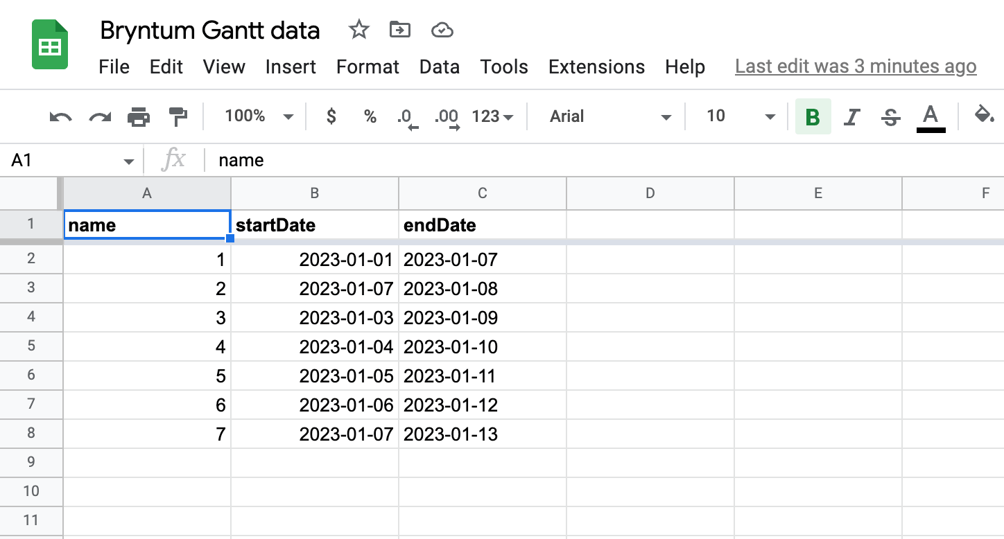
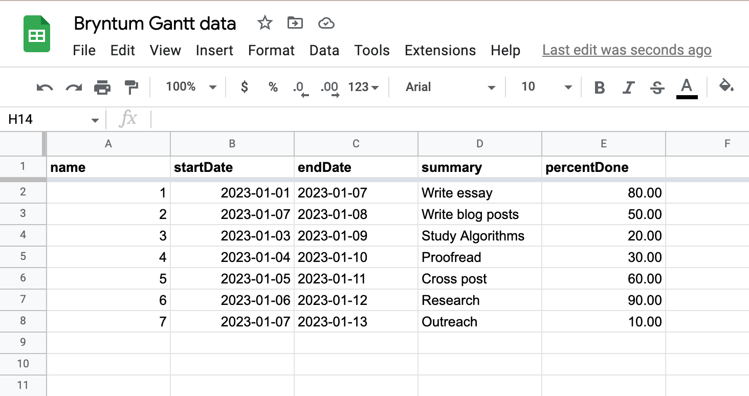
The data is stored in three columns: name, startDate, and endDate.
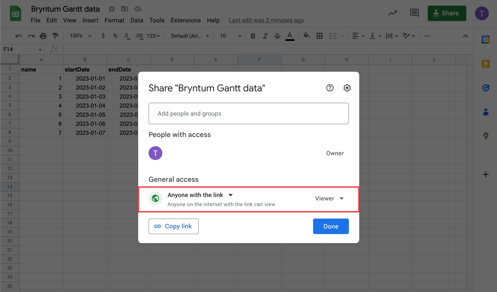
We will experiment with adding some more fields to the file later on. For now, all we need before we can run our app is our sheet ID. Find your sheet’s ID located here in its URL:

Paste this as a string in the .env file in the root of your project.
SHEET_ID = '<your-sheet-id-here>';Adjust access to the sheet to allow general access by clicking the “Share” button and then selecting the “Anyone with the link” option.
Now that your app can find and download your sheet data, we can run it!
Run your app
To run your app, start the server in a terminal with the following command:
npm run serverTo run your frontend, open a second terminal and run the following command:
npm run startYour browser should automatically open with your new Gantt chart rendered, otherwise you can find the Gantt at localhost:8080].
You can interact with this Gantt by adding tasks, changing heading names, and more, without changing the data in your Google sheet.
This Gantt is a powerful tool that can change and grow to meet the needs of your data. For example, if you want to customize the styling, add more fields to your data, or make and save changes through the Gantt UI, this can all be done by configuring your Gantt.
Powerful features and customization
Let’s quickly experiment with some of these customizations. We’ll start by changing our theme.
Change themes
In the index.html file, swap out this line:
<link
  rel="stylesheet"
  href="node_modules/@bryntum/gantt/gantt stockholm.css"
  id="bryntum-theme"
/>
With your choice of style here:
<!-- Classic-Dark theme -->
<link
  rel="stylesheet"
  href="node_modules/@bryntum/gantt/gantt.classic-dark.css"
  id="bryntum-theme"
/>
<!-- Classic theme -->
<link
  rel="stylesheet"
  href="node_modules/@bryntum/gantt/gantt.classic.css	"
  id="bryntum-theme"
/>
<!-- Classic-Light theme
 -->
<link
  rel="stylesheet"
  href="node_modules/@bryntum/gantt/gantt.classic-light.css"
  id="bryntum-theme"
/>
<!-- Material theme
 -->
<link
  rel="stylesheet"
  href="node_modules/@bryntum/gantt/gantt.material.css	"
  id="bryntum-theme"
/>
Now when you run your application, your new theme will be loaded.
So much more can be done to make your Gantt more intuitive and pleasant to look at. Visit our website to learn more about customizing your Gantt chart.
Add columns
The Gantt chart ships a lot of predefined columns (such as the PercentDoneColumn). You can add your own columns too, showing any additional data in your data model. The only mandatory column is the name column.
Let’s experiment by adding both a predefined column and a new column we will create.
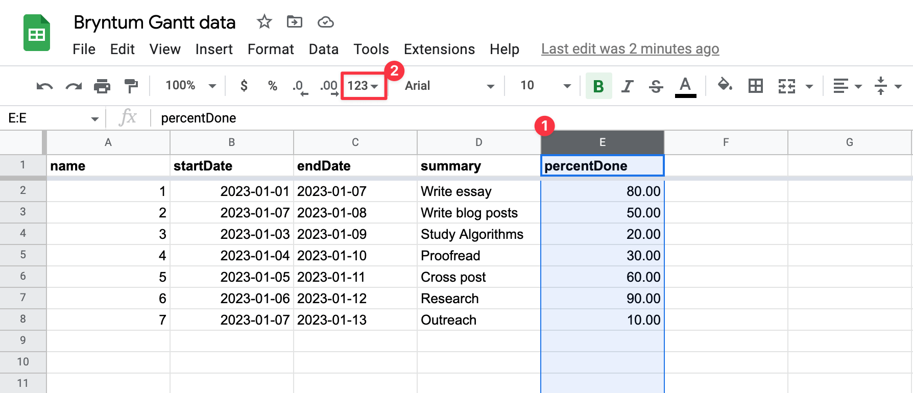
In your Google sheet, add two new column headers: percentDone and summary.
Click on the percentDone column to highlight it, then format the column to hold numbers.
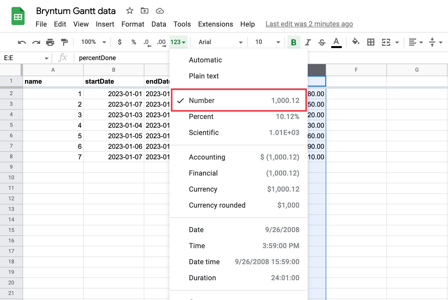
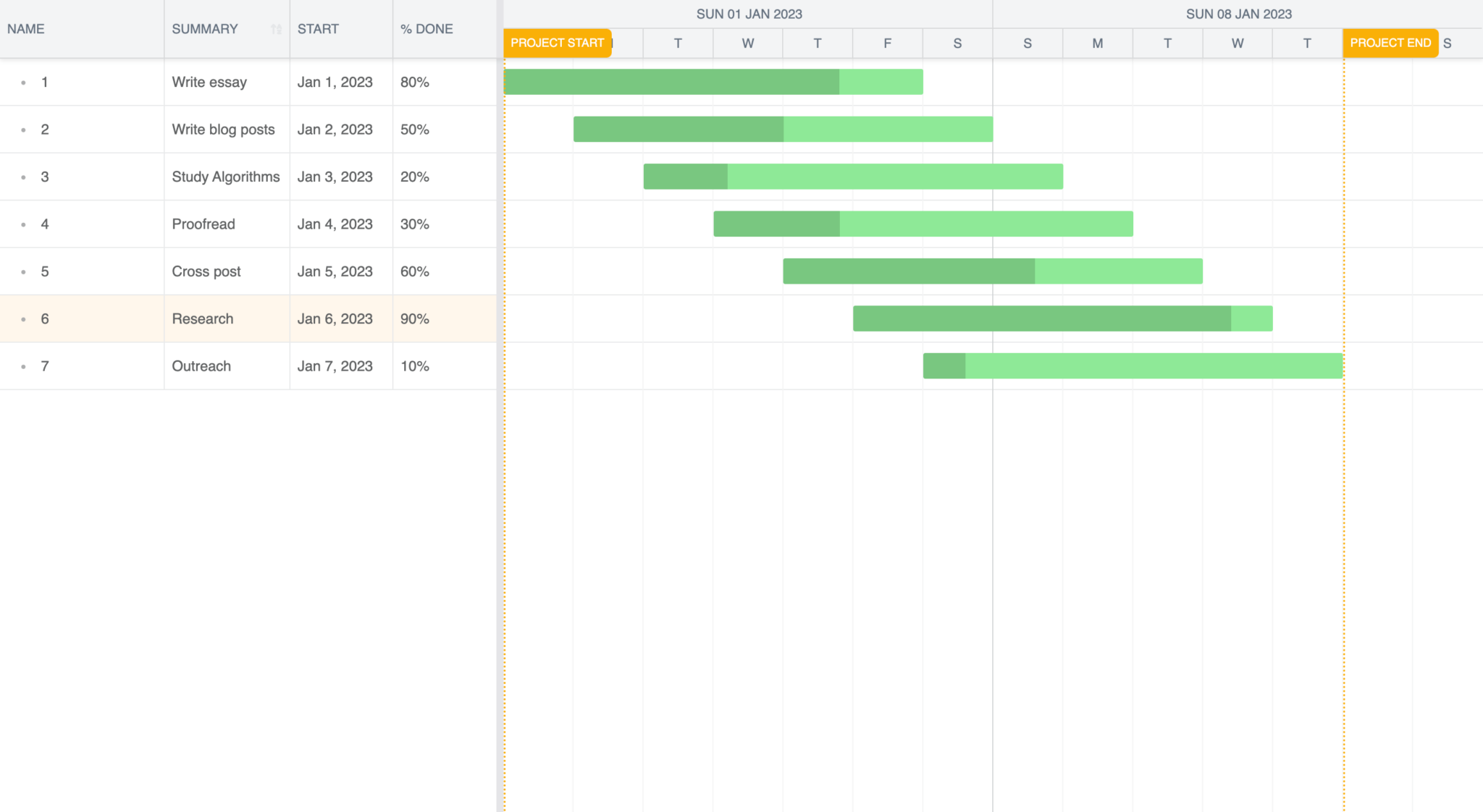
Let’s take a look at the columns we created here. The percentDone column is a predefined Bryntum Gantt column that stores a value representing how far along a project is as a percentage. This column is especially useful because it interacts with the UI of our tasks to visually represent the data held in these columns, which we will see when we render our data shortly.
Next we created our own custom column called summary. This will contain some additional text to describe each task.
Add some data to both of these columns like so:

Then add these column definitions to our Gantt in the gantt.js file by replacing the columns configuration with the following:
  columns: [
    { type: 'name', width: 160 },
    { text: 'summary', field: 'summary', width: 100 },
    { type: 'startdate', width: 100 },
    { type: 'percentdone', width: 100 },
  ],
Now when you run your Gantt, you will see your summary and percentDone data in their own columns, and the tasks should be styled to represent the percentage that they have been completed.
There is so much power at your fingertips with our Gantt charts. To learn more about customizing your Gantt’s configuration check out the guides on our website.
Persisting changes made through the UI
Our Gantt can be used to take full control over your data by making and persisting changes to your Gantt through the UI. If you are interested in checking this out, take a look at the Saving data section of our docs, which walks you through how to set up a database for your Gantt chart.
Conclusion
The Google Sheets timeline feature is a simple tool for visualizing project tasks, but its limitations become apparent when managing complex projects. If your project grows, a simple timeline feature will not be able to keep up with managing the many dependencies and resources involved.
Bryntum Gantt is specifically designed to handle complex projects and offers the full range of advanced features needed for project management. Features such as task dependencies, resource management, and customization options ensure a seamless project-management experience. Its user-friendly interface and flexible design make Bryntum Gantt an ideal choice for teams looking to take their project management to the next level.
If you’re interested in seeing what the Bryntum Gantt is capable of, take a look at our demo page. To see our full suite of project management tools, visit our website.