How to onboard customers using Bryntum’s HintFlow
We strive to keep posts updated, but code samples may sometimes be outdated. Humans, see the Bryntum documentation; agents, https://mcp.bryntum.com for the latest info.
The Bryntum v6.2.0 release added new features, including the HintFlow utility. With HintFlow, you can create user tours of your app that are ideal for onboarding. Bryntum products have advanced features, which can get complicated. This is why we use HintFlow in some of our complex demos, like the Bryntum Calendar custom rendering and Bryntum Grid AI-powered review insights demos.
We released this feature to help you onboard customers and employees who need to use complex, Bryntum-powered apps.
In this guide, we’ll show you how to use HintFlow by adding onboarding steps to a Bryntum Calendar app.
Setup and configuration
Let’s learn how to use HintFlow by adding it to an example app. We’ll first clone a GitHub repository with an example Bryntum Calendar app, install the Bryntum Calendar component, and then add HintFlow hints to the app.
Setting up an example Bryntum Calendar app
Clone the Bryntum Calendar starter repository, which is a modified copy of our Bryntum Calendar custom rendering demo.
Install the dependencies by running the following command:
npm installIf you’re using the free trial, install the public Bryntum trial package:
npm install @bryntum/calendar@npm:@bryntum/calendar-trialIf you have a Bryntum license, refer to our npm Repository Guide and install the licensed package:
npm install @bryntum/calendarRun the following command to start the local dev server:
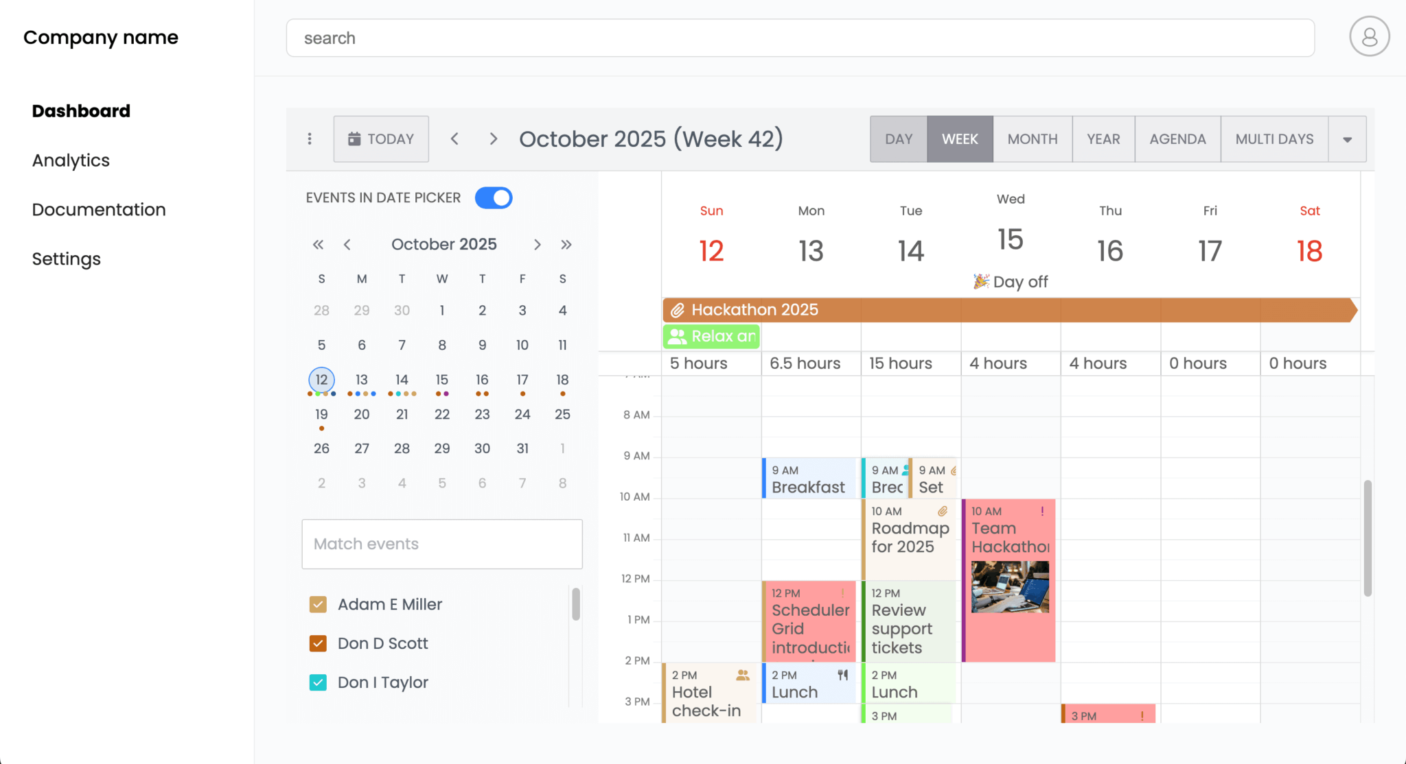
npm run devOpen https://localhost:5173. You’ll see an app with a Dashboard page showing a Bryntum Calendar:
Building an onboarding flow using HintFlow
Let’s add a series of hint popups to help users learn to navigate the example app.
In the src/main.js file, import the HintFlow utility class:
import { HintFlow } from '@bryntum/calendar';Add the following lines of code below the imports:
new HintFlow({
    defaults : {
        modal : true
    },
    hints : [
        {
            target  : 'body > div.app-layout > nav > ul > li:nth-child(4) > a > span',
            align   : 'e-s',
            title   : 'Settings page',
            content : 'Page for app settings.'
        },
        {
            target  : 'body > div.app-layout > nav > ul > li:nth-child(1) > a > span',
            align   : 'e-s',
            title   : 'Dashboard page',
            content : 'Page for app dashboard. Contains Bryntum Calendar.'
        }
    ]
});
We initialize the HintFlow utility class with a config object to create a sequence of Hint popups.
There are two config options for HintFlow:
The defaults object contains configuration properties that are applied to all hints. Here, we set modal to true, which adds a grey overlay outside the hint modal.
We also provide an array of hints. Each object in the hints array is a hint widget with two required config options:
target: The element that the hint highlights. It’s found using the target’s element or CSS selector.content: The HTML content that is displayed in the Hint widget.
The two example hints also have title and align properties.
The align property sets how the Hint widget aligns with its target element. For example, ‘e-s’ means that the end of the hint widget should be aligned with the start of the target element. The format of the string is '[trblc]n-[trblc]n', where:
t: topr: rightb: bottoml: leftc: center
You can optionally add an offset, n, to the end of the letters used to indicate which parts of the hint and target align. The value of n, which can range from 0 to 100, specifies the offset from the aligned edges.
For example, the following value aligns the top-right corner of the hint with the bottom-right corner of its target element:
align : 't100-b100',So the hint is positioned like this:
Now open your dev server and refresh the page. You’ll see the two hints we created. You can click the Next and Previous buttons to move between the hints:
Note that the elements we targeted aren’t part of the Bryntum component. You can target any element in your app.
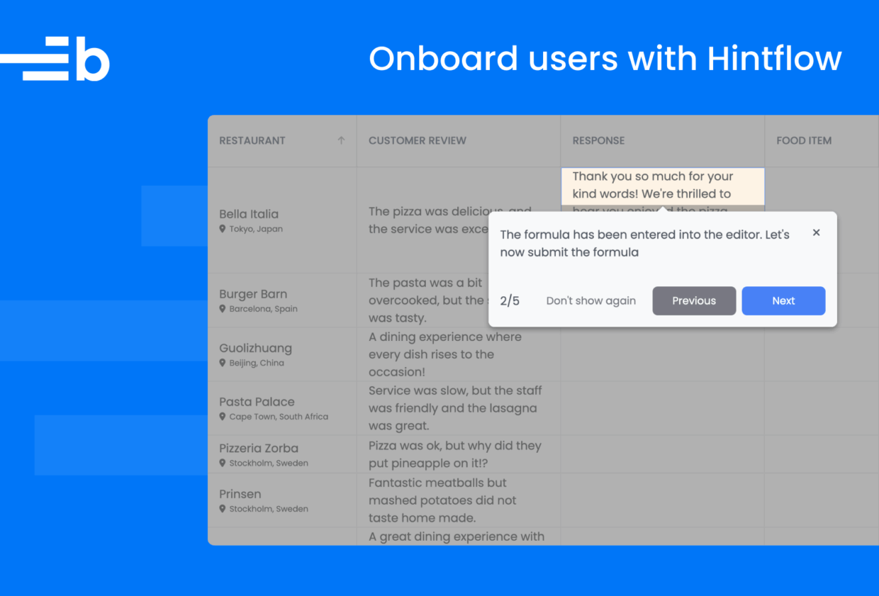
Let’s add some more hints for elements of the Bryntum Calendar. Add the following hint objects to the hints array:
,{
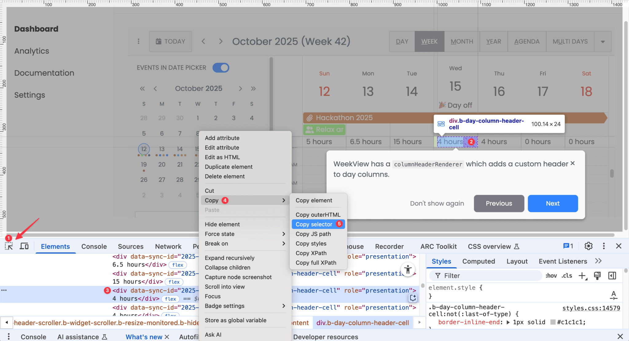
target : '.b-day-column-header-cell[data-sync-id="2025-10-15"]',
align : 't-b',
content : 'WeekView has a <code>columnHeaderRenderer</code> which adds a custom header to day columns.'
},
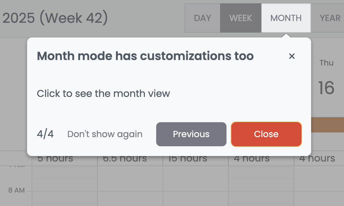
{
target : '[data-ref="monthShowButton"]',
align : 'r100-l',
title : 'Month mode has customizations too',
content : 'Click to see the month view',
nextAction : {
click : '[data-ref="monthShowButton"]'
}
},
{
target : '.b-monthview [data-week="2025,41"] .b-week-number-cell',
align : 'r-l',
content : 'Month mode has a week renderer which makes a more descriptive week column.',
previousAction : {
click : '[data-ref="weekShowButton"]',
}
}In this code, the second hint has a nextAction property. This property configures the actions that occur when the Next button is clicked. When the Next button is clicked for this hint, the Month button is clicked so that the monthly view is displayed:
The previousAction property configures the actions that occur when the Previous button is clicked. Once we’ve entered the monthly view, we can switch back to the weekly view using the Previous button.
You can find the target element’s CSS selector using your browser’s dev tools. In Chrome, open DevTools, click the element inspector button, and then click the element on the page. This shows the element in the Elements tab. Right click on the element, select Copy in the context menu, and then select Copy selector:
Let’s add three more hints:
,{
	target     : '.b-monthview .b-cal-event-wrap[data-event-id="1"] .b-cal-event',
	align      : 't-b',
	title      : 'Custom event renderer in MonthView',
	content    : "Month mode's CSS has been customized to display event bars with a similar appearance to event blocks in DayView. Double-click on an event bar to open the event editor.",
	nextAction : {
		dblclick : '.b-monthview .b-cal-event-wrap[data-event-id="1"] .b-cal-event'
	}
},
{
	target  : '#b-calendar-1-event-editor',
	title   : 'Event editor',
	align   : 'r50-l17',
	content : 'You can edit fields such as the name.',
	buttons : {
		previous : {
			hidden : true
		}
	},
	nextAction : {
		dblclick : {
			target : '#b-textfield-1-input'
		},
		waitFor : 200,
		type    : {
			text  : 'Bryntum Hackathon 2025',
			clear : true,
			focus : true
		}
	}
},
{
	target  : '#b-calendar-1-event-editor',
	title   : 'Save changes',
	align   : 'r35-l100',
	content : 'Click the save button to save changes',
	buttons : {
		previous : {
			hidden : true
		}
	}
}
These three hints show the user how to click on an event bar to open the event editor, how to edit a field, and how to save their changes. Note how the buttons config is used to hide the Previous button in the second and third hints.
When the Next button is clicked in the second hint, the Name field is double-clicked and focused on. After 200 milliseconds, the text Bryntum Hackathon 2025 is then typed into the input. This creates a typewriter effect, which you can see in the complete sequence of hints that we’ve created:
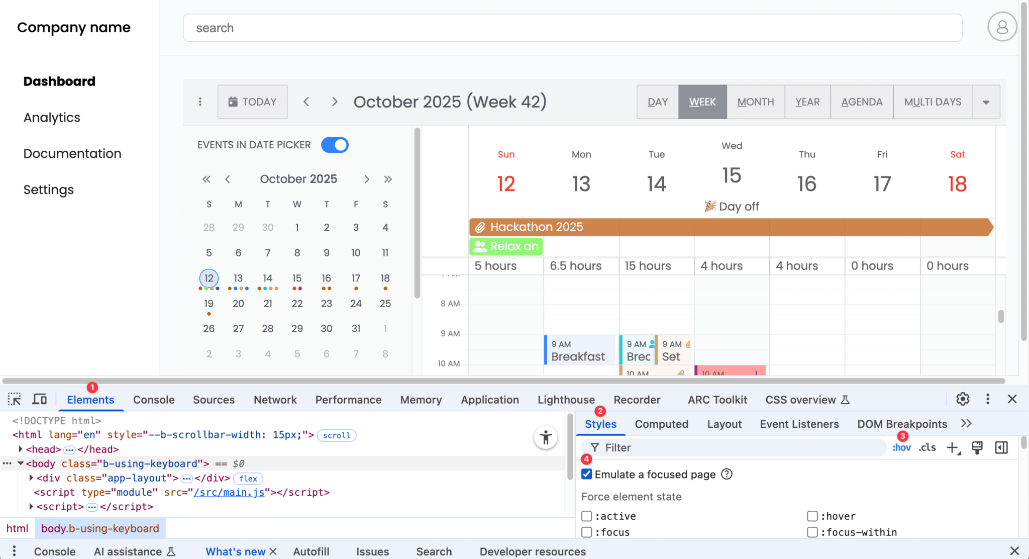
Note that if you try to inspect a target element in the event editor popup using dev tools, the switch of focus from the page to dev tools closes the popup. You can prevent this in Chrome Dev Tools by enabling Emulate a focused page. You can find this option by clicking the :hov button in the Styles tab under the Elements tab:
Next steps
Now that you know the basics of creating onboarding steps with HintFlow, take a look at the hints in our demos to see more examples of how you can use HintFlow:
Notice the drag feature in the Bryntum Grid AI-powered review insights demo. You can see the HintFlow configuration used for the demos by opening the hints.json file in the Network tab of your browser’s dev tools. Note that HintFlow only runs in the demos when the window size is at least 900px wide by 700px high.
You can also get the source code for the demos by downloading the Bryntum products free-trial distribution code. If you have a Bryntum license, you can download the distribution code from the Bryntum Customer Zone.
Take a look at the HintFlow and Hint docs to learn more about advanced features, such as:
- Adding
?to the end of a target selector to skip the target if it isn’t found - Using
autoNextto automatically move to the next hint after a set time - Mapping key names to hint actions using
keyMap:
keyMap : {
	'A' : 'next',
	'B' : 'previous',
	'C' : 'stop'
}
Visit the Bryntum Calendar demos to discover more features you can add to the app. The forums are always open if you have any questions or need support.
If you’re new to Bryntum, sign up for a 45-day free trial to explore the powerful capabilities of Bryntum’s products.