What’s new in v6.2.0
We strive to keep posts updated, but code samples may sometimes be outdated. Humans, see the Bryntum documentation; agents, https://mcp.bryntum.com for the latest info.
We’re excited to announce the release of Bryntum v6.2.0, packed with powerful new features, enhancements, and demos. This release introduces capabilities like the new highlightEvents API, the TreeSummary feature, the ProjectEdit interface, and much more. In this blog, we’ll walk through some of the most impactful additions and improvements in detail.
AI support in Grid
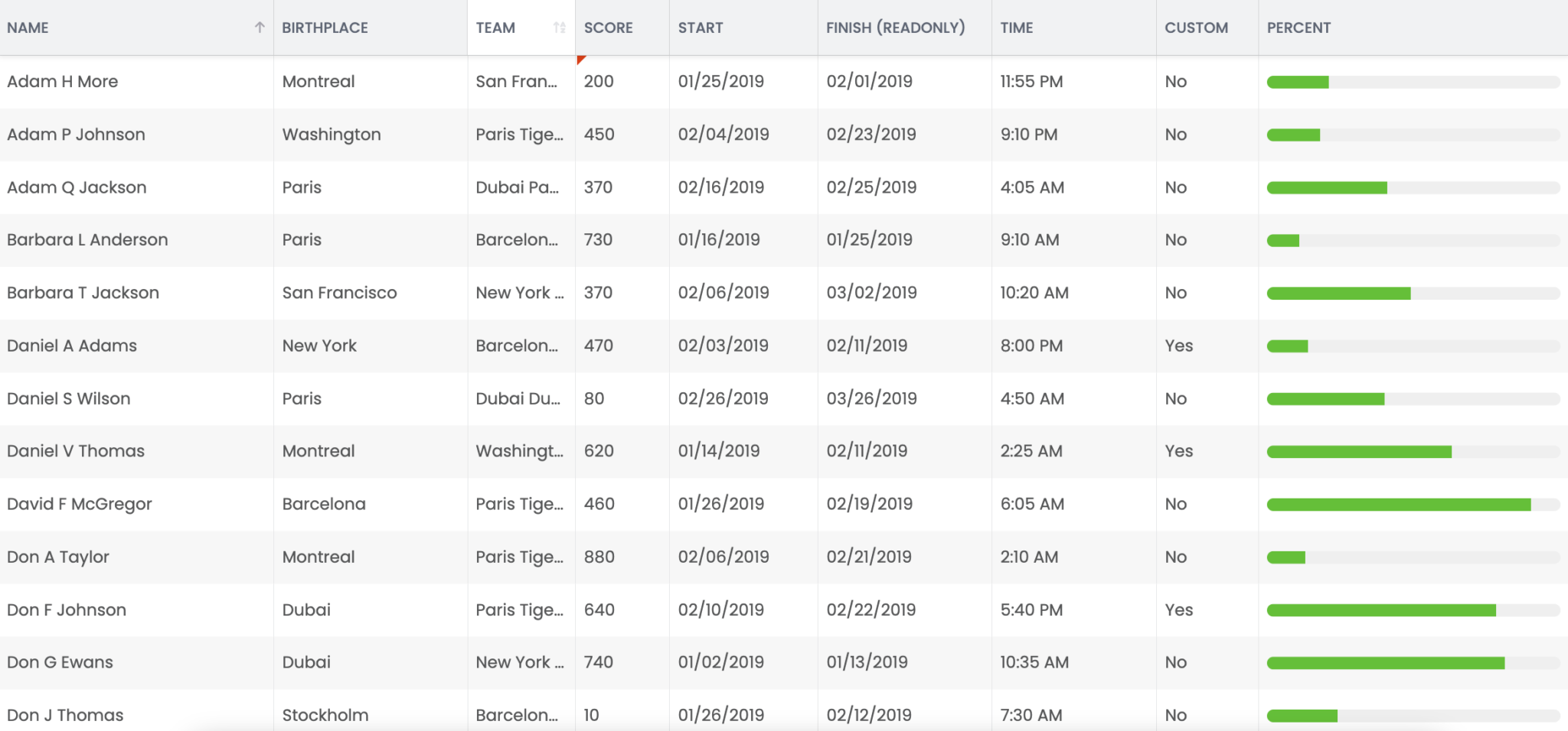
Grid now supports AI-powered columns that can generate content from natural language prompts. Just type something like =AI(Write a short SEO description for $name) in a cell, and the response will be generated automatically. This is powered using a custom AI prefix configured via a formulaProvider that connects to your remote AI service.
You can customize the prompt globally, tweak the model’s creativity, and even add extra instructions via the settings panel. Perfect for generating SEO tags, summaries, or any text-based content – right inside your grid.
We have two demos that cover these new features:
Edit Grid rows in side panel
The new RowEdit feature enables full row editing within a docked panel, which slides in from the right by default. This panel allows users to edit an entire record at once, providing a more spacious and user-friendly editing experience compared to inline cell editing.
The RowEdit feature is disabled by default. To enable it, you must explicitly disable the cellEdit feature:
features : {
    cellEdit : false,
    rowEdit  : true
}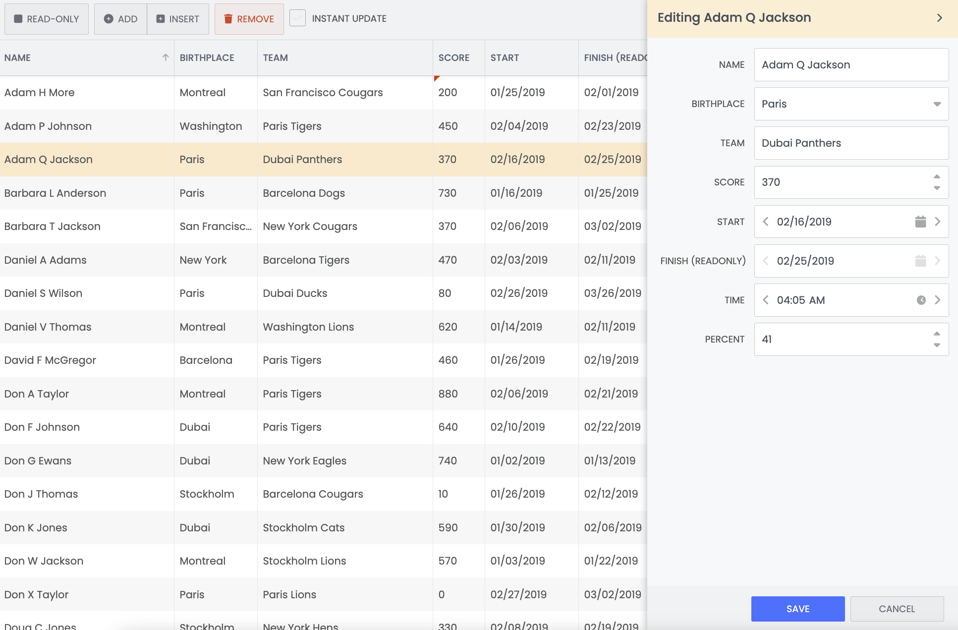
Explore this feature in our row edit demo.
Highlight events in Scheduler
You can programmatically highlight one or more events or assignments in the Scheduler using the highlightEvents API, passing the events’ IDs in an array.
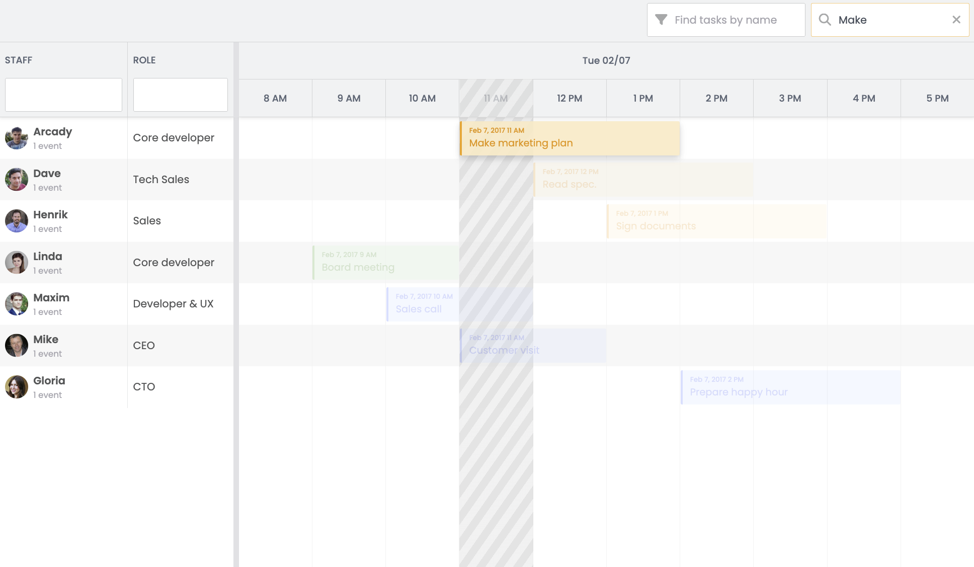
The code below will highlight the events with IDs 1, 2, and 3, and automatically scroll to the nearest visible event if necessary.
scheduler.highlightEvents({ events : [1,2,3] });In addition to event IDs, the method accepts several optional arguments, such as scroll, unhighlightOnClick, and unhighlightOthers. Refer to the highlightEvents API documentation for full details on these options.
In Gantt, highlightTasks is used to achieve the same results and accepts the same arguments.
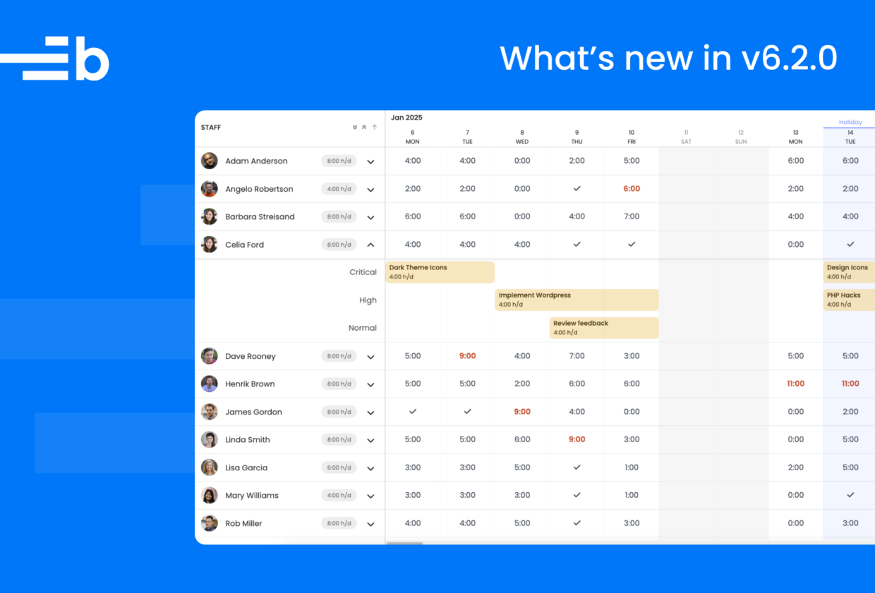
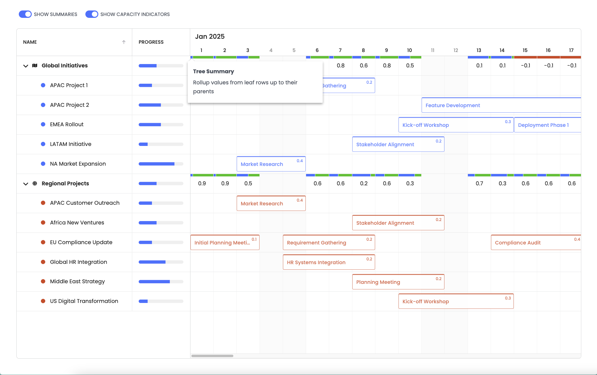
The TreeSummary feature for aggregating values in Scheduler
The TreeSummary feature allows you to roll up and display values in the time axis cell for each parent row in a tree scheduler.
new Scheduler({
     features : {
         treeSummary : {
             summaryRenderer({ startDate, endDate, resourceRecord, timeline }) {
                 let totalDemandedCapacity = 0;

                 resourceRecord.traverse(node => {
                     node.events.forEach(task => {
                         if (DateHelper.intersectSpans(task.startDate, task.endDate, startDate, endDate)) {
                             totalDemandedCapacity += task.demandedCapacity || 0;
                         }
                     });
                 }, true);

                 if (timeline.project.effectiveCalendar.isWorkingTime(startDate, endDate)) {
                     return 1 - totalDemandedCapacity;
                 }
                 else {
                     return 0;
                 }
             }
         }
     }
});
This new functionality is demonstrated in the new Tree Summary and Tree Summary Custom Scheduler demos and Tree Summary Heatmap Scheduler Pro demo.
Delete event dependencies by clicking
You can now quickly delete a dependency by clicking on the line to reveal a delete icon.
Toggle this new behavior with the enableDelete config option.
const scheduler = new Scheduler({
    features : {
        dependencies : {
            // Disable the new delete icon (on by default)
            enableDelete : false
        }
    }
});
If enableDelete is set to false, you’ll need to use the former method of right clicking the line and selecting Delete.
Edit Gantt project settings with the ProjectEdit API
The ProjectEdit feature lets you edit project settings such as name, start date, and scheduling direction by opening a special popup.
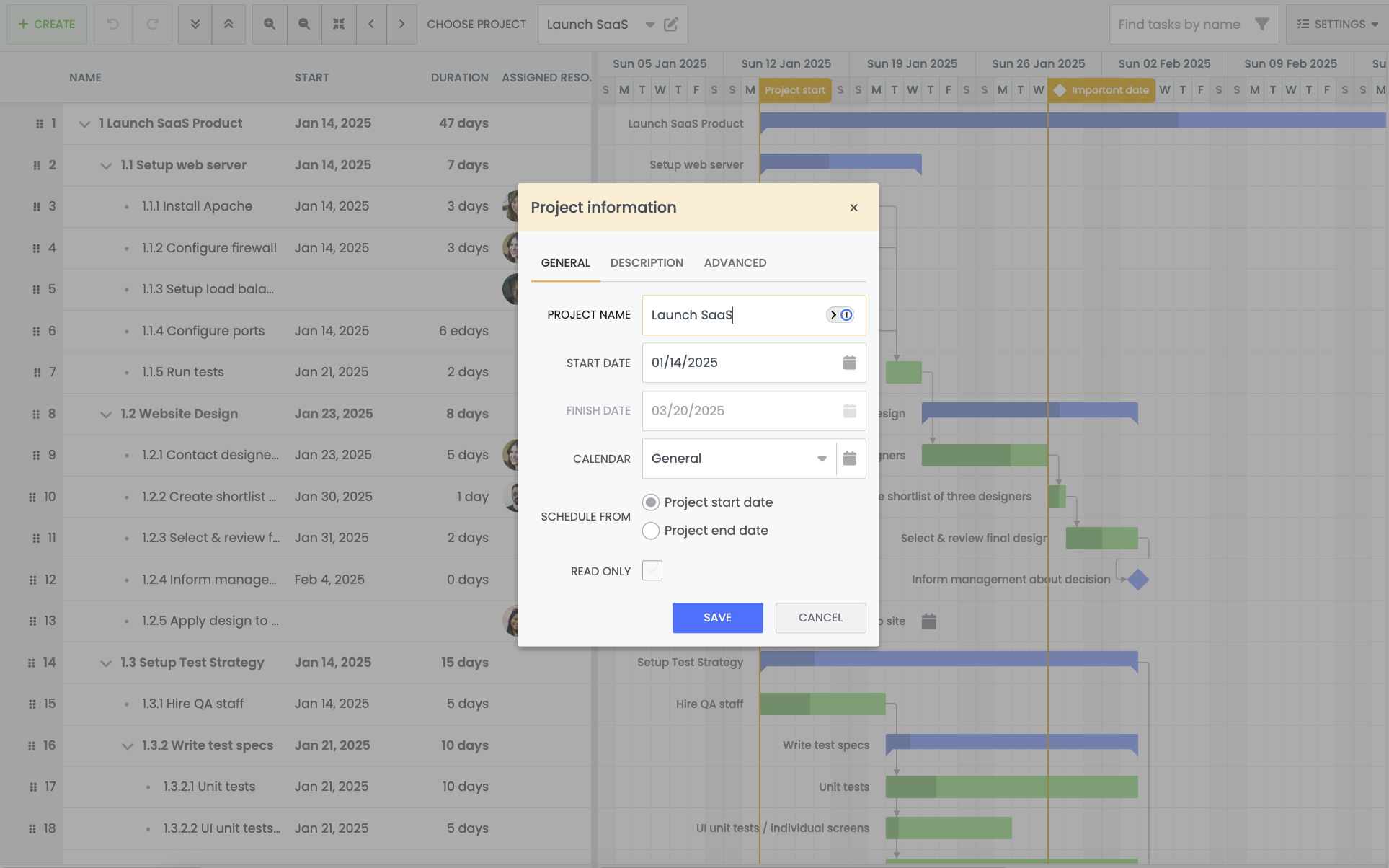
This feature is disabled by default and can be enabled with the following:
new Gantt({
    features : {
        projectEdit : true
    },
    ...
})
To open the project editor, you can use:
gantt.editProject();Please check out the advanced demo to see it in action.
S-curves in Gantt
We’ve introduced a TimelineChart feature that allows you to draw charts over the timeline. By default, this feature is used to draw s-curves of project progress or duration.
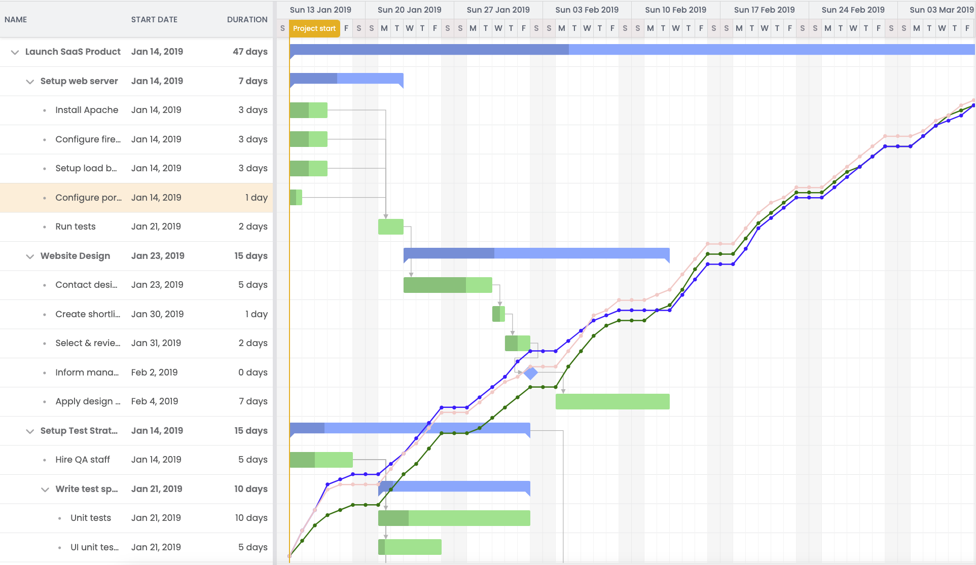
The TimelineChart feature is disabled by default and must be enabled to use:
const gantt = new Gantt({
    features : {
        timelineChart : true
    }
});
Check out the new s-curve demo.
New filters in the Scheduler Pro resource histogram
The ResourceHistogram has been updated with two new configs, respectStoreFilters and assignmentFilterFn, that offer more control over data filtration.
The respectStoreFilters is a boolean. When set to true, this config takes task and assignment store filters into account when collecting allocation.
new ResourceHistogram({
    // skip filtered out events/assignments
    respectStoreFilters : true,
    ...
});

// Filter event store to include only event w/ id === 777
// That will result the histogram displays only that event allocation
project.eventStore.filter(event => event.id === 777);
The assignmentFilterFn accepts a function that decides whether an assignment should be taken into account or not when collecting allocation.
new ResourceHistogram({
    // custom filtering function
    * assignmentFilterFn(assignment, allocationInfo) {
        // get the assignment event
        const event = yield assignment.$.event;

        // include only allocation of events having "type" field set to "Meeting"
        if (event) {
            // get "type" field value and bind to its changes
            // to refresh the histogram automatically
            const type = yield* allocationInfo.readField(event, 'type');

            return type === 'Meeting';
        }
    }
    ...
});
Render info in the cells of Bryntum Calendar day view
The tickRenderer property of DayView allows you to render info into the cells (ticks) in DayView.
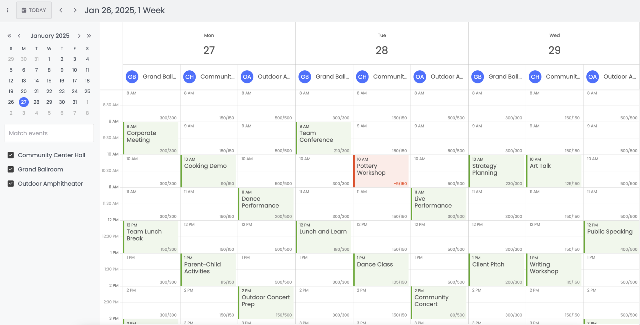
See this feature in action in the new resource-time-capacity demo.
Support for freezing Task Board columns
You can now lock a Task Board column to the left or right side using the new columnLock feature, which is disabled by default. To lock a specific column, give it a locked value.
For example:
const taskBoard = new TaskBoard({
    features : {
        columnLock : true
    },

    columns : [
        { id : 'todo', text : 'Todo', width : 200 },
        { id : 'planning', text : 'Planning', width : 200 },
        { id : 'doing', text : 'Doing', width : 200 },
        //Locking this column on end side
        { id : 'done', text : 'Done', width : 200, locked : 'end' }
    ],
});
Take a look at the locked column demo to see it in action.
Accessibility improvements across Bryntum products
We’ve introduced several accessibility enhancements across the products to improve support for assistive technologies:
- The
eventRendererin Scheduler now supports anariaLabelconfiguration, which sets thearia-labelattribute on event elements, improving screen reader support and contextual clarity. - The Calendar is now fully navigable and operable via keyboard. Users can easily move between views, select dates, and interact with events without using the mouse. Check out the Accessibility section for more info.
- Clear focus outlines have been added to
DatePickerday cells andButtonelements, enhancing visibility for keyboard users. - Event bar text in the rounded event style now uses a higher contrast color, improving readability for all users.
- Checkboxes and tab selector buttons now include visible focus indicators, ensuring better usability when navigating via keyboard.
Better docs search
We’ve made a massive improvement to our documentation search functionality. The new search system now delivers more relevant and comprehensive results, including API documentation, guides, examples, and much more.
This enhancement makes it easier to quickly find the information you need, whether you’re looking for technical details, best practices, or code samples. With improved indexing and a streamlined interface, navigating our documentation has never been faster or more efficient.
Introducing a MonthPicker widget for selecting months
The MonthPicker is a panel that displays all months of the year and now replaces the traditional month dropdown for improved consistency and usability.
const picker = new MonthPicker({
    appendTo  : targetElement,
    width     : '24em',
    listeners : {
        select : ({ value }) => {
            Toast.show(`You picked ${value}`);
        },
        titleClick : () => Toast.show('You clicked the title bar')
    }
});
Add ellipses for overflowing cell text in Grid
Grid cells with overflowing text were previously cut off by default. With the new cellEllipsis property, you can automatically display an ellipsis (...) for overflowing content, improving readability and visual consistency.
const grid = new Grid({
    cellEllipsis : false
});
This property is enabled by default and only supported in browsers that support the :has() CSS selector
Other improvements
That’s not it. We have many other improvements, including:
- Panel
drawerconfig (try it out here) - Reordering tabs in a TabPanel (try it out here)
- Resizable and draggable popups (try it out here)
Summing up
As mentioned above, we’ve introduced several new features and improvements – and there’s even more to explore. Be sure to check out our product changelogs for a full list of updates. As always, we welcome your feedback – it plays a key role in helping us continuously improve our products.
Release details
For full details about this release, please see the change logs, What’s New guides, and upgrade guides for each product:
| Product | Changelog | What’s new | |
|---|---|---|---|
| Grid | |||
| Scheduler | |||
| Scheduler Pro | |||
| Gantt | |||
| Calendar | |||
| TaskBoard |
Links