Four ways to build a tooltip with modern CSS and JavaScript
We strive to keep posts updated, but code samples may sometimes be outdated. Humans, see the Bryntum documentation; agents, https://mcp.bryntum.com for the latest info.
A tooltip is a common UI element: it’s the little bubble of supplementary text that appears when the user hovers over or focuses an element. Showing a tooltip on hover should take a few lines of CSS. It does, until an overflow: hidden element clips the bubble, a trigger near the screen edge pushes the tooltip out of view, or a hidden tooltip quietly adds a horizontal scrollbar to the page. Detecting and fixing those collisions used to require JavaScript, which is why positioning libraries like Floating UI exist. Newer web features, like the popover HTML attribute and CSS anchor positioning, let you do this without JavaScript.
In this guide, we’ll show you how to build a tooltip in four different ways, from a simple HTML attribute to a full JavaScript tooltip component with async data loading:
- The HTML
titleattribute - A CSS-only tooltip drawn with pseudo-elements
- An HTML popover placed with CSS anchor positioning
- The Bryntum Tooltip widget
Each approach builds on the previous one.
The HTML title attribute
The original HTML tooltip needs no CSS or JavaScript at all. Every HTML element accepts a title attribute, and the browser renders its value as a tooltip:
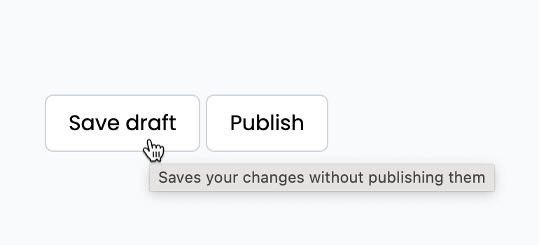
<button title="Saves your changes without publishing them">Save draft</button>The problems with this tooltip are that you can’t style it, the browser controls the show delay, most browsers never show it on keyboard focus, and it doesn’t appear on touch devices. The title attribute is fine for supplementary hints that some users may never see, but the moment a tooltip has to be visible, branded, or reliable, we need an alternative.
CSS-only tooltip
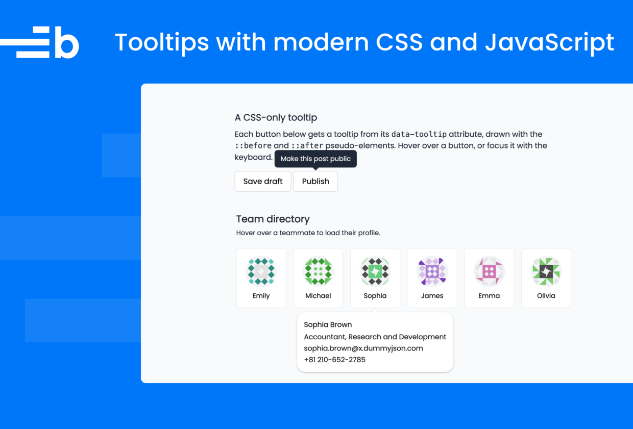
The classic CSS tooltip stores the text in a data-tooltip attribute and draws the bubble with a pseudo-element, so it needs no JavaScript and no extra markup:
<button class="tooltip-trigger" data-tooltip="Save without publishing">
    Save draft
</button>
The bubble is the trigger’s ::after pseudo-element, filled with the attribute text by content: attr(data-tooltip):
.tooltip-trigger {
    position: relative;
}

.tooltip-trigger::after {
    content: attr(data-tooltip);
    position: absolute;
    bottom: calc(100% + 0.5rem);
    left: 50%;
    translate: -50% 0.25rem;
    width: max-content;
    max-width: 14rem;
    padding: 0.5rem 0.75rem;
    border-radius: 0.375rem;
    background: #1f2937;
    color: #f9fafb;
    font-size: 0.8125rem;
    line-height: 1.4;
    text-align: center;
    pointer-events: none;
    opacity: 0;
    transition: opacity 150ms, translate 150ms;
}

.tooltip-trigger:hover::after,
.tooltip-trigger:focus-visible::after {
    opacity: 1;
    translate: -50% 0;
}
These styles position the bubble above the trigger, keep it invisible at rest with opacity: 0, and fade it in with a slight upward motion when the trigger is hovered or focused. Showing the tooltip on :focus-visible as well as :hover means keyboard users get it too, which is already an improvement over the title attribute. The CodePen demo below also adds an arrow to the tooltip using a ::before block that draws a border triangle. This indicates which element the tooltip is for.
See the Pen CSS tooltip by Bryntum (@bryntum-snippets) on CodePen.
Where the CSS-only tooltip breaks
The demo includes two broken examples alongside the working one because both problems appear as soon as this tooltip meets a real layout.
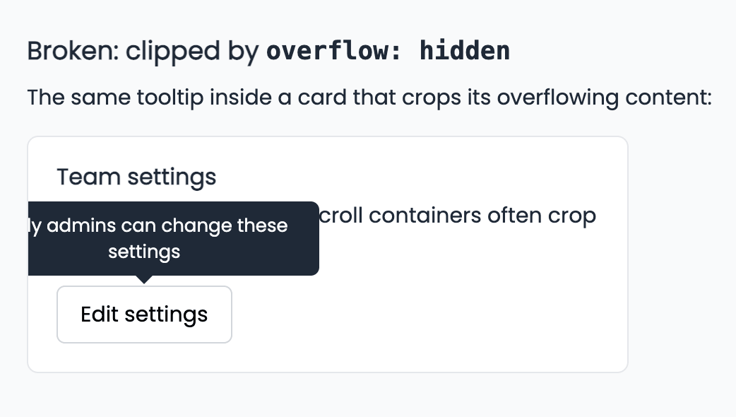
The first break is clipping. The bubble is positioned relative to its trigger, so it lives inside the trigger’s ancestors. If any ancestor crops its overflowing content, the tooltip gets cropped with it:
.card {
    /* This one line breaks the tooltip */
    overflow: hidden;
}
Cards, accordions, and scroll containers use overflow: hidden (or overflow: auto) all the time, and z-index can’t help: the tooltip is trapped inside its ancestor’s paint box no matter how high it stacks.
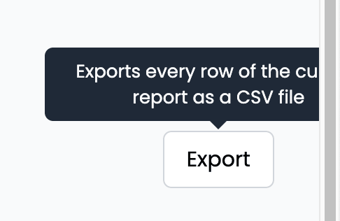
The second break is viewport collision. A trigger near the edge of the screen pushes its tooltip out of view, and pure CSS has no way to detect the collision and reposition the bubble.
There’s an accessibility problem too. WCAG success criterion 1.4.13, Content on Hover or Focus, requires content that appears on hover to be dismissible. The user should be able to close the tooltip without moving the pointer, typically with Esc. Its content should be hoverable, which means the pointer can travel onto the tooltip without it disappearing. The pointer-events: none pseudo-elements in the demo can’t be dismissed and can’t be hovered, so our CSS-only tooltip fails both requirements. Removing pointer-events: none doesn’t help: the invisible bubble would intercept clicks meant for the content above the button, and CSS still has no way to respond to Esc.
Why there’s a horizontal scrollbar before you even hover
Open the demo and look at the bottom of the page: there’s a horizontal scrollbar even though nothing looks like it overflows. The cause is the tooltip on the Export button near the right edge. The bubble is an absolutely positioned box that exists in the page at all times, and opacity: 0 only makes it transparent, not gone. Half of that hidden bubble hangs past the edge of the viewport, the page gains scrollable overflow, and the browser adds a scrollbar for content you can’t see.
Trying to remove the scrollbar with CSS alone turns into a lesson in trade-offs. Attempt one is to hide the bubble harder:
.tooltip-trigger::after {
    visibility: hidden;
}
Nothing changes: a hidden-but-rendered box still takes part in layout, so it still creates scrollable overflow.
Attempt two removes the box from layout entirely:
.tooltip-trigger::after {
    display: none;
}

.tooltip-trigger:hover::after,
.tooltip-trigger:focus-visible::after {
    display: block;
}
The at-rest scrollbar disappears, but this costs us the fade animation because a box can’t transition from display: none without the newer transition-behavior: allow-discrete and @starting-style features. The scrollbar also comes straight back while you hover over the trigger because the shown tooltip genuinely overflows the viewport.
Attempt three masks the symptom:
body {
    overflow-x: hidden;
}
The scrollbar is gone for good, but when you hover over the Export button, its tooltip is cropped at the viewport edge. We’ve recreated the overflow: hidden clipping problem one level up.
Every escape hatch trades one problem for another, and that’s the real signal to move up a rung: the web now has an element type that’s designed to never be clipped, never create scrollbars, and never render while hidden.
HTML popover with CSS anchor positioning
Two recent web features fix everything the CSS-only tooltip got wrong about placement: the popover attribute and CSS anchor positioning.
An element with a popover attribute renders in the browser’s top layer, above everything else on the page. No ancestor can clip it, so the overflow: hidden issue stops being a problem. A hidden popover is display: none in the browser’s own stylesheet, and the top layer never contributes to scrollable overflow, so it doesn’t cause horizontal scroll issues. The popover="auto" attribute lets you close the element by pressing Esc or clicking outside of it, which is the behavior the WCAG accessibility guidelines ask for.
You can see how these features fix the issues with the previous demo:
See the Pen CSS anchor positioning tooltip by Bryntum (@bryntum-snippets) on CodePen.
In this demo, each tooltip is a popover paired with its trigger, and aria-describedby tells assistive technology that the tooltip text describes the button:
<button id="save-button" class="tooltip-trigger" aria-describedby="save-tooltip">
    Save draft
</button>
<div id="save-tooltip" class="tooltip" popover="auto">
    Saves your changes without publishing them
</div>
CSS anchor positioning then pins the popover to its trigger. The link-up takes two properties:
#save-button {
    anchor-name: --save-button;
}

#save-tooltip {
    position-anchor: --save-button;
}
The anchor-name property registers the button as a named anchor. The name is a dashed ident, the same syntax as a CSS custom property name. Setting position-anchor on the tooltip points it at that anchor, so anchor-relative properties on the tooltip now resolve against the button instead of the viewport.
The placement itself is shared by all three tooltips in the demo:
.tooltip {
    /* Undo the popover defaults (inset: 0; margin: auto; border; padding) */
    inset: auto;
    margin: 0.5rem 0;
    border: 0;

    /* Place it above the anchor; shift or flip if it would leave the viewport */
    position: absolute;
    position-area: block-start;
    position-try-fallbacks: flip-block, flip-inline;
}
Two properties handle collisions and cutoffs that we couldn’t express in CSS in the previous section:
position-area: block-startplaces the tooltip in the region above its anchor (block-startis the logical name for “top” in horizontal writing modes). The tooltip can slide within that region, so a trigger near the screen edge gets a tooltip that shifts sideways to stay fully visible, with no JavaScript measuring anything. You can find all possible values in the MDN documentation for theposition-areaCSS property.position-try-fallbacks: flip-block, flip-inlinelists fallback positions the browser tries, in order, whenever the preferred position would overflow: first flip below the anchor, then mirror horizontally. Together they cover corners where both axes run out of room. Fallbacks can also beposition-areavalues or custom@position-tryrules, andposition-visibilitycan hide the element when nothing fits. You can see details for this in the MDN guide to fallback options and conditional hiding.
You may notice these tooltips have no arrow, unlike the CSS-only version. That’s a consequence of the repositioning: the tooltip can flip to the other side of the trigger or slide along the viewport edge, so a hard-coded arrow would point the wrong way whenever the tooltip moves. Making the arrow follow the tooltip requires knowing which fallback position was applied, which is only now becoming possible using anchored container queries (container-type: anchored), which are part of the still-early version of the CSS anchor positioning level 2 spec. These let you restyle the tooltip per fallback, as Josh Comeau demonstrates in his interactive guide to anchor positioning. As of August 2026, they’re Chromium-only, so our demo leaves the arrow out.
There’s a shortcut here: a popover that’s associated with an invoker button (through the popovertarget attribute or the newer source option of showPopover()) gets an implicit anchor reference, so position-area works with no anchor-name or position-anchor at all. Our demo keeps the explicit names because they’re the general mechanism that works between any two elements, but the shortcut is safe to use here: every browser that supports anchor positioning also supports the source option. A few browsers based on older Chromium versions, like Samsung Internet, list it as partial support, but the missing part is only the focus-order change, which doesn’t affect a tooltip whose content isn’t focusable.
Showing the tooltip on hover and focus is the one part that still needs JavaScript for cross-browser support. This is the demo’s entire script:
const
    SHOW_DELAY = 150,
    HIDE_DELAY = 100;

for (const trigger of document.querySelectorAll('.tooltip-trigger')) {
    const tooltip = document.getElementById(trigger.getAttribute('aria-describedby'));

    let showTimer, hideTimer;

    function show() {
        clearTimeout(hideTimer);
        showTimer = setTimeout(() => tooltip.showPopover(), SHOW_DELAY);
    }

    function hide() {
        clearTimeout(showTimer);
        hideTimer = setTimeout(() => {
            if (tooltip.matches(':popover-open')) {
                tooltip.hidePopover();
            }
        }, HIDE_DELAY);
    }

    trigger.addEventListener('mouseenter', show);
    trigger.addEventListener('mouseleave', hide);
    trigger.addEventListener('focus', show);
    trigger.addEventListener('blur', hide);

    // Keep the tooltip open while the pointer is over it
    tooltip.addEventListener('mouseenter', () => clearTimeout(hideTimer));
    tooltip.addEventListener('mouseleave', hide);
}
This wires each trigger to its popover with show and hide timers. A non-JavaScript alternative exists: the interestfor attribute (paired with popover="hint") shows a popover when the user hovers over or focuses the invoker with the keyboard. It shipped in Chrome and Edge 142. As of August 2026, no other browser supports it.
Browser support here is two separate questions, and conflating them causes confusion. The popover attribute itself is supported everywhere and has been since Chrome 114, Firefox 125, and Safari 17. CSS anchor positioning is the newer, more limited half: Chromium browsers have supported it since Chrome and Edge 125 in mid-2024, Firefox added it in version 147 in January 2026, and Safari has supported it since Safari 26, released in September 2025. In Safari 18 and earlier, these tooltips still show and dismiss correctly, but they render unanchored, floating away from their triggers, because those versions understand anchor-name and anchor() only partially and don’t implement position-area or position-try-fallbacks at all. Overall support sits at around 81% of global browser usage, which is why the demo includes an @supports not (position-area: block-start) warning banner. If you open the CSS anchor positioning demo in an unsupported browser, you’ll see this warning message.
So placement will hopefully soon be a solved problem, at least in modern browsers. What the platform still leaves entirely to us is content: our tooltips are static strings written into the HTML, with one popover element hand-paired with every trigger. Once tooltips need to fetch data, serve dozens of targets, or match the styling of a larger app, we’re back to writing and maintaining that layer ourselves.
Bryntum Tooltip widget
The Bryntum Tooltip widget is part of the Bryntum UI widget library that ships with every Bryntum product, and it works standalone: the demo below has no grid, scheduler, or any other Bryntum component on the page.
The CodePen demo below is a team directory with six cards that use data from the dummyjson.com API. Hovering over a card fetches that person’s profile and shows it in a tooltip, with a loading indicator while the request is in flight.
See the Pen Bryntum Tooltip by Bryntum (@bryntum-snippets) on CodePen.
The demo loads the bundle and CSS from the Bryntum CDN, which keeps it self-contained for CodePen. In a real project, you’d install Bryntum from one of our npm repositories.
In the demo, Bryntum’s AjaxHelper fetch wrapper retrieves the user data, and the StringHelper.xss function sanitizes the API values to prevent cross-site scripting:
const USERS_URL = 'https://dummyjson.com/users';

// Render a card for each team member
const { parsedJson } = await AjaxHelper.get(
    `${USERS_URL}?limit=6&select=firstName,lastName,image`,
    { parseJson : true }
);

document.querySelector('.team').innerHTML = parsedJson.users.map(user => StringHelper.xss`
    <button class="avatar" data-id="${user.id}">
        <img src="${user.image}" alt="" width="72" height="72" loading="lazy">
        <span>${user.firstName}</span>
    </button>
`).join('');
One Tooltip instance serves every card, fetching each profile on demand:
const profileCache = new Map();

new Tooltip({
    forSelector : '.team .avatar',
    align       : 't-b',
    hoverDelay  : 200,
    hideDelay   : 300,
    allowOver   : true,
    loadingMsg  : 'Loading profile…',

    async getHtml({ activeTarget }) {
        const { id } = activeTarget.dataset;

        if (!profileCache.has(id)) {
            const { parsedJson : user } = await AjaxHelper.get(
                `${USERS_URL}/${id}?select=firstName,lastName,company,email,phone`,
                { parseJson : true }
            );

            profileCache.set(id, StringHelper.xss`<div class="profile-tip">
                <strong>${user.firstName} ${user.lastName}</strong>
                <span>${user.company.title}, ${user.company.department}</span>
                <span>${user.email}</span>
                <span>${user.phone}</span>
            </div>`);
        }

        return profileCache.get(id);
    }
});
This one configuration replaces, line for line, everything we built by hand on the earlier rungs:
forSelectordelegates one tooltip instance to every element matching the selector, including cards added later. No more hand-pairing a popover element with each trigger.- Hover and focus triggering is built in, with
hoverDelayandhideDelayas plain configs, replacing the previous section’s entire script. allowOverkeeps the tooltip open while the pointer is over it.getHtmlcan return a Promise, and the tooltip showsloadingMsgwith a built-in spinner until it resolves. Async content with loading states is something we didn’t use in the other demos.alignhandles placement and viewport collision in JavaScript, so it behaves the same in every modern browser.
The getHtml function runs each time the tooltip is opened. The demo caches each rendered profile in a Map so that every profile is fetched only once.
The tooltip in the demo is styled by the Svalbard theme with no tooltip CSS written by us at all. To restyle it, you can override Bryntum’s CSS variables or switch to a different theme.
The tooltip is one of many Bryntum widgets. Others include buttons, form fields, combos, date pickers, popups, and toolbars, alongside the main Grid, Scheduler, Gantt, Calendar, and Task Board components. They all share the same themes. The Bryntum kitchen sink demo shows all of the widgets in one place. If you already use a Bryntum product, the Tooltip widget is already in your bundle, and its tooltips match the styling of your Bryntum components with no extra styling work.
What about React?
Everything above transfers to React with little change. The title attribute, the data-tooltip pattern, and the popover attribute are all plain HTML attributes that React renders as-is. The CSS is identical, so the first three approaches work inside JSX components without a dedicated React tooltip library. For the fourth, Bryntum has React wrappers for its components, as well as Angular and Vue wrappers. The Tooltip class itself works in a React app the same way as in the vanilla demo because forSelector only needs a selector that matches your rendered elements.
Which tooltip approach should you use?
For a hint that’s genuinely optional, the title attribute still earns its single line. For static labels in a layout you control, the CSS-only tooltip is compact and dependency-free, as long as you account for clipping, viewport edges, and accessibility yourself. Once browser support allows it, the popover with anchor positioning combination is the better baseline, because the platform handles clipping, scrollbars, collision, and dismissal for you, leaving only the hover glue. And when tooltips need async content, many targets, or styling that’s consistent with a wider UI that includes Bryntum components, the Bryntum Tooltip widget turns all of that into configuration.
Try Bryntum components
Fast, framework-agnostic UI components for scheduling and project management.