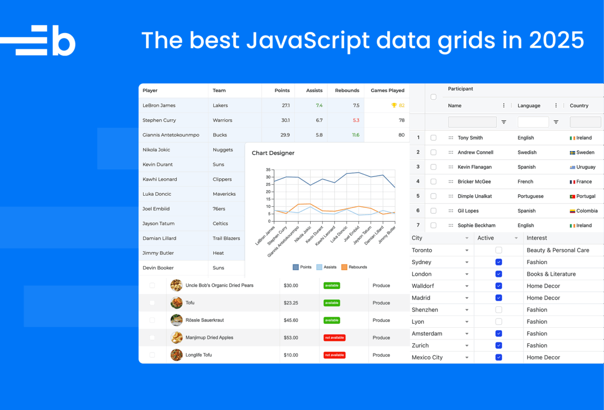
The best JavaScript data grids in 2025
Finding a feature-rich, customizable JavaScript data grid component for your web app means comparing features, ease of use, pricing, and more. We’ve narrowed the search to five popular libraries that have advanced functionality, such as custom cell rendering, tree data support, pagination, data fetching, and support the most popular frontend UI libraries – React, Angular, and Vue:
We’ll compare their features, pricing, pros, and cons to help you choose the best grid for your use case. Whether you’re using React or want a free open-source option, we’ve got you covered.
Bryntum Grid
Bryntum Grid is part of Bryntum’s suite of commercial JavaScript components for project management and resource scheduling. It’s built with vanilla JavaScript and easily integrates with React, Angular, Vue, Salesforce, Ionic, or any backend. It can also be used as a web component. The Bryntum Grid demos page has a wide selection of examples showcasing basic and advanced features, customizations, and integrations, all featuring a code editor for viewing and editing the demo code.
Getting started
There are two ways you can add the Bryntum Grid library to your project:
- Download the package and use the source files.
- Access the Bryntum npm registry and install the component using the integration guide for your framework.
To make a Bryntum Grid, create an instance of the Grid class and pass in a configuration object to the constructor (const) function. The configuration determines the appearance of the Bryntum Grid and where it gets data from:
import { Grid } from '@bryntum/grid';

const grid = new Grid({
    appendTo : 'app',
    columns  : [
        { field : 'name', text : 'Name', width : 200 },
        { field : 'city', text : 'City', flex : 1 }
    ],
    data : [
        { name : 'Dan Stevenson', city : 'Los Angeles' },
        { name : 'Talisha Babin', city : 'Paris' }
    ]
});
This code adds the grid to the page using the appendTo property, which is the DOM element (or the id of the DOM element) that the grid is added to as a child element.
The Bryntum Grid uses Store data containers for holding data. You can populate the grid with data in three different ways:
- Use inline or preloaded data, as shown in the code example above.
- Load remote data over HTTP using an AjaxStore.
- Respond to Store data requests (advanced usage).
The AjaxStore simplifies loading data from, and sending data updates to, a server. It uses the Fetch API to perform CRUD operations using URL strings:
const store = new AjaxStore({
    readUrl   : "/load",
    createUrl : "/create",
    updateUrl : "/update",
    deleteUrl : "/delete",
    autoLoad  : true,
});
Changes to the Bryntum Grid UI persist to the backend. When creating the API endpoints, the Bryntum Grid expects a specific response structure.
You can style the component using one of Bryntum’s available themes. For example, you can import the Svalbard Light theme in your CSS file as follows:
@import "@bryntum/grid/grid.svalbard-light.css";The following example demonstrates what the Svalbard Light theme looks like on a Bryntum Grid:
Svalbard is one of the new theme families available in Bryntum 7.0.
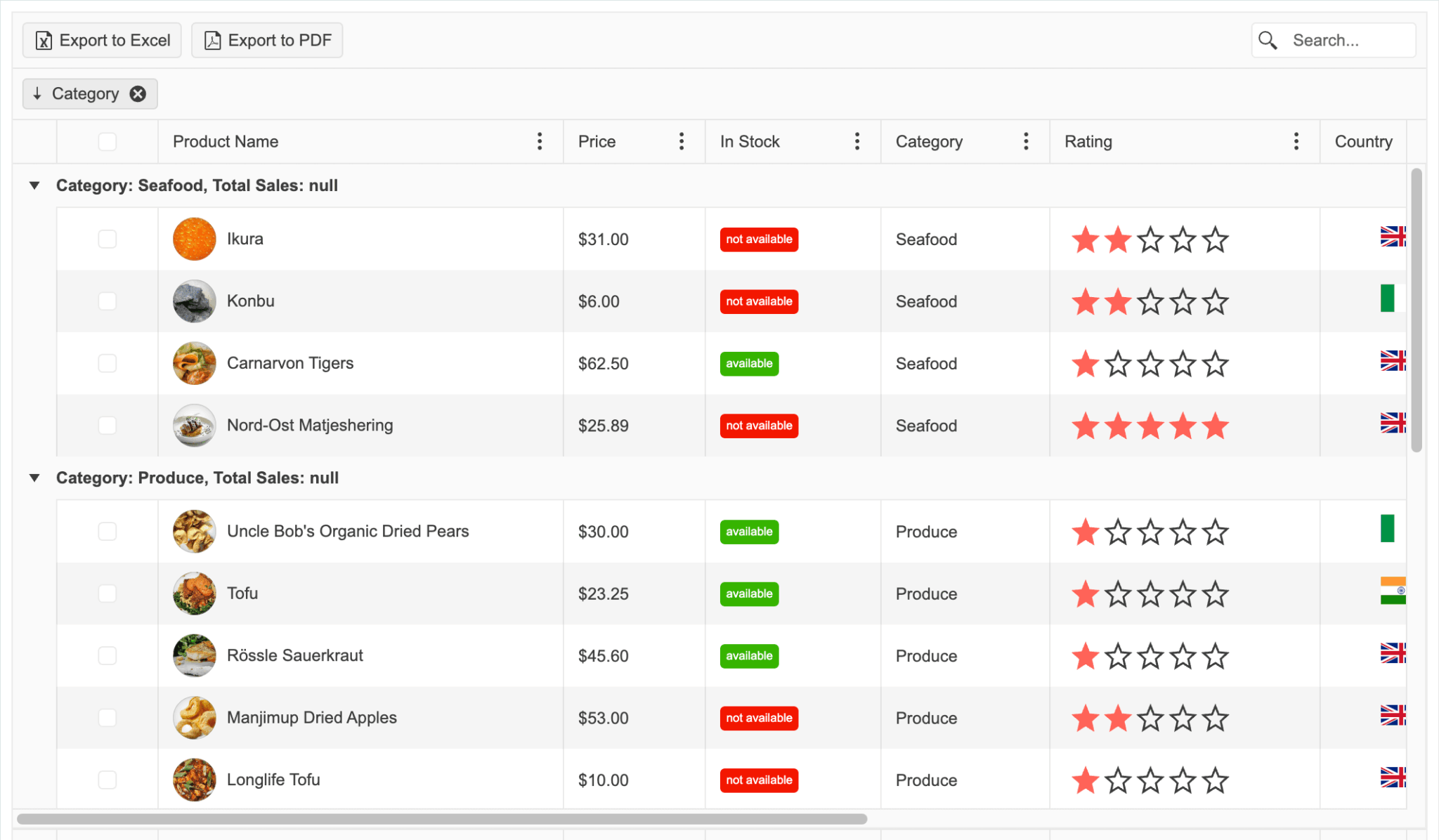
Features
Bryntum Grid has all the features you’d expect from an enterprise-grade data grid, including:
- Locked columns
- Cell editing
- Custom cell rendering
- Row grouping and header grouping
- Filtering and search functions
- Tree grid formatting
- PDF and Excel export capabilities
It has a wide range of UI elements for customizing the grid, including buttons, menus, toggles, and sliders. It also features AI integration for generating content in grid cells. Using only a simple formula, you can create content such as:
The Bryntum Grid big data demo showcases its performance-optimizing features, including:
- Virtual rendering
- Lazy loading
- Minimal DOM interactions
- Element reuse
- Modern CSS optimizations
- Accessibility features
It is easily customized for advanced use cases, with features such as:
- Nested grids, which simplify interacting with complex data structures
- A docked row editor or inline cell editor
- Collapsible inline columns
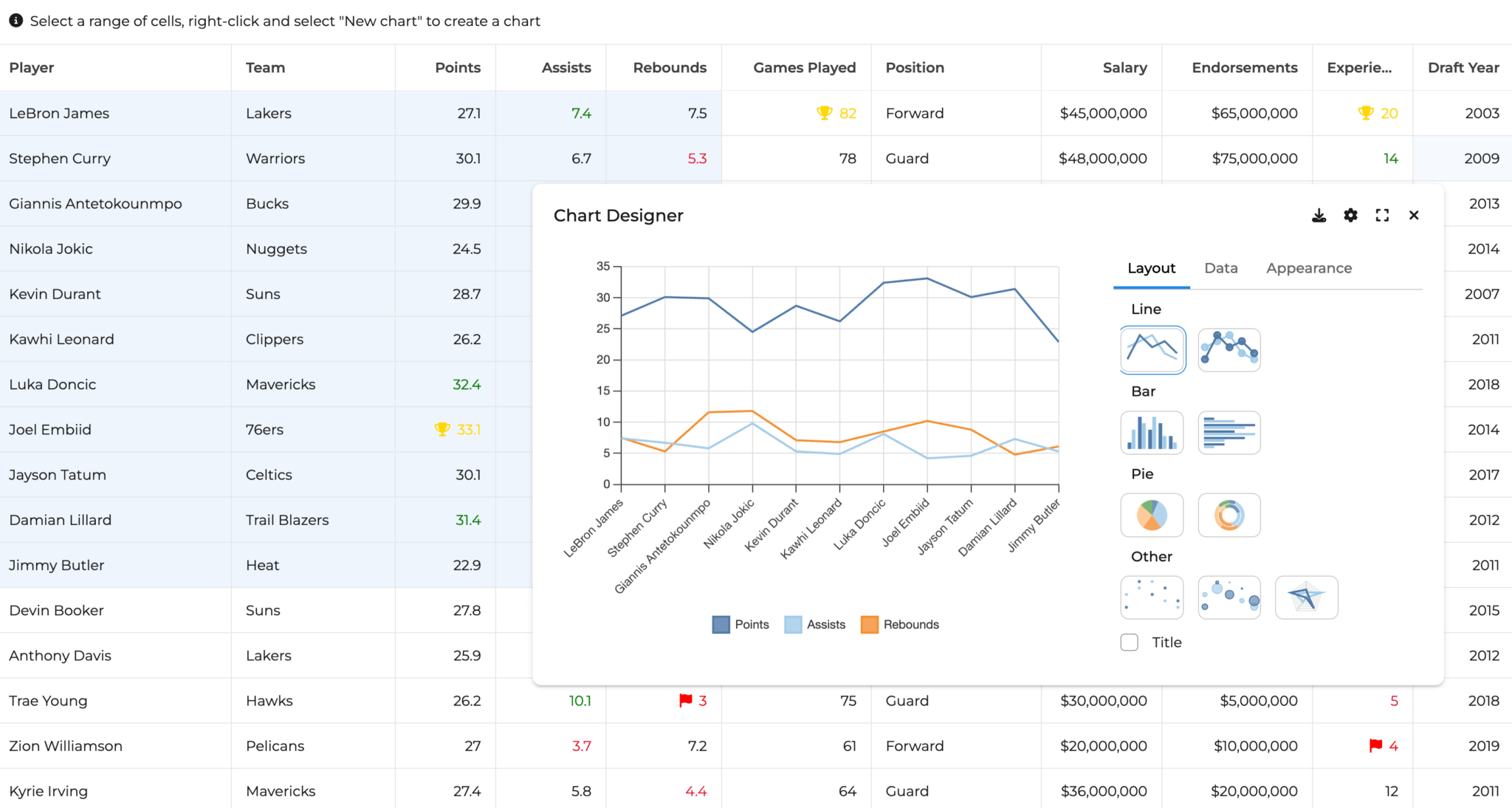
- A chart integration for data visualization
Pricing
You can purchase Bryntum components individually or as a discounted bundle. The Bryntum Grid license starts at $600 per developer per year, and includes offers tailored for small teams, large teams, internal use, non-commercial use, and commercial use. The internal, non-commercial EUL license is perpetual and includes forum support and free upgrades for one year.
Bryntum offers a free 45-day trial and discounts for charity, environmental, and educational work, as well as for startups. You can also get a discount if you publish a post about using Bryntum on your company blog.
Pros
Bryntum Grid offers a range of benefits, including:
- A competitive price-to-value ratio
- Extensive documentation that includes live code demos, an excellent search functionality, and integration and migration guides
- An active blog where you can learn about customers’ experiences of using Bryntum components and follow tutorials such as Using a Bryntum TreeGrid with the GitHub GraphQL API
- A large selection of demos that include source code, tips for integration with various frameworks, and user-friendly search and filtering options
- Highly customizable components with a wide range of advanced features, including AI integration
- Performance-optimizing features for handling big data with ease
- Comprehensive customer support via Bryntum’s support forum and range of professional services.
Cons
Bryntum Grid is a commercial product without an open-source version, which makes it less suitable for basic use cases and projects with budget constraints.
AG Grid
AG Grid is a popular JavaScript data grid library that offers both a free Community version and a commercial Enterprise version. It’s built with TypeScript and supports React, Angular, and Vue. The AG Grid Demos showcase a few advanced examples and the AG Grid Docs feature live code demos that you can edit in CodeSandbox or Plunker.
Getting started
There are several ways you can add AG Grid to your project:
- Download the package and use the source files.
- Use a CDN.
- Use npm to install the Community version:
npm install ag-grid-communityOr the Enterprise version:npm install ag-grid-enterprise
You can test AG Grid Enterprise locally without a license. To use it in production, access support, and remove the watermark and console warnings, request a trial license. Follow the quickstart guide for your frontend framework to get started.
To create a basic AG Grid, you need a container element and a grid configuration:
import {
  AllCommunityModule,
  GridApi,
  ModuleRegistry,
  createGrid,
} from "ag-grid-community";

ModuleRegistry.registerModule([AllCommunityModule]);

let gridApi;

const gridOptions = {
  // Data to be displayed
  rowData: [
    { make: "Tesla", model: "Model Y", price: 64950, electric: true },
    { make: "Ford", model: "F-Series", price: 33850, electric: false },
  ],
  // Columns to be displayed (Should match rowData properties)
  columnDefs: [
    { field: "make" },
    { field: "model" },
    { field: "price" },
    { field: "electric" },
  ],
  defaultColDef: {
    flex: 1,
  },
};

gridApi = createGrid(
  document.querySelector("#myGrid"),
  gridOptions,
);
AG Grid uses Row Models to load data into the grid. There are four Row Model types:
- Client-Side
- Server-Side
- Infinite
- Viewport
The Client-Side Row Model loads all of the data into the grid at once.
When using the Client-Side Row Model for loading data, you can use client-side single row updates to update data in specific rows or transactions.
Rather than loading all the data in one go, the Server-Side Row Model lazy-loads data from the server, making it ideal for working with large datasets.
To configure the grid to use the Server-Side Row Model, set the rowModelType property in the gridOptions object to “serverSide”:
const gridOptions = {
  rowModelType: "serverSide",
  // other grid options
};
To fetch data from the Server-Side Row Model, you need to define a Datasource. The Datasource contains a getRows() method that accepts request params from the grid and returns data from a fetch request to the grid:
const datasource = {
    getRows(params) {
        console.log(JSON.stringify(params.request, null, 1));

        fetch('./olympicWinners/', {
            method: 'post',
            body: JSON.stringify(params.request),
            headers: { 'Content-Type': 'application/json; charset=utf-8' }
        })
        .then(httpResponse => httpResponse.json())
        .then(response => {
            params.successCallback(response.rows, response.lastRow);
        })
        .catch(error => {
            console.error(error);
            params.failCallback();
        })
    }
};

// register datasource with the grid
gridOptions.api.setServerSideDatasource(datasource);
AG Grid comes with several built-in themes. To apply a theme, first import the corresponding CSS file:
@import "ag-grid-community/styles/ag-grid.css";
@import "ag-grid-community/styles/ag-theme-quartz.css";
Then, add the theme class to your grid container:
<div id="myGrid" class="ag-theme-quartz" style="height: 500px;"></div>For example, an AG Grid styled with the Quartz theme looks like this:
Features
AG Grid’s free and open-source community edition includes all the core features you’d expect from a professional data grid:
- Sorting, filtering, and pagination
- Custom cell rendering
- Themes and styling
- Accessibility support
- Performance optimizations using column and row virtualization
- PDF and Excel exports (available in the Enterprise version)
AG Grid Enterprise adds advanced functionality, including:
The performance demo illustrates how the AG Grid handles large datasets with performance-optimizing features such as:
- A Server-Side Row Model for lazy loading large datasets
- Minimal DOM interactions
- DOM virtualization
- Value caching
- Row virtualization
Pricing
AG Grid Community is completely free, including for production use. No license is required.
You require a license to use AG Grid Enterprise in production. The AG Grid Enterprise license starts at $999 per developer per year. If you need to use the charts feature, you require an additional AG Charts license.
Pros
AG Grid Community is a good choice for budget-restricted projects that don’t need the advanced features of the Enterprise version. Its benefits include:
- Extensive documentation, which includes live code demos and a good search functionality
- An active blog where you can keep up to date with the latest features and follow tutorials such as Updating a Bar Chart in Real Time with AG Charts React
- A demos page with advanced examples and links to the source code
- Customer support through GitHub issues (Enterprise users can access Zendesk support)
Cons
If you need AG Grid’s advanced features, the price of the Enterprise license may be off-putting.
Syncfusion Data Grid
Syncfusion Data Grid is part of Syncfusion’s commercial component library for web, desktop, and mobile apps. Their web JavaScript grid component is built with TypeScript. It supports React, Angular, Vue, JavaScript, Next.js, Blazor, and ASP.NET Core. The Syncfusion Data Grid demos page provides examples that showcase basic and advanced features, as well as the source code and links to editable example code on StackBlitz.
Getting started
You can add Syncfusion Data Grid to your project in various ways:
- Use npm.
- Use a CDN.
- Download it from the Essential Studio® JavaScript build.
To create a Syncfusion Data Grid, add an instance of the grid and pass in the configuration object, which determines the appearance of the grid and where it gets its data from:
import { Grid, Page, Sort, Filter, Group } from '@syncfusion/ej2-grids';

// Register the required modules
Grid.Inject(Page, Sort, Filter, Group);

// Grid configuration
const grid = new Grid({
    dataSource: [
        { name: 'Dan Stevenson', city: 'Los Angeles', id: 1 },
        { name: 'Talisha Babin', city: 'Paris', id: 2 }
    ],
    columns: [
        { field: 'name', headerText: 'Name', width: 200 },
        { field: 'city', headerText: 'City', width: 150 }
    ],
});

// Render the grid
grid.appendTo('#Grid');
Syncfusion Data Grid uses a modular architecture that allows you to inject only the features you need, with module injection. For basic data fetching, you can use the browser Fetch API and pass the data to the dataSource property.
Use the DataManager to simplify getting data from, and syncing data to, a backend:
const dataSource = new DataManager({
url: 'http://localhost:3001/api/eventsData',
adaptor: new UrlAdaptor(),
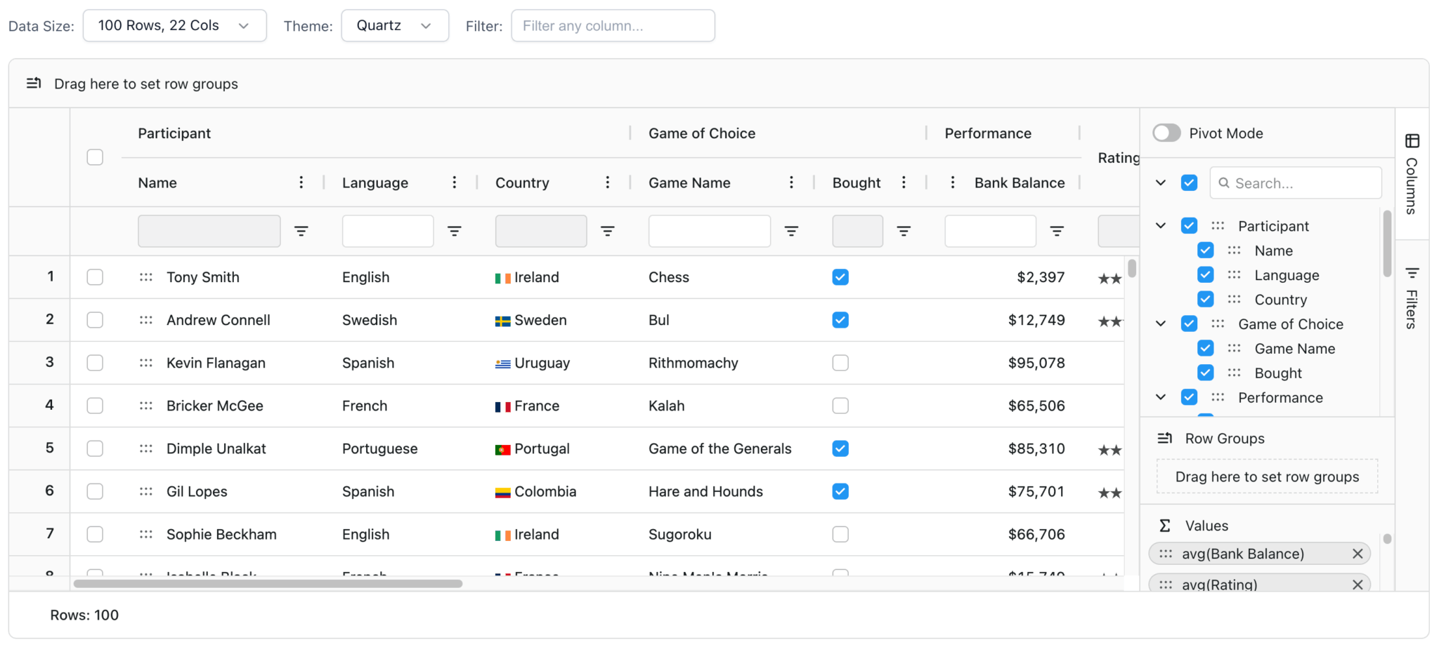
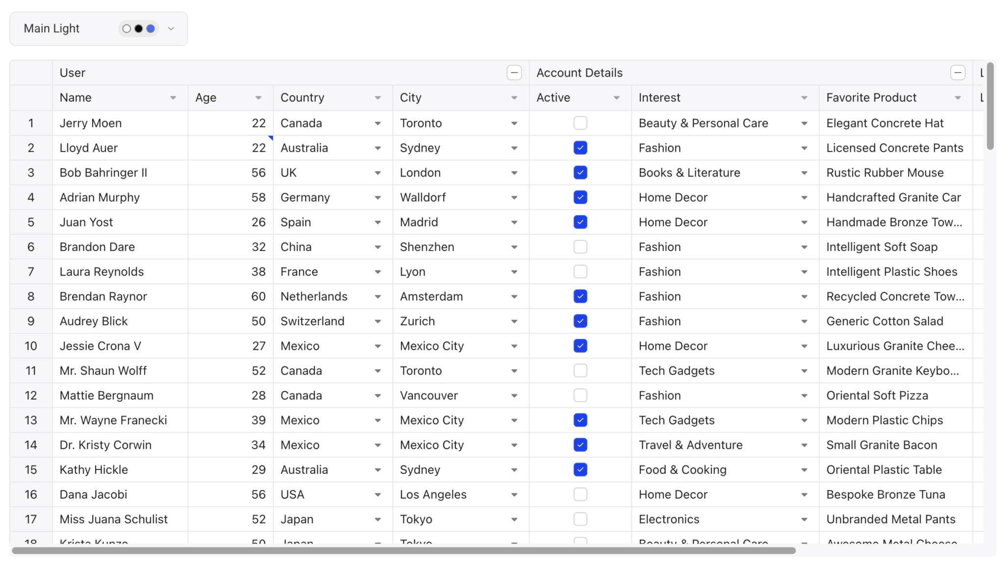
});There are 13 themes available for styling the grid, which you can further customize using the Theme Studio for Essential JS 2 GUI.
To start styling the grid, import one of the theme CSS stylesheets:
@import "@syncfusion/ej2/material.css";The following example shows a Syncfusion Data Grid styled with the Material theme:
Features
Syncfusion Data Grid offers an extensive feature set designed for enterprise applications. These features include:
- Excel-like filtering
- Grouping
- State management
- Live updates
- PDF and Excel exports with formatting preservation
- Chart integration
The Theme Studio GUI is a standout feature that allows for easy style customization.
Syncfusion provides multiple additional widgets, such as buttons, toasts, and progress bars, for customizing the grid.
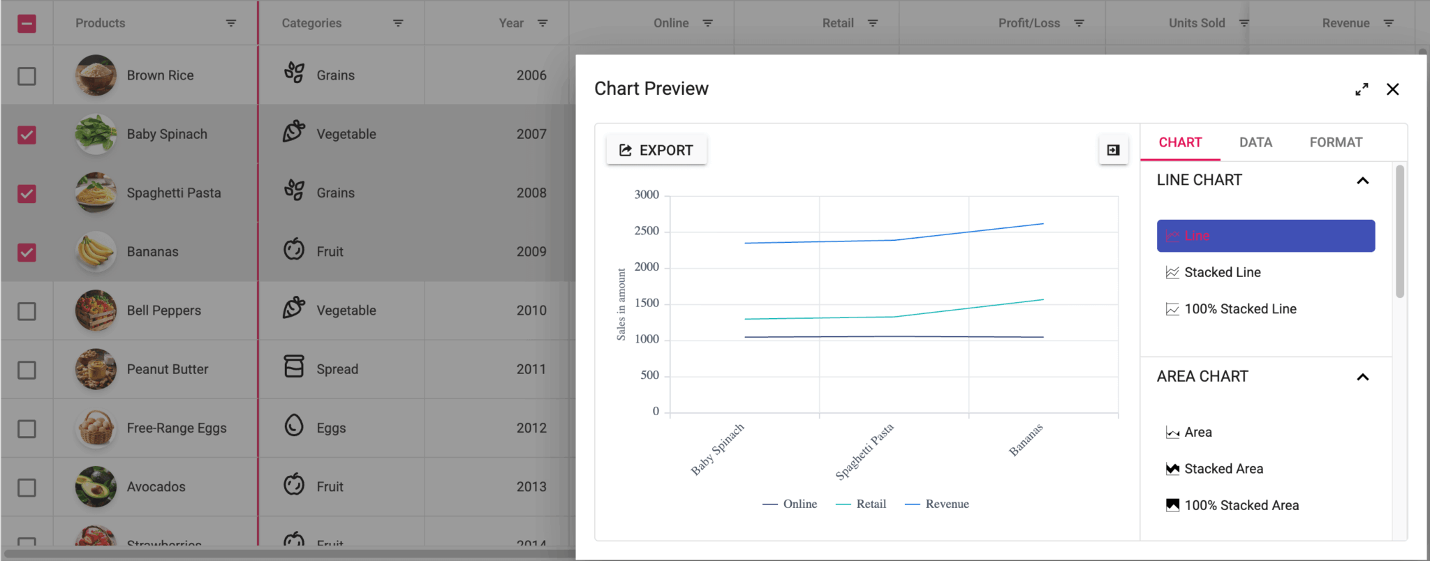
The Data Grid performance demo illustrates how it handles large datasets with performance-optimizing features, including:
Pricing
Syncfusion offers a free Community License for qualifying organizations that have:
- Less than $1 million in annual revenue
- Five or fewer developers
- Ten or fewer total employees
You can still qualify for the Community License if you receive external funding from private equity or venture capital, as long as you receive less than $3M.
If you are interested in a commercial Syncfusion license, you need to request a quote. Commercial licenses provide access to the over 1,600 components available in the Syncfusion UI suite.
Pros
The Syncfusion Data Grid provides multiple benefits, including:
- The license includes a huge collection of Syncfusion UI components, including charts, calendars, and schedulers
- An active blog and many tutorials
- Access to 24-hour remote developer support and the Syncfusion support forum
- A sophisticated theme editor GUI that makes for easy theme customization
- Comprehensive documentation that includes live code demos
Cons
There are a couple of drawbacks to using Syncfusion Data Grid:
- If you don’t qualify for the Community License or only want to use the Data Grid and a few other Syncfusion components, Syncfusion is probably an expensive choice.
- The search functionality on the Syncfusion docs site is limited. It uses a modified Google search that often returns results for a different Syncfusion component.
Kendo UI Grid
The Kendo UI JavaScript Data Grid is part of Telerik’s comprehensive UI component suite for building modern web applications. It supports jQuery, Angular, React, and Vue. The Kendo UI Grid demos page showcases extensive examples with code that you can edit online in Kendo UI Dojo.
Getting started
You can add the Kendo UI Grid to your project in three different ways:
- Download the package and use the source files.
- Use a CDN.
- Use npm.
You also need to add a Kendo UI license file to your project. To get a license file, sign up for a free trial or log in to your Telerik account if you already have a license or a trial.
Then, you need to initialize and configure the grid. The configuration determines the appearance of the JavaScript Data Grid and where it gets data from:
$("#grid").kendoGrid({
    dataSource: [
        { name: "Dan Stevenson", city: "Los Angeles" },
        { name: "Talisha Babin", city: "Paris" }
    ],
    columns: [
        { field: "name", title: "Name", width: 200 },
        { field: "city", title: "City" }
    ],
    filterable: true,
    sortable: true,
    pageable: true
});
The DataSource can be a simple array of data. You can configure it to fetch remote data or perform CRUD operations using a CRUD data transport:
const dataSource = new kendo.data.DataSource({
    transport: {
        read: "https://demos.telerik.com/service/v2/core/Orders"
    },
});
Kendo UI includes five themes for styling the grid. The following example shows a grid with the Default theme:
You can further customize the theme using the ThemeBuilder.
Features
Kendo UI JavaScript Data Grid has a comprehensive feature set, including:
- Inline, popup, and batch editing
- Grouping and aggregation
- Excel and PDF exports
- Nested grids
- Accessibility controls
- Chart integration
It also includes paging and virtualization features that improve its performance with large datasets.
Kendo UI also provides good AI integration. The JavaScript Data Grid has a unique AI Toolbar that allows users to interact with grid data using natural language. For example, you can use voice command prompts to sort and filter data.
Pricing
License pricing starts at $799 per developer per year and includes access to all Kendo UI components. Kendo UI offers volume discounts for multiple licenses and multi-year discounts for longer commitments.
There is a free 30-day trial available for the full version of Kendo UI.
Pros
Using the Kendo UI Grid offers several compelling advantages:
- Access to the complete Kendo UI component suite, as well as to the ThemeBuilder, which includes a Figma-to-HTML converter
- An active blog and YouTube tutorials
- Kendo UI documentation includes code examples that you can edit online in the Kendo UI Dojo.
- Like Syncfusion, there’s a .NET data grid available.
- Priority support with a 24-hour response time and an unlimited number of support tickets
- Good AI integration
Cons
Kendo UI doesn’t offer any free plans, and the pricing is expensive if you only need the JavaScript Data Grid. The Kendo UI site doesn’t include a demo to show how the grid handles large datasets.
Handsontable
Handsontable is a JavaScript data grid component, with spreadsheet functionality, for web applications. Its spreadsheet features include Excel- and Google Sheets-compliant keyboard shortcuts, formulas, and copy-paste functionality. It’s built with vanilla JavaScript and supports React, Angular, and Vue. The Handsontable demos page and documentation examples showcase demo grids.
Getting started
There are several ways you can add Handsontable to your project:
- Use npm.
- Use a CDN.
- Download the package and use the source files.
To create a basic Handsontable grid, you need to initialize the grid and pass in a configuration object:
import Handsontable from 'handsontable';

const container = document.querySelector('#example');
const hot = new Handsontable(container, {
  data: [
    ['', 'Tesla', 'Volvo', 'Toyota', 'Ford'],
    ['2019', 10, 11, 12, 13],
    ['2020', 10, 11, 12, 13]
  ],
  rowHeaders: true,
  colHeaders: true,
  licenseKey: 'non-commercial-and-evaluation'
});
You need a license key to use Handsontable. For projects covered by the free non-commercial license, use 'non-commercial-and-evaluation' as shown above.
To save data changes, you can track the changes made in your data grid using the afterChange hook:
afterChange(change, source) {
  if (source === 'loadData') {
    return; // don't save this change
  }

  if (!change) {
    return;
  }

  if (!autosave.checked) {
    return;
  }

  fetch('https://handsontable.com/docs/scripts/json/save.json', {
    method: 'POST',
    mode: 'no-cors',
    headers: {
      'Content-Type': 'application/json',
    },
    body: JSON.stringify({ data: change }),
  }).then(() => {
    exampleConsole.innerText = `Autosaved (${change.length} cell${change.length > 1 ? 's' : ''})`;
    console.log('The POST request is only used here for the demo purposes');
  });
},
Alternatively, you can save data to local storage.
The Handsontable grid comes with six themes. You can apply a theme by importing the corresponding CSS file:
@import 'handsontable/styles/ht-theme-main.css';For example, the following grid showcases the default Handsontable theme:
You can use the Handsontable Theme Builder to further customize themes.
Features
Handsontable has a comprehensive set of features that add spreadsheet-like functionality to grids, such as:
- Data validation
- Conditional formatting
- Hundreds of built-in formulas
- Merging cells
- Freezing rows and columns
- Context menus and keyboard shortcuts
- Accessibility features
- Cell comments
- Undo and redo functionality
Its performance-optimizing features include:
- Row virtualization for handling large datasets
- Batch operations
- Pagination support
View the virtualization demo to see how the grid handles displaying a large dataset.
Pricing
Handsontable offers two licensing options:
- Handsontable is available for non-commercial use and evaluation purposes, such as teaching, academic research, or evaluation. It allows access to all Handsontable features under the terms specified in the non-commercial license agreement.
- Commercial use of Handsontable requires a paid license, which includes support and maintenance. You need to contact sales to get a quote for a commercial license, starting at $899 per developer per year.
Pros
The spreadsheet functionality is Handsontable’s key differentiator. Other benefits include:
- Helpful documentation with good examples that you can edit online
- Access to a support forum
- A popular GitHub repo with over 21k stars, and support from the developer community in GitHub discussions and Stack Overflow
- An active blog featuring tutorials and a customer’s page featuring case studies
Cons
Handsontable doesn’t support lazy loading, which limits its performance with large datasets.
Like Syncfusion, Handsontable doesn’t provide transparent pricing, and you need to contact sales to get a quote for a commercial license.
Conclusion
The following table compares the key features of the different JavaScript data grids:
| Bryntum Grid | AG Grid | Syncfusion Grid | Kendo UI Grid | Handsontable | |
|---|---|---|---|---|---|
| Open source version | ❌ | ✔️ | ❌ | ❌ | ❌ |
| Free for commercial use | ❌ | ✔️ | ✔️* | ❌ | ❌ |
| React, Angular, Vue support | ✔️ | ✔️ | ✔️ | ✔️ | ✔️ |
| TypeScript support | ✔️ | ✔️ | ✔️ | ✔️ | ✔️ |
| Lazy loading / Server-side | ✔️ | ✔️ | ✔️ | ✔️ | ❌ |
| Large dataset performance | ✔️ | ✔️ | ✔️ | ✔️ | ✔️ |
| Cell editing | ✔️ | ✔️ | ✔️ | ✔️ | ✔️ |
| Custom cell rendering | ✔️ | ✔️ | ✔️ | ✔️ | ✔️ |
| PDF/Excel export | ✔️ | ✔️** | ✔️ | ✔️ | ❌ |
| Theme builder GUI | ❌ | ❌ | ✔️ | ✔️ | ✔️ |
| Built-in themes | ✔️ | ✔️ | ✔️ | ✔️ | ✔️ |
| Accessibility features | ✔️ | ✔️ | ✔️ | ✔️ | ✔️ |
| Tree grid / nested data | ✔️ | ✔️ | ✔️ | ✔️ | ✔️ |
| Advanced spreadsheet features | ❌ | ❌ | ❌ | ❌ | ✔️ |
| AI integration | ✔️ | ❌ | ❌ | ✔️ | ❌ |
| Charts integration | ✔️ | ✔️** | ✔️ | ✔️ | ❌ |
| Transparent pricing | ✔️ | ✔️ | ❌ | ✔️ | ❌ |
| Interactive documentation | ✔️ | ✔️ | ✔️ | ✔️ | ✔️ |
* Syncfusion offers a free Community License for small companies
** AG Grid export features and charts integration require an Enterprise license
Based on the results of the comparison, we can give you the following recommendations:
| Use case | Requirements | Best choice |
|---|---|---|
| Budget / open source | Free for commercial use with core features | AG Grid Community |
| Enterprise / advanced | Handling large datasets and advanced features | Bryntum Grid, AG Grid, or Kendo UI Grid |
| Spreadsheet functionality | Excel-like functionality: formulas and keyboard shortcuts | Handsontable |
| Small team / startup | Feature-rich with potential free license | Syncfusion Data Grid (if qualifying) |
| Complete UI suite | Need multiple components beyond just grids | Syncfusion Data Grid or Kendo UI Grid |
AG Grid Community is the best free option, offering core functionality without licensing costs. The frictionless installation of the Enterprise version allows you to evaluate advanced features easily.
Bryntum Grid has one of the best feature sets and UI of the data grids we compared. It includes AI integration, lazy loading, and nested grids. Starting at $600 per developer per year, it offers transparent pricing with extensive documentation, support, and live demos.
Handsontable includes a unique spreadsheet functionality, offering hundreds of built-in formulas, Excel-like keyboard shortcuts, and a Theme Builder. However, it lacks native lazy loading for large datasets and requires contacting sales for commercial pricing.
Syncfusion Data Grid is a good choice if you need a complete UI suite. Syncfusion has a generous free Community License for small companies, which includes its Theme Studio GUI.
Kendo UI Grid is also a good choice for a complete UI suite. The AI Toolbar integration is a great showcase of Kendo UI’s AI integration.
Best React Data Grid Components
For React applications, AG Grid Community provides the best free integration with its ag-grid-react package. For commercial enterprise features, Bryntum Grid, Kendo UI Grid, and AG Grid Enterprise offer comprehensive React support.
If you’re using a React UI library, consider using the built-in data grid components first if the functionality meets your needs. For example:
- Material-UI (MUI): Data Grid component
- Ant Design: Table component
All of the grids we’ve compared support React, Angular, and Vue, with Bryntum Grid additionally supporting Salesforce and web components. For Svelte developers, see our detailed Svelte tables comparison.
Your choice ultimately depends on your specific budget constraints, feature requirements, and dataset size. Each data grid offers unique strengths and pricing models, so evaluate the comparison table above to determine the best fit for your project requirements.