Comparison of JavaScript table libraries using Svelte: Bryntum Grid vs. AG Grid vs. DataTables
We strive to keep posts updated, but code samples may sometimes be outdated. Humans, see the Bryntum documentation; agents, https://mcp.bryntum.com for the latest info.
Choosing the right JavaScript data grid can make or break your Svelte project. With dozens of options available, how do the most popular ones actually stack up when you build the same table with each?
In this tutorial, we’ll put Bryntum Grid, AG Grid, and DataTables head-to-head by building a feature-rich Svelte table with each library. We’ll compare them across the following features:
- Filtering and sorting.
- Adding and deleting rows.
- Cell editing.
- Row and column reordering.
- Adding summaries.
- Setting the table to read-only.
- Exporting to Excel.
Setting up the Svelte project
We’ll start this project by cloning the following starter GitHub repository. The starter repository is a Svelte app that uses Vite, which is a development server and JavaScript bundler. You’ll need Node.js version 14.18+ for Vite to work. The completed-tables branch in the GitHub repository contains the completed code for the tutorial.
Now install the dev dependencies by running the following command:
npm installNext, install Bryntum Grid with npm. Bryntum npm packages are hosted in a private Bryntum registry.
First, follow this set up guide to get access to the Bryntum registry. You can then install the Bryntum Grid dependencies with one of the following commands:
Trial version:
npm install @bryntum/grid@npm:@bryntum/grid-trial@5.2.1Licensed version:
npm install @bryntum/grid@5.2.1The starter Svelte app has routing set up using svelte-spa-router so that each table can be viewed on a separate page. There are three routes in the src/routes folder, one for each table. There is also a basic table set up for each of the table libraries in the src/lib folder. The tables are all created once the table component is first rendered to the DOM using Svelte’s onMount method. The table data, which shows data for fictional soccer players, is also fetched after the component is rendered from the public/data/data.json file.
Now run the local dev server using npm run dev and you’ll see three card elements that link to pages for the different tables. Click through to view the tables. You’ll see a starter table for each with no data.
In this tutorial, we’ll only change files in the /lib folder. We’ll add data and features to the tables. Let’s start by adding data and features to the Bryntum Grid table.
Create a data table with Bryntum Grid in Svelte
The Bryntum Grid, which is the grid variable in the BryntumGrid.svelte file, has some basic configuration added. It’s appended to the <div> with an id of bryntum-grid that’s in the routes/BryntumGridPage/svelte file.
Let’s add our table data.
Load data into Bryntum Grid
Import the following AjaxStore in the <script> tag of the BryntumGrid.svelte file:
import { AjaxStore } from "@bryntum/grid";Add the following variable below the imports:
  const store = new AjaxStore({
    readUrl: "/data/data.json",
    autoLoad: true,
  });
Now add the store to the grid configuration object:
store,Bryntum Grid uses a Store data container to store and manage data in JSON format. The AjaxStore is a Store that uses the Fetch API to read and sync data from a remote server. In our code, we read the data from the public folder using the readUrl property. The autoLoad property is set to true so that the data is automatically loaded when the store is instantiated.
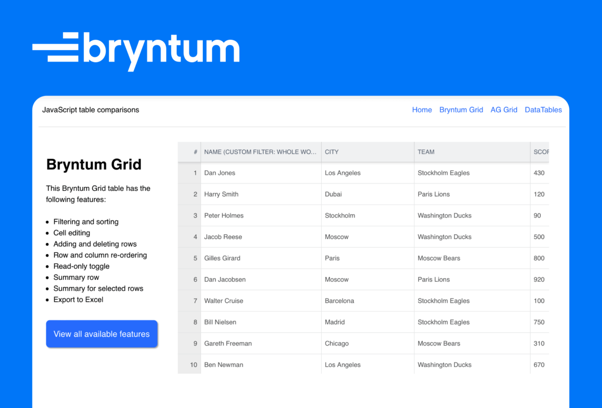
You’ll now see data in the Bryntum Grid table:
The columns are sortable by default. Click on a column heading to sort a row in ascending order. Click it again to sort it in descending order. The columns are also reorderable. Click and drag a column to reorder it.
Now let’s add some more features to the Bryntum Grid table.
Add filtering and row reordering
Add the following features property to the grid configuration object:
     features: {
        filter: true,
        rowReorder: {
          showGrip: true,
        },
        stripe: true,
      },
Features add functionality to the grid. The features property defines what features the grid will use. We added the filter property to allow the grid to be filtered. The rowReorder property allows a user to reorder a row by dragging it. The showGrip property adds a grip icon to the left side of each row. The stripe property adds stripes by adding alternating background colors to the rows.
We can also add the following property below the features property to show which cells have been edited:
      // Show changed cells
      showDirty: true,
This property makes the grid show a red “changed” tag in cells that have had their field value changed and the change has not yet been committed to a backend database.
Now let’s add a custom filter to the “NAME” column.
Add a custom Bryntum Grid column filter
In the “name” field object of the columns property array, add the following method:
          // This column has a custom filtering function that matches whole words
          filterable: ({ value, record }) =>
            Boolean(record.name.match(new RegExp(`${value}b`, "i"))),
This function adds a custom filter that matches whole words only. To find the “Dan Jones” record, you’ll need to type out “dan”, “jones”, or “dan jones”. The search is case-insensitive.
You can filter a row by hovering over a column heading and clicking on the filter icon:
Adding add, insert, and remove row buttons
Now let’s add buttons to the top of our Bryntum Grid that let you add, insert, or remove rows. First, add the following variable in the <script> tag at the top:
let newPlayerCount = 0;Now add the following tbar config object to the Bryntum Grid to configure its Toolbar:
tbar: [
{
type: "buttongroup",
items: [
{
type: "button",
ref: "addButton",
color: "b-green",
icon: "b-fa-plus-circle",
text: "Add",
tooltip: "Adds a new row (at bottom)",
onAction: () => {
const counter = ++newPlayerCount,
added = grid.store.add({
name: `New player ${counter}`,
cls: `new_player_${counter}`,
});
grid.selectedRecord = added[0];
},
},
{
type: "button",
ref: "insertButton",
color: "b-green",
icon: "b-fa-plus-square",
margin: "0 7",
text: "Insert",
tooltip: "Inserts a new row (at top)",
onAction: () => {
const counter = ++newPlayerCount,
added = grid.store.insert(0, {
name: `New player ${counter}`,
cls: `new_player_${counter}`,
});
grid.selectedRecord = added[0];
},
},
{
type: "button",
ref: "removeButton",
color: "b-red",
icon: "b-fa b-fa-trash",
text: "Remove",
tooltip: "Removes selected record(s)",
onAction: () => {
const selected = grid.selectedRecords;
if (selected && selected.length) {
const store = grid.store,
nextRecord = store.getNext(selected[selected.length - 1]),
prevRecord = store.getPrev(selected[0]);
store.remove(selected);
grid.selectedRecord = nextRecord || prevRecord;
}
},
},
],
},
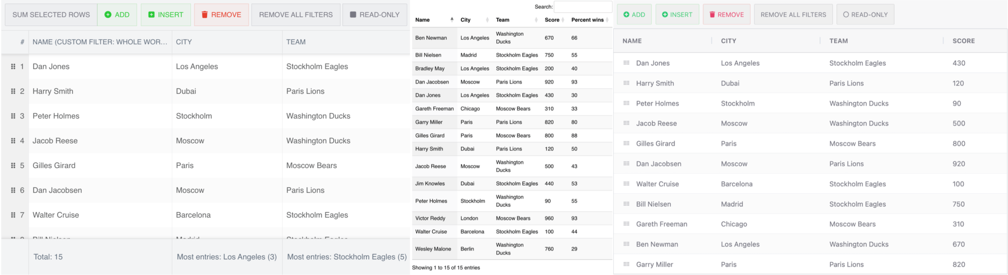
],We added our buttons to the toolbar as a buttonGroup of button items. When one of the buttons is pressed, the onAction callback function is called. It adds, inserts, or removes items from the grid store. The “Remove” button deletes selected rows.
Adding a remove all filters button
The filters for different columns can be applied at the same time. Let’s create a button that will remove all filters in the grid. Add the following object to the tbar array:
        {
          type: "button",
          ref: "removeAll",
          text: "Remove all filters",
          margin: "0 5",
          onAction: () => store.clearFilters(),
        },
This button will clear all filters in the Bryntum Grid store when it’s pressed.
Adding a read-only toggle button
Let’s add a toggle button to set the read-only state of the grid. Add the following object to the tbar array:
        {
          type: "button",
          ref: "readOnlyButton",
          text: "Read-only",
          tooltip: "Toggles read-only mode on grid",
          toggleable: true,
          icon: "b-fa-square",
          pressedIcon: "b-fa-check-square",
          onToggle: ({ pressed }) => {
            addButton.disabled =
              insertButton.disabled =
              grid.readOnly =
                pressed;
            removeButton.disabled = pressed || !grid.selectedRecords.length;
          },
        },
Now, add the following line in the onMount callback function, below the grid variable:
const { addButton, removeButton, insertButton } = grid.widgetMap;The read-only mode is set by toggling the grid.readOnly property. We also disable the add, insert, and remove buttons when the grid is in read-only mode.
Add a Bryntum Grid summary row with aggregation
To add a summary row at the bottom of the grid, we’ll first import the StringHelper function:
import { StringHelper } from "@bryntum/grid";Now, add the following summary property to the features property of the grid config:
summary: true,Next, we’ll add the sum and summaryRenderer properties for the columns. The sum is the summary type and the summaryRenderer is the renderer function for the summary. We also use the summaries property for the score column because we’ll have more than one summary value for the column.
Add the following properties to the name column object:
          sum: "count",
          summaryRenderer: ({ sum }) => `Total: ${sum}`,
Add the following properties to the city column object:
          sum: (result, current, index) => {
            if (index === 0) {
              result = {};
            }
            const city = current.city;
            if (!Object.prototype.hasOwnProperty.call(result, city)) {
              result[city] = 1;
            } else {
              ++result[city];
            }
            return result;
          },
          summaryRenderer: ({ sum }) => {
            let value = 0,
              mostPopularCity = "";
            Object.keys(sum).forEach((key) => {
              if (value < sum[key]) {
                value = sum[key];
                mostPopularCity = key;
              }
            });
            return StringHelper.xss`Most entries: ${mostPopularCity} (${value})`;
          },
Add the following properties to the team column object:
     sum: (result, current, index) => {
            if (index === 0) {
              result = {};
            }
            const team = current.team;
            if (!Object.prototype.hasOwnProperty.call(result, team)) {
              result[team] = 1;
            } else {
              ++result[team];
            }
            return result;
          },
          summaryRenderer: ({ sum }) => {
            let value = 0,
              mostPopularTeam = "";
            Object.keys(sum).forEach((key) => {
              if (value < sum[key]) {
                value = sum[key];
                mostPopularTeam = key;
              }
            });
            return StringHelper.xss`Most entries: ${mostPopularTeam} (${value})`;
          },
Add the following properties to the score column object:
         // Using built in summary calculations
          summaries: [
            { sum: "min", label: "Min" },
            { sum: "max", label: "Max" },
          ],
Add the following properties to the percentWins column object:
          sum: "average",
          summaryRenderer: ({ sum }) => `Average: ${Math.round(sum)}%`,
The sum properties use one of the valid string types or a function for a custom summary.
You’ll now be able to see the summary rows for all of the columns:
Adding a sum selected rows button
Now let’s add a button that will show the summary values for the selected rows. Add the following object to the tbar array:
        {
          type: "button",
          text: "Sum selected rows",
          margin: "0 auto",
          toggleable: true,
          onToggle: "up.onSelectToggle",
        },
Add the onSelectToggle method below the columns array in the grid config object:
      onSelectToggle() {
        this.features.summary.selectedOnly =
          !this.features.summary.selectedOnly;
      },
When the button is clicked, the summary.selectedOnly feature is toggled. When it’s true, the summary will be for the selected rows:
Now let’s add an Excel export feature.
Export Bryntum Grid data to Excel
For the Excel export, we’ll use the third-party library zipcelx. Import it inside the <script> tag:
import zipcelx from "zipcelx";Now add the following features to the features property in the grid config:
          excelExporter: {
            zipcelx,
          },
          cellMenu: {
            items: {
              extraItem: {
                text: "Export - Excel",
                icon: "b-fa-download",
                weight: 200,
                onItem: () => {
                  grid.features.excelExporter.export();
                },
              },
            },
          },
We create the excelExporter and then add it as a menu item to the cellMenu, which is the menu that’s displayed when you right-click on a cell. When the “Export – Excel” menu item is pressed, it calls the excelExporter.export method, which downloads an Excel file of the table data. The data does not include the summary data.
We’ve now completed our Bryntum Grid table. Let’s create the same table using AG Grid.
Create a data table with AG Grid in Svelte
We’re using the enterprise version of AG Grid for this tutorial to showcase its full feature set. AG Grid also offers a free Community edition. You can see the differences between the editions in this comparison table.
The AG Grid table, which is the grid variable in the AgGrid.svelte file, has some basic grid options added. In the routes/AgGridPage.svelte file, the table is appended to the <div> with an id of datagrid.
Now, let’s add data to our table.
Load data into AG Grid
Import the following client fetch wrapper in the <script> tag of the AgGrid.svelte file:
import { client } from "../utils/fetchWrapper";In the onMount callback function, add the following lines below the grid variable assignment:
    client("data/data.json").then(({ data }) => {
      gridOptions.api.setRowData(data);
    });
We fetch the soccer player data using our fetch wrapper function and then add the data to the grid using api.setRowData.
You’ll now see data in the AG Grid table:
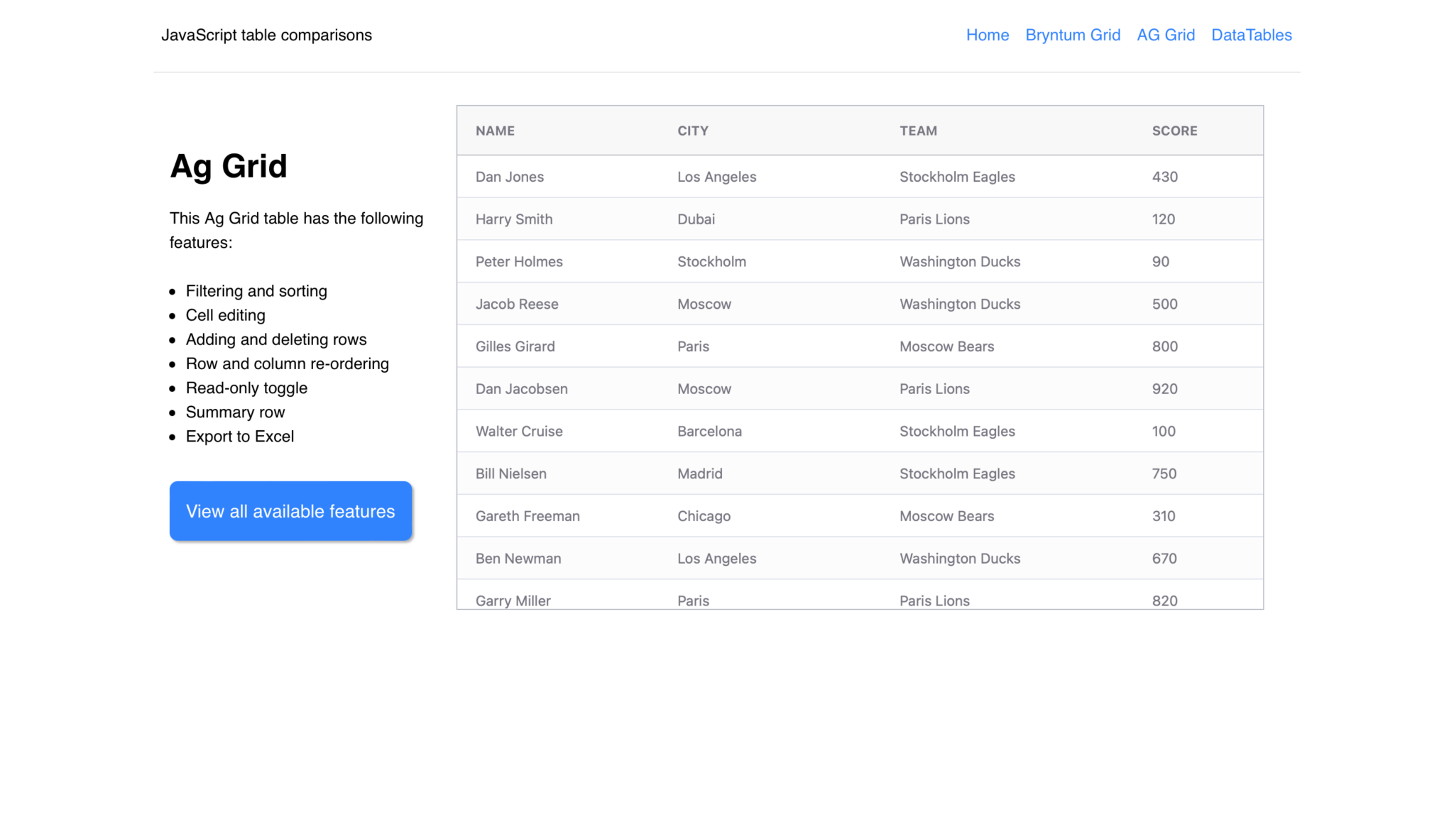
The columns are reorderable by default. Click and drag a column to reorder it. Each column also has a built-in search input, column pinning, and auto-sizing. You can find these features by hovering over a column header and clicking on the icon that appears. AG Grid also includes a built-in CSV and Excel export function. Right-click on a cell to find the export options.
Now let’s add some more features to the AG Grid table.
Add filtering, cell editing, and row reordering
Add the following property to each object that’s returned from the getColumnDefs function:
editable: true,This makes the cells editable.
Now add the following property to the first object that’s returned from the getColumnDefs function:
        // only allow non-group rows to be dragged
        rowDrag: (params) => !params.node.group,
To enable row dragging on all columns, you set the column property rowDrag to true for the first column. The rowDrag is enabled for rows that are not grouped. We do this so that the summary row that we’ll add later does not have row drag enabled.
Let’s set some default column definitions that are applied to all columns. Add the following property in the gridOptions object:
   defaultColDef: {
      sortable: true,
      filter: true,
      resizable: true,
    },
Now add the following properties below the defaultColDef property:
    rowSelection: "multiple", // allow rows to be selected
    animateRows: true, // have rows animate to new positions when sorted
    rowDragManaged: true,
We set the rowDragManaged property to true so that the grid is responsible for rearranging the rows when they are reordered by dragging.
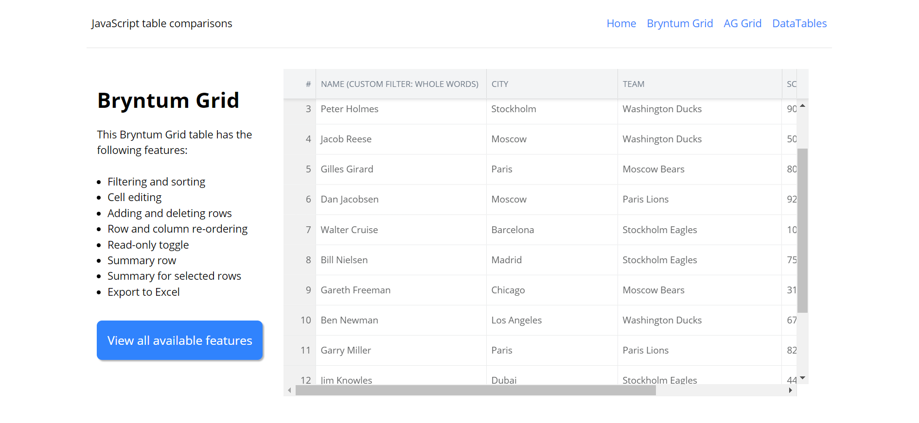
You’ll now be able to edit cells, filter columns, and reorder rows:
Now let’s add a custom filter to the “NAME” column, like the one we made for the Bryntum Grid.
Add a custom AG Grid column filter
We’ll use a filter component to create a custom filter. In the lib folder, create a file called personFilter.js and add the following lines to it:
export class PersonFilter {
  init(params) {
    this.valueGetter = params.valueGetter;
    this.filterText = null;
    this.setupGui(params);
  }
  // not called by AG Grid, just for us to help setup
  setupGui(params) {
    this.gui = document.createElement("div");
    this.gui.innerHTML = `<div style="padding: 4px; width: 200px;">
                <div style="font-weight: bold;">Custom filter: whole words</div>
                <div>
                    <input style="margin: 4px 0 4px 0;" type="text" id="filterText" placeholder="Full name search..."/>
                </div>
            </div>
        `;
    const listener = (event) => {
      this.filterText = event.target.value;
      params.filterChangedCallback();
    };
    this.eFilterText = this.gui.querySelector("#filterText");
    this.eFilterText.addEventListener("changed", listener);
    this.eFilterText.addEventListener("paste", listener);
    this.eFilterText.addEventListener("input", listener);
    // IE doesn't fire changed for special keys (eg delete, backspace), so need to
    // listen for further ones
    this.eFilterText.addEventListener("keydown", listener);
    this.eFilterText.addEventListener("keyup", listener);
  }
  getGui() {
    return this.gui;
  }
  doesFilterPass(params) {
    const searchQuery = this.filterText.toLowerCase();
    const value = this.valueGetter(params);
    console.log({ searchQuery }, { value });
    return Boolean(searchQuery.match(new RegExp(`${value}b`, "i")));
  }
  isFilterActive() {
    return this.filterText != null && this.filterText !== "";
  }
  getModel() {
    return { value: this.filterText.value };
  }
  setModel(model) {
    this.eFilterText.value = model.value;
  }
}
This custom filter class adds a custom filter that matches whole words only.
Import this filter in the <script> tag of the AgGrid.svelte file:
import { PersonFilter } from "./personFilter";Add the following components property to the gridOptions object:
    components: {
      personFilter: PersonFilter,
    },
Now set the filter of the “NAME” column to our custom filter. Add the following property to the first object of the array returned by the getColumnDefs function:
filter: "personFilter",The “NAME” column now has a custom whole-word filter.
Add, insert, and remove rows
We’ll now add buttons to add, insert, and remove a row to the top of the AG Grid table, like we did with the Bryntum Grid table. First, import the following icons:
  import FaRegCheckCircle from "svelte-icons/fa/FaRegCheckCircle.svelte";
  import FaRegCircle from "svelte-icons/fa/FaRegCircle.svelte";
  import FaPlusCircle from "svelte-icons/fa/FaPlusCircle.svelte";
  import FaTrash from "svelte-icons/fa/FaTrash.svelte";
Add the following variable below the gridContainer variable declaration:
let canEdit = true;We’ll use this variable to determine if the grid is read-only or not so that we can disable editing if the read-only button is toggled on. We’ll be adding this button later.
Add the following toolbar <div> inside the grid container that has an id of datagrid:
  <div class="toolbar">
    <button
      class="btn add-btn"
      on:click={() => gridOptions.api.applyTransaction({ add: [{}] })}
      disabled={!canEdit}
    >
      <div class="icon">
        <FaPlusCircle />
      </div>
      <div>ADD</div>
    </button>
  </div>
Add the following CSS styling for the toolbar and the buttons that we’ll add:
  .toolbar {
    display: flex;
    flex-wrap: wrap;
    gap: 0.5rem;
    width: 100%;
    background-color: var(--light-grey);
    padding: 0.5rem;
  }
  .btn {
    display: flex;
    gap: 0.3rem;
    align-items: center;
    padding: 0.75rem;
    border-radius: 2px;
    color: var(--dark-grey);
    border: 1px solid var(--medium-grey);
    transition: all 0.3s ease;
  }
  .btn:hover {
    cursor: pointer;
    filter: brightness(115%);
  }
  .btn:disabled {
    opacity: 0.5;
  }
  .icon {
    display: flex;
    align-items: center;
    width: 12px;
    height: 12px;
  }
  .add-btn {
    color: var(--green);
    border: 1px solid var(--light-green);
  }
  .remove-btn {
    color: var(--red);
    border: 1px solid var(--light-red);
  }
We use api.applyTransaction to add a row when the button is clicked.
Now add the following two buttons below the “ADD” button:
<button
class="btn add-btn"
on:click={() =>
gridOptions.api.applyTransaction({ add: [{}], addIndex: 0 })}
disabled={!canEdit}
>
<div class="icon">
<FaPlusCircle />
</div>
<div>INSERT</div>
</button>
<button
class="btn remove-btn"
on:click={() => {
const selectedRows = gridOptions.api.getSelectedRows();
gridOptions.api.applyTransaction({ remove: selectedRows });
}}
disabled={!canEdit}
>
<div class="icon"><FaTrash /></div>
<div>REMOVE</div></button
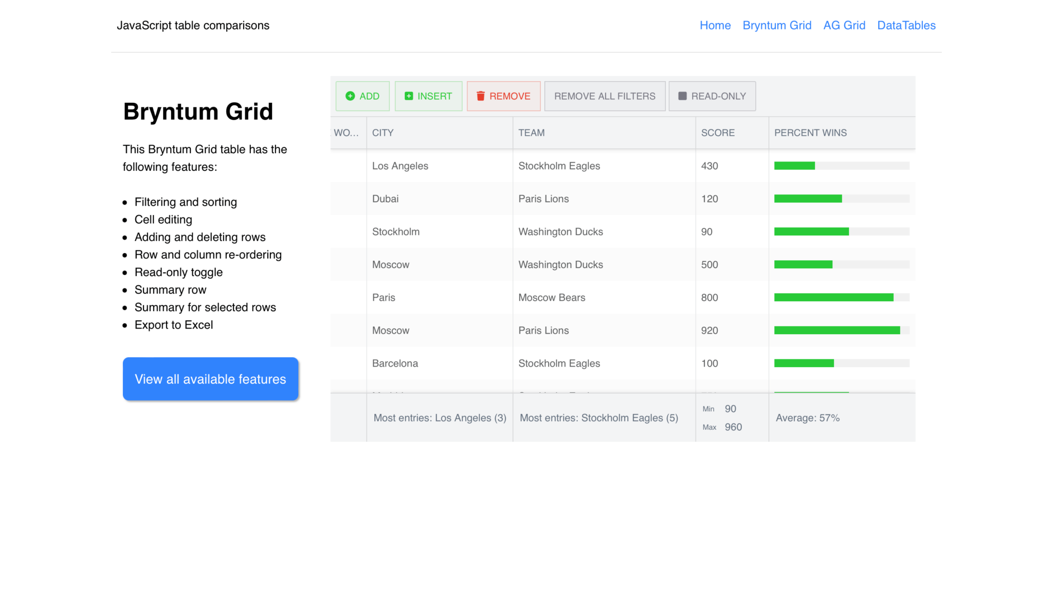
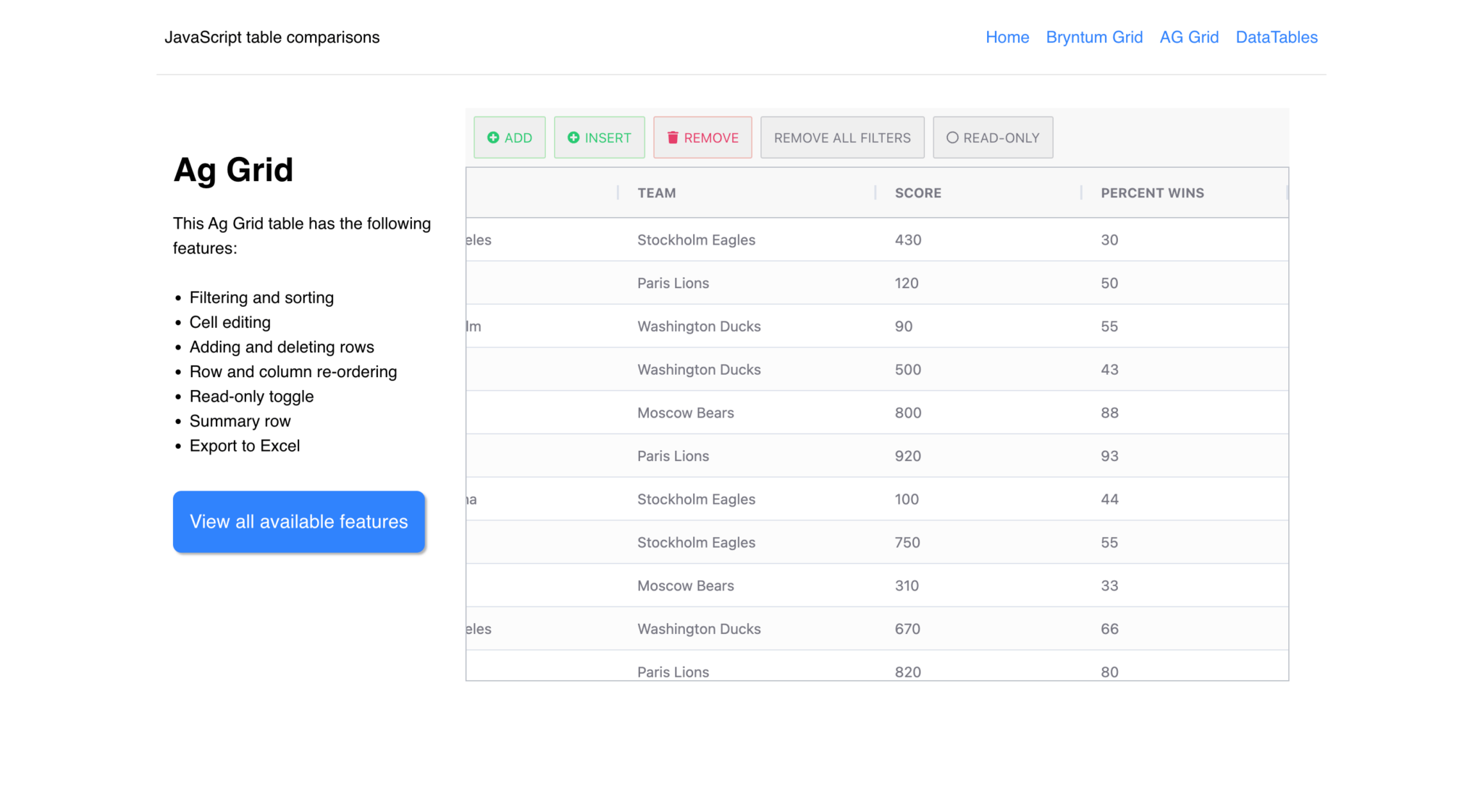
>Now you’ll see “ADD”, “INSERT”, and “DELETE” buttons at the top of the AG Grid table:
Next, let’s add a button that removes all filters applied to the grid.
Adding a remove all filters button
Add the following button below the “REMOVE” button:
    <button
      class="btn remove-filters-btn"
      on:click={() => gridOptions.api.setFilterModel(null)}
    >
      REMOVE ALL FILTERS</button
    >
This “REMOVE ALL FILTERS” button clears the filters by setting the grid’s filter model to null.
Adding a read-only toggle button
Add the following button below the “REMOVE ALL FILTERS” button:
  <button
      class="btn read-only-btn"
      on:click={() => {
        const columnDefs = getColumnDefs();
        const newState = canEdit ? false : true;
        canEdit = newState;
        columnDefs.forEach(function (colDef) {
          colDef.editable = newState;
        });
        gridOptions.api.setColumnDefs(columnDefs);
      }}
    >
      <div class="icon">
        {#if canEdit}
          <FaRegCircle />
        {/if}
        {#if !canEdit}
          <FaRegCheckCircle />
        {/if}
      </div>
      <div>READ-ONLY</div>
    </button>
When the “READ-ONLY” button is clicked, we toggle the canEdit variable’s state and then loop through each column definition and set the editable property to the new canEdit state. We then call the setColumnDefs method to set new column definitions that have the new editable state.
Add an AG Grid summary row with aggregation
To add a summary row, add the following property to the gridOptions object:
groupIncludeTotalFooter: true,To create a summary for each column, we’ll use the aggFunc property, which is used for custom aggregation functions, for each column. We’ll add these to the column objects of the array returned from the getColumnDefs function.
Add the following aggFunct to the name column object:
        aggFunc: (params) => {
          let count = 0;
          params.values.forEach((value) => {
            count += 1;
          });
          return `Total: ${count}`;
        },
Add the following aggFunct to the city column object:
        aggFunc: (params) => {
          const valueCountObj = {};
          params.values.forEach((value) => {
            if (!valueCountObj[value]) {
              valueCountObj[value] = 1;
            } else {
              valueCountObj[value] += 1;
            }
          });
          const mostEntries = Object.keys(valueCountObj).reduce(
            (a, b) => (valueCountObj[a] > valueCountObj[b] ? a : b),
            0
          );
          return `Most entries: ${mostEntries} (${valueCountObj[mostEntries]})`;
        },
Add the following aggFunct to the team column object:
        aggFunc: (params) => {
          const valueCountObj = {};
          params.values.forEach((value) => {
            if (!valueCountObj[value]) {
              valueCountObj[value] = 1;
            } else {
              valueCountObj[value] += 1;
            }
          });
          const mostEntries = Object.keys(valueCountObj).reduce(
            (a, b) => (valueCountObj[a] > valueCountObj[b] ? a : b),
            0
          );
          return `Most entries: ${mostEntries} (${valueCountObj[mostEntries]})`;
        },
Add the following aggFunct to the score column object:
        aggFunc: (params) => {
          let min = null;
          let max = null;
          params.values.forEach((value) => {
            if (value < min || min === null) {
              min = value;
            }
            if (value > max || max === null) {
              max = value;
            }
          });
          return `Min ${min} Max ${max}`;
        },
Add the following aggFunct to the percentWins column object:
        aggFunc: (params) => {
          let count = 0;
          let sum = 0;
          params.values.forEach((value) => {
            count += 1;
            sum += Number(value);
          });
          return `Average: ${Math.round(sum / count)} %`;
        },
You’ll now see the summary rows in the completed AG Grid table:
We’ll now create a table using DataTables.
Create a table with DataTables in Svelte
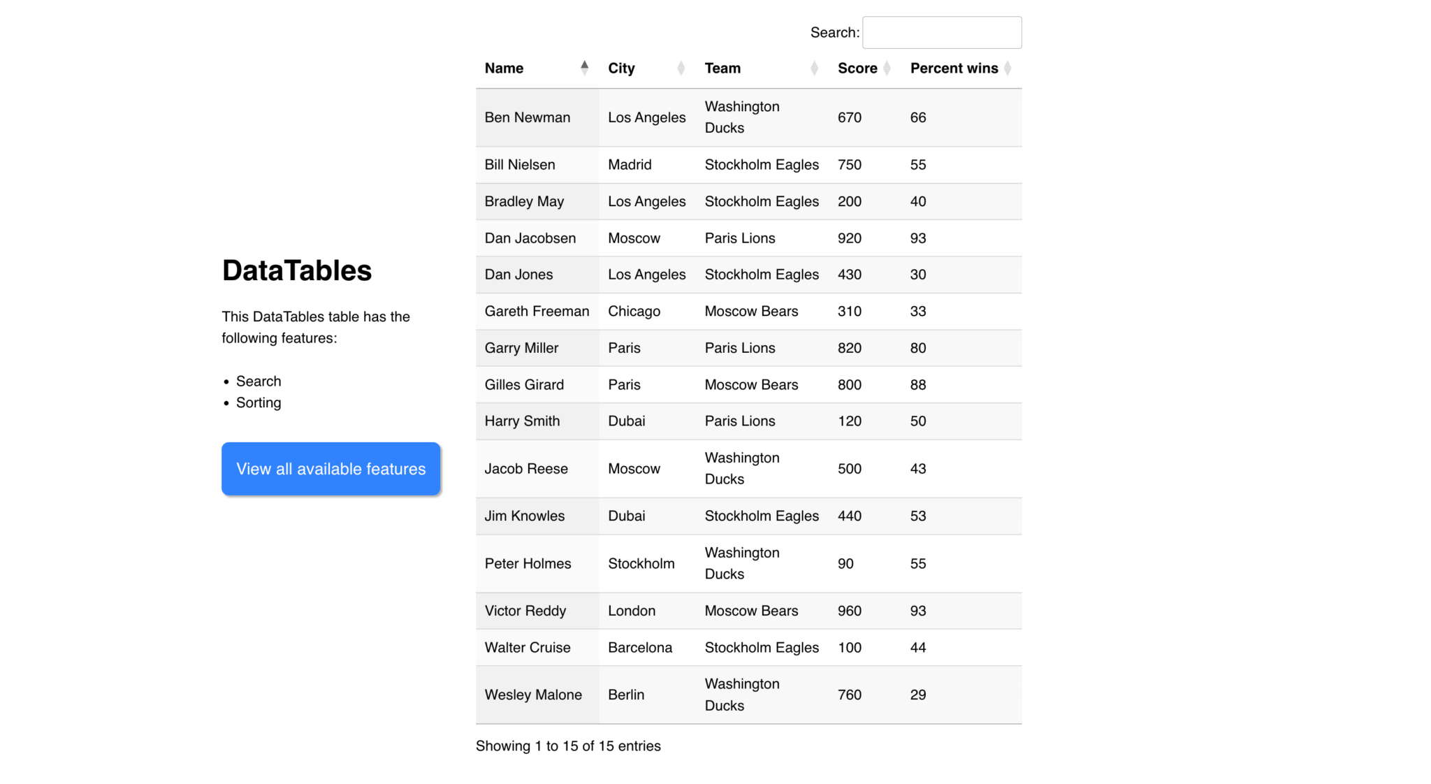
The DataTable, which is the table variable in the DatatableJS.svelte file, has some basic table options added. The paging option is set to false and the columns are defined with the columns property. The table has a search input feature on the top right. In the routes/DataTablesPage/svelte file, the table is appended to the <div> with an id of datatable.
Now, let’s add data to our table.
Load data into DataTables
In the table variable, add the following property below the paging property:
      ajax: {
        url: "/data/data.json",
        dataSrc: "data",
      },
The ajax property is used to load data into the table. You’ll now be able to see the data in the table:
Feature comparison: Bryntum Grid vs. AG Grid vs. DataTables
All three libraries support sorting and basic filtering, but beyond that the gap widens quickly. The table below shows how each library handled the features we built in this tutorial, and, more importantly, whether they were built-in or required extra work:
| Feature | AG Grid | Bryntum Grid | DataTables |
|---|---|---|---|
| Sorting | Built-in | Built-in | Built-in |
| Filtering | Built-in | Built-in | Basic search only |
| Custom filters | Filter component API | Inline function | Not supported |
| Cell editing | Built-in | Built-in | Requires plugin |
| Row reordering | Built-in | Built-in | Not supported |
| Column reordering | Built-in | Built-in | Not supported |
| Adding/removing rows | Transaction API | Store API | Not supported |
| Summary row | Custom aggFunc | Built-in feature | Not supported |
| Exporting to Excel | Built-in | Requires third-party library | Not supported |
| Read-only toggle | Per-column config | Single property | Not supported |
DataTables fell short on most of the advanced features. Cell editing, row reordering, and row management either required plugins or weren’t supported at all. AG Grid and Bryntum Grid both covered every feature, with AG Grid having an edge on Excel export, which is built in rather than requiring a third-party library.
Regarding documentation, all the libraries have many examples with good search functionality. AG Grid’s documentation and Bryntum Grid’s demos page both provide extensive interactive examples alongside their API references.
In terms of pricing, DataTables is free to use and a once-off fee gets you full access to their forum. However, there are additional costs if you make use of plugins such as the DataTables Editor. AG Grid offers a generous free Community edition that covers many common use cases, with an Enterprise edition available for advanced features. Bryntum Grid is a commercial library that requires the purchase of a license.
Next steps
In conclusion, for the tables we built in this tutorial, AG Grid offered the best overall developer experience thanks to its built-in features, including Excel export without third-party dependencies and a clean Transaction API for row management.
Browse the AG Grid examples to see what else it can do, and follow the getting started guide to get AG Grid running in your project in a few minutes.