What’s new in 5.6.0
We strive to keep posts updated, but code samples may sometimes be outdated. Humans, see the Bryntum documentation; agents, https://mcp.bryntum.com for the latest info.
We are thrilled to present the highly anticipated 5.6.0 release of our UI component suite. This release is filled with exciting features, including the introduction of new NPM packages that enable seamless integration of multiple Bryntum products. Additionally, we have added print support, introduced row resizing capabilities, and made significant user experience enhancements to provide you with a more powerful and intuitive UI toolkit.
New “thin” NPM packages
This release introduces a new set of NPM packages and framework components, that allows combining multiple Bryntum products in the same application. These packages contain the product specific code only, as opposed to the current packages that has all code for the products each product builds upon (for example Scheduler contains Grid & Core).
The new packages are called “thin” packages, and moving forward it will be the recommended way of using Bryntum products in NPM based applications (for all supported frameworks).
More information per framework (links for Scheduler, available for all products):
Local print support
Grid, Scheduler, SchedulerPro and Gantt now also support local printing (previously only available in Calendar). Behind the scenes it uses the same mechanics as the PDF export feature, but instead of sending anything to an export server on the backend, it is used for local printing.
Since modern browsers let you print to PDF, the Print feature will also allow you to replace the PDF export feature in many cases.
Try it out for example in Grid here:

CSV export
The ExcelExport feature can now also export to CSV (with configurable delimiter). Can be tried in Grid’s Export to Excel demo:

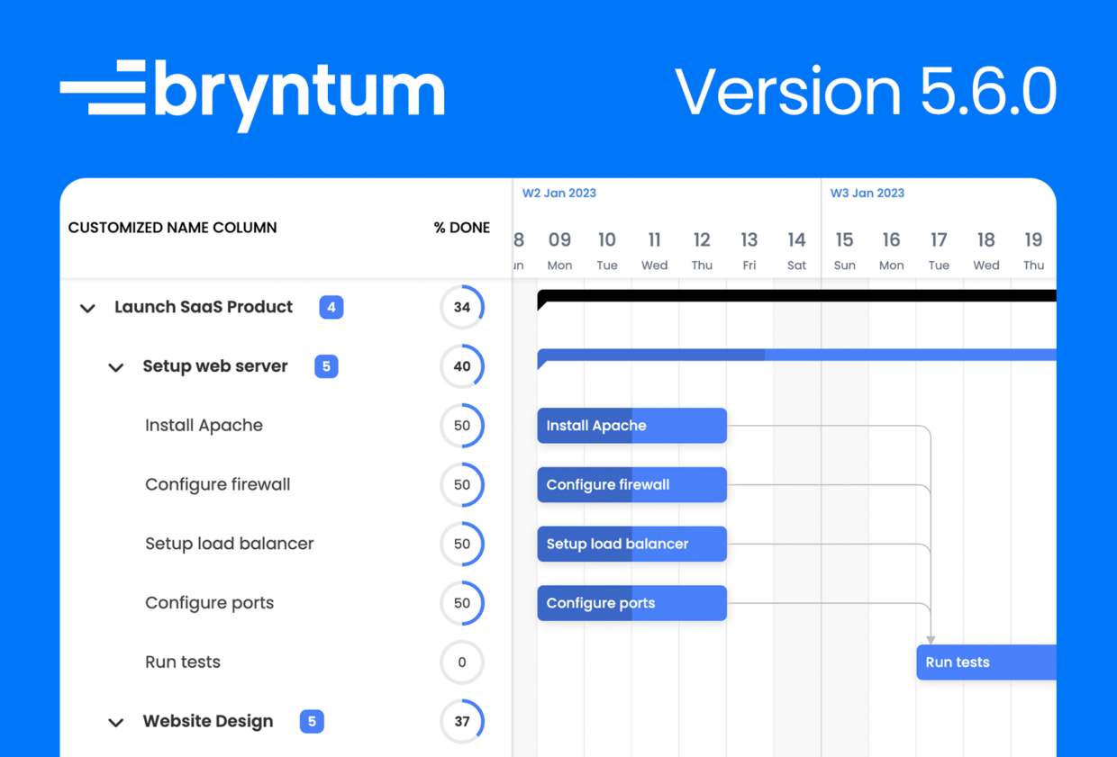
Support for drag-resizing rows
There is a new RowResize feature that lets you drag-resize rows in Grid, Scheduler, SchedulerPro and Gantt. Can be tried in for example Scheduler’s updated Variable row height demo (which also shows the new support for asymmetrical resource margins):

RowExpander improvements
The popular RowExpander feature has been updated with two new abilities, it can now support different content per Grid region:

And it can be configured to span all Grid regions:

Animated toggling of tree nodes
Grid can now animate expanding/collapsing nodes in a tree. Opt in using the animateTreeNodeToggle config. Support for Scheduler and Gantt is planned for later. Try it out in the update tree demo in Grid:

Multi-group support using array data
The Group and TreeGroup features now lets you group by an array field, and thus displaying the same record in multiple groups. Used for example here in the new Multi-grouping demo:

Improvements for nested events
The NestedEvents feature in SchedulerPro has been improved to take non-working time into account when scheduling nested events. It now also allows dependencies between nested events (and scheduling based on those). Dependencies between nested events are shown in this new demo:

More dependency terminal options
Scheduler, SchedulerPro and Gantt now have more customization options for dependency terminals. You can configure their size (terminalSize), their position (terminalOffset) and delay hiding/showing them (terminalShowDelay, terminalHideDelay) – good for transitions for example. Can be tried in the updated Dependencies demo:

React JSX in TaskBoard cards
TaskBoard has a new card item, JSXItem, that lets you use JSX based components in card’s header, body and footer in your React application. Check it out in the new React JSX Task Items demo:

React JSX in resource headers
We have also added support for using JSX in the resource headers of Scheduler’s vertical mode. Used in the updated React Vertical Mode demo:

ScrollButtons feature in Gantt
The new ScrollButtons feature in Gantt displays buttons for tasks that are out of view on their rows. Clicking a button scrolls the task into view. On display in the new Scroll buttons demo:

Gantt demo UI overhauled
The Custom rendering demo was updated with a fresh new look.

The demo now uses a new feature adding scroll buttons to the timeline header:

Typed functions & events
Our typings have been greatly improved in this release, they now specify types for most functions and events for all our products.
Before this update:
/**
 * Fired after rendering an event, when its element is available in DOM.
 */
onRenderEvent: Function|string
After the update (redacted for brevity):
/**
 * Fired after rendering an event, when its element is available in DOM.
 * @param {object} event Event object
 * @param {EventModel} event.eventRecord The event record
 * @param {ResourceModel} event.resourceRecord The resource record
 * @param {HTMLElement} event.element The event bar element
 */
onRenderEvent: ((event: { eventRecord: EventModel, resourceRecord: ResourceModel, element: HTMLElement }) => void)|string
More improvements
This release also includes many smaller improvements and bug fixes, among them:
- Calendar now lets you inject elements into its day cells using the new
dayCellPopulatedevent Listgroups can now be collapsibleResourceTimeRangescan be customized using the newresourceTimeRangeRenderer- Milestones CSS layout was tweaked + how they are laid out in the schedule was also improved
- The tooltip shown when dragging an event in SchedulerPro now takes non-working time into account
Release details
For full details about this release, please see the change logs, What’s New guides and upgrade guides of each product:
| Product | Changelog | What’s new | Upgrade guide | |
|---|---|---|---|---|
| Grid | ||||
| Scheduler | ||||
| Scheduler Pro | ||||
| Gantt | ||||
| Calendar | ||||
| TaskBoard |
What’s next?
5.6 is a big step forward, but there is a lot more to come yet. For 6.0 we are aiming to include lazy loading of data, live updates and much more.
Is there a specific feature you would like us to add next?
Links
Try Bryntum components
Fast, framework-agnostic UI components for scheduling and project management.
Related posts