What’s new in 5.4.0
We strive to keep posts updated, but code samples may sometimes be outdated. Humans, see the Bryntum documentation; agents, https://mcp.bryntum.com for the latest info.
We are delighted to present the 5.4 release of our UI component suite, packed with many new exciting enhancements. In the release you will find new widgets, powerful features as well performance improvements and lots of bug fixes too. Let’s dig in!
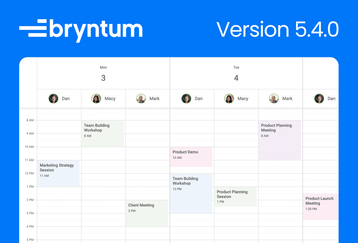
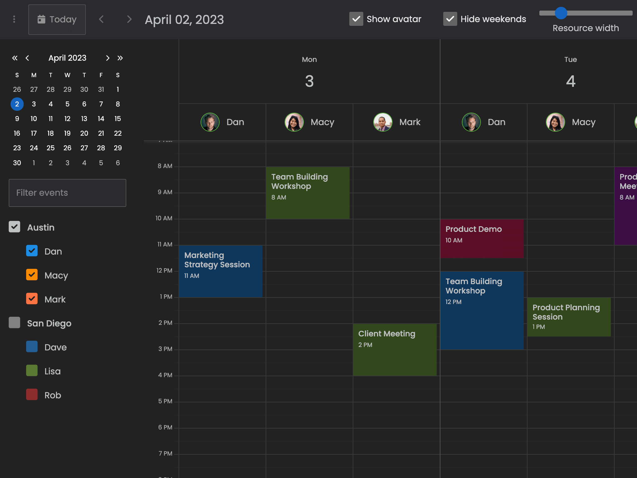
New Date/Resource view in Calendar
Calendar has a new DayResourceView which shows events in separate columns for each resource, grouped under each day. Try it out in the new Resources grouped by date demo:
Task color support in Gantt
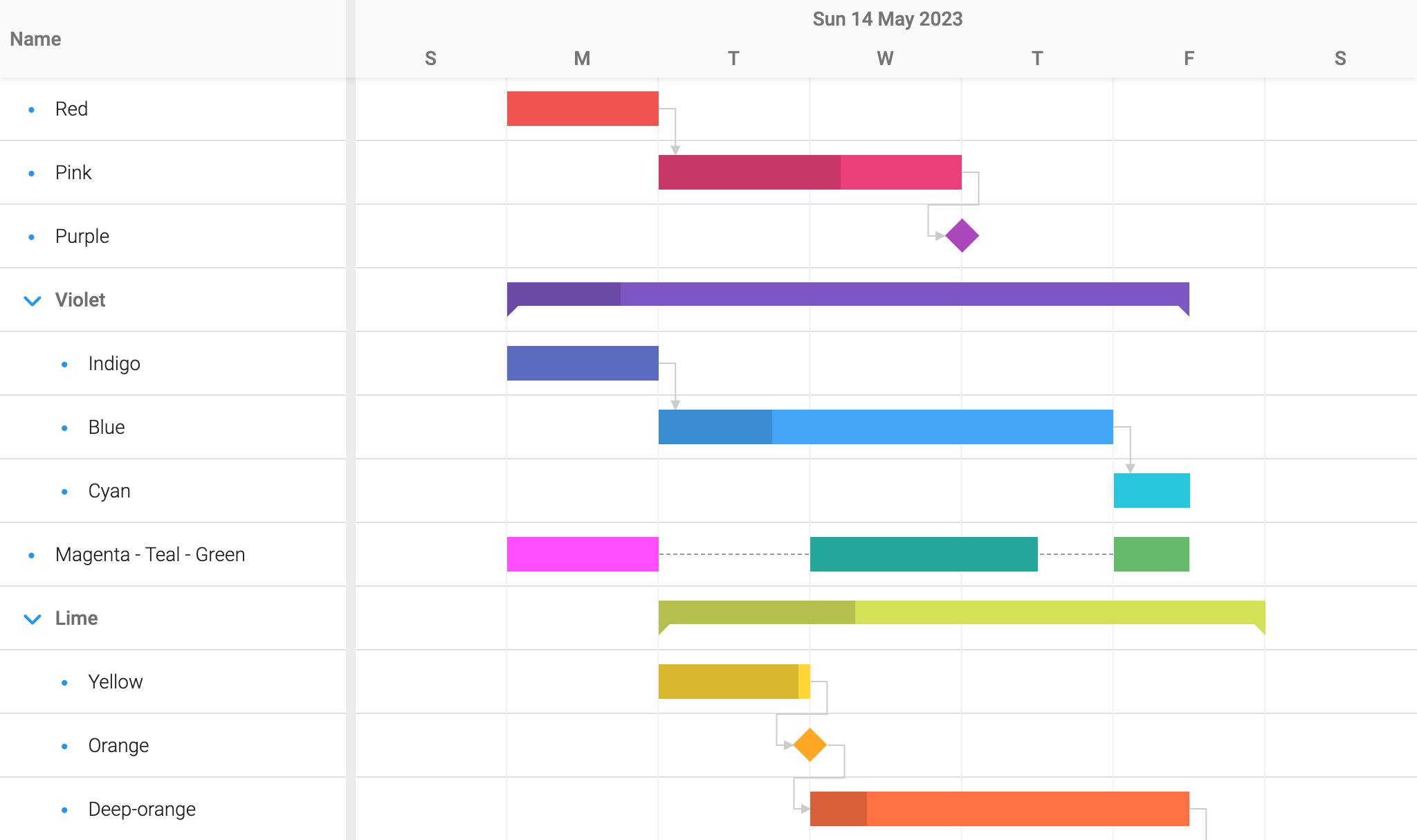
Gantt now supports the eventColor field on tasks, in the same way that Scheduler does for events. It accepts a set of predefined named colors (red, green, blue etc.) or a CSS color value. Assigning a value changes the background color of the rendered task bar.
It is also possible to configure the Gantt instance with an eventColor that applies to all tasks, overriding the default coloring. The available colors are displayed in the new Task coloring demo:
New color selection UI components
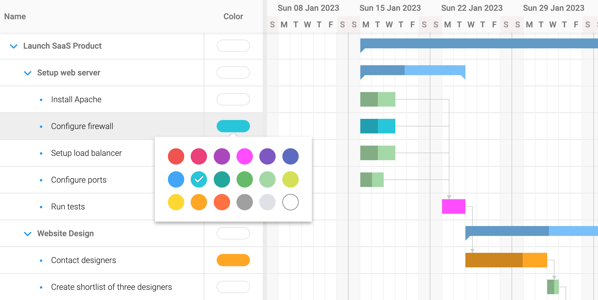
This release includes new widgets and columns for selecting colors:
- A
ColorPicker, meant to be used from menus. - A
ColorField, meant to be used in editors. - A
ColorColumn, that uses theColorPickerfor editing.
Scheduler & Gantt has specialized versions of these, and allows showing color pickers in the default UI by configuring showEventColorPickers : true or showTaskColorPickers : true respectively. You can for example try it in the updated Task editor customization demo in Gantt:
Nested grids & widgets
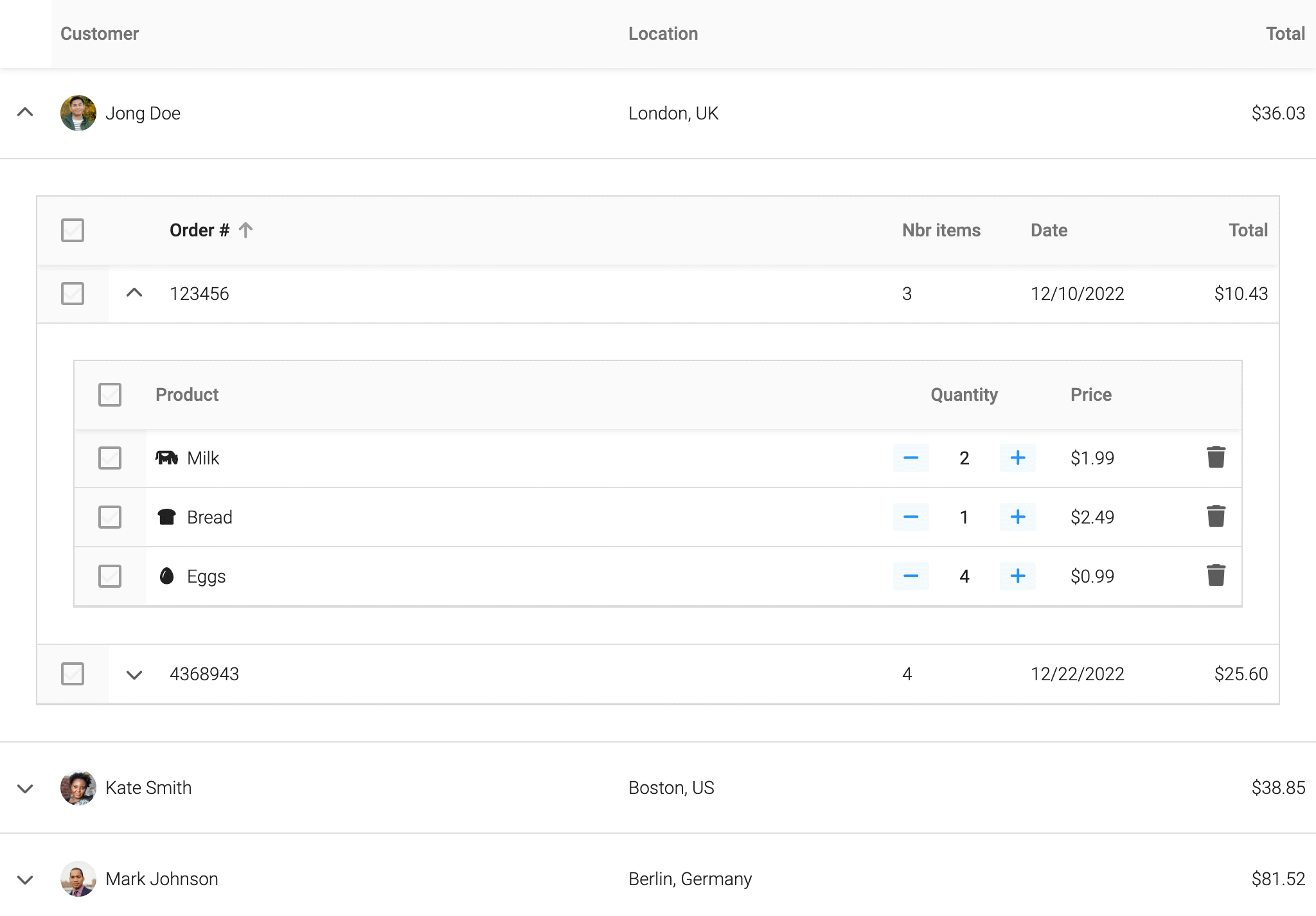
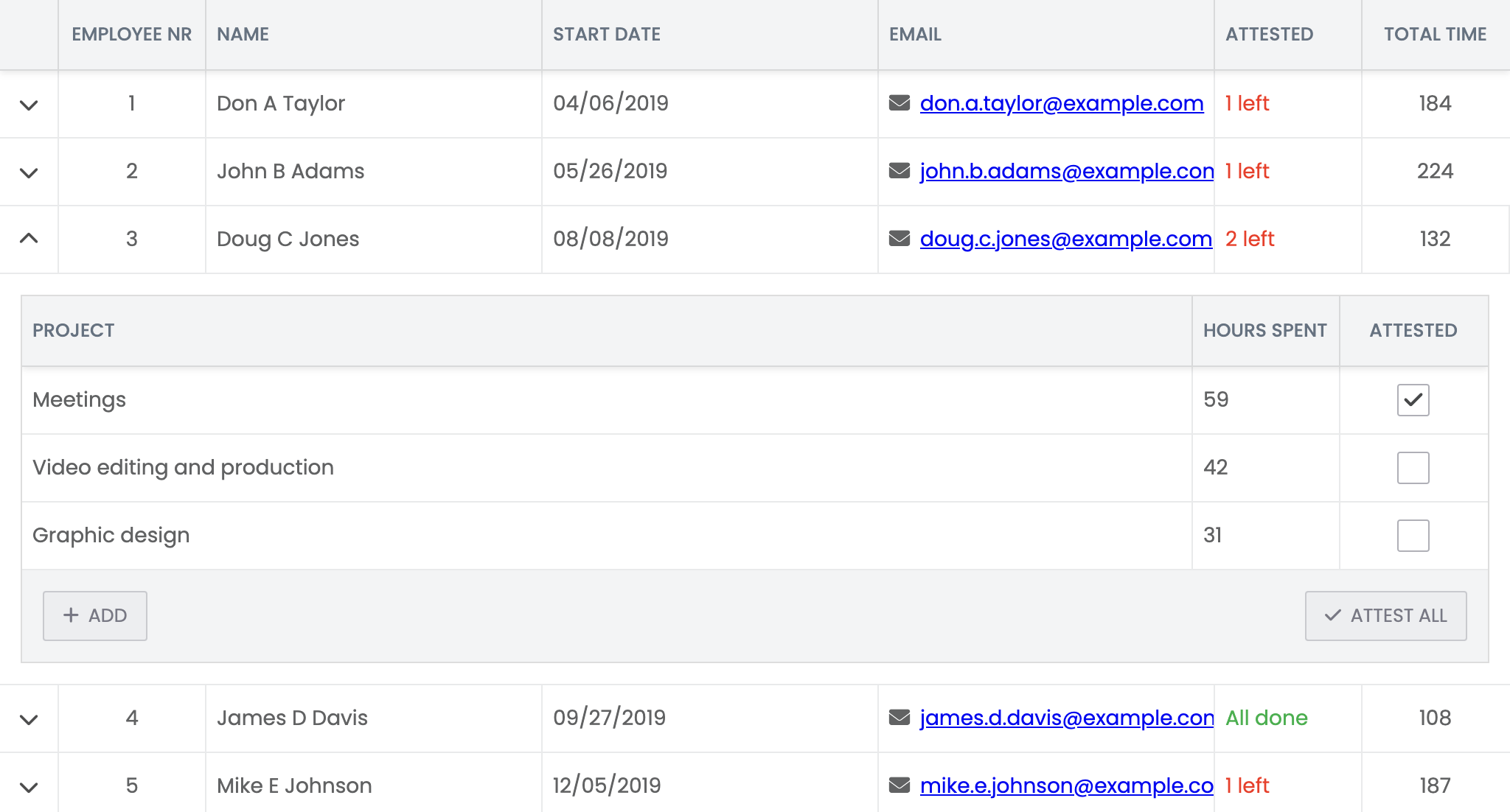
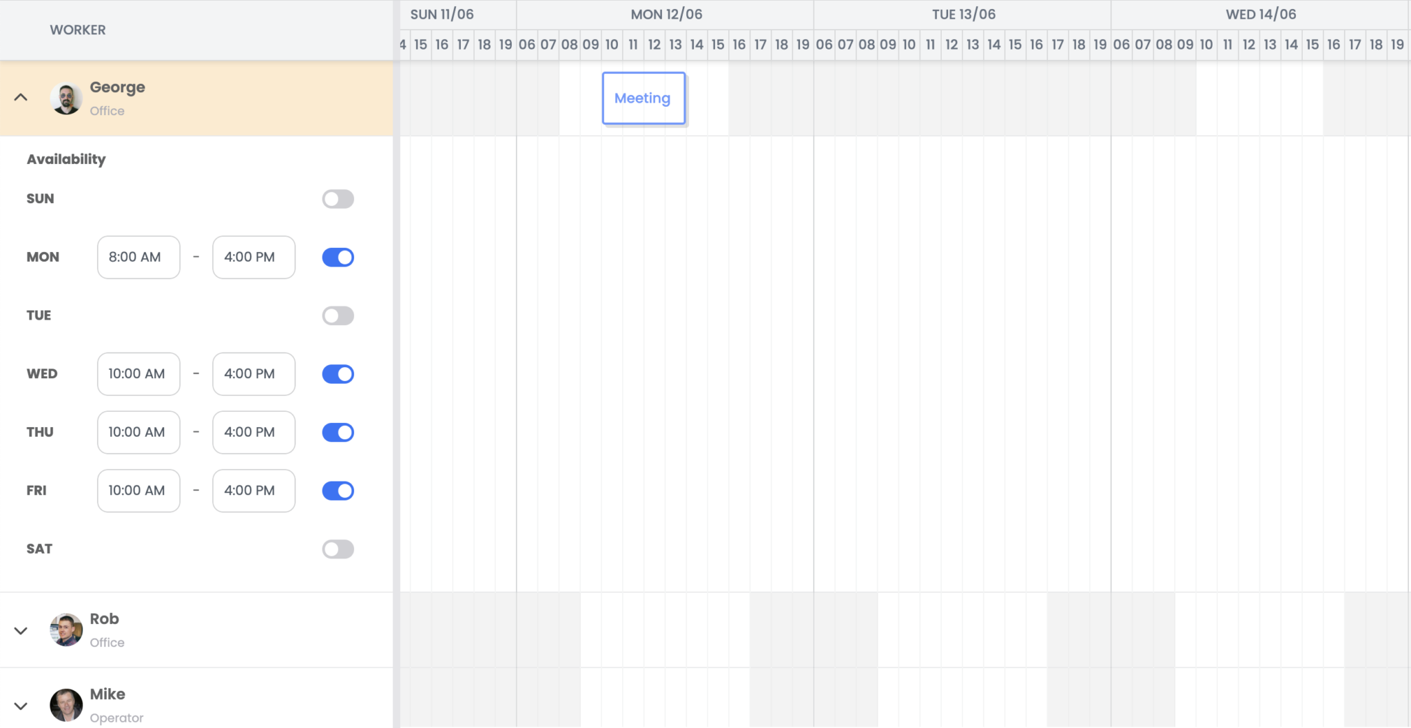
The RowExpander feature now supports rendering any Bryntum widget inside the expanded row. This is a super powerful concept which makes it possible to show any number of nested widgets upon expand. This makes it trivial to implement a detail Grid when expanding a row. Either configure the feature with a widget or return a Widget configuration object in the renderer.
Check it out in either the new Master detail demo:
Or in the new Nested grids demo:
Since the Scheduler and Gantt widgets are based on the Grid, the expander feature works just as well there.
New split grid & scheduler features
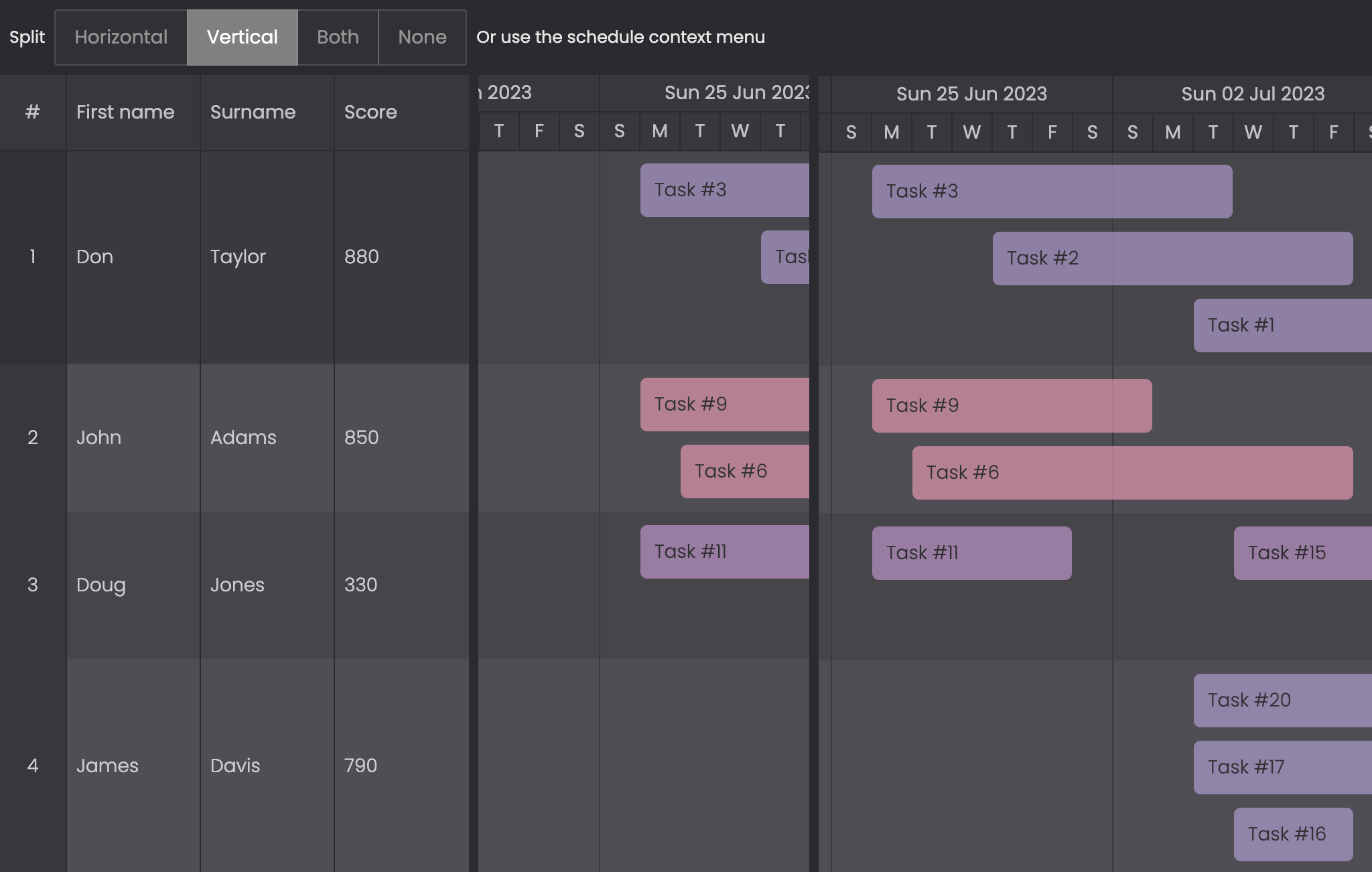
The Grid has a new feature called Split, which allows you to split the grid into multiple parts (two or four). This lets you access different parts of the grid that might not otherwise fit in the same viewport. Try it in the new Splitting demo:
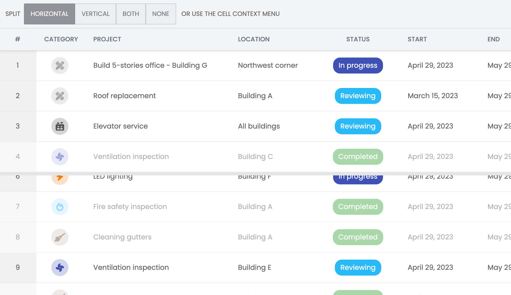
There is also a specialized version of this feature available in the Scheduler, that in addition lets you split the view at a certain point in time. We encourage you to test it out in the new Splitting demo and let us know what you think.
Scheduling direction per task
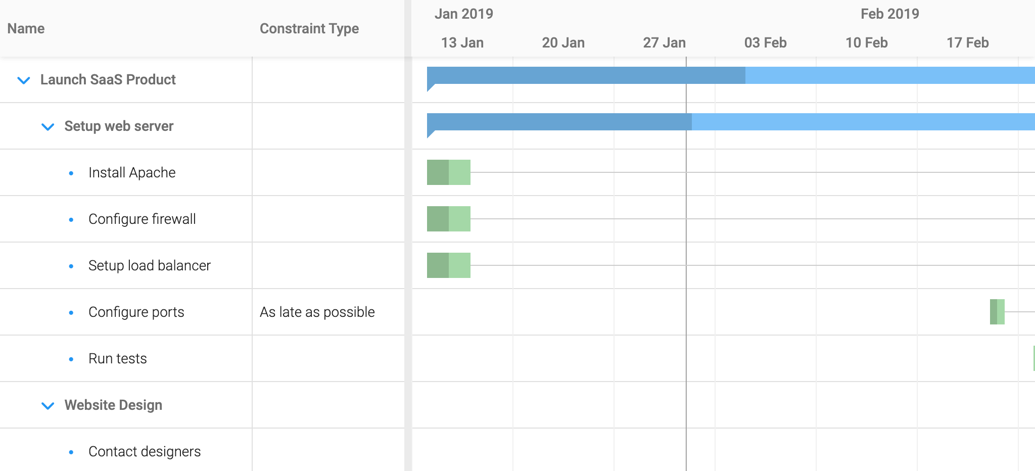
The Gantt widget now supports setting scheduling direction on a per-task basis. This is controlled by either using the direction field, or in a MS Project compatible way, by setting corresponding AsSoonAsPossible or AsLateAsPossible constraints (see docs for includeAsapAlapAsConstraints). Shown in the new Scheduling direction demo:
Native clipboard support
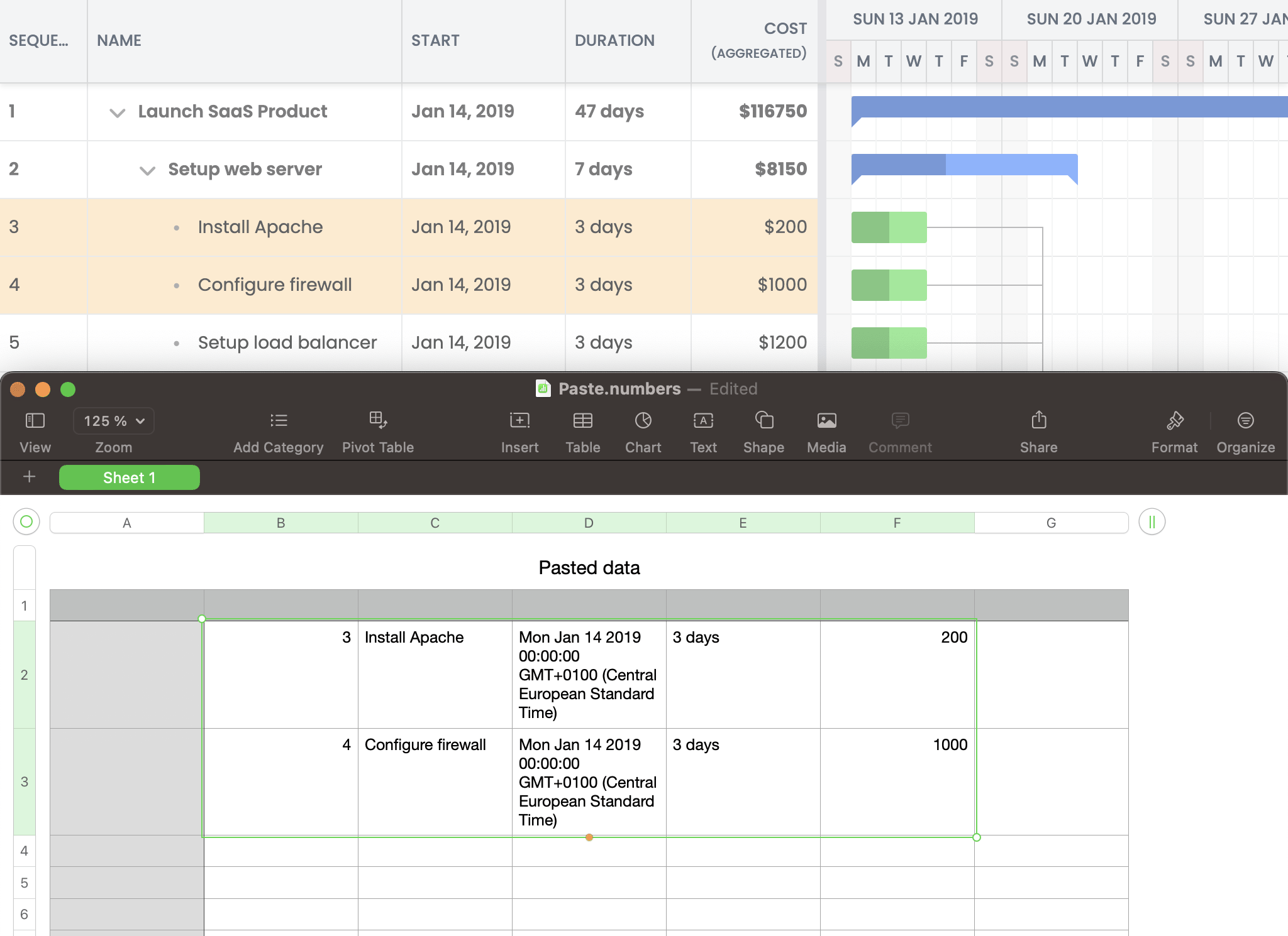
The RowCopyPaste, CellCopyPaste, EventCopyPaste and TaskCopyPaste features have been enhanced to use a page-global internal clipboard, and also supports the browser’s native Clipboard API if accessible. This means that it is possible to copy and paste between multiple instances of Grid-based components. It is also possible to copy a range of cells etc. and paste into an external application like Excel (depending on platform).
If your browser supports it, you can try the native clipboard functionality out in the updated Aggregation column demo:
New timeline histogram view in Scheduler
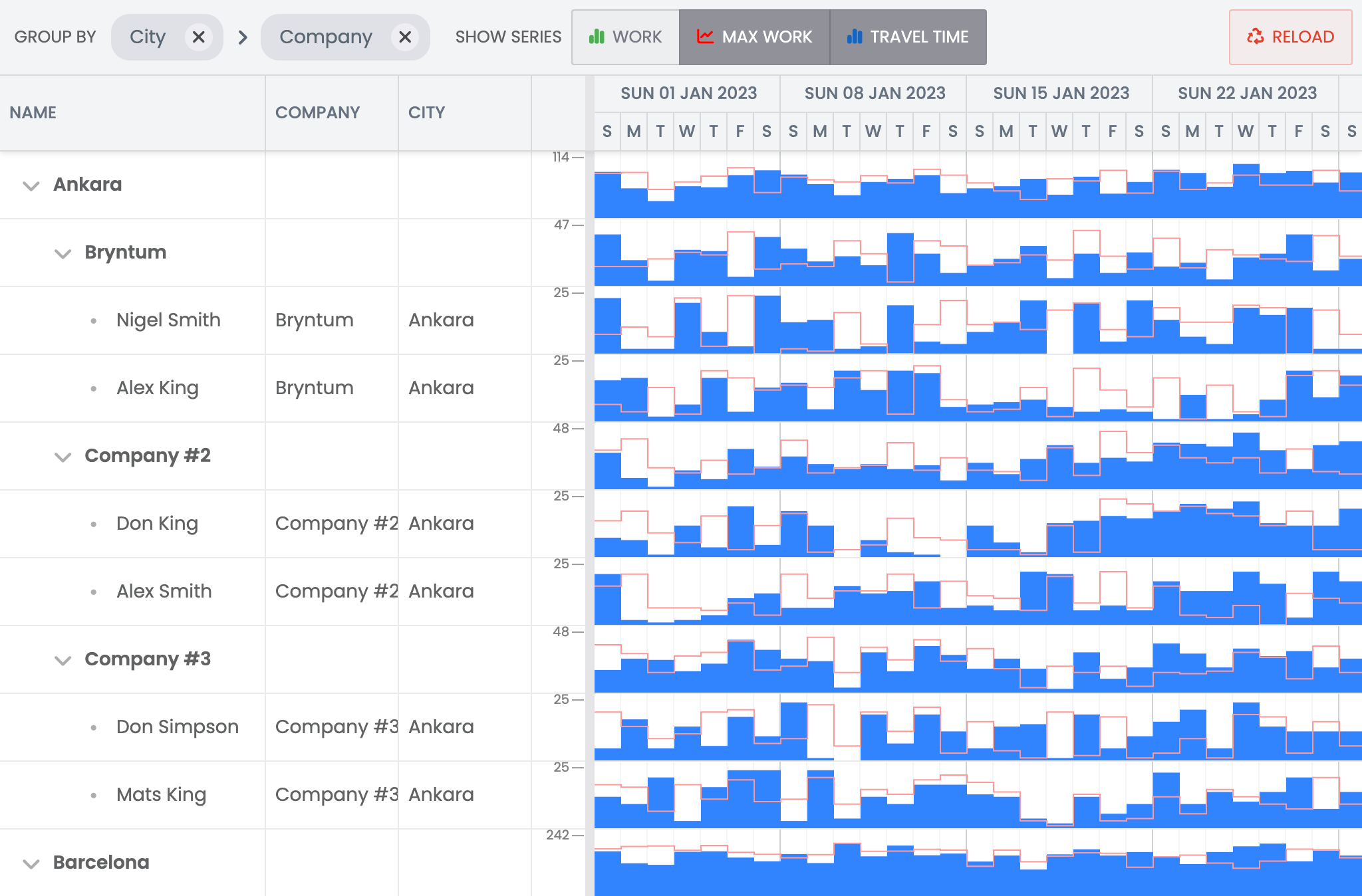
This release introduces a brand new TimelineHistogram widget which combines a grid widget with a histogram timeline. It can be used to visualize temporal data series, as demonstrated in the new Timeline histogram demo:
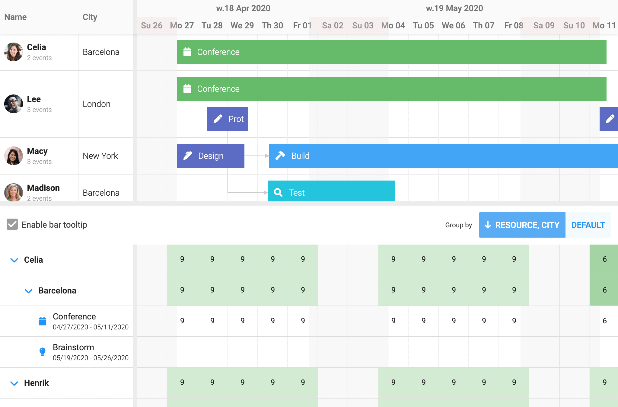
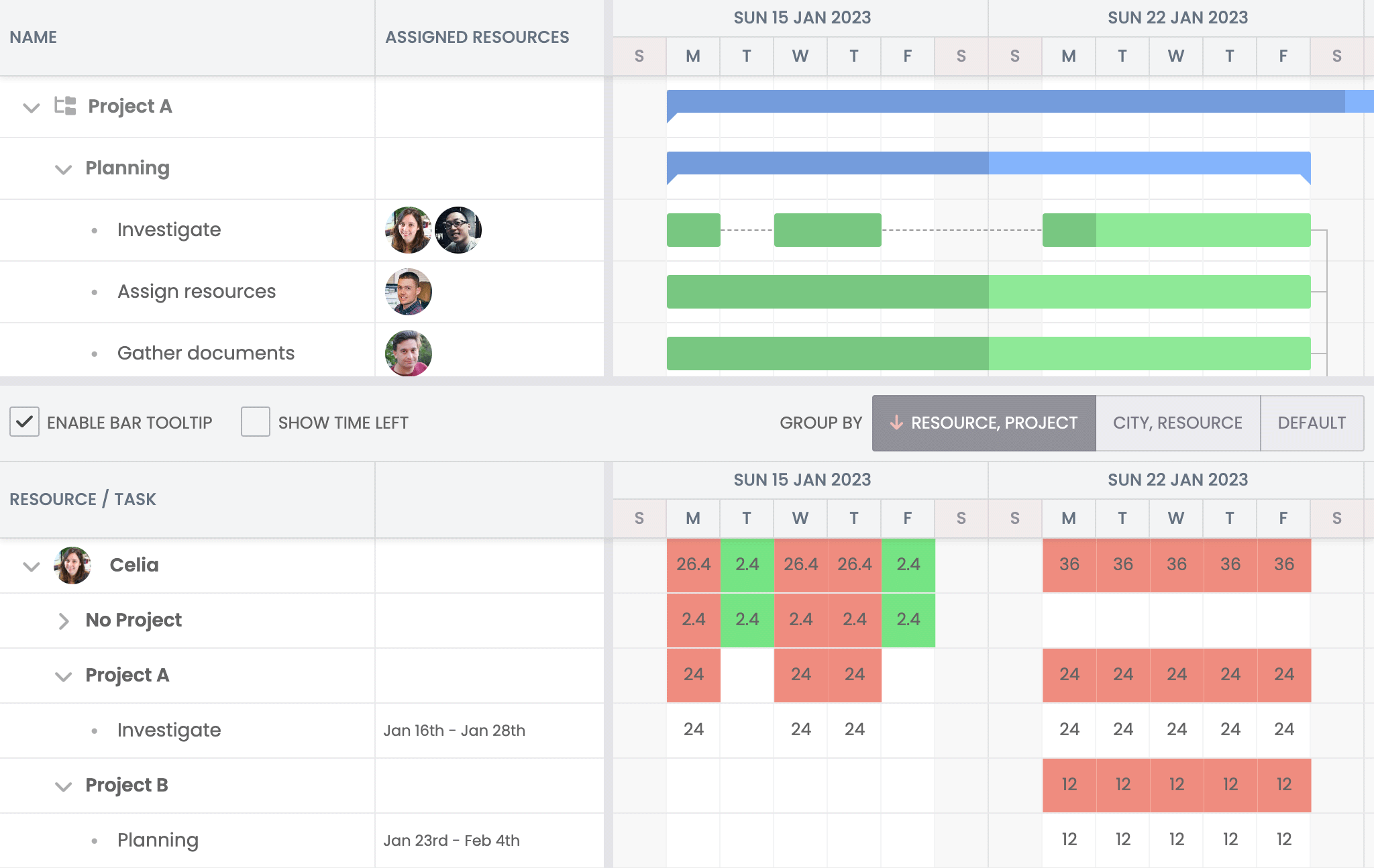
Grouping improvements for resource histogram & utilization views
This release adds better grouping (and tree grouping) support to the ResourceHistogram and ResourceUtilization views. The classes now automatically aggregate data on parent node levels based on corresponding child nodes. Try it out in the updated Resource utilization demo in Scheduler Pro:
Or in the corresponding demo in Gantt:
New Baseline columns
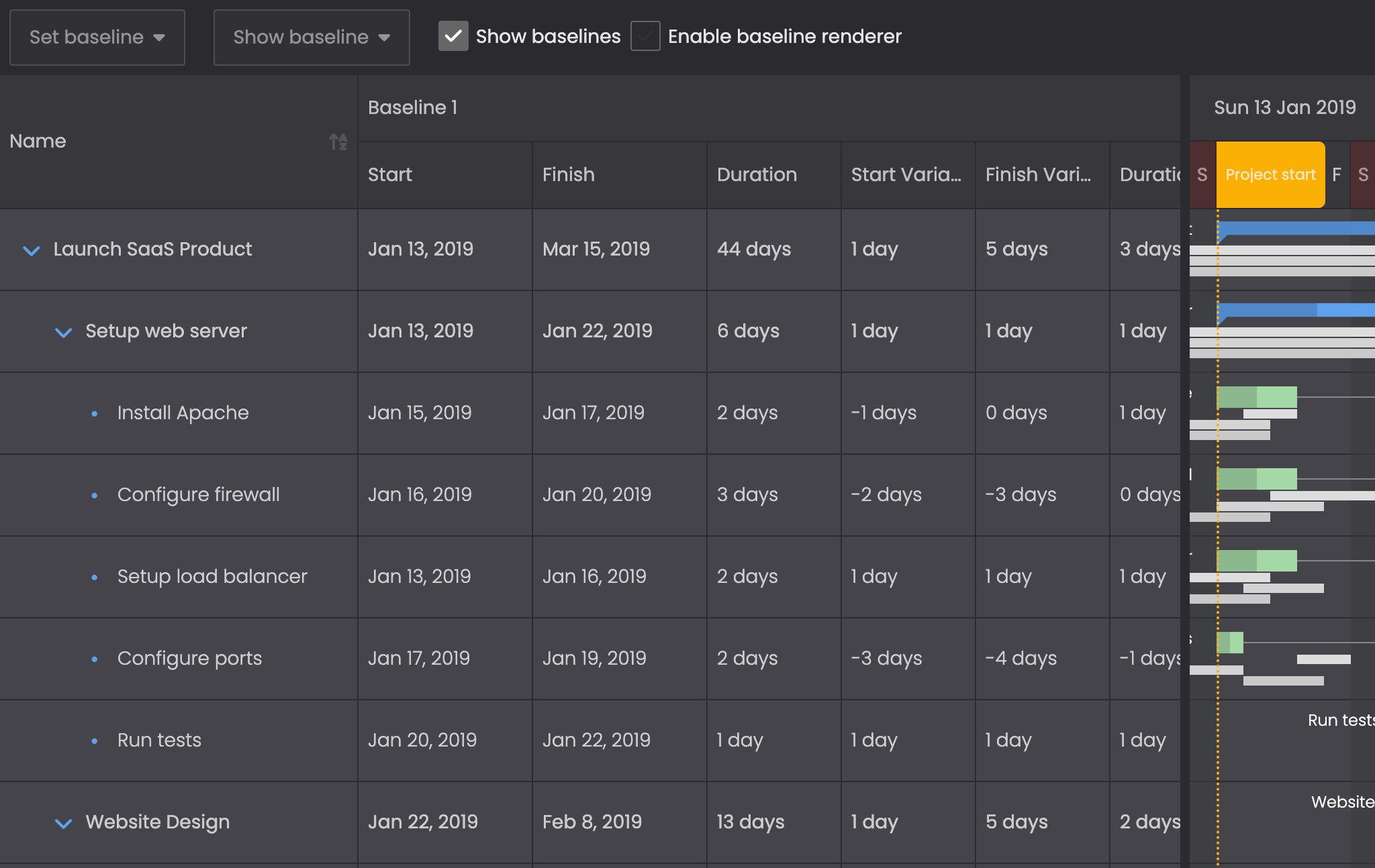
In the Gantt widget, we have added a new set of baseline columns:
- Baseline start (
BaselineStartDateColumn) - Baseline finish (
BaselineEndDateColumn) - Baseline duration (
BaselineDurationColumn) - Baseline start variance (
BaselineStartVarianceColumn) - Baseline end variance (
BaselineEndVarianceColumn) - Baseline duration variance (
BaselineDurationVarianceColumn)
By default, they show values for the first baseline, but can be configured to show and edit values for any baseline using the field config. You can try the new columns out in the updated Baselines demo:
More improvements
- The MergeCells feature now supports merging cells in all columns, not only sorted columns.
- Scheduler now supports simplified multi-assignment using the
resourceIdsfield. - Support for deeper nesting of events was added to Scheduler Pro
- Improved performance with large amount of columns and swimlanes in TaskBoard
- Improved UX for mobile editor popups (see
maximizeOnMobileconfig)
Release details
For full details about this release, please see the change logs, What’s New guides and upgrade guides of each product:
| Product | Changelog | What’s new | Upgrade guide | |
|---|---|---|---|---|
| Grid | ||||
| Scheduler | ||||
| Scheduler Pro | ||||
| Gantt | ||||
| Calendar | ||||
| TaskBoard |
What’s next?
5.4 marks a big step forward for us but we are far from done. We are currently working on bringing you RTL support, multi-product support when using wrappers, improved TypeScript support, live updates, filtering improvements and much more.
We hope you will find Is there a specific feature you would like us to add next?
Links
- Grid product page
- Scheduler product page
- Scheduler Pro product page
- Gantt product page
- Calendar product page
- TaskBoard product page
- Docs
- Examples