What’s New In 4.1.0

We strive to keep posts updated, but code samples may sometimes be outdated. Humans, see the Bryntum documentation; agents, https://mcp.bryntum.com for the latest info.
We are super thrilled to announce v4.1.0 of the Bryntum web component suite. This release brings a long awaited major new feature: NPM support. But there’s so many more new features and a whole lot of bug fixes too. For full details, please see the change logs and upgrade guides of each product:
- Bryntum Grid (upgrade guide)
- Bryntum Scheduler (upgrade guide)
- Bryntum Scheduler Pro (upgrade guide)
- Bryntum Gantt (upgrade guide)
- Bryntum Calendar (upgrade guide)
NPM support
For over a decade, we have offered our customers access to our releases as downloadable ZIP archives. We now also offer NPM packages for our web component suite. The packages can be installed and used as any other packages. This makes it very easy to use Bryntum components, especially with JS frameworks like Angular, React and Vue.
Bryntum components are commercial products and therefore they cannot be hosted in a public NPM repository. We have created our own repository at npm.bryntum.com that you can easily connect `npm` to with your customer zone or trial credentials.
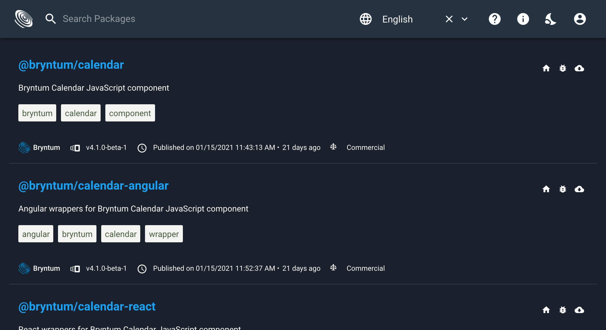
There are packages for each product in the Bryntum suite in the @bryntum namespace:
- `@bryntum/grid`
- `@bryntum/scheduler`
- `@bryntum/schedulerpro`
- `@bryntum/gantt`
- `@bryntum/calendar`
Also, for each product, we provide wrappers for the most popular JavaScript frameworks: Angular, React and Vue. For Grid, for example there are:
- `@bryntum/grid-angular`
- `@bryntum/grid-react`
- `@bryntum/grid-vue`
The last package available is `@bryntum/demo-resources` which contains styling, fonts and images used by our examples. Using it in your application is not mandatory. However, you can install it if you find it useful.
Each product now has its own guide describing how to get started with NPM, click here to see the Scheduler NPM repo guide.
Improved web component
Web components are great for encapsulating complex widgets and helps avoid CSS conflicts with the ‘main’ page framework like WordPress or Sharepoint. Our widgets have been refactored to fully support the web component model. Previous versions of our code made certain assumptions about the Widget existing inside the normal document.body, but this is now all cleaned up. Our updated web component wrappers now also have a destroy method, which you should call prior to removing the the wrapper from the page to ensure you don’t leak memory.
New web component demos were added in both Scheduler Pro + Calendar, example below:
<bryntum-calendar data-date="2018-04-02">
	<data>
		<events>
			<data data-id="1" data-name="Click me" data-resource-id="1" data-start-date="2018-04-02T10:00:00:000" data-end-date="2018-04-02T13:00:00:000"></data>
			<data data-id="2" data-name="Drag me" data-resource-id="2" data-start-date="2018-04-04T11:00:00:000" data-end-date="2018-04-04T13:00:00:000"></data>
			<data data-id="3" data-name="Resize me" data-resource-id="3" data-start-date="2018-04-05T08:00:00:000" data-end-date="2018-04-05T10:00:00:000"></data>
		</events>
		<resources>
			<data data-id="1" data-name="Daniel"></data>
			<data data-id="2" data-name="Steven"></data>
			<data data-id="3" data-name="Sergei"></data>
		</resources>
	</data>
</bryntum-calendar>
Under the hood, the widgets now share a common “float root” where all floating things (e.g. popups, tooltips) are rendered. This root is added once per document root or shadow root, ensuring that each web component is fully encapsulated.
Better Salesforce LWC support
As a direct result of the improved web component support described above, our widgets now need far fewer overrides to be implemented inside LWC. Gantt, Scheduler, Calendar and Grid all integrate seamlessly into the LockerService environment.
Promise.all([
    loadScript(this, SCHEDULER + '/scheduler.lwc.module.js'),
    loadStyle(this, SCHEDULER + '/scheduler.stockholm.css')
]).then(() => {
    new bryntum.scheduler.Scheduler({
        appendTo : this.template,
        ...
    });
})

Improved docs browser
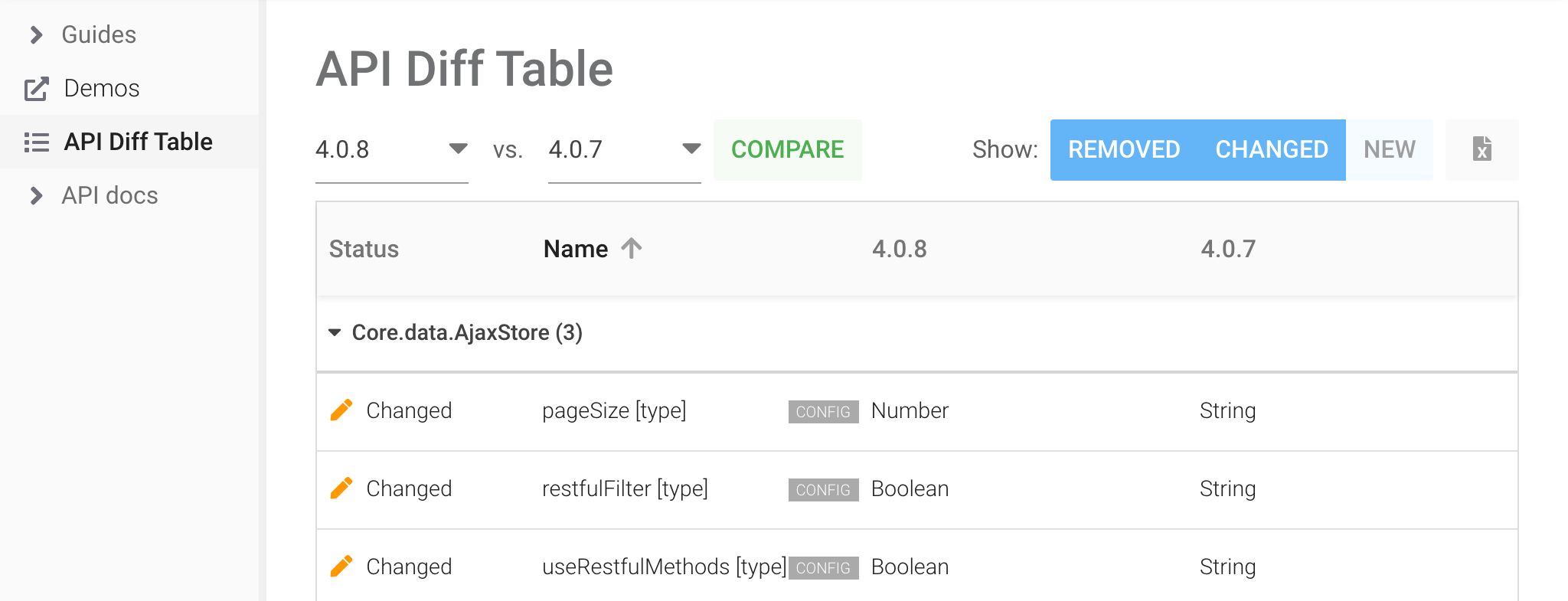
Our API documentation browser has a couple of cool new additions: fiddle panels and an API version diff viewer.
The fiddle panel is used as a container for all live demos throughout the API docs. It lets you view and edit the source directly in the docs, a great way of easily and quickly trying smaller things out:

The API diff viewer lets you see all public API changes between two versions of the product. A good compliment to the upgrade guides when upgrading from one version to another:
RequireJS support discontinued
We have removed support and demos for the outdated RequireJS module loader. Moving forward we encourage everyone to use ES modules, as we plan to also discontinue the UMD bundles when we drop support for IE11 on May 1st 2021.
React 17 demos and improvements
In addition to the NPM support described above, which makes getting started with our components and React much easier we have also added a new React 17 demo to each product:
- Grids big dataset demo
- Schedulers vertical mode demo
- Scheduler Pros timeline demo
- Gantts timeline demo
- Calendars visible hours demo
Another improvement worth mentioning is the new discardPortals config on the React wrappers. Setting it to false will keep any portals created by the wrapper in memory for later reuse, trading memory for increased scroll performance with JSX renderers.
Widgets can now go fullscreen
The Widget base class now exposes two new methods requestFullScreen / exitFullscreen which manages moving the float root inside the element going fullscreen to ensure tooltips and other floating widgets continue working well.
News in Grid
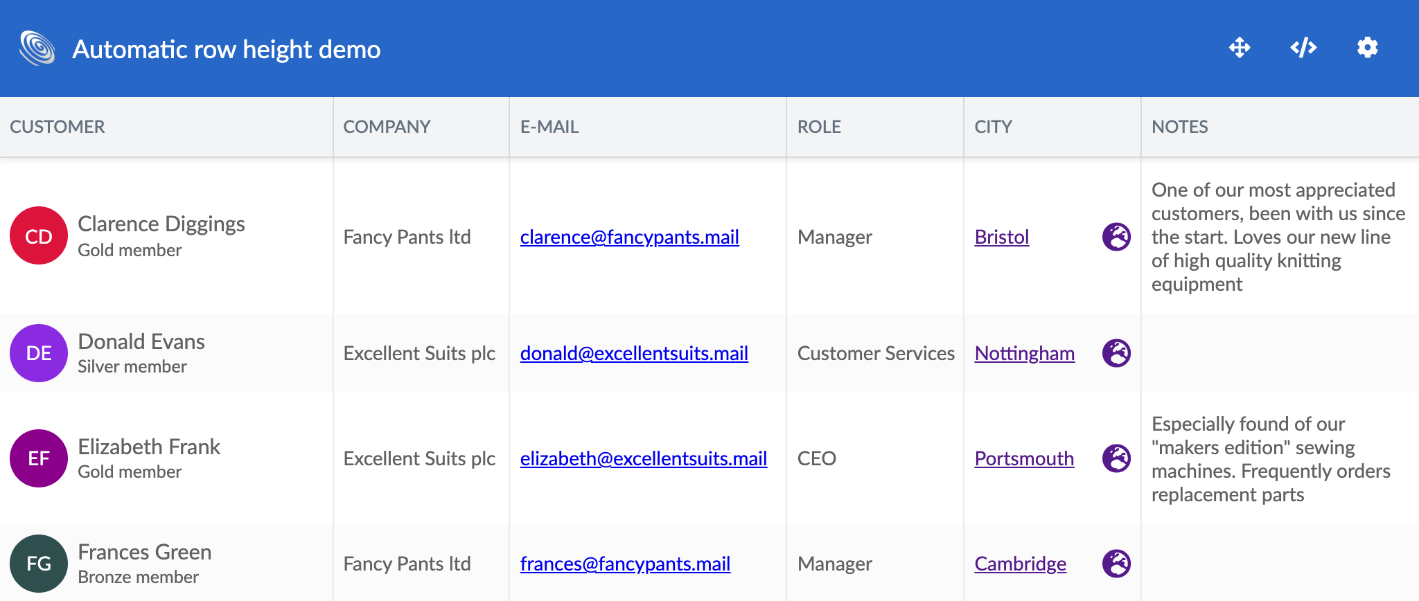
Columns can now be configured to measure the height of their cells, shrinkwrapping their content. This allows rows to grow and shrink with their content (a BIG disclaimer: using this mode degrades performance). Check it out in the new “Automatic row height” demo:
The popular filterBar feature has a new compact mode that turns the filtering fields “invisible”. Try it in the updated filterbar demo:

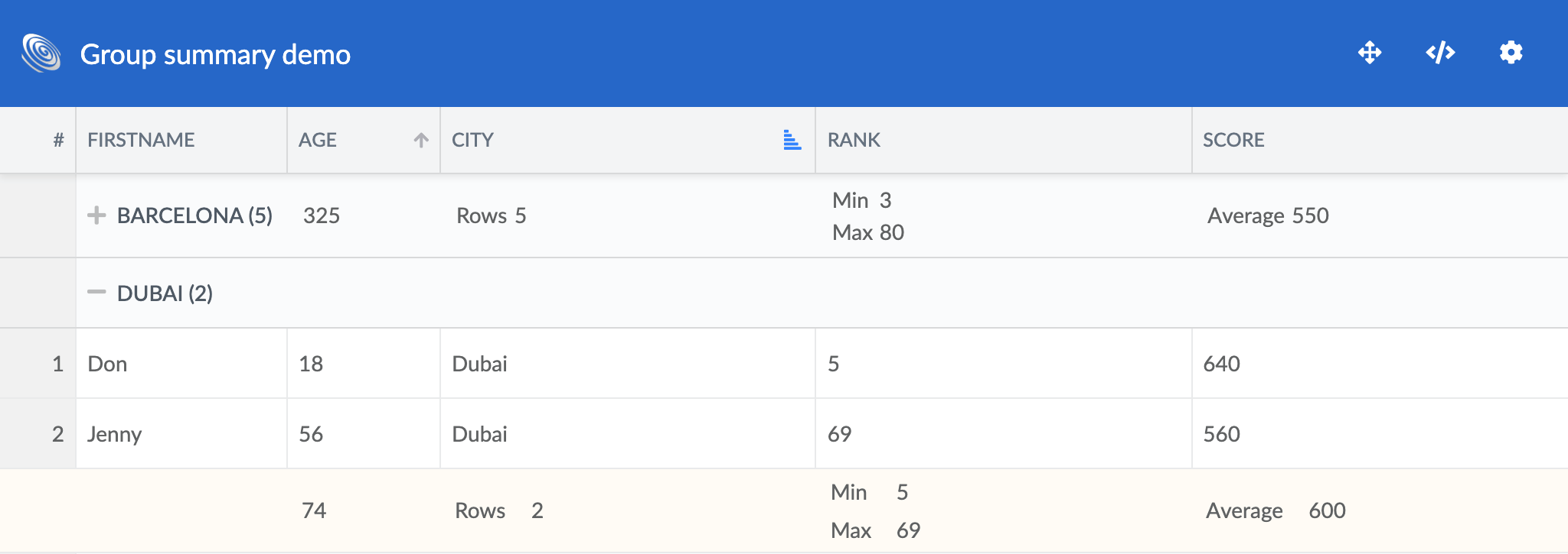
Group summaries can now be moved to the group header when a group is collapsed, making them always visible. See the new collapseToHeader config and try it out in the updated groupsummary demo:
News in Scheduler & Scheduler Pro
This release contains many improvements to the event layout process in the Scheduler. The most major addition (actually introduced in 4.0.4) is the new StickyEvents feature, which allows events text to stick as the event is scrolled partially out of view. The feature is enabled by default and on display in most of our demos:
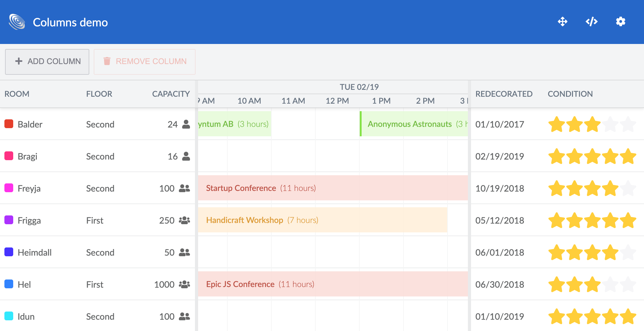
The 4.1.0 release also allows controlling the event layout mode for individual resources, by allowing you to specify per-resource eventLayout, resourceMargin, barMargin and rowHeight. On display in the updated rowheight and layouts demos:

To avoid having labels overlapped by adjacent events, the labels feature can now be configured to take label widths into account during the event layout process. Check out the the new labelLayoutMode config and the updated labels demo:

Other small improvements worth mentioning are:
- The eventColor config on Scheduler, ResourceModel and EventModel now accepts colors in HSL, RGB and RGBA formats (in addition to hex and predefined named colors)
- Milestones can now display short texts in the diamond (1-2 chars). See the new milestoneTextPosition config
- The text of the current time indicator can be customized
- Using the visibleDate config you can specify a date to scroll to initially
News in Gantt
Resource avatars now fall back to rendering the resource initials when there is no image available. The code for this is shared with Scheduler, enabling the same functionality for the ResourceInformationColumn and the vertical Scheduler mode resource headers.
Other small improvements worth mentioning are:
- The behaviour of the WBS column was altered to match how it works in MS Project. It now retains its initial values after sort, filter operations.
- A new undo redo widget was added. Drop it into the toolbar of Gantt, Scheduler, Scheduler Pro or Calendar to easily get basic undo/redo support.
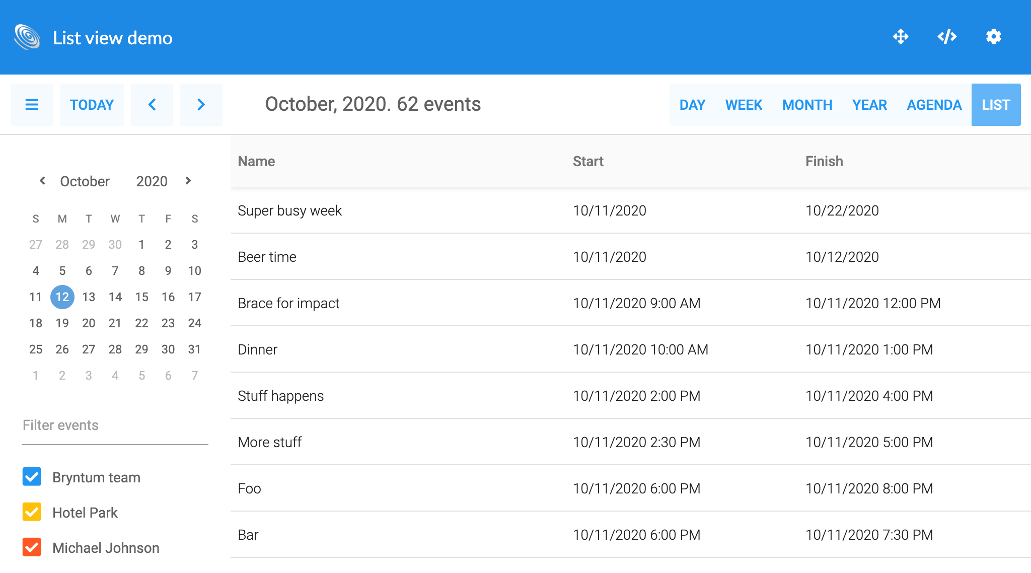
News in Calendar
Calendar has a new list mode, which displays the events in a table (using the new EventList widget). The columns in the list are automatically generated from the used event model and users can pick the range to display. Try it out in the new listview demo:
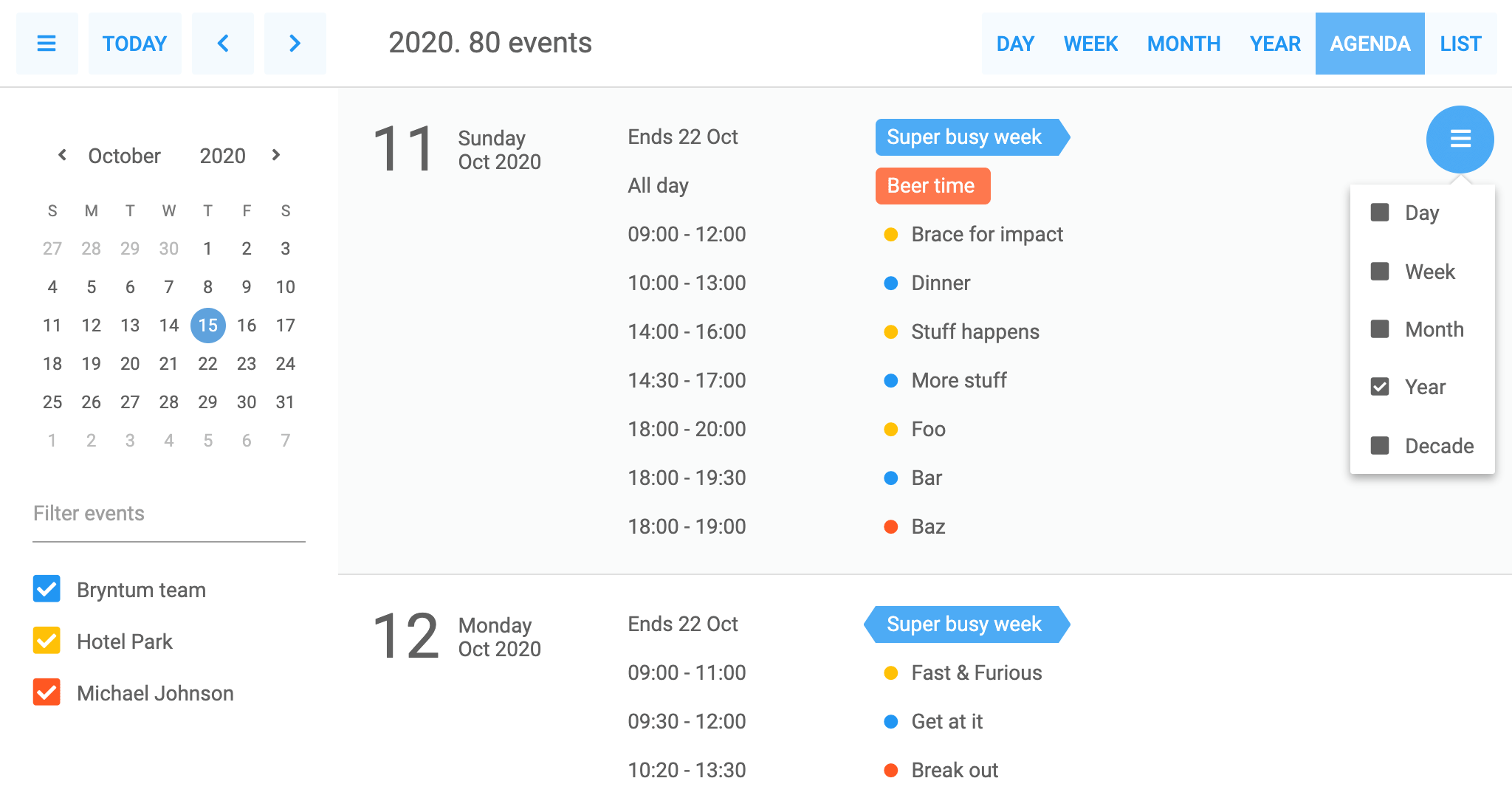
The Agenda view was updated, it is now based on the new List view. This enables picking a time range to display and proper projection of recurring events during that range:
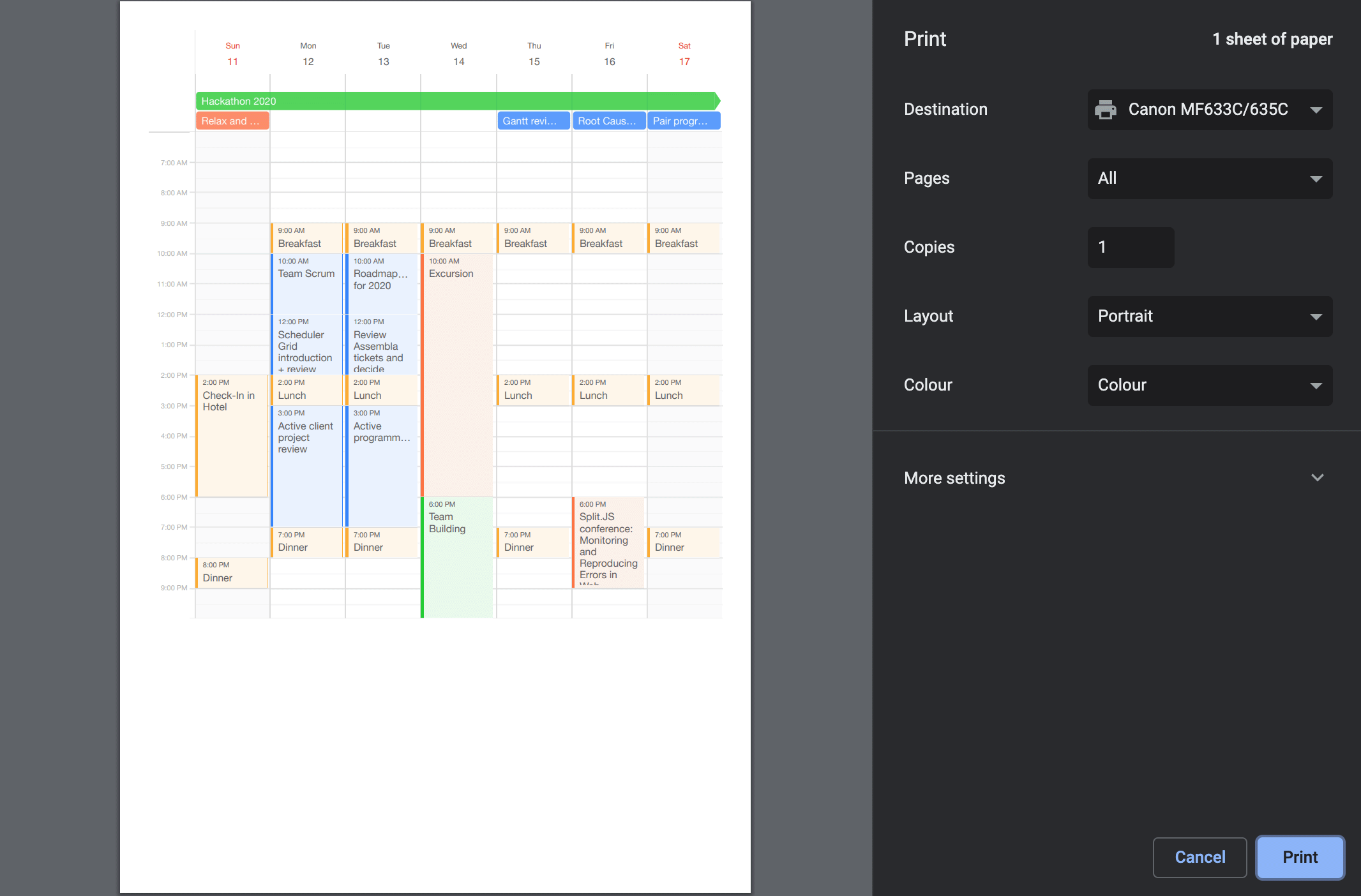
Calendar now also supports being printed, allowing you to print all of its views from the client side. This feature is showcased in the new print demo:
Other improvements worth mentioning are:
- A new Calendar + Scheduler combination demo, using Scheduler as a Calendar view
- Calendar can now expand rows (All day view, Month view) that have overflowing events
- Added two new context menu features: EventMenu and ScheduleMenu
Learn more
The new features and examples we add are almost exclusively a result of the feedback received from our community. We hope you will enjoy these new features and please keep the feedback coming. For full details please see each product change log, links at the top.