What’s new in 5.1.0
We strive to keep posts updated, but code samples may sometimes be outdated. Humans, see the Bryntum documentation; agents, https://mcp.bryntum.com for the latest info.
We are super happy to announce the new 5.1 release of our Bryntum web component suite. In this update, you will find a new Row Expander feature, improved nested events support, and much more. We also spent a lot of time improving our documentation and onboarding.
Onboarding
For the past 5 years or so we have focused on catching up with the functionality of our old product line. Each product comes with a huge API, making them highly customizable, and they ship with a lot of demos to show off the functionality.
Based on feedback from our customer base, all this can be a bit overwhelming. We are now focusing on making it easier to use the products by investing in the onboarding process.
These are some of the goals we are working towards over the coming releases:
- Improved documentation, especially the Getting Started parts
- More demos available for the major frameworks (React, Vue & Angular)
- Code viewer for the framework demos
- Code snippets in docs for each major framework
- Improved typings to help TypeScript users
Considering that we have around 300 different demos in plain JavaScript and some 2000 snippets it won’t happen overnight, but the work has begun.
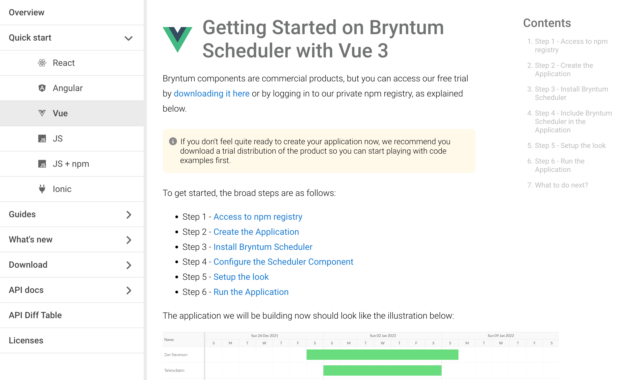
With this release we have reorganized the docs a bit and added content to make it easier to get started with the major frameworks:
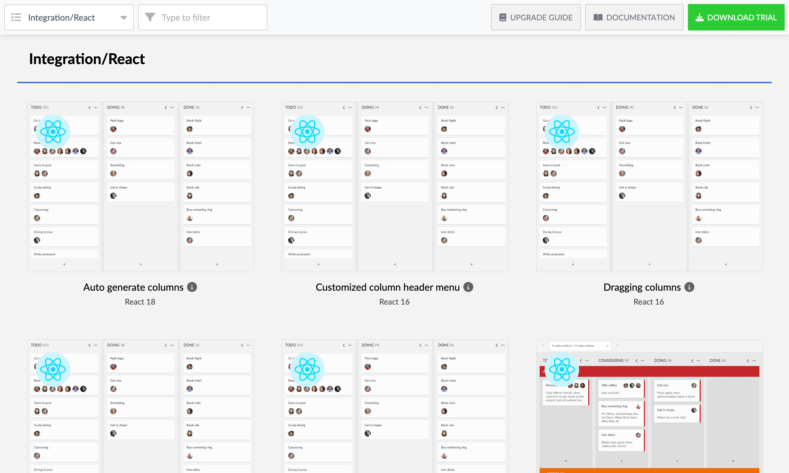
We have also ported 10+ vanilla JS demos to each framework:
And added “Create React App” templates for all products to simplify getting started with React. Available in our npm repo:
- CRA for Calendar
- CRA for Gantt
- CRA for Grid
- CRA for Scheduler
- CRA for SchedulerPro
- CRA for TaskBoard
Finally, this release comes with improved typings for configs and properties that accept a set of strings to now list available options. For example:
// Previously
type TextFieldConfig = {
  textAlign: string
}

// Now
type TextFieldConfig = {
  textAlign: 'left'|'center'|'right'|'start'|'end'
}
Nesting events in Scheduler Pro
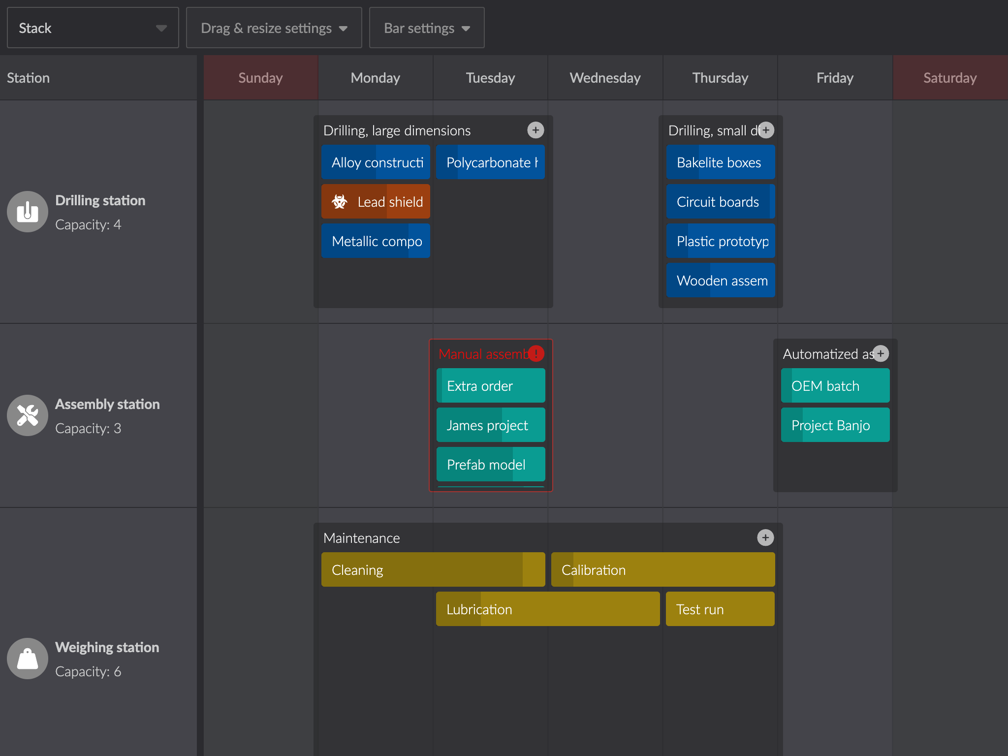
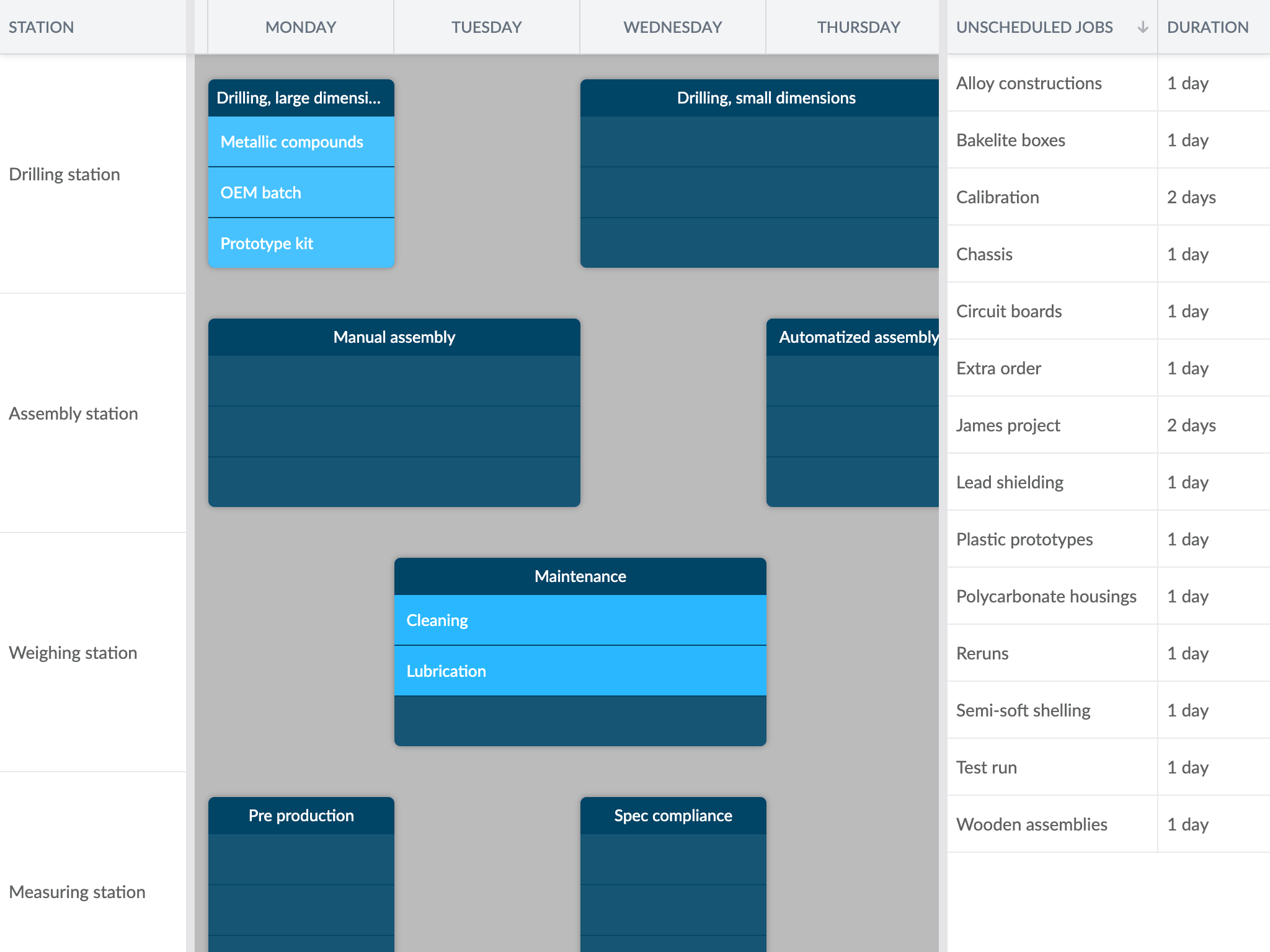
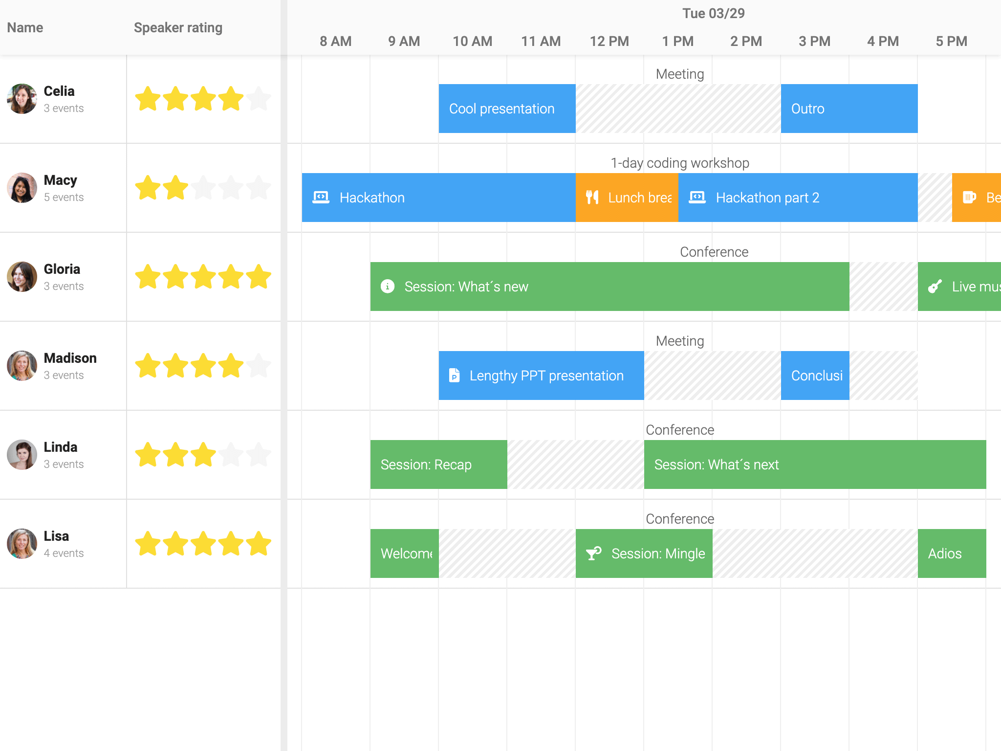
Scheduler Pro now supports nesting events (one level deep) by consuming a tree store and enabling the new NestedEvents feature. The nested events are draggable and resizable the same way as main events, and they can be dragged into, out of and between parent events (this behaviour is configurable).
The feature comes with two new demos, and the previously existing demo was rewritten to take advantage of the new feature:
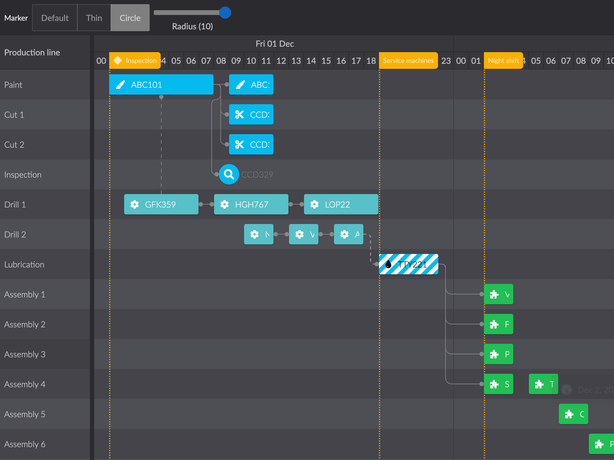
Dependencies feature improvements
The dependencies feature got a big overhaul in this version, enabling the following (while at the same time removing 1000+ lines of code):
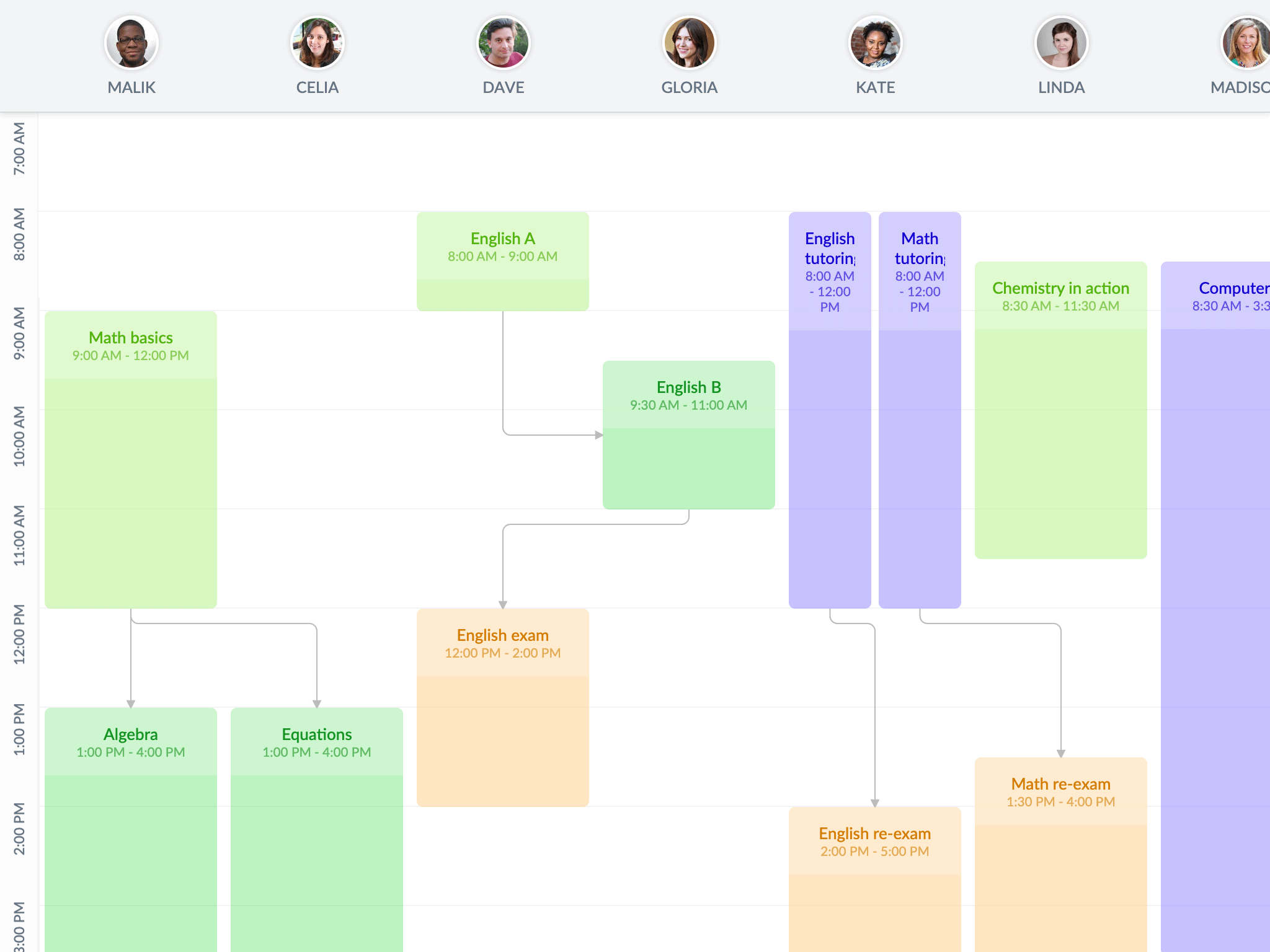
- Dependencies in vertical mode in Scheduler
- Live redrawing of dependencies during transitions, drag and resize operations
- A renderer config, allowing apps to affect the outputted SVG per dependency
- Rounded “corners” by configuring a radius
- Custom arrow heads
The existing dependencies demo was updated to showcase the new functionality and we added a new demo for vertical mode:
Row expander in Grid
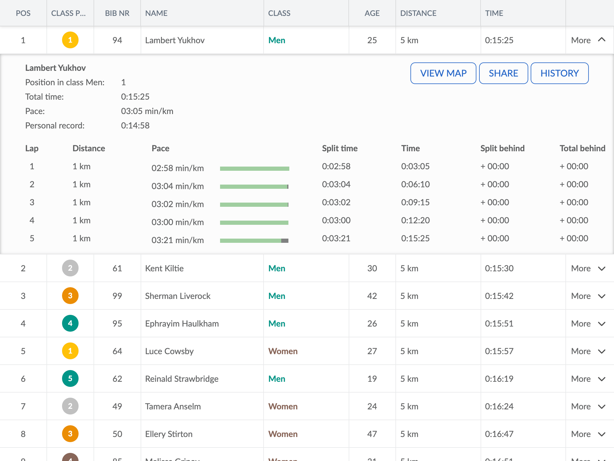
Grid has a much requested new RowExpander feature that lets you expand and collapse rows, rendering any custom markup into the expanded part. Try it out in this new demo:
Angular components now use ES module bundle
The Angular wrapper and accompanying demos now use the ES module bundle instead of the legacy UMD bundle. Aside from being a more modern approach, the bundle is slightly smaller and more performant. If you are using our Angular wrapper, you need to adjust your imports accordingly:
// 4.x imports from the umd bundle
import { TaskModel } from '@bryntum/gantt/gantt.umd.js';

// 5.1 imports from the module bundle (which is the default bundle for the package)
import { TaskModel } from '@bryntum/gantt';
The Vue and React wrappers already use the ES module bundle. Please note that the UMD bundle will still be available but not used by default.
More news
The release contains even more new features and improvements, such as:
- Most keyboard shortcuts are now configurable using the
keyMapconfig - Scheduler’s vertical mode now supports variable resource column widths
Release details
For full details about this release, please see the change logs, What’s New guides and upgrade guides of each product:
| Product | Changelog | What’s new | Upgrade guide | |
|---|---|---|---|---|
| Grid | ||||
| Scheduler | ||||
| Scheduler Pro | ||||
| Gantt | ||||
| Calendar | ||||
| TaskBoard |
Summing up
Version 5.1 brings some really nice new features and demos, almost exclusively based on the feedback received from our customers and community. We hope you will enjoy this release and please keep your feedback coming. Is there a specific feature you would like us to add next?
For full details please see each product change log, links above.
Build it with Bryntum Calendar
Start a free trial, explore live demos, or read the docs.