Using multiple Bryntum components
We strive to keep posts updated, but code samples may sometimes be outdated. Humans, see the Bryntum documentation; agents, https://mcp.bryntum.com for the latest info.
The Bryntum range of web components makes your job easy, but can you use more than one Bryntum product in a single page?
With Bryntum thin components, you can. Bryntum products share the same data model, which means you can combine them to provide different views of the underlying data. But the standard Bryntum component packages contain the complete codebase for all the products, which can negatively impact efficiency and cause runtime issues when you use them together.
Bryntum thin packages contain only the code and styling you need for a single product, enhancing performance and streamlining the application development process. Take a look at our quick start guides to using multiple Bryntum components together with Angular, React, Vue, and Ionic.
This blog post will show you how to use thin packages to create a single page featuring a Bryntum Task Board for to-do list management and a Bryntum Grid to display an employee list. You’ll also learn how to configure the components to share a data source for seamless integration and interaction.
Getting Started
Start by doing the following:
- Create a Vanilla JavaScript Vite project using
npm create vite@latest. - Add the project name (for example,
multiple-components). - Select
Vanilla>JavaScript. - Install the dependencies with
cd multiple-components && npm install.
Now you can install the Bryntum components using npm. First, get access to the Bryntum private npm registry by following the guide in our docs.
Next, install the Bryntum Grid and Bryntum Task Board thin packages
// Install grid, taskboard and related package
npm install @bryntum/grid-thin @bryntum/taskboard-thin @bryntum/core-thin @bryntum/engine-thin
We’ll tweak the Bryntum theme variables using SCSS, so install scss now:
npm install sass
You won’t need the counter.js file in this project, so you can delete it.
Rename the style.css to style.scss and replace the content with:
@import url("https://fonts.googleapis.com/css2?family=Poppins:wght@400;600;700&display=swap");

html,
body {
  font-family: Poppins, "Open Sans", Helvetica;
}
Creating a basic task board
To create a grid structure for the to-do list, replace the content of main.js with the following code:
import { TaskBoard } from "@bryntum/taskboard-thin";

const taskBoard = new TaskBoard({
  appendTo: "app",

  features: {
    taskMenu: false,
    columnDrag: true,
    simpleTaskEdit: true,
  },

  tbar: ["Bryntum AB", "->", "Employee Task List"],

  newTaskDefaults: {
    name: "Add title",
    description: "Add description",
    team: "Pick team",
  },

  // Columns to display
  columns: [
    { id: "todo", text: "Todo", color: "blue" },
    { id: "doing", text: "Doing", color: "light-green" },
    { id: "review", text: "Review", color: "green" },
    { id: "done", text: "Done", color: "gray" },
  ],

  // Field used to pair a task to a column
  columnField: "status",
});
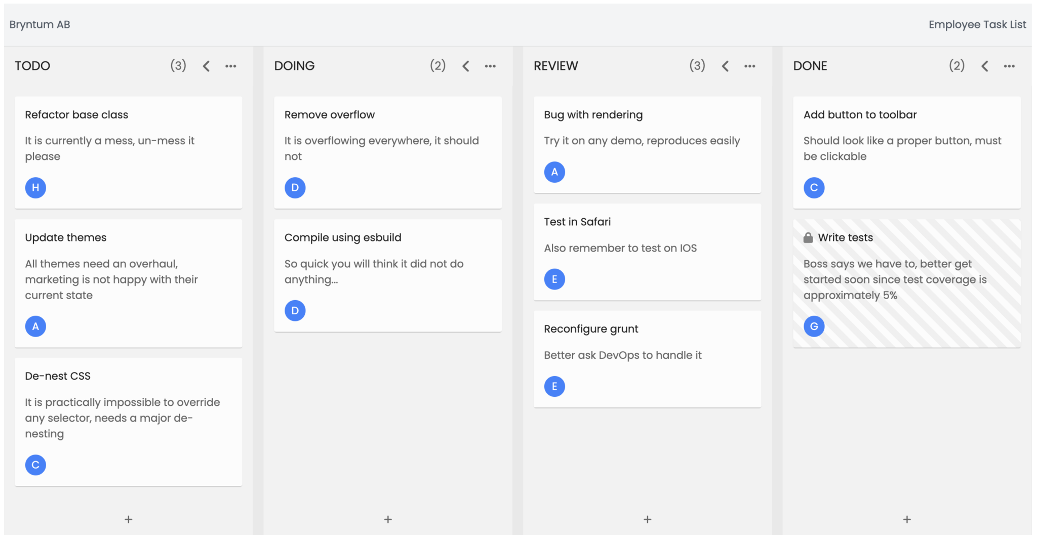
This creates a basic task board structure.
Now import the default theme for Bryntum Task Board at the top of the style.scss file:
@import "@bryntum/core-thin/core.stockholm.css";
@import "@bryntum/taskboard-thin/taskboard.stockholm.css";
Import style.scss in main.js:
import "./style.scss";
Run the dev server by executing:
npm run devYou will see the basic task board in the browser:

Fetching data from an external resource
Create a public/data.json file and populate it with the following code:
{
  "success": true,
  "tasks": {
    "rows": [
      {
        "id": 1,
        "name": "Bug with rendering",
        "description": "Try it on any demo, reproduces easily",
        "status": "review",
        "prio": "medium"
      },
      {
        "id": 2,
        "name": "Add button to toolbar",
        "description": "Should look like a proper button, must be clickable",
        "status": "done",
        "prio": "low"
      },
      {
        "id": 3,
        "name": "Remove overflow",
        "description": "It is overflowing everywhere, it should not",
        "status": "doing",
        "prio": "medium"
      },
      {
        "id": 4,
        "name": "Test in Safari",
        "description": "Also remember to test on IOS",
        "status": "review",
        "prio": "low"
      },
      {
        "id": 5,
        "name": "Write tests",
        "description": "Boss says we have to, better get started soon since test coverage is approximately 5%",
        "status": "done",
        "prio": "high",
        "readOnly": true
      },
      {
        "id": 6,
        "name": "Refactor base classes!!",
        "description": "It is currently a mess, un-mess it please",
        "status": "todo",
        "prio": "low"
      },
      {
        "id": 7,
        "name": "Update themes",
        "description": "All themes need an overhaul, marketing is not happy with their current state",
        "status": "todo",
        "prio": "medium"
      },
      {
        "id": 8,
        "name": "De-nest CSS",
        "description": "It is practically impossible to override any selector, needs a major de-nesting",
        "status": "todo",
        "prio": "medium"
      },
      {
        "id": 9,
        "name": "Compile using esbuild",
        "description": "So quick you will think it did not do anything...",
        "status": "doing",
        "prio": "medium"
      },
      {
        "id": 10,
        "name": "Reconfigure grunt",
        "description": "Better ask DevOps to handle it",
        "status": "review",
        "prio": "high"
      }
    ]
  },
  "resources": {
    "rows": [
      {
        "id": 1,
        "name": "Angelo",
        "employed": "01-03-2014",
        "position": "Team Lead",
        "team": "Developer",
        "address": "2937 Colleen Circles",
        "image": "angelo.jpg"
      },
      {
        "id": 2,
        "name": "Celia",
        "employed": "28-03-2006",
        "position": "Senior Engineer",
        "team": "QA",
        "address": "21317 Nguyen Circles Suite 245",
        "image": "celia.jpg"
      },
      {
        "id": 3,
        "name": "Dave",
        "employed": "12-03-2015",
        "position": "Creative Lead",
        "team": "UX",
        "address": "35570 Sarah Key Apt. 013",
        "image": "dave.jpg"
      },
      {
        "id": 4,
        "name": "Emilia",
        "employed": "18-07-2020",
        "position": "Internee",
        "team": "Developer",
        "address": "3586 Andrew Forges",
        "image": "emilia.jpg"
      },
      {
        "id": 5,
        "name": "Gloria",
        "employed": "10-05-2018",
        "position": "QA Analyst",
        "team": "QA",
        "address": "2240 Angela Valley Suite 033",
        "image": "gloria.jpg"
      },
      {
        "id": 6,
        "name": "Henrik",
        "employed": "25-09-2011",
        "position": "Devops Engineer",
        "team": "DevOps",
        "address": "770 Carroll Run Suite 332",
        "image": "henrik.jpg"
      }
    ]
  },
  "assignments": {
    "rows": [
      {
        "id": 1,
        "event": 1,
        "resource": 1
      },
      {
        "id": 2,
        "event": 2,
        "resource": 2
      },
      {
        "id": 3,
        "event": 3,
        "resource": 3
      },
      {
        "id": 4,
        "event": 4,
        "resource": 4
      },
      {
        "id": 5,
        "event": 5,
        "resource": 5
      },
      {
        "id": 6,
        "event": 6,
        "resource": 6
      },
      {
        "id": 7,
        "event": 7,
        "resource": 1
      },
      {
        "id": 8,
        "event": 8,
        "resource": 2
      },
      {
        "id": 9,
        "event": 9,
        "resource": 3
      },
      {
        "id": 10,
        "event": 10,
        "resource": 4
      }
    ]
  }
}
The task board data contains Tasks, Resources, and Assignments. Assignments are how tasks and resources are connected. Learn more about the Bryntum Task Board store in the documentation.
In main.js, import the data by adding the following to the TaskBoard instance:
const taskBoard = new TaskBoard({
  // other configuration
  project: {
    loadUrl: "data.json",

    autoLoad: true,
  },
});
This will populate the task board with the data from public/data.json.
Styling the Bryntum Task Board
Bryntum components ship with five built-in themes that use SCSS variables internally. You can tweak the styling by modifying those variables.
Adding color to the task board
Append the style.scss file with the following:
.b-taskboardbase {
  --taskboard-body-padding: 2em;
  --taskboard-column-gap: 2em;

  --taskboard-card-border-top-radius: 5px;
  --taskboard-card-border-bottom-radius: 5px;

  --taskboard-column-header-box-shadow: 0 2px 2px rgba(0, 0, 0, 0.2);
  --taskboard-column-header-border-radius: 5px 5px 0 0;
  --taskboard-column-background: #f5f5f5;
  --taskboard-column-box-shadow: 0 2px 2px rgba(0, 0, 0, 0.2);
  --taskboard-column-border-radius: 0 0 5px 5px;

  --taskboard-card-header-background: currentColor;
  --taskboard-card-header-color: #fff;
  --taskboard-card-body-padding: var(--taskboard-card-padding);
}

.b-theme-classic-dark .b-taskboardbase {
  --taskboard-column-header-box-shadow: 0 2px 2px rgba(0, 0, 0, 0.7);
  --taskboard-column-background: #292929;
  --taskboard-column-box-shadow: 0 2px 2px rgba(0, 0, 0, 0.7);
}

.b-theme-classic-light .b-taskboardbase,
.b-theme-material .b-taskboardbase {
  --taskboard-column-background: #fbfbfb;
}

.b-theme-classic .b-taskboardbase {
  --taskboard-column-background: #d9d9d9;
}

// Above headers box-shadow
.b-taskboard-column {
  z-index: 3;
}

.b-simple-task-editor .b-resourcescombo {
  // Contrast picker icon against header
  .b-icon-picker {
    color: #fff;
  }

  // Right-align resources in the inline editor, to better match card layout
  .b-chipview {
    justify-content: flex-end;
  }
}

.b-resource-avatar {
  border: 1px solid #ddd;
}

// Use same color for the read-only icon as for the header
.b-taskboard-card.b-readonly .b-taskboard-card-header::before {
  color: var(--taskboard-card-header-color);
}
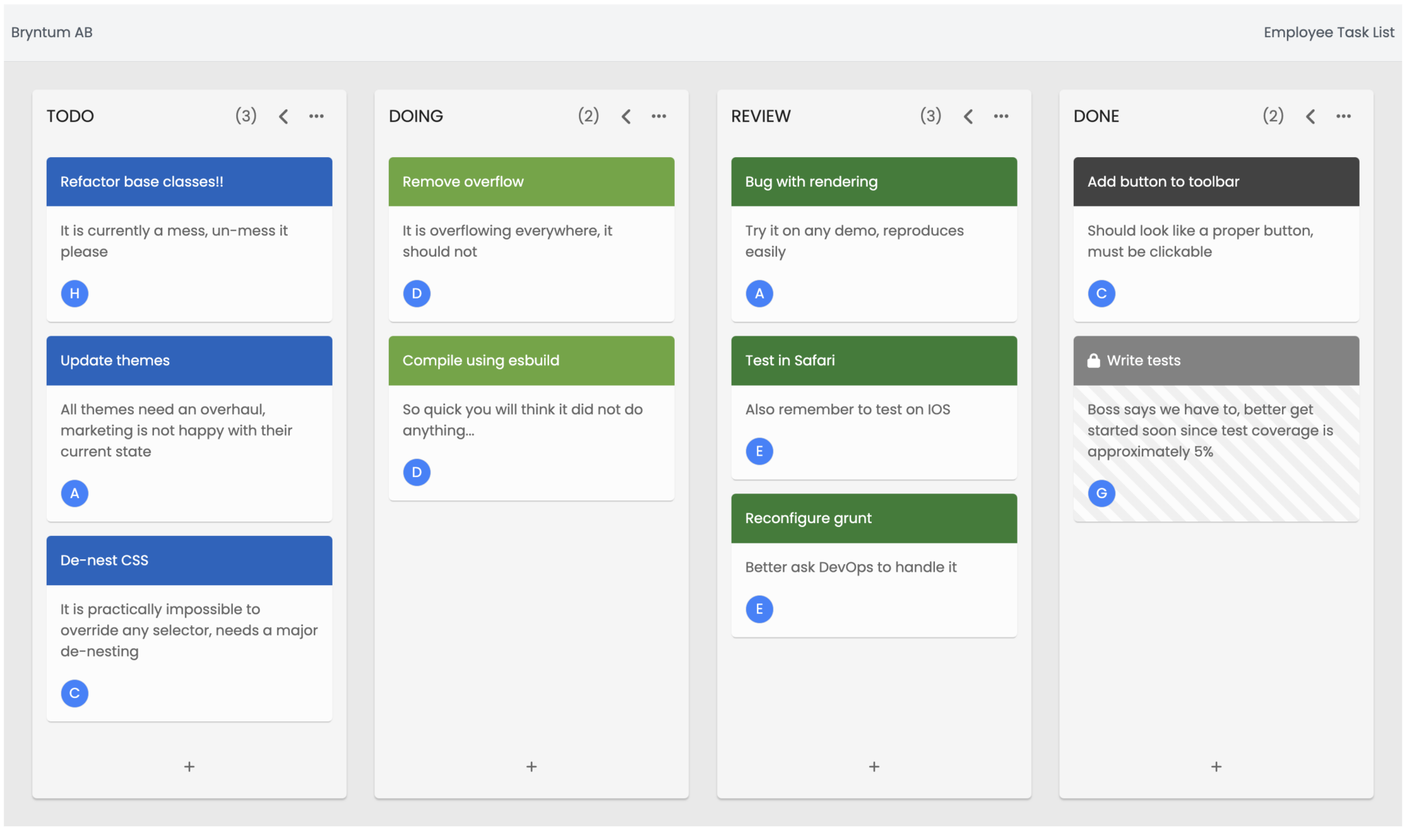
Now the task board is more visually appealing with added color.
Styling to-do items
Let’s improve the to-do items by modifying the task item header and footer.
Add the code below to main.js after the import statements:
const priority = ["low", "medium", "high"];

const taskBoard = new TaskBoard({
	// other config
Now add the code below to the TaskBoard instance in main.js:
	// Task item header
  headerItems: {
    text: {
      field: "name",
      // Configure inline editor for name field to make task name a mandatory field
      editor: {
        type: "text",
        required: true,
      },
    },
  },

  footerItems: {
    resourceAvatars: null,
    prio: {
      type: "template",
      template: ({ taskRecord }) =>
        `<div class='prio ${taskRecord.prio}-prio'>${taskRecord.prio}</div>`,
      editor: { type: "combo", items: priority },
    },
    resources: { type: "resourceAvatars" },
  },
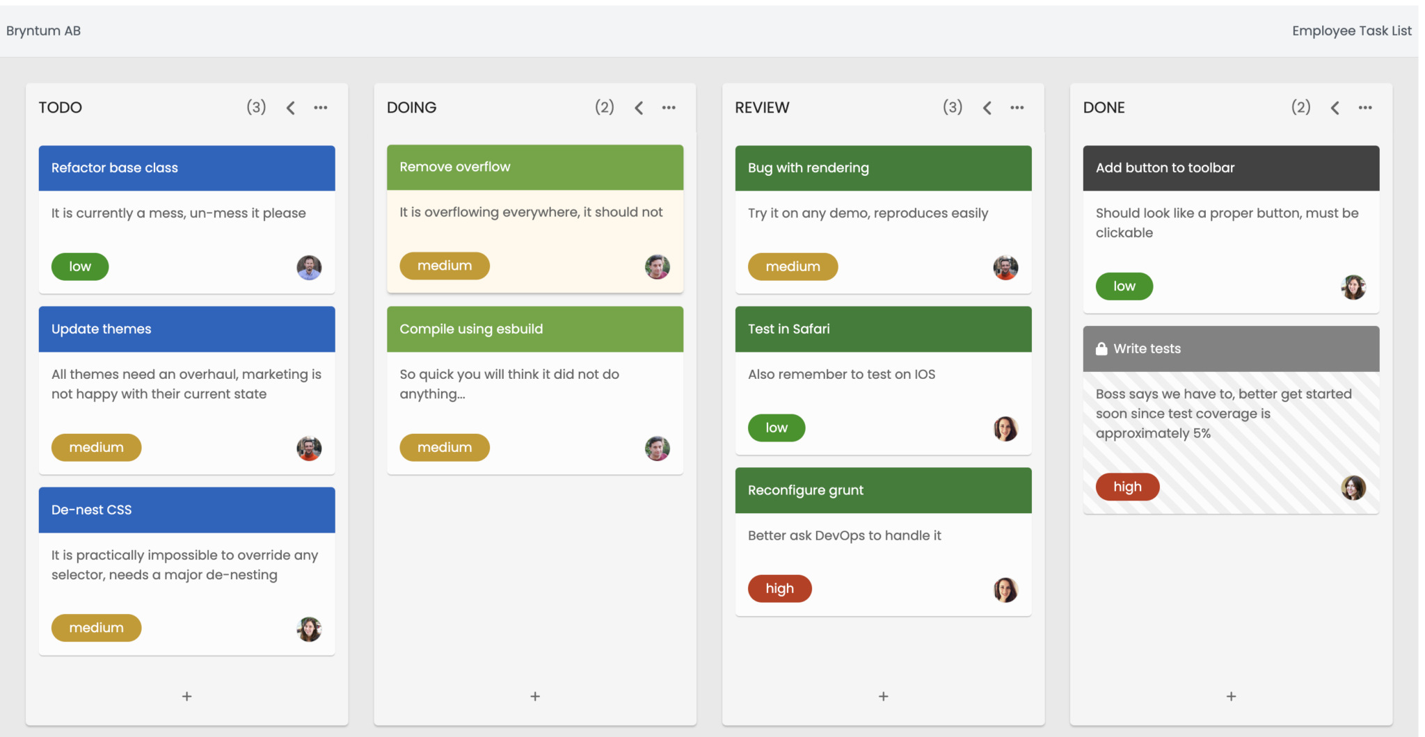
This adds priority tag to the left of the items’ footer placed before the name’s initial.
You can learn more about Task Items and configuring tasks’ headerItems and footerItems in the Bryntum Task Board documentation.
Adding team member images
Let’s replace each team member’s initial with their image.
First you need to add the images to public/images. Get the reference images we used here from the GitHub repo.
Next, add the following to the TaskBoard instance to replace the initial in the task header with the team member’s image:
const taskBoard = new TaskBoard({
  // other configuration
  // Url for resource avatar images
  resourceImagePath: "users/",
});
Styling the priority icon
Finally, modify the priority icon by adding the following styling to style.scss.
// Make resource avatars wide, to leave room for the editor
.b-taskboard-resource-avatars {
  width: 50%;
  display: flex;
  flex-wrap: wrap;
}

// Add margin to footer items on both sides evenly
.b-taskboard-card-footer {
  margin-top: 20px;
  justify-content: space-between;
}

.prio {
  color: white;
  padding: 5px 22px;
  border-radius: 50px;
}
.high-prio {
  background-color: #c23616;
}
.medium-prio {
  background-color: #c99916;
}
.low-prio {
  background-color: #259413;
}
The Bryntum Task Board to-do list will now look like this:
Creating a basic grid
To create a basic grid component, add the following code to the main.js file:
import { Grid } from "@bryntum/grid-thin";

const grid = new Grid({
  appendTo: "app",
  autoHeight: true,

  tbar: ["Bryntum AB", "->", "Employee Record"],

  columns: [
    {
      field: "name",
      text: "Name",
      flex: 1,
    },
    {
      field: "team",
      text: "Team",
      flex: 1,
    },
    {
      field: "position",
      text: "Position",
      flex: 1,
    },
    {
      field: "employed",
      text: "Employed Since",
      flex: 1,
    },
    {
      field: "address",
      text: "Address",
      flex: 1,
    },
  ],
});

// const taskboard = ...
Import the grid theme in style.scss:
@import "@bryntum/grid-thin/grid.stockholm.css";
Now you have a basic grid structure.
Populating the grid with data
The public/data.json file you created previously contains an array of resources that you can use to populate the grid
You may want to sync the grid data with taskboard, for that, you can use the taskboard’s resourceStore as grid’s store.
const taskBoard = new TaskBoard({
  // configuration
});

grid.store = taskBoard.project.resourceStore;
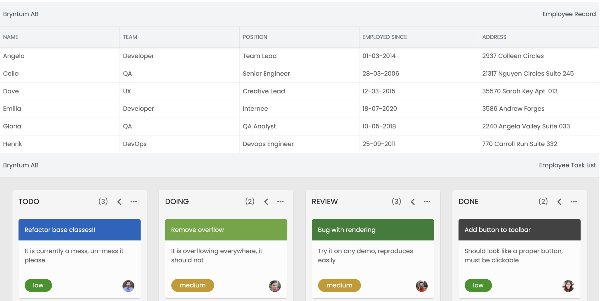
The grid is now populated with resources.
Styling the Bryntum Grid
Now you can tweak the grid appearance by modifying the style.scss file as you did with the task board.
Adding some basic styling
Notice that the grid and the task board components are attached and very close to each other. Let’s add some margin to create space between them.
.b-grid {
  margin: 20px 0px;
}
Now change the font-weight of the title and set the row height:
/* Styling for column and grid header */
.b-grid-header-text,
.b-column-title-text {
  font-weight: 600;
  font-size: 18px;
  color: #646464;
}

/* Spacing for cells */
.b-grid-row {
  height: 60px;
}
Finally, modify the tbar styling:
.b-toolbar-text {
  font-weight: bold;
  font-size: 20px;
  text-transform: uppercase;
}
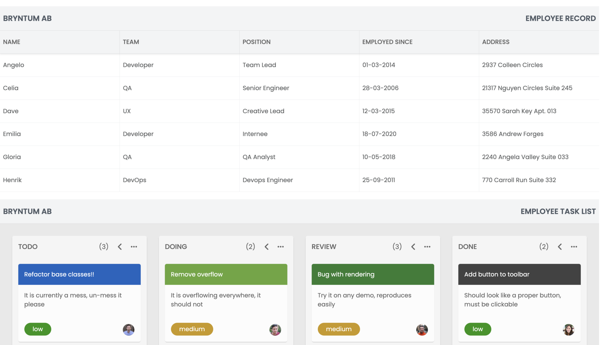
Now the grid component should look like this:
Styling the “NAME” column
Let’s improve the grid data by adding team members’ headshots to the “NAME” column.
Add the following function to main.js before the Grid instance:
const getAvatars = (value) => {
  return {
    tag: "img",
    class: "avatar",
    src: `/users/${value}`,
  };
};
Add the following renderer function to the name column in the grid:
    {
      field: "name",
      text: "Name",
      flex: 1,
      renderer({ record: { image }, value }) {
        return {
          class: "name-container",
          children: [getAvatars(image), { html: value }],
        };
      },
    },
Now you can add some CSS to improve the styling of data in the “NAME” column:
.name-container {
  display: flex;
  gap: 10px;
  align-items: center;
}

.avatar {
  height: 2.5em;
  width: 2.5em;
  border-radius: 50%;
}
Styling the “TEAM” column
Let’s improve the appearance of the “TEAM” column.
First, add team colors to main.js before the Grid instance:
const teamColor = {
  DevOps: "#ff6b6b",
  Developer: "#54a0ff",
  QA: "#1dd1a1",
  UX: "#ff9ff3",
};
Add a renderer function to the “TEAM” column:
{
      field: "team",
      text: "Team",
      flex: 1,
      renderer({ value }) {
        return {
          class: "badge", // the style should be defined in .css file
          style: {
            backgroundColor: teamColor[value],
          },
          text: value,
        };
      },
    },
Finally, add some CSS:
.badge {
  border-radius: 1em;
  padding: 0.4em 0.8em;
  color: #fff;
  text-align: center;
  min-width: 6em;
}
Now your Bryntum Grid component is complete.

Adding toggle buttons
Let’s add some buttons to the page that allow the user to toggle between the Bryntum component views.
First, open index.html and create a new div container before the app container:
<div id="buttons"></div>
<div id="app"></div>
Next, create buttons in main.js:
import { Button } from "@bryntum/core-thin";

/*
Grid and Taskboard code
*/

new Button({
  appendTo: "buttons",
  icon: "b-fa-list",
  text: "Toggle Grid View",
  cls: "b-raised",
  color: "b-blue",
  style: "margin: 10px",
});

new Button({
  appendTo: "buttons",
  icon: "b-fa-bars-progress",
  text: "Toggle Task View",
  cls: "b-raised",
  color: "b-blue",
  style: "margin: 10px",
});
The page will now show two buttons at the top.
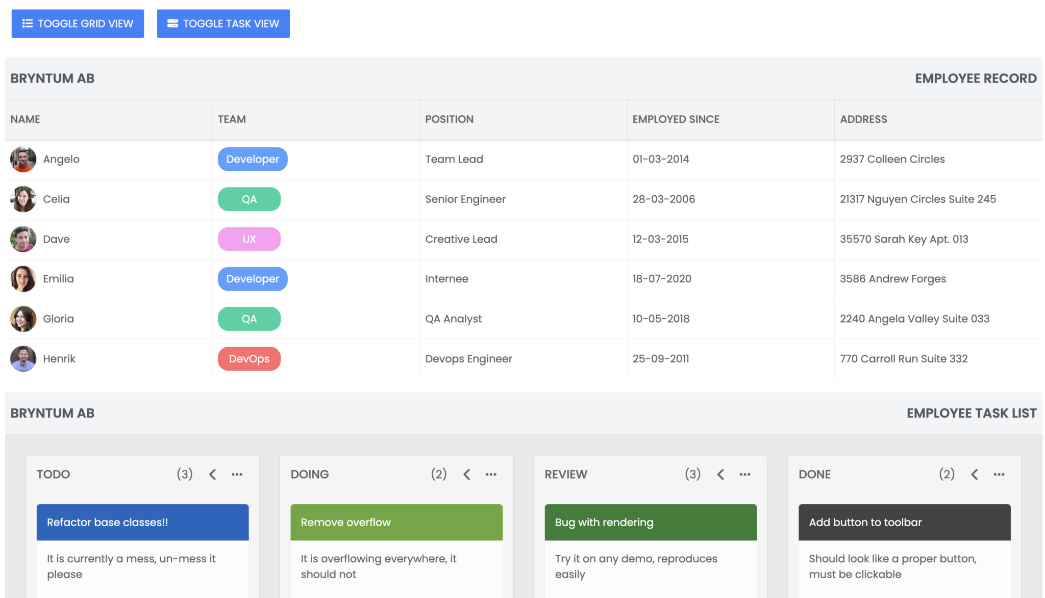
Let’s add the toggling functions to the buttons in main.js:
new Button({
	/* button config */
  text: "Toggle Grid View",
  onClick: () => {
    grid.hidden = grid.isVisible;
  },
});

new Button({
	/* button config */
  text: "Toggle Task View",
  onClick: () => {
    taskBoard.hidden = taskBoard.isVisible;
  },
});
Now you can toggle the components view using the buttons.
Next steps
Now that you know how to use multiple Bryntum components in a single-page application, you can browse the GitHub repo for this demo to see the final code.
You can use Bryntum component thin packages in popular frameworks React, Angular, and Vue. Here’s a guide from our docs on using the Bryntum Grid thin package in React.
To get inspiration for ways to use the Bryntum Grid component, visit our selection of interactive online examples.
Finally, if you’re new to Bryntum Grid, consider taking advantage of our 45-day trial – the perfect opportunity to explore the full capabilities of our tool in your projects. If you have any questions or need support along the way, our forums are always open.