Using htmx with Bryntum Scheduler
We strive to keep posts updated, but code samples may sometimes be outdated. Humans, see the Bryntum documentation; agents, https://mcp.bryntum.com for the latest info.
Bryntum Scheduler is a performant, feature-rich scheduling UI component built with JavaScript. In this tutorial, we’ll show you how to use htmx with Bryntum Scheduler. The htmx JavaScript library allows you to build complex user interfaces without a frontend framework. With htmx you can add new attributes to HTML to perform AJAX requests, use CSS transitions without JavaScript, establish a WebSocket connection, and respond to server-sent events. The power and simplicity of htmx have led to a recent surge in its popularity.
This tutorial shows you how to do the following:
- Set up a local MySQL database with events and resource data for a scheduler.
- Create another database table for extra information about the resources.
- Create an API endpoint to get the extra information about resources. We’ll add it to an Express server with API endpoints to get data and sync changes to the scheduler.
- Create a button in the scheduler using htmx to get the extra information about a resource and display it in a dialog box.
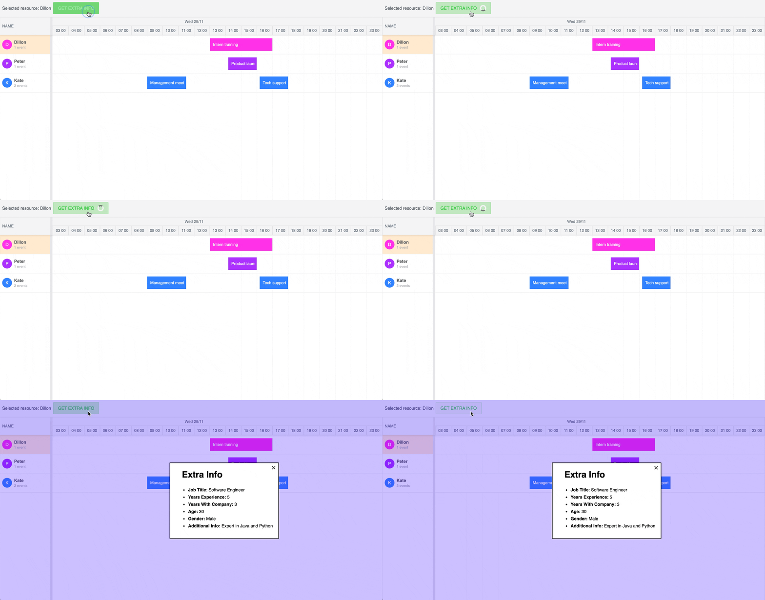
Here is what we’ll build:
Getting started
As a starting point, we’ll use a basic full-stack Bryntum Scheduler app with a separate backend and frontend. The frontend uses vanilla JavaScript, and the backend server is an Express app.
The backend server has REST API endpoints that we’ll use to perform CRUD operations on the database. We’ll store the scheduler data in a MySQL database.
Set up a MySQL database locally and set up an Express server
Clone the Express server starter GitHub repository and follow the instructions in the README.md file to create a local MySQL database, add example data to it, and connect it to the Express server. The completed-scheduler branch contains the code for the completed tutorial.
The Express server has two API routes, /api/load and /api/sync. The /api/load route will get events and resources from the MySQL database. The /api/sync route syncs changes to the Bryntum Scheduler on the frontend with the MySQL database. To get a detailed explanation of how the /api/sync route works, take a look at our tutorial on migrating from DHTMLX Gantt to Bryntum Gantt where we use a /sync route with similar logic.
Create an API endpoint to get extra information about a resource
Let’s create an API endpoint to get data from the resource_details table in the database. We’ll use htmx to issue an AJAX GET request when an HTML button element is pressed. The request will fetch the data. This extra information will not be used by the scheduler.
Add the following lines of code to the bottom of the server.js file:
app.get("/api/extra-info", async (req, res) => {
  const { id } = req.query;
  try {
    const extraInfo = await db.query(
      `SELECT jobTitle, yearsExperience, yearsWithCompany, age, gender, additionalInfo  FROM resource_details WHERE resourceId in (?)`,
      id
    );
    if (extraInfo[0].length === 0) {
      return res.send(`
        <div>No extra info for this resource</div>
    `);
    }
    const extraInfoObj = extraInfo[0][0];
    const {
      jobTitle,
      yearsExperience,
      yearsWithCompany,
      age,
      gender,
      additionalInfo,
    } = extraInfoObj;
    res.send(
      sanitizeHtml(`
    <div class="extraInfo">
      <h3>Extra Info</h3>
      <ul>
        <li><b>Job Title</b>: ${jobTitle}</li>
        <li><b>Years Experience:</b> ${yearsExperience}</li>
        <li><b>Years With Company:</b> ${yearsWithCompany}</li>
        <li><b>Age:</b> ${age}</li>
        <li><b>Gender:</b> ${gender}</li>
        <li><b>Additional Info:</b> ${additionalInfo}</li>
      </ul>
    </div>
    `)
    );
  } catch (error) {
    console.error({ error });
    res.send({
      success: false,
      message: "There was an getting the extra info for the resource.",
    });
  }
});
We get the resource id from the URL query parameter and use the MySQL2 query method to get extra information about the resource. An HTML string will be returned and displayed in a dialog on the frontend using htmx. To prevent XSS attacks, we use the sanitize-html library to escape any special characters in the resource_details data.
Import the sanitizeHtml library at the top of the server.js file:
import sanitizeHtml from "sanitize-html";Now let’s work on the frontend of our application.
Create a Bryntum Scheduler
Start by cloning the Bryntum Scheduler with htmx starter GitHub repository. The starter repository uses Vite as a development server and JavaScript bundler. Install the Vite dev dependency by running the following command:
npm installYou can try out Bryntum components for free using our public Bryntum trial packages. If you have a Bryntum license, please refer to our npm Repository Guide to access the private Bryntum repository.
Add the following CSS styles to the style.css file:
body {
  margin: 0;
  padding: 0;
}
body,
html {
  display: flex;
  flex-direction: column;
  height: 100vh;
  font-family: Poppins, "Open Sans", Helvetica, Arial, sans-serif;
  font-size: 14px;
}
This CSS is imported as a style sheet in the index.html file and makes the Bryntum Scheduler take up the full height of the screen.
In the main.js file, add the following lines of code to define and initialize a basic Bryntum Scheduler:
import { Scheduler } from "@bryntum/scheduler";
import "@bryntum/scheduler/scheduler.stockholm.css";
const scheduler = new Scheduler({
  appendTo: document.body,
  date: new Date(2023, 10, 29),
  viewPreset: "day",
  resources: [
    { id: 1, name: "Dan Stevenson" },
    { id: 2, name: "Talisha Babin" },
  ],
  events: [
    {
      resourceId: 1,
      name: "Intern training",
      startDate: "2023-11-29 13:00:00",
      endDate: "2023-11-29 17:00:00",
    },
    {
      resourceId: 2,
      name: "Product launch webinar",
      startDate: "2023-11-29 14:00:00",
      endDate: "2023-11-29 16:00:00",
    },
  ],
  columns: [{ text: "Name", field: "name", width: 160 }],
});
We import the Bryntum Scheduler component and the Stockholm CSS theme. The CSS theme is required to render the Bryntum Scheduler correctly. You can choose from five Bryntum themes you can modify or create your own theme. Learn more about styling in the styling guide.
The Bryntum Scheduler config has some example resources and events data that we’ll remove later.
Now run the local development server using the following command:
npm run devYou’ll see a basic Scheduler app:

Let’s get the data from our server into our Bryntum Scheduler.
Set up a Bryntum Scheduler Crud Manager to get data from and sync data changes to the server
Add the following lines of code to the top of the main.js file:
import { CrudManager } from "@bryntum/scheduler";
const crudManager = new CrudManager({
  transport: {
    load: {
      url: "https://localhost:1338/api/load",
    },
    sync: {
      url: "https://localhost:1338/api/sync",
    },
  },
  autoLoad: true,
  autoSync: true,
  // This config enables response validation and dumping of found errors to the browser console.
  // It's meant to be used as a development stage helper only so please set it to false for production systems.
  validateResponse: true,
});
We use the Bryntum Scheduler Crud Manager to simplify fetching data from our API endpoints. The transport property is used to configure the AJAX requests used by the Crud Manager to communicate with a server. The load URL is used to fetch our events and resource data. The Crud Manager expects the data it receives from the load API endpoint to have a specific structure.
The sync URL is used to sync data changes to our /api/sync API endpoint. For more information, you can read the guide in our docs.
Now remove the resources, events, and columns config properties in the scheduler to remove the example data. Add the following config properties in their place:
    crudManager,
    columns: [
      {
        type: "resourceInfo",
        text: "Name",
        width: 160,
      },
    ],
Start the server in one terminal and the frontend local application in another terminal using the following command:
npm run devYou should see the MySQL events and resources data in your Bryntum Scheduler:

Any changes you make to the events or resources will be persisted in your MySQL database.
Now let’s use htmx with our scheduler to dynamically get extra information about a resource.
Create a toolbar button to get and display extra information about a resource using htmx
Add the following tbar config to your scheduler below the columns property to get a Toolbar widget added to the top of the scheduler:
  tbar: [
    {
      type: "widget",
      ref: "resourceLabel",
      html: "No resource selected",
    },
    {
      type: "widget",
      ref: "extraInfoButton",
      icon: "b-fa b-fa-plus",
      html: "<button class='b-widget b-button b-text b-box-item b-green' disabled>Get extra info about the resource</button>",
    },
  ],
The toolbar container widget has two widgets. One is a label that will show which resource is selected, the other is a button that we’ll use to get extra information about the selected resource. The button uses classes from the Bryntum Button widget.
Add the following listeners config object below the tbar config:
  listeners: {
    cellClick(props) {
      const selectedResourceName = props.record.data.name;
      scheduler.widgetMap.resourceLabel.html = StringHelper.xss`Selected resource: ${selectedResourceName}`;
    },
  },
We use the cellClick event listener to determine the resource of the cell that’s been clicked in the scheduler. We then use the widgetMap object to select the resource label widget in the toolbar. We get the object using its ref property, which is an identifier by which a widget will be registered in the widgetMap, and set its HTML to include the name of the selected resource. The StringHelper.xss function helps prevent XSS attacks.
Make sure to import the StringHelper class along with the other imports at the top:
import { StringHelper } from "@bryntum/scheduler";Now click on a cell in your scheduler. You should see the name of the selected resource in the toolbar:

Fetch the extra information for a resource using htmx
The “Get extra info about the resource” button is not yet functional. We’ll use the cellClick event listener to swap out the button for one that uses htmx to fetch extra information about the selected resource.
First, we need to add htmx to our project. For simplicity, we’ll add it using a CDN. Add the following <script> tag to the <head> tag in your index.html file:
<script src="https://unpkg.com/htmx.org@1.9.9" integrity="sha384-QFjmbokDn2DjBjq+fM+8LUIVrAgqcNW2s0PjAxHETgRn9l4fvX31ZxDxvwQnyMOX" crossorigin="anonymous"></script>Note that you may want to consider not using CDNs in production.
In the cellClick event handler in your main.js file, add the following lines of code:
      const selectedResourceId = props.record.data.id;
      updateToolbarButton(selectedResourceId);
Here we get the resource ID from the props and pass it to the updateToolbarButton function.
Let’s define the updateToolbarButton function now. Add the following lines of code to the top of your main.js file:
function updateToolbarButton(selectedResourceId) {
  let toolbarButton = scheduler.widgetMap.extraInfoButton;
  if (toolbarButton) {
    toolbarButton.html = `<button hx-get="https://localhost:1338/api/extra-info?id=${selectedResourceId}" class="b-widget b-button b-text b-box-item b-green">Get extra info</button>`;
    // Manually process the updated part of the page with HTMX
    htmx.process(toolbarButton.element);
  }
}
We select the toolbar button widget using the widgetMap object. We then replace the HTML contents of the button to add a button with an hx-get htmx attribute. When this button is clicked, the hx-get attribute causes the button to make a GET request to our api/extra-info API endpoint. The HTML returned from our API endpoint is swapped into the innerHTML of the button. You can control the target of the swap and the swap type using the hx-target and hx-swap attributes. You can also control which events trigger the request by using the hx-trigger attribute.
We call the htmx.process() method to initialize the button element. You need to do this for any content added to the DOM by JavaScript with htmx attributes.
Now select a resource and click the toolbar button. You should see the extra information about the selected resource displayed in the button’s innerHTML:

You can see the GET requests made by htmx in your browser dev tools network tab.
Now let’s create a dialog to better display the extra information about our resources.
Create a dialog to display the extra information about a resource
We’ll use the HTML dialog element to create a dialog containing the extra information about the selected resource.
In your index.html file, add the following <dialog> element in the <body> element:
    <dialog>
      <div class="dialog-info"></div>
    </dialog>
In your main.js file, add the following query selector at the top of the file:
const dialog = document.querySelector("dialog");At the bottom of the file, add the following event listener:
document.body.addEventListener("htmx:beforeSwap", (e) => {
  dialog.showModal();
});
The htmx:beforeSwap event occurs before htmx swaps new content into the DOM. This event opens the modal window when requesting extra information about a resource. We use the dialog element’s showModal() method to display the dialog.
By default, htmx loads the HTML response into the element that made the request. To load the response into a different element, change the target element using the hx-target attribute. The hx-target attribute takes a CSS selector as a value. We’ll make the target element for the extra resource information the <div> inside the <dialog> element. Add the following htmx attribute to the HTML button string in the updateToolbarButton function:
hx-target=".dialog-info"Let’s also improve the styling of the extra information HTML returned. Add the following styles to your style.css file:
.dialog-info h3 {
  font-size: 2rem;
  margin: 0;
  margin-left: 1.2rem;
  padding: 0.5rem;
}
.dialog-info ul li {
  padding: 0.25rem;
}
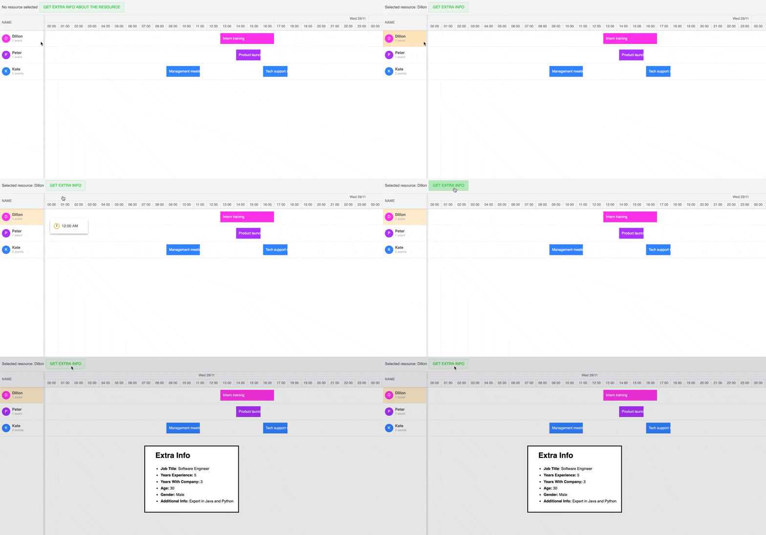
Now when you click on the “Get extra info” button, you’ll see the extra information about the selected resource displayed in a dialog:
Press the escape key to close the dialog. Next, we’ll add a close button to our dialog and make the dialog close when you click outside of it.
Add a close button to the dialog
First, add the following <button> element inside the <dialog> element in your index.html file:
      <button class="dialog-close-button" aria-label="Close">
        <span aria-hidden="true" class="close"></span>
      </button>
Now add the following CSS styles in your style.css file:
dialog::backdrop {
  background-color: hsl(250, 100%, 50%, 0.25);
}
.dialog-close-button {
  position: absolute;
  display: flex;
  justify-content: center;
  align-items: center;
  top: 5px;
  right: 5px;
  height: 20px;
  width: 20px;
  padding: 3px;
  border: none;
  border-radius: 50%;
  background-color: transparent;
}
.dialog-close-button:hover {
  cursor: pointer;
  background-color: rgb(231, 230, 230);
}
.close {
  position: relative;
  display: flex;
  align-items: center;
  justify-content: center;
  width: 100%;
  height: 100%;
}
.close::before, .close::after {
  position: absolute;
  content: ' ';
  height: 100%;
  width: 2px;
  background-color: rgb(50, 50, 50);
}
.close::before {
 transform: rotate(45deg);
}
.close::after {
  transform: rotate(-45deg);
}
For styling, we give the dialog background some color using the ::backdrop CSS pseudo-element.
We position the close button at the top right of the dialog and create the “X” close button using ::before and ::after CSS pseudo-elements.
In your main.js file, add the following event listener at the bottom:
document
  .querySelector(".dialog-close-button")
  .addEventListener("click", () => dialog.close());
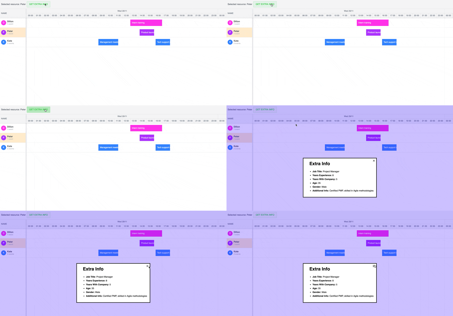
When the close button is clicked, the dialog element’s close() method is called to close the dialog:
Close the dialog when a user clicks outside of the dialog
To close the dialog when a user clicks outside of the dialog, add the following "click" event listener at the bottom of the main.js file:
dialog.addEventListener("click", (e) => {
  const dialogDimensions = dialog.getBoundingClientRect();
  if (
    e.clientX < dialogDimensions.left ||
    e.clientX > dialogDimensions.right ||
    e.clientY < dialogDimensions.top ||
    e.clientY > dialogDimensions.bottom
  ) {
    dialog.close();
  }
});
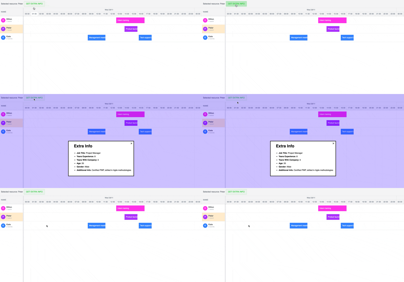
We use the getBoundingClientRect() method to determine the size and position of the dialog in the viewport. If a user clicks outside of the dialog, the dialog closes:
Display a loading state in the extra information button using htmx and CSS
Lastly, let’s add a loading indicator to the button for getting extra information about a resource in case of a slow network connection. In the server.js file in your server, add the following line of code at the top of the route handler function for the /api/extra-info route:
await new Promise((resolve) => setTimeout(resolve, 2000));This will cause the API response to be two seconds slower.
In the frontend code, add the following <div> element in the updateToolbarButton() function in the main.js file. Place it just after the “Get extra info” text within the button element string:
<div class="loading-indicator"></div>In the style.css file, add the following CSS styles to create a spinning loading indicator:
.loading-indicator {
  display: none;
  width: 20px;
  height: 20px;
  margin-left: 10px;
  border: 4px solid #f3f3f3;
  border-top: 4px solid #747474;
  border-radius: 50%;
  animation: spin 1s linear infinite;
}
@keyframes spin {
  100% { transform: rotate(360deg); }
}
.htmx-request .loading-indicator {
  display: block;
}
The spinning loading indicator is a <div> inside the button to get the extra resource information. It’s initially hidden. When htmx makes a request, it adds the htmx-request class to the loading indicator div to display the loading spinner in the button. You’ll now see a loading spinner when you request extra information about a resource:

Next steps
This tutorial covered the basics of using htmx with a Bryntum scheduler. Take a look at the htmx examples page to see demos of htmx functionality that you could add to your scheduler.
You can also check out the Bryntum Scheduler examples page to see many Bryntum Scheduler features in action, such as:
- Integrating with JavaScript frameworks React, Angular, and Vue.
- Exporting data to PDF, PNG, and Excel.
- Undoing and redoing actions.
You can see a full list of the Bryntum Scheduler features here.