Using Bryntum with Tailwind CSS, Shadcn UI, and Material UI
When you add a third-party component to an app you’ve created using a component library, like Shadcn UI or Material UI (MUI), or a CSS framework such as Tailwind CSS, you don’t want it to look out of place or clash with your styles. Bryntum components render as regular HTML and CSS and expose renderers and style configs that let you customize their output, so they can fit right in. You can style them with Tailwind or add custom components, such as a Shadcn UI button, to them.
In this guide, we’ll show you how to use Tailwind for Bryntum Scheduler Pro event styling, how to add a Shadcn UI Switch to a Bryntum toolbar, and how to add an MUI slider as a custom percentage editor in a Bryntum Gantt column. Along the way, we’ll cover the Bryntum architecture that makes this possible and the one styling conflict to watch out for. The examples use React, but the same ideas apply to Bryntum’s Angular and Vue wrappers and to the vanilla JavaScript components.
How Bryntum’s architecture supports UI library compatibility
Several parts of the Bryntum architecture make it possible to build with other UI libraries and CSS frameworks, including Bryntum’s namespaced CSS classes, cls configs for adding custom classes to Bryntum elements, and renderers for custom content.
Namespaced CSS classes
All Bryntum CSS classes use a b- prefix, such as b-button-group, b-calendar-row, and b-date-picker. This namespacing helps Bryntum avoid collisions with Tailwind utility classes, MUI classes, and other frameworks that use their own class naming conventions.
Custom rendering in Bryntum components
Bryntum components can render custom HTML and framework components in several places, including:
cellRenderer: Customize cell content with custom HTML.cellEditor: Replace the default text editor with a vanilla JS, React, Vue, or Angular component.eventRenderer: Control how Gantt, Scheduler, or Calendar events look by returning custom HTML.tooltipRenderer: Display custom components in cell or event tooltips.html: Embed custom content in a Bryntum widget. Bryntum components come with helper widgets, such as charts, date pickers, file pickers, and form elements.headerRenderer: Customize headers by returning custom HTML.
In React, Bryntum uses React portals for these renderers. Using portals lets us render React components (including components styled with Tailwind, Shadcn UI, or MUI) anywhere in the DOM.
⚠️ Sanitize any user-entered values you return from a renderer to prevent cross-site scripting (XSS) attacks. Use Bryntum’s StringHelper.encodeHtml or StringHelper.xss helper methods for sanitization.
eventRenderer(eventRecord) {
    return StringHelper.xss`<span class="text-2xl font-medium">${eventRecord.name}</span>`;
}
Custom widgets
For more advanced cases, create a custom Bryntum widget that renders UI library components. Its DOM structure accepts any CSS, including Tailwind utility classes or styles from your UI library.
Tailwind CSS
We can use Tailwind classes inside Bryntum renderers and data configs to style Bryntum components. The main styling conflict to watch for is Tailwind’s Preflight base layer, which can break Bryntum resource images in grid cells.
Using Tailwind utility classes inside Bryntum components
Tailwind classes work inside Bryntum renderers. For example, an event renderer in Bryntum Scheduler Pro can use Tailwind utility classes to style its content:
eventRenderer({ eventRecord }) {
    const task = eventRecord as Task;
    return [
        {
            tag       : 'span',
            className : 'event-name text-xl font-extrabold',
            html      : StringHelper.encodeHtml(task.name)
        },
        ...
In the above code, the text-xl and font-extrabold utility classes style the event bar text:
Watch for CSS specificity issues. If you add a font size to the event-name class in the example above, Tailwind’s text-xl class will no longer apply:
.event-name {
  font-size: 1.3rem;
}
By setting a font-size, we prevent the text-xl class from applying its styling.
For event styling, set eventColor and eventStyle to null. This gives the event minimal default styling, making it easier to apply Tailwind or custom CSS.
We can also add custom classes, including Tailwind classes, with the cls property in many Bryntum element configs. The same cls field can be added to data such as events, resources, and dependencies:
"events": {
    "rows": [
        {
            "id": 1,
            "resourceId": 1,
            "name": "Bridge repair",
            "startDate": "2025-12-01T08:00:00",
            "duration": 4,
            "cls": "text-xl font-extrabold"
        },
        ...
The Tailwind Preflight styling conflict with Bryntum resource images
Tailwind includes Preflight, an opinionated set of baseline styles that fix cross-browser inconsistencies. Preflight applies display: block and max-width: 100% to all img elements. However, display: block and max-width: 100% break Bryntum resource images in grid cells, because Bryntum expects each resource image to be an inline-block with unconstrained width.
We recommend overriding Preflight for Bryntum’s grid cells:
.b-grid-cell img,
.b-resource-info img {
    display: inline-block !important;
    max-width: none !important;
    vertical-align: middle;
}
We need to add the !important declarations, because Preflight targets all img elements. The declarations keep the fix scoped to Bryntum’s grid cells. We used the same approach in our blog post Build a location-based scheduler with Bryntum Scheduler Pro, TanStack Table, Shadcn UI, and Mapbox. If you don’t need Preflight, you can also disable it and import Tailwind’s theme and utilities layers without the Preflight base layer.
Shadcn UI
Shadcn UI is a collection of reusable React components that work alongside Bryntum components. The Shadcn UI components are built on Radix UI and styled with Tailwind CSS, so the same Preflight image fix from the Tailwind section applies here too.
Using Shadcn UI components alongside Bryntum
In our blog post, Build a location-based scheduler with Bryntum Scheduler Pro, TanStack Table, Shadcn UI, and Mapbox, we built a TanStack Table styled with Shadcn UI components that shows unplanned tasks next to a Bryntum Scheduler Pro timeline:
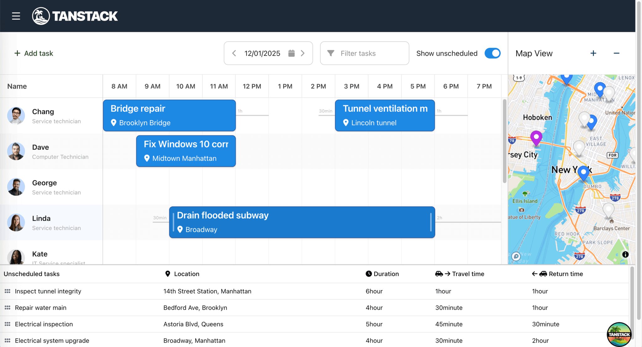
The TanStack Table is separate from the Bryntum Scheduler Pro, and there aren’t any conflicts between the two components.
Using Shadcn UI components inside Bryntum renderers
We can add Shadcn UI components to Bryntum through renderers and the widget html config. For example, a Shadcn UI Switch can be rendered inside a Bryntum Scheduler Pro toolbar:
This toolbar widget is initialized in an effect when both the scheduler and project are ready:
// Initialize components when both scheduler and project are ready
useEffect(() => {
    const schedulerPro = schedulerproRef.current?.instance,
        project = projectRef.current?.instance;

    if (schedulerPro && project) {
        // Wire events to widgets
        const widgetMap = schedulerPro.widgetMap;

        widgetMap['toggleUnscheduled'].html = (
            <div className="flex items-center gap-2">
                <label htmlFor="show-unscheduled" className="text-sm">Show unscheduled</label>
                <Switch
                    id="show-unscheduled"
                    defaultChecked={true}
                    onCheckedChange={onToggleUnscheduled}
                />
            </div>
        );
...
widgetMap contains descendant widgets keyed by their ref.
When the user toggles Show unscheduled, the switch calls onToggleUnscheduled:
const onToggleUnscheduled = (checked: boolean) => {
    setShowUnscheduled(checked);
    setTableCollapsed(!checked);
};
The toggleUnscheduled widget is defined in the tbar config:
tbar : [
    {
        type   : 'widget',
        ref    : 'toggleUnscheduled',
        height : 'auto'
    },
    ...
]
The same cls approach from the Tailwind section also works here, since Shadcn UI uses Tailwind utility classes for styling.
Material UI
MUI components can sit alongside, as well as inside, Bryntum components.
Material Design theme alignment
Bryntum ships with six themes that have light and dark variants. One of those themes is Material3, which is based on the same design system MUI uses: the Google Material Design system. Using the Material3 theme makes Bryntum components look visually consistent with MUI components in the same application.
We import the theme separately from Bryntum’s structural CSS:
/* FontAwesome is used for icons */
@import "@bryntum/schedulerpro/fontawesome/css/fontawesome.css";
@import "@bryntum/schedulerpro/fontawesome/css/solid.css";
/* Structural CSS */
@import "@bryntum/schedulerpro/schedulerpro.css";
/* Bryntum theme of your choice */
@import "@bryntum/schedulerpro/material3-light.css";
Using Material UI components alongside Bryntum
MUI components also work well as layout wrappers and controls around Bryntum components. In our blog post, Using Bryntum Gantt and Bryntum Scheduler with React and Material UI components, MUI’s Box provides the flex layout for a Bryntum Gantt and Scheduler:
export default function BryntumGanttScheduler() {
    const ganttRef = useRef<BryntumGantt>(null);
    return (
        <Box
            sx={{
                height        : '100%',
                display       : 'flex',
                flex          : 1,
                flexDirection : 'column' }}
        >
            <BryntumGantt
                ref={ganttRef}
                {...ganttProps}
            />
        </Box>
    );
}
The same example uses MUI’s Button and Tooltip components for zoom controls alongside Bryntum:
<Box sx={{ display : 'flex', background : '#fafafa', borderBottom : '1px solid var(--mui-palette-divider);', gap : 1, justifyContent : 'flex-end', py : 2, px : 2 }}>
    <Tooltip title="Zoom in">
        <Button
            id="zoomIn"
            variant="outlined"
            sx={{
                color       : 'var(--mui-palette-action-active)',
                borderColor : 'var(--mui-palette-action-active)',
                '&:hover'   : {
                    borderColor : 'var(--mui-palette-action-active)'
                }
            }}
            onClick={(e) => onZoom(e) }
        >
            <ZoomIn />
        </Button>
    </Tooltip>
    <Tooltip title="Zoom out">
    ...
Swapping out a Bryntum widget for an MUI component
We can embed MUI components inside Bryntum widgets, for example, as custom cell editors. The same blog post uses an MUI Slider as a custom percentage editor in a Bryntum Gantt column:
import React, { Component } from 'react';
import { Slider } from '@mui/material';
import { BryntumGantt } from '@bryntum/gantt-react-thin';
import { EditorConfig } from '@bryntum/core-thin';
export default class CustomMUISlider extends Component<{ ref: BryntumGantt, instance: EditorConfig }> {
    state = { value : this.props.instance.features.cellEdit.editor?.initialValues?.percentDone || 0 };
    // eslint-disable-next-line
    getValue(value: number) {
        return this.state.value;
    }
    setValue(value: number) {
        return new Promise(resolve => this.setState({ value }, () => resolve(value)));
    }
    isValid() {
        return true;
    }
    focus() {
    }
    onChangeHandler(_ : Event, value: number | number[]) {
        const editor = this.props.instance.features.cellEdit.editor;
        const { record, dataField } = editor;
        record[dataField] = value;
    }
    render() {
        return (
            <Slider
                value={this.state.value}
                aria-label="percent completed"
                onChange={this.onChangeHandler.bind(this)}
                size='small' sx={{ my : 1 }}
            />
        );
    }
}
This component implements the getValue, setValue, isValid, and focus methods Bryntum expects from a custom editor. We then use it in a Gantt column config:
{
        type      : 'percent',
        text      : '% Completed',
        field     : 'percentDone',
        showValue : false,
        width     : 160,
        editor    : (ref: (LegacyRef<CustomMUISlider> | undefined) & BryntumGantt, instance: EditorConfig) => <CustomMUISlider instance={instance} ref={ref} />
},
Passing ref to the editor component is essential for it to work within Bryntum’s cell editing system.
Note that Bryntum’s Material3 theme matches MUI’s component styling.
Using Bryntum with other UI libraries
The same approach works with other UI libraries and CSS frameworks, because Bryntum’s namespaced CSS and renderer system are not specific to Tailwind, Shadcn UI, or MUI. Bryntum also integrates with platform-specific frameworks. To review an example, see our guide on using Bryntum Scheduler Pro as a Salesforce Lightning Web Component.