Using Bryntum Gantt and Bryntum Scheduler with React and Material UI components
We strive to keep posts updated, but code samples may sometimes be outdated. Humans, see the Bryntum documentation; agents, https://mcp.bryntum.com for the latest info.
Bryntum Gantt and Bryntum Scheduler are feature-rich and fully customizable JavaScript components. They can be used together to display different views of the same data, as they share a data model.
Material UI (MUI) offers a range of intuitive React components that enhance development and user experience.
In this tutorial, we’ll show you how to share data between a Bryntum Gantt component and a Bryntum Scheduler component, then add MUI button and slider components that you can use within them.
We’ll do the following:
- Add a Bryntum Gantt component and a Bryntum Scheduler component to an example MUI project.
- Style the components to implement the Google Material Design guidelines used by MUI.
- Share data between the Gantt and the Scheduler components.
- Add MUI buttons that zoom in and out of the component timelines.
- Use an MUI slider as a custom cell editor inside a Gantt column.
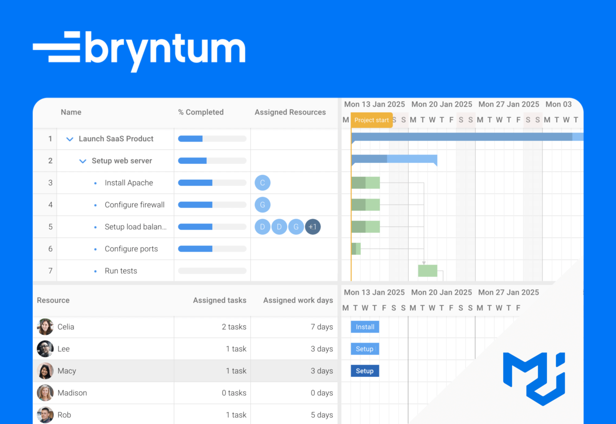
Here’s what we’ll build:
The code for the completed tutorial can be found in the Bryntum Gantt, Scheduler, and MUI GitHub repository in the completed-app branch.
Getting started
We’ll use the MUI Vite with TypeScript example project as a starting point.
Install the dependencies by running the following command:
npm installRun the Vite dev server using the following command:
npm run devThe starter example app has a navigation drawer with three pages:
- Project planning
- Analytics
- Clients
React Router is used for navigation. The public/data/launch-saas.json file contains data for the example project of launching a SaaS product. The public/images/team folder contains images of the team members for the project, which serve as the resources in the example project data.
We’ll add the Bryntum components to the Project planning page.
Creating a React Bryntum Gantt component
You can try out Bryntum components for free using our public Bryntum trial packages.
If you have a Bryntum license, please refer to our npm Repository Guide to access the private Bryntum repository.
Installing the React Bryntum Gantt thin packages
Install the required thin packages for the React Bryntum Gantt:
npm install @bryntum/core-thin @bryntum/engine-thin @bryntum/gantt-react-thin @bryntum/gantt-thin @bryntum/grid-thin @bryntum/scheduler-thin @bryntum/schedulerpro-thin Thin Bryntum packages differ from the regular packages in that they only contain product-specific code and styling, reducing the amount of code and CSS required. Using the thin packages is required to use multiple components together.
Regular Bryntum packages contain code and styling for all underlying products. For example, the regular Gantt package includes code for the Gantt, Scheduler, Scheduler Pro, Grid, Core UI, and Core data components.
⚠️ The @bryntum/core-react-thin package includes the Bryntum base UI widgets, such as the BryntumButton and other wrappers. Install this package if you use any of the base UI widgets.
Creating a Bryntum Gantt configuration file
Create a ganttConfig.ts file in the src folder, and add the following lines of code to it:
import { BryntumGanttProps } from '@bryntum/gantt-react-thin';
const ganttProps : BryntumGanttProps = {
    startDate               : '2025-01-14',
    weekStartDay            : 1,
    viewPreset              : 'weekAndDayLetter',
    resourceImageFolderPath : './images/team/'
};
export { ganttProps };
The week start day is set to Monday.
Rendering the Bryntum Gantt
Create a BryntumGanttScheduler.tsx file in the src/components folder and add the following lines of code to it:
import { useRef } from 'react';
import { BryntumGantt } from '@bryntum/gantt-react-thin';
import { ganttProps } from '../ganttConfig';
import { Box } from '@mui/material';
export default function BryntumGanttScheduler() {
    const ganttRef = useRef<BryntumGantt>(null);
    return (
        <Box
            sx={{
                height        : '100%',
                display       : 'flex',
                flex          : 1,
                flexDirection : 'column' }}
        >
            <BryntumGantt
                ref={ganttRef}
                {...ganttProps}
            />
        </Box>
    );
}
The ganttRef gives you access to the Bryntum Gantt instance, which you’ll use later to sync the scrolling positions of the Gantt and Scheduler components.
Styling the component
Create a BryntumGanttScheduler.css file in the src/components folder and add the following required Gantt-specific style imports to it:
@import '@bryntum/core-thin/core.material.css';
@import '@bryntum/grid-thin/grid.material.css';
@import '@bryntum/scheduler-thin/scheduler.material.css';
@import '@bryntum/schedulerpro-thin/schedulerpro.material.css';
@import '@bryntum/gantt-thin/gantt.material.css';
These styles use the Bryntum Gantt Material theme, which is one of five available themes.
Import the CSS styles in the src/components/BryntumGanttScheduler.tsx file:
import './BryntumGanttScheduler.css';In the src/App.tsx file, render the BryntumGanttScheduler component in the index route:
- <Route index element={<div>TODO</div>} />
+ <Route index element={<BryntumGanttScheduler />} />
Import the BryntumGanttScheduler component:
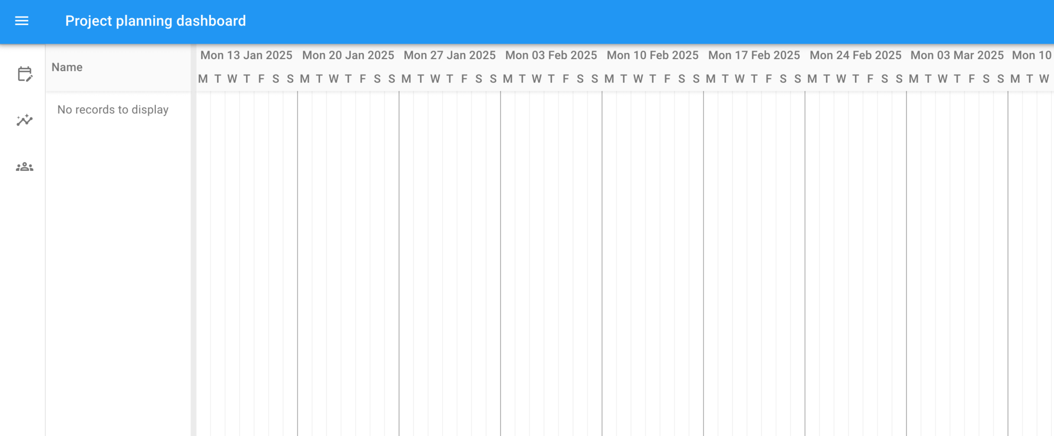
import BryntumGanttScheduler from './components/BryntumGanttScheduler';Open https://localhost:5173/. You should see an empty Bryntum Gantt component on the Project planning dashboard:
Fetching example data using the Bryntum Crud Manager
The Bryntum Gantt project holds and links data stores together. The Bryntum Gantt has the following types of data stores:
The project has a Crud Manager that handles loading and saving data.
Let’s create a project for the Gantt component.
In the src/ganttConfig.ts file, add the following Gantt project props:
const ganttProjectProps : BryntumGanttProjectModelProps = {
    autoSetConstraints : true,
    // General calendar is used by default.
    calendar           : 'general',
    transport          : {
        load : {
            url : './data/launch-saas.json'
        }
    },
    autoLoad         : true,
    // This config enables response validation and dumping of found errors to the browser console.
    // It's meant to be used as a development-stage helper only, so please set it to false for production systems.
    validateResponse : true
};
Import the types for the props:
import { BryntumGanttProjectModelProps } from '@bryntum/gantt-react-thin';Export the ganttProjectProps along with the ganttProps at the bottom of the file:
export { ganttProps, ganttProjectProps };The transport property is used to populate the project’s data stores. The load property is configured to get data from the example data JSON file. The autoLoad and validateResponse properties are set to true, so that autoLoad initiates a data load when the store is instantiated and validateResponse checks the response structure of requests made by the Crud Manager.
You can also configure transport to sync data changes to a specific URL. To learn more, read the saving data section of the Crud Manager guide in our docs.
Importing example data to Bryntum Gantt
We’ll bind this data to a standalone BryntumGanttProjectModel, then assign the project we created for the BryntumGantt component to the BryntumGanttProjectModel. A standalone BryntumGanttProjectModel is suitable for applications that use multiple Bryntum components that share a common project.
Import the BryntumGanttProjectModel component and ganttProjectProps into the src/components/BryntumGanttScheduler.tsx file:
import { BryntumGanttProjectModel } from '@bryntum/gantt-react-thin';
import { ganttProjectProps } from '../ganttConfig';
Create a ref for the BryntumGanttProjectModel in the BryntumGanttScheduler() function:
const ganttProjectRef = useRef<BryntumGanttProjectModel>(null);Render the BryntumGanttProjectModel component just above the BryntumGantt component and pass in the ref and props:
<BryntumGanttProjectModel
        ref={ganttProjectRef}
        {...ganttProjectProps}
/>
Pass in the ref as the project prop of the BryntumGantt component:
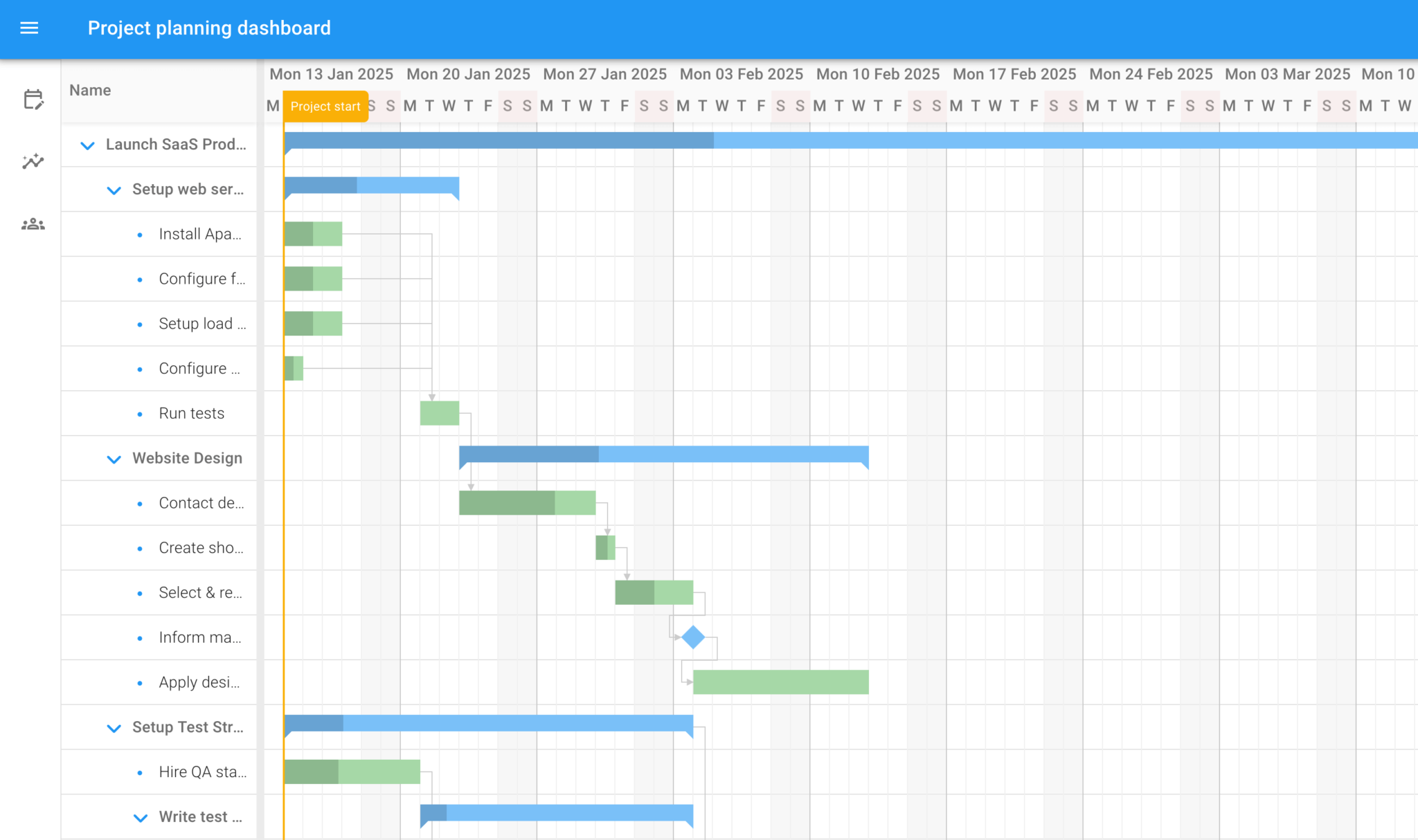
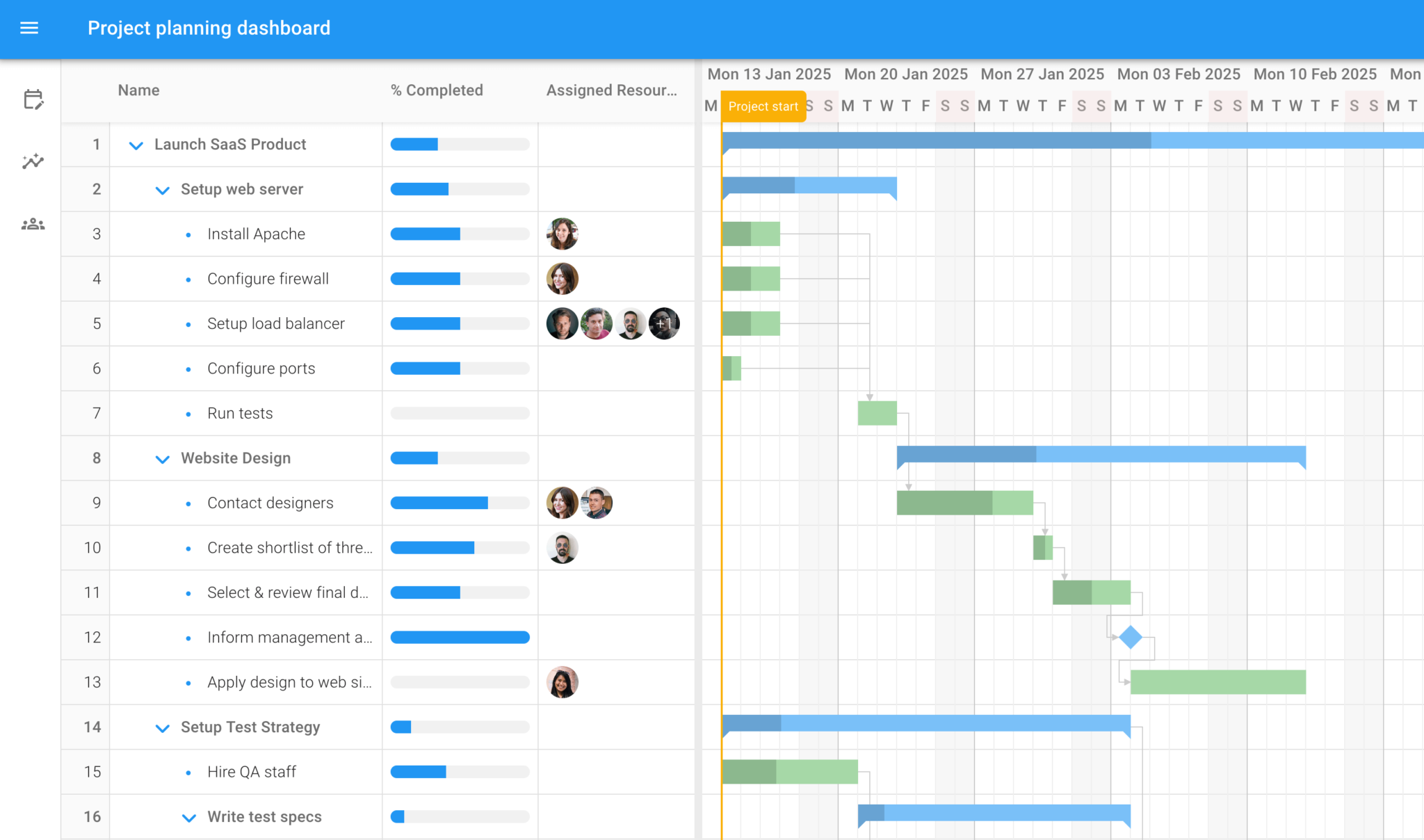
project={ganttProjectRef}Open https://localhost:5173/. You should see the Bryntum Gantt component populated with the example data:
Adding extra columns to the Bryntum Gantt
Let’s make the name column wider and add two extra columns to the Gantt: % Completed and Assigned Resources. We’ll add the columns as a React state variable, as we’ll use an MUI component in the % Completed column later.
In the src/components/BryntumGanttScheduler.tsx file, add the following columns React state variable within the BryntumGanttScheduler() function:
const [columns] = useState([
        { type : 'sequence', minWidth : 50, width : 50, text : '', align : 'right', resizable : false },
        { type : 'name', width : 280 },
        { type : 'percent', text : '% Completed', field : 'percentDone', showValue : false, width : 160
        },
        { type : 'resourceassignment', text : 'Assigned Resources', showAvatars : true, width : 160 }
]);
Import the useState hook:
import { useState } from 'react';In Bryntum Gantt, a percent done column represents the percentDone field of a task, and a resource assignment column allows you to change the assigned resources.
Add the columns variable to the columns prop of the BryntumGantt component:
columns={columns}Open https://localhost:5173/. You should see the additional columns in the Bryntum Gantt:
Double-click on column cells to edit the values.
Creating a React Bryntum Scheduler component
Now let’s create a Bryntum Scheduler that uses the same project data as the Gantt.
Installing the React Bryntum Scheduler thin packages
Install the additional required thin package for the React Bryntum Scheduler:
npm install @bryntum/scheduler-react-thinNote: You only need to install one additional thin package, as you installed most of the required packages for the Gantt.
Creating a Bryntum Scheduler configuration file
Create a schedulerConfig.ts file in the src folder and add the following lines of code to it:
import { BryntumSchedulerProps } from '@bryntum/scheduler-react-thin';
import { EventModel } from '@bryntum/scheduler-thin';
type Record =  {
    events: EventModel[];
}
const schedulerProps : BryntumSchedulerProps = {
    rowHeight           : 45,
    eventColor          : 'blue',
    resourceImagePath   : './images/team/',
    dependenciesFeature : true,
    columns : [
        {
            type           : 'resourceInfo',
            field          : 'name',
            text           : 'Resource',
            showEventCount : false,
            width          : 330
        },
        {
            text     : 'Assigned tasks',
            field    : 'events.length',
            width    : 160,
            editor   : false,
            align    : 'right',
            renderer : ({ value }: { value: number }) => `${value} task${value !== 1 ? 's' : ''}`
        },
        {
            text     : 'Assigned work days',
            width    : 160,
            editor   : false,
            align    : 'right',
            renderer : ({ record }: { record: Record }) => record.events.map(event => event.duration).reduce((total, current) => {
                return total + current;
            }, 0) + ' days'
        }
    ]
};
export { schedulerProps };
The resourceImagePath value determines the path via which resource images are loaded. It is set to the team images in the public folder.
The dependenciesFeature is enabled, so that dependencies can be drawn between events.
The Assigned tasks and Assigned work days columns use a renderer function to display the number of tasks and the total hours assigned to each team member.
Rendering the Bryntum Scheduler
Import the Scheduler configuration and the BryntumScheduler component in the src/components/BryntumGanttScheduler.tsx file:
import { BryntumScheduler } from '@bryntum/scheduler-react-thin';
import { schedulerProps } from '../schedulerConfig';
Create a ref for the Scheduler:
const schedulerRef = useRef<BryntumScheduler>(null);Render the Bryntum Scheduler component below the BryntumGantt component:
<BryntumScheduler
project={ganttProjectRef}
ref={schedulerRef}
{...schedulerProps}
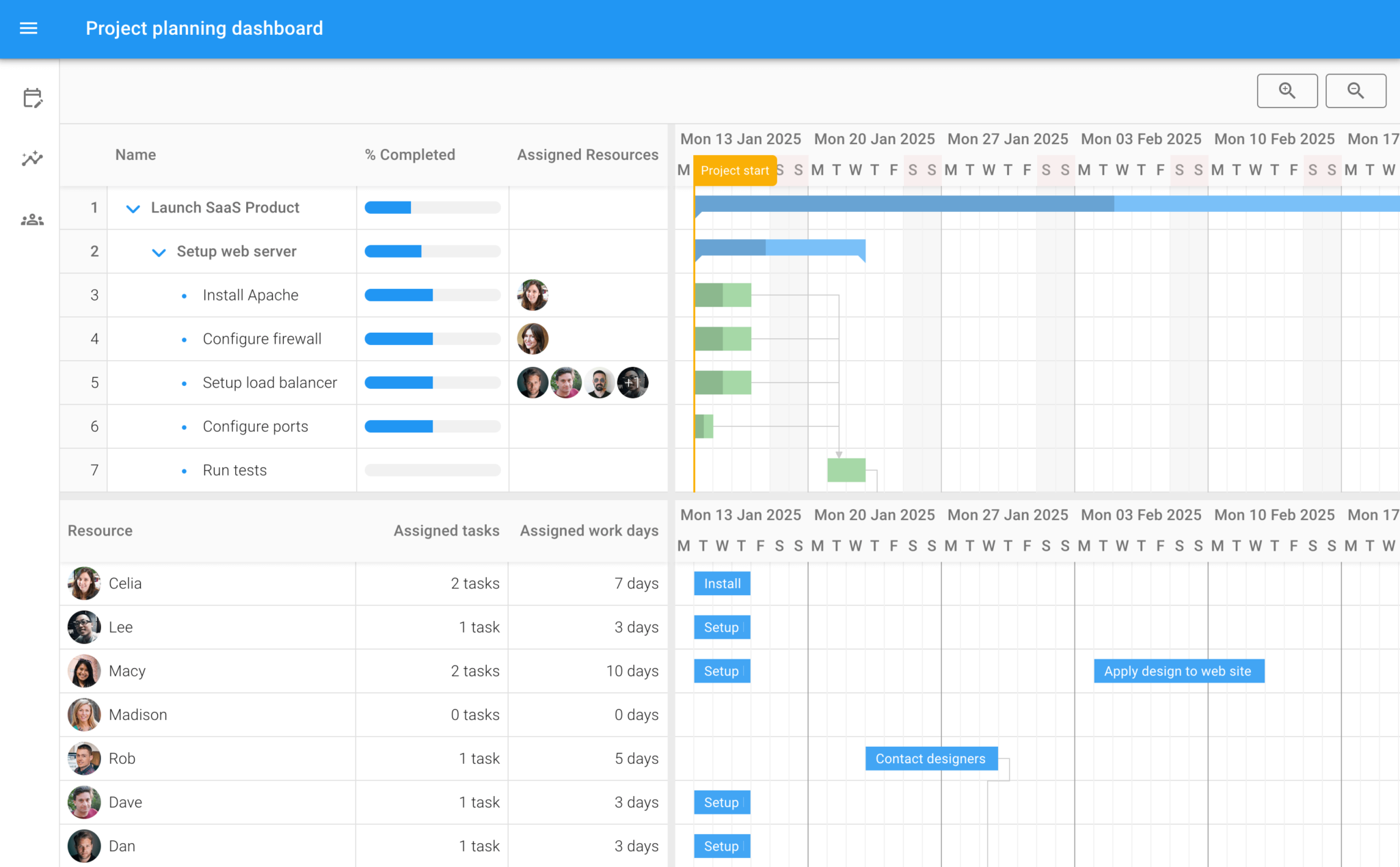
/>Open https://localhost:5173/. You should see the Bryntum Scheduler component below the Bryntum Gantt component:
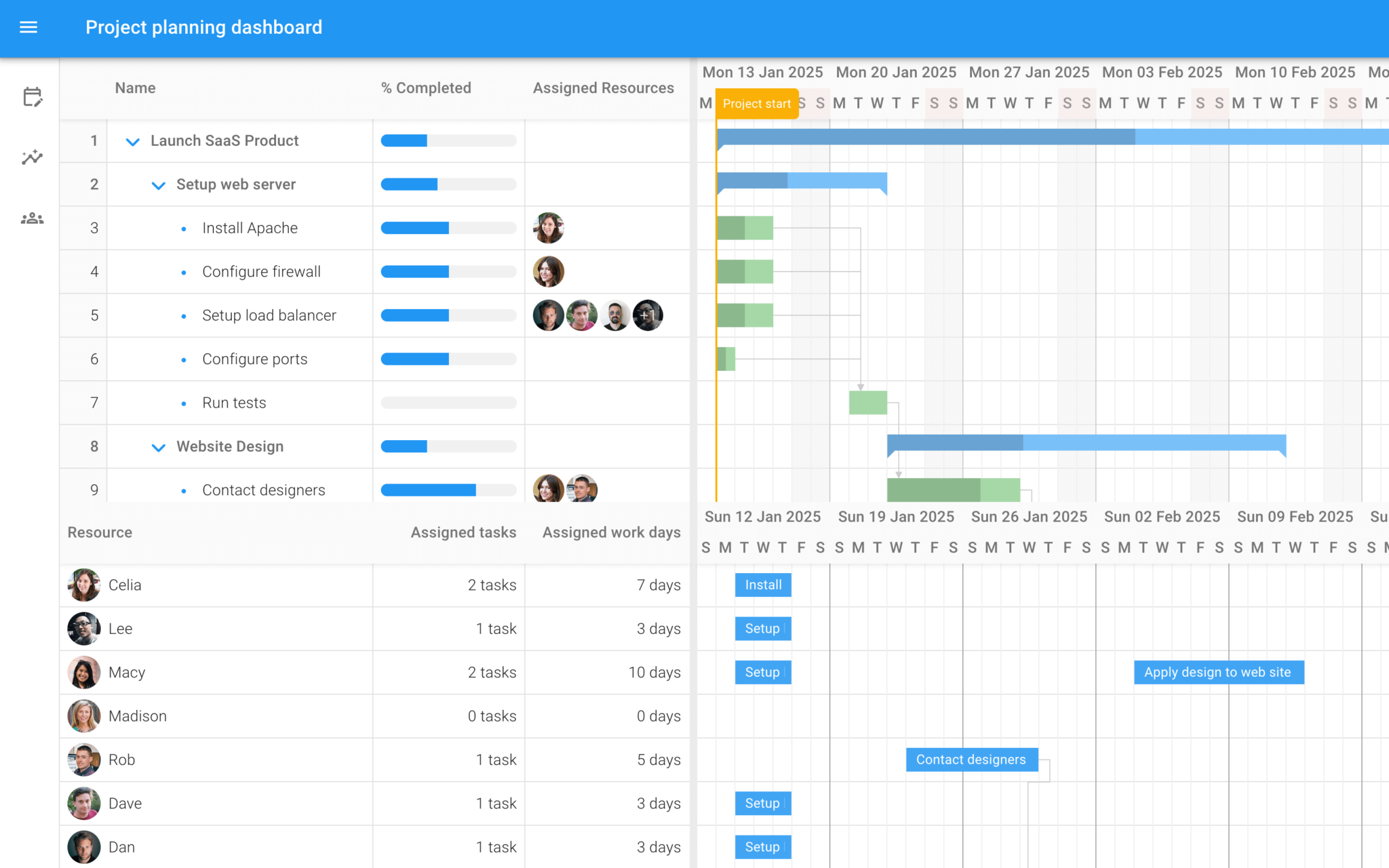
Any changes you make to the Scheduler will be reflected in the Gantt, and vice versa.
Adding a Splitter component
Let’s add a Bryntum Splitter UI widget between the Gantt and Scheduler components to ensure they are well separated and can be resized.
First, install the thin package for the base Bryntum React UI widgets:
npm install @bryntum/core-react-thinImport the BryntumSplitter component in the src/components/BryntumGanttScheduler.tsx file:
import { BryntumSplitter } from '@bryntum/core-react-thin';Render the widget between the Bryntum Gantt and Bryntum Scheduler components:
<BryntumSplitter />Open https://localhost:5173/ to resize the components by clicking and dragging the splitter:
Syncing the scroll positions of the Gantt and Scheduler
If you scroll the timeline of either the Gantt or Scheduler, you’ll see that each component scrolls independently. Let’s sync the scrolling.
Add the following Effect to your BryntumGanttScheduler component:
useEffect(() => {
        if (ganttRef.current && schedulerRef.current) {
                ganttRef.current.instance.addPartner(schedulerRef.current.instance);
        }
}, []);
Import the useEffect hook:
import { useEffect } from 'react';This calls the addPartner method on the Gantt instance to sync its timeline scroll position with the Scheduler instance.
Adding MUI zoom buttons
Now let’s add MUI buttons that allow us to zoom in and out of the component timelines.
Import the MUI Button, Tooltip, and required icons in the src/components/BryntumGanttScheduler.tsx file:
import { Button, Tooltip } from '@mui/material';
import { ZoomIn, ZoomOut } from '@mui/icons-material';
Add the following lines of code just above the rendered BryntumGanttProjectModel component:
<Box sx={{ display : 'flex', background : '#fafafa', borderBottom : '1px solid var(--mui-palette-divider);', gap : 1, justifyContent : 'flex-end', py : 2, px : 2 }}>
    <Tooltip title="Zoom in">
        <Button
            id="zoomIn"
            variant="outlined"
            sx={{
                color       : 'var(--mui-palette-action-active)',
                borderColor : 'var(--mui-palette-action-active)',
                '&:hover'   : {
                    borderColor : 'var(--mui-palette-action-active)'
                }
            }}
            onClick={(e) => onZoom(e) }
        >
            <ZoomIn />
        </Button>
    </Tooltip>
    <Tooltip title="Zoom out">
        <Button
            id="zoomOut"
            variant="outlined"
            sx={{
                color       : 'var(--mui-palette-action-active)',
                borderColor : 'var(--mui-palette-action-active)',
                '&:hover'   : {
                    borderColor : 'var(--mui-palette-action-active)'
                }
            }}
            onClick={(e) => onZoom(e) }
        >
            <ZoomOut />
        </Button>
    </Tooltip>
</Box>
Define the onZoom() function in the BryntumGanttScheduler() function:
    function onZoom(e: React.MouseEvent<HTMLButtonElement, MouseEvent>) {
        if (ganttRef.current) {
            const action = e.currentTarget.id as 'zoomIn' | 'zoomOut';
            ganttRef.current.instance[action]();
        }
    };
The id for each button determines the action it performs. For example: In the Gantt instance, clicking the Zoom in button uses the zoomIn function and the Zoom out button uses the zoomOut function. The Scheduler will also zoom in and out when these buttons are clicked, as the addPartner method syncs both the scroll position and the zoom level across components.
Using an MUI slider as a custom editor in the Bryntum Gantt
At this point, you can edit values in the % completed column of the Gantt chart by double-clicking on a cell to show an editable number input. Let’s replace this editor with an MUI slider component.
We’ll use a function as the value of the editor property of the % completed column so that we can use a JSX component as a custom editor.
Add the following imports to the src/components/BryntumGanttScheduler.tsx file:
import { LegacyRef } from 'react';
import { EditorConfig } from '@bryntum/core-thin';
Replace the percentDone object in the columns state value array with the following object, which adds the editor property:
{
        type      : 'percent',
        text      : '% Completed',
        field     : 'percentDone',
        showValue : false,
        width     : 160,
        editor    : (ref: (LegacyRef<CustomMUISlider> | undefined) & BryntumGantt, instance: EditorConfig) => <CustomMUISlider instance={instance} ref={ref} />
},
This creates the CustomMUISlider JSX component, which will become the custom editor. We pass in the instance and ref object of the CustomMUISlider component as props to the CustomMUISlider.
Now let’s create the CustomMUISlider React editor component. Currently, the Bryntum React editor relies on the class-based React editor component, so it needs to be implemented as a class component.
Create a file called CustomMUISlider.tsx in the src/components folder and add the following lines of code to it:
import React, { Component } from 'react';
import { Slider } from '@mui/material';
import { BryntumGantt } from '@bryntum/gantt-react-thin';
import { EditorConfig } from '@bryntum/core-thin';
export default class CustomMUISlider extends Component<{ ref: BryntumGantt, instance: EditorConfig }> {
    state = { value : this.props.instance.features.cellEdit.editor?.initialValues?.percentDone || 0 };
    // eslint-disable-next-line
    getValue(value: number) {
        return this.state.value;
    }
    setValue(value: number) {
        return new Promise(resolve => this.setState({ value }, () => resolve(value)));
    }
    isValid() {
        return true;
    }
    focus() {
    }
    onChangeHandler(_ : Event, value: number | number[]) {
        const editor = this.props.instance.features.cellEdit.editor;
        const { record, dataField } = editor;
        record[dataField] = value;
    }
    render() {
        return (
            <Slider
                value={this.state.value}
                aria-label="percent completed"
                onChange={this.onChangeHandler.bind(this)}
                size='small' sx={{ my : 1 }}
            />
        );
    }
}
The React editor component must have a setValue method that internally calls setState. React setState is asynchronous, so setValue returns a Promise that resolves when setState resolves.
Cell editors must also have getValue, isValid, and focus methods.
The render() method returns an MUI Slider component with the state value as its value. The initial state value is the percentDone value of the task. When the Slider value changes, it calls the onChange method, which gets the task record, and sets a new percentDone value in the task record.
Import the CustomMUISlider editor component in the src/components/BryntumGanttScheduler.tsx file:
import CustomMUISlider from './CustomMUISlider';You can now edit the % completed column values using the MUI slider:
Next steps
This tutorial serves as a starting point for integrating Bryntum components with MUI components.
Take a look at our Bryntum Gantt and Bryntum Scheduler demo pages to get an idea of the features available to add to Bryntum components and how they can meet your business needs.