Getting Started with CSS Container Queries
We strive to keep posts updated, but code samples may sometimes be outdated. Humans, see the Bryntum documentation; agents, https://mcp.bryntum.com for the latest info.
If you’ve designed a responsive website in CSS, you’ve probably used media queries. Media queries have always been the go-to and only solution for responsive and adaptable styling, whether that’s for detecting user preferences (like dark mode or reduced motion) or display size. That said, it doesn’t mean they are suitable for every scenario.
What if, instead of adapting the content to the viewport size, you want it to adapt to the container to create a component with a flexible layout? In this case, media queries can be pretty limiting. For responsiveness, you need separate media queries for every part of the layout, making the code much more cumbersome. That’s where container queries come in.
Container queries are an upcoming feature of CSS that’s currently a working draft specification, with only experimental support from the browsers (at the time of writing). They’re meant to allow you to create responsive designs based on the parent element’s (container’s) size rather than the viewport. That said, it’s easy to see why this feature draws developers’ attention.
In this article, you’ll get to know container queries and how you can use them.
Why You Need Container Queries
In the era of component-based UI frameworks, more often than not, developers want their components to adapt to their parent elements, aka containers, rather than the entire viewport. Such an approach allows more flexibility as you can reuse the same component while adapting it to different placements, effectively decoupling responsiveness from the viewport. For example, you could have an e-commerce site with a product grid on the main page and a single Recommended products row on every product page, both in a single component.
Container queries are meant precisely for this kind of use case. By using them, you can easily define different styling for the element only when its container matches the provided constraints, similar to how media queries allow you to define styling based on viewport size:
.item {
  display: flex;
  justify-content: center;
  align-items: center;
  flex-direction: column;
}
@container (min-width: 600px) {
  .item {
    flex-direction: row;
  }
}
To see how easy and convenient container queries are, compare them directly with media queries in a working demo.
Getting Started with Container Queries
To get started with container queries, you need to ensure you have a compatible browser and the required feature flags turned on.
For this demo, you’ll use the CSS grid layout, which is often combined with media queries to build responsive views. Keep in mind that the same technique can be used with other layouts, like flexbox.
To start, create a simple CSS grid layout that adapts the number of columns to viewport size with the help of media queries:
.grid-container {
  display: flex;
  justify-content: center;
  align-items: flex-start;
}
.grid {
  display: grid;
  gap: 1rem;
  padding: 1rem;
  grid-template-columns: repeat(1, minmax(0, 1fr));
}
@media (min-width: 560px) {
  .grid {
    grid-template-columns: repeat(2, minmax(0, 1fr));
  }
}
@media (min-width: 832px) {
  .grid {
    grid-template-columns: repeat(3, minmax(0, 1fr));
  }
}
@media (min-width: 1104px) {
  .grid {
    grid-template-columns: repeat(4, minmax(0, 1fr));
  }
}
@media (min-width: 1376px) {
  .grid {
    grid-template-columns: repeat(5, minmax(0, 1fr));
  }
}
.item {
  height: 16rem;
  width: 16rem;
  /* ... */
}
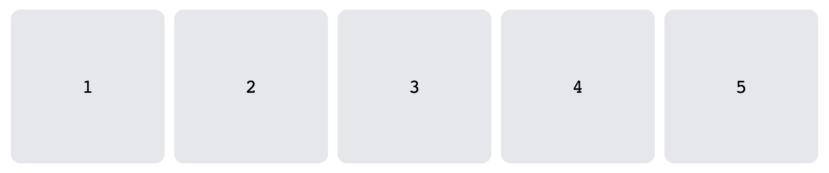
With this CSS, the grid works as intended, adapting to the viewport at each one of the five breakpoints. For example, here’s the grid at the largest viewport size, over 1376 px in width:
And here’s the same grid at less than 1104 px viewport width:

Imagine this grid represents a list of products, blog posts, or photos. Even in the basic web apps, you’ll need to present this kind of content in several ways (grids, lists, carousels, etc.) and in many different places (main view, sidebar, search box, etc.). For this purpose, you’ll likely extract this part of the UI into a separate component. However, that’s where things start to get complicated.
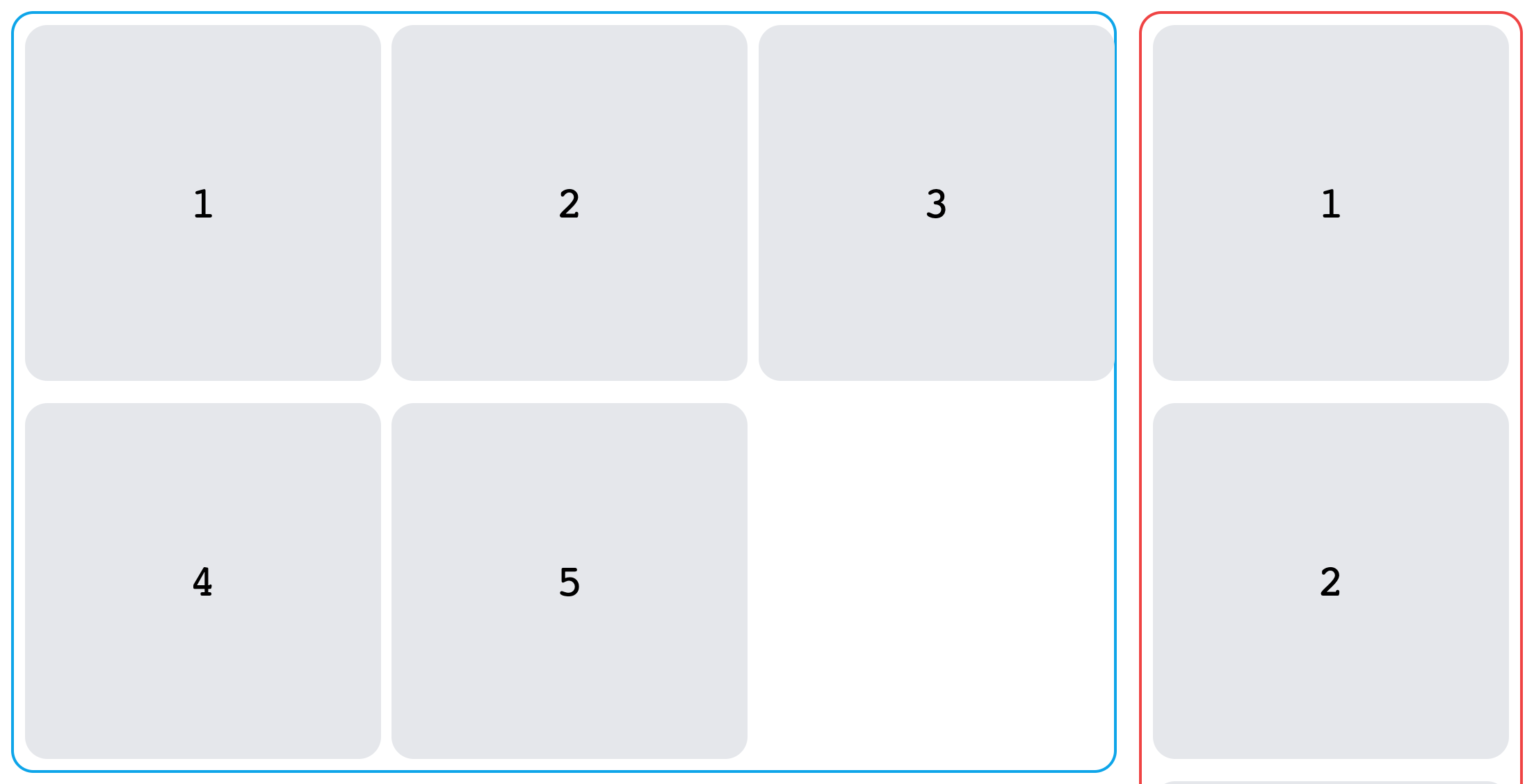
What if you’d like to place the same component as a column next to the main grid view? In this case, using it as is would be less than ideal, resulting in the entire UI being broken:

The only solution would be to introduce a new class name like .grid-vertical that forces a single-column layout:
.grid-vertical {
  grid-template-columns: repeat(1, minmax(0, 1fr));
}
Now, this approach isn’t ideal. First off, it requires you to either add a vertical prop, making the component more complex and less flexible, or you have to create an entirely separate component that only differs in styling while duplicating the logic.
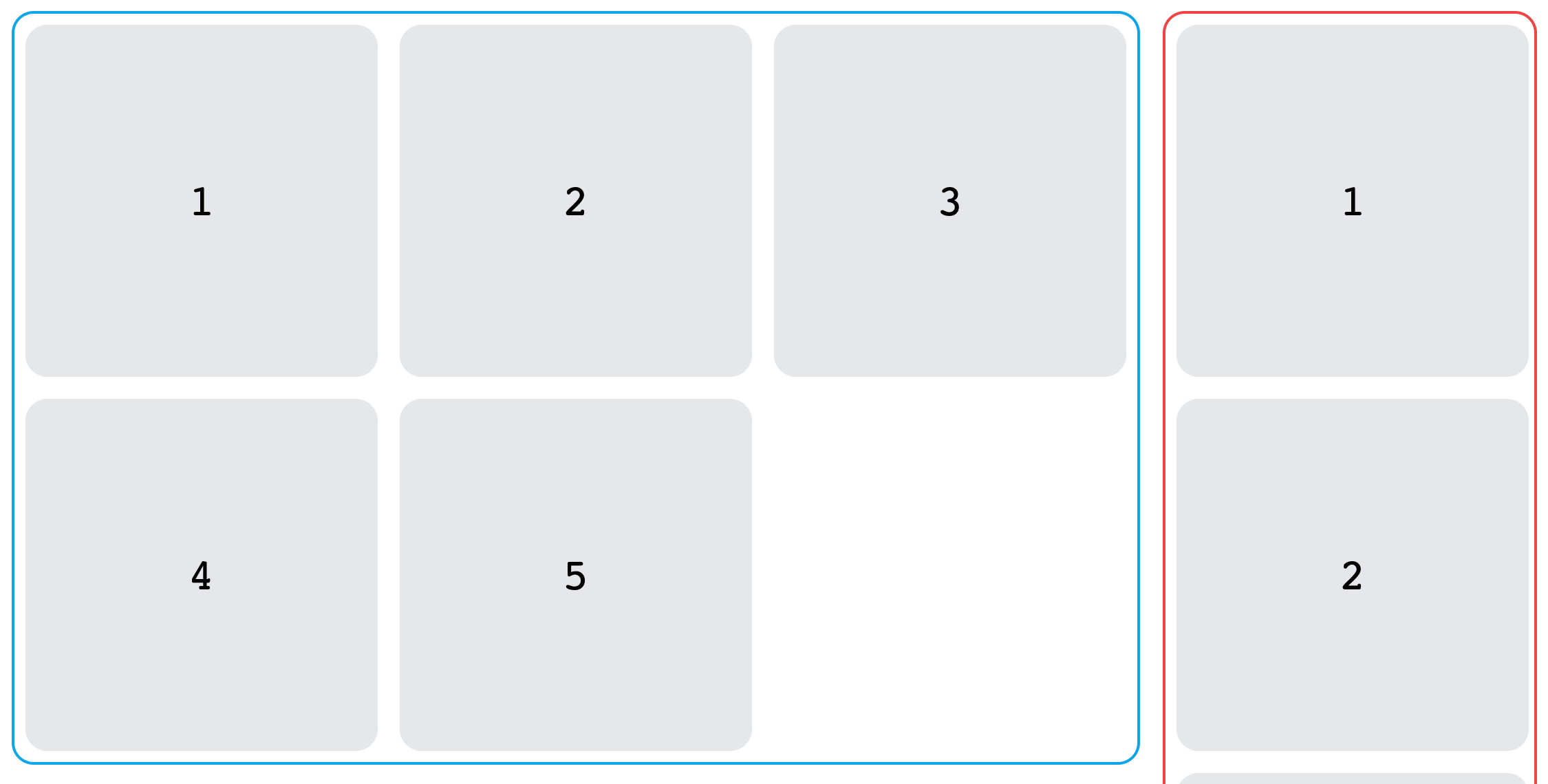
On top of that, this solution works well only at specific viewport sizes (separate layouts highlighted with different colors):
The minute viewport is resized, and the UI breaks:

All the media queries for the grid layout need to be updated, with consideration of the new limited viewport. Adding such code is cumbersome and, again, either makes the component unnecessarily complex or necessitates an entirely separate component. More code, decreased readability, and more challenging maintenance are all issues that you could avoid by using container queries.
Implementing Container Queries
To see how container queries can fix the mentioned issues, you’ll need to first wrap your layouts in separate containers:
.grid-container {
  display: flex;
  justify-content: center;
  align-items: flex-start;
  container-type: size;
}
On top of basic styling properties, you’ll have to include a container-type property. It defines the element as a query container, allowing its descendants to query its properties. It can have different values to indicate what type of query container you want: size, inline-size, style, and so forth. Since you’ll be querying the container’s dimensions, use size.
Alternatively, instead of container-type, you can use the container property, which is a shorthand for container-type and container-name:
.grid-container {
  /* ... */
  container: size my-container;
}
The container-name property allows you to set a custom name for the container to target it directly in case the element has multiple query containers, like so:
.grid-container {
  /* ... */
  container-name: my-container;
}
With containers ready, all you need to do is change the @media queries to @container:
@container (min-width: 560px) {
  .grid {
    grid-template-columns: repeat(2, minmax(0, 1fr));
  }
}
@container (min-width: 832px) {
  .grid {
    grid-template-columns: repeat(3, minmax(0, 1fr));
  }
}
@container (min-width: 1104px) {
  .grid {
    grid-template-columns: repeat(4, minmax(0, 1fr));
  }
}
@container (min-width: 1376px) {
  .grid {
    grid-template-columns: repeat(5, minmax(0, 1fr));
  }
}
In case you’ve specified a container-name (eg my-container), you can query the specific container directly by using the following syntax:
@container my-container (min-width: 560px) {
  .grid {
    grid-template-columns: repeat(2, minmax(0, 1fr));
  }
}
Now, all the styles will apply based on container size, which fixes all the previous issues with media queries:

Thanks to the use of container queries, you now have a single component that easily adapts to the available space. For you, this translates to less code, more flexibility, and faster development.
If you have a compatible browser and the required feature flags turned on, you can preview the working demo at this CodePen.
Conclusion
When container queries become an official part of the CSS specification, they’ll massively help developers create more flexible and responsive components. As you’ve seen, container queries are easy to use and serve to improve maintainability and development experience while working with CSS. Are you already using container queries today? We would love to hear your feedback on how it changes the way you write your web apps.