Customizing the event editor for Bryntum Scheduler
We strive to keep posts updated, but code samples may sometimes be outdated. Humans, see the Bryntum documentation; agents, https://mcp.bryntum.com for the latest info.
Bryntum Scheduler is a feature-rich, high-performance scheduling UI component built with JavaScript that can be used with major JavaScript frameworks such as React, Vue, and Angular. In this tutorial, we’ll create a meeting room booking app to show some common event editor customizations that you can make to your Bryntum Scheduler. We’ll make the following customizations to the event editor:
- Add styles to field labels and inputs using CSS.
- Add a dropdown room number input.
- Add a group input field with radio buttons colored according to the event type.
- Add a text area input for event notes.
- Add a checkbox input.
- Add a slide toggle input.
- Add an input that allows the user to make recurring events.
The event editor of the Bryntum Calendar component can also be customized like the Bryntum Scheduler event editor. The Bryntum Gantt does not have an event editor, but it has a task editor that’s similar to the event editor, and it can be customized too. You can learn more about customizing the task editor by following this guide in our docs.
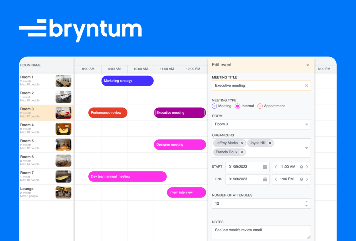
Once you’re done with this tutorial, you’ll have a meeting scheduler that looks like the one shown in the image below:
You can find the code for the completed meeting scheduler in our GitHub repository.
Getting started
We’ll start by cloning the custom event editor Scheduler starter GitHub repository. The starter repository uses Vite, which is a development server and JavaScript bundler. You’ll need Node.js version 14.18+ for Vite to work.
Install the Vite dev dependency by running the following command: npm install.
The starter repository contains code for a working meeting scheduler booking app. We’ll improve it by customizing the event editor. The following table explains the contents of some of its files and folders:
| File / folder | Contents |
main.js | JavaScript file where the Bryntum meeting scheduler is defined. |
style.css | Contains custom CSS styling for the scheduler. |
/lib/MeetingBookingModel.js | Custom event model for the meeting room booking data. |
/data/data.json | Data for resources and events. The resources for the scheduler are the meeting rooms and the events are the bookings. |
/data/data-recurring.json | Data for resources and events. The data in this file is the same as the data in the data.json file but the events have a recurrenceRule property. |
/public/data/resources | Images for the meeting rooms, which are displayed in the “Room name” column of the scheduler. |
To customize the event editor, we’ll change the Bryntum Scheduler config in the main.js file. We’ll only need to change the code in this file for this tutorial.
You can try out Bryntum components for free using our public Bryntum trial packages.
If you have a Bryntum license, please refer to our npm Repository Guide to access the private Bryntum repository.
Now run the local development server using npm run dev. You’ll see the meeting room booking app as shown below:
To open the event editor, double-click one of the meeting event bars. You can also right-click on a meeting event bar and then click on the “Edit event” item on the menu that pops up. The edit event pop-up contains default widgets and default buttons. We’ll customize these widgets using a config object and add custom widgets. You can also remove default widgets if you need to.
Initial scheduler configuration
The scheduler in the main.js file has some initial configuration for the timeline view, the data source, and the columns of the scheduler. The viewPreset property describes the type of timeline view and how the timeline header is formatted:
  viewPreset: {
    base: "hourAndDay",
    tickWidth: 100,
    headers: [
      {
        unit: "day",
        // Use different date format for top headerdateFormat: " ddd DD.MM.YYYY",
      },
      {
        unit: "hour",
        dateFormat: "LT",
      },
    ],
  },
The base property defines the base preset. It uses one of the predefined presets. The headers property is used to customize the header rows. You can view the different dateFormat options here.
The resourceImagePath property contains the path to load resource images from:
resourceImagePath: "resources/",
In this case, the images are for the meeting rooms. They’ll be displayed in the “Room name” column defined in the columns property:
  columns: [
    {
      type: "resourceInfo",
      text: "Room name",
      width: 200,
      showMeta: (room) =>StringHelper.xss`Max ${room.capacity} people`,
    },
  ],
The showMeta property allows us to show extra information about each resource (meeting room). We’ll show the maximum number of people each room can accommodate. This data can be seen for each resource in the data.json file.
Make sure that the StringHelper class is imported:
import { StringHelper } from"@bryntum/scheduler";
We use the crudManager to load data for the resources and events from the data.json file:
  crudManager: {
    autoLoad: true,
    loadUrl: "data/data.json",
    eventStore: {
      modelClass: MeetingBookingModel,
    },
  },
The loadUrl property defines the URL data source that’s used to populate the scheduler’s data stores. The eventStore holds the data for our meeting events. It uses the custom MeetingBookingModel that extends the scheduler EventModel and it adds extra fields to our meeting event. These extra fields can be seen in the static fields property in the MeetingBookingModel.js file within the lib folder. You can see these extra event properties in the starting events data in the data/data.json file.
You can configure the crudManager to sync data changes to a specific backend URL. For more information, read the following guide in our docs: Saving data.
Now let’s start customizing our event editor.
Styling field labels and inputs using CSS
To customize our event editor pop-up, we’ll configure the eventEdit feature. Add the following features property below the resourceImagePath property:
  features: {
    // Customize the event editor
    eventEdit: {
      editorConfig: {
        autoUpdateRecord: true,
        defaults: {
          // can be "before" (default) or "above" labelPosition: "above",
        },
      },
    },
  },
We set the scheduler to update the assigned record automatically when the field changes by setting autoUpdateRecord to true. The record in this case is the meeting room. The default labelPosition is set to “above” instead of the default “before”. You’ll see that the labels are now above the inputs in the event editor pop-up:
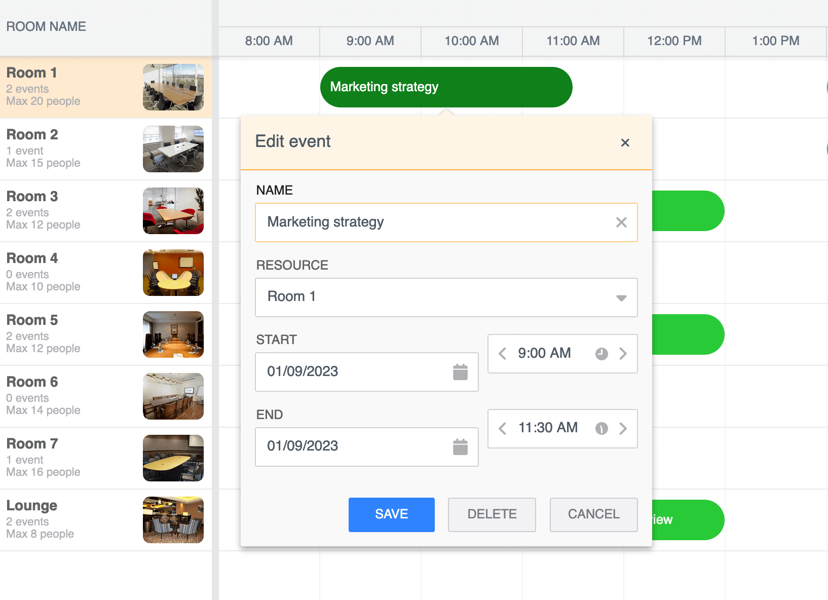
We need to change some of the labels and fix the alignment for the startTimeField and endTimeField. Add the following items property below the editorConfig property:
      items: {
        nameField: {
          label: "Meeting title",
        },
        resourceField: {
          label: "Room",
        },
        startDateField: {
          labelPosition: "before",
          id: "startDateField",
        },
        endDateField: {
          labelPosition: "before",
          id: "endDateField",
        },
      },
The items config is used to customize existing widgets or add new ones. We customized the default widgets by changing their label and label position. We also added an id to the startDateField and endDateField widgets to remove the flexbox styling on the labels. This is done to overwrite the flexbox styling on the widgets and align the labels to the left. The styles for the CSS can be seen in the style.css file. If you want to inspect the CSS styles of the event editor pop-up, open your dev tools and run the following code in the console:
setTimeout(()=>{debugger;},5000);
Open the event editor pop-up within five seconds. The application execution will be paused in the debugger. Now you can inspect the event editor pop-up’s CSS styles without the pop-up closing when you want to inspect it.
Adding a dropdown input field
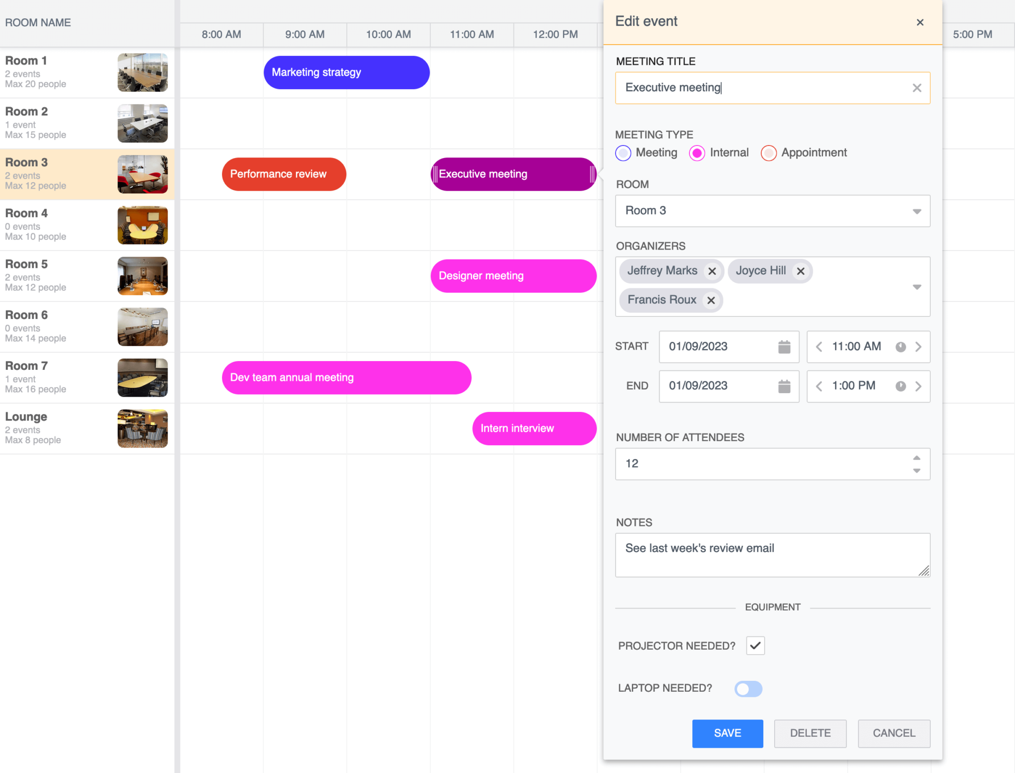
Let’s add a custom input field, a combo (dropdown) widget for the name of the meeting organizers. Add the following widget item below the endDateField:
organizersField: {
  type: "combo",
  label: "organizers",
  name: "organizers",
  multiSelect: true,
  weight: 210,
  items: [
    "Peter Johnson",
    "Francis Roux",
    "Jeffrey Marks",
    "Joyce Hill",
    "Bryce Jones",
  ],
  required: "true",
},
This adds a dropdown input for the meeting organizers. We set multiSelect to true to allow multiple organizers to be selected.
The weight property determines the order of the default widgets. We set the weight to 210 so that the organizers field is displayed after the resourceField, which has a weight of 200. You can see a list of the default weights in this default widgets table in our docs. Note that the added organizers field in our MeetingBookingModel in MeetingBookingModel.js has a type of “object”. This is because the data is an array of values, as can be seen in the initial data in the data.json file. The input won’t work if the type is changed to “string”, for example.
You’ll now be able to select multiple organizers for each meeting:
Adding a number input field
Let’s add an input field for the number of attendees. Add the following custom widget item below the organizersField:
    attendeesField: {
      type: "number",
      name: "attendees",
      label: "Number of attendees",
      labelCls: "label-padding",
      required: true,
      min: 1,
    },
We added a custom CSS class to the input’s label using the labelCls property. This adds some padding to the top of the label, as can be seen in the style.css file. We also set the min value to 1. We can set the max property here as well, but each resource (meeting room) has a different capacity. To set the max for each room, we’ll use a method that fires when the beforeEventEditShow event occurs. Add the following method below the columns property of the scheduler config:
  onBeforeEventEditShow({ eventEdit, resourceRecord }) {
    eventEdit.attendeesField.max = resourceRecord.data.capacity;
  },
The beforeEventEditShow event fires just before the event editor pop-up is opened and before it’s populated with data. For each event, we set the max value of the event editor’s attendees field to the capacity of the meeting room.
Adding a styled radio group input field
We’ll now add an input for the eventType field to specify the type of meeting. Add the following custom widget item below the attendeesField:
    eventTypeField: {
      type: "radiogroup",
      name: "eventType",
      label: "Meeting Type",
      labelPosition: "before",
      weight: 110, // Provided items start at 100, and go up in 100s, so insert after first onevalue: "meeting", // the default choiceid: "eventTypeField",
      items: [
        {
          type: "radio",
          color: `b-${eventTypeColors["meeting"]}`,
          name: "eventType",
          text: "Meeting",
          checkedValue: "meeting",
          checked: true,
        },
        {
          type: "radio",
          color: `b-${eventTypeColors["internal"]}`,
          name: "eventType",
          text: "Internal",
          checkedValue: "internal",
        },
        {
          type: "radio",
          color: `b-${eventTypeColors["appointment"]}`,
          name: "eventType",
          text: "Appointment",
          checkedValue: "appointment",
        },
      ],
    },
The radiogroup widget contains a set of related radio button widgets. The possible values are: “meeting”, “internal”, and “appointment”. The color property value defines the radio button’s color. The color is applied using a class name. The color class names, which all start with b-, are defined in the imported scheduler.stockholm.css file. The available checkbox colors are: blue, orange, deep-orange, indigo, green, purple, yellow, red, amber, lime, teal, light-green, and purple. You can also customize this with your own class names.
Let’s define the eventTypeColors object. Add the following code at the top of the main.js file, below the imports:
const eventTypeColors = {
  meeting: "indigo",
  internal: "purple",
  appointment: "red",
};
This object makes it easy to change the eventTypeColors and use it in multiple places.
Let’s also change the color of the meeting event bars in the scheduler depending on the event type. Add the following method below the onBeforeEventEditShow method:
  eventRenderer({ renderData, eventRecord }) {
    // change event bar color based on meeting typeconst { eventType } = eventRecord.data;
    renderData.eventColor = eventTypeColors[eventType];
    return StringHelper.xss`${eventRecord.name}`;
  },
The eventRenderer method is called when an event is rendered in the scheduler.
We get the eventType for each meeting room and then use it to change the color of the event bar. We return a string that adds the meeting title to the meeting room event bar. The string returned is rendered as HTML. You can add HTML elements, including icons, as can be seen in this tutorial: Create a property management scheduler with Bryntum using vanilla JavaScript.
Now, you’ll have a meeting-type radio group input that changes the color of the event bar when different values are selected:
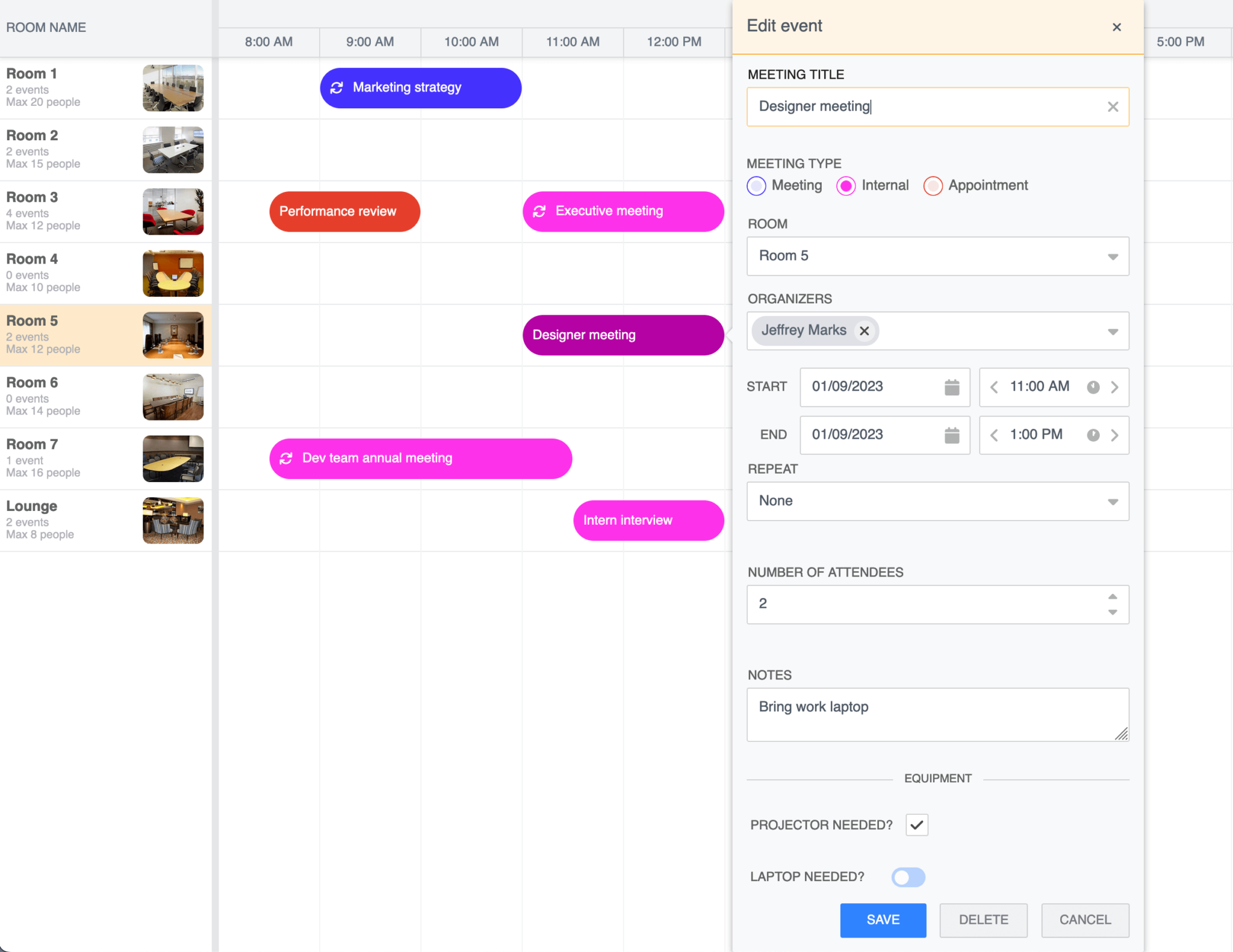
Adding a text area input
We’ll add a text area input for the meeting notes field. Add the following custom widget item below the eventTypeField:
    notesField: {
      type: "textarea",
      name: "notes",
      label: "Notes",
      labelCls: "label-padding",
      resize: "vertical",
    },
The textarea field is used for multiline text input. We added the custom “label-padding” CSS class to the label as we did for the attendeesField. The resize property is set to “vertical” so that the text field can be resized in a vertical direction.
Adding a checkbox and slide toggle input
Add the following custom widget item below the notesField:
    projectorNeededField: {
      type: "checkbox",
      name: "projectorNeeded",
      label: "Projector needed?",
      labelPosition: "before",
    },
    laptopNeededField: slideToggle,
Now add the following slide toggle field definition at the top of the main.js file:
const slideToggle = newSlideToggle({
  name: "laptopNeeded",
  label: "Laptop needed?",
  color: "b-blue",
  labelPosition: "before",
  cls: "laptopNeeded",
});
Make sure that you import the SlideToggle class:
import { SlideToggle } from"@bryntum/scheduler";
The laptopNeeded field uses the SlideToggle field, which is a customized CheckBox field that has a sliding toggle.
Let’s add a section to our event editor pop-up to visually separate these added fields from the previous fields. Add the following field below the notesField:
    customDivider: {
      html: "",
      dataset: {
        text: "Equipment",
      },
      cls: "b-divider",
      flex: "1 0 100%",
    },
This custom field renders a divider that has the text “Equipment” in the center. The line is created using the b-divider CSS class in scheduler.stockholm.css. The dataset object adds a data-text value to the rendered field <div>. The flex styling is used to make the field expand across the event editor pop-up.
You’ll now see a section for “Equipment” in the event editor pop-up:
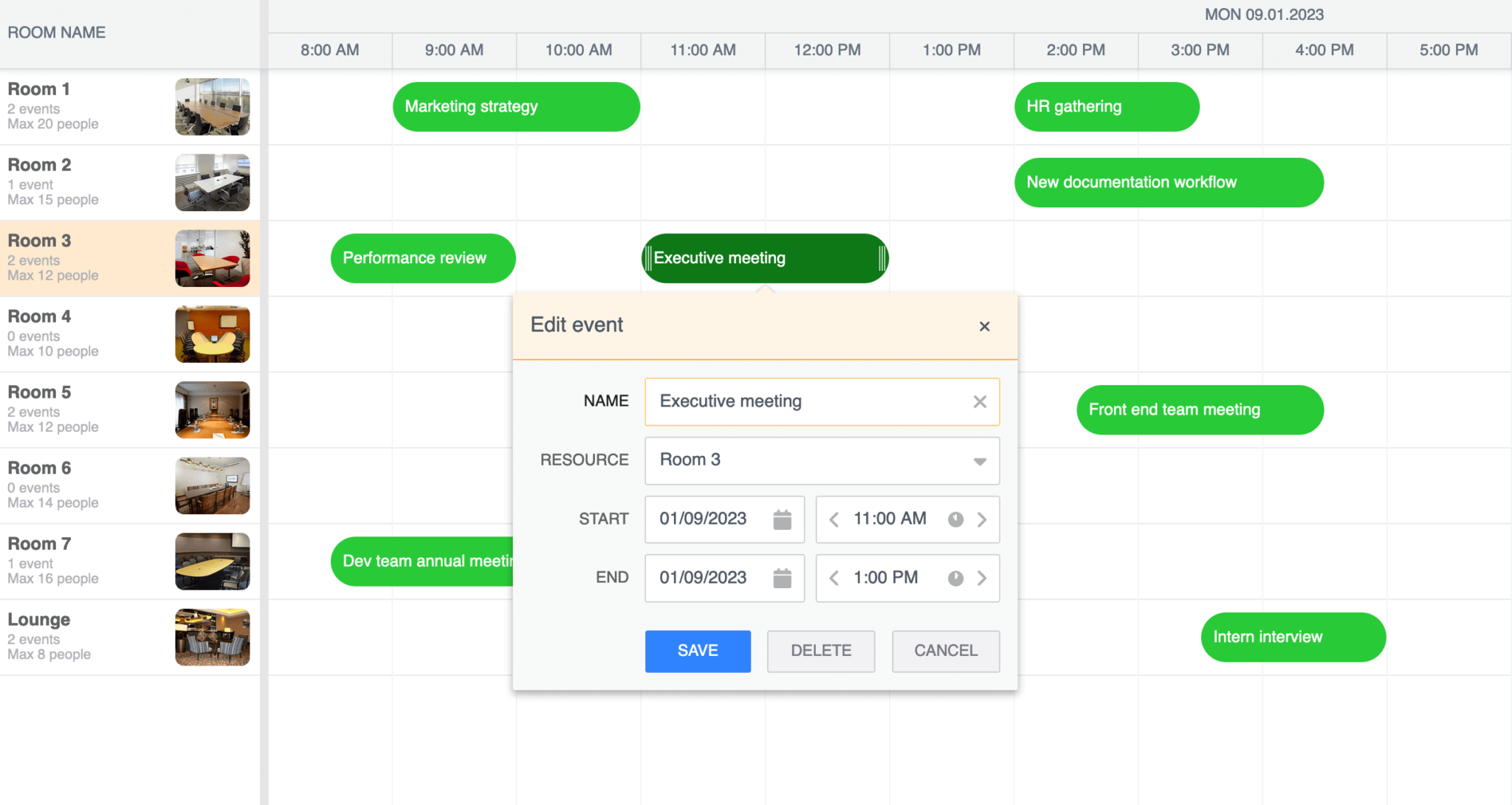
Adding an input to allow a user to make events recurring
The last customization we’ll make is to allow events to be recurring. To do this, add the following property below the resourceImagePath property:
enableRecurringEvents: true,
The enableRecurringEvents property is set to true to enable recurring events to be shown. It also adds additional default widgets, recurrenceCombo, and editRecurrenceButton to the event editor pop-up.
You’ll be able to see these in the event editor pop-up now:
Now, we’ll change the data source to include events that recur. In the crudManager config, change the data source by setting the loadUrl to “data/data-recurring.json”.
In the data-recurring.json file, the events have a recurrenceRule property that defines how often the event reoccurs. The recurrenceRule string format is described in RFC-5545. Basic recurrence rule strings include:
- “FREQ=WEEKLY”
- “FREQ=DAILY;INTERVAL=2”
- “FREQ=WEEKLY;INTERVAL=1;BYDAY=MO,TU,WE,TH,FR”
The last thing we’ll do is to show which events are recurring events by adding an icon to the meeting event bar. Add the following line to the eventRenderer method:
renderData.iconCls = eventRecord.isRecurring ? "b-fa b-fa-sync" : "";
This adds a Font Awesome sync icon to meeting event bars that are recurring:
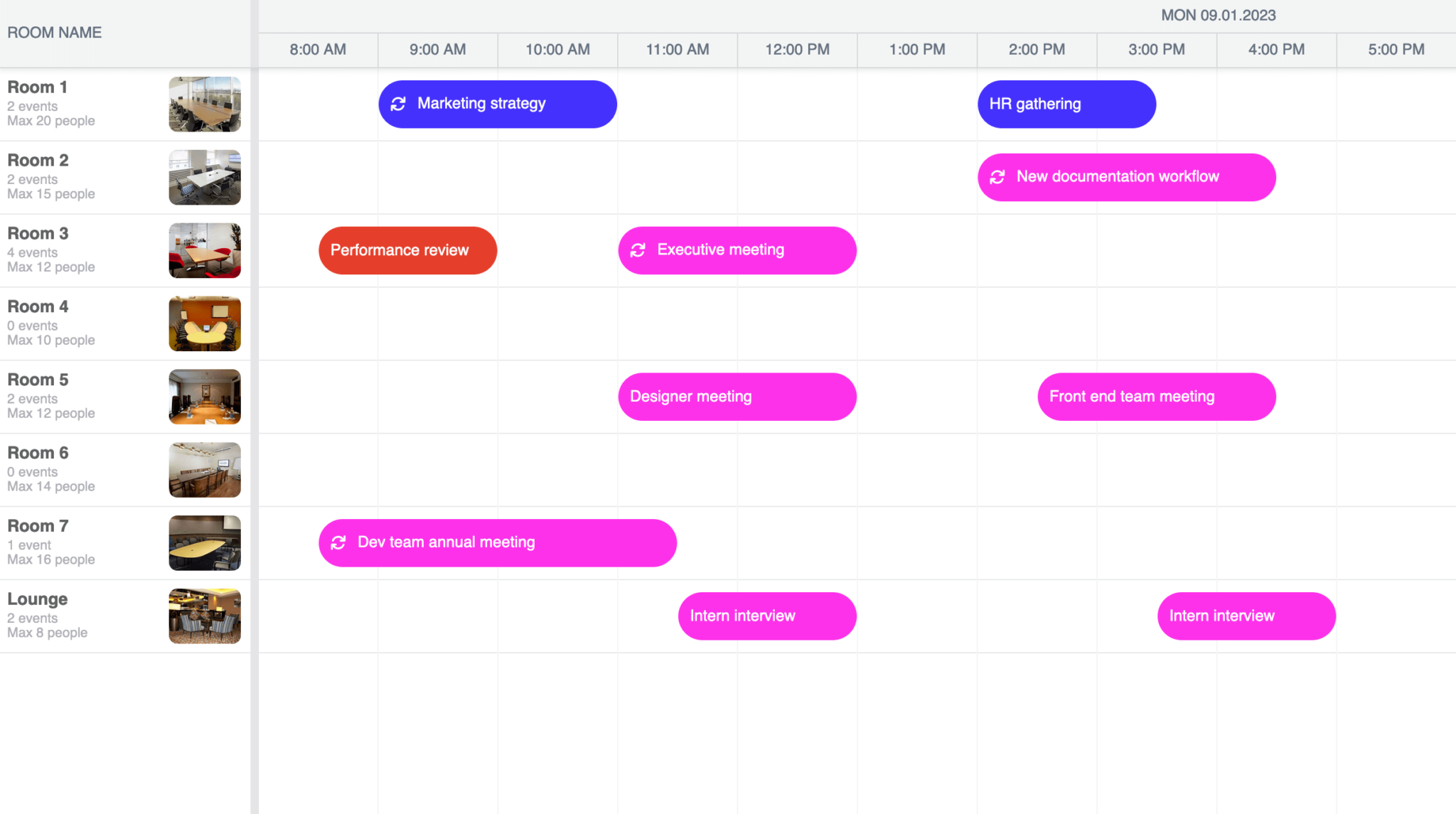
The version of Font Awesome used by Bryntum has a b-fa prefix instead of fa to prevent conflicts with other versions of Font Awesome on the page.
Next steps
This tutorial covers some basics for customizing the Bryntum Scheduler event editor pop-up. To learn more, take a look at the following articles in our docs:
You can also customize the event editor of the Bryntum Calendar: