Creating an admin dashboard app with Lovable and Bryntum Gantt
We strive to keep posts updated, but code samples may sometimes be outdated. Humans, see the Bryntum documentation; agents, https://mcp.bryntum.com for the latest info.
Lovable is one of the hottest new startups to come out of Stockholm, Sweden. It’s an AI-assisted web development tool that’s a competitor to v0 by Vercel and Bolt by StackBlitz. You provide prompts in its web UI and it creates an app for you. Further prompting allows you to build, improve, and debug your app. You don’t need to know how to code to use it. Its features include:
- Image prompts
- Contextual prompts
- Revert-change functionality
- A Select feature for modifying specific UI elements
- GitHub integration
- A Supabase connector
It creates frontend apps using Vite, TypeScript, React, shadcn/ui components, and Tailwind CSS. Its Supabase connector allows you to create full-stack apps. Its GitHub integration allows you to manually edit your code so you can build on or modify code generated by Lovable. The GitHub integration also makes it ideal for team development.
Lovable is under rapid development and often releases new features, as can be seen in its Changelog. You can also take a look at the Lovable Roadmap to see which features are coming next.
In this tutorial, we’ll build an admin dashboard with Lovable and Bryntum Gantt by:
- Creating a Lovable project
- Creating a basic admin dashboard app from an image prompt
- Using prompts to add a functional dark mode toggle to the app
- Connecting the project to a GitHub repository
- Adding a Bryntum Gantt component to a local clone of the project
- Adding a dark mode theme and theme-switching feature to the Bryntum Gantt
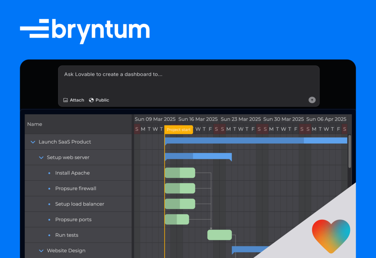
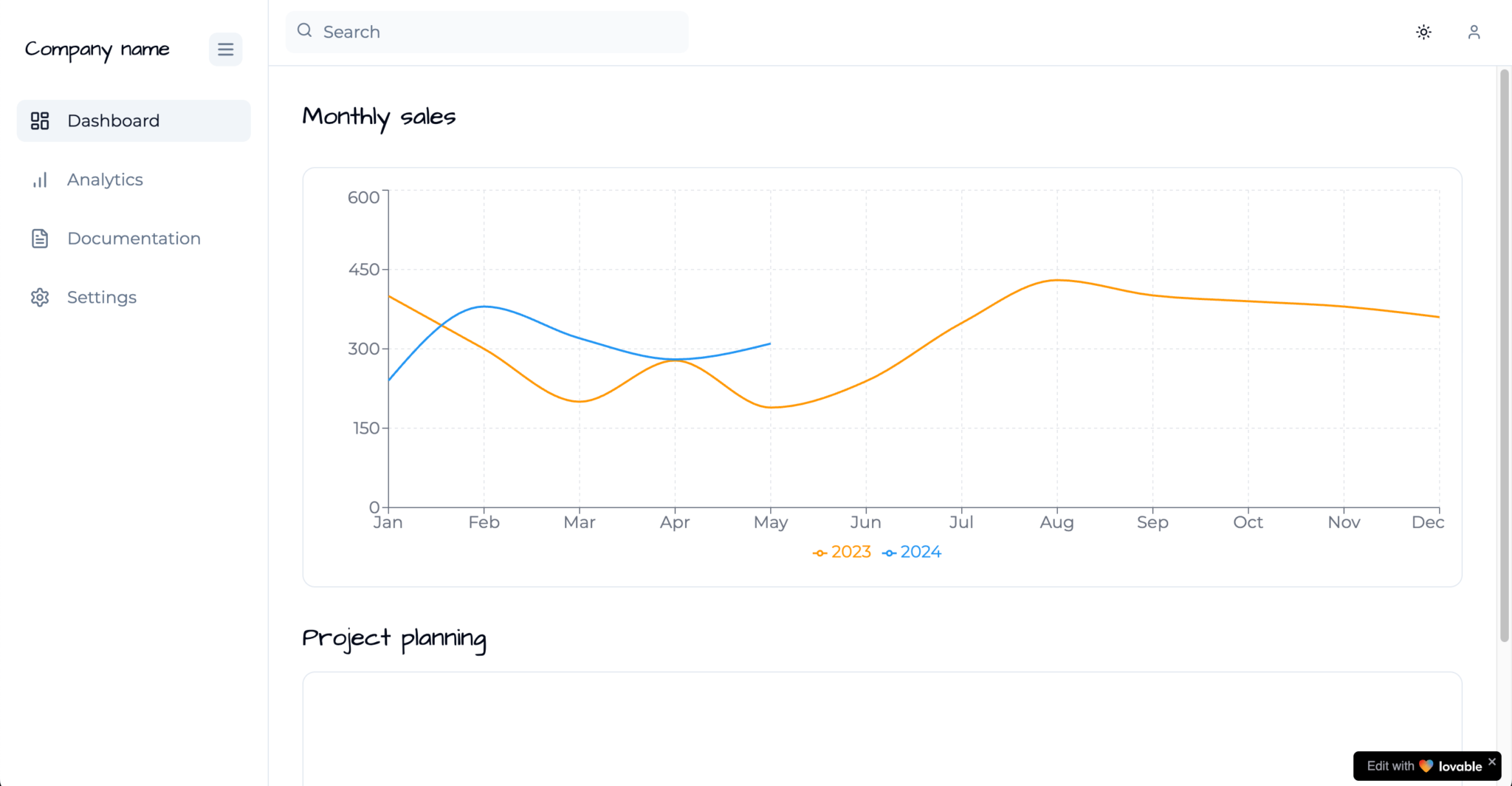
Here’s what we’ll build:
You can find all the prompts used in this tutorial in the Bryntum Gantt admin dashboard Lovable project. The code for the completed tutorial is in the Bryntum Gantt Lovable admin dashboard GitHub repo.
Creating a Lovable account and your first project
First, sign up for Lovable. The free plan gives you five prompts per day, with a maximum of 50 prompts per month. All free plan projects are public; they can be viewed and remixed by anyone.
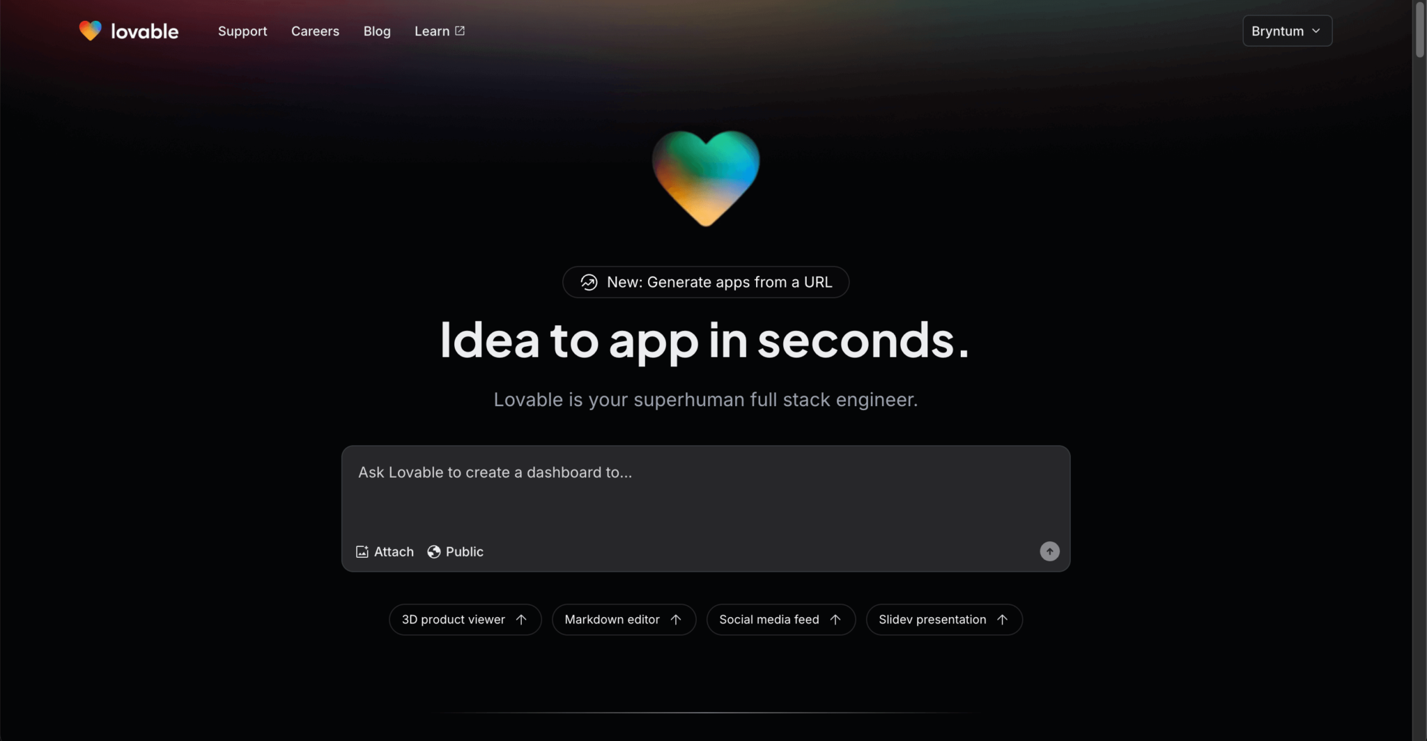
Once you’ve created an account, you’ll be redirected to the homepage. You can enter a prompt in the input to create your first project.
Lovable has a prompting guide that lists prompting strategies, features, and approaches.
We’ll create an admin dashboard app using an image of our desired app design attached to a prompt. Image prompts are particularly useful in this case, as it’s easier to show the design than to describe it. We’ll also add specific text instructions to the prompt to describe the image and help the AI better understand the intended result.
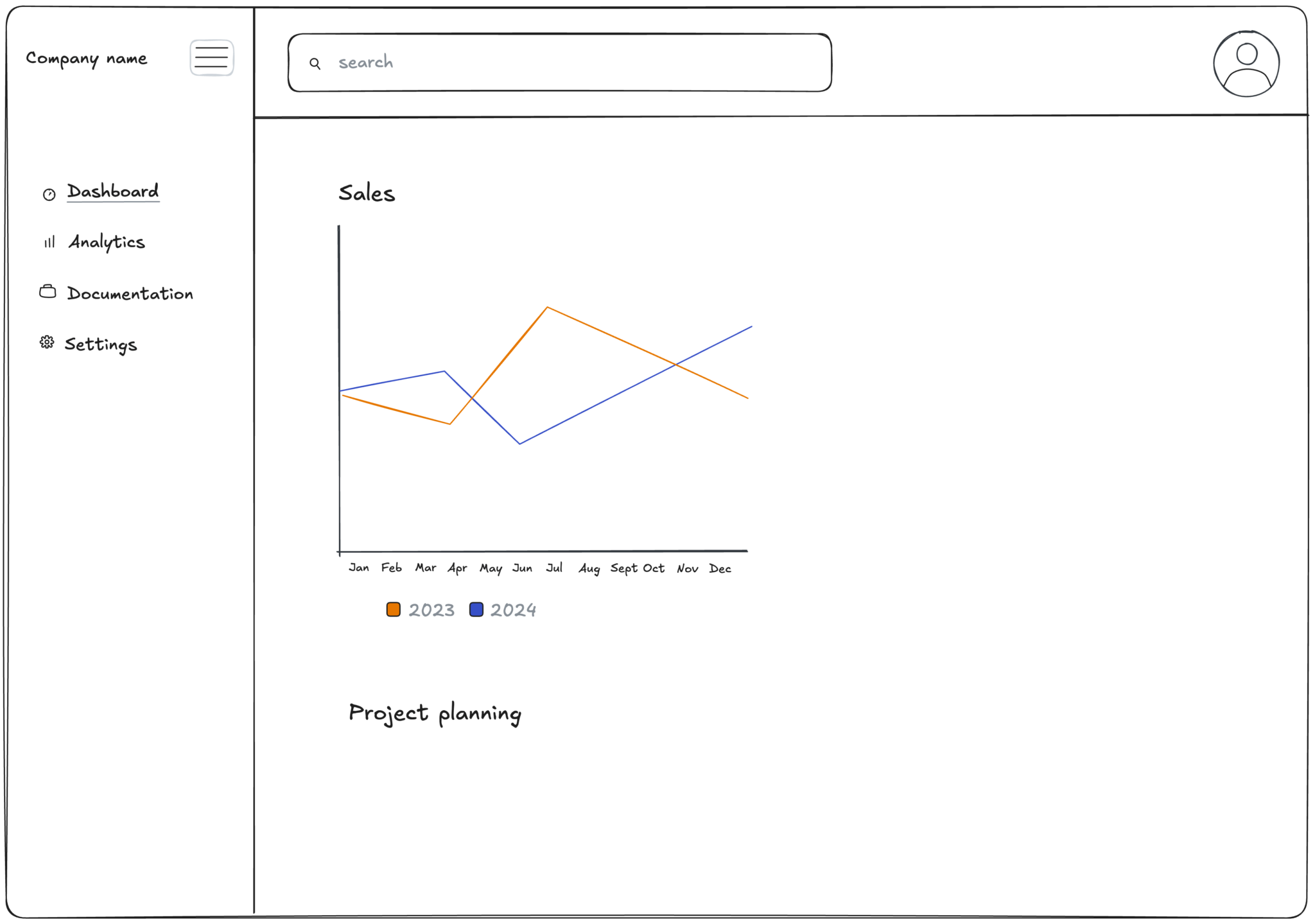
Attach the following image of a basic admin dashboard app design by clicking the Attach button below the prompt input:
Add the following text as a prompt:
I want you to create a dashboard app as similar as possible
to the one shown in this screenshot.

Here are the steps to make the dashboard app:

1. Navigation: The navigation on the left expands and
   closes using the burger button at the top of the navigation.
   In the closed state, only the icons are shown.
   Animate the transition as well.

2. Routes: Each navigation item opens a new route.

3. Dashboard route: Display a Sales chart.
   Use the Recharts library.
After sending the prompt message, you’ll be redirected to the project page.
The project page has a chat panel on the left and a preview panel on the right. Lovable will start generating the code files for the app and explain the process in the preview panel. This will take a few seconds.
This is the admin dashboard app that it created when we entered the prompt:
⚠️ LLMs can be unpredictable, so you might not get exactly the same output. Take a look at the commits in the Bryntum Gantt Lovable admin dashboard GitHub repo to see the code changes that were made by each prompt when creating this tutorial.
Lovable did a good job of recreating the design – it looks good and it’s interactive. It successfully completed all three steps in the prompt. The 2024 sales data in the chart is cut off after May, but that’s not a major issue with this first version.
The Lovable response in the chat panel explains the styling and features of the generated app.
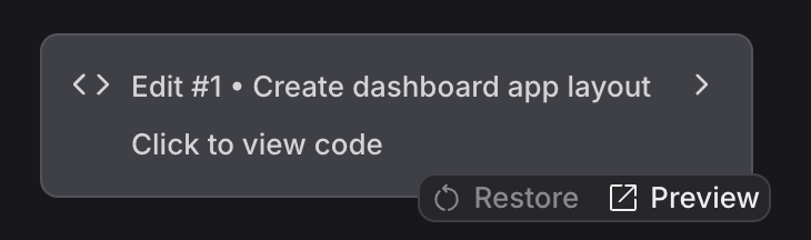
You’ll see an interactive Edit #1 element in the chat:
Clicking on this element reveals the code changes:
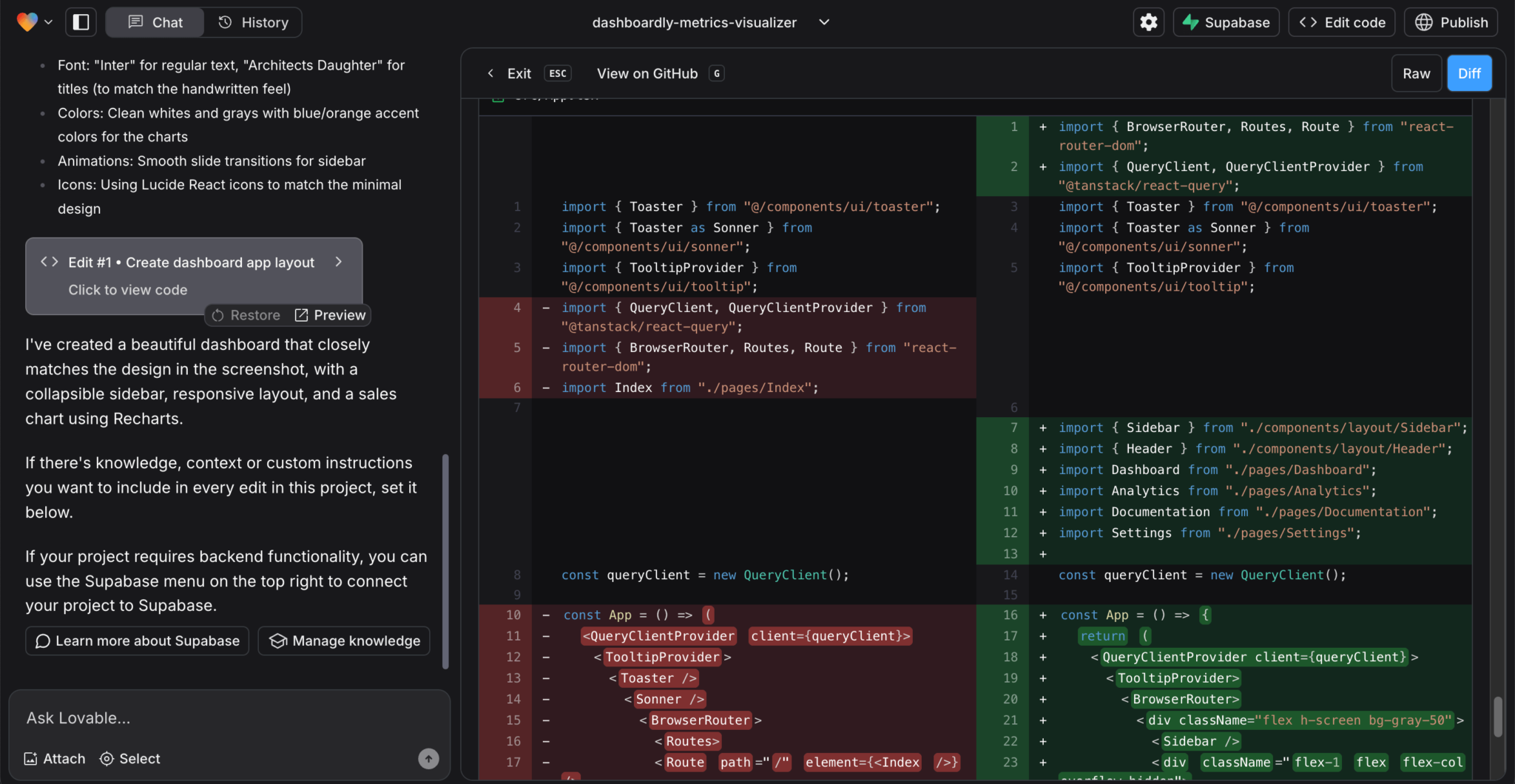
The tech stack Lovable uses is Vite, TypeScript, React, shadcn/ui components, and Tailwind CSS. It installs other npm packages as needed. For this app, it installed Recharts, Lucide React, React Query, and React Router.
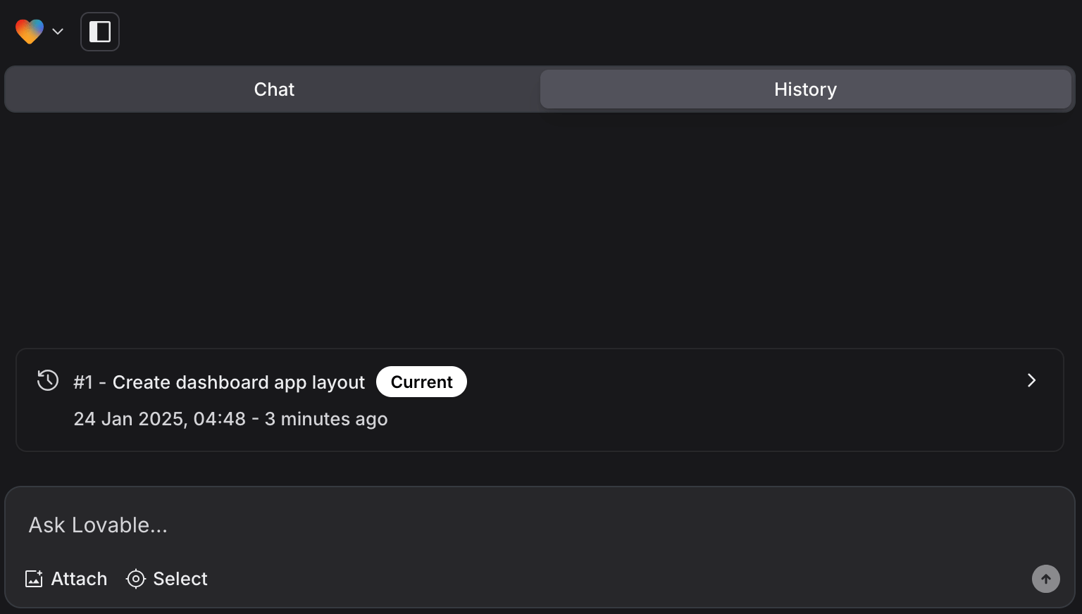
Lovable allows you to restore your app to a previous edit using the Restore button. You can see all edits in the History tab:
Adding custom knowledge and instructions for your project
Lovable projects have a Knowledge Base that lets you add custom context and instructions that will be used for every edit. You can use it to define project-specific rules or guidelines, set coding style preferences, and include external documentation or style guides.
You can access the Knowledge Base by clicking the Manage knowledge button at the bottom of the chat. Alternatively, click the gear icon at the top right of the project page to open the Project Settings, navigate to the Knowledge section, and click the Manage knowledge button. This opens a dialog with an input for editing the Knowledge Base:
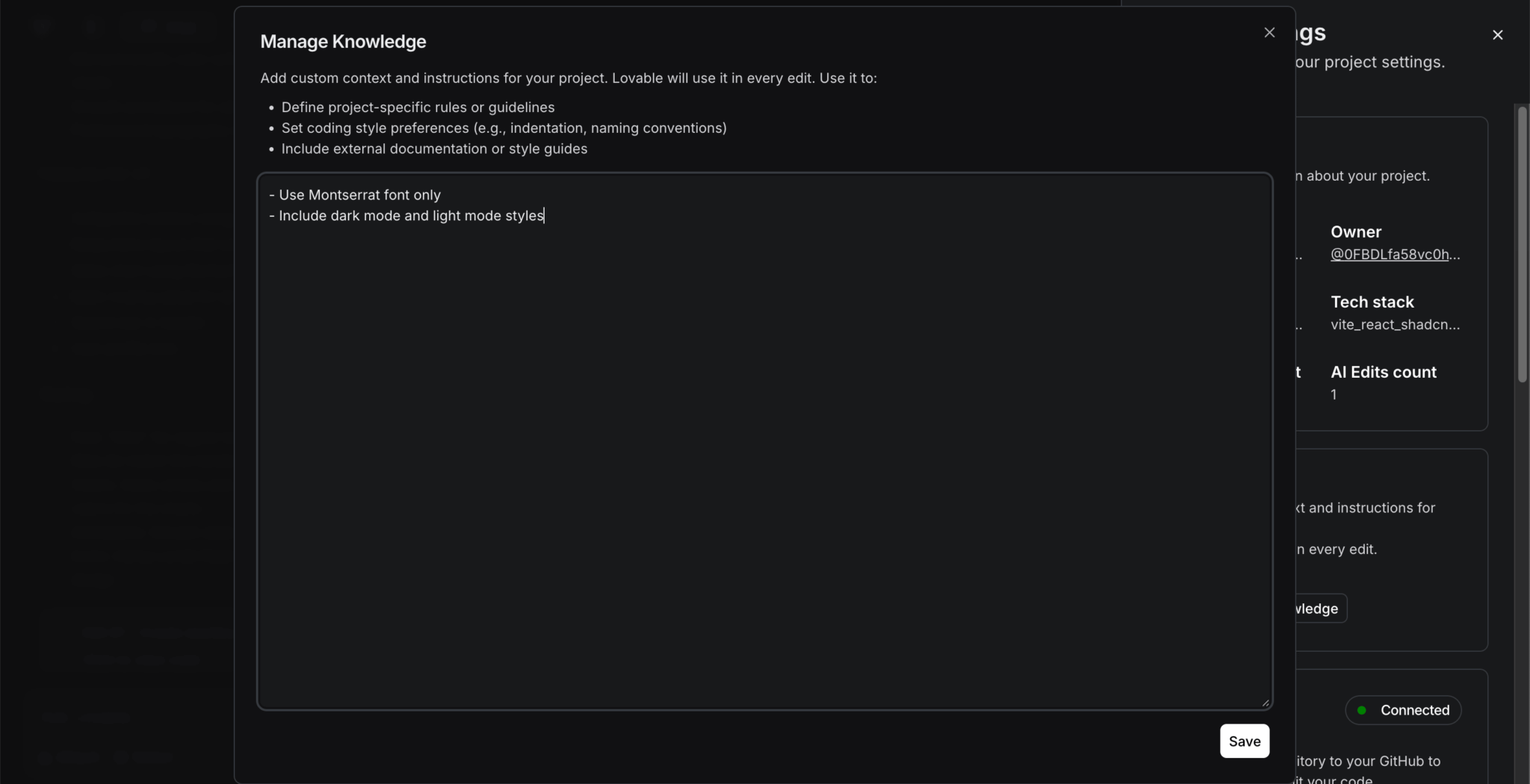
Add the following text to the Knowledge Base:
- Use Montserrat font only
- Include dark mode and light mode styles
Adding a functional dark mode toggle button
Let’s add a feature that can be quite tricky to implement yourself: dark mode.
Send the following prompt in the chat to create a functional dark mode toggle button:
Add a light mode - dark mode toggle button to the right
of the user profile icon. When dark mode is toggled on,
it should change the Tailwind styling of the background,
text, icons, and chart.
This created the dark mode toggle button, but it wasn’t functional, and only the chart grid color changed:
You can provide specific feedback to fix the output. Add the following prompt to the chat:
Toggling dark mode on does not change the background color to a dark color.
The only visible change is that the chart's grid color changes to black.
The background should be dark.
The text and icons should be light.
This fixed the dark mode toggle by applying the correct theme-aware Tailwind classes to the components:
One issue with the response was that the header font didn’t change to Montserrat, even though our Knowledge Base stated that only the Montserrat font should be used. We added an instruction to change the font in our next prompt and were able to quickly solve this issue, but if you encounter any technical issues such as “Fix Error” loops, take a look at the Lovable Troubleshooting Guide.
Using the Select feature to modify a specific component
The Select tool allows you to make changes to specific UI elements. To activate it, click the Select button below the chat input:
When you hover over a UI element, you’ll see a tooltip that displays its HTML element type. Once you select an element, it will be attached above the chat input. Hovering over the attached input shows the line number and file location of the element. Clicking on the attached input removes the selection. You can also remove the current element selection by selecting a different element.
Select the Sales header in the Dashboard route and add the following text prompt:
Change the text to Monthly sales. Also, change the font to Montserrat
for all of the text in the app. This instruction is in the Knowledge Base.
This changed the header text but failed to change the handwritten Architects Daughter header font:
We could send another prompt to specifically change the header fonts to Montserrat, but we’ll leave it as is because we’ve reached the five-message daily limit on the free plan.
Now, let’s learn how to connect the project to a GitHub repository so that we can manually edit the code.
Connecting the project to a GitHub repository to make code edits
At the top right of the preview panel, click on the Edit code button:
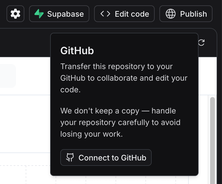
In the popup menu that opens, click Connect to GitHub to connect Lovable to your GitHub account. Follow the prompts to install lovable.dev on your GitHub account. On the Install and Authorize screen, you can choose Only select repositories, then select a repository in your account from the dropdown, and click the Install & Authorize button.
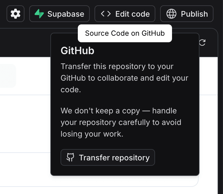
Opening the Edit code popup will now show the Transfer repository button. Click on it and select your GitHub account:
Once the code has been transferred, opening the Edit code popup will reveal the GitHub repo connected to the project and the URL for cloning the repo:
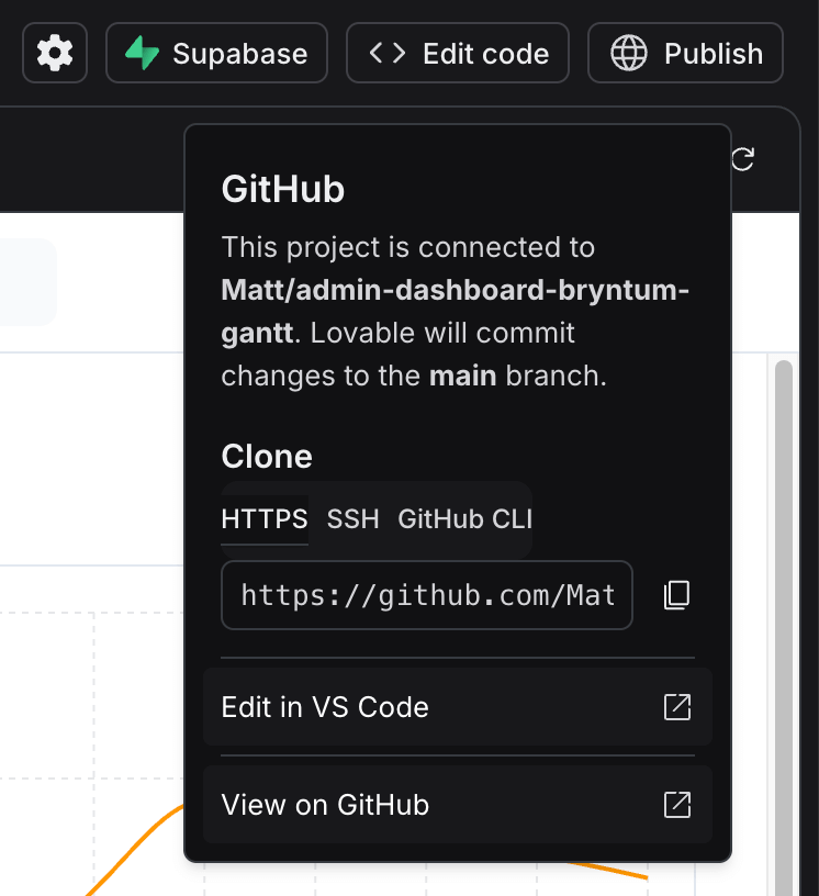
Lovable will commit changes to the main branch of the repository.
⚠️ If you’re unable to copy the project to GitHub, select All repositories instead of Only select repositories to give Lovable access to all of your repositories. Once the repository is created by Lovable, you can change the access to Only select repositories in your GitHub Applications settings.
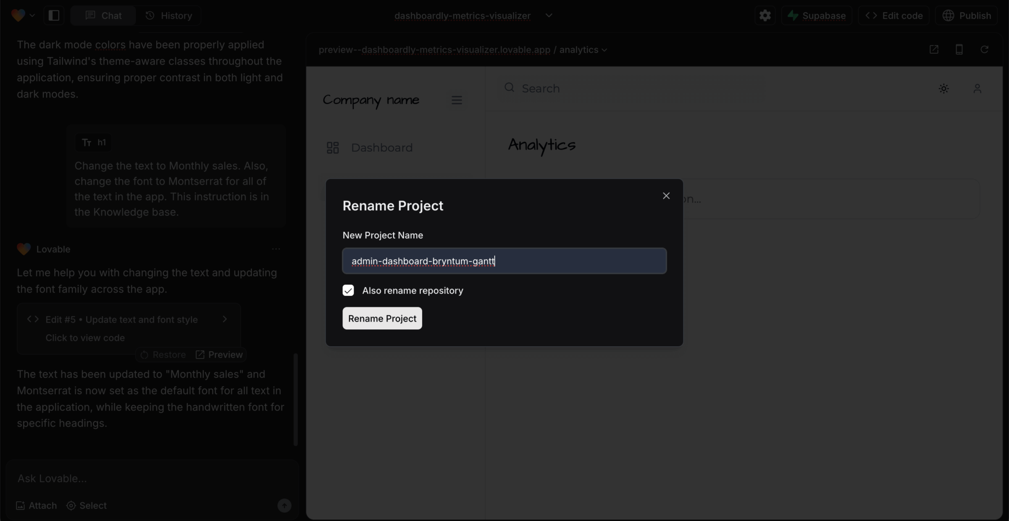
You can change the name of the project and repository by clicking on the project name at the top of the project preview panel:
Changes that you make to the GitHub repo will change the Lovable project. You can see external commits in the chat panel. Changes that you make to the Lovable project will automatically be committed to this repo.
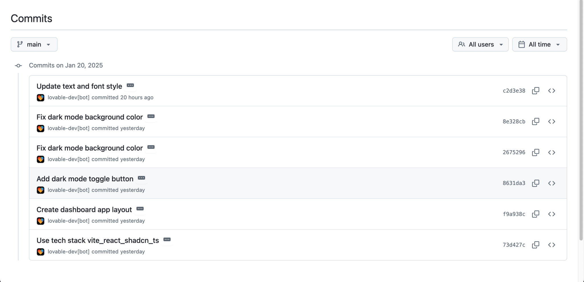
Your GitHub repo will have a README containing information about your project, including its tech stack and instructions for editing the code and deploying the app.
The repo will also contain a commit made by the lovable.dev GitHub app for each of the prompts that you sent via the Lovable UI:
Lovable limitations
One alternative option is to download the Bryntum Gantt JavaScript bundles and use the vanilla JavaScript Bryntum Gantt without npm. The maximum codebase size supported by Lovable is 100,000 lines of code, so you would need to use the minified source code that comes with the licensed version of the Bryntum Gantt.
However, the Lovable GitHub integration allows us to bypass these limitations, so we’ll now work locally with the admin app skeleton that we were able to build so rapidly.
Fixing the header font in a local copy of the project
Because LLMs can be unpredictable, the Lovable app output can vary and your header fonts may have changed to Montserrat. To follow along with the rest of this tutorial, clone the bryntum-gantt-lovable-admin-dashboard GitHub repo.
Move back two commits using the following command:
git reset --hard HEAD~2This command reverts the repository to the commit that marks the last Lovable update, which did not change the header fonts to Montserrat.
Next, install the dependencies, then run the Vite development server using the following command:
npm run devThe admin dashboard app is now accessible at https://localhost:8080/.
Let’s remove the handwritten font family from the theme extension configuration. In the tailwind.config.ts file, locate fontFamily under extend and remove the line handwritten: ["Architects Daughter", "cursive"],.
Now remove the Architects Daughter font import from the index.css file:
- @import url('https://fonts.googleapis.com/css2?family=Architects+Daughter&family=Montserrat:wght@400;500;600;700&display=swap');
+ @import url('https://fonts.googleapis.com/css2family=Montserrat:wght@400;500;600;700&display=swap');
Next, remove the font-handwritten class from all of the header elements in the components.
Your headings should now use the Montserrat font.
You may have noticed that the Company name header and burger button are not vertically aligned with the top navigation items. To fix this, open the Sidebar.tsx file and change the Tailwind CSS top padding of the <aside> element to pt-4:
- pt-8
+ pt-4
Adding a Bryntum Gantt React component to the local app
If you’re using the free trial, install the public Bryntum trial packages:
npm install @bryntum/gantt@npm:@bryntum/gantt-trial @bryntum/gantt-reactIf you have a Bryntum license, refer to our npm Repository Guide and install the licensed packages:
npm install @bryntum/gantt @bryntum/gantt-reactConfiguring the Bryntum Gantt and adding example data
Create a config folder in the src folder. Create a ganttConfig.ts file inside the config folder and add the following lines of code to it:
import { BryntumGanttProps } from "@bryntum/gantt-react";
const ganttProps : BryntumGanttProps = {
  columns: [
    { type: 'name', field: 'name', width: 350 }
  ],
  viewPreset: 'weekAndDayLetter',
  project: {
    transport: {
      load: {
        url: 'data.json'
      }
    },
    autoLoad: true,
    // Automatically introduces a `startnoearlier` constraint for tasks that (a) have no predecessors, (b) do not use
    // constraints and (c) aren't `manuallyScheduled`
    autoSetConstraints: true
  }
};
export { ganttProps };
The Bryntum Gantt Project has a Crud Manager that simplifies loading data to and from a server. The Crud Manager uses the Fetch API as a transport system.
In the above code, we set the loadUrl to a data.json file, which we’ll add to the public folder.
Create a data.json file in the public folder and add the data from the completed app’s data.json file to it.
Creating the Bryntum Gantt React component
Next, create the Bryntum Gantt component by creating a gantt.tsx file in the src/components/ui folder and adding the following lines of code to it:
import { useRef } from 'react';
import { BryntumGantt } from '@bryntum/gantt-react';
import { ganttProps } from '../../config/ganttConfig';

const Gantt = () => {
  const ganttRef = useRef<BryntumGantt>(null);

  return <BryntumGantt ref={ganttRef} {...ganttProps}  />;
};

export default Gantt;
The ganttRef gives you access to the Bryntum Gantt instance.
Adding a CSS theme
Import the Bryntum Gantt Classic light theme in the src/index.css file:
@import "@bryntum/gantt/gantt.classic-light.css";This theme is one of the five available themes for Bryntum Gantt.
Delete the src/App.css file, as it’s not used anywhere.
Rendering the Bryntum Gantt
Import the Gantt component in the src/pages/Dashboard.tsx file:
import Gantt from '@/components/ui/gantt';Render the Gantt in the Project planning section:
- <div className="bg-card rounded-xl p-4 border border-border h-64">
-   /* Project planning content will go here in future iterations */}
- </div>
+ <div className="bg-card rounded-xl p-4 border border-border h-[80vh]">
+   <Gantt />
+ </div
Here, we increase the height of the Gantt container div to 80% of the viewport height.
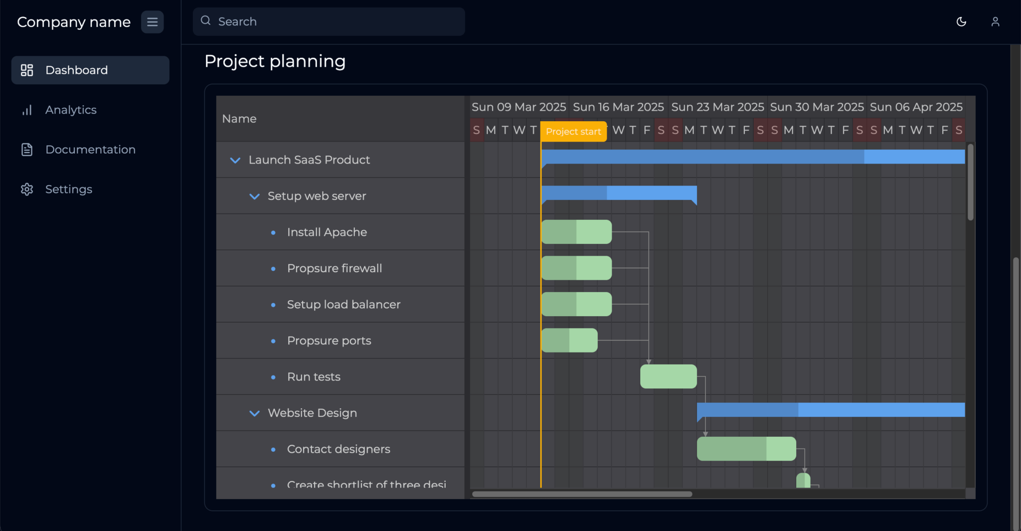
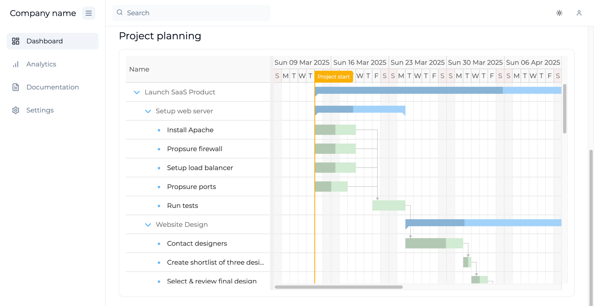
Run the Vite development server and open https://localhost:8080. You should see a Bryntum Gantt chart populated with example data:
If you open your Bryntum Gantt in the Lovable UI, you’ll get an error:
Failed to resolve import "@bryntum/gantt" from "src/pages/Dashboard.tsx".
Does the file exist?
Now let’s improve the styling of the Gantt chart to better match the dashboard styling.
Styling the Bryntum Gantt row height and task bars
First, increase the row height of the Gantt and decrease the margin of the task bars by adding the following properties to the ganttProps in the src/config/ganttConfig.ts file:
barMargin: 8,
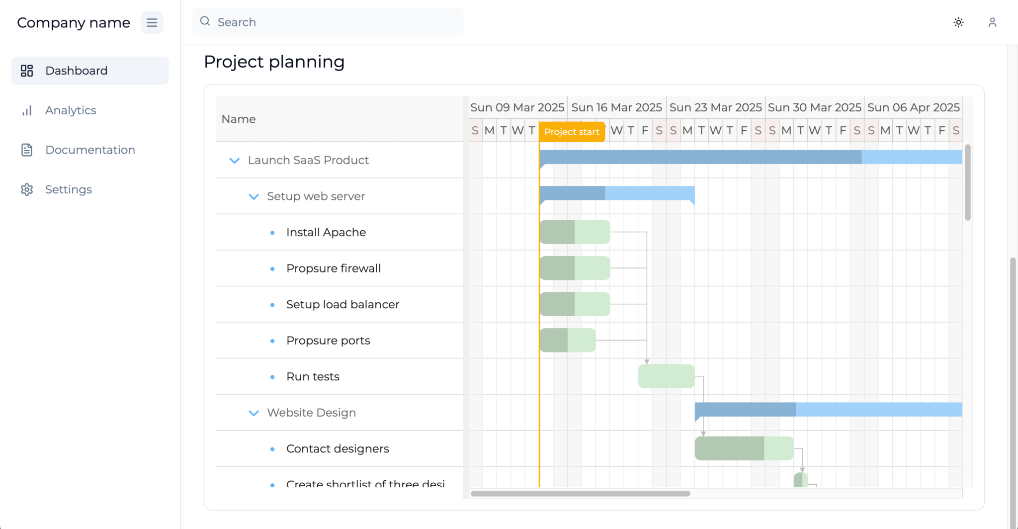
rowHeight: 50,Now, round the task bars using the taskRenderer method. Add the following lines of code to the ganttProps:
  taskRenderer: ({
    renderData
  }) => {
    renderData.cls += ' rounded-lg';
    return '';
  },
This method is called when a task bar is rendered in the Gantt. The returned value is displayed on the task bar, and can be a string, HTML string, or DOM config. We use the renderData argument to add a TailwindCSS class to the task bar, which changes its border radius:
Adding a dark mode theme and theme-switching feature to the Bryntum Gantt
We chose the Classic light theme because there’s a Classic dark theme as well. You can also create custom themes by modifying the variables of an existing theme.
Let’s get the Bryntum Gantt to switch between the light and dark themes when light or dark mode is selected.
First, remove the Classic light theme CSS import in the src/index.css file:
- @import "@bryntum/gantt/gantt.classic-light.css";In the public folder, create a themes folder. Add the gantt.classic-light.css file, the gantt.classic-dark.css file, and the fonts folder from node_modules/@bryntum/gantt to the themes folder.
In the index.html file, import the Classic light theme CSS stylesheet in the <head> of the HTML document:
<link rel="stylesheet" href="/themes/gantt.classic-light.css" data-bryntum-theme>The data-bryntum-theme attribute allows you to change the theme using the DomHelper.setTheme() method.
Import the DomHelper in the Header.tsx file:
import { DomHelper } from "@bryntum/gantt";Add the following line of code to the onClick event handler of the Toggle theme button, above the setTheme() state setter call:
DomHelper.setTheme(theme === "dark" ? "classic-light" : "classic-dark");Lovable installed and used the next-themes npm library to add a dark mode toggle to our app. The light or dark theme is stored in local storage so that the selected theme persists on page refresh. We need to check the theme on page load and set the correct initial theme for the Bryntum Gantt.
Import the DomHelper in the src/pages/Dashboard.tsx file:
import { DomHelper } from '@bryntum/gantt';In the Dashboard component, set the Bryntum Gantt theme below the isDark variable declaration:
DomHelper.setTheme(isDark ? "classic-dark" : "classic-light");Open your development server and switch between light mode and dark mode. You’ll see that the Bryntum Gantt theme changes as you switch between modes:
Next steps
As with all AI-generated code, it’s important to review the code added by Lovable to make sure that you understand it. It can have incorrect output, as we saw with the misaligned burger button and unused App.css file.
Building apps with AI-assisted development tools can get you far – Lovable just allowed us to rapidly build an admin dashboard template – but the last part of building an app may require you to manually edit code. This has been described as the 70% problem. The Lovable GitHub integration allows us to get past this problem. We used the integration to continue building the app locally, as we couldn’t add a Bryntum Gantt component using the Lovable UI.
Lovable has a Supabase connector, which is in Beta. It allows you to connect your project to a Supabase database, add authentication, and call third-party APIs. Take a look at our guide to using Supabase Edge Functions with Bryntum Gantt to learn how to save and sync your Bryntum Gantt data to a Supabase database.