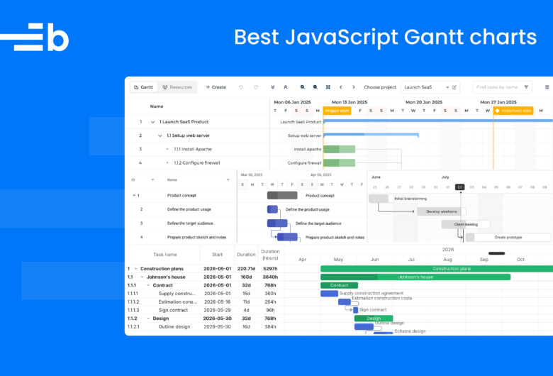
Creating a Gantt chart with React using Next.js

We strive to keep posts updated, but code samples may sometimes be outdated. Humans, see the Bryntum documentation; agents, https://mcp.bryntum.com for the latest info.
A Gantt chart is a project management tool for coordinating complex schedules for large or multiple teams. Using a Gantt chart that is JavaScript-based has a couple of advantages over spreadsheet-based Gantt charts, such as:
- Easy integration into existing project management dashboards.
- Sharing your chart online.
- Customizing your chart to suit your needs.
In a previous article, we described how to make a basic drag-and-drop Gantt chart component using vanilla JavaScript. In this article, we’ll make the same basic Gantt chart with React using Next.js.
We’ll also create a basic Gantt chart using our commercial Bryntum Gantt Chart and look at the differences between building your own chart versus using an off-the-shelf solution.
The basic React Gantt chart that we’ll create using Next.js will have the following features:
- The user can select the planning time period by selecting a start date and an end date.
- We’ll be able to add, delete, and edit tasks.
- Task durations can be added and deleted, and we’ll be able to edit them using drag and drop.
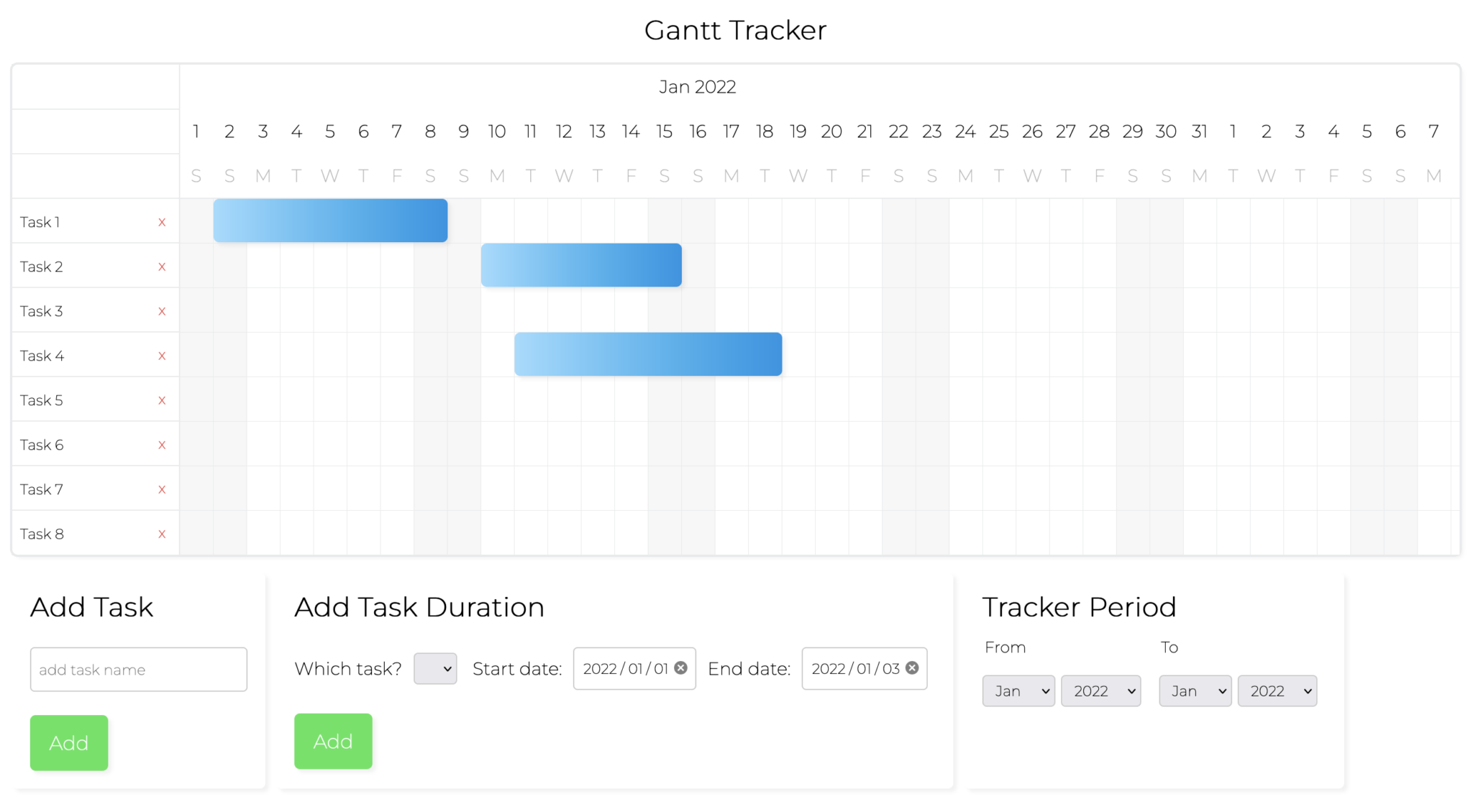
Once you’re done, you’ll have a Gantt chart that looks like the one shown below.

You can find the code for the completed Next.js Gantt Chart in our GitHub repository.
Getting started
We’ll start this project by cloning the following Next.js Gantt chart starter GitHub repository.
The .vscode folder includes some VS Code settings and extension recommendations, as well as settings for ESLint and Prettier. ESLint and Prettier have been added and configured to format your code on paste and on save. If you don’t use VS Code as an IDE, you’ll need to configure these for your IDE. Once you’ve done that, you can delete this file.
The starter repository contains all the components you’ll need to create the Gantt chart. You’ll need to create some state and complete the code for the components. The code used is similar to our previous article that explains how to make a vanilla JavaScript Gantt Chart.
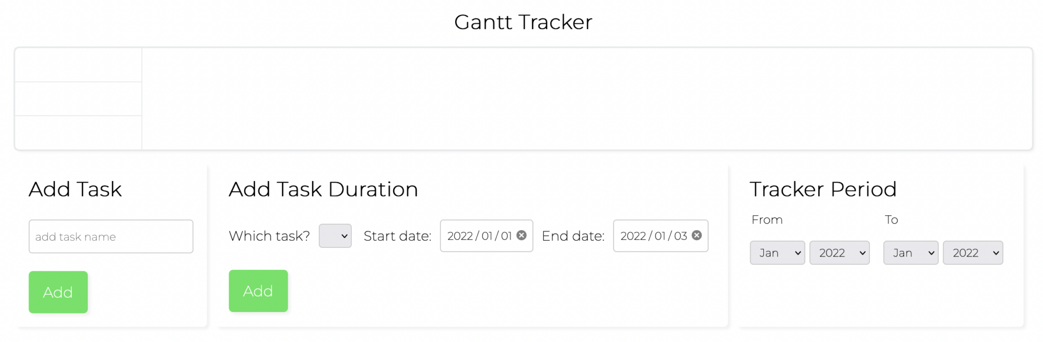
If you install dependencies npm install and run the local development server using npm run dev, you’ll see a page with the header “Gantt Tracker”.
Let’s take a look at how the Gantt chart starter code is structured.
Adding styling with CSS
The CSS we’ll use for the Gantt chart is included in the starter code. We’ve used Styled JSX, which comes with Next.js, to write scoped-styled components. There are some global styles in styles/globals.js. These global styles are added to our app in the Layout component in the components folder. The entire app is wrapped in this Layout component in the _app.js file, which is in the pages folder.
The <style jsx> tags in the components contain CSS that is scoped to the component. Styled JSX does this by making the class names unique. In the GanttChart component, there are some CSS variables for color, border radius, and cell height, which we’ll use for the Gantt chart.
Utility functions, helpers, constants, and data
The fetchWrapper.js file in the utils folder contains a fetch API wrapper function that we’ll use to make HTTP requests to our API endpoint. This wrapper function is from Kent C. Dodd’s article Replace Axios with a simple custom fetch wrapper. We’ll use this fetch wrapper function to fetch the example Gantt chart data, which is in the data.json file in the public folder.
The dateFunctions.js file in the helpers folder contains helper functions that we’ll use for date calculations and formatting. Finally, the constants.js file in the root folder contains a months array that we’ll use for creating the columns of the Gantt chart and for populating the select input elements for selecting the date range of our Gantt chart.
Now let’s start creating the Gantt chart component.
Adding state
First, we’ll add state to the GanttChart component. We’ll add state for the tasks, task durations, and the time range that will show on the Gantt chart. We’ll use blue horizontal bars across the cells to show task durations.
Import the useState and useEffect hooks in GanttChart.js:
import { useState, useEffect } from 'react';Add the following state variables and setters to the GanttChart() function:
  const [tasks, setTasks] = useState(null);
  const [taskDurations, setTaskDurations] = useState(null);
  const [timeRange, setTimeRange] = useState({
    fromSelectMonth: 0,
    fromSelectYear: '2022',
    toSelectMonth: 1,
    toSelectYear: '2022',
  });
We’ll get the tasks and taskDurations data from the data.json file by making a fetch request using the client fetch wrapper. Import the client function:
import { client } from '../../utils/fetchWrapper';Add the following useEffect hook to fetch the data:
useEffect(() => {
client('data.json').then(
(data) => {
setTasks(data?.tasks);
setTaskDurations(data?.taskDurations);
},
(error) => {
console.error('Error: ', error);
}
);
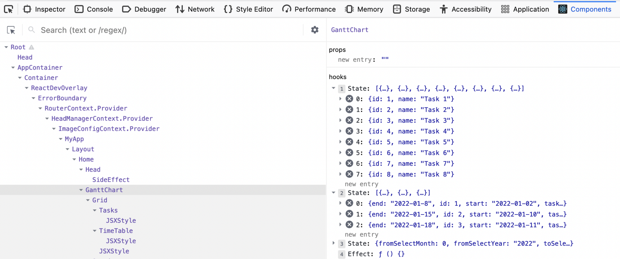
}, []);After the data is fetched, the tasks and taskDurations state will be set. You’ll be able to see the state in the React Developer Tools “Components” tab.
Creating the Gantt chart component
The Gantt chart component will be composed of seven components, which you’ll find in the components/GanttChart folder. In the Home page file index.js, located in the pages folder, we’ll import the main file GanttChart.js. There is also an AddButton component that is used in the AddTask and AddTaskDuration components.

Import the seven components in GanttChart.js:
import AddTaskDuration from './AddTaskDuration';
import AddTask from './AddTask';
import Grid from './Grid';
import Settings from './Settings';
import Tasks from './Tasks';
import TimeRange from './TimeRange';
import TimeTable from './TimeTable';
Now add them in the <div> with an id of gantt-container:
  <Grid>
    <Tasks
      tasks={tasks}
      setTasks={setTasks}
      setTaskDurations={setTaskDurations}
    />
    <TimeTable
      timeRange={timeRange}
      tasks={tasks}
      taskDurations={taskDurations}
      setTaskDurations={setTaskDurations}
    />
  </Grid>
  <Settings>
    <AddTask setTasks={setTasks} />
    <AddTaskDuration tasks={tasks} setTaskDurations={setTaskDurations} />
    <TimeRange timeRange={timeRange} setTimeRange={setTimeRange} />
  </Settings>
The Grid and Settings components are wrappers that apply some CSS styles to their children. For each of the components, destructure the passed-in props. For example, in the Tasks component, destructure tasks, setTasks, and setTaskDurations as follows:
export default function Tasks({ tasks, setTasks, setTaskDurations }) {
   // ...
}
As well as in the TimeTable component:
export default function TimeTable({
  timeRange,
  tasks,
  taskDurations,
  setTaskDurations,
}) {
    //..
}
Do the same for the AddTask, AddTaskDuration, and TimeRange components.
If you run your local server now, you should see the following basic skeleton of our app in your browser window:
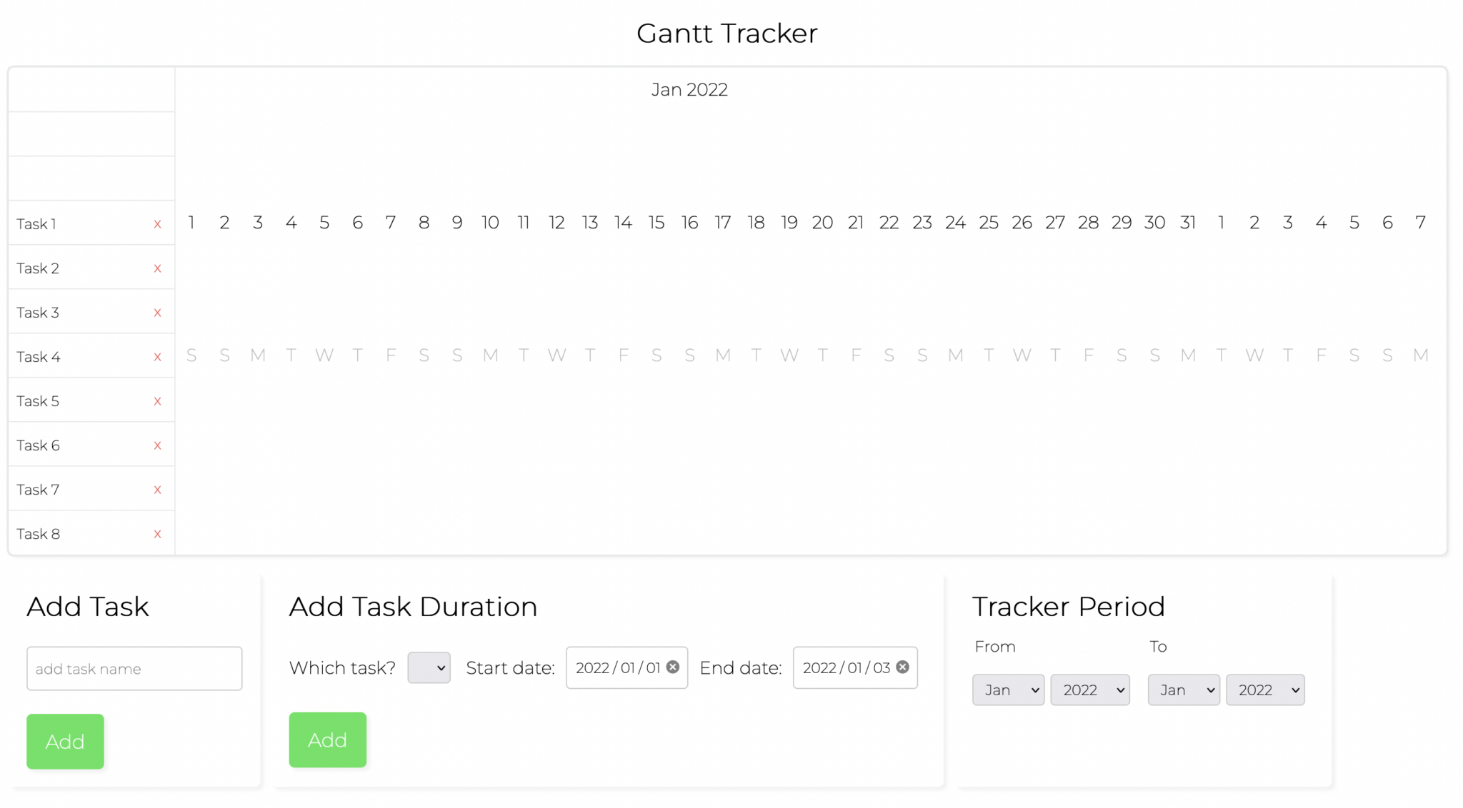
Creating task rows
The Tasks component currently renders three empty div rows. Below the last <div className="gantt-task-row"></div> line, add the following code to create our task inputs:
  {tasks &&
    tasks.map((tsk, i) => (
      <div key={`${i}-${tsk?.id}-${tsk.name}`} className="gantt-task-row">
        <input data-task-id={tsk?.id} value={tsk?.name} />
        <button type="button" data-task-id={tsk?.id}>
          x
        </button>
      </div>
    ))}
We first check if tasks is not null, because Next.js does server-side rendering. The tasks state is added after the component is mounted.
We create an <input> element for each task with a value equal to the task name. There is a delete button for deleting the element. We’ll use the data attributes to update the tasks state when a task is edited or deleted.
Making tasks deletable
Now let’s make the delete buttons work. First, add the following property to the delete button:
onClick={handleDelete}Now add the following handleDelete function:
  function handleDelete(e) {
    const idNum = parseInt(e.target.getAttribute('data-task-id'));
    const newTasks = tasks.filter((task) => task.id !== idNum);
    // update state (if data on backend - make API request to update data)
    setTasks(newTasks);
    setTaskDurations((prevState) => {
      // delete any taskDurations associated with the task
      const newTaskDurations = prevState.filter(
        (taskDuration) => taskDuration.task !== idNum
      );
      return newTaskDurations;
    });
  }
We pass in a function to setTaskDurations to get the previous value of the state from the function’s argument. We get the task id from the data attribute on the button. We then update the tasks state by filtering out the task by id from the tasks state passed in as a prop and then setting the tasks state using setTasks. We also update the tasksDurations state by removing any task durations associated with the deleted task and then updating the state. This causes the Tasks component to re-render, which passes in the new state.
Now if you click on the delete button, the task will be deleted.
Making tasks editable
The task inputs are not editable, let’s fix that. Add the following onChange property to the task <input>:
onChange={(e) => onChange(e, i)}Now add the following onChange function:
  function onChange(e, i) {
    const { value } = e.target;
    const idNum = parseInt(e.target.getAttribute('data-task-id'));
    let newTasks = tasks.filter((task) => task.id !== idNum);
    newTasks.push({ id: idNum, name: value });
    newTasks = newTasks.sort((a, b) => a.id - b.id);
    // update state (if data on backend - make API request to update data)
    setTasks(newTasks);
  }
We get the value of the input, and id for the task. We then create a new tasks state by filtering out the edited task, creating a new task object and then updating the tasks state. We also sort the tasks by id, the order in which they are created. When we add new tasks later in this tutorial, we’ll see that the given id is a number: the most recently created tasks have a higher number.
Now try editing the tasks in your development server. You’ll notice that the input loses focus after you add or remove a character from it. The tasks state is updated, as you can see in your React development tools. The input loses focus because the Tasks component is re-rendered each time the tasks state updates.
We’ll fix this using two refs that will allow us to focus the correct input on each re-render. Add the following ref objects:
  const inputRef = useRef([]);
  const indexRef = useRef(null);
The inputRef will contain an array of our input elements. The indexRef will hold the index of the last input that has been changed. The ref values will persist after each re-render.
Add the following ref property to the task <input>:
ref={(el) => (inputRef.current[i] = el)}This will set the current value of the inputRef. The array will contain a ref to each input element.
In the onChange function, add the following line:
  useEffect(() => {
    if (inputRef.current.length && indexRef.current >= 0) {
      inputRef?.current[indexRef.current]?.focus();
    }
  });
This useEffect will run on each render. It will set focus on the input that was last edited. Now try editing the tasks in your development server. The input will maintain focus as you are editing the task.
Creating the Gantt chart grid
We’ll create the Gant chart grid in the TimeTable component. At the top of the TimeTable.js file, there are some objects, including ganttTimePeriod, that we’ll use for dynamic CSS styling. We’ll create the grid using similar code to the previous article, which used vanilla JavaScript. We’ll create the grid row by row. We’ll add the task duration bars to the correct starting cell by checking the task duration’s task property and its start date.
There is some starter code for creating the rows. We’ll fill the monthRows, dayRows, and weekRows arrays with React elements for the Gantt chart grid and then render them.
Replace the imported modules with the following modules:
import { useState } from 'react';
import { monthDiff, getDaysInMonth, getDayOfWeek } from '../../helpers/dateFunctions';
import { months } from '../../constants';
Above the component’s return, add the following for loop:
  for (let i = 0; i < numMonths; i++) {
    // create month rows
    monthRows.push(
      <div key={i} style={{ ...ganttTimePeriod, outline: 'none' }}>
        <span style={ganttTimePeriodSpan}>
          {months[month.getMonth()] + ' ' + month.getFullYear()}
        </span>
      </div>
    );
    // create day and week rows
    const numDays = getDaysInMonth(month.getFullYear(), month.getMonth() + 1);
    const currYear = month.getFullYear();
    const currMonth = month.getMonth() + 1;
    for (let j = 1; j <= numDays; j++) {
      dayRow.push(
        <div key={j} style={{ ...ganttTimePeriod, outline: 'none' }}>
          <span style={ganttTimePeriodSpan}>{j}</span>
        </div>
      );
      weekRow.push(
        <div key={j} style={{ ...ganttTimePeriod, outline: 'none' }}>
          <span style={{ ...ganttTimePeriodSpan, color: '#3E455B' }}>
            {getDayOfWeek(currYear, currMonth - 1, j - 1)}
          </span>
        </div>
      );
    }
    dayRows.push(
      <div key={i} style={{ ...ganttTimePeriod, outline: 'none' }}>
        {dayRow}
      </div>
    );
    weekRows.push(
      <div key={i} style={{ ...ganttTimePeriod, outline: 'none' }}>
        {weekRow}
      </div>
    );
    dayRow = [];
    weekRow = [];
    month.setMonth(month.getMonth() + 1);
  }
This loops through the number of months in the time period range and creates month, week, and day rows. The value for numMonths is two. We will be able to change this value when we complete the TimeRange component’s code later in the tutorial. We use the month variable and the setMonth method to increment the month value on each loop. We use this value and the months array from our constants file to add styled React elements with the correct month name to the monthRows array.
We use a nested loop to create the dayRow and weekRow cells. We make use of JavaScript Date methods, as well as the getDaysInMonth and getDayOfWeek functions from our dateFunctions file.
If you view your app now, you’ll see the year and month, day of the month, and day of the week rows. They’ll be positioned correctly once we add the date cells for each task.
Now let’s create the task row cells and add the task durations. Make sure the following functions are imported from dataFunctions.js:
import {
  monthDiff,
  getDaysInMonth,
  getDayOfWeek,
  createFormattedDateFromStr,
  createFormattedDateFromDate,
  dayDiff,
} from '../../helpers/dateFunctions';
Add the following for loop below the one that you added:
  // create task rows
  if (tasks) {
    tasks.forEach((task) => {
      let mnth = new Date(startMonth);
      for (let i = 0; i < numMonths; i++) {
        const curYear = mnth.getFullYear();
        const curMonth = mnth.getMonth() + 1;
        const numDays = getDaysInMonth(curYear, curMonth);
        for (let j = 1; j <= numDays; j++) {
          // color weekend cells differently
          const dayOfTheWeek = getDayOfWeek(curYear, curMonth - 1, j - 1);
          // add task and date data attributes
          const formattedDate = createFormattedDateFromStr(
            curYear,
            curMonth,
            j
          );
          taskRow.push(
            <div
              key={`${task.id}-${j}`}
              style={{
                ...ganttTimePeriodCell,
                backgroundColor:
                  dayOfTheWeek === 'S' ? 'var(--color-tertiary)' : '#fff',
              }}
              data-task={task?.id}
              data-date={formattedDate}
            >
              {taskDurations.map((el, i) => {
                if (el?.task === task?.id && el?.start === formattedDate) {
                  return (
                    <div
                      key={`${i}-${el?.id}`}
                      tabIndex="0"
                      style={{
                        ...taskDuration,
                        width: `calc(${dayDiff(el?.start, el?.end)} * 100% - 1px)`,
                      }}
                    ></div>
                  );
                }
              })}
            </div>
          );
        }
        taskRows.push(
          <div key={`${i}-${task?.id}`} style={ganttTimePeriod}>
            {taskRow}
          </div>
        );
        taskRow = [];
        mnth.setMonth(mnth.getMonth() + 1);
      }
    });
  }
We loop through each month as we did in the first for loop that we added. We use the nested for loop to create the cells. The data-attributes data-task and data-date are added to each cell. We’ll use these when we add drag-and-drop functionality to the task durations. For each cell, we map over the taskDurations state and add a task duration <div> element as a child of the cell if the cell’s task id and start date matches the task duration task and start properties. The width of the task duration element is determined by calculating the duration of the task duration using the dayDiff function and then multiplying it by 100% of the cell width using CSS.
Now you’ll see the task rows and task durations in your app.
Making task durations deletable
Now let’s make our task durations deletable by pressing the delete button when the task duration is in focus. Add the following property to the task duration element, which is the <div> that’s returned where the taskDurations are mapped over (taskDurations.map((el, i) => {):
onKeyDown={(e) => deleteTaskDuration(e, el?.id)}Now let’s create the deleteTaskDuration function below the two for loops:
  function deleteTaskDuration(e, id) {
    if (e.key === 'Delete' || e.key === 'Backspace') {
      // update taskDurations
      const newTaskDurations = taskDurations.filter(
        (taskDuration) => taskDuration.id !== id
      );
      // update state (if data on backend - make API request to update data)
      setTaskDurations(newTaskDurations);
    }
  }
The React SyntheticEvent and the task duration id are passed into the deleteTaskDuration function. If the “Delete” or “Backspace” key is pressed, a new state object is created by filtering out the deleted task from the taskDurations state, and the state is updated.
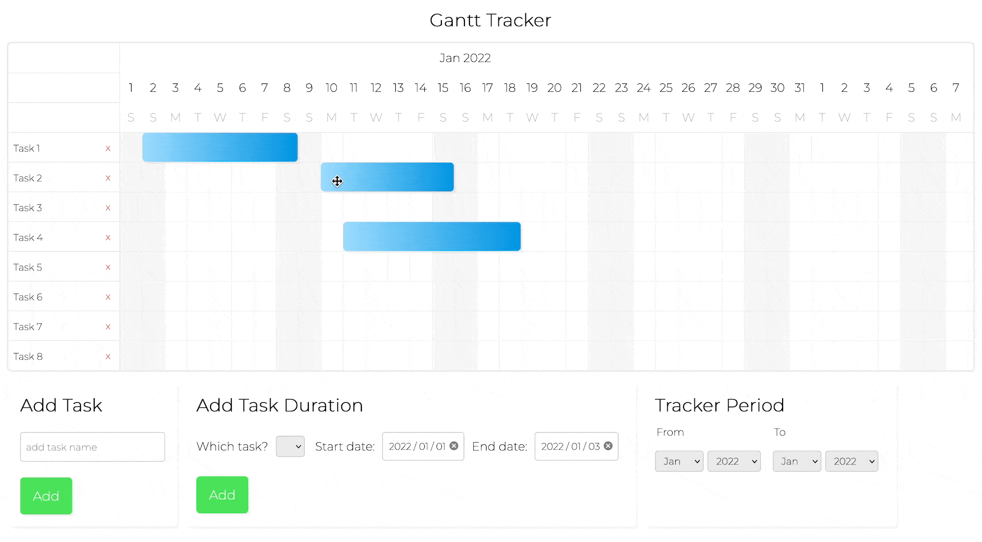
Adding drag-and-drop functionality to task durations
Let’s add drag-and-drop functionality to our task durations to change the position of the task duration elements on the grid. Add the following state and its setter:
const [taskDurationElDraggedId, setTaskDurationElDraggedId] = useState(null);The taskDurationElDraggedId state will keep track of the task duration id that is currently being dragged. Now add the following function below the deleteTaskDuration function:
  function handleDragStart(taskDurationId) {
    console.log(taskDurationId);
    setTaskDurationElDraggedId(taskDurationId);
  }
This function will handle setting the taskDurationElDraggedId state.
Now change the returned task duration <div> element to the following:
  <div
    key={`${i}-${el?.id}`}
    draggable="true"
    tabIndex="0"
    onDragStart={() => handleDragStart(el?.id)}
    style={{
      ...taskDuration,
      width: `calc(${dayDiff(
              el?.start,
              el?.end
      )} * 100% - 1px)`,
      opacity:
        taskDurationElDraggedId === el?.id ? '0.5' : '1',
    }}
    onKeyDown={(e) => deleteTaskDuration(e, el?.id)}
  ></div>
We set the draggable property of the task duration <div> element to true. Of course, we don’t need this property for our drag and drop to work, but it’s good for UX because it creates a “ghost” image of the task duration element attached to the mouse cursor as it’s dragged. We then call the handleDragStart function and pass in the task duration id as an argument when dragging of the task duration starts. We also made the opacity of the task duration decrease while dragging.
Also, while dragging, you’ll see the task duration id in your dev tools console.
Add the following property to the task row cell, which has a data-task property:
onDrop={onTaskDurationDrop}We add the onDrop attribute to define the drop event handler for each cell in the drag-and-drop zone of the grid, which is the task cells area. Dropping an element on a cell will trigger an onTaskDuration function call. Let’s define the onTaskDurationDrop function. Add the following lines below the handleDragStart function:
  function onTaskDurationDrop(e) {
    const targetCell = e.target;
    // prevent adding on another taskDuration
    if (!targetCell.hasAttribute('draggable')) {
      // find task
      const taskDuration = taskDurations.filter(
        (taskDuration) => taskDuration.id === taskDurationElDraggedId
      )[0];
      const dataTask = targetCell.getAttribute('data-task');
      const dataDate = targetCell.getAttribute('data-date');
      const daysDuration = dayDiff(taskDuration.start, taskDuration.end);
      // get new task values
      // get start, calc end using daysDuration - make Date objects - change taskDurations
      const newTask = parseInt(dataTask);
      const newStartDate = new Date(dataDate);
      let newEndDate = new Date(dataDate);
      newEndDate.setDate(newEndDate.getDate() + daysDuration - 1);
      // update taskDurations
      taskDuration.task = newTask;
      taskDuration.start = createFormattedDateFromDate(newStartDate);
      taskDuration.end = createFormattedDateFromDate(newEndDate);
      const newTaskDurations = taskDurations.filter(
        (taskDuration) => taskDuration.id !== taskDurationElDraggedId
      );
      newTaskDurations.push(taskDuration);
      // update state (if data on backend - make API request to update data)
      setTaskDurations(newTaskDurations);
    }
    setTaskDurationElDraggedId(null);
  }
We prevent a task duration from being added on top of another task duration by checking if the target cell has a draggable attribute. We then update the taskDuration state. We first find the task that was dragged and dropped, and remove it from a copy of the taskDurations state. We then create a new task duration and add it to the copied state. We use this copied and modified state to update the state.
If you now try to drag a task duration, you’ll see that the cursor will turn to the “not-allowed” icon. This is because dragging and dropping an element inside of another element is disabled by default. To remove this default behavior in our drag-and-drop zone, add the following property to the <div> element with an id of gantt-time-period-cell-container:
onDragOver={(e) => e.preventDefault()}Now that the drag-and-drop works, let’s get the “Add Task” form working.
Making the “Add task” form functional
In the AddTask component, the form has an input element with an onChange event handler that updates the local state variable task. Submitting the form will call the handleSubmit function. We need to complete this function by updating the tasks state using the passed-in prop setTasks.
Set the new tasks state by adding the following state setter above setTask(''):
  setTasks((prevState) => {
    const newState = prevState;
    // find largest task number, add 1 for new task - else could end up with tasks with same id
    const maxIdVal = prevState.reduce(function (a, b) {
      return Math.max(a, b.id);
    }, -Infinity);
    // create new task
    newState.push({
      id: isFinite(maxIdVal) ? maxIdVal + 1 : 1,
      name: task,
    });
    return [...newState];
  });
We create a new task and add it to a copy of the state, newState, and then return it from setState to replace the state with the new state.
To determine the new task id, we use the reduce method to find the largest current task id, and then add one to it to create the id for the new task. The task id values are numbers that represent the order in which they were created. The tasks are sorted by their id.
You’ll now be able to add tasks to your Gantt chart. When you add a task, the Gantt Chart is re-rendered, displaying the new tasks state.
Making the “Add task duration” form functional
The AddTaskDuration component is partly created for you, like the AddTask component was. We need to loop through the passed-in tasks state and populate the “Which tasks” <select> input. We also need to update the taskDuration state using the passed in setTaskDurations state setter.
The form has three inputs: a <select> input for selecting the task that the task duration is for, and two date inputs for selecting the start and end date of the task duration. The form state is managed using the three local state variables, task, startDate, and endDate, as well as their state setters. The onChange function handles updating the local state when an input value is changed.
First, let’s populate the tasks <select> input with <option> elements for each task. Add the following code inside of the <select> input with an id of select-task:
  <option disabled defaultValue value="">
    select a task
  </option>
  {tasks &&
    tasks.map((tsk) => (
      <option key={tsk?.id} value={tsk?.id}>
        {tsk?.name}
      </option>
    ))}
Now you’ll see that the <select> menu is populated with all the task names. If you add a task, you’ll see that it’s added to the <select> menu as the GanttChart component re-renders.
To get the handleSubmit function to work, add the following lines to it, below e.preventDefault():
  if (task === '') return;
  const timeStamp = Date.now();
  const newTaskDuration = {
    id: timeStamp,
    start: startDate,
    end: endDate,
    task: parseInt(task),
  };
  setTaskDurations((prevState) => {
    const newState = prevState;
    return [...newState, newTaskDuration];
  });
If a task has not been selected, we return. We then create a new task duration using the local state and a time stamp for the id. We then set the taskDurations state using setTaskDurations by returning a new array from the passed-in function.
You’ll now be able to add new task durations to your Gantt chart.
Making the “Tracker period” functional
To complete the code for the TimeRange component, we need to give each <select> element the correct value using the passed-in timeRange state. We then need to update this state in the onChange handler function.
Replace the value props of the four <select> elements with the following value props:
// <select> with id="from-select-month""
value={timeRange.fromSelectMonth}
// <select> with id="from-select-year"
value={timeRange.fromSelectYear}
// <select> with id="to-select-month"
value={timeRange.toSelectMonth}
// <select> with id="to-select-year"
value={timeRange.toSelectYear}
Now add the following lines to the onChange function, below the line const { value, id } = e.target;:
  if (id === 'from-select-month') {
    setTimeRange((prevState) => {
      return { ...prevState, fromSelectMonth: value };
    });
  }
  if (id === 'from-select-year') {
    setTimeRange((prevState) => {
      return { ...prevState, fromSelectYear: value };
    });
  }
  if (id === 'to-select-month') {
    setTimeRange((prevState) => {
      return { ...prevState, toSelectMonth: value };
    });
  }
  if (id === 'to-select-year') {
    setTimeRange((prevState) => {
      return { ...prevState, toSelectYear: value };
    });
  }
When the value of one of the <select> inputs is changed, we update the timeRange state. This causes the GanttChart component to re-render, which will show the updated time range.
We’ve completed our basic Gantt chart, but the process was a little tedious and possibly not bug free. 😃Now let’s create a Gantt chart using our Bryntum Gantt component for comparison.
Using Bryntum Gantt with Next.js
To install Bryntum Gantt with npm you just need to install two libraries with zero external dependencies. If you are unfamiliar with Bryntum products, you can follow the guide here.
Let’s import the Bryntum Gantt component. In the components folder, create a Gantt.js file and add the following lines:
import { BryntumGantt } from '@bryntum/gantt-react';
export default function Gantt({ ganttRef, ...props }) {
  return <BryntumGantt {...props} ref={ganttRef} />;
}
We’ll use the imported BryntumGantt component. We’ll pass in a config file as props to determine how the Gantt chart looks and where it gets data from. You can also pass in a ref if needed.
We need to import the BryntumGantt component dynamically. Create another component called GanttInstance.js and add the following code:
import dynamic from 'next/dynamic';
import { ganttConfig } from '../ganttConfig.js';
const Gantt = dynamic(() => import('../components/Gantt.js'), {
  ssr: false,
  loading: () => {
    return (
      <div
        style={{
          display: 'flex',
          alignItems: 'center',
          justifyContent: 'center',
          height: '100vh',
        }}
      >
        <p>Loading...</p>
      </div>
    );
  },
});
const GanttInstance = () => {
  return (
    <>
      <Gantt
        {...ganttConfig}
        // other props
      />
    </>
  );
};
export { GanttInstance };
In the project’s root folder, create a ganttConfig.js file and add the following code:
/**
 * Application configuration
 */

const ganttConfig = {
  columns: [{ type: 'name', field: 'name', width: 250 }],
  viewPreset: 'weekAndDayLetter',
  barMargin: 10,
  project: {
    transport: {
      load: {
        url: 'data/gantt-data.json',
      },
    },
    autoLoad: true,
  },
};
export { ganttConfig };
We pass in the configuration from ganttConfig.js to the Gantt component. This includes the columns property to create the Gantt chart columns for the tasks. You can learn more about the config options in the Bryntum docs. We configure the project with the transport property to populate the Gantt chart’s data stores. We’ve configured the url to load data using the load property. The url data source is a JSON file in the public folder of the starter repository. You can also configure the transport to sync data changes to a specific url. For more information, you can read the following guide in our docs: Binding Bryntum Gantt data.
We dynamically import the Gantt component with ssr set to false. While the component is loading, we display a loading component that returns a <p> tag with the message “Loading…”.
In order for the Gantt chart’s data population to work, we need to turn off strict mode. Set reactStrictMode to false in the next.config.js file, which is in the project’s root folder:
/** @type {import('next').NextConfig} */
const nextConfig = {
  reactStrictMode: false,
  swcMinify: true,
};
module.exports = nextConfig;
Let’s create a page to view our Bryntum Gantt chart. In the pages folder, create a file named bryntum.js and add the following lines to it:
import Head from 'next/head';
import { GanttInstance } from '../components/GanttInstance';
import '@bryntum/gantt/gantt.stockholm.css';
export default function BryntumGanttPage() {
return (
<div className="container">
<Head>
<title>
Creating a Gantt chart with React using Next.js and Bryntum
</title>
<link rel="icon" href="/favicon.ico" />
</Head>
<GanttInstance></GanttInstance>
<style jsx>{`
.container {
height: 100vh;
}
`}</style>
</div>
);
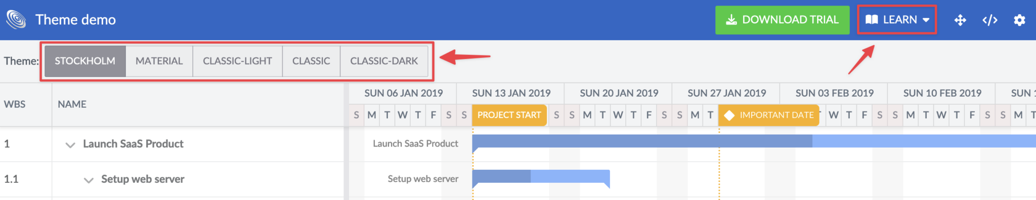
}We import our GanttInstance component and the CSS for the Bryntum Gantt Stockholm theme, which is one of five available themes. You can see a demo showing the different themes here. You can also create custom themes. In this demo, you can also learn about the different components of the Gantt chart by clicking on the “Learn” button in the top right corner.
The GanttInstance component is wrapped in a <div> with a class of container. We give it a height of 100vh so that the Gantt chart fills the whole screen.
In your app, go to the bryntum route by going to the following url: https://localhost:3000/bryntum. You’ll now see the Bryntum Gantt chart.

This basic example of the Bryntum Gantt component has more features by default than the Gantt chart that we created. The features include:
- Collapsible task groups.
- Drag-and-drop re-ordering of tasks.
- Add, edit, copy, and delete tasks. Right-click on a task to see a pop-up menu with these actions.
- Draggable task durations.
- Re-sizeable task durations. Hover your mouse over the left or right side of a task duration, which is green, until the cursor changes to a resize icon. Then click and hold down while you move your mouse left or right.
Try out some of these features in your app.
Comparing the vanilla JS, React, and Bryntum Gantt charts
Let’s compare the Gantt chart that we created with the basic example of the Bryntum Gantt chart, as well as the vanilla JavaScript one that we created in a previous article.
Breaking the React Gantt chart into different components, organizing code, and managing state was easier than when vanilla JavaScript was used. React manages state declaratively, which makes managing it easier. The vanilla JavaScript Gantt chart required a lot of direct DOM manipulation, selecting DOM elements and adding events to them. The code of the vanilla JavaScript Gantt chart and React Gantt chart are quite similar, however because we used Next.js, we had to take SSR into account.
The Bryntum Gantt chart was easy to set up, it has a very customizable API that you can learn about in the API docs. You can see all the available features here and view an advanced demo of a React Gantt chart here. The advanced demo includes features such as highlighting critical paths, theme selection, and undoing or redoing actions.
The Bryntum Gantt chart is built with pure JavaScript/ES6+ and it uses a very fast rendering engine. Its performance is great even with large datasets. You can test this yourself: Return to your local development server and set the Tracker Period in the custom-built Gantt to its maximum range and add a new task. You’ll notice that it takes a couple of seconds for the new task to be added. This is because there are many cells to render. Try this with the live example of the vanilla JavaScript Gantt from the previous article as well. You’ll notice the same thing.
Now change the date range of the project in the chart that you created with the Bryntum Gantt component. Make the date range 1000 years and then add a task. There is no noticeable difference in performance.
Next steps
There are many ways you can add to or improve the Gantt chart component as described in the “Next Steps” section of our previous article where we used vanilla JavaScript to create a Gantt chart. Unlike the vanilla JavaScript Gantt chart, you don’t need to worry about sanitizing the task and task duration data with React.
You can improve the Gantt chart by adding input validation. State management can also be improved by preventing unnecessary re-renders. The TimeTable component renders the table using many nested loops. Minimizing the number of nested loops would improve performance.
Build or buy?
This article gives you a starting point for building your own React Gantt chart using Next.js. If you’re instead looking to buy an off-the-shelf, battle-tested solution that just works, take a look at some examples of our Bryntum Gantt. With the Bryntum Gantt component, you can:
- Schedule tasks using dependencies and constraints.
- Leverage calendars for projects, tasks, and resources.
- Use recurrent and fixed time intervals.
- Customize rendering and styling.
- Customize user experience through many different column types and task editors.
- Deal with extensive datasets and performance tuning.
We also have a support forum and offer professional services.
Build it with Bryntum Gantt
Start a free trial, explore live demos, or read the docs.
