Creating a Bryntum Grid React component and integrating it with Storybook
We strive to keep posts updated, but code samples may sometimes be outdated. Humans, see the Bryntum documentation; agents, https://mcp.bryntum.com for the latest info.
Storybook is a popular library for developing and testing UI components in isolation. It has millions of weekly npm downloads and is used by teams at Airbnb, Dropbox, GitHub, and more. Storybook provides a development-only UI environment, called a workshop, which runs separately from your development server, allowing you to isolate your components outside your application environments. A workshop functions as an interactive directory of your UI components in different rendered states, known as stories, as seen in the workshop we’ll create in this tutorial:
Storybook is particularly useful for developing complex UIs that have hundreds or thousands of components, each with variants rendered using different colors, sizes, and data sources. By letting you render and test components without needing to run your application, Storybook circumvents the complex business logic that often further complicates testing component variants, especially in edge cases.
When using Storybook, you create a stories file for each component. A story is a code snippet that renders a component in a specific state. You pass in properties and mock data to simulate different versions of each component.
You can customize and extend Storybook using its numerous addons. Popular addons include Chromatic for visual testing, a11y for accessibility checks, and Mock Service Worker (MSW) for mocking API requests.
In this tutorial, we’ll show you how to use Storybook with a complex and feature-rich React UI component – Bryntum Grid, an easily customizable, high-performance JavaScript table component.
You’ll learn how to:
- Create a Bryntum Grid React component
- Add a toolbar to your Bryntum Grid
- Set up Storybook
- Create a
storiesfile and default story for Bryntum Grid - Create stories for different Grid formats and features
- Create stories for different data states
You can find the code for the completed tutorial on the completed-grid branch of the GitHub repository.
Getting started
Clone the starter GitHub repository. This starter repository uses the development server and JavaScript bundler, Vite. You need Node.js version 18+ for Vite to work.
Install the dependencies by running the following command:
npm installThen, run the local dev server as follows:
npm run devFinally, open https://localhost:5173.
On your screen, you should see text reading, TODO: Add Bryntum Grid. This text is rendered by the Grid component in the src/components folder, where we’ll create the Bryntum Grid.
Creating the Bryntum Grid component
We’ll create the Bryntum Grid in the src/components/Grid.tsx file and demonstrate how to configure its features to showcase the following functions:
- Sorting, filtering, and grouping dates
- Reordering rows
- Switching themes
Then, we’ll further customize the component by styling it.
Installing Bryntum Grid as a React component
First, install the Bryntum Grid component by logging into Bryntum’s npm repository and following the instructions for accessing the npm registry. Bryntum components are commercial products, but you can use our free trial version for this tutorial.
Then, install the React Grid React wrapper component by running the following command:
npm install @bryntum/grid-reactCreating a Grid config file
To configure a basic Bryntum Grid, create a file called gridConfig.ts in the src folder and add the following lines of code to it:
import { BryntumGridProps } from '@bryntum/grid-react';
export const gridConfig: BryntumGridProps = {
filterFeature : true,
rowReorderFeature : {
showGrip : true
},
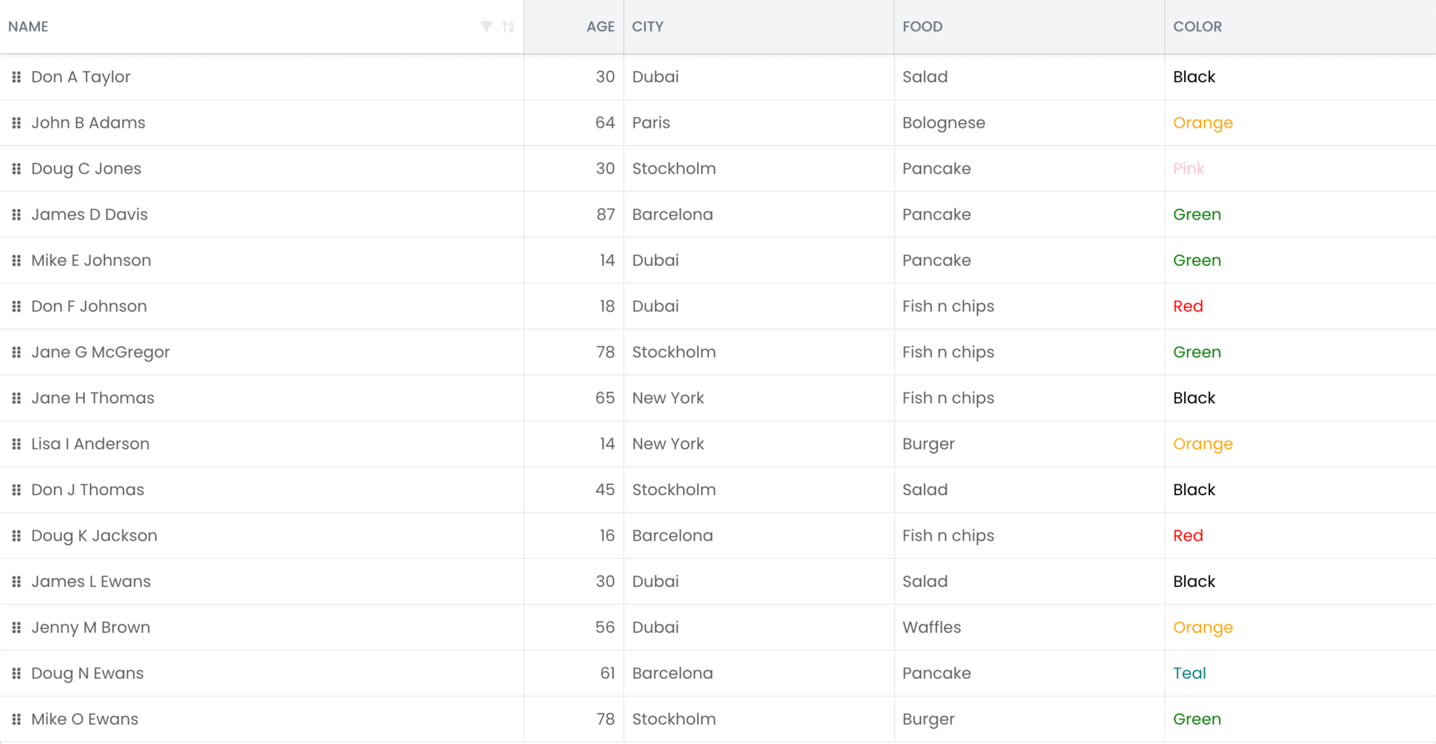
columns : [
{ text : 'Name', field : 'name', flex : 2 },
{ text : 'Age', field : 'age', width : 100, type : 'number', sum : 'average' },
{ text : 'City', field : 'city', flex : 1 },
{ text : 'Food', field : 'food', flex : 1 },
{
text : 'Color',
field : 'color',
flex : 1,
renderer({
cellElement,
value
}: {
cellElement: HTMLElement;
value: string;
}) {
// Set the color based on the value (e.g., "Red" should be red).
cellElement.style.color = value;
return value;
}
}
],
store : {
readUrl : '/data.json',
autoLoad : true
}
};The gridConfig variable defines the Bryntum Grid configuration properties. In the above code, we first enable the filter and rowReorder features, which are disabled by default. Then, we use the columns property to define the Grid columns. The store is an AjaxStore that uses the Fetch API to read data from a remote server specified by the readUrl. For the sake of simplicity in this guide, we set the readUrl to a data.json file in the public folder.
Rendering the Bryntum Grid component
Now, let’s render the Grid we have just configured.
Replace the code in the src/components/Grid.tsx file with the following:
import { BryntumGrid, BryntumGridProps } from '@bryntum/grid-react';
import { useRef } from 'react';
export default function GridComponent(gridProps: BryntumGridProps) {
    const gridRef = useRef<BryntumGrid>(null);
    return (
        <BryntumGrid
            ref={gridRef}
            {...gridProps}
        />
    );
}
Here, the GridComponent accepts the props that are spread into the BryntumGrid React component. Later, we’ll use the gridRef from the above code to access our Bryntum Grid instance.
In the src/App.tsx file, import the Bryntum Grid config variable:
import { gridConfig } from './gridConfig';Finally, spread the config into the rendered Grid component:
<Grid {...gridConfig} />Styling the Bryntum Grid
Now that we have a component, we can style it.
Specify the size of your component by opening the the src/index.css file, finding the rendered <div> element with an id of root, and setting its height to 100vh:
#root {
  height: 100vh;
}
Import the Bryntum Grid Stockholm theme in the src/components/Grid.tsx file:
import '@bryntum/grid/grid.stockholm.css';The Stockholm theme is one of five available themes for the Bryntum Grid. If you want to create a custom theme or use multiple themes, check out the Bryntum Grid Styling documentation.
Run the local dev server using npm run dev. You’ll see your Bryntum Grid component has replaced the initial TODO that was rendered on your screen:
Creating a Grid toolbar
Let’s add a toolbar to our Bryntum Grid to showcase its features. First, we’ll configure the Toolbar widget to include buttons for adding and removing rows. Then, we’ll insert a toggle that allows users to disable the other buttons by activating the Read-only mode. Finally, we’ll add a theme selector to the toolbar.
Adding buttons to the toolbar
Create a GridToolbar.tsx file in the src/components folder and add the following lines of code to it:
import { RefObject, useState } from 'react';
import { BryntumGrid, BryntumToolbar } from '@bryntum/grid-react';
type GridToolbarProps = {
    gridRef: RefObject<BryntumGrid | null>;
    toolbarRef: RefObject<BryntumToolbar | null>;
}
export default function GridToolbar({ gridRef, toolbarRef }: GridToolbarProps) {
    const [count, setCount] = useState(1);
    return (
        <BryntumToolbar
            ref={toolbarRef}
            items={[
                {
                    type  : 'buttongroup',
                    ref   : 'group',
                    items : [
                        {
                            type     : 'button',
                            ref      : 'addButton',
                            icon     : 'b-fa-plus-circle',
                            text     : 'Add',
                            tooltip  : 'Adds a new row (at bottom)',
                            onAction : handleAdd
                        },
                        {
                            type     : 'button',
                            ref      : 'insertButton',
                            icon     : 'b-fa-plus-square',
                            text     : 'Insert',
                            tooltip  : 'Inserts a new row (at top)',
                            onAction : handleInsert
                        }
                    ]
                }
            ]}
        />
    );
}
Here, we configure a ButtonGroup widget in the Grid Toolbar. Our button group includes an Insert button, which adds a row to the top of the Grid, and an Add button, which adds a row to the bottom of the Grid. Both buttons include the onAction function, which calls the handleAdd when Add is clicked, and calls the handleInsert function when Insert is clicked.
Add the following handleAdd function definition in the GridToolbar component:
const handleAdd = () => {
    const grid = gridRef.current?.instance;
    if (!grid) return;
    setCount(prevCount => prevCount + 1);
    const store = grid.store as Store;
    const added = store.add({
        name : `New person ${count}`
    });
    grid.selectedRecord = added[0];
};
This function accesses the Grid instance using the passed-in gridRef prop, adds a new item to the data store using the store.add method, and uses the count state variable to name the newly added record.
Define the handleInsert function below the handleAdd function:
const handleInsert = () => {
    const grid = gridRef.current?.instance;
    if (!grid) return;
    setCount(prevCount => prevCount + 1);
    const store = grid.store as Store;
    const added = store.insert(0, {
        name : `New person ${count}`
    });
    grid.selectedRecord = added[0];
};
Similarly to the handleAdd function, the handleInsert function uses gridRef to access the Grid instance, uses the store.insert method to insert a new item in the data store, and names the item using count.
Next, import the Store type from the Bryntum Grid node module:
import { Store } from '@bryntum/grid';Our toolbar now contains functional buttons for adding and inserting rows, so let’s create a button for removing rows.
Add a Remove button to your toolbar by adding the following code to the items property array in the BryntumToolbar.
{
    type     : 'button',
    ref      : 'removeButton',
    color    : 'b-red',
    icon     : 'b-fa b-fa-trash',
    text     : 'Remove',
    tooltip  : 'Removes selected record(s)',
    disabled : true,
    onAction : handleRemove
},
When this button is clicked, the onAction function calls handleRemove.
Define the handleRemove function in the GridToolbar component as follows:
const handleRemove = () => {
    const grid = gridRef.current?.instance;
    if (!grid) return;
    const selected = grid.selectedRecords;
    if (selected?.length) {
        const store = grid.store as Store;
        const nextRecord = store.getNext(selected[selected.length - 1]);
        const prevRecord = store.getPrev(selected[0]);
        store.remove(selected);
        grid.selectedRecord = nextRecord || prevRecord;
    }
};
In this function, the store.remove method removes the selected records from the data store.
Now, let’s add a Read-only toggle item to the toolbar. We’ll use this toggle button to activate a read-only mode that disables the row-editing buttons.
Add the following button to the BryntumToolbar items property array:
{
    type        : 'button',
    ref         : 'readOnlyButton',
    text        : 'Read-only',
    tooltip     : 'Toggles read-only mode on grid',
    toggleable  : true,
    icon        : 'b-fa-square',
    pressedIcon : 'b-fa-check-square',
    onToggle    : handleReadOnlyToggle
}
The onToggle function calls the handleReadOnlyToggle function.
Define handleReadOnlyToggle by inserting the following code in the GridToolbar component:
const handleReadOnlyToggle = ({ pressed }: { pressed: boolean }) => {
    const grid = gridRef.current?.instance;
    const toolbar = toolbarRef.current?.instance;
    if (!grid || !toolbar) return;
    const group = toolbar.widgetMap['group'] as ButtonGroup;
    const addButton = group.widgetMap['addButton'];
    const insertButton = group.widgetMap['insertButton'];
    const removeButton = toolbar.widgetMap['removeButton'];
    addButton.disabled = insertButton.disabled = grid.readOnly = pressed;
    removeButton.disabled = pressed || !grid.selectedRecords.length;
};
This function disables or enables the Grid based on the Boolean grid.readOnly property value. When grid.readOnly is true, it disables the Add, Insert, and Remove buttons.
Import the ButtonGroup type from the Bryntum Grid node module:
import { ButtonGroup } from '@bryntum/grid';Now, render the toolbar above the Bryntum Grid component by adding the following GridToolbar above the BryntumGrid in the src/components/Grid.tsx file:
<div className="bryntum-grid-container">
    <GridToolbar
        gridRef={gridRef}
        toolbarRef={toolbarRef}
    />
    <BryntumGrid
        ref={gridRef}
        onSelectionChange={handleSelectionChange}
        {...gridProps}
    />
</div>
Define the toolbarRef React ref and the handleSelectionChange function as shown below:
const toolbarRef = useRef<BryntumToolbar>(null);
const handleSelectionChange =
    ({ selection }: { selection: Model[] }) => {
        const removeButton = toolbarRef.current?.instance.widgetMap['removeButton'];
        const grid = gridRef.current?.instance;
        if (!removeButton || !grid) return;
        if (selection?.length && !grid?.readOnly) {
            removeButton.enable();
        }
        else {
            removeButton.disable();
        }
    };
Add the following imports to the top of the src/components/Grid.tsx file:
import { Model } from '@bryntum/grid';
import { BryntumToolbar } from '@bryntum/grid-react';
import GridToolbar from './GridToolbar';
The handleSelectionChange function disables the Remove button when the Grid is set to read-only and no rows have been selected, and enables the Remove button when read-only mode is disabled and rows have been selected.
Finally, add the following bryntum-grid-container CSS class styling to the src/index.css file:
.bryntum-grid-container {
  height: 100vh;
  min-height: 500px;
}
When you run the dev server, you’ll now see a toolbar with buttons rendered above the Grid:
Adding a theme selector to the toolbar
Let’s add a selector input to the toolbar so that users can switch between themes.
First, remove the Stockholm CSS import in the src/components/Grid.tsx file:
- import '@bryntum/grid/grid.stockholm.css';In the public folder, create a themes folder.
Add the following files and folder from the node_modules/@bryntum/grid to this new folder:
grid.classic-light.cssgrid.classic-dark.cssgrid.classic.cssgrid.material.cssgrid.stockholm.cssfonts
In the index.html file, import the Stockholm theme CSS stylesheet in the <head> of the HTML document:
<link rel="stylesheet" href="/themes/grid.stockholm.css" data-bryntum-theme>The data-bryntum-theme attribute allows you to change the theme using the DomHelper.setTheme() method.
Import the DomHelper in the src/components/GridToolbar.tsx file:
import { DomHelper } from "@bryntum/grid";Add the following variable at the top of the file:
const THEME_STORAGE_KEY = 'bryntum-theme';This value sets the key that is used to store the theme state in local storage.
Add the following item to the toolbar items array:
{
    type  : 'combobox',
    items : [
        { value : 'classic-dark', text : 'Classic dark' },
        { value : 'classic-light', text : 'Classic light' },
        { value : 'classic', text : 'Classic' },
        { value : 'material', text : 'Material' },
        { value : 'stockholm', text : 'Stockholm' }
    ],
    // @ts-expect-error themeInfo type is Object
    placeholder : DomHelper.themeInfo.name,
    onChange    : handleThemeChange,
    style       : 'margin-left: auto;',
    value       : localStorage.getItem(THEME_STORAGE_KEY) || 'stockholm'
}
This Combo widget lets users select a theme from a dropdown menu.
Define the onChange event handler function in the GridToolbar component:
type EventOnChange = {
    source: unknown;
    value: string | number | boolean;
    oldValue: string | number | boolean;
    valid: boolean;
    event: Event;
    userAction: boolean;
};
const handleThemeChange = (event: EventOnChange) => {
    DomHelper.setTheme(`${event.value}`);
    localStorage.setItem(THEME_STORAGE_KEY, `${event.value}`);
};
When the theme is changed, this function sets the Bryntum Grid theme using the DomHelper.setTheme() method and saves the theme value to local storage.
Add the following line of code to the top of the GridToolbar component:
DomHelper.setTheme(localStorage.getItem(THEME_STORAGE_KEY) || 'stockholm');This sets the initial theme based on the local storage value.
Now, run the development server. You should see the dropdown theme selector rendered in your Bryntum Grid:
Setting up Storybook
Install Storybook by running the following command in your project’s root directory:
npx storybook initWhen prompted, What do you want to use Storybook for?, select both theDocumentation: MDX, auto-generated component docs option and the Testing: Fast browser-based component tests, watch mode option.
The setup adds a storybook script to the package.json file, which you can run to view the Storybook workshop. Run this script using the following command:
npm run storybookYou’ll see example components displayed in the workshop:
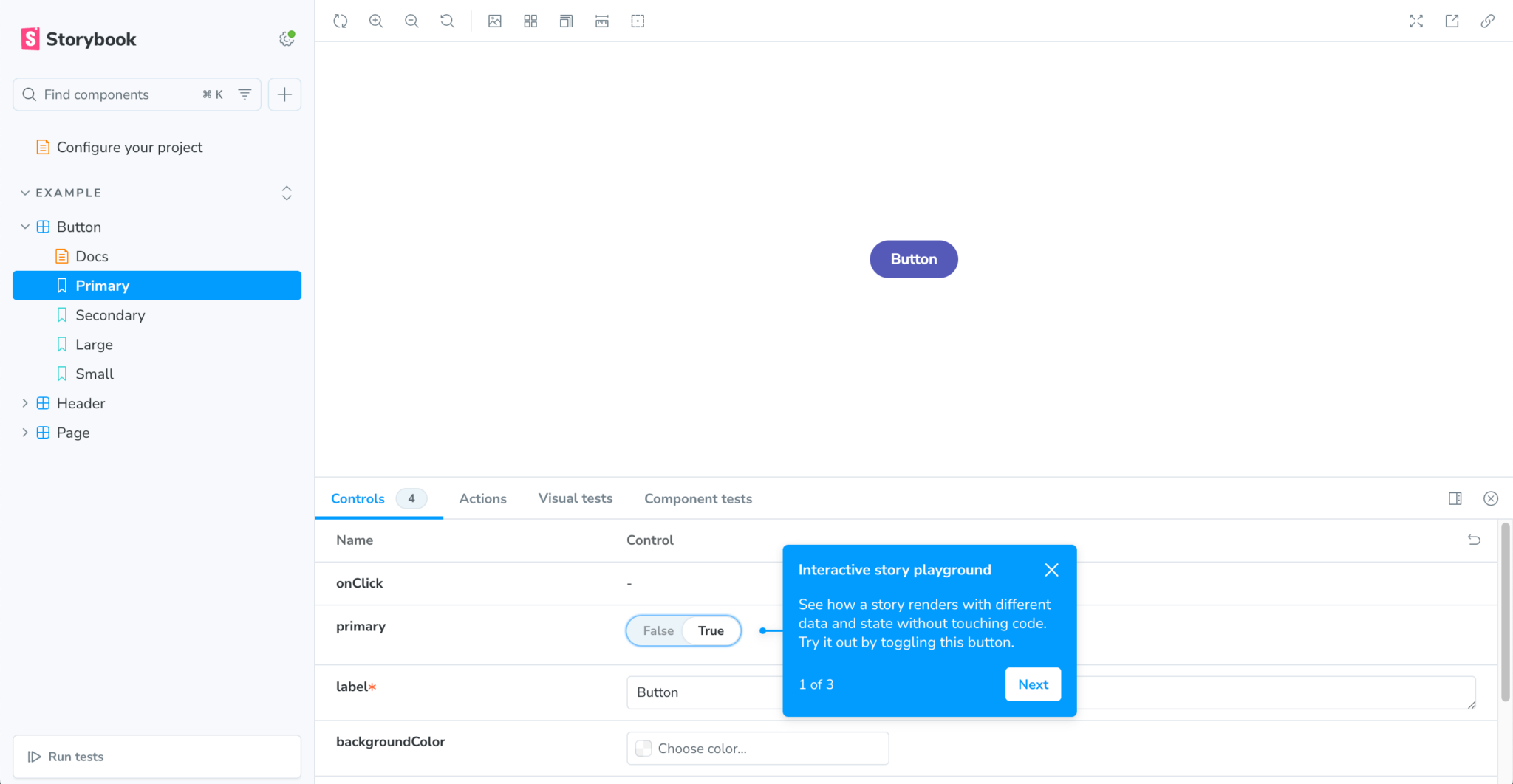
You’ll also see tooltips, which you can use to familiarize yourself with the workshop’s functionality.
The example components and their stories are located in the src/stories folder. Rather than using this default structure, we will create story files in the components folder to colocate our stories and components.
Delete the src/stories folder.
Storybook is configured using a folder called .storybook, which contains various configuration files.
Open the .storybook/main.ts file and change the stories property to the following:
- 'stories': ['../src/**/*.mdx', '../src/**/*.stories.@(js|jsx|ts|tsx)'],
+ 'stories' : ['../src/components/**/*.stories.@(ts|tsx)'],
Remove the onboarding addon that displays the tooltips for getting started with the workshop:
- '@storybook/addon-onboarding',Add the following staticDirs property to the StorybookConfig:
+ staticDirs : ['../public']The staticDirs property sets a list of directories of static files loaded by Storybook.
Import the CSS file in the .storybook/preview.ts file:
import '../src/index.css';Storybook uses the preview.ts file to add global code that applies to all stories, such as CSS imports and JavaScript mocks. We add the index.css import to this file because our original import in the src/main.tsx file will not be available to Storybook, as the Grid stories are rendered in isolation.
Create a preview-head.html file in the .storybook folder and add the following line of code to it:
<link rel="stylesheet" href="/themes/grid.stockholm.css" data-bryntum-theme>This file lets us add extra elements to the head of the preview iframe in the Storybook workshop, which we need to do to add the initial Bryntum Grid theme CSS file.
Creating the stories file and default story for Bryntum Grid
Create a Grid.stories.tsx file in the src/components folder and add the following lines of code to it:
import type { Meta, StoryObj } from '@storybook/react';
import Grid from './Grid';
import { gridConfig } from '../gridConfig';
const meta = {
    component : Grid,
    title     : 'Grid',
    tags      : ['autodocs'],
    args      : {
        ...gridConfig
    }
} satisfies Meta<typeof Grid>;
export default meta;
type Story = StoryObj<typeof meta>;
export const Default: Story = {
    args : {
        columnLines : true,
        sortFeature : {
            disabled : false
        },
        filterFeature : {
            disabled : false
        },
        summaryFeature : {
            disabled : false
        },
        groupFeature : {
            disabled : false
        },
        rowReorderFeature : {
            showGrip : true,
            disabled : false
        },
        stripeFeature : {
            disabled : true
        },
        rowHeight           : 50,
        animateRemovingRows : true
    }
};
In the above code block:
- We use the exported
metaobject to configure the metadata for Bryntum Grid stories. We set thecomponentto theGridcomponent that renders the Bryntum Grid, then set thetagto'autodocs'to create a documentation page in the Storybook workshop for theGridcomponent. The documentation is generated using the metadata and can be further extended using MDX and Doc Blocks. - We use
argsto pass in the Bryntum Grid configuration properties as the props for the Grid story component. Args allow Storybook to live-edit components. - Lastly, we define a single
Defaultstory, which uses Component Story Format 3 (CSF3) and represents one possible Bryntum Grid state. We pass in additional arguments to define the Bryntum Grid features of this story.
Now, when you run the Storybook workshop, you’ll see the Default story under the Grid component in your component directory:
The Controls tab lets you change the Bryntum Grid properties passed in as args to the story, allowing you to change configurations easily.
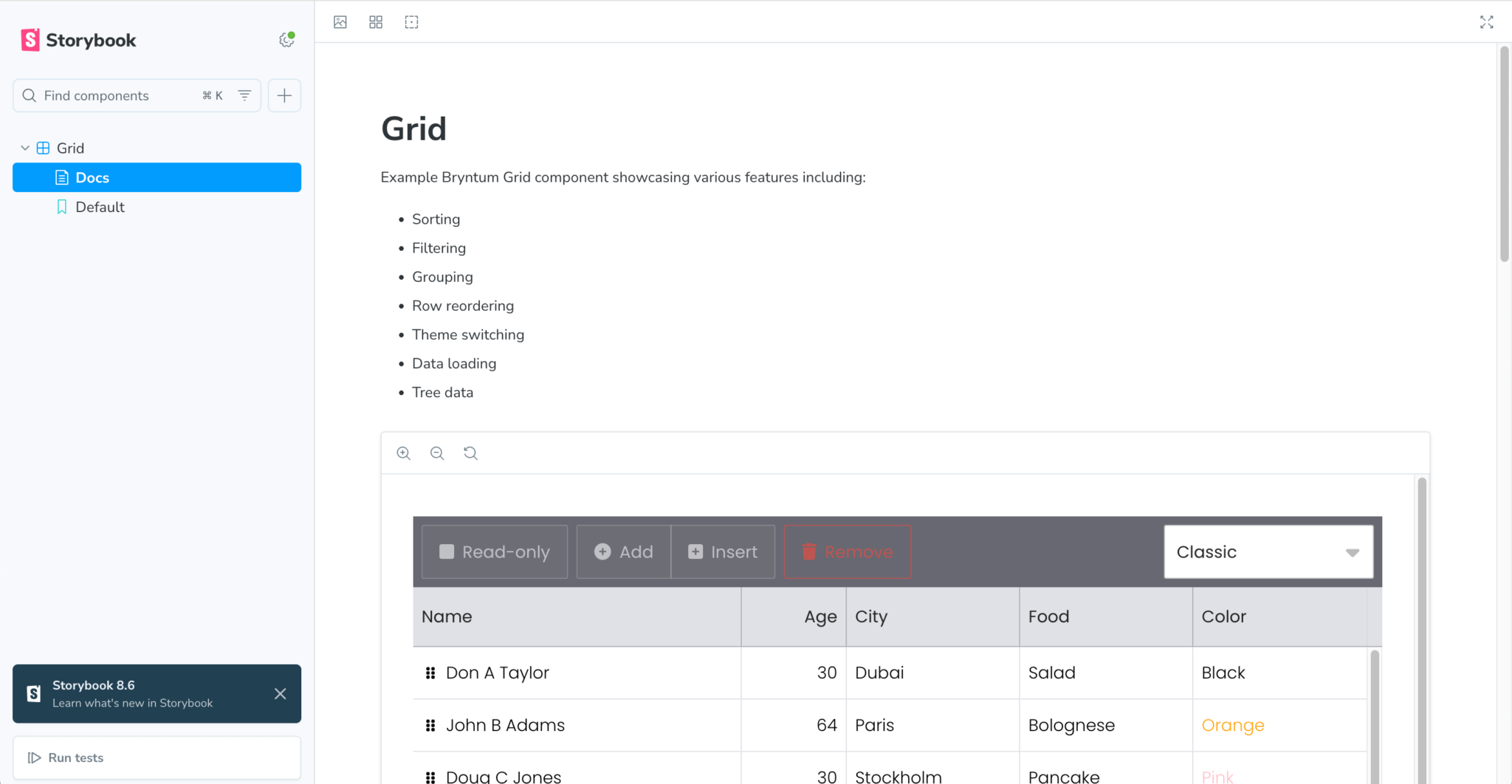
The Docs page shows the auto-generated documentation. Add the following comment below the import declarations in the src/components/Grid.tsx file to add some explanatory text to the top of the Docs page:
/**
 * Example Bryntum Grid component showcasing various features including:
 * - Sorting
 * - Filtering
 * - Grouping
 * - Row reordering
 * - Theme switching
 * - Data loading
 * - Tree data
 */
When you open your workshop, you’ll see the comments at the top of the Docs page:
Creating Bryntum Grid stories for different formats and features
Let’s create two more stories to showcase a more compact Grid format and the Bryntum Group feature, which lets users group rows by their values in a specific column.
Creating stories for the compact Grid and grouping feature
Add the following story definitions to the bottom of the src/components/Grid.stories.tsx file:
export const CompactGrid: Story = {
    args : {
        ...Default.args,
        rowHeight   : 25,
        columnLines : false
    }
};
export const GroupByCity: Story = {
    args : {
        ...Default.args,
        groupFeature : { field : 'city' }
    }
};
These stories build on the Default story using their additional args.
You’ll see the stories in the Storybook workshop:
In the Group By City story, you can group the rows according to one of their column values by right-clicking on a column header and selecting Group ascending or Group descending in the context menu. You can also change which column the rows are grouped by in the Story Controls tab.
Creating Bryntum Grid stories for different data states
We’re going to use the MSW Storybook addon to mock API requests in Storybook with the MSW JavaScript API mocking library. We’ll use mock API requests to create stories for the data states in the following simulated scenarios:
- There is no data in the Grid
- The data loading is delayed
- An incorrect data-loading API request is received
- There is tree data in the Grid
This is much easier than testing API calls manually because you don’t need to run your backend server and can avoid dealing with complex backend logic.
Installing MSW
Install MSW and its Storybook addon:
npm i msw msw-storybook-addon --save-devGenerating a service worker
Run the following command to generate a service worker for MSW in the public folder:
npx msw init public/This creates a service worker script, mockServiceWorker.js, which allows MSW to intercept your app’s outgoing network traffic.
Configuring the MSW addon
To enable MSW in Storybook, we’ll initialize MSW in ./storybook/preview.ts and add the MSW loader to the preview object.
Open the .storybook/preview.ts file and add the following imports to it:
import { initialize, mswLoader } from 'msw-storybook-addon';Call the initialize() function at the top of the file:
initialize();Add the mswLoader to the loaders property of the preview object:
loaders : [mswLoader]MSW uses request handlers, which are functions that describe the requests that should be intercepted and how they should be handled.
Let’s define these request handlers in a separate file.
Create a src/mocks/handlers.ts file and add the following lines of code to it:
import { http, HttpResponse } from 'msw';
import { data } from '../gridData';
export const handlers = [
    http.get('/data.json', async() => {
        return HttpResponse.json({
            success : true,
            data    : data
        });
    }),
];
In the handlers array, we configure a request handler that intercepts GET requests to /data.json and returns data from the gridData file.
Add the following request handlers to the handlers array:
http.get('/delay', async() => {
    await delay(5000);
    return HttpResponse.json({
        success : true,
        data    : data
    });
}),
http.get('/no-data', async() => {
    return HttpResponse.json({
        success : true,
        data    : []
    });
}),
http.get('/incorrect-url', () => {
    console.log('msw');
    return new HttpResponse(null, { status : 404 });
}),
http.get('/tree-data', async() => {
    return HttpResponse.json({
        success : true,
        data    : treeData
    });
})
Import the delay helper method and treeData:
import { delay } from 'msw';
import { treeData } from '../gridTreeData';
These handlers mock responses for the Grid data states that occur when there is no data in the Grid, when the data loading is delayed, when an incorrect data-loading API request is received, and when tree data is loaded in the Grid.
To use these request handlers in Storybook, you must first import them in the .storybook/preview.ts file:
import { handlers } from '../src/mocks/handlers';Then, add the handlers to the second argument in the initialize function:
initialize({}, handlers );Now that we’ve configured our request handlers, we can create Grid stories using mock API requests.
Creating a story for no data
Add the following DataEmpty story to the src/components/Grid.stories.tsx file:
export const DataEmpty: Story = {
    args : {
        ...Default.args,
        store : {
            readUrl  : '/no-data',
            autoLoad : true
        }
    }
};
For this story, the fetch request is intercepted by the MSW request handler that we created, and no data is returned.
Creating a story for delayed data loading
Add the following DelayedDataLoading story to the src/components/Grid.stories.tsx file:
export const DelayedDataLoading: Story = {
    args : {
        ...Default.args,
        store : {
            readUrl  : '/delay',
            autoLoad : true
        }
    }
};
Creating a story for an incorrect read URL
Add the following IncorrectReadURL story to the src/components/Grid.stories.tsx file:
export const IncorrectReadURL: Story = {
    args : {
        ...Default.args,
        store : {
            readUrl  : '/incorrect-url',
            autoLoad : true
        }
    }
};
Creating a story for tree data
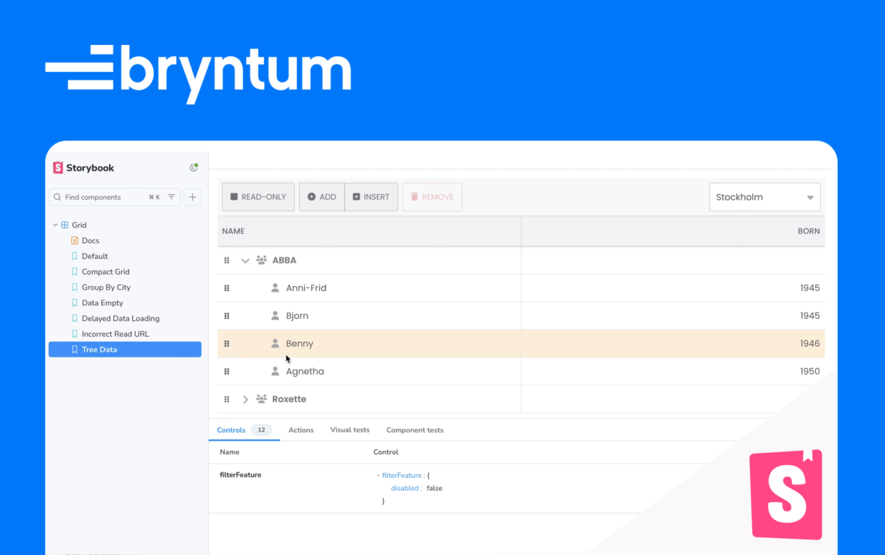
Add the following TreeData story to the src/components/Grid.stories.tsx file:
export const TreeData: Story = {
    args : {
        ...Default.args,
        treeFeature : true,
        store       : {
            readUrl  : '/tree-data',
            autoLoad : true
        },
        columns : [
            { type : 'tree', field : 'name', text : 'Name', flex : 1 },
            { type : 'number', field : 'born', text : 'Born', flex : 1, format : '0'  }
        ]
    }
};
This story enables the treeFeature so that the Grid can read tree data. All tree Grid configurations must have one TreeColumn with its type set to tree.
When you open your Storybook workshop, you’ll see you now have stories for the different data states:
Next steps
This tutorial provides a starting point for integrating Bryntum Grid components with Storybook. To further enhance your project, you can take a look at the additional features available on our Bryntum Grid demo page, or you can extend and customize your Storybook with addons such as:
- The a11y addon for accessibility checks.
- The Actions addon for displaying data received by event handlers
- The Chromatic addon for conducting visual tests
- The Test runner addon for turning stories into executable tests with Jest and Playwright