Built-in Font Awesome Support in Bryntum Components
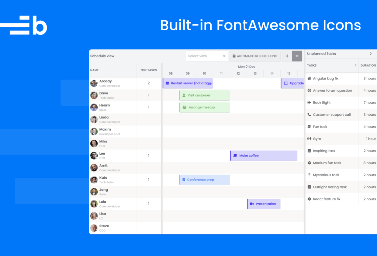
Icons speak louder than words. Now that Font Awesome is integrated with Bryntum, adding clean, recognizable icons is as easy as assigning a class name. No setup or configuration needed: Just drop it in, and you’re ready!
At Bryntum, we understand that every detail matters in a high-quality application, especially the visual cues that guide users through complex interfaces. That’s why Font Awesome support is built into all Bryntum products. Whether you’re building advanced schedulers, Gantt charts, or calendar-based applications, Font Awesome helps you enhance clarity, improve usability, and deliver a polished user experience effortlessly.
Why Font Awesome?
Trusted by millions of developers and designers, Font Awesome is the industry standard for icon libraries. With over 2,000 free icons and 20,000+ icons in the Pro set, it offers extensive visual coverage for nearly every use case, from UI navigation to industry-specific symbols.
Font Awesome icons are:
- Recognizable: Familiar symbols your users instantly understand
- Scalable: Vector-based icons that look crisp at any size
- Customizable: Easily style icons with CSS for color, size, rotation, animation, and more
- Lightweight: Minimal footprint with only the icons you need
Font Awesome delivers design consistency and developer convenience, all while reducing the time spent on custom iconography. It’s a perfect fit for Bryntum’s high-performance UI components, where visual clarity and responsiveness are key.
Easy Integration
You can forget about manual configurations and setups. Font Awesome is integrated with Bryntum products by default. All components come with built-in support for the free version of Font Awesome, so you can start using icons immediately without worrying about dependencies or asset loading.
It doesn’t matter if you’re adding icons to column headers, buttons, toolbars, or custom templates. The process is straightforward. Just use the standard Font Awesome class syntax:
<i class="b-fa b-fa-user"></i>It’s that simple.
Support for Pro Icons
Integrating Font Awesome Pro with Bryntum is just as easy. With a few simple adjustments, you can unlock access to thousands of additional icons, including duotone styles, advanced categories, and brand-specific symbols.
Follow our guide to upgrading Font Awesome to replace the default free icons with Pro icons. Bryntum gives you full flexibility to enhance your UI with the rich visual library that Font Awesome Pro offers.
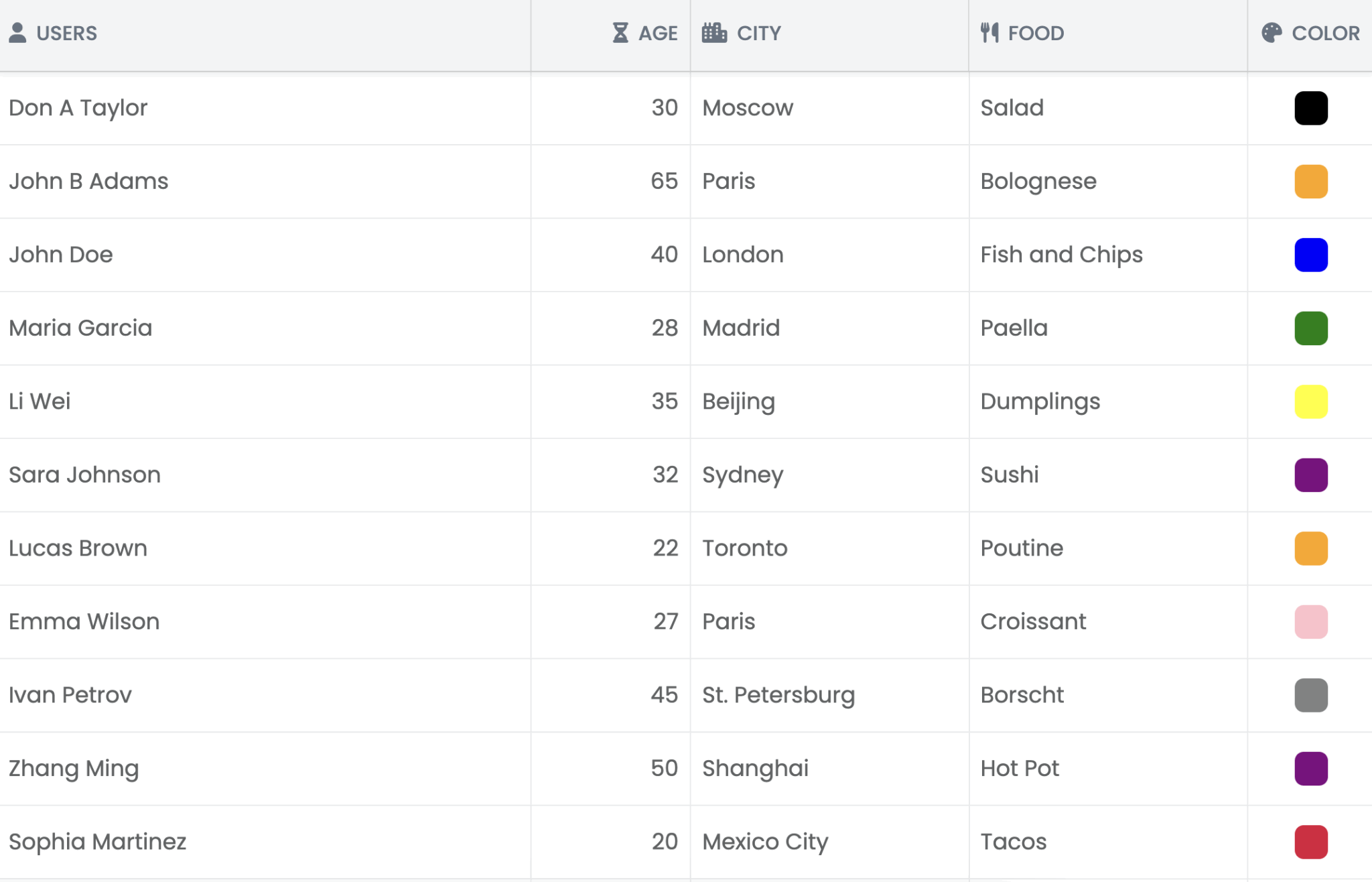
A Practical Example – using in Bryntum Grid
A Practical Example – using in Bryntum Grid
To reduce the development and setup complexity, let’s add icons to our most basic Bryntum Grid demo. Notice the plain-text column headers. We’ll add icons to all of them.
Thanks to the built-in Font Awesome support, we only need to assign class names.
For Name:
 {
    text   : 'Name',
    field  : 'name',
    flex   : 2,
    icon   : 'b-fa b-fa-user',
    editor : {
        type     : 'textfield',
        required : true
    }
}
For Age:
{
    text  : 'Age',
    field : 'age',
    width : 100,
    type  : 'number',
    icon  : 'b-fa b-fa-hourglass-half'
}
For City:
{
    text  : 'City',
    field : 'city',
    flex  : 1,
    icon  : 'b-fa b-fa-city'
}
For Food:
{
    text  : 'Food',
    field : 'food',
    flex  : 1,
    icon  : 'b-fa b-fa-utensils'
}
For Color:
{
    type  : 'color',
    text  : 'Color',
    field : 'color',
    width : 80,
    icon  : 'b-fa b-fa-palette'
}
With that, you have icons in every column header.
More Practical Examples
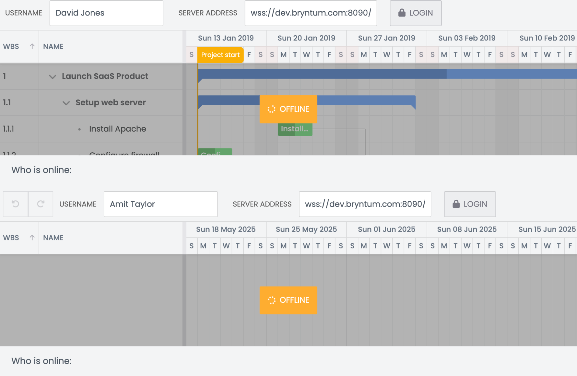
You can easily add Font Awesome icons to buttons in more complex setups than the Basic Grid, like the Bryntum Gantt Realtime Updates demo.
Let’s add icons to the Login and Logout buttons.
In the items object of the LoginWidget class, add the Font Awesome lock class to the loginButton:
            loginButton : {
                type    : 'button',
                cls     : 'b-skip-test',
                icon    : 'b-fa b-fa-lock',
                text    : 'Login',
                onClick : 'up.login'
            },
The lock icon is rendered like this in the UI:
When a user is logged in, the sign-out icon is rendered next to the Logout text:
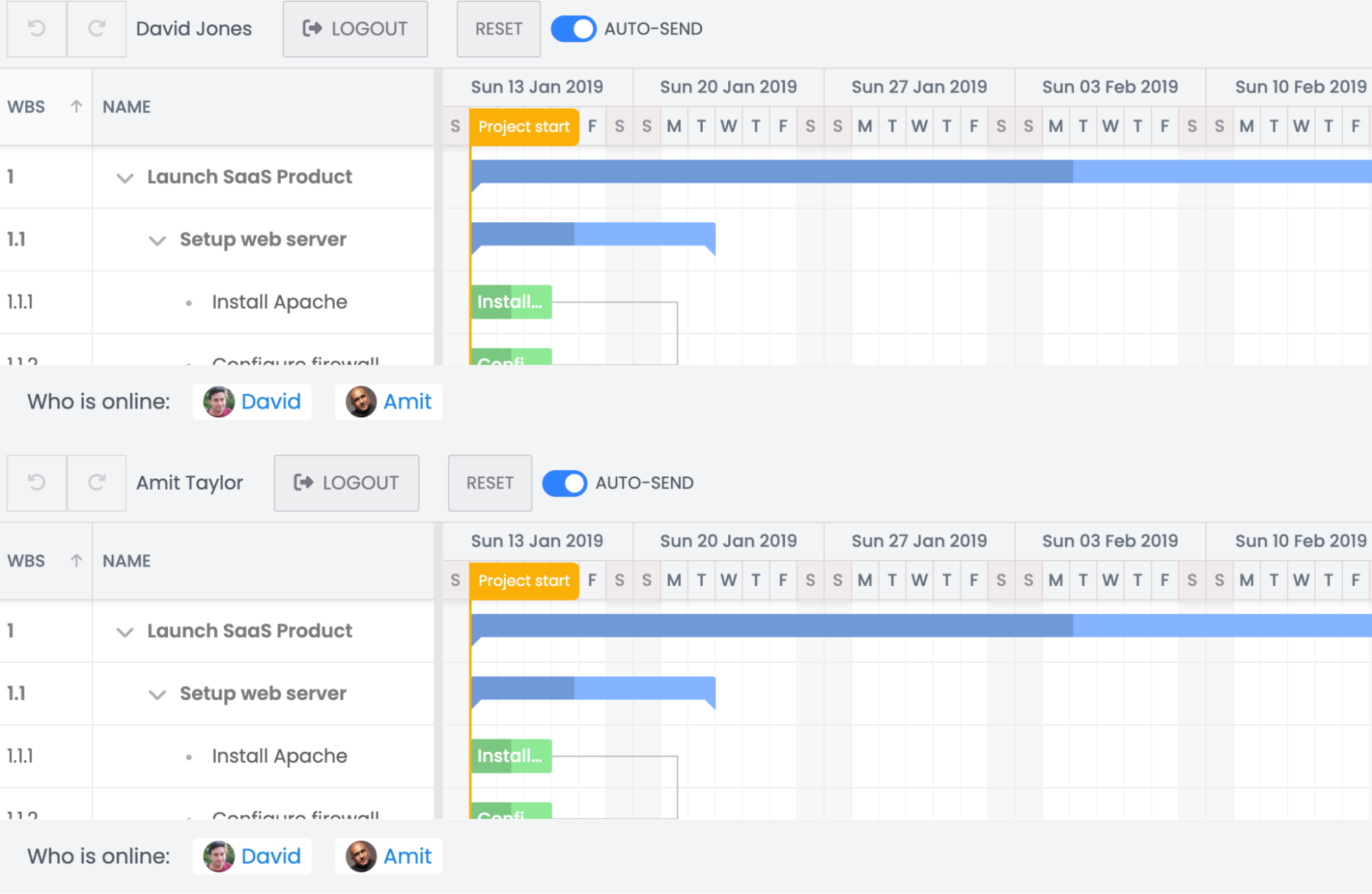
Visit the Bryntum Gantt API docs for more information on using Font Awesome icons in buttons.
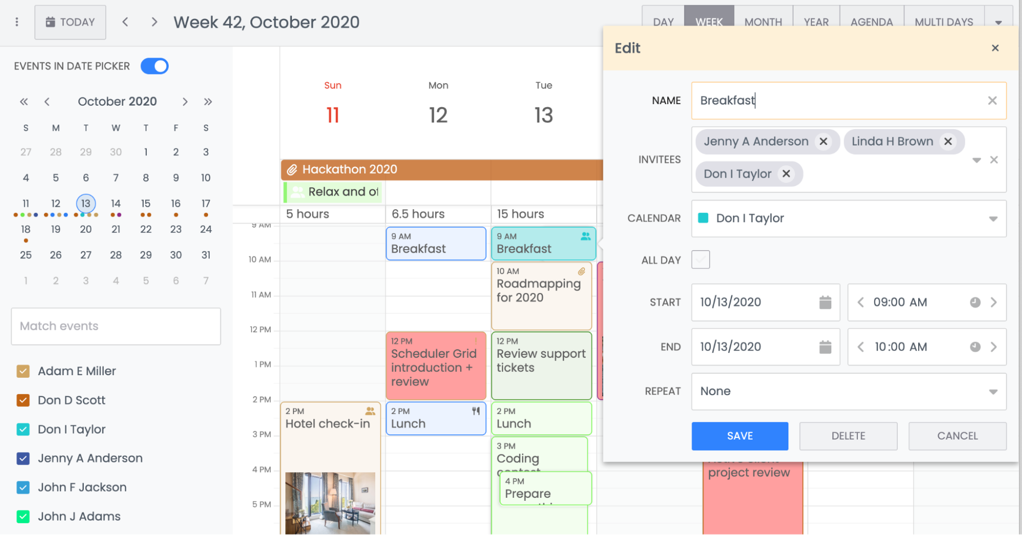
Our Bryntum Calendar Custom Rendering demo applies Font Awesome icons conditionally.
In the week object configuration for rendering event data, we include different Font Awesome icon classes in the iconCls field. Different icons are rendered based on whether the events are marked as important, include attachments, or have invitees.
               eventRenderer : ({ eventRecord, renderData }) => {
                   if (eventRecord.important) {
                       renderData.bodyColor = '#ff9f9f';
                       renderData.iconCls['b-fa b-fa-exclamation'] = 1;
                   }
                   else if (eventRecord.nbrAttachments > 0) {
                       renderData.iconCls['b-fa b-fa-paperclip'] = 1;
                   }
                   else if (eventRecord.invitees.length > 0) {
                       renderData.iconCls['b-fa b-fa-user-friends'] = 1;
                   }
               //…
               }
Next Steps
Now that you’ve seen how easy it is to integrate Font Awesome icons with Bryntum components, you can unlock even more with the Pro version. Purchase Font Awesome Pro using this link to enjoy an exclusive 30% discount.
If you’re new to Bryntum, we offer a 45-day free trial so you can explore our Grid, Gantt, Scheduler, or any other components without limitations.
Need help? Our active and developer-friendly community forum allows you to ask questions, share feedback, or get support anytime.