React Hook Form and Zod validation in Bryntum Scheduler Pro
We strive to keep posts updated, but code samples may sometimes be outdated. Humans, see the Bryntum documentation; agents, https://mcp.bryntum.com for the latest info.
Bryntum’s suite of scheduling components is full of forms including task, event, resource, and calendar editors. The Bryntum Scheduler Pro includes a task editor form with validation that can be customized, turned off, or replaced with a custom editor. Bryntum components come with over 100 widgets that you can use to modify the forms including DateField, Combo, and ColorPicker.
You may want to replace the task editor with a custom one if you’re adding the Scheduler Pro to an app that uses UI library form components, such as Material UI, and a form validation library such as React Hook Form, the popular React form state management and validation library. Replacing the task editor can keep validation and form components consistent with the rest of the application.
In this guide, we’ll show you how to customize and validate Scheduler Pro’s built-in task editor. We’ll then replace it with a React Hook Form dialog, show how to add a Bryntum date widget, and move the validation rules into a Zod schema.
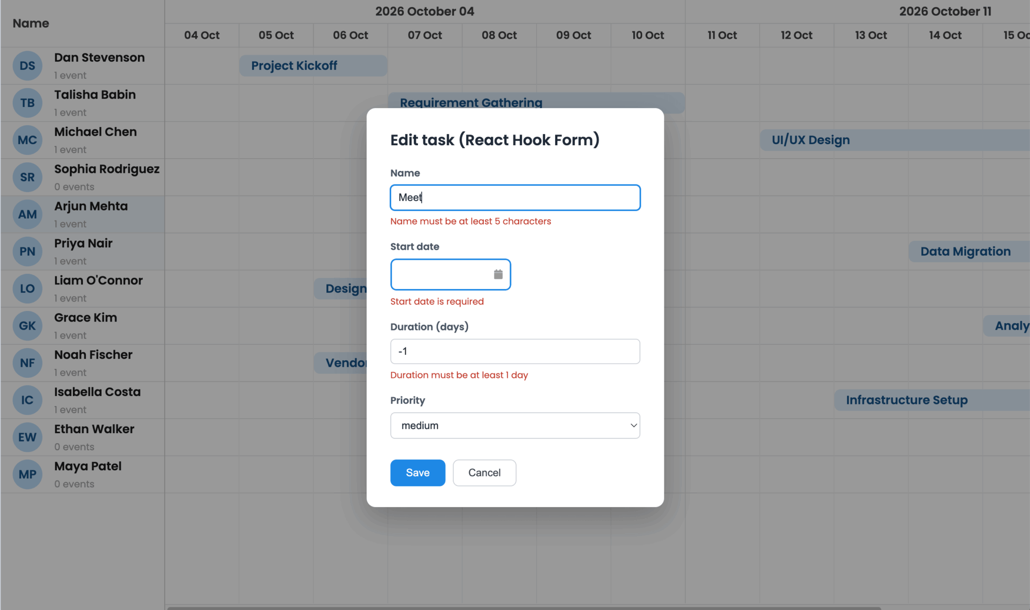
You can find the code in the Bryntum Scheduler Pro React Hook Form and Zod GitHub repo.
Getting started: Setting up a React Bryntum Scheduler Pro
Run the following commands in your terminal to create a Vite React TypeScript application and install Scheduler Pro, its React wrapper, and React Hook Form:
npm create vite@latest schedulerpro-react-hook-form -- --template react-ts
cd schedulerpro-react-hook-form
npm install
npm install @bryntum/schedulerpro@npm:@bryntum/schedulerpro-trial @bryntum/schedulerpro-react
npm install react-hook-form
If you have a Bryntum license, follow the npm repository guide to access the private Bryntum repository and install @bryntum/schedulerpro instead of the trial package.
Delete the Vite starter files that the tutorial does not use:
rm src/App.css && rm -r src/assetsUpdate the vite.config.ts file so Vite prebundles both Bryntum packages once during development:
import { defineConfig } from 'vite';
import react from '@vitejs/plugin-react';

export default defineConfig({
    plugins: [react()],
    optimizeDeps: {
        include: ['@bryntum/schedulerpro', '@bryntum/schedulerpro-react'],
    },
});
The optimizeDeps entry prevents Vite from processing the Scheduler Pro packages as separate dependency graphs during development.
Replace the contents of src/index.css with the Bryntum structural CSS, icons, Svalbard light theme, and the page sizing styles:
@import "@bryntum/schedulerpro/fontawesome/css/fontawesome.css";
@import "@bryntum/schedulerpro/fontawesome/css/solid.css";
@import "@bryntum/schedulerpro/schedulerpro.css";
@import "@bryntum/schedulerpro/svalbard-light.css";
@import url("https://fonts.googleapis.com/css2?family=Poppins:wght@300;400;500;600&display=swap");

html,
body,
#root {
    height: 100%;
    margin: 0;
}

body {
    font-family: 'Poppins', 'Segoe UI', Arial, sans-serif;
}

#root {
    display: flex;
    flex-direction: column;
}
The first four imports provide Scheduler Pro’s structural styles, icons, and theme. The full-height flex layout makes the scheduler fill the viewport height.
Loading the Scheduler Pro data
We’ll load the resources, events, and assignments data from one local file. Create a data.json file in the public folder and add the following JSON to it:
{
    "success": true,
    "resources": {
        "rows": [
            { "id": 1, "name": "Dan Stevenson" },
            { "id": 2, "name": "Talisha Babin" },
            { "id": 3, "name": "Michael Chen" },
            { "id": 4, "name": "Sophia Rodriguez" },
            { "id": 5, "name": "Arjun Mehta" },
            { "id": 6, "name": "Priya Nair" },
            { "id": 7, "name": "Liam O'Connor" },
            { "id": 8, "name": "Grace Kim" },
            { "id": 9, "name": "Noah Fischer" },
            { "id": 10, "name": "Isabella Costa" },
            { "id": 11, "name": "Ethan Walker" },
            { "id": 12, "name": "Maya Patel" }
        ]
    },
    "events": {
        "rows": [
            { "id": 1, "name": "Project Kickoff", "startDate": "2026-10-05", "duration": 2, "durationUnit": "d", "priority": "medium" },
            { "id": 2, "name": "Requirement Gathering", "startDate": "2026-10-07", "duration": 4, "durationUnit": "d", "priority": "high" },
            { "id": 3, "name": "UI/UX Design", "startDate": "2026-10-12", "duration": 5, "durationUnit": "d", "priority": "medium" },
            { "id": 4, "name": "Backend Development", "startDate": "2026-10-19", "duration": 7, "durationUnit": "d", "priority": "high" },
            { "id": 5, "name": "Frontend Development", "startDate": "2026-10-26", "duration": 6, "durationUnit": "d", "priority": "medium" },
            { "id": 6, "name": "API Integration", "startDate": "2026-11-02", "duration": 4, "durationUnit": "d", "priority": "low" },
            { "id": 7, "name": "Testing & QA", "startDate": "2026-11-06", "duration": 3, "durationUnit": "d", "priority": "high" },
            { "id": 8, "name": "Final Deployment", "startDate": "2026-11-10", "duration": 2, "durationUnit": "d", "priority": "medium" },
            { "id": 9, "name": "Stakeholder Review", "startDate": "2026-10-08", "duration": 2, "durationUnit": "d", "priority": "medium" },
            { "id": 10, "name": "Data Migration", "startDate": "2026-10-14", "duration": 5, "durationUnit": "d", "priority": "high" },
            { "id": 11, "name": "Security Audit", "startDate": "2026-10-21", "duration": 3, "durationUnit": "d", "priority": "high" },
            { "id": 12, "name": "Performance Tuning", "startDate": "2026-10-27", "duration": 4, "durationUnit": "d", "priority": "medium" },
            { "id": 13, "name": "Documentation", "startDate": "2026-11-03", "duration": 3, "durationUnit": "d", "priority": "low" },
            { "id": 14, "name": "User Training", "startDate": "2026-11-09", "duration": 2, "durationUnit": "d", "priority": "medium" },
            { "id": 15, "name": "Vendor Onboarding", "startDate": "2026-10-06", "duration": 3, "durationUnit": "d", "priority": "low" },
            { "id": 16, "name": "Infrastructure Setup", "startDate": "2026-10-13", "duration": 6, "durationUnit": "d", "priority": "high" },
            { "id": 17, "name": "Load Testing", "startDate": "2026-10-22", "duration": 3, "durationUnit": "d", "priority": "medium" },
            { "id": 18, "name": "Accessibility Review", "startDate": "2026-10-29", "duration": 2, "durationUnit": "d", "priority": "low" },
            { "id": 19, "name": "Localization", "startDate": "2026-11-04", "duration": 4, "durationUnit": "d", "priority": "medium" },
            { "id": 20, "name": "Go-Live Support", "startDate": "2026-11-11", "duration": 3, "durationUnit": "d", "priority": "high" },
            { "id": 21, "name": "Design Handoff", "startDate": "2026-10-06", "duration": 2, "durationUnit": "d", "priority": "medium" },
            { "id": 22, "name": "Analytics Setup", "startDate": "2026-10-15", "duration": 3, "durationUnit": "d", "priority": "low" },
            { "id": 23, "name": "Payment Integration", "startDate": "2026-10-20", "duration": 5, "durationUnit": "d", "priority": "high" },
            { "id": 24, "name": "Regression Testing", "startDate": "2026-11-05", "duration": 3, "durationUnit": "d", "priority": "medium" }
        ]
    },
    "assignments": {
        "rows": [
            { "id": 1, "event": 1, "resource": 1 },
            { "id": 2, "event": 2, "resource": 2 },
            { "id": 3, "event": 3, "resource": 3 },
            { "id": 4, "event": 4, "resource": 4 },
            { "id": 5, "event": 5, "resource": 1 },
            { "id": 6, "event": 6, "resource": 2 },
            { "id": 7, "event": 7, "resource": 3 },
            { "id": 8, "event": 8, "resource": 4 },
            { "id": 9, "event": 9, "resource": 5 },
            { "id": 10, "event": 10, "resource": 6 },
            { "id": 11, "event": 11, "resource": 7 },
            { "id": 12, "event": 12, "resource": 8 },
            { "id": 13, "event": 13, "resource": 5 },
            { "id": 14, "event": 14, "resource": 6 },
            { "id": 15, "event": 15, "resource": 9 },
            { "id": 16, "event": 16, "resource": 10 },
            { "id": 17, "event": 17, "resource": 11 },
            { "id": 18, "event": 18, "resource": 12 },
            { "id": 19, "event": 19, "resource": 9 },
            { "id": 20, "event": 20, "resource": 10 },
            { "id": 21, "event": 21, "resource": 7 },
            { "id": 22, "event": 22, "resource": 8 },
            { "id": 23, "event": 23, "resource": 11 },
            { "id": 24, "event": 24, "resource": 12 }
        ]
    }
}
The Bryntum Scheduler Pro’s project model reads these three stores from the same response. Assignments connect each event to a resource using their IDs.
Creating a custom event model
The data includes a custom priority value. We’ll add it to the Bryntum task model by defining a custom event model. Create a TaskModel.ts file in src/lib:
mkdir src/lib && touch src/lib/TaskModel.tsAdd the following lines of code to it:
import { EventModel } from '@bryntum/schedulerpro';

export const taskPriorities = ['low', 'medium', 'high'] as const;
export type TaskPriority = (typeof taskPriorities)[number];

export default class TaskModel extends EventModel {
    declare priority: TaskPriority;

    static get fields() {
        return [
            { name: 'priority', defaultValue: 'medium' },
        ];
    }
}

export type TaskRecord = InstanceType<typeof TaskModel>;
The TaskModel class extends Scheduler Pro’s EventModel, and adds the custom priority field.
Configuring the Bryntum Scheduler Pro and task editor
Create an AppConfig.ts file in the src folder and add the following project configuration to it:
import type {
    BryntumSchedulerProProjectModelProps,
    BryntumSchedulerProProps,
} from '@bryntum/schedulerpro-react';
import TaskModel, { taskPriorities } from './lib/TaskModel';

export const projectProps: BryntumSchedulerProProjectModelProps = {
    eventModelClass: TaskModel,
    autoLoad: true,
    transport: {
        load: {
            url: 'data.json',
        },
    },
};
The project config registers the custom task model and loads the data from the local JSON file.
Add the following Scheduler Pro configuration below projectProps:
export const schedulerProProps: BryntumSchedulerProProps = {
    startDate: new Date(2026, 9, 5),
    viewPreset: 'weekAndDay',
    rowHeight: 50,
    barMargin: 10,
    columns: [
        { type: 'resourceInfo', text: 'Name', field: 'name', width: 220 },
    ],
    taskEditFeature: {
        items: {
            generalTab: {
                items: {
                    percentDoneField: false,
                    effortField: {
                        cls: 'b-half-width',
                    },
                    nameField: {
                        required: true,
                        showRequiredIndicator: true,
                        minLength: 5,
                    },
                    durationField: {
                        min: '1d',
                        max: '60d',
                    },
                    startDateField: {
                        required: true,
                        showRequiredIndicator: true,
                    },
                    priorityField: {
                        type: 'combo',
                        label: 'Priority',
                        name: 'priority',
                        weight: 630,
                        editable: false,
                        items: [...taskPriorities],
                        required: true,
                        showRequiredIndicator: true,
                    },
                },
            },
        },
    },
};
The Bryntum Scheduler Pro React wrapper exposes feature configurations as individual props such as taskEditFeature, which configures the taskEdit feature. You can modify the input items in the editor tabs. Setting the percentDoneField to false removes that field, while the priorityField config adds a Combo (dropdown) widget whose name matches the custom model field.
The input fields use Bryntum’s built-in validation. The task name is required and must contain at least five characters, the start date is required, and the duration must be between 1 and 60 days. The DurationField min and max configs expect duration strings such as '1d' and '60d'.
Rendering and validating the built-in task editor
Replace the code in src/App.tsx with the following:
import { useRef, useState } from 'react';
import {
    BryntumSchedulerPro,
    BryntumSchedulerProProjectModel
} from '@bryntum/schedulerpro-react';
import { projectProps, schedulerProProps } from './AppConfig';

export default function App() {
    const projectRef = useRef<BryntumSchedulerProProjectModel>(null);
    const [project] = useState(projectProps);
    const [schedulerPro] = useState(schedulerProProps);

    return (
        <>
            <BryntumSchedulerProProjectModel ref={projectRef} {...project} />
            <BryntumSchedulerPro
                project={projectRef}
                {...schedulerPro}
            />
        </>
    );
}
The project component loads the data, and the Scheduler Pro component receives the project via the React ref. Holding the configuration objects in useState keeps their identities stable across React renders.
Running the app and testing the Bryntum Scheduler Pro task editor’s validation
Run the application:
npm run devOpen the app in your browser and open the built-in task editor by double-clicking a task. The task editor’s validation prevents saving when a field’s input is invalid and displays the field’s error in the editor, which you can see by trying to save with an empty task name:
For this app, the built-in editor is already a complete solution. It owns the edit lifecycle, validates its fields, and updates the project stores. The next section deliberately replaces it for applications that need React Hook Form to own that lifecycle, showing the flexibility of Scheduler Pro.
Replacing the task editor with a custom task editor that uses React Hook Form
React Hook Form registers native inputs and collects their values using the handleSubmit function. Create a TaskFormDialog.tsx file in the src folder with the imports and types:
import { Controller, useForm } from 'react-hook-form';
import { BryntumDateField } from '@bryntum/schedulerpro-react';
import {
    taskPriorities,
    type TaskPriority,
    type TaskRecord,
} from './lib/TaskModel';

export interface TaskFormValues {
    name: string;
    startDate: Date | null;
    duration: number;
    priority: TaskPriority;
}

interface TaskFormDialogProps {
    task: TaskRecord | null;
    onClose: (task: TaskRecord) => void;
    onSave: (task: TaskRecord, values: TaskFormValues) => void;
}
The TaskFormValues interface describes the values React Hook Form collects, while TaskFormDialogProps defines the selected task and the callbacks.
Add the following dialog component below the types:
export default function TaskFormDialog({ task, ...props }: TaskFormDialogProps) {
    if (!task) return null;

    return <TaskForm task={task} {...props} />;
}

function TaskForm({ task, onClose, onSave }: TaskFormDialogProps & {
    task: TaskRecord;
}) {
    const {
        register,
        handleSubmit,
        control,
        formState: { errors },
    } = useForm<TaskFormValues>({
        defaultValues: {
            name: task.name ?? '',
            startDate: (task.startDate as Date | null) ?? null,
            duration: task.duration ?? 1,
            priority: task.priority ?? 'medium',
        },
    });

    return (
        <div
            className="task-form-overlay"
            onKeyDown={({ key }) => key === 'Escape' && onClose(task)}
            role="presentation"
        >
            <div
                aria-labelledby="task-form-title"
                aria-modal="true"
                className="task-form-dialog"
                role="dialog"
            >
                <h2 id="task-form-title">Edit task (React Hook Form)</h2>

                <form noValidate onSubmit={handleSubmit((values) => onSave(task, values))}>
                    {/* Add the field snippets below here, in order. */}
                </form>
            </div>
        </div>
    );
}
The useForm hook is used for form initialization.
The TaskFormDialog component renders nothing until a task is selected. Once mounted, TaskForm gives React Hook Form the task’s current values and sends validated submissions to the onSave callback supplied by App, where this component will be rendered.
Add the following native name input in place of the comment inside the <form>:
<label>
    Name
    <input
        aria-describedby={errors.name ? 'name-error' : undefined}
        aria-invalid={Boolean(errors.name)}
        autoFocus
        {...register('name', {
            required: 'Name is required',
            minLength: {
                value: 5,
                message: 'Name must be at least 5 characters',
            },
        })}
    />
    {errors.name && (
        <p className="field-error" id="name-error" role="alert">{errors.name.message}</p>
    )}
</label>
The name input is registered directly with React Hook Form for validation, tracking, and submission. Its rules require a value of at least five characters, and formState.errors supplies the message shown below it. The aria-invalid and aria-describedby attributes connect the input to its error message for accessibility.
Add the following start date field below the name input:
<label>
    Start date
    <Controller
        name="startDate"
        control={control}
        rules={{ required: 'Start date is required' }}
        render={({ field }) => (
            <BryntumDateField
                ariaDescription={errors.startDate?.message}
                ariaLabel="Start date"
                value={field.value ?? undefined}
                onChange={({ value }) => field.onChange(value)}
                onFocusOut={field.onBlur}
            />
        )}
    />
    {errors.startDate && (
        <p className="field-error" role="alert">{errors.startDate.message}</p>
    )}
</label>
The React Hook Form Controller is used to integrate with external controlled UI inputs such as MUI, React-Select, AntD, and Bryntum widgets like the Bryntum DateField that do not expose the native input interface expected by register(). The controller maps the Bryntum widget’s value, change event, and focus-out event to React Hook Form values.
Add the following duration input below the start date field:
<label>
    Duration (days)
    <input
        aria-describedby={errors.duration ? 'duration-error' : undefined}
        aria-invalid={Boolean(errors.duration)}
        type="number"
        {...register('duration', {
            required: 'Duration is required',
            valueAsNumber: true,
            min: { value: 1, message: 'Duration must be at least 1 day' },
            max: { value: 60, message: 'Duration must be at most 60 days' },
        })}
    />
    {errors.duration && (
        <p className="field-error" id="duration-error" role="alert">{errors.duration.message}</p>
    )}
</label>
The valueAsNumber option converts the browser’s string input to a number before React Hook Form applies the 1 to 60 day range rules.
Finish the <form> in src/TaskFormDialog.tsx by adding the priority select input and action buttons:
<label>
    Priority
    <select {...register('priority', { required: true })}>
        {taskPriorities.map((priority) => (
            <option key={priority} value={priority}>{priority}</option>
        ))}
    </select>
</label>

<div className="task-form-actions">
    <button type="submit">Save</button>
    <button type="button" onClick={() => onClose(task)}>Cancel</button>
</div>
The priority select uses the same values as the TaskModel. The Save button runs handleSubmit, which validates every registered or controlled field before calling onSave; Cancel closes the dialog without submitting.
Add the dialog styles to src/index.css:
.task-form-overlay {
    position: fixed;
    inset: 0;
    z-index: 1000;
    display: flex;
    align-items: center;
    justify-content: center;
    background: rgb(0 0 0 / 40%);
}

.task-form-dialog {
    box-sizing: border-box;
    width: 400px;
    max-width: calc(100vw - 32px);
    max-height: calc(100vh - 32px);
    padding: 28px 32px;
    overflow-y: auto;
    color: #1f2937;
    font-family: inherit;
    background: #fff;
    border-radius: 12px;
    box-shadow: 0 16px 40px rgb(0 0 0 / 25%);
}
These rules place a modal overlay above Scheduler Pro and constrain the dialog width and height so it remains usable on smaller screens.
Add the following form field, validation-message, and action-button styles to src/index.css:
.task-form-dialog h2 {
    margin: 0 0 20px;
    font-size: 20px;
}

.task-form-dialog form {
    display: flex;
    flex-direction: column;
    gap: 16px;
}

.task-form-dialog label {
    display: flex;
    flex-direction: column;
    gap: 6px;
    color: #4b5563;
    font-size: 13px;
    font-weight: 600;
}

/* Direct children only — the BryntumDateField's inner input styles itself */
.task-form-dialog label > input,
.task-form-dialog label > select {
    padding: 8px 10px;
    color: #1f2937;
    font-size: 14px;
    font-weight: 400;
    background: #fff;
    border: 1px solid #c9ced6;
    border-radius: 6px;
}

.task-form-dialog label > input:focus-visible,
.task-form-dialog label > select:focus-visible {
    outline: 2px solid var(--b-color-blue, #1e88e5);
    outline-offset: -1px;
}

.field-error {
    margin: 0;
    color: #c0392b;
    font-size: 12px;
    font-weight: 400;
}

.task-form-actions {
    display: flex;
    gap: 10px;
    margin-top: 12px;
}

.task-form-actions button {
    padding: 9px 20px;
    font-size: 14px;
    cursor: pointer;
    border: 1px solid transparent;
    border-radius: 8px;
    transition: background-color 0.15s;
}

.task-form-actions button[type='submit'] {
    color: #fff;
    background: var(--b-color-blue, #1e88e5);
}

.task-form-actions button[type='submit']:hover {
    background: #1976d2;
}

.task-form-actions button[type='button'] {
    color: #374151;
    background: #fff;
    border-color: #c9ced6;
}

.task-form-actions button[type='button']:hover {
    background: #f3f4f6;
}
Replace the code in src/App.tsx with the following lines of code:
import { useCallback, useRef, useState } from 'react';
import {
    BryntumSchedulerPro,
    BryntumSchedulerProProjectModel,
    type BryntumSchedulerProProps
} from '@bryntum/schedulerpro-react';
import { projectProps, schedulerProProps } from './AppConfig';
import TaskFormDialog, { type TaskFormValues } from './TaskFormDialog';
import type { TaskRecord } from './lib/TaskModel';

export default function App() {
    const projectRef = useRef<BryntumSchedulerProProjectModel>(null);
    const [editingTask, setEditingTask] = useState<TaskRecord | null>(null);
    const [project] = useState(projectProps);
    const [schedulerPro] = useState(schedulerProProps);

    const [listeners] = useState<
        NonNullable<BryntumSchedulerProProps['listeners']>
    >(() => ({
        beforeTaskEdit({ taskRecord }) {
            setEditingTask(taskRecord as TaskRecord);
            return false;
        },
    }));
    const closeDialog = useCallback((task: TaskRecord) => {
        if (task.isCreating) {
            task.eventStore?.remove(task);
        }
        setEditingTask(null);
    }, []);

    const saveTask = useCallback((task: TaskRecord, values: TaskFormValues) => {
        task.beginBatch();
        try {
            task.name = values.name;
            if (values.startDate) {
                task.setStartDate(values.startDate, false);
            }
            task.duration = values.duration;
            task.priority = values.priority;
        }
        finally {
            task.endBatch();
        }

        task.isCreating = false;
        setEditingTask(null);
    }, []);
    return (
        <>
            <BryntumSchedulerProProjectModel ref={projectRef} {...project} />
            <BryntumSchedulerPro
                project={projectRef}
                listeners={listeners}
                {...schedulerPro}
            />
            <TaskFormDialog
                key={editingTask?.id ?? 'none'}
                task={editingTask}
                onClose={closeDialog}
                onSave={saveTask}
            />
        </>
    );
}
The beforeTaskEdit listener is used to store the selected record in React state and returns false, preventing Bryntum’s built-in task editor popup from opening.
Cancelling a task edit removes a temporary drag-created record, while saving batches the form values into the Bryntum model before clearing its isCreating flag.
The custom task editor now owns the Bryntum Scheduler Pro record lifecycle that the built-in editor previously handled. Cancelling an existing task leaves it unchanged because the React Hook Form values are only written to the record on save.
Moving the validation rules to Zod
Inline React Hook Form rules work well for a small form. A schema becomes useful when the application shares validation between forms or when you need more complex validation.
Run the following command in your terminal to install Zod and the React Hook Form resolvers package:
npm install zod @hookform/resolversZod defines the schema, while @hookform/resolvers lets React Hook Form run that schema during handleSubmit and expose its issues through formState errors.
Create taskFormSchema.ts in the src folder and add the following Zod schema to it:
import { z } from 'zod';
import { taskPriorities } from './lib/TaskModel';

export const taskFormSchema = z.object({
    name: z.string().min(5, 'Name must be at least 5 characters'),
    startDate: z
        .date({ message: 'Start date is required' })
        .nullable()
        .refine((date) => date !== null, 'Start date is required'),
    duration: z
        .number()
        .min(1, 'Duration must be at least 1 day')
        .max(60, 'Duration must be at most 60 days'),
    priority: z.enum(taskPriorities),
});

export type TaskFormInput = z.input<typeof taskFormSchema>;
export type TaskFormValues = z.output<typeof taskFormSchema>;
The form input type permits null while the start date is empty. After the refinement succeeds, the schema’s output type narrows it to Date.
In src/TaskFormDialog.tsx, replace the local TaskFormValues interface with these imports:
import { zodResolver } from '@hookform/resolvers/zod';
import {
    taskFormSchema,
    type TaskFormInput,
    type TaskFormValues,
} from './taskFormSchema';
These imports replace the form’s handwritten value interface with input and validated output types inferred from the schema.
In the same file, remove the TaskPriority type import so that only one type is imported from ./lib/TaskModel:
import { taskPriorities, type TaskRecord } from './lib/TaskModel';In the TaskForm function, replace the existing useForm call with the following:
const {
    register,
    handleSubmit,
    control,
    formState: { errors },
} = useForm<TaskFormInput, unknown, TaskFormValues>({
    resolver: zodResolver(taskFormSchema),
    defaultValues: {
        name: task.name ?? '',
        startDate: (task.startDate as Date | null) ?? null,
        duration: task.duration ?? 1,
        priority: task.priority ?? 'medium',
    },
});
The zodResolver makes the schema the form’s validation source.
Update the dialog heading:
<h2 id="task-form-title">Edit task (React Hook Form + Zod)</h2>Next, replace the four labeled fields inside the form with the following versions. The label wrappers, error messages, and the Save and Cancel buttons stay as they are; only the inline validation rules are removed:
<label>
    Name
    <input
        aria-describedby={errors.name ? 'name-error' : undefined}
        aria-invalid={Boolean(errors.name)}
        autoFocus
        {...register('name')}
    />
    {errors.name && (
        <p className="field-error" id="name-error" role="alert">{errors.name.message}</p>
    )}
</label>

<label>
    Start date
    <Controller
        name="startDate"
        control={control}
        render={({ field }) => (
            <BryntumDateField
                ariaDescription={errors.startDate?.message}
                ariaLabel="Start date"
                value={field.value ?? undefined}
                onChange={({ value }) => field.onChange(value)}
                onFocusOut={field.onBlur}
            />
        )}
    />
    {errors.startDate && (
        <p className="field-error" role="alert">{errors.startDate.message}</p>
    )}
</label>

<label>
    Duration (days)
    <input
        aria-describedby={errors.duration ? 'duration-error' : undefined}
        aria-invalid={Boolean(errors.duration)}
        type="number"
        {...register('duration', { valueAsNumber: true })}
    />
    {errors.duration && (
        <p className="field-error" id="duration-error" role="alert">{errors.duration.message}</p>
    )}
</label>

<label>
    Priority
    <select {...register('priority')}>
        {taskPriorities.map((priority) => (
            <option key={priority} value={priority}>{priority}</option>
        ))}
    </select>
</label>
Only valueAsNumber remains because it’s input transformation rather than validation: it converts the duration string before Zod receives it.
Finally, remove the TaskFormValues type import in src/App.tsx and add the schema-derived type import:
import TaskFormDialog from './TaskFormDialog';
import type { TaskFormValues } from './taskFormSchema';
Because the schema’s output type narrows startDate to a Date, the if (values.startDate) guard in saveTask is no longer needed. Replace it with the direct call:
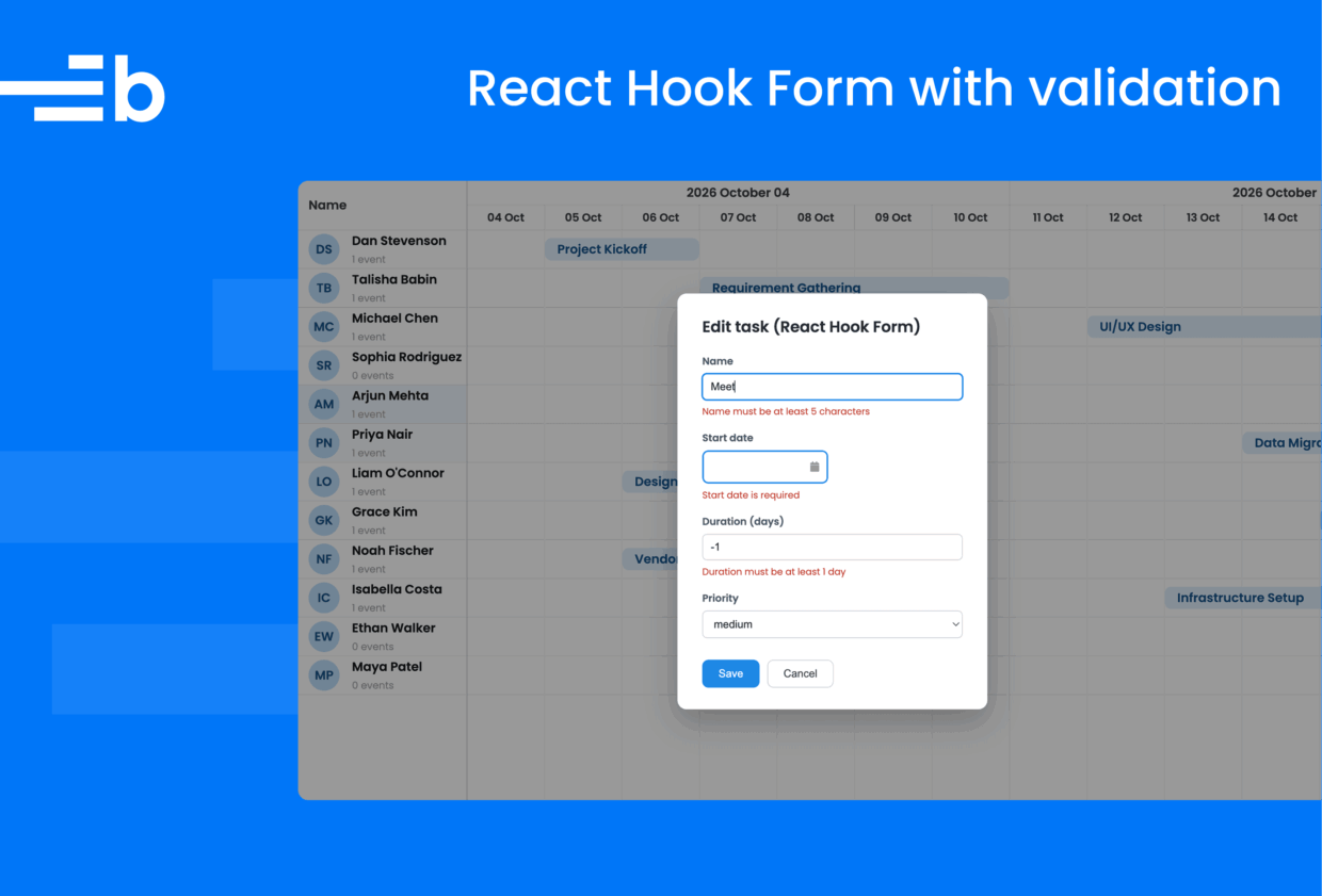
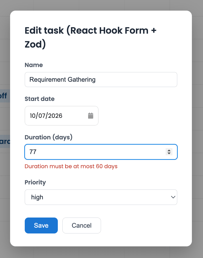
task.setStartDate(values.startDate, false);Apart from its heading, the form does not change: React Hook Form still registers inputs, controls BryntumDateField, stores errors, and runs handleSubmit. On submission, zodResolver passes the collected values through taskFormSchema and converts any Zod issues into formState.errors; only the location of the validation rules changed:
Building this demo with the Bryntum MCP server and skills
We built and verified this demo with Bryntum’s AI tooling. The Bryntum MCP server provides version-specific documentation to coding agents. It helped confirm the Scheduler Pro taskEdit item refs, the duration string validation, the React wrapper’s taskEditFeature prop, and the supported beforeTaskEdit replacement pattern.
Run the following command in your terminal to add the MCP to Claude Code:
claude mcp add --transport http bryntum https://mcp.bryntum.comThe Bryntum AI Agent skills complement the documentation search with practical knowledge for using Bryntum.
Next steps
We learned how to customize the Bryntum Scheduler Pro task editor and replace it with a custom one using a React Hook Form dialog as well as Zod. This lets you integrate Bryntum Scheduler Pro seamlessly into your app.
From here, you can add more fields to TaskModel and both editors, connect your Scheduler Pro to a backend, and add more complex validation. For another example of form-driven scheduling in React, take a look at our React Admin x Bryntum: Creating a scheduler blog post, which uses React Admin to create a custom event form where the form inputs are built using MUI components and React Hook Form for validation.
Build it with Bryntum Scheduler Pro
Start a free trial, explore live demos, or read the docs.
Related posts