React Admin x Bryntum: Creating a scheduler
We strive to keep posts updated, but code samples may sometimes be outdated. Humans, see the Bryntum documentation; agents, https://mcp.bryntum.com for the latest info.
We’re excited to announce our partnership with Marmelab, the team behind React-admin. Together, we’ve created the React-admin Scheduler – a powerful scheduling component that brings Bryntum’s advanced scheduling capabilities to React-admin.
React-admin is a popular frontend framework for building web apps that are powered by REST or GraphQL APIs and use TypeScript, React, and MUI components. React-admin simplifies the creation of data-driven business-to-business applications with features including authentication, validation, and data fetching. It also comes with a collection of UI components for common use cases.
In this tutorial, we demonstrate how to create and configure a React-admin Scheduler component. We’ll do the following:
- Create, customize, and style a React-admin Scheduler.
- Connect the Scheduler to a backend REST API.
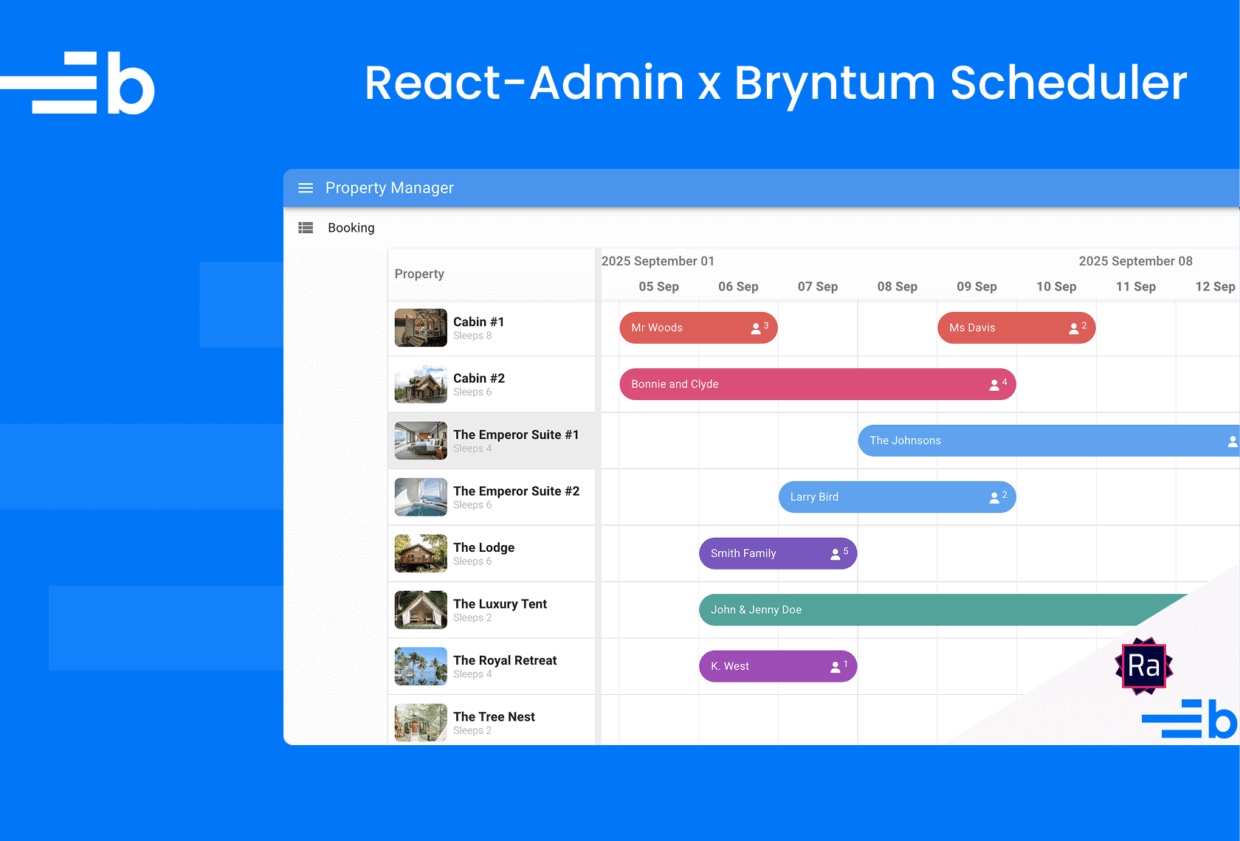
Here’s what we’ll build:
Prerequisites
To follow along, you need a valid Bryntum Scheduler license and a valid React-admin Enterprise Edition license.
Getting started
Begin by downloading the React-admin Scheduler starter template.
The starter template has a frontend app and a backend app. The frontend uses Vite, which is a development server and bundler. The backend uses Express and has Zod schema and TypeScript types for the React-admin Scheduler events and resources data. For reference, the completed-app branch contains the code for the completed tutorial.
Next, install the backend and frontend dependencies:
npm run install-allCreate and populate a local SQLite database with the example property bookings data in backend/src/initialData by running the addExampleData.ts script in the backend app:
npm run seedRun the local dev servers for the frontend and backend using the following command:
npm run devThis runs the frontend and backend apps at the same time, using the npm package concurrently.
You can access the frontend app at https://localhost:5173 and the backend app at https://localhost:1337.
If you open the frontend app in your browser, you’ll see text that reads App component. This text is rendered by the frontend/src/App.tsx component.
Creating a React-admin Scheduler component
The React-admin Scheduler component has all the config options and features of the Bryntum Scheduler, and accepts them as props. It also includes several features specific to the React-admin Scheduler, which make it particularly well-suited for enterprise applications:
The React-admin Scheduler has extra React-admin-specific props for data handling and styling. For example, the converters prop is an object containing converters that change dataProvider records into Bryntum models and vice-versa. The Data Provider is the interface between React-admin and your API. It uses TanStack Query (formerly React Query) to handle data fetching and caching.
Installing the React-admin Scheduler
First, you need to configure npm to log in to the private React-admin Enterprise Edition npm registry.
Set the registry URL for the @react-admin packages:
npm config set @react-admin:registry https://registry.marmelab.comThen log in to the React-admin registry:
npm login --registry=https://registry.marmelab.comThis opens a new browser window asking you to sign in. Sign in using your React-admin Enterprise Edition email and password.
In the frontend app, install the React-admin Scheduler (ra-scheduler) package:
npm install @react-admin/ra-schedulerNext, we’ll install the Bryntum Scheduler component.
If you’re using the free trial, install the public Bryntum trial packages:
npm install @bryntum/core-thin-trial @bryntum/grid-thin-trial @bryntum/scheduler-thin-trialThen configure your package manager, in frontend/package.json, to force the resolution to the trial version of the Bryntum Scheduler packages.
{
    ...
    "overrides": {
        "@bryntum/core-thin": "npm:@bryntum/core-thin-trial@6.2.4",
        "@bryntum/engine-thin": "npm:@bryntum/engine-thin-trial@6.2.4",
        "@bryntum/grid-thin": "npm:@bryntum/grid-thin-trial@6.2.4",
        "@bryntum/scheduler-thin": "npm:@bryntum/scheduler-thin-trial@6.2.4"
    }
}
If you have a Bryntum license, refer to our npm Repository Guide and install the licensed packages:
npm install @bryntum/core-thin @bryntum/grid-thin @bryntum/scheduler-thinCreating a React-admin Scheduler component
Create a ReactAdminScheduler.tsx file in the frontend/src folder and add the following code to it:
import { Scheduler } from '@react-admin/ra-scheduler';
import { schedulerProps } from './AppConfig';

import '@bryntum/core-thin/core.material.css';
import '@bryntum/grid-thin/grid.material.css';
import '@bryntum/scheduler-thin/scheduler.material.css';

export const ReactAdminScheduler = () => (
    <Scheduler
        resources={{
            events    : 'events',
            resources : 'resources'
        }}
        {...schedulerProps}
    />
);
The React-admin <Scheduler> component renders a Bryntum Scheduler and integrates it with the Data Provider and React-admin Form Layout dialogs. The resources prop lets you change the resource names in the Scheduler (if, for example, you need to change the names of the API CRUD endpoints).
Create an AppConfig.tsx file in the frontend/src folder and add the following configuration for the Scheduler:
import { SchedulerProps } from '@react-admin/ra-scheduler';

export const schedulerProps : SchedulerProps = {
    viewPreset        : 'weekAndDay',
    weekStartDay      : 1,
    rowHeight         : 70,
    barMargin         : 15,
    tickSize          : 100,
    snap              : true,
    resourceImagePath : 'resources/',
    date              : new Date('2025-09-14'),
    timeZone          : 'UTC',
    allowOverlap      : false
};
Replace the content of the frontend/src/App.tsx file with the following code:
import { Admin, Resource } from 'react-admin';
import i18nProvider from './i18nProvider';
import { ReactAdminScheduler } from './ReactAdminScheduler';
import './App.css';

const App = () => (
    <Admin
        i18nProvider={i18nProvider}
        darkTheme={null}
    >
        <Resource
            name="events"
            list={
                ReactAdminScheduler
            }
            options={{ label : 'Bookings' }}
        />
    </Admin>
);

export default App;
The Admin component is the root component of a React-admin application. It handles application configuration, routing, authentication, and connects to your Data Provider. It passes data to its children using context providers. It requires a dataProvider prop and at least one child <Resource> to work.
Resource components define CRUD routes in your application. A resource defines the CRUD routes for a specific data type, such as Scheduler events and resources. The list prop specifies which component should be rendered when viewing the list of resources.
Create an i18nProvider.ts file in the frontend/src folder and add to it the following internationalization configuration:
import { mergeTranslations } from 'react-admin';

import polyglotI18nProvider from 'ra-i18n-polyglot';
import englishMessages from 'ra-language-english';
import frenchMessages from 'ra-language-french';
import {
    raSchedulerLanguageEnglish,
    raSchedulerLanguageFrench
} from '@react-admin/ra-scheduler';

export default polyglotI18nProvider(locale => {
    if (locale === 'fr') {
        return mergeTranslations(frenchMessages, raSchedulerLanguageFrench);
    }
    // Always fallback on english
    return mergeTranslations(englishMessages, raSchedulerLanguageEnglish);
}, 'en');
The React-admin Scheduler provides translations for English and French. You should merge these translations with the other interface messages before passing them to your i18nProvider.
You need to install the French language pack:
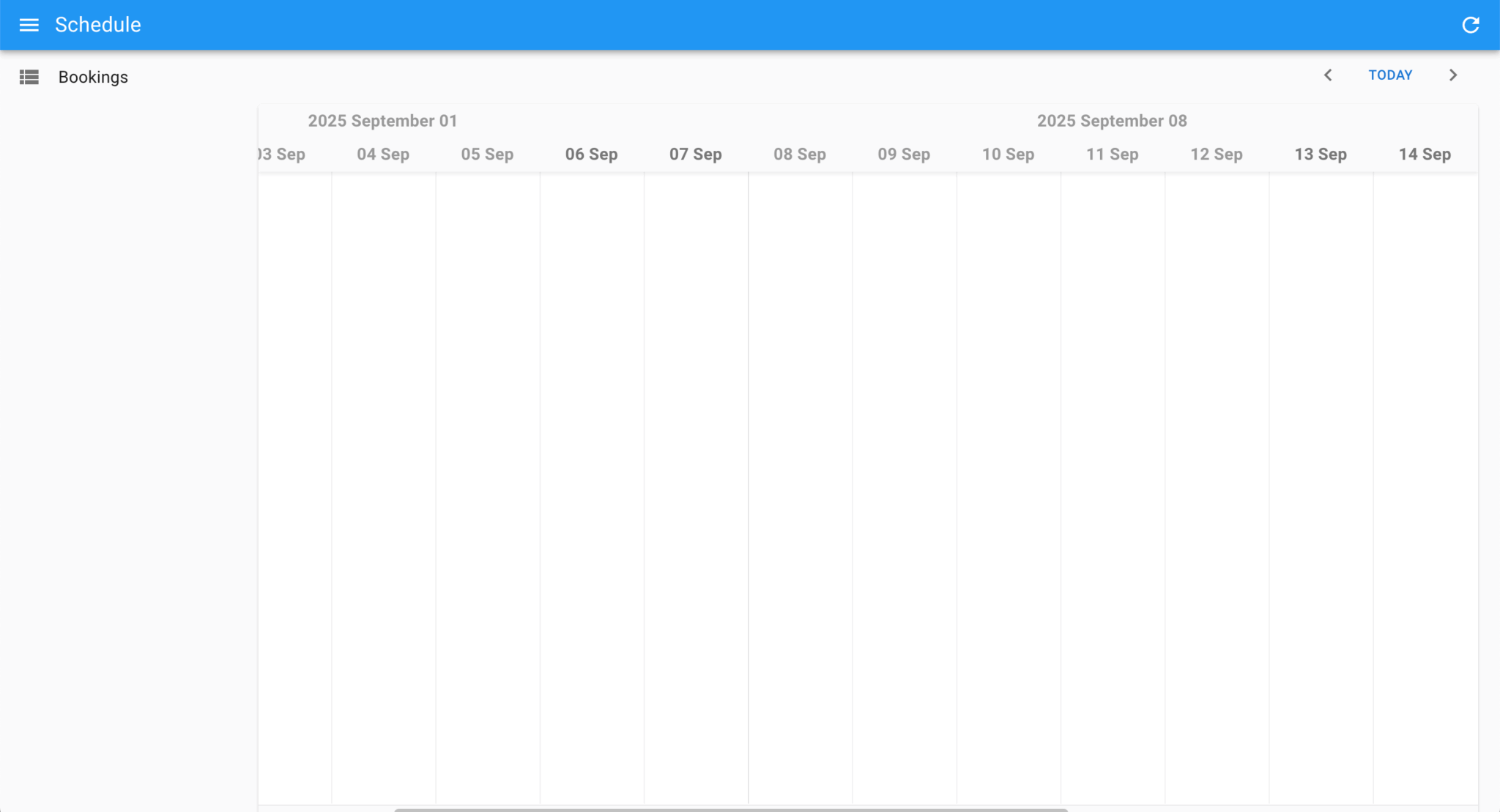
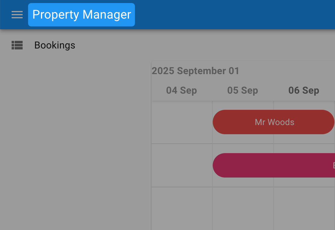
npm install ra-language-frenchRun the local dev server. You’ll see an empty React-admin Scheduler component:
Adding the Simple REST Data Provider
To connect the Scheduler to the backend API, we need to install and configure a Data Provider. Let’s install the Simple REST Data Provider:
npm install ra-data-simple-restAdd the import to the frontend/src/App.tsx file:
import simpleRestProvider from 'ra-data-simple-rest';Add the Data Provider as a prop to the Admin component and set the base URL to the URL of the backend API:
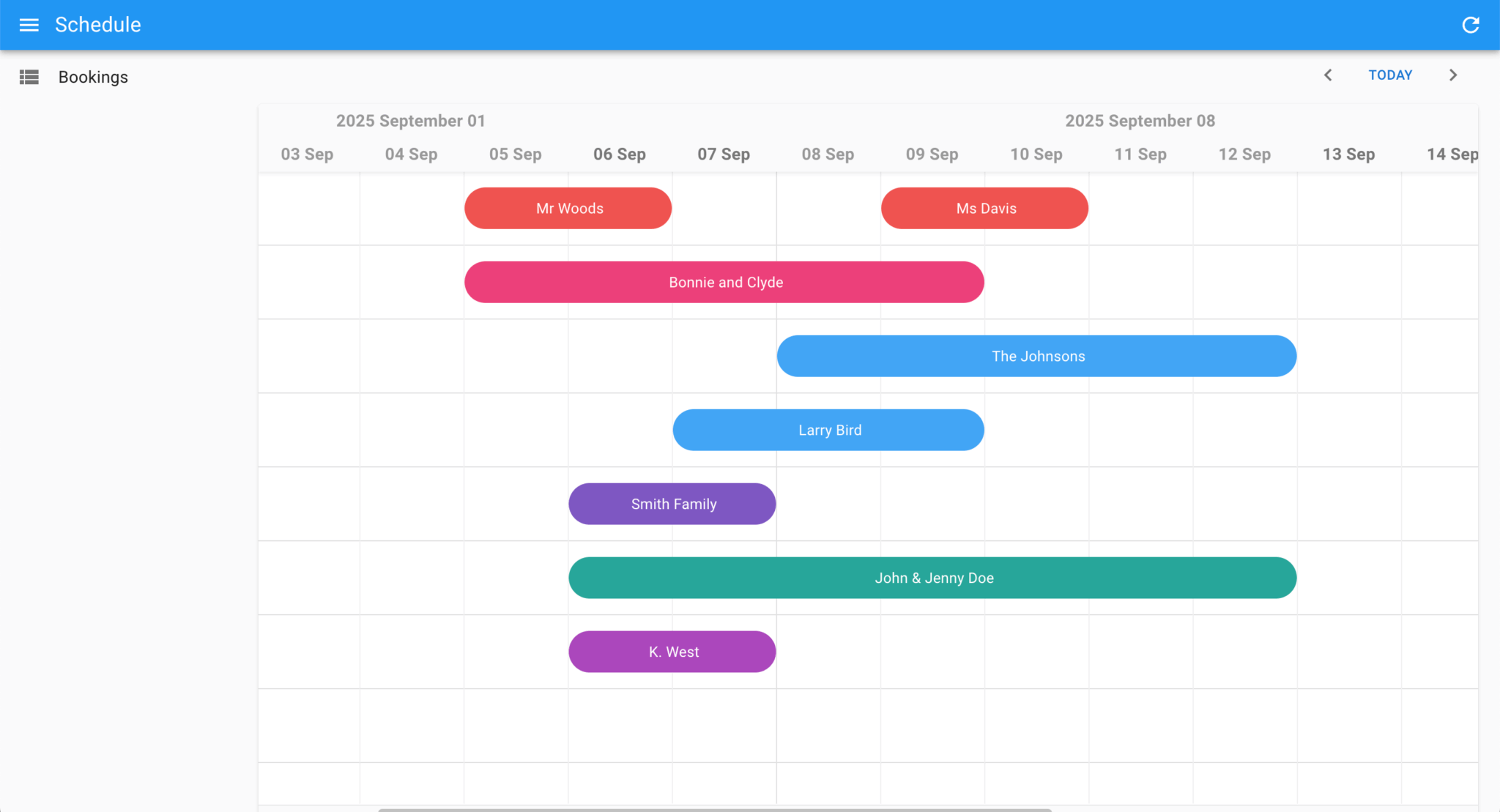
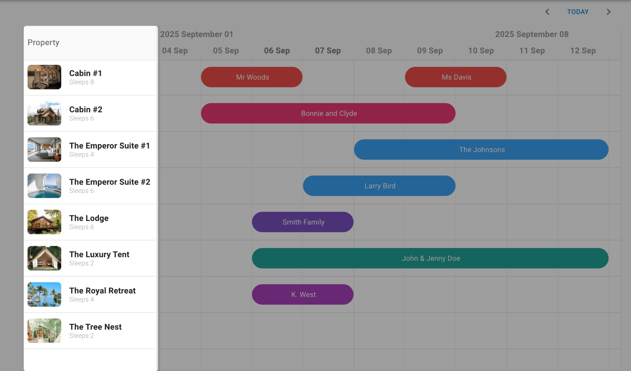
dataProvider={simpleRestProvider('https://localhost:1337/api')}Run the frontend and backend dev servers. You’ll see the Scheduler with the example data from the backend API:
The Scheduler has full CRUD functionality. React-admin uses TanStack Query to fetch and cache data, so you can install the TanStack Query Devtools to analyze the data fetching and caching behavior.
Customizing the app layout
Create an AppLayout.tsx file in the frontend/src folder and add the following code to it:
import { Layout, AppBar } from 'react-admin';
import { Typography } from '@mui/material';

export const AppLayout = ({ children }: { children: React.ReactNode }) => (
    <Layout appBar={CustomAppBar}>
        {children}
    </Layout>
);

const CustomAppBar = () => (
    <AppBar>
        <Typography variant="h6" sx={{ flex : 1 }}>
          Property Manager
        </Typography>
    </AppBar>
);
Import the layout in the frontend/src/App.tsx file:
import { AppLayout } from './AppLayout';Add the layout as a prop to the Admin component:
layout={AppLayout}The Layout component lets you customize the App Bar, navigation, and content.
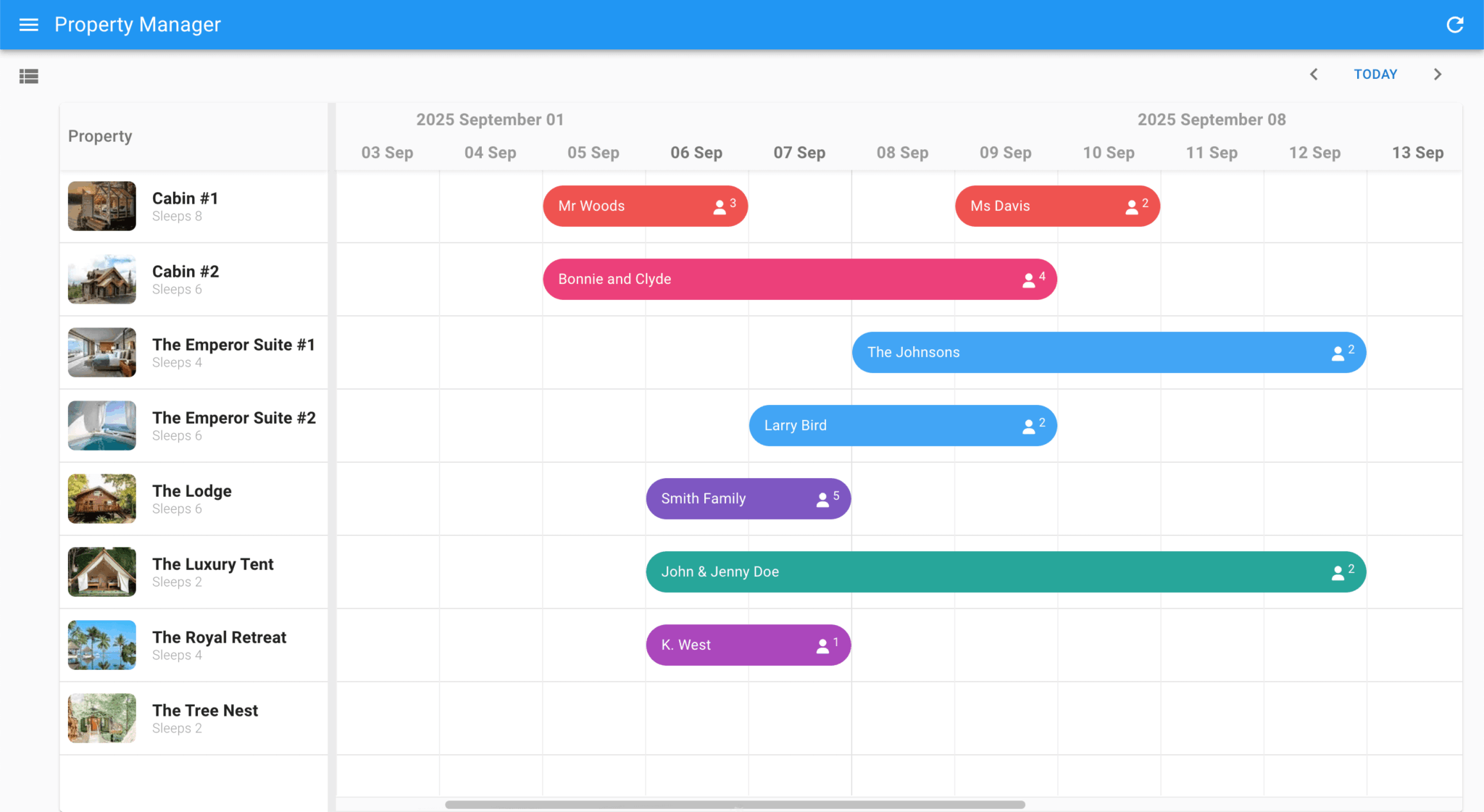
You’ll now see that the App Bar’s title has been changed to Property Manager:
Creating custom event and resource models
The React-admin Scheduler events and resources data use fields from two Bryntum Scheduler models, the EventModel and the ResourceModel, as can be seen in the backend/src/models folder. The React-admin Scheduler data also has some custom fields: the guests field in the EventModel and the sleeps field in the ResourceModel. Let’s add custom models to the React-admin Scheduler to add these fields.
Create a lib folder in the frontend/src folder. Then, in src/lib, create a ReservationModel.ts file and add the following custom EventModel to it:
import { EventModel } from '@bryntum/scheduler-thin';


// Custom event model, adding the guests and pricePerNight fields
export class ReservationModel extends EventModel {
    declare guests: number;

    static override get fields() : object[] {
        return [
            { name : 'guests', type : 'number', defaultValue : 2 }
        ];
    }

}
The custom ReservationModel extends the Bryntum Scheduler EventModel to include an extra guests field.
Now, create a PropertyModel.ts file in the lib folder and add the following custom ResourceModel to it:
import { ResourceModel } from '@bryntum/scheduler-thin';

// Custom resource model, adding the sleeps field
export class PropertyModel extends ResourceModel {
    declare sleeps : number;

    static override get fields(): object[] {
        return [
            { name : 'sleeps', type : 'number' }
        ];
    }
}
Import the custom models in the frontend/src/AppConfig.tsx file:
import { ReservationModel } from './lib/ReservationModel';
import { PropertyModel } from './lib/PropertyModel';
Then add them to the schedulerProps config:
resourceStore : PropertyModel,
eventStore    : ReservationModel
Adding custom columns
Let’s add a resource column to the Scheduler to display the properties for each booking.
First, import Bryntum’s StringHelper utility in the frontend/src/AppConfig.tsx file:
import { StringHelper } from '@bryntum/core-thin';Then, add the following columns configuration to the schedulerProps object in the frontend/src/AppConfig.tsx file:
columns : [
    {
        type           : 'resourceInfo',
        text           : 'Property',
        width          : 260,
        sum            : 'count',
        showEventCount : false,
        showMeta       : resource => StringHelper.xss`Sleeps ${(resource as PropertyModel).sleeps}`
    }
]
You’ll now see a resource column that shows the properties:
Adding a custom event renderer
You can customize the appearance of event bars using the eventRenderer function.
Let’s customize the event bars so that they display the guest count. Add the following event renderer to the schedulerProps object in the frontend/src/AppConfig.tsx file:
eventRenderer : ({ eventRecord }) => {
return StringHelper.xss`${eventRecord.isCreating ? '' : eventRecord.getData('name')} <i class="b-fa b-fa-user">` +
`<sup>${(eventRecord as ReservationModel).getData('guests') ? (eventRecord as ReservationModel).getData('guests') : ''}</sup>`;
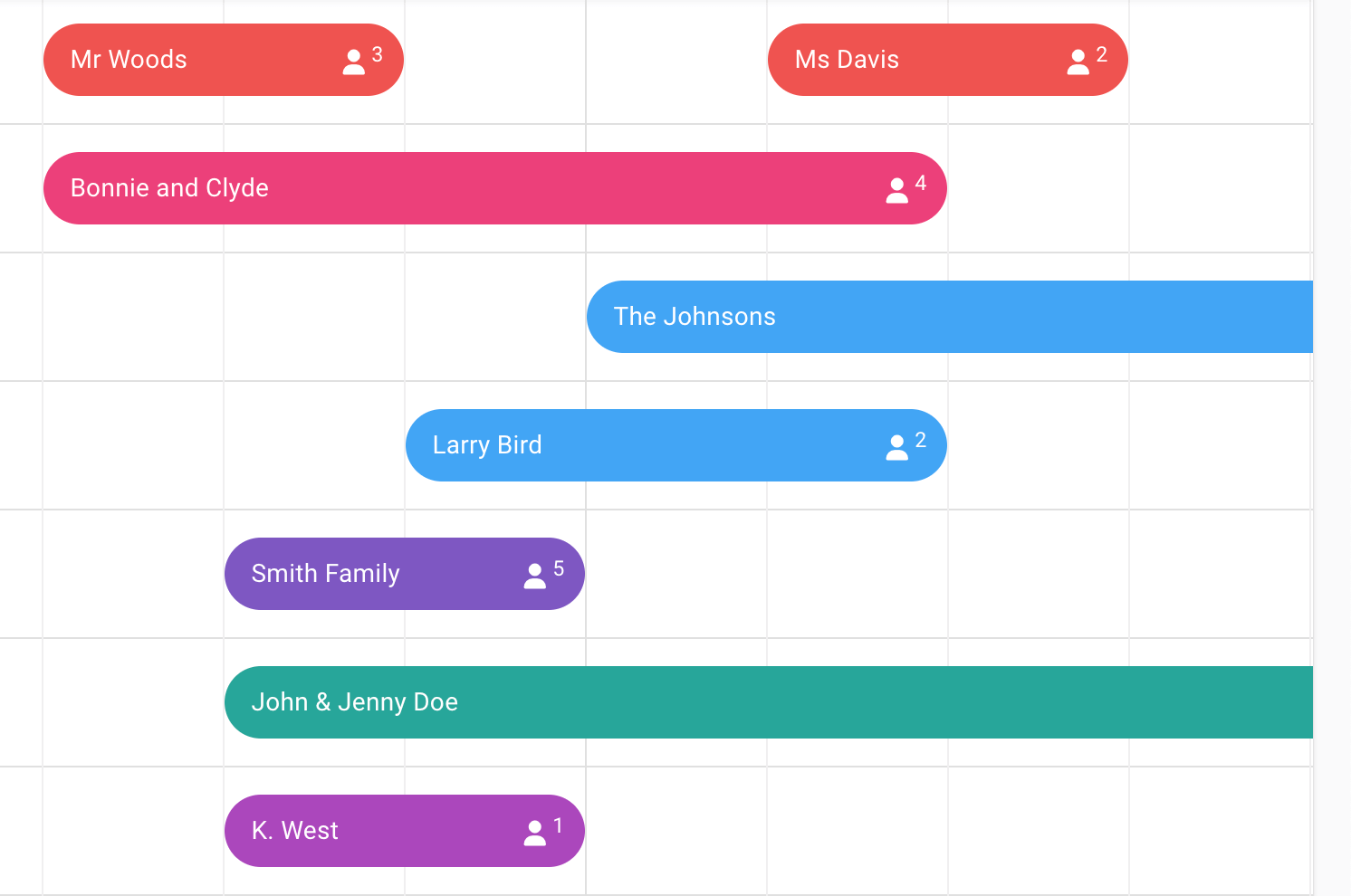
}This adds the event name, along with the guest count, to the event bars:
Adding custom Create and Edit event forms
The Create and Edit event forms, which open when you create or edit an event, use React-admin Form Layout dialog components. Let’s customize them to include the custom guest count field and change the input labels.
Add the following imports to the frontend/src/ReactAdminScheduler.tsx file:
import {
    AutocompleteInput,
    DateInput,
    ReferenceInput,
    required,
    SimpleForm,
    TextInput,
    NumberInput
} from 'react-admin';
Add the following CustomEventForm component to the bottom of the file:
const CustomEventForm = () => (
    <SimpleForm>
        <TextInput source="name" validate={required()} />
        <NumberInput source="guests" validate={required()} label="Number of Guests" defaultValue={2} />
        <ReferenceInput source="resourceId" reference="resources">
            <AutocompleteInput validate={required()} label="Accommodation"/>
        </ReferenceInput>
        <DateInput source="startDate" validate={required()} label="Check-in" />
        <DateInput source="endDate" validate={required()} label="Check-out" />
    </SimpleForm>
);
The form and form inputs are built using MUI components and React Hook Form for validation.
Add the following props to the Scheduler component:
eventCreate={<CustomEventForm />}
eventEdit={<CustomEventForm />}
CreateDialogProps={{ title : 'Create Booking', maxWidth : 'sm' }}
EditDialogProps={{ title : 'Edit Booking', maxWidth : 'sm' }}
The Create and Edit forms now have custom widths, labels, and inputs:
Next steps
Now that you know the basics of creating a React-admin Scheduler component, you can extend and customize it to meet your specific business needs.
If the Simple REST Data Provider doesn’t meet your needs, take a look at the other React-admin Data Providers. There are also many third-party data providers available for various backends and services, including Django, Firebase, Spring Boot, and Strapi CMS.
Take a look at the Bryntum Scheduler demos page to see examples of the customizations and advanced features you can add to your React-admin Scheduler, such as: