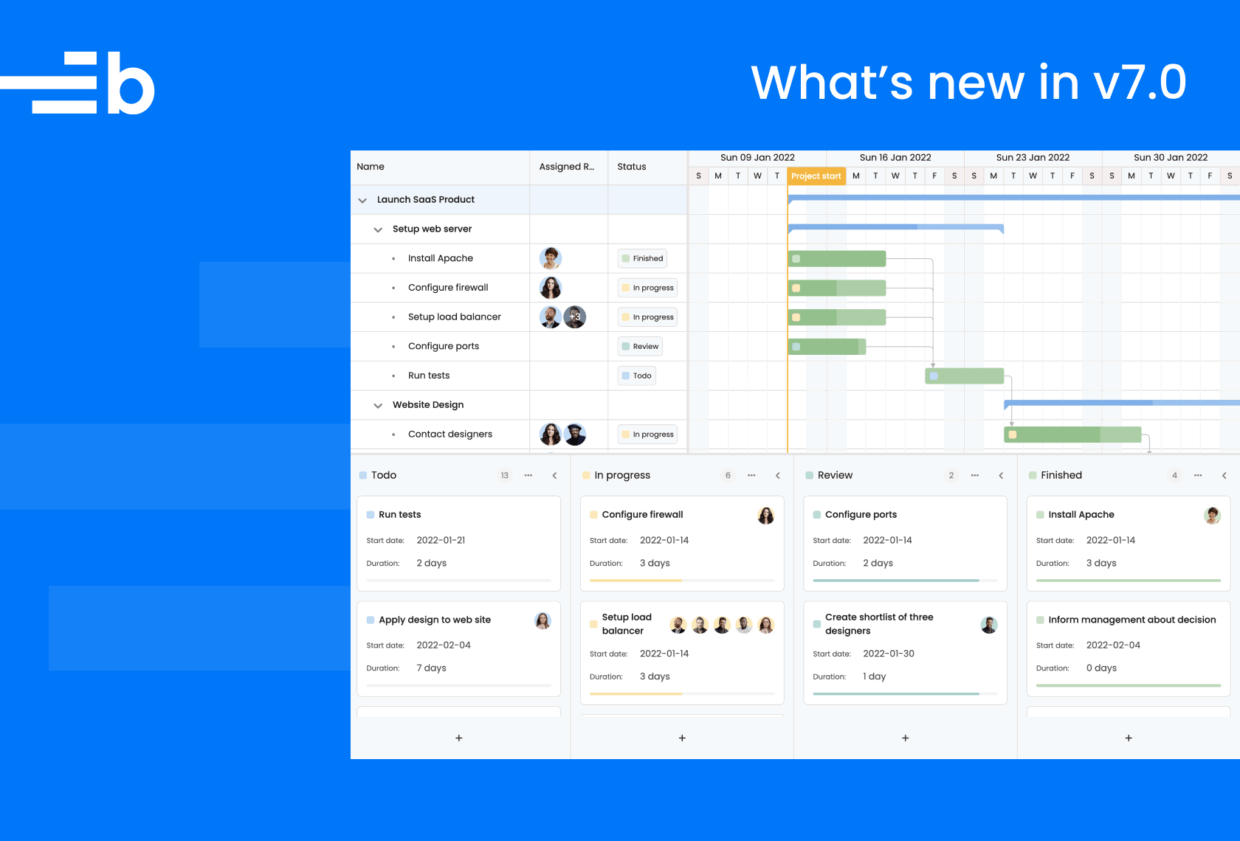
What’s new in v7.0.0
We’re proud to introduce Bryntum v7.0, a release that brings a fresh look and cleaner code to all our products. A long time in the making, the latest version of Bryntum simplifies, modernizes, and removes technical debt within components, making our tools faster, easier to style, and more consistent across the board.
You’ll notice the difference right away. The new themes give Bryntum a lighter, more refined appearance, and under the hood, we’ve dropped Sass in favor of pure CSS. It’s a big change that makes customization simpler and future updates smoother.
In this post, we’ll walk through what’s new in v7.0, what’s changed under the surface, and why this release sets a new standard for the Bryntum suite.
New themes and CSS
We’ve rebuilt our theming system. All Bryntum products now come with a fresh set of themes, each including a light and dark mode:
- Svalbard
- Stockholm
- Visby
- Material 3
- High Contrast
The new themes are built entirely with CSS variables. We’ve replaced the old Sass-based setup to bring you:
- Simpler customization: You can override colors and styles directly with CSS custom properties, without touching selectors or source files.
- Clearly separated theme and structural CSS: Theme files are smaller and easier to manage.
- Decoupled fonts and icons: Themes no longer include FontAwesome or set a default font, giving you full control over your app’s styling.
<!-- Optionally include FontAwesome Free -->
<link rel="stylesheet" href="build/fontawesome/css/fontawesome.css">
<link rel="stylesheet" href="build/fontawesome/css/solid.css">- Standardized all CSS selectors: Consistent use of kebab-case makes custom styling more predictable. For example, the
CellEditfeature no longer adds the.b-celleditclass, and instead adds the correctly kebab-cased.b-cell-edit.
The AIFilter feature
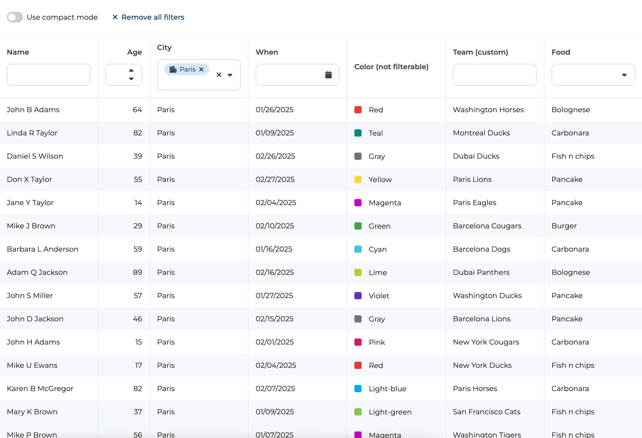
The new AI Filter feature lets you filter Bryntum Grid data using natural language. Instead of manually configuring filters or using dropdowns, you can now just type requests like:
Show me all tasks completed last week.Only display customers from Sweden with active subscriptions.
Behind the scenes, the feature uses a large language model (LLM), such as OpenAI’s GPT-5, to interpret your query and convert it into actual filter criteria for the Grid.
To enable the AIFilter feature, include it in your Bryntum Grid configuration and add an aifilterfield to your toolbar (or anywhere you prefer in your UI).
You also need to provide:
- A URL endpoint for handling AI prompts
- An API plugin for your chosen LLM provider
- Field descriptions in your Store, so that the AI understands which data it can filter
new Grid({
    features : {
        aiFilter : {
            promptUrl : '/ai/prompt', // Your own endpoint that returns the prompt
            apiPlugin : OpenAIPlugin, // GooglePlugin, AnthropicPlugin is also available (and more is coming)
            model : 'gpt-5', // Model to use, not required by all plugins
        }
    },
    tbar : [{
        type        : 'aifilterfield',
        width       : 400,
        placeholder : 'Ask AI to filter…'
    }],
    store : {
        fields : [
            // Descriptions for the fields in your store
            { name : 'name', type : 'string', description : 'The name of the person' },
            { name : 'age', type : 'number', description : 'The age of the person' },
            { name : 'country', type : 'string', description : 'The country the person lives in' }
        ]
    }
})
The AIFilter opens up a new level of interactivity, allowing end users to explore data in a more intuitive and conversational way. Explore our AI-powered E-commerce Grid demo to see the aiFilter feature in action
The PinColumns feature
With the new PinColumns you can easily keep important data visible while scrolling large Bryntum Grid components. No additional subGrid configuration required, just pin columns to the start or end of the Grid.
This feature is disabled by default, but it can be turned on through the Grid configuration.
const grid = new Grid({
    features : {
        pinColumns : true
    }
});
Enabling the feature adds a Pin column option to both the column header menu and the cell context menu, allowing users to manage pinned columns interactively.
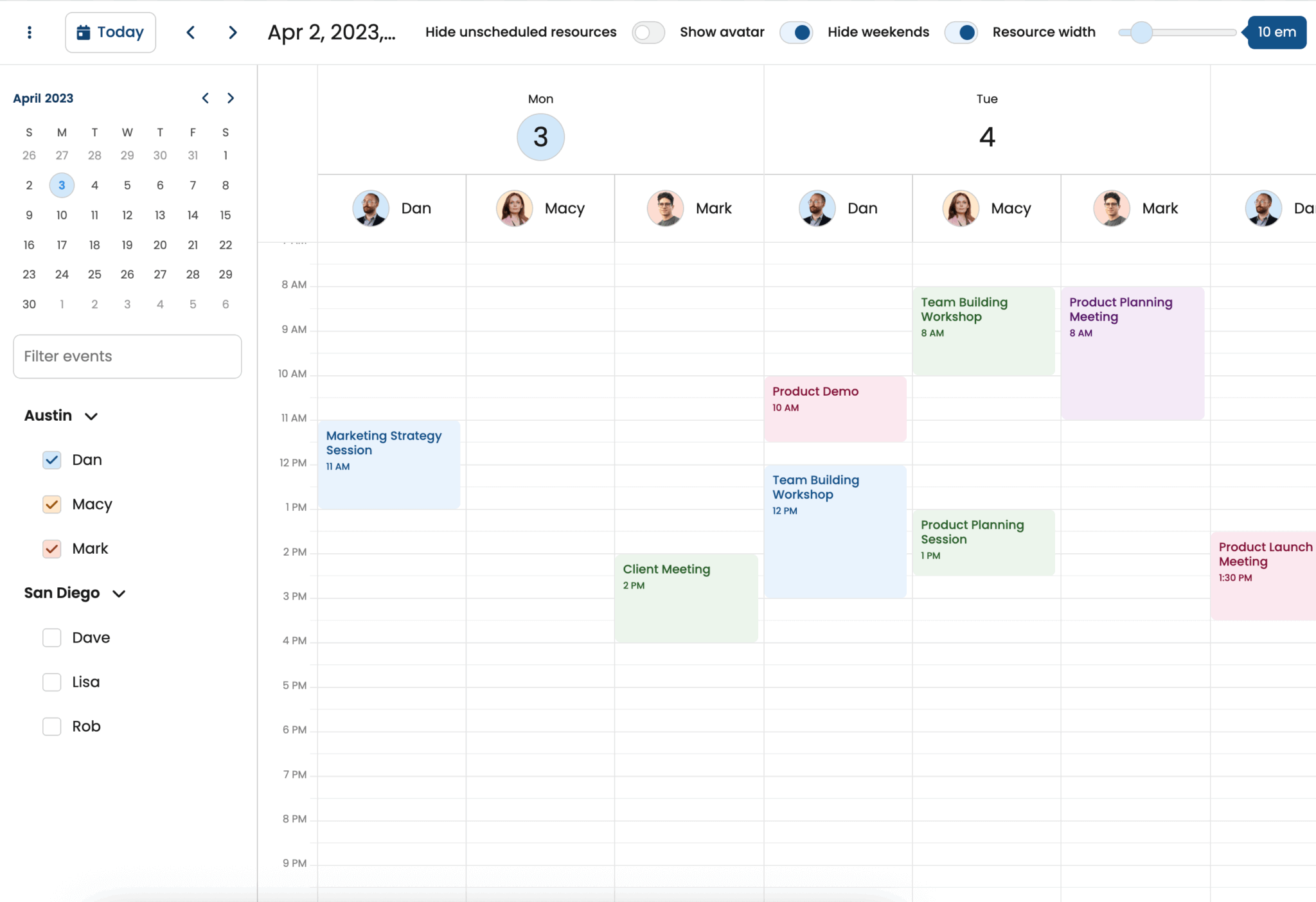
Time-phased assignments
Time-phased assignments introduce a more flexible way to manage resource allocations over time. In previous versions, a resource assignment lasted for the full duration of its event. With time-phased assignments, you can now define individual start and end dates for each assignment, independent of the event’s own time span.
This enhancement allows you to model more complex scenarios, such as when a resource only works during part of an event’s duration or returns to work on an assignment later.
Bryntum v7.0 supports multiple assignments of the same resource to a single event, each with its own time range.
const project = new TimePhasedProjectModel({
    resourcesData : [
        { id : 'r1', name : 'Resource1' }
    ],

    tasksData : [
        { id : 't1', name : 'Event1', startDate : '2024-01-01' }
    ],

    assignmentsData : [
        { id : 'a1', resource : 'r1', event : 'e1', startDate : '2024-01-01', endDate : '2024-01-04', effort : 24 },
        { id : 'a2', resource : 'r1', event : 'e1', startDate : '2024-01-07', endDate : '2024-01-10', effort : 48 }
    ]
});
In this example, Resource1 is assigned to Event1 twice: First, from January 1 to January 4, and again from January 7 to January 10.
See the updated Time-Phased Assignments documentation for more details and take a look a our Gantt Resource Utilization demo to see it in action.
Improved transitions
Bryntum Grid now includes a range of new and improved transitions that add smoother, more dynamic visual feedback to data interactions.
Transitions are now controlled through a single transition configuration object, replacing the older individual animation-related configs. This makes it easier to manage animations in one place and fine-tune how your Grid behaves.
The new transition config lets you control specific types of transitions:
| Property | Description |
removeRecord | Transition for removing rows (replaces animateRemovingRows) |
insertRecord | Transition for inserting rows (new) |
toggleTreeNode | Transition for expanding or collapsing tree nodes (replaces animateTreeNodeToggle) |
filterRemoval | Transition when filters remove rows (under certain conditions, replaces animateFilterRemovals) |
toggleRegion | Transition for collapsing or expanding regions (replaces RegionResize.animateCollapseExpand) |
toggleColumn | Transition for showing or hiding columns (new) |
toggleGroup | Transition for collapsing or expanding groups (new) |
expandCollapseColumn | Transition for expanding or collapsing parent/group columns (new) |
const grid = new Grid({
    transition : {
        removeRecord : true/false,
        insertRecord : true/false,
        toggleTreeNode : true/false,
        filterRemoval : true/false,
        toggleRegion : true/false,
        toggleColumn : true/false,
        toggleGroup : true/false,
        expandCollapseColumn : true/false
    }
});
All transitions are enabled by default, but you can easily customize or disable them through the new config.
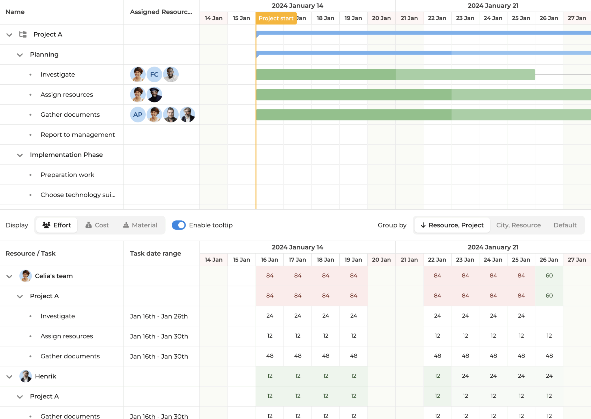
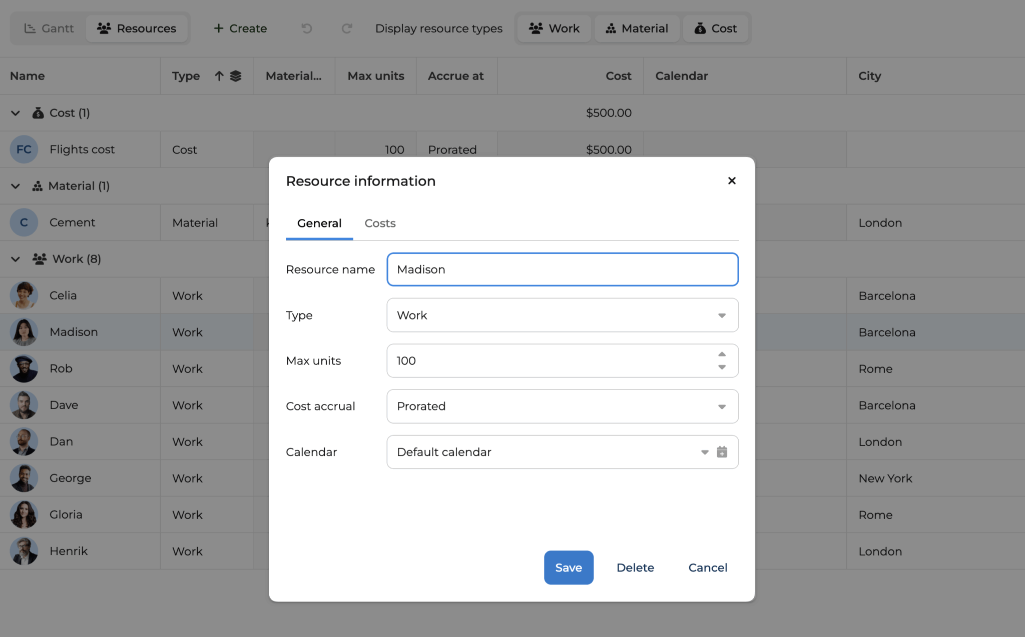
New resource grid and editor widgets
This release introduces two closely related components designed to improve how project resources are viewed and managed: the ResourceGrid view and the ResourceEditor widget.
The ResourceGrid provides a dedicated interface for displaying and editing project resources. It lists all defined resources along with their key attributes, including new cost-related data. Each resource record now exposes its total cost, which is automatically collected across all project assignments. The grid supports editing of resource data directly and integrates seamlessly with the new ResourceEditor for more detailed modifications.
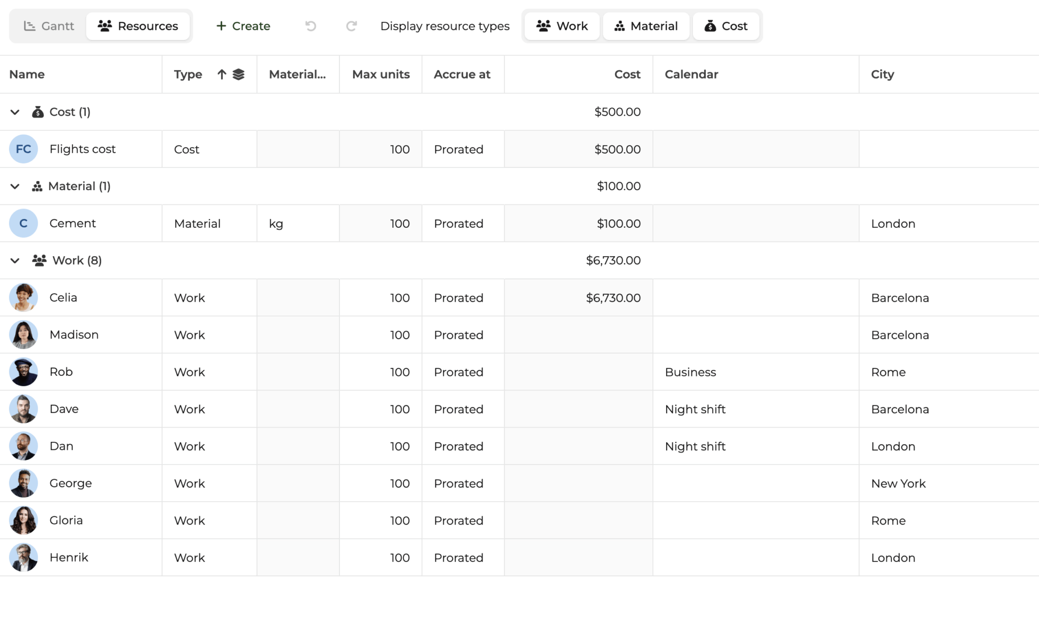
The ResourceEditor is a popup dialog used to edit a specific resource’s details. It is available in the grid through the resourceEdit feature and can be opened from the resource context menu. The editor allows users to modify general resource information and, for work and material resources, provides a “Costs” tab for managing rate tables. These rate tables define how resource costs are calculated over time, allowing flexible rate configurations such as per-use costs or time-based rates.
Together, the ResourceGrid and ResourceEditor enable complete visibility and control over project resources, including work, material, and cost resource types, supporting the new cost calculation logic introduced in this release.
Take a look at our Gantt Advanced demo to see ResourceGrid and ResourceEditor.
Summing up
Bryntum v7.0 is a major step forward for our entire product suite. This release isn’t just about new features; it’s about building a stronger, more modern foundation for the future. We’ve reimagined how our tools look, feel, and perform, resulting in cleaner designs, faster performance, and simpler customization experiences.
One of the most significant changes in this release is the move from Sass to pure CSS. This shift makes it significantly easier to restyle and theme Bryntum components using standard CSS variables with no build steps or preprocessing required. With new theme families and CSS styling, Bryntum now looks and feels more modern, consistent, and lightweight across all products.
We’ve also refined many existing features, including ScheduleContext, Cost Calculation, and Resource Utilization, and made numerous under-the-hood improvements that boost performance, accessibility, and consistency across the suite.
Bryntum v7.0 sets a new standard for UI components. It’s faster, cleaner, and easier to work with to give developers and teams more control, better performance, and a foundation that’s ready for the future.
Release details
For the full details about this release, please see the Changelog and What’s new guide for each product:
| Product | Changelog | What’s new | |
|---|---|---|---|
| Grid | |||
| Scheduler | |||
| Scheduler Pro | |||
| Gantt | |||
| Calendar | |||
| Task Board |