What’s New In Bryntum Grid 2.0

We strive to keep posts updated, but code samples may sometimes be outdated. Humans, see the Bryntum documentation; agents, https://mcp.bryntum.com for the latest info.
We are really excited to announce the new 2.0 release of our Bryntum Grid component, lots of new stuff and a slew of bug fixes included. This blog post describes the bigger changes, for full details please see the change log.
Using Grid as a local NPM package
While yet not available on NPM, you can now install Grid as a local NPM package from the downloaded sources. This makes integrating it with frameworks much easier and our framework demos has been updated with the new approach.
Depending on your setup you now do something similar to these steps to include Grid in your Angular/React/Vue app:
1. Install the local package, by running `npm install path-to-the-grid/build-folder`
2. The package is called `bryntum-grid`, import from it in your code similar to:
import { Grid, Store, ... } from 'bryntum-grid';
3. Depending on your setup you can also directly import the theme you want to use:
import 'bryntum-grid/grid.material.css';
Depending your transpilation setup and if you need to support IE11 you can optionally import from the already transpiled umd bundle:
import { Grid, Store, ... } from 'bryntum-grid/grid.umd';
Major Grid improvements
There are new demos, new features, bug fixes and some API changes in this release so let’s dive in:
New default theme – Stockholm
We have created a slick new default theme for Grid, called “Stockholm”. Like the city itself we strived for a clean and modern look, hope you like it!
Multi region support
Previously the grid allowed just two regions, a locked left hand side region and a flexed center region. Now you can define the regions yourself, allowing any number of sub grids, although we have not really got any use case for more than three 🙂 Check it out in this new demo.
Each region scrolls horizontally (if needed) independent of the others, but they all share the same vertical scroller. Define your regions like this:
const grid = new Grid({
    subGridConfigs : {
      left : { width : 300 },
      middle : { flex : 1 },
      right : { width : 150 }
    },

    columns : [
      { field : 'name', region : 'left' },
      { field : 'goals', region : 'middle' },
      { field : 'progress', region : 'middle' },
      { field : 'result', region : 'right' }
    ]
});
Small disclaimer: Please note that all features are not guaranteed to work with more than three regions.
Row reordering
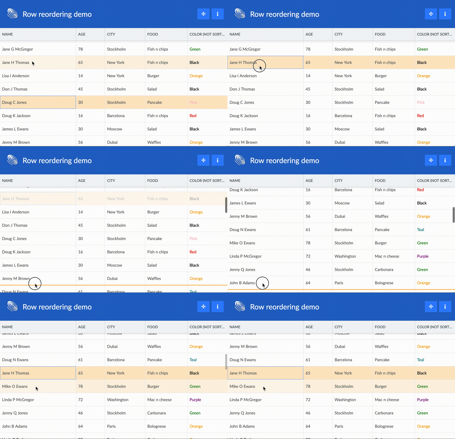
A new feature called RowReorder was added. Enable it to allow drag and drop reordering of rows, try the demo here.
New time picker
For 2.0 we wrote our own time picker to replace flatpickr (the date picker was replaced in 1.2), meaning that we now have zero dependencies on 3rd party JavaScript libraries! The time field also got horizontal spin triggers for easy adjustment. You can try it out in this demo.
More new demos
Two new demos was added in addition to the ones mentioned above. First a demo showing integration with Ionic:
And we also made a demo showing how to set up cascading combos:
Store tree refactoring
We rebuilt the tree support in our Store. It now works more like you would expect, the tree has a root node (hidden when rendered) and manipulations should be made on the tree nodes rather than on the Store (instead of `store.add()`, use `node.appendChild()` etc).
As a part of the refactoring we also changed the behaviour when expanding/collapsing in a tree. The Store is considered the “visible” expanded part of the tree, while the tree in full is kept as part of the root node. When expanding or collapsing records will be added to or removed from the Store part, thus triggering `add` and `remove` related events. To distinguish these events from normal adds and removes, you can check the `isExpand` and `isCollapse` flags.
If you are not using trees, this change should not affect you.
Additional improvements
- A custom filtering function can be defined on columns by specifying the `filterable` config, for use with the Filter and FilterBar features
- API support for repainting a single column was added
- Showing and hiding load masks for Grid were made public. Call
`grid.maskBody(‘msg’)` / `grid.unmaskBody()`
Breaking changes
As part of our major releases we also ensure we do some house cleaning. Please review the list below carefully and update your code accordingly.
- The tree refactoring mentioned above might be breaking if you are using trees
- `pickerFormat` was removed from TimeField and DateField, please use `format` instead
- Grid now renders on `paint` instead of on `render`. This should only matter if you are using the Grid inside one of our containers (for example our TabPanel), in which case it is rendered when shown instead of directly.
- The `idField` config was removed from Store. It is still available on Model.
- The AjaxHelper (the server communication class used by AjaxStore) was completely overhauled and is now a thin wrapper of the native Fetch API. If you were using AjaxHelper you should review your code and adapt it according to the new API docs.
Learn more
For full details please see the change log.


