Using the TinyMCE rich text editor in Bryntum Grid
We strive to keep posts updated, but code samples may sometimes be outdated. Humans, see the Bryntum documentation; agents, https://mcp.bryntum.com for the latest info.
TinyMCE is a popular WYSIWYG rich text editor that can be used to create a Microsoft Word-like editing experience in web apps. The basic open-source version of the editor is available for free. You can enhance its capabilities with a TinyMCE subscription, plus paid add-on features such as an AI assistant, support for math equations, and revision history.
See how the TinyMCE editor works inside some of our Bryntum components by browsing the demos below:
Tutorial outline
In this tutorial, we’ll show you how to use the TinyMCE rich text editor in a Bryntum Grid, which is a high-performance, feature-rich, and customizable JavaScript table component. We’ll use the default iframe-based TinyMCE editor in this guide. You can experiment with this inline version of the editor in the Bryntum Grid TinyMCE Cell editor demo.
You’ll learn how to:
- Create a Bryntum Grid
- Create a custom TinyMCE input widget
- Use the TinyMCE input as a custom editor for cells of a column
You can find the code for the completed tutorial on the completed-grid branch of this GitHub repository.
Getting started
Clone the starter GitHub repository. This starter repository uses the development server and JavaScript bundler, Vite. You need Node.js version 18+ for Vite to work.
Install the dependencies by running the following command:
npm installThen, run the local dev server as follows:
npm run devFinally, open https://localhost:5173.
You should see a blank white screen.
The src/public folder has two example data files that contain information about people who are interested in food:
- Simple Foodies: The data in
foodiesSimple.jsonincludes simple text data in thedescriptionfields. - Foodies: The data in
foodies.jsonincludes rich text HTML data in thedescriptionfields, and in one case, a Base64 image.
Creating a Bryntum Grid
Let’s start by creating a Bryntum Grid to display the Simple Foodies data. We’ll install the Bryntum Grid, configure it, and style it.
Installing Bryntum Grid
If you’re using the free trial, install the public Bryntum trial package:
npm install @bryntum/grid@npm:@bryntum/grid-trialIf you have a Bryntum license, refer to our npm Repository Guide and install the licensed package:
npm install @bryntum/gridWe’ll use the
RichTextFieldwidget to create a custom TinyMCE input field.
Configuring and rendering the Bryntum Grid
Replace the console log in the src/main.js file with the following lines of code:
import { Grid } from '@bryntum/grid';

const grid = new Grid({
    appendTo : 'container',
    columns  : [
        {
            text  : 'Name',
            field : 'name',
            flex  : 1
        }, {
            text     : 'Email',
            field    : 'email',
            type     : 'template',
            template : ({ value }) => `<a href="mailto:${value}">${value}</a>`,
            flex     : 1
        }, {
            text  : 'City',
            field : 'city',
            flex  : 1
        }, {
            text     : 'Description',
            field    : 'description',
            flex     : 2,
            minWidth : 334
        },
        {
            text   : 'Date',
            field  : 'date',
            type   : 'date',
            format : 'YYYY-MM-DD',
            flex   : 1
        },
        {
            text  : 'Color',
            field : 'color',
            type  : 'color',
            width : 80
        }
    ],

    store : {
        readUrl  : 'foodiesSimple.json',
        autoLoad : true
    }
});
Here, we create an instance of the Bryntum Grid and set the following configuration properties:
- The
appendToconfig appends the Grid component to thedivwith anidof'container'. - The
columnsconfig creates a column for each field in the Simple Foodies data. - The
storeis an AjaxStore that uses the Fetch API to read data from a remote server specified by thereadUrl. For simplicity, in this guide, we set thereadUrlto thefoodiesSimple.jsonfile in thesrc/publicfolder.
Styling the Bryntum Grid
Now that we have a component, we can style it.
By default, the Grid component is configured to occupy 100% of the parent DOM element and has a min-height of 10em.
In the src/styles.css file, make the grid take up the full height of the screen by adding the following styles to its parent div element:
#container {
    margin         : 0;
    display        : flex;
    flex-direction : column;
    height         : 100vh;
    font-size      : 14px;
}
Import the Bryntum Grid Stockholm theme by adding the following line of code to the top of the src/styles.css file:
@import "../node_modules/@bryntum/grid/grid.stockholm.css";The Stockholm theme is one of five available themes for Bryntum Grid. If you want to create a custom theme or use multiple themes, check out the Bryntum Grid Styling documentation.
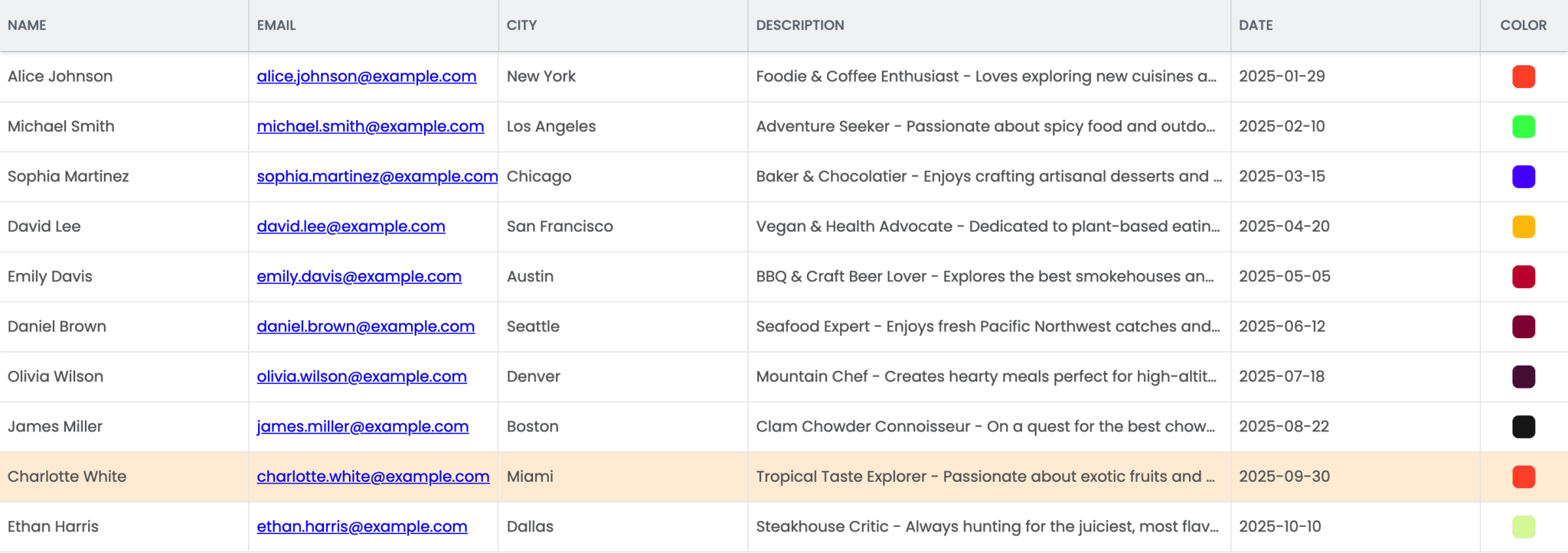
Run the local dev server using npm run dev. You’ll see a Bryntum Grid component displaying the Simple Foodies data:
Adding TinyMCE to your app
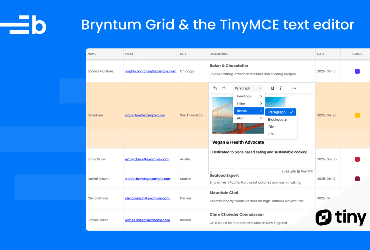
Now, let’s create a custom TinyMCE input field that we can use as a custom editor for cells in the Description column. This will allow us to format the description text and add images to the cell.
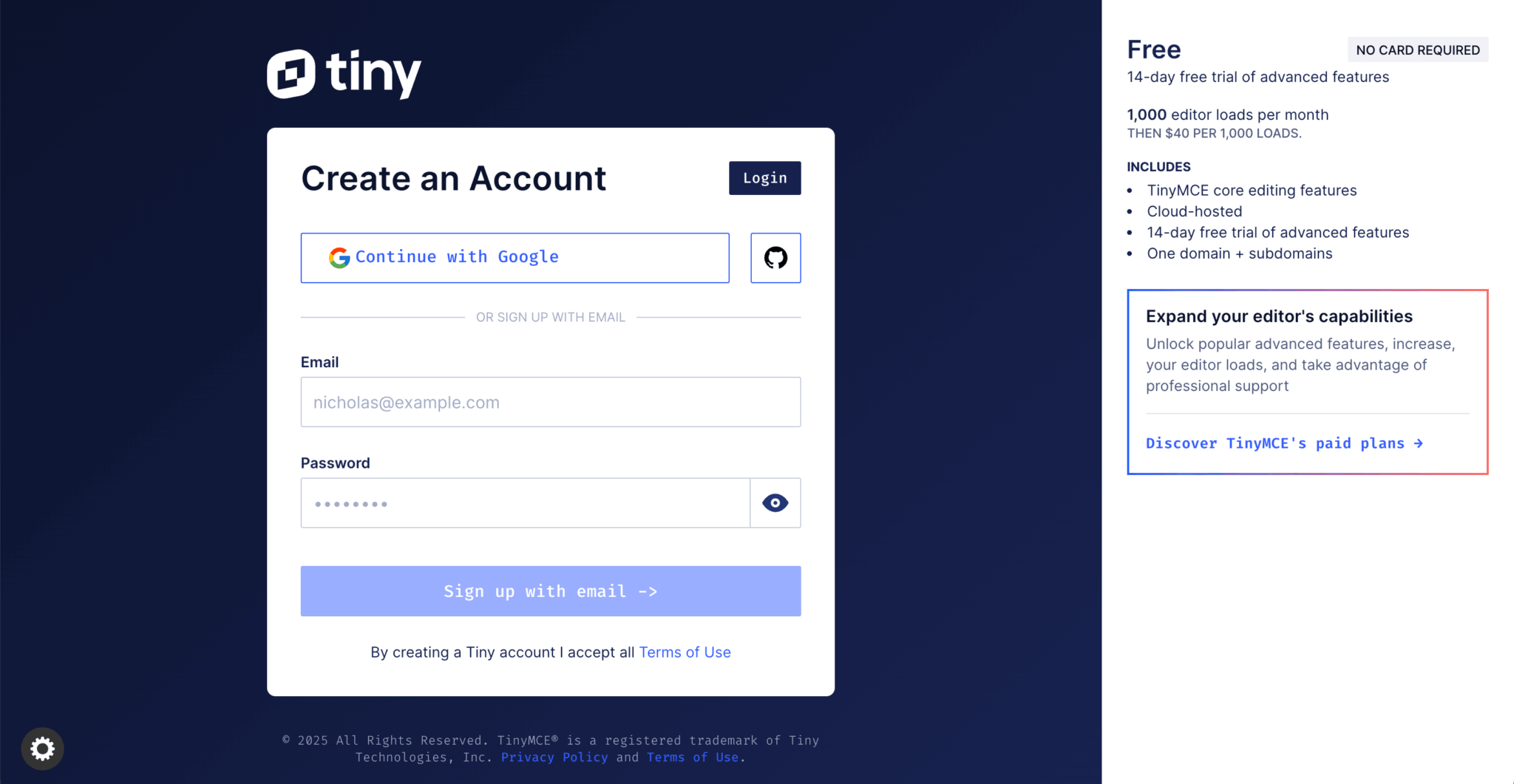
To use TinyMCE, you first need to create an account. You can sign up for a free account, which includes a 14-day trial of advanced features. No credit card details are required.
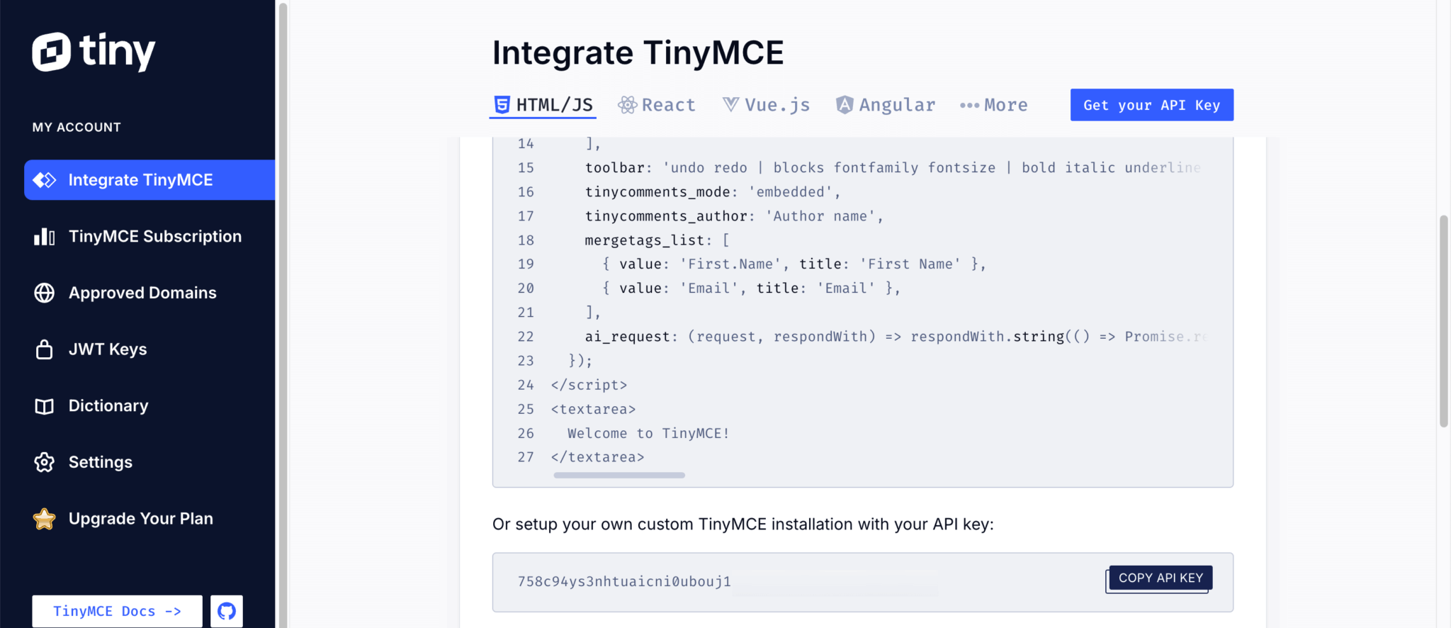
Once you’ve logged in, the Integrate TinyMCE page will open in your account dashboard. You can install TinyMCE using Tiny Cloud, package managers, or self-hosted downloads. We’ll use Tiny Cloud for this guide.
Copy the API key by clicking the Get your API key button:
In the src/index.html file in your Bryntum Grid app, add the following script below the div with the id="container". Replace your-api-key with your TinyMCE API key.
<script src="https://cdn.tiny.cloud/1/your-api-key/tinymce/7/tinymce.min.js" referrerpolicy="origin"></script>To load the script, TinyMCE needs at least one approved root domain. By default, localhost is an approved domain. When you deploy your app, add the domain using the Approved Domains page in your Tiny Cloud dashboard.
Note that an API key is used when loading TinyMCE from the Tiny Cloud. Use a license key when self-hosting TinyMCE.
Creating a custom TinyMCE input field widget
Bryntum components have UI elements called widgets that you can add to your project interface. These widgets, such as Button, DatePicker, and RichTextField, are instances of classes that extend the base Widget class.
The RichTextField widget is an interface class designed to be used with rich text field editors like TinyMCE. It uses a div as the input field, which rich text editors use as their target element. However, RichTextField isn’t used directly. Instead, we’ll use it as a base class to create a class specific to the rich text editor.
Let’s create a TinyMCE input field widget.
Create a lib folder in the src folder. In src/lib, create a TinyMceField.js file and add the following lines of code to it:
import { DomHelper, GlobalEvents, RichTextField } from '@bryntum/grid';

export default class TinyMceField extends RichTextField {
    static $name = 'TinyMceField';
    static type = 'tinymcefield';

    tinymce = null;

}

TinyMceField.initClass();
In this code, the TinyMceField class extends the RichTextField class. We give the widget its own $name and type, and create a property that will hold the TinyMCE instance. The initClass() method registers the widget with the base Widget class, which allows us to create the TinyMceField widget by type.
Next, add the following static configurable property below the tinymce property, making sure to replace 'your-api-key' with your TinyMCE API key:
static configurable = {
    tinyMceConfig : {},
    apiKey : 'your-api-key',
    inline : false,
    resize : false,
    menubar : false,
    autoFocus : true,
    rootBlock : 'div',
    inputAttributes : {
      tag : 'textarea'
    }
};
This configuration disables widget resizing and hides the drop-down menu bar.
When the widget is made visible, we’ll populate the tinyMceConfig using the default iframe-based TinyMCE editor.
Add the following _onPaint method below the configurable property:
_onPaint() {
    const me = this;

    if (me.editor) {
        me.destroyEditor();
    }

    if (!me.editor) {
        const html = me.value ?? '';
        me.input.value = html;

        globalThis.tinymce.init({
            ...me.tinyMceConfig,
            apiKey       : me.apiKey,
            auto_focus        : me.autoFocus,
            inline            : me.inline,
            forced_root_block : me.rootBlock,
            menubar           : me.menubar,
            resize            : me.resize,
            height            : me.height,
            target            : me.input,
            skin              : DomHelper.themeInfo?.name
                ?.toLowerCase().endsWith('-dark')
                ? 'oxide-dark'
                : 'oxide',
            ui_mode : 'split',

            setup : editor => {
                editor.on('init', () => editor.setContent(html, { format : 'html' }));

                editor.on('NodeChange', () => {
                    if (me.isDestroying) return;

                    const newVal = editor.getContent();
                    if (newVal !== me.value) {
                        me.richText = newVal;
                        me.triggerFieldChange({
                            value      : newVal,
                            oldValue   : me.value,
                            userAction : true
                        });
                    }
                });

                editor.on('blur', () => {
                    const grid = me.up('grid');
                    grid.finishEditing();
                });
            }
        }).then(editors => (me.editor = editors[0]));
    }
}
The onPaint method is called when the widget or an element in the widget becomes visible. The _onPaint above is called when the TinyMCE cell editor is opened in our Bryntum Grid:
- In it, we first destroy the existing editor (if there is one), then create a new TinyMCE editor instance and pass in the configuration options.
- The TinyMCE
setupoption lets us provide a callback that is executed before the TinyMCE editor is rendered. - Inside the setup option, we add three event listeners. When the editor is initiated, we set its content to the input value of the Bryntum Grid cell value using the
setContentmethod. - The
NodeChangeevent is fired when the editor’s content changes. When this happens, we update the value of the Bryntum Grid cell with the value of the editor’s content. - The
blurevent occurs when the editor loses focus. When this happens, we call the Bryntum GridfinishEditingmethod to update the cell value and hide the editor. We need to do this because we’ll disablemanagedCellEditingto have control over when the TinyMCE editor closes.
Now add the following owns method below the _onPaint method:
owns(target) {
    return super.owns(target) || Boolean(target?.closest('.tox-tinymce'));
}
The owns method returns true if the widget owns the passed-in element, event, or widget. We use it to indicate that the TinyMCE floating toolbar element is part of this widget.
Add the following destroyEditor method below the owns method:
destroyEditor() {
    this.editor?.destroy(); // Destroy the existing instance
    this.editor = null;
}
We use this method in _onPaint to destroy the editor object.
Lastly, add the following construct method below the configurable property:
construct(config = {}) {
    super.construct(config);

    const me = this;

    GlobalEvents.ion({
        theme   : 'destroyEditor',
        thisObj : me
    });

   me.up(w => w.isPopup)?.ion({
        hide    : 'destroyEditor',
        thisObj : me
    });

    me.ion({
        paint   : '_onPaint',
        thisObj : me
    });
}
The construct method applies the configuration. When the global theme changes or a surrounding popup is hidden, we call destroyEditor, and on every paint, we rerun _onPaint.
Adding the TinyMCE editor to the Description column
In the src/main.js file, import your custom TinyMCE input field widget:
import './lib/TinyMceField.js';Add the following properties to the 'Description' column object in the Grid columns config array:
type               : 'template',
template           : ({ value }) => value,
autoHeight         : true,
revertOnEscape     : false,
managedCellEditing : false,
cellEditor         : {
    // The rich text editor is allowed to overflow the cell height.
    matchSize : {
        height : false
    }
},
editor : {
    type   : 'tinymcefield',
    inline : false,
    height : 400
}
We change the column type to template, allowing us to use a template for the cell content, so we can render rich HTML content, like image tags, in the cell. We use the editor config object to create the input field for editing cells in the Description column and set its type to the TinyMCE input field.
In the store config, replace the Simple Foodies data with the rich text data in the Foodies JSON file by changing the readUrl as follows:
- readUrl : 'foodiesSimple.json',
+ readUrl : 'foodies.json',
Add the following styles to the src/styles.css file:
.b-grid-cell[data-column="description"] {
  display       : block;
  padding-block : .75em;

  h3 {
      margin-block : 0 .5em;
  }
}

.b-tinymcefield {
    .tox.tox-tinymce {
        width         : 100%;
        border-radius : 2px;

        &:not(.tox-tinymce-inline) {
            border : 1px solid #d0d1d2;
        }

        &.tox-edit-focus {
            border-color : rgba(254, 172, 49, 0.6);
        }

        .tox-edit-area::before {
            border : none;
        }
    }
}
When you run the dev server, you’ll now see rich text rendered in the Description column. You can format the text of the Description cells and add images to them.
Next steps
Take a look at the TinyMCE editing demo on the Tiny Cloud homepage to see the advanced features that you can add to your editor, such as the Microsoft Word import and export functionality.
Visit the Bryntum Grid demo page to see some of the other features you can add to your component, such as: