Using a React Bryntum Gantt as a custom Power BI visual
We strive to keep posts updated, but code samples may sometimes be outdated. Humans, see the Bryntum documentation; agents, https://mcp.bryntum.com for the latest info.
Power BI is Microsoft’s business intelligence platform for analyzing and visualizing data. It enables users to create interactive reports and data visualization dashboards. Power BI comes with a set of core visuals, which include bar charts, line charts, and pie charts. You can download or import visuals from Microsoft AppSource or Power BI. However, the available visuals may not meet your needs. In that case, you can create your own custom visuals, as we’ll do in this tutorial.
Bryntum Gantt is a performant, fully customizable Gantt chart component that works with all major JavaScript frameworks, including React. It has advanced project management features for uses such as identifying and highlighting critical paths, implementing advanced filtering, and tracking the rate of a project’s progress with an S-curve. These features can bring advanced project tracking capabilities to your Power BI reports.
In this tutorial, we’ll create a custom Bryntum Gantt Power BI visual for displaying project data in an interactive Gantt chart and add it to a Power BI report. You’ll learn to do the following:
- Set up a Power BI visual development environment.
- Create a Power BI report and upload sample tasks data from an Excel file.
- Create a custom Bryntum Gantt Power BI visual.
- Access Power BI report data in the custom visual.
- Add the custom visual to a Power BI report.
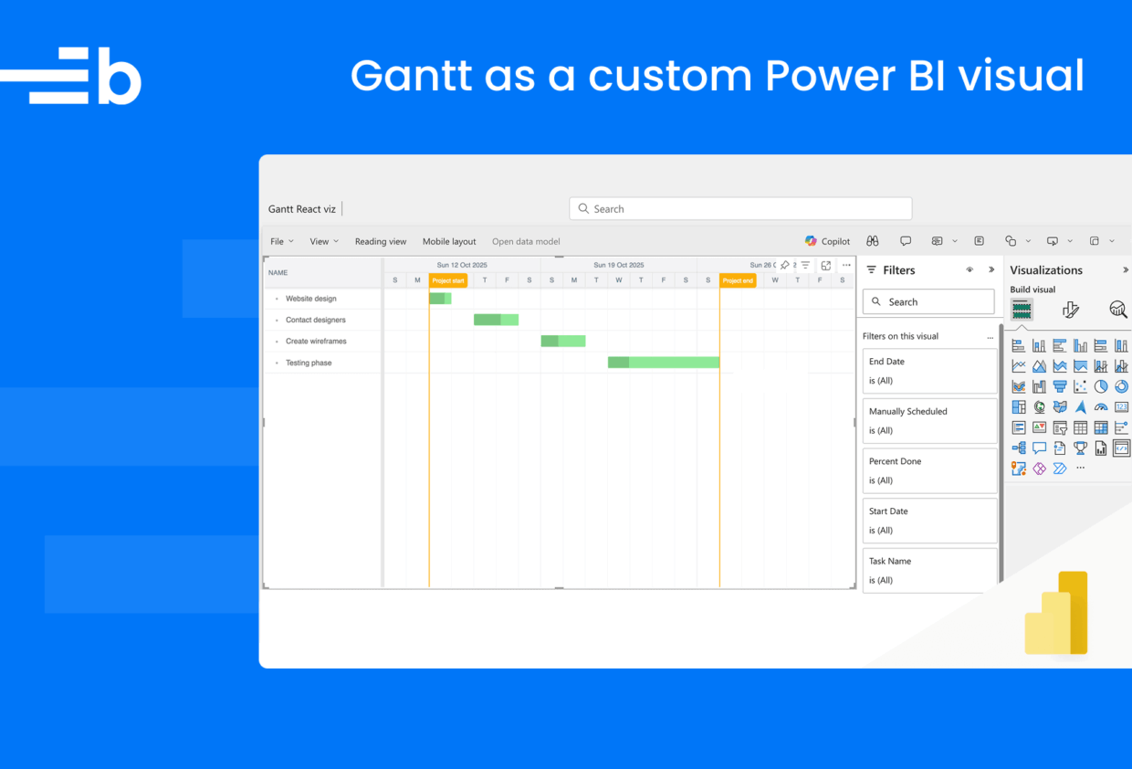
Here’s what we’ll build:
You can find the code for the completed tutorial in the Bryntum Gantt Power BI Visual GitHub repository.
Prerequisites
Before starting, ensure you have:
- A Power BI Pro or Premium Per User account To get free access to Power BI Pro, join the Microsoft 365 Developer Program with your Microsoft account. Take a look at the Developer Program FAQ to see if you qualify. If you’re using the Microsoft 365 Developer Program to get free access to Power BI Pro, sign in to Power BI using the admin email address from your Microsoft 365 Developer Program account.
- Windows PowerShell version 4 or higher (Windows) or Terminal (Mac/Linux)
- The latest long-term support (LTS) Node.js version from the Node.js download page
- Sample task data in Excel format (from the GitHub repository)
Power BI is available as a web service and as the Power BI Desktop app for Windows. We’ll use the web service in this tutorial.
Set up your development environment
Before creating a custom Power BI visual, you need to set up your development environment by installing the pbiviz tool and enabling developer mode in Power BI.
Install the pbiviz tool
The pbiviz tool compiles Power BI visual source code into deployable packages. Install it globally in your terminal using npm:
npm i -g powerbi-visuals-tools@latest⚠️ You might get some warnings during installation. You can ignore them, as they shouldn’t prevent pbiviz from installing.
Enable developer mode
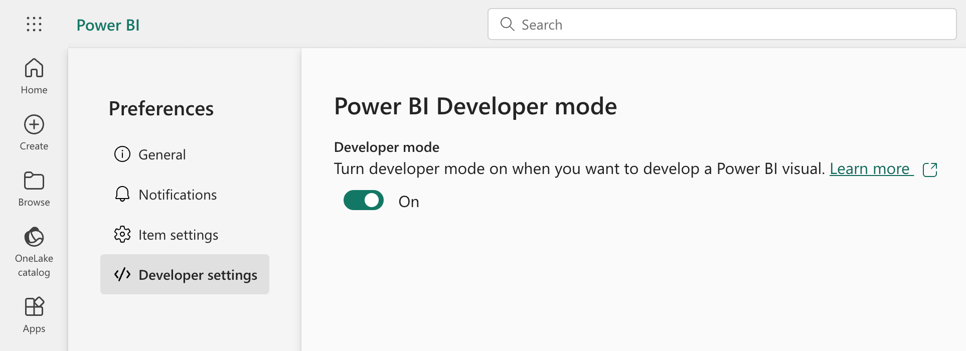
To develop or upload your own Power BI visual, you must enable developer mode.
In the web service, go to the Power BI Developer settings and use the toggle to enable Developer mode:
If you’re using Power BI Desktop, follow the instructions for enabling developer mode in the Power BI documentation.
Create the development project
Create a new project folder and open it in your IDE. Then, create a new Power BI visual project in the terminal:
pbiviz new BryntumGanttThis creates a new folder with all the necessary files for a Power BI visual. Open the BryntumGantt folder in your IDE.
You can find a detailed explanation of the function of each file in the Power BI visual project structure documentation.
Install the Power BI visual tools dependencies:
npm installThese tools provide everything you need to develop visuals and test them in Power BI reports and dashboards.
Start the development server:
pbiviz startKeep this development server running for the rest of the tutorial. It will serve your visual during development. The visual is now running locally and ready for testing in Power BI.
Create a Power BI report and upload sample tasks data from an Excel file
Let’s create a Power BI report and upload sample tasks data from an Excel file.
First, download the Excel file containing the example tasks data. The Task Name, Start Date, End Date, Percent Done, and Manually Scheduled columns in the Excel file represent some common fields of the Bryntum Gantt task model.
Then, follow these steps to create a report and upload the example tasks data:
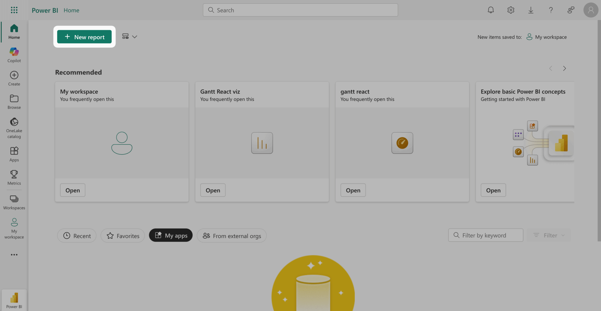
- Sign in to Power BI and create a new report by clicking the New report button in the top left corner:
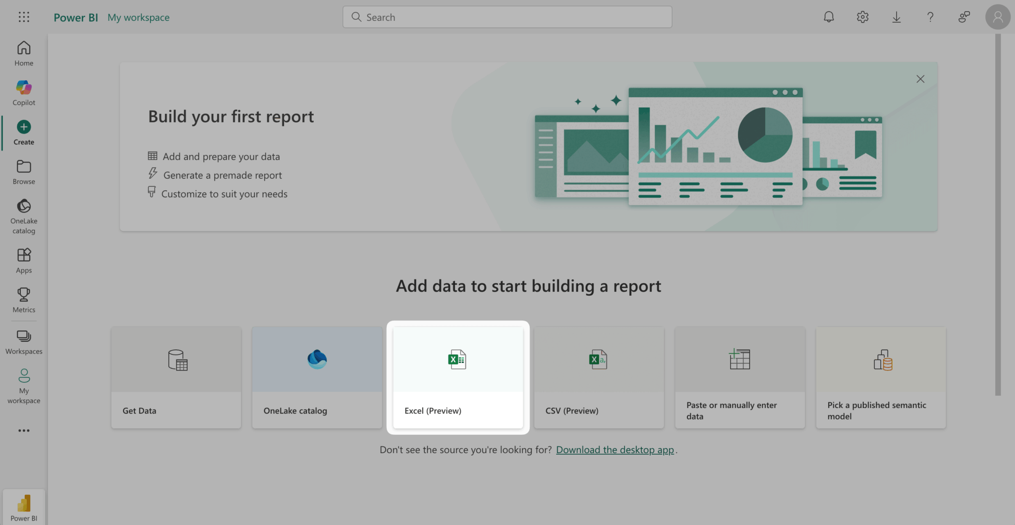
- Click the Excel (Preview) card to upload an Excel file:
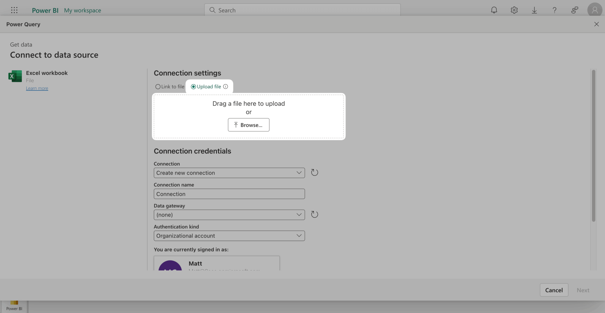
- Select the Upload file radio button. Then, upload the example tasks data Excel file and click Next in the bottom left corner:
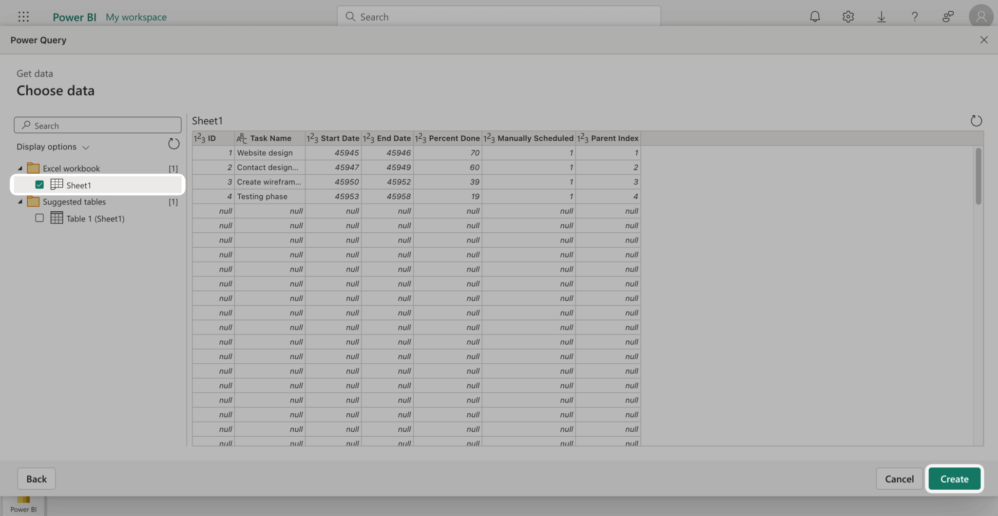
- In the Choose data window, select the Excel workbook, Sheet1, and click Create:
This creates a new report:
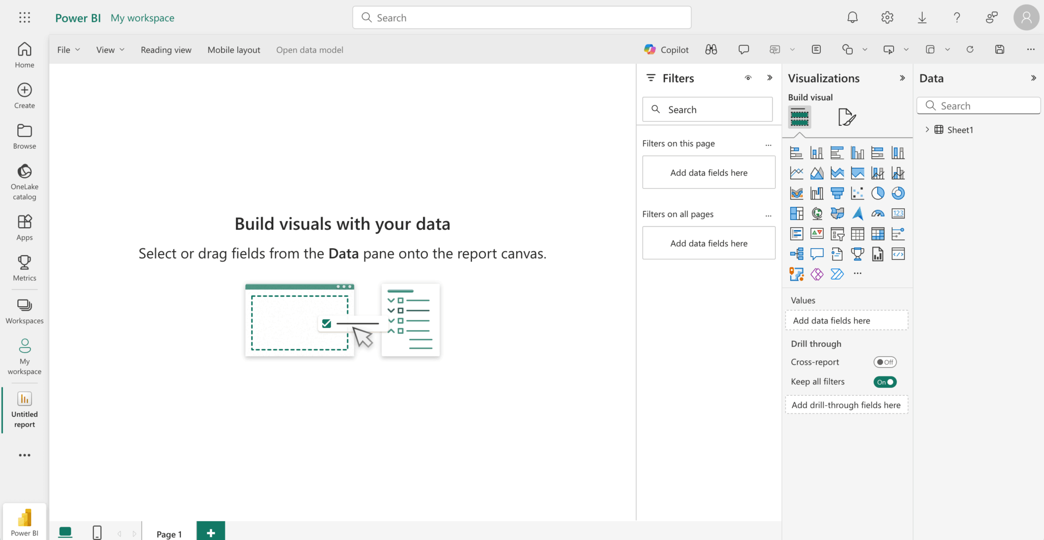
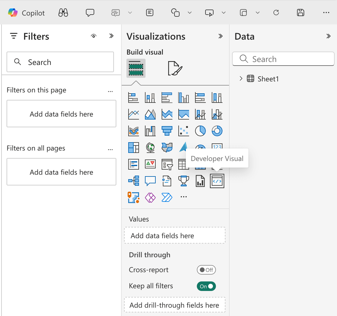
- In the Visualizations pane on the right, select the Developer Visual:
This adds the visual to the report canvas:
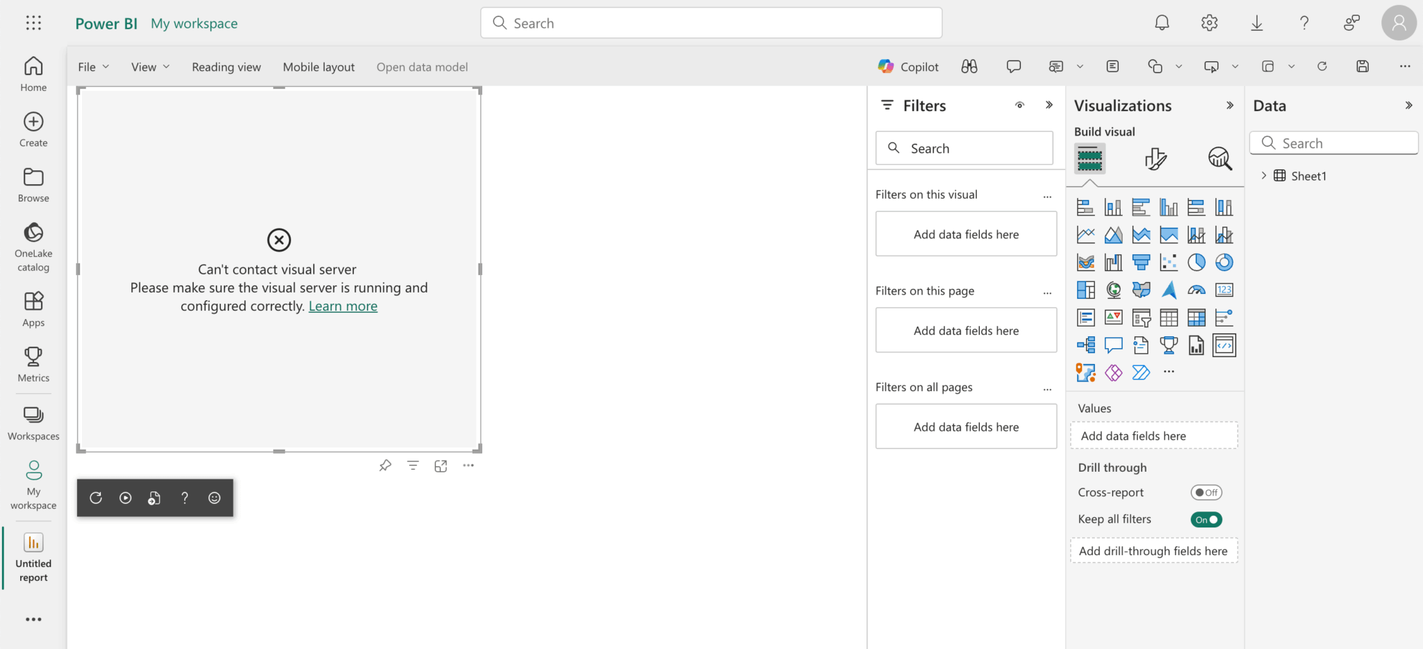
- To fix the connection issue, open https://localhost:8080/assets in a new tab and authorize your browser to use this address.

- In Chrome, click the Advanced button and then click Proceed to localhost (unsafe).
- Back in Power BI, click the Reload Visual Code button, which is the circular arrow at the bottom of the visual in the report canvas:
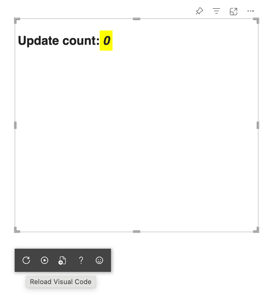
- Click the Toggle Auto Reload button (represented by the play icon) to the right of the Reload Visual Code button to enable auto-reload.
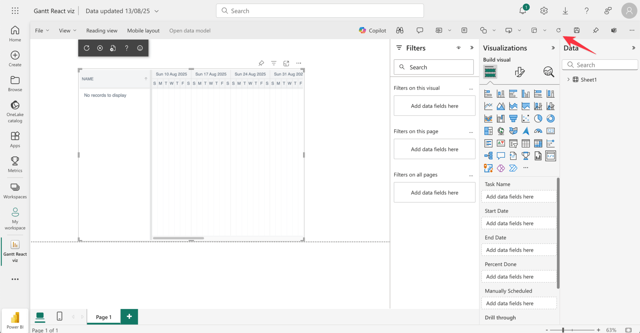
- To grant the visual access to the uploaded tasks data, select the visual in the report canvas, expand Sheet1 in the Data pane on the right, and then select all the data columns from the example tasks:
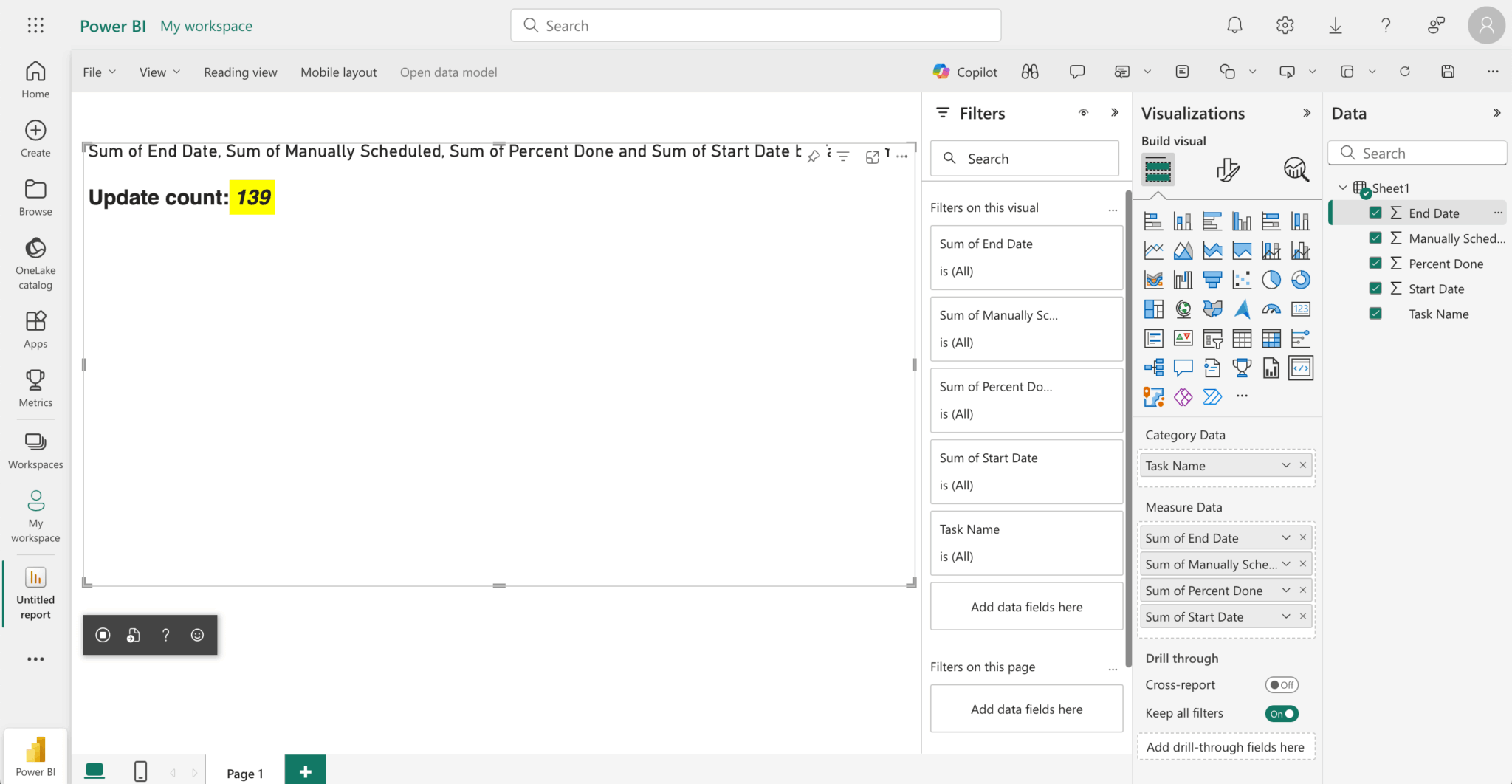
Note that the Update count value increases when you resize the visual.
Power BI treats data fields as either category (descriptive text) or measure (numerical values for calculations) data. In the example tasks data, Task Name is category data because it provides descriptive labels. The rest of the columns are measure data that Power BI can use for calculations and aggregations. The measure data are displayed as the sum of the values in the column.
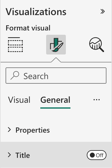
- Remove the data titles from the visual in the Visualizations pane on the right. Open the Format your visual tab and then set the Title toggle to Off:
Now let’s make the custom Visual render a Bryntum Gantt React chart.
Install React and the Bryntum Gantt React component
Install React and its type definitions:
npm install react react-dom @types/react @types/react-domNext, install the Bryntum Gantt packages for React.
If you’re using the free trial, install the public Bryntum trial packages:
npm install @bryntum/gantt@npm:@bryntum/gantt-trial @bryntum/gantt-reactIf you have a Bryntum license, refer to our npm Repository Guide and install the licensed packages:
npm install @bryntum/gantt @bryntum/gantt-reactReplace the content of tsconfig.json with the following:
{
    "compilerOptions": {
        "jsx": "react",
        "types": [
            "react",
            "react-dom"
        ],
        "allowJs": false,
        "emitDecoratorMetadata": true,
        "experimentalDecorators": true,
        "target": "es2022",
        "sourceMap": true,
        "outDir": "./.tmp/build/",
        "moduleResolution": "node",
        "declaration": true,
        "lib": [
            "es2022",
            "dom"
        ]
    },
    "files": [
        "src/visual.ts",
        "./src/settings.ts"
    ]
}
Here, we add "jsx": "react" and "types": ["react", "react-dom"] to enable React JSX compilation, including React type definitions. We also add the src/settings.ts file to the files array.
Create the Bryntum Gantt configuration file
Create a ganttConfig.ts file in the src folder and add the following lines of code to it:
import { BryntumGanttProps } from '@bryntum/gantt-react';

const ganttConfig: BryntumGanttProps = {
    columns    : [{ type : 'name', field : 'name', width : 250 }],
    viewPreset : 'weekAndDayLetter',
    barMargin  : 10
};

export { ganttConfig };
This creates a basic Gantt configuration with a Name column.
Create the React component
Create a BryntumGanttComponent.tsx file in the src folder and add the following lines of code to it:
import * as React from 'react';
import { useState, useEffect, useRef } from 'react';
import { BryntumGantt } from '@bryntum/gantt-react';
import { ganttConfig } from './ganttConfig';
import { TaskModel } from '@bryntum/gantt';

interface GanttState {
    tasks: TaskModel[];
}

const BryntumGanttComponent = ({ updateCallback }) => {
    const gantt = useRef(null);
    const [state, setState] = useState<GanttState>({ tasks : [] });

    useEffect(() => {
        updateCallback(setState);
    }, [updateCallback]);

    const GanttComponent = BryntumGantt as any;

    return (
        <GanttComponent
            ref={gantt}
            tasks={state.tasks}
            {...ganttConfig}
        />
    );
};

export default BryntumGanttComponent;
This code renders the Bryntum Gantt React component and passes in the ganttConfig and tasks data state as props.
Update the constructor method of the Power BI visual class to render the Bryntum Gantt React component
When the visual instantiates, it calls the constructor method in the Visual class. We’ll use it to render the Bryntum Gantt React component.
Open the src/visual.ts file and add the following imports:
import * as React from 'react';
import { createRoot, Root } from 'react-dom/client';
import BryntumGanttComponent from './BryntumGanttComponent';
Add the following private properties to the Visual class:
private root: Root;
private updateState: (newState: any) => void;
Next, replace the constructor method of the Visual class with the following:
constructor(options: VisualConstructorOptions) {
    this.updateState = () => {};

    this.target = options.element;
    this.root = createRoot(this.target);

    const reactRoot = React.createElement(BryntumGanttComponent, {
        updateCallback : (updateFunc: (newState: any) => void) => {
            this.updateState = updateFunc;
        }
    });

    this.root.render(reactRoot);
}
This creates a Bryntum Gantt React element. In the updated constructor, we pass in an updateCallback prop that we’ll use to update the Bryntum Gantt’s task state. This callback is run in the useEffect hook in the BryntumGanttComponent React component.
Add CSS styling
Update style/visual.less to import a Bryntum theme and set the size of the Gantt chart:
@import "@bryntum/gantt/gantt.stockholm.css";

#root {
  height: 100vh;
}
This imports the Bryntum Stockholm theme and ensures the Gantt chart fills the available space.
Refresh the visual in the report canvas to see the Gantt chart:
The Gantt chart doesn’t display the tasks data yet. Let’s fix that.
Configure the visual capabilities
Before adding the tasks data from Power BI to the Gantt chart, we need to configure the visual capabilities.
Replace the JSON object in capabilities.json with the following:
{
    "dataRoles": [
        {
            "displayName": "ID",
            "name": "id",
            "kind": "Grouping"
        },
        {
            "displayName": "Task Name",
            "name": "taskName",
            "kind": "Grouping"
        },
        {
            "displayName": "Start Date",
            "name": "startDate",
            "kind": "Grouping"
        },
        {
            "displayName": "End Date",
            "name": "endDate",
            "kind": "Grouping"
        },
        {
            "displayName": "Percent Done",
            "name": "percentDone",
            "kind": "Grouping"
        },
        {
            "displayName": "Manually Scheduled",
            "name": "manuallyScheduled",
            "kind": "Grouping"
        },
        {
            "displayName": "Parent Index",
            "name": "parentIndex",
            "kind": "Grouping"
        }
    ],
    "dataViewMappings": [
        {
            "table": {
                "rows": {
                    "select": [
                        { "for": { "in": "id" } },
                        { "for": { "in": "taskName" } },
                        { "for": { "in": "startDate" } },
                        { "for": { "in": "endDate" } },
                        { "for": { "in": "percentDone" } },
                        { "for": { "in": "manuallyScheduled" } },
                        { "for": { "in": "parentIndex" } }
                    ]
                }
            }
        }
    ],
    "objects": {},
    "privileges": []
}
Here, we use the dataRoles array to define the data fields that the visual expects from Power BI. Each role corresponds to a column in the Excel file. We set the kind property to "Grouping" to allow users to drag data fields into these roles.
The dataViewMappings object tells Power BI how to structure the data for the visual. The table mapping creates a tabular data structure where each row contains values for all five data roles, making it easy to iterate through tasks in the visual code.
Update the visual update method
When the data changes or the visual refreshes, Power BI calls the update method in the Visual class.
Replace the update method in the src/visual.ts file with the following lines of code:
public update(options: VisualUpdateOptions) {
    const dataView = options.dataViews[0];

    if (dataView && dataView.table) {
        // Extract data from Power BI table dataView
        const columns = dataView.table.columns;
        const rows = dataView.table.rows;

        // Find column indices by display name
        const idIndex = columns.findIndex((col: any) => col.displayName === 'ID');
        const taskNameIndex = columns.findIndex((col: any) => col.displayName === 'Task Name');
        const startDateIndex = columns.findIndex((col: any) => col.displayName === 'Start Date');
        const endDateIndex = columns.findIndex((col: any) => col.displayName === 'End Date');
        const percentDoneIndex = columns.findIndex((col: any) => col.displayName === 'Percent Done');
        const manuallyScheduledIndex = columns.findIndex((col: any) => col.displayName === 'Manually Scheduled');
        const parentIndexIndex = columns.findIndex((col: any) => col.displayName === 'Parent Index');

        if (rows && rows.length > 0) {
            // Sort rows by parentIndex
            const sortedRows = [...rows].sort((a: any, b: any) => {
                if (parentIndexIndex >= 0) {
                    return (a[parentIndexIndex] || 0) - (b[parentIndexIndex] || 0);
                }
                return 0;
            });

            const tasks = sortedRows
                .filter((row: any) => {
                    const taskName = taskNameIndex >= 0 ? row[taskNameIndex] : null;
                    return taskName &&
                            taskName !== null &&
                            taskName !== undefined &&
                            typeof taskName === 'string' &&
                            taskName.trim() !== '';
                })
                .map((row: any) => {
                    const task = {
                        id                : idIndex >= 0 ? row[idIndex] : undefined,
                        name              : taskNameIndex >= 0 ? row[taskNameIndex] : undefined,
                        startDate: startDateIndex >= 0 ? this.convertExcelDate(row[startDateIndex]) : undefined,
                        endDate           : endDateIndex >= 0 ? this.convertExcelDate(row[endDateIndex])   : undefined,
                        percentDone       : percentDoneIndex >= 0 ? row[percentDoneIndex] : 0,
                        manuallyScheduled : manuallyScheduledIndex >= 0 ? Boolean(row[manuallyScheduledIndex]) : undefined,
                        parentIndex       : parentIndexIndex >= 0 ? row[parentIndexIndex] : undefined,
                    };
                    return task;
                });

            this.updateState({ tasks });
        }
    }
}
Power BI calls the update method whenever data changes or the visual needs to refresh. In the code above, we get the tasks data from options.dataViews[0].table. Then, we find the column indices of the tasks data using their display names, sort the rows by the parentIndex column, and filter out invalid rows with empty task names. Each valid data row is transformed into a Gantt task object. We call this.updateState(), which passes the tasks data to the BryntumGanttComponent React component.
Refresh the visual in the report canvas to see the Gantt chart with the tasks data. Make sure that you select all of the tasks data in the Data pane.
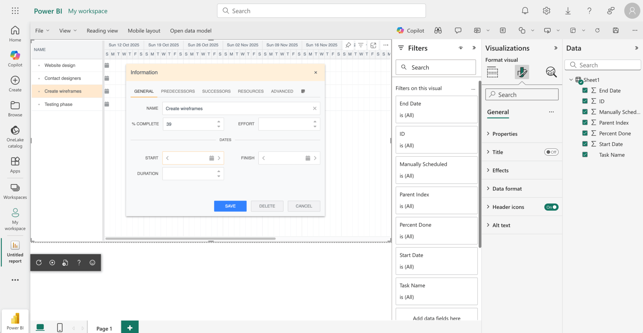
The date values are incorrect. We need to convert the Excel dates to JavaScript dates.
Convert Excel dates to JavaScript dates
We’ll use the SheetJS library to convert the Excel dates to JavaScript dates. Install it using npm:
npm install xlsxImport the library modules at the top of the src/visual.ts file:
import * as xlsx from 'xlsx';Add the following method to the Visual class to convert Excel dates to JavaScript dates:
private convertExcelDate(excelDate: any): string {
    if (typeof excelDate === 'number') {
        // Use xlsx library to parse Excel date numbers
        const dateObj = xlsx.SSF.parse_date_code(excelDate);
        const date = new Date(
            dateObj.y,
            dateObj.m - 1, // months are zero-indexed in JavaScript
            dateObj.d,
            dateObj.H,
            dateObj.M,
            dateObj.S
        );
        return date.toISOString().split('T')[0];
    }
    // If it's already a string date, return as is
    if (typeof excelDate === 'string' && excelDate.match(/^\d{4}-\d{2}-\d{2}$/)) {
        return excelDate;
    }
    return new Date().toISOString().split('T')[0];
}
The convertExcelDate method uses the xlsx library’s spreadsheet format (SSF) object and its parse_date_code method to parse the Excel number into an SSF date object. We use this SSF date object to create a JavaScript Date object. To construct the JavaScript Date object, we subtract one from the SSF date object’s month value, as months are zero-indexed in JavaScript. The method provides fallbacks for string dates or returns today’s date for invalid values.
Find the tasks object in the map function that is used in the update method. Then, in the tasks object, replace the startDate and endDate values with the following:
startDate         : startDateIndex >= 0 ? this.convertExcelDate(row[startDateIndex]) : new Date().toISOString().split('T')[0],
endDate           : endDateIndex >= 0 ? this.convertExcelDate(row[endDateIndex]) : new Date().toISOString().split('T')[0],
The convertExcelDate method converts the Excel dates to JavaScript dates.
You’ll now see the correct dates in the Gantt chart:
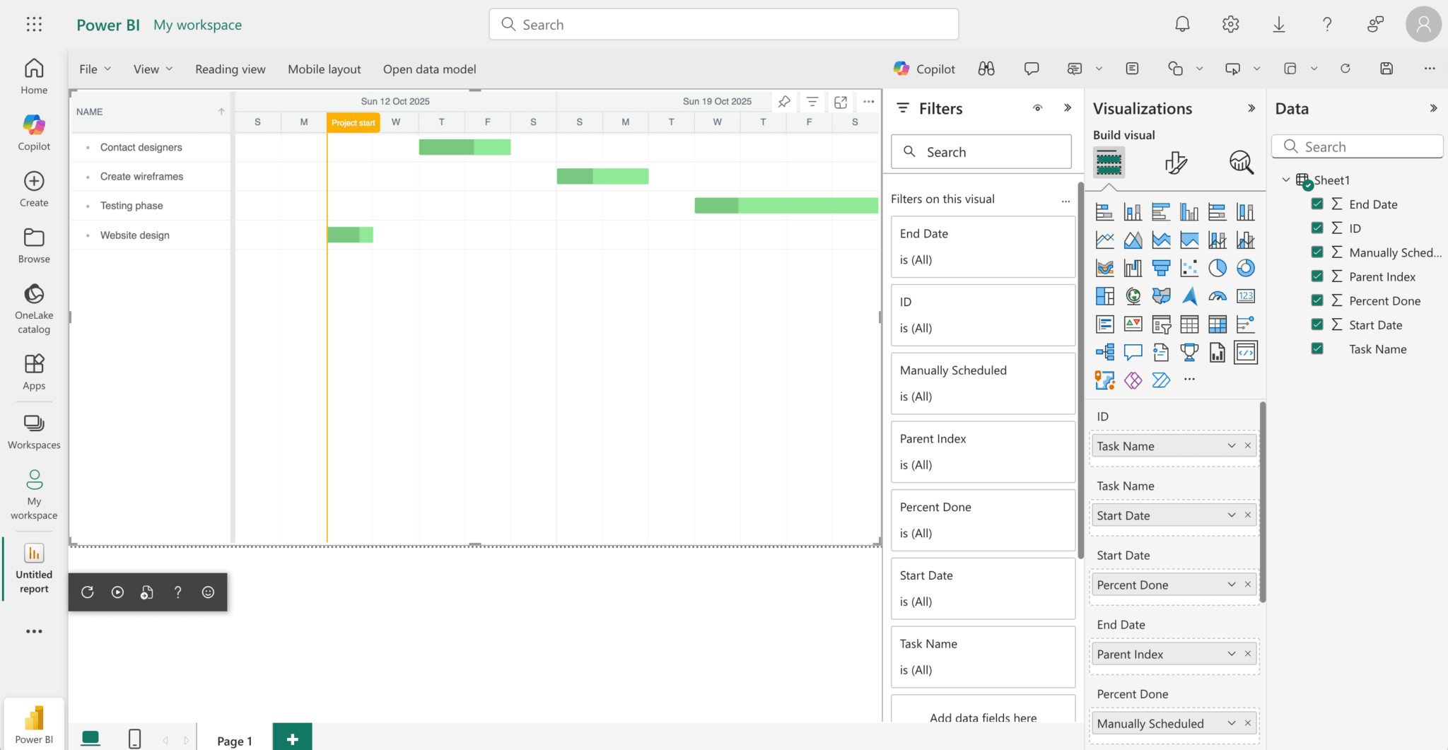
If you don’t see the correct dates, try refreshing the visual in the report canvas by clicking the Refresh button, at the top left of the report page.
⚠️ Clicking the Reload Visual Code button, which is the circular arrow at the bottom of the visual in the report canvas, will show a blank Gantt chart because the visual reinitializes with empty state and Power BI doesn’t automatically trigger the
update()method in the Power BI visual class with cached data during development. You’ll need to interact with the visual, for example resize the visual, or click the Refresh button at the top left of the report page to see the data in the Gantt chart.
If you encounter any issues during testing, you can debug your visual using browser developer tools. See the Power BI visual debugging guide for detailed debugging instructions.
Packaging your visual
Before you can load your custom visual into Power BI Desktop or share it with the community, you need to package it. Update pbiviz.json with the necessary author information and run the following command:
pbiviz packageThis creates a .pbiviz file in the /dist/ directory of your visual project. The package contains everything required to import the custom visual into either the Power BI service or a Power BI Desktop report.
For detailed packaging and distribution instructions, see the Microsoft documentation on packaging Power BI visuals.
Next steps
Now that you know how to create a custom Bryntum Gantt Power BI visual, you can further customize it by adding extra features.
- Take a look at the Power BI docs for more information. For example, you can follow the Power BI guide to publishing your visual.
- Check out our Bryntum Gantt demos page to explore examples of the features you can add to your custom Bryntum Gantt Power BI visual.