The new RowExpander feature

We strive to keep posts updated, but code samples may sometimes be outdated. Humans, see the Bryntum documentation; agents, https://mcp.bryntum.com for the latest info.
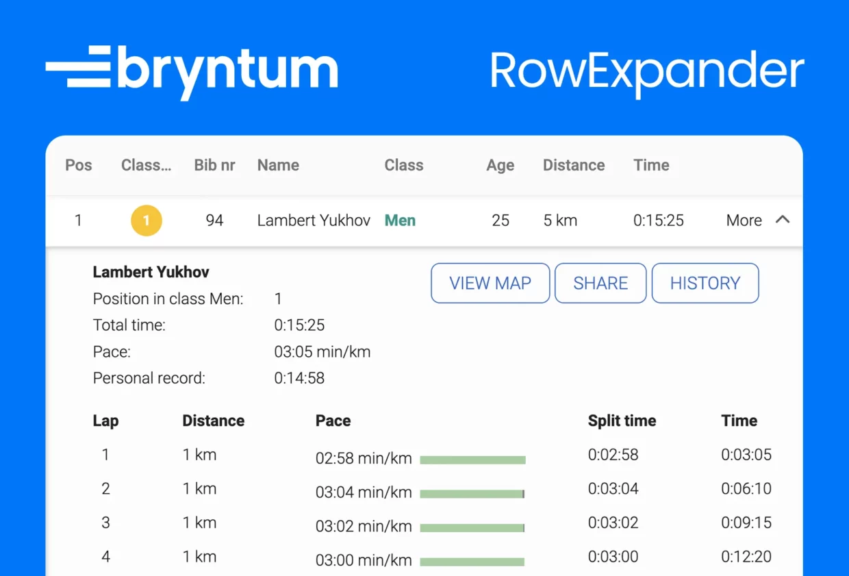
In the recent 5.1.0 release of Bryntum Grid, we introduced a cool new feature: the RowExpander. The RowExpander feature makes it possible to expand individual Grid rows to display more content. This is very useful for showing additional information that does not fit in a regular Grid cell. The feature can also be used in products based on the Grid, such as the Gantt and the Scheduler.
Live demo
Using the RowExpander feature
To use the RowExpander feature you simply configure it with a renderer in the Grid’s feature config.
new Grid({
  features: {
    rowExpander: {
      renderer({record, region}){
        return record.LongDescription;
      }
  }
});
By default, the RowExpander will add a column to the Grid which holds an expand/collapse button. This column can be configured or, if it is preferable, the row could expand and collapse on a trigger event like cellclick instead.
Example configuration:
new Grid({
  features: {
    rowExpander: {
      renderer({record, region}){
        return record.LongDescription;
      },
      column: null,
      triggerEvent: 'cellclick'
  }
});
The renderer can of course also be asynchronous by returning a Promise.
new Grid({
  features: {
    rowExpander: {
      async renderer({record, region}){
        return await fetchAndRenderExpander('/api/moreinfo');
      }
  }
});
For further information, please read the RowExpander docs. Or explore the new example. If you have suggestions for future improvements, we would be very grateful if you could reply with a comment or post them in the forums.