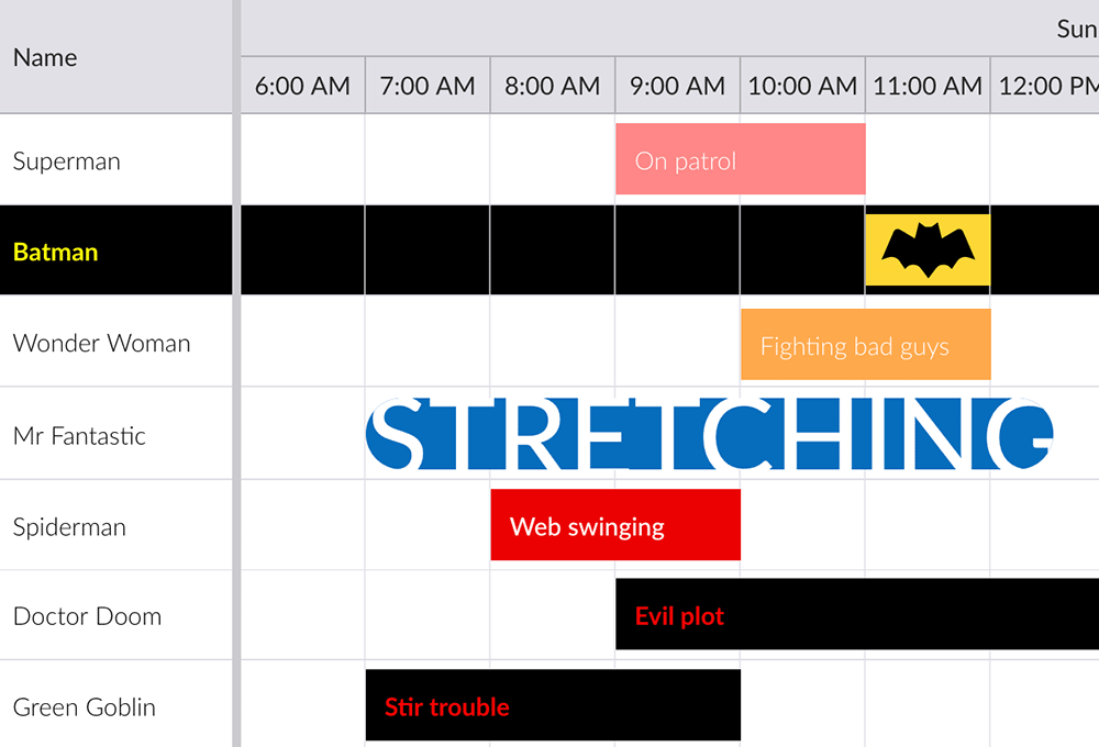
Styling Your Tasks – Part 2: Custom Styling

This post is the second in a two part series on task bar styling, the first post can be found here. Read on to find out how to do custom styling using the eventRenderer and CSS.
Setting CSS classes
It is possible to customize the look of task bars and resource rows by specifying your own CSS classes.
On task bars
You can add custom CSS classes to task bars either through data or by using `eventRenderer` (see below). When using data, simply assign a value to the `cls` field:
const scheduler = new Scheduler({
    events : [
        { startDate : '2018-12-04', duration : 2, cls : 'stretch' },
        ...
    ]
});
The CSS for above might look like this:
.b-sch-event.stretch {
    border-radius: 10em;
    font-size: 1.6em;
    text-transform: uppercase;
    padding: 0;
}
And result in this:

In case you want to take full control of the appearance of the task bars, you should set both `eventStyle` and `eventColor` to `null`. That makes them initially not appear at all, allowing you to easier specify their look:
const scheduler = new Scheduler({
    eventColor : null,
    eventStyle : null
});
On resource rows
Resource rows work much the same way, either specify a CSS class using a cell `renderer` (see below) or through data by specifying the `cls` field on a resource:
const scheduler = new Scheduler({
    resources : [
        { id : 1, name : 'Batman', cls : 'dark' },
        ...
    ]
});
Using the following css:
.rounded-cornerns {
  .dark {
    background-color : #000;
}

.dark .b-grid-cell {
    color : yellow;
    font-weight : bolder;
}
Results in something like this:

The event renderer
Each time a task bar is drawn, the Scheduler calls an `eventRenderer` function. Inside this method, you can manipulate some of the data used when rendering the task bar, to for example add a CSS class or to directly alter its style. Specify the `eventRenderer` in your Scheduler config, for example:
const scheduler = new Scheduler({
    eventRenderer({ eventRecord, resourceRecord, tplData }) {
        // eventRecord is the event whose task bar is being drawn
        // resourceRecord is the record for the "row"
        // tplData is used to populate the template used for drawing the task bar

        // alter style directly
        if (eventRecord.startDate < new Date()) {
            tplData.style = `
                background-color: black;
                font-weight: bold;
                color: red
            `;
        }

        // assign a CSS class
        if (resourceRecord.villain) {
            tplData.cls += 'villain';
        }
    }
});
Result might be:

The cell renderer
A cell `renderer` is similar to the event renderer described above, but they are specified on a per column basis. Another difference is that when called they also give you access to the cell and row elements, allowing you to directly manipulate those to add CSS classes or to set style:
const scheduler = new Scheduler({
    columns : [
        {
            field : 'name',
            text : 'Name',
            renderer({ cellElement, row, record, value }) {
                // cellElement is the element for the cell being rendered
                // row is the row that contains the cell, can be used to access its elements
                // record is the record for the row being rendered
                // value is the value that would have been displayed without this renderer fn

                // Set some custom style on the cellElement
                cellElement.style.color = 'blue';

                // The return value of the renderer is displayed in the cell
                return value;
            }
        }
    ]
});
Learn more
Below are a few useful resources to help you get started with your customisation:
Happy styling!