Making an interactive CSS avatar editor with zero lines of JS

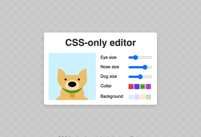
This post explores CSS interactivity by showing some techniques that can be used to create a simple avatar editor, without any JavaScript. It was amusing to implement and I hope it will be equally amusing to read & try. With that said, I would not recommend anyone actually using this in production. 😊
See the Pen
CSS-only avatar editor – no JS by Johan (@johan-bryntum)
on CodePen.
Interactivity using CSS
The CSS :checked pseudo-class selector can be used to add a basic level of interactivity to a page without using JavaScript. It is a special selector in that it is toggled on and off as a user toggles a checkbox or radio button. For example, the following snippet makes a checked checkbox twice as large as an unchecked:
input:checked {
    transform : scale(2);
}
Try clicking the checkboxes below:
By linking a label to the checkbox or radio button (using id and for), you can also click on the label to toggle the checkbox:
<input type="checkbox" id="box" />
<label for="box">Click label to toggle</label>
By using CSS sibling combinators you can affect the label when the checkbox is toggled:
input:checked + label {
    background : orangered;
}
If you then hide the checkbox, it can still be toggled using the label. Which opens up for interesting possibilities, like in these CSS only examples found on CodePen:
Building a CSS only range control
The avatar editor shown at the top uses a set of range controls to affect the appearance of the avatar. To allow this without using JavaScript, we cannot use <input type="range">. Instead, we have to roll our own using the techniques described above.
Each segment of the range will be represented by a radio button and a label. The label will be styled to look like a segment of a range control. Below is the HTML defining a range control with 4 segments:
<div class="range">
    <input type="radio" id="range4" name="range">
    <label for="range4"></label>
    <input type="radio" id="range3" name="range">
    <label for="range3"></label>
    <input type="radio" id="range2" name="range" checked>
    <label for="range2"></label>
    <input type="radio" id="range1" name="range">
    <label for="range1"></label>
</div>
Without styles we’re not fooling anyone:
By adding a little CSS, we can make it look like the track of a range control:
.range {
    display : flex;
}

/* Hide the radio buttons */
.range input {
    display : none;
}

/* Style labels to look like a solid range control track */
.range label {
    width        : 16px;
    height       : 6px;
    background   : #efefef;
    border-block : 1px solid #b2b2b2;
    display      : flex;
    cursor       : pointer;
    align-items  : center;
}

.range label:first-of-type {
    border-radius       : 6px 0 0 6px;
    border-inline-start : 1px solid #b2b2b2;
}

.range label:last-of-type {
    border-radius     : 0 6px 6px 0;
    border-inline-end : 1px solid #b2b2b2;
}
Resulting in this:
To highlight the current value, we leverage :checked and style a pseudo-element for the label to act as the thumb:
.range :checked + label::before {
    content       : "";
    width         : 16px;
    height        : 16px;
    background    : #0075ff;
    position      : absolute;
    border-radius : 100%;
    margin-left   : 1px;
}
Click to move the thumb:
Now on to the tricky part, we also want to highlight the part of the track before the thumb. Problem is, there is no CSS combinator (not yet anyway) to target previous siblings. By reversing the element order in DOM we can target what visually appears to be previous siblings with the ~ combinator 😵💫
.range {
    /* Reverse element order */
    flex-direction : row-reverse;
    /* Move them back to the left */
    justify-content : flex-end;
}
A mess:
First segment is now last and vice versa, you also have to switch places of the :first-of-type and :last-of-type selectors for appearance to be correct again:
And lastly we add the track highlight (made possible with the reversal above):
.range :checked ~ label {
    background   : #0075ff;
    border-color : #4b76bb;
}
Looks like a range control!
Using the range control for interactivity
While the range control above looks nice and is interactive, we should use it to manipulate something else 🤔. We can (currently) only affect sibling elements, by once again using the ~ combinator. Therefor, we have to put another element into the outer .range element
<div class="range">
    <!-- Existing range markup -->

    <div class="avatar"></div>
</div>
And use some more CSS magic, here to scale the avatar depending on range value (using CSS variables):
/* Represent the leftmost value, since we reversed the elements */
:nth-of-type(4):checked ~ .avatar {
    --avatar-size : 0.5;
}

:nth-of-type(3):checked ~ .avatar {
    --avatar-size : 0.75;
}

:nth-of-type(2):checked ~ .avatar {
    --avatar-size : 1;
}

/* Rightmost value */
:nth-of-type(1):checked ~ .avatar {
    --avatar-size : 1.25;
}

.avatar {
    /* Lots of CSS here to make the avatar look like a dog */

    transform : scale(var(--avatar-size));
}
Try it out:
That’s it! 🎉 By using the techniques in the post it is possible to create the full avatar editor shown at top, be sure to check it out over at CodePen. If you’re already using similar tricks in your application, we would love to hear about it.
PS. In a not too distant future, we will be able to use the :has() selector to affect an element that i️s not a direct sibling (we could also avoid reversing elements using it). Stay tuned for a future update using it ⭐
PS2: Interested in a CSS / designer career? Check this link for open opportunities.