Create an Airbnb-like date selector using the Bryntum DateRangeField
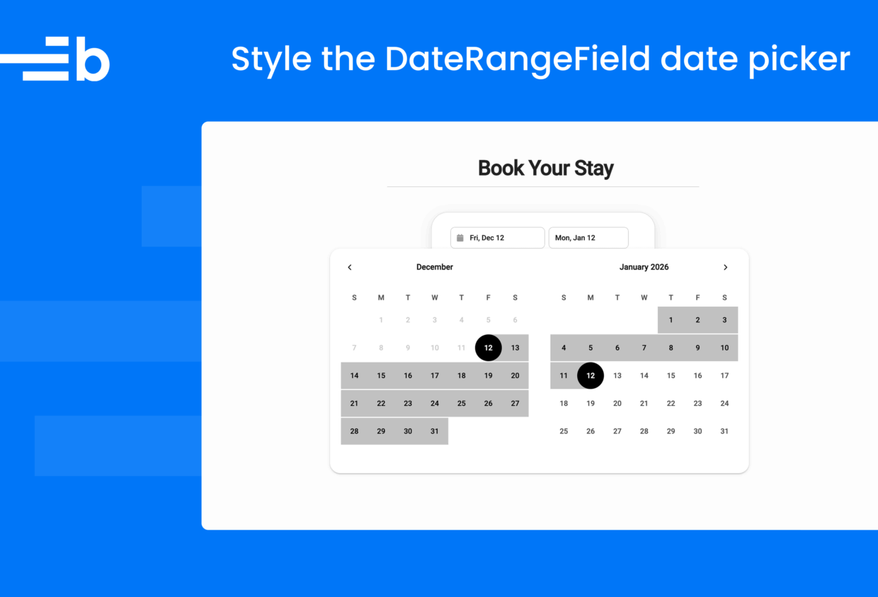
The Bryntum DateRangeField widget allows users to select a date range, for example, by picking the check-in and check-out dates for a hotel booking. In this post, we’ll show you how to style the DateRangeField to look like the Airbnb date selector.
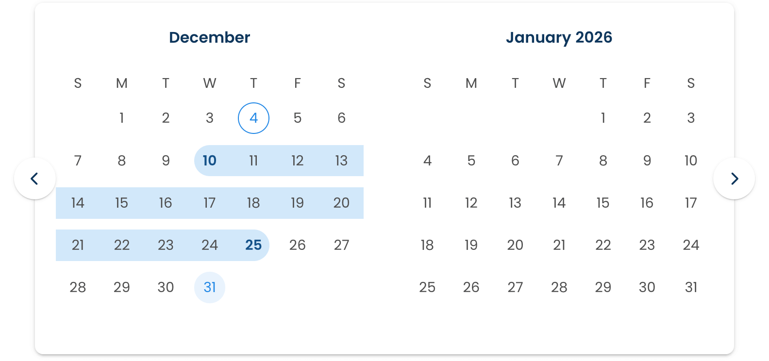
The DateRangeField docs include a live demo with the default styling:
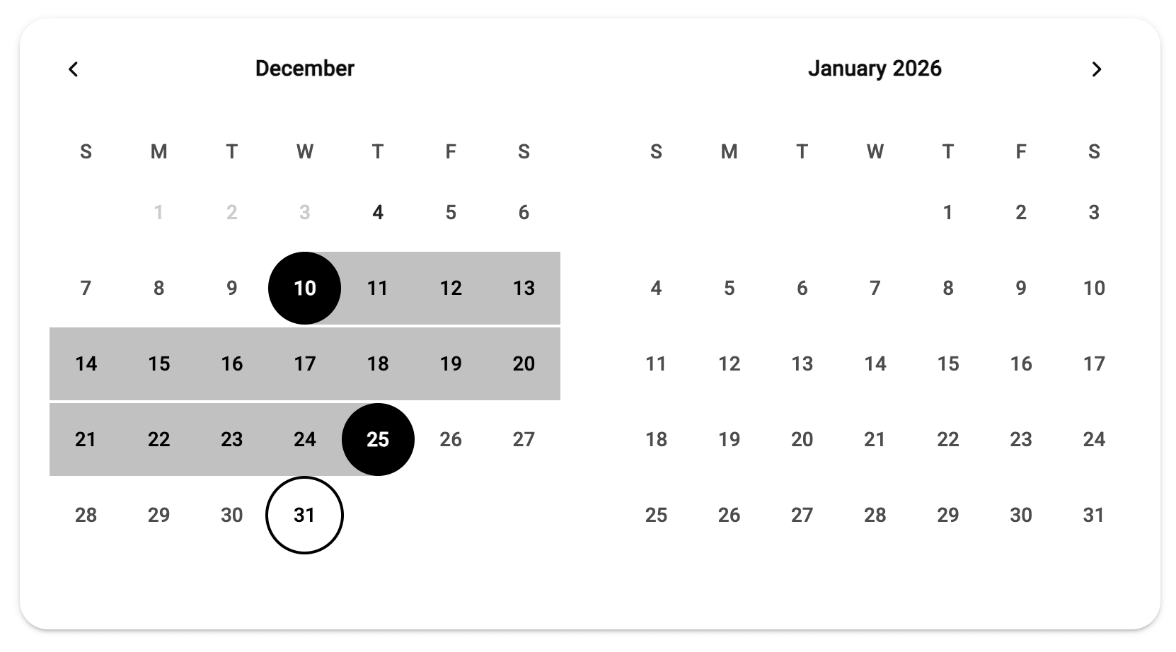
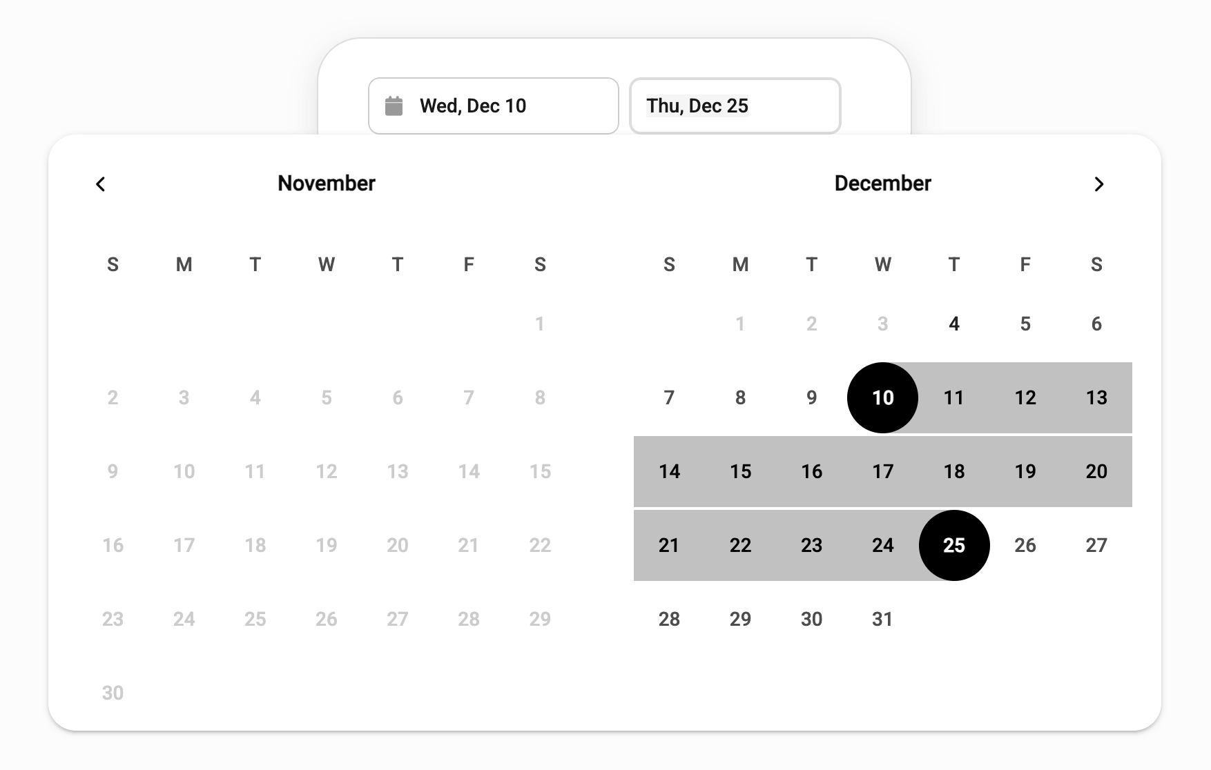
The DateRangeField CodePen demo shows the widget styled to mimic the Airbnb date selector:
Styling Bryntum widgets
Bryntum products come with a wide selection of helper widgets, such as popups, date pickers, file pickers, and charts.
These widgets are styled using Bryntum’s CSS themes. There are six themes, each with a light and dark variant.
Bryntum products have their “structural” CSS and themes separated into different CSS files. The structural CSS contains the basic layout and styling shared between all themes for the product. It defines CSS variables that the themes set to specific values.
To style a widget, you can override existing CSS variables and change the styles for specific elements of the widget.
Now, let’s look at styling the DateRangeField.
Configuring the DateRangeField
Configure the DateRangeField by passing a config object to the DateRangeField constructor:
const today = new Date();
today.setHours(0, 0, 0, 0);

new DateRangeField({
    appendTo : 'app',
    cls      : 'booking-date-picker',

    // Set primary color to dark (Airbnb style) - this sets --b-primary CSS variable
    color  : '#dddddd',
    // Use a clean, travel-style date format like "Fri, Nov 28"
    format : 'ddd, MMM D',

    // Auto-expand picker on focus for better UX
    autoExpand : true,

    // Departure field configuration
    fieldStartDate : {
        placeholder : 'Check in',
        min         : today
    },

    // Return field configuration
    fieldEndDate : {
        placeholder : 'Check out',
        min         : today
    }
});
Here, we use the cls property to define the custom CSS classes that we add to the DateRangeField element for styling. The format, fieldStartDate, and fieldEndDate properties let us configure and style the date input fields.
The config object also contains a picker property, which we can use to configure the DatePicker popup that opens when a user clicks or focuses on a date input field. It has several properties that we can configure to style the DatePicker popup:
picker : {
    // Show two months side by side like Airbnb/Google Flights
    twoMonths     : true,
    // Align below the field
    align         : 't-b',
    // Apply dark color to picker as well
    color         : '#222222',
    // Prevent selection of past dates
    disabledDates : (date) => date < today,
    minDate       : today,
    // Custom cell renderer to manually disable past dates
    cellRenderer  : ({ date, cell }) => {
        if (date < today) {
            cell.classList.add('b-disabled-date');
            cell.style.color = '#ccc';
            cell.style.pointerEvents = 'none';
        }
        else {
            // Reset styles for valid dates (since cells are reused)
            cell.classList.remove('b-disabled-date');
            cell.style.color = '';
            cell.style.pointerEvents = '';
        }
    }
},
In this code, we disable previous dates by setting the disabledDates property to a function that returns true for any date before the current date (today). We also use a cellRenderer to add a class to the cell and set the text color to grey. This visually indicates that the date is not available.
Styling the DateRangeField using CSS variables
In the demo CSS, you can see many CSS variables in the :root selector. These variables override the default styling of the Bryntum theme, which is Svalbard Light. The DateRangeField is composed of other Bryntum widgets, including the Input, Button, and DatePicker widgets, as well as the Popup widget for the DatePicker. The DatePicker has the most custom styling.
Round the DatePicker Popup’s corners to match the Airbnb date range selector by setting the b-popup-border-radius CSS variable to 20px:
:root {
    --b-popup-border-radius: 20px;
    ...
The Popup docs include a list of the CSS variables that we can adjust to style the Popup.
Next, we want the start and end dates to have black backgrounds and white text:
Set the b-date-picker-selected-background and b-date-picker-selected-color CSS variables to black and white, respectively.
:root {
    --b-date-picker-selected-background: black;
    --b-date-picker-selected-color: white;
    ...
Change the range color to a darker grey by setting the b-date-picker-selected-range-background CSS variable to #c1c1c1:
:root {
    --b-date-picker-selected-range-background: #c1c1c1;
    ...
The demo also shows less of a gap between the weeks in the DatePicker calendar:
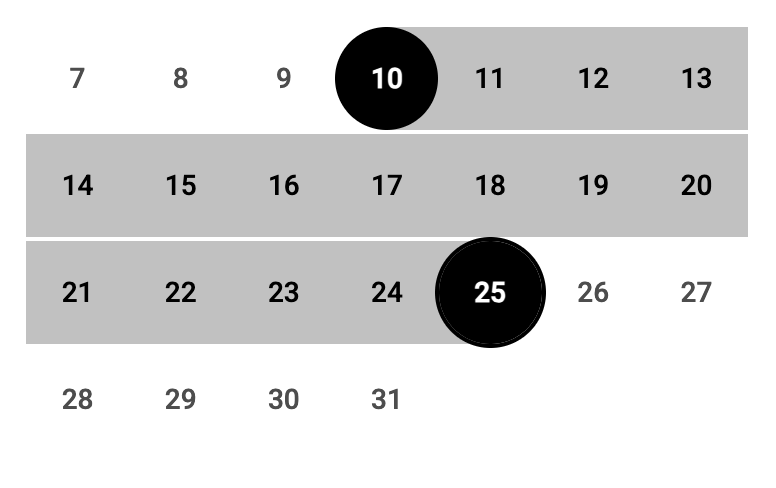
Remove the gap by setting the b-calendar-panel-weeks-gap CSS variable to 0:
:root {
    --b-calendar-panel-weeks-gap: 0;
    ...
Styling the DateRangeField using CSS selectors
The CodePen demo source code shows additional CSS changes you can make targeting specific elements. For example, the following CSS adds a black outline when the user hovers over a date in the DatePicker:
.b-date-picker-cell-inner:hover {
    outline: 2px solid black;
}
And that’s it! A few CSS tweaks can transform your DateRangeField from default to destination-ready.