Build interactive dashboards with Gridstack.js and Bryntum
We strive to keep posts updated, but code samples may sometimes be outdated. Humans, see the Bryntum documentation; agents, https://mcp.bryntum.com for the latest info.
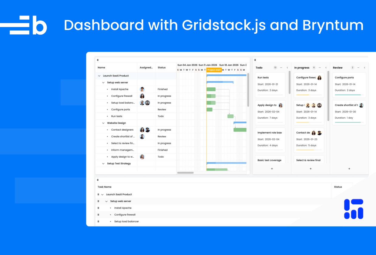
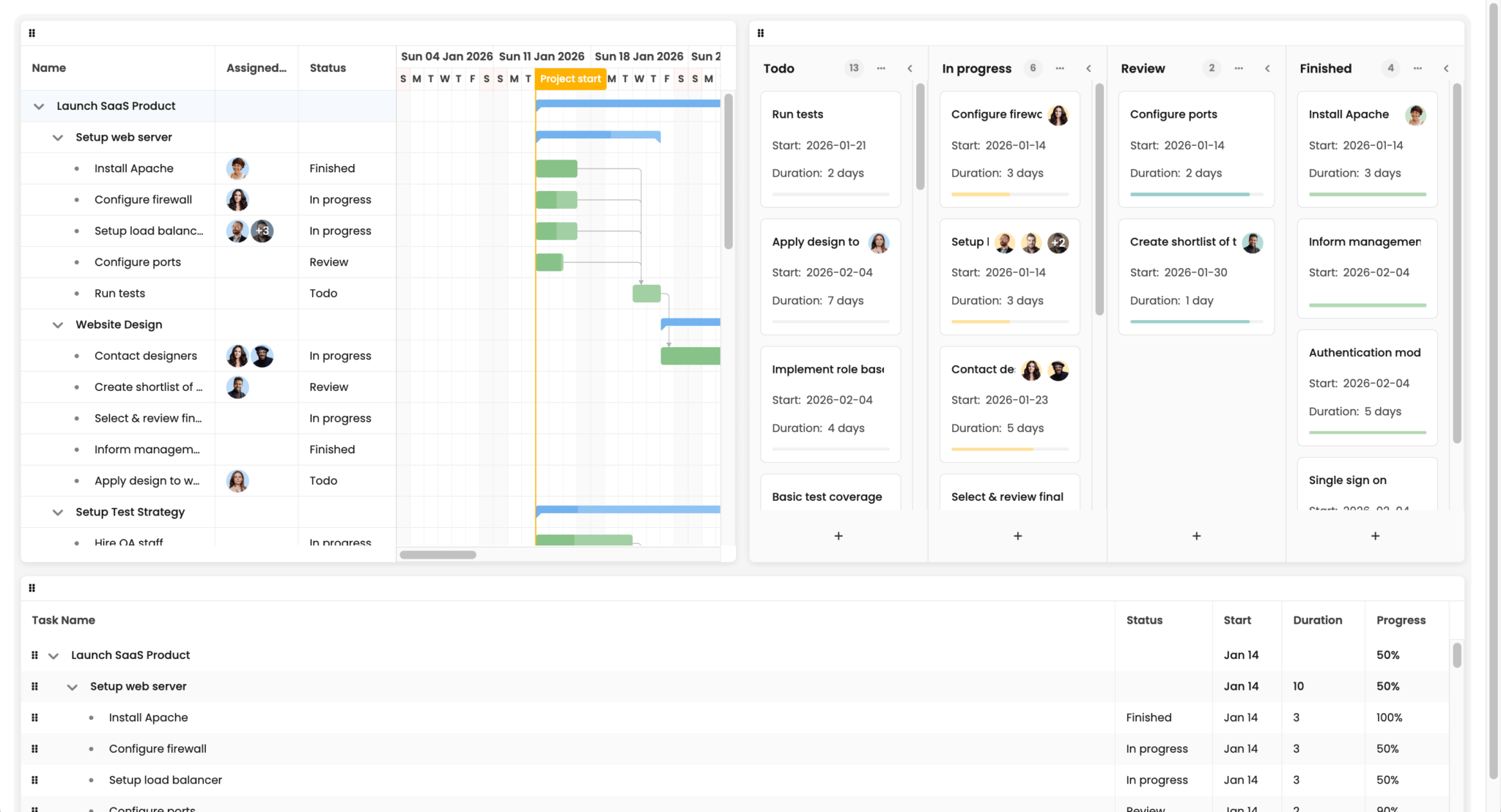
Bryntum has a range of web components for project management that you can use together. In this guide, we’ll create a dashboard where users can reorder and resize Bryntum components to customize their layout. We’ll use Gridstack.js, a library for building interactive dashboards, and add three Bryntum components with synchronized views of the same project data:
- A Gantt chart for timeline planning
- A Task Board for kanban-style task management
- A Grid for a hierarchical task overview
Because Bryntum components share a common data model, we can configure them to share the same data so that editing a task in one Bryntum component automatically updates the others.
By the end of this tutorial, you’ll have a dashboard that looks like this:
You can find the code for the completed tutorial in our Bryntum Gridstack GitHub repo.
Create a TypeScript app with Vite
Create a vanilla TypeScript Vite project and install the Vite and TypeScript dependencies by running the following command:
npm create vite@latest bryntum-gridstackjs -- --template vanilla-ts
cd bryntum-gridstackjs
npm install
Delete the following default files that we don’t need:
src/counter.tssrc/typescript.svg
Create a draggable widget layout with Gridstack
First, install the Gridstack.js library using npm:
npm install gridstackIn index.html, replace the default div in the body with a div that uses the grid-stack class:
- <div id="app"></div>
+ <div class="grid-stack"></div>
Gridstack targets elements with the grid-stack class and turns them into draggable, resizable grid layouts.
To initialize Gridstack, replace the contents of src/main.ts with the following code:
import 'gridstack/dist/gridstack.min.css';
import { GridStack } from 'gridstack';
import './style.css';

// Initialize Gridstack with drag handle set to widget headers
const gridstack = GridStack.init({
    cellHeight : 100,
    handle     : '.widget-header',
    draggable  : {
        cancel : '.widget-content'
    },
    resizable : {
        handles : 'all' // Enable resize from all corners and edges
    }
});
This imports the Gridstack CSS and initializes it, passing in grid options. The cellHeight sets each grid row to 100px. The handle option restricts dragging to Gridstack item headers, which we’ll create soon, so users can interact with the widget content without accidentally moving the widget. This is important because the Bryntum components that we’ll add have draggable elements. The resizable option enables resizing from all edges and corners. The default is the bottom-right corner only.
Now add a helper function that creates a Gridstack widget with a header for dragging and a content container for mounting Bryntum components:
// Helper to create widget with a header (drag handle) and container element
function createWidget(
    id: string,
    x: number,
    y: number,
    w: number,
    h: number,
    containerId: string
) {
    const widget = gridstack.addWidget({ id, x, y, w, h });
    const content = widget.querySelector('.grid-stack-item-content');
    if (content) {
        const header = document.createElement('div');
        header.className = 'widget-header';
        content.appendChild(header);

        const container = document.createElement('div');
        container.id = containerId;
        container.className = 'widget-content';
        content.appendChild(container);
    }
    return widget;
}
The addWidget method adds a widget to the grid and returns it. It has a GridStackWidget object as a parameter. We pass in the ID, the widget position on the x-axis of the grid, the widget position on the y-axis, its width, and its height. Gridstack uses a 12-column layout by default, which you can change. The height is the number of grid rows, which we set to 100px.
Each widget gets a header element, which serves as the drag handle, and a content div, to which we’ll add the Bryntum components.
Create three widgets for the Gantt chart, Task Board, and Grid:
// Add Gridstack widgets with containers for Bryntum components
createWidget('gantt-widget', 0, 0, 6, 8, 'gantt-container');
createWidget('taskboard-widget', 8, 0, 6, 8, 'taskboard-container');
createWidget('grid-widget', 0, 8, 12, 4, 'grid-container');
The Gantt chart and Task Board each take half the width at the top (six columns each), while the Grid spans the full 12 columns along the bottom.
Style the Gridstack grid
Replace the contents of src/style.css with the following base styles:
@import "https://fonts.googleapis.com/css2?family=Poppins:wght@300;400;500;600;700&display=swap";

:root {
  font-family: Poppins, "Open Sans", Helvetica, Arial, sans-serif;
  line-height: 1.5;
  font-weight: 400;
  --border-color: var(--b-neutral-85);
  --b-task-board-card-border: 1px solid var(--border-color);
  --b-task-board-column-separator-border: 1px solid var(--border-color);
}

* {
  box-sizing: border-box;
}

body {
  margin: 0;
  padding: 20px;
  min-height: 100vh;
  background-color: white;
}
Add the following styles for the Gridstack grid container, widget cards, drag-handle headers, and resize handles:
.grid-stack {
  width: 100%;
  background: #f5f5f5;
  border-radius: 1rem;
}

.grid-stack-item-content {
  position: absolute;
  inset: 0;
  display: flex;
  flex-direction: column;
  overflow: hidden;
  background: white;
  border-radius: 8px;
  box-shadow: 0 2px 8px rgba(0, 0, 0, 0.1);
}

/* Widget header - drag handle */
.widget-header {
  flex-shrink: 0;
  padding: 8px 12px;
  border-bottom: 1px solid #dee2e6;
  cursor: move;
}

/* Widget content - contains Bryntum components */
.widget-content {
  flex: 1;
  display: flex;
  flex-direction: column;
  min-height: 0;
}

/* Gridstack resize handles */
.grid-stack-item > .ui-resizable-handle {
  background: rgba(0, 0, 0, 0.05);
}

.grid-stack-item:hover > .ui-resizable-handle {
  background: rgba(0, 0, 0, 0.15);
}

.grid-stack-item > .ui-resizable-se,
.grid-stack-item > .ui-resizable-sw,
.grid-stack-item > .ui-resizable-ne,
.grid-stack-item > .ui-resizable-nw {
  width: 12px;
  height: 12px;
}

.grid-stack-item > .ui-resizable-e,
.grid-stack-item > .ui-resizable-w {
  width: 8px;
}

.grid-stack-item > .ui-resizable-n,
.grid-stack-item > .ui-resizable-s {
  height: 8px;
}
These styles give each widget a white card appearance, with rounded corners and a subtle shadow. The .widget-header acts as a visible drag handle with a cursor: move to signal that widgets can be repositioned. The .widget-content container uses flexbox, so that Bryntum components fill the remaining space below the header.
Now run the Vite development server:
npm run devYou’ll see a grid with three items that you can drag and drop by clicking and dragging the top of the items:
If you have a small screen, you may need to zoom out in your browser to best view all three items.
Next, let’s add Bryntum components as grid items.
Install the Bryntum components
You can try out Bryntum components for free using our public Bryntum trial packages.
We’ll install the packages for the Bryntum Gantt, Task Board, and Grid components. Bryntum products share the same data model and can be combined to provide different views of the same underlying data.
When using multiple Bryntum products in an app, use the thin packages, which contain only product-specific code and styling. The regular packages contain code and styling for all underlying products (for example, the Gantt includes Scheduler Pro, as well as Scheduler and Grid and Core).
If you’re installing the trial versions, run the following command:
npm install @bryntum/core-thin@npm:@bryntum/core-thin-trial @bryntum/engine-thin@npm:@bryntum/engine-thin-trial @bryntum/gantt-thin@npm:@bryntum/gantt-thin-trial @bryntum/grid-thin@npm:@bryntum/grid-thin-trial @bryntum/scheduler-thin@npm:@bryntum/scheduler-thin-trial @bryntum/schedulerpro-thin@npm:@bryntum/schedulerpro-thin-trial @bryntum/taskboard-thin@npm:@bryntum/taskboard-thin-trialIf you have a Bryntum license, please refer to our npm Repository Guide to access the private Bryntum repository and run:
npm install @bryntum/core-thin @bryntum/engine-thin @bryntum/gantt-thin @bryntum/grid-thin @bryntum/scheduler-thin @bryntum/schedulerpro-thin @bryntum/taskboard-thinShare data across Bryntum components with ProjectModel
We’ll synchronize the data in all of the Bryntum components using a shared project, which holds and links data stores. When all components use the same project, editing data in one component automatically updates the others.
In src/main.ts, create a ProjectModel instance for all three components to share:
const project = new ProjectModel({
    autoLoad : false,  // Load manually after components are ready
    loadUrl  : 'data.json',
    startDate : '2026-01-09',
    endDate   : '2026-04-01',
    autoSetConstraints : true,
    // General calendar is used by default
    calendar : 'general',

    validateResponse : true
});
The autoLoad option is set to false, so we can load the data after the Gridstack grid has loaded. The loadUrl points to a data.json file that we’ll add to the public folder.
We also need to import the ProjectModel:
import { ProjectModel } from '@bryntum/gantt-thin';Add the example JSON data
Copy the data.json file in the Bryntum Gridstack tutorial repo and add it to the public folder. This example data for launching a SaaS product includes tasks, dependencies, and resources.
Copy the images folder to the public folder as well. It contains resource images, which are the profile pictures of the employees in the example data.
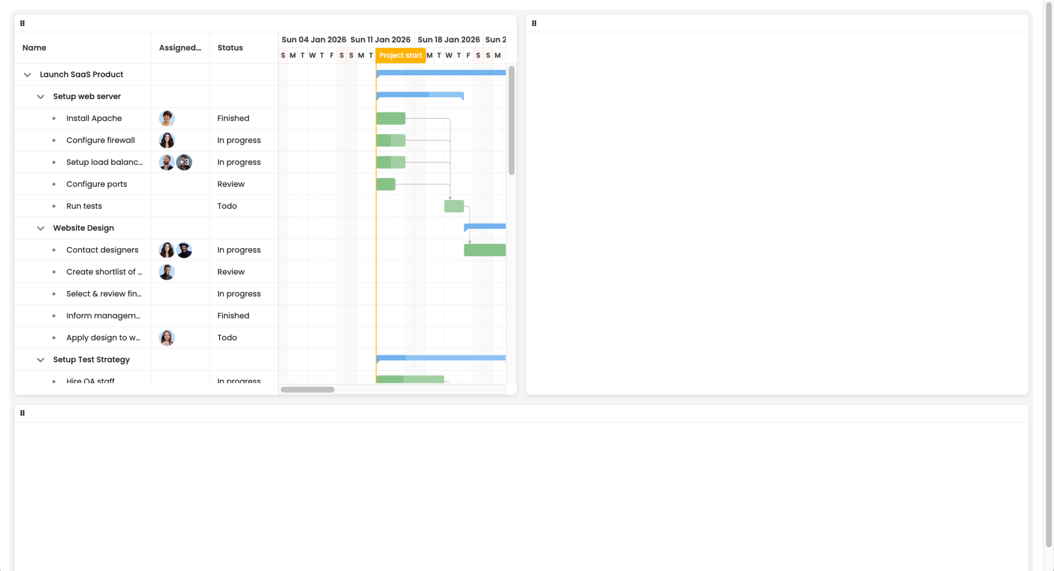
Add a Gantt chart for timeline planning
Next, we initialize the Bryntum components inside a window load event listener, so that the Gridstack layout is fully rendered before we mount the components. This prevents Bryntum from issuing a warning about missing container dimensions.
In src/main.ts, add the following event listener below the createWidget calls:
// Initialize Bryntum components after page layout is complete
window.addEventListener('load', () => {
    const gantt = new Gantt(getGanttConfig(project)) as GanttWithTaskBoard;
    // Load data after all components are ready
    project.load();
});
Without this, the Gridstack items may not have their final dimensions yet, and you’ll see the following warning in your browser console:
The Gantt is sized by its predefined minHeight, likely this is not intended.
Please check your CSS and review how you size the widget, or assign a fixed height in the config.
For more information, see the "Basics/Sizing the component" guide in docs.
Add the following imports and type interface to the top of the file, so the Gantt can reference the Task Board:
import { Gantt } from '@bryntum/gantt-thin';
import { TaskBoard } from '@bryntum/taskboard-thin';

interface GanttWithTaskBoard extends Gantt {
    taskBoard?: TaskBoard;
}
Now, create a bryntumConfig.ts file in the src folder. This file will hold the configuration for all three Bryntum components. Add the following import to it:
import { ProjectModel, TaskModel, type GanttConfig } from '@bryntum/gantt-thin';All three components will share a set of task statuses. Add the following type and variables to the top of the file:
// Type alias for taskboard column
type TaskBoardColumnInfo = { color: string; text: string };

// Shared status configuration used by Gantt, TaskBoard, and Grid
export const statusConfig: Record<string, TaskBoardColumnInfo> = {
    todo   : { text : 'Todo', color : 'blue' },
    wip    : { text : 'In progress', color : 'amber' },
    review : { text : 'Review', color : 'teal' },
    done   : { text : 'Finished', color : 'green' }
};

// Status items for combo editors
export const statusItems: [string, string][] = Object.entries(statusConfig).map(([id, { text }]) => [id, text]);
The statusConfig object maps each status key to a display label and color. The statusItems array reformats this for use in Bryntum Combo (dropdown) widgets.
Add the following Gantt configuration function to the file:
// Gantt configuration
export function getGanttConfig(project: ProjectModel): Partial<GanttConfig> {
    return {
        appendTo : 'gantt-container',
        project,

        startDate : '2026-01-09',
        endDate   : '2026-04-01',

        viewPreset        : 'weekAndDayLetter',
        resourceImagePath : '/images/transparent-users/',

        columns : [
            { type : 'name', width : 280 },
            { type : 'resourceassignment', width : 120, showAvatars : true },
            {
                text   : 'Status',
                field  : 'status',
                width  : 140,
                editor : {
                    type       : 'combo',
                    editable   : false,
                    autoExpand : true,
                    items      : statusItems
                },
                renderer({ value }: { value: string | null }) {
                    const status = value && statusConfig[value];
                    if (status) {
                        return {
                            className : {
                                'status-tag'                : true,
                                'b-colorize'                : true,
                                [`b-color-${status.color}`] : true
                            },
                            children : [{ text : status.text }]
                        };
                    }
                    return value || '';
                }
            }
        ],

        features : {
            taskEdit : {
                editorConfig : {
                    centered : true
                },
                items : {
                    generalTab : {
                        items : {
                            status : {
                                type   : 'combo',
                                label  : 'Status',
                                name   : 'status',
                                weight : 600, // Position right before duration
                                items  : statusItems
                            }
                        }
                    }
                }
            }
        },
    };
}
Here, we add the Gantt to the Gridstack item with an id of gantt-container. The taskEdit feature lets you customize the task editor that opens when you click on a task. Lastly, we add a status dropdown to the general tab form.
In src/main.ts, import the getGanttConfig function:
import { getGanttConfig } from './bryntumConfig';In src/style.css, add the Bryntum CSS imports for fonts, structural styles, and the Svalbard Light theme:
/* Fonts */
@import '@bryntum/core-thin/fontawesome/css/fontawesome.css';
@import '@bryntum/core-thin/fontawesome/css/solid.css';

/* Bryntum structural CSS */
@import '@bryntum/core-thin/core.css';
@import '@bryntum/grid-thin/grid.css';
@import '@bryntum/scheduler-thin/scheduler.css';
@import '@bryntum/schedulerpro-thin/schedulerpro.css';
@import '@bryntum/gantt-thin/gantt.css';
@import '@bryntum/taskboard-thin/taskboard.css';

/* Bryntum theme */
@import '@bryntum/core-thin/svalbard-light.css';
This imports the CSS for the Svalbard Light theme (one of the six customizable Bryntum themes with light and dark variants). The structural CSS and themes have separate imports.
Add the following CSS to make the Bryntum components fill their Gridstack item containers:
.b-gantt,
.b-taskboard,
.b-grid {
  flex: 1;
  width: 100%;
}
Return to src/main.ts, and add the following line below the header.className = 'widget-header'; line in the createWidget function to add a grip icon to the drag handle:
header.innerHTML = `<span class="b-row-reorder-grip"></span>`;This uses a Bryntum class to add the icon.
Run the dev server. You’ll see the Gantt chart rendered inside the first Gridstack widget:
Add a Task Board for kanban-style task management
In src/bryntumConfig.ts, add the following imports:
import type { TaskBoardConfig } from '@bryntum/taskboard-thin';
import { DateHelper, Model } from '@bryntum/core-thin';
Add the following type interfaces so the Gantt and Task Board can reference each other for cross-component navigation:
// Extend Gantt to include taskBoard reference
export interface GanttWithTaskBoard {
    taskBoard?: { scrollToTask: (id: string | number) => void };
}

// Extend TaskBoard to include gantt reference
export interface TaskBoardWithGantt {
    gantt?: {
        editTask: (task: TaskModel) => void;
        scrollTaskIntoView: (task: TaskModel, options?: object) => void;
    };
}
Add the following getTaskBoardConfig function to the bottom of the file:
export function getTaskBoardConfig(project: ProjectModel): Partial<TaskBoardConfig> {
    return {
        appendTo          : 'taskboard-container',
        project           : project as unknown as TaskBoardConfig['project'],
        resourceImagePath : '/images/transparent-users/',
        useDomTransition  : true,

        // Force sorting by weight, independent of how Gantt sorts the tasks
        taskSorterFn : true,

        columns : Object.entries(statusConfig).map(([id, { text, color }]) => ({ id, text, color })),

        columnField : 'status',

        features : {
            taskDrag   : true,
            columnDrag : false,
            taskEdit   : false // Disabled - using Gantt's editor via taskDblClick listener
        },

        headerItems : {
            text      : { field : 'name' },
            resources : {
                type : 'resourceAvatars'
            }
        },

        footerItems : {
            // eslint-disable-next-line @typescript-eslint/no-explicit-any
            resourceAvatars : false as any
        },

        bodyItems : {
            startDate : {
                type     : 'template',
                template : ({ value }: { value: Date | null }) =>
                    value ? `<div>Start:</div>${DateHelper.format(value, 'YYYY-MM-DD')}` : ''
            },
            duration : {
                type     : 'template',
                template : ({
                    value,
                    taskRecord
                }: {
                    value: number | null;
                    taskRecord: Model & { durationUnit: string };
                }) =>
                    value
                        ? `<div>Duration:</div>${value} ${DateHelper.getLocalizedNameOfUnit(taskRecord.durationUnit as 'millisecond' | 'second' | 'minute' | 'hour' | 'day' | 'week' | 'month' | 'quarter' | 'year', value !== 1)}`
                        : ''
            },
            progress : { type : 'progress', max : 100, field : 'percentDone' }
        },

        listeners : {
            // Open Gantt's task editor on double-click or Enter key
            taskDblClick(this: TaskBoardWithGantt, { taskRecord }: { taskRecord: Model }) {
                this.gantt?.editTask(taskRecord as unknown as TaskModel);
            },
            taskKeyDown(this: TaskBoardWithGantt, { taskRecord, event }: { taskRecord: Model, event: KeyboardEvent }) {
                if (event.key === 'Enter') {
                    this.gantt?.editTask(taskRecord as unknown as TaskModel);
                }
            },
            async selectionChange(this: TaskBoardWithGantt, { select }: { select: Model[] }) {
                if (select.length) {
                    this.gantt?.scrollTaskIntoView(select[0] as unknown as TaskModel, {
                        animate   : true,
                        highlight : true
                    });
                }
            }
        }
    };
}
The Task Board columns are generated from the shared statusConfig, so they match the statuses in the Gantt. We disable the built-in task editor so that we can use the Gantt task editor instead. We do this by listening for a double-click on a task or pressing Enter on a focused task and calling the Gantt’s editTask function. The selectionChange listener scrolls the Gantt to the selected task.
To complete the cross-component navigation, add the following listeners property to the object returned by the getGanttConfig function:
listeners : {
    selectionChange(this: GanttWithTaskBoard, { selected }: { selected: Model[] }) {
        if (selected.length) {
            this.taskBoard?.scrollToTask(selected[0].id as string | number);
        }
    }
}
When a task is selected in the Gantt, the Task Board scrolls to it.
In src/main.ts, add the following imports:
import type { Model, Store } from '@bryntum/core-thin';
import { TaskModel } from '@bryntum/gantt-thin';
import { getTaskBoardConfig } from './bryntumConfig';
Add the following type interface so the Task Board can reference the Gantt:
// Extend TaskBoard to include gantt reference
interface TaskBoardWithGantt extends TaskBoard {
    gantt?: Gantt;
}
Add the following taskStore property to the ProjectModel config:
taskStore : {
    fields    : ['status', 'weight'],
    listeners : {
        // Change percentDone when changing status
        update({ record, changes }: { source: Store, record: Model, changes: Record<string, unknown> }) {
            const task = record as TaskModel & { status: string };
            if (changes.status) {
                switch (task.status) {
                    case 'todo':
                        task.percentDone = 0;
                        break;
                    case 'wip':
                        task.percentDone = 50;
                        break;
                    case 'review':
                        task.percentDone = 90;
                        break;
                    case 'done':
                        task.percentDone = 100;
                        break;
                }
            }
        }
    }
},
This adds custom status and weight fields to tasks. The task weight determines a task’s default position in a Task Board column. The update event listener updates a task’s percentDone when its status changes.
In the window load event-listener callback function, add the following code below the gantt variable to create the Task Board and link the Gantt and Task Board together:
const taskBoard = new TaskBoard(getTaskBoardConfig(project)) as TaskBoardWithGantt;
// Link components together
gantt.taskBoard = taskBoard;
taskBoard.gantt = gantt;
You’ll now see both a Gantt chart and a Task Board. Changes in one component are reflected in the other, because they share the same ProjectModel. You can also hide Gantt columns and collapse Task Board columns if needed:
Add a Grid with a hierarchical task overview
The Bryntum TreeGrid displays hierarchical data with expandable rows, showing the nested task structures from the Gantt.
In src/bryntumConfig.ts, add the following import:
import type { TreeGridConfig } from '@bryntum/grid-thin';Add the following Grid configuration function:
export function getGridConfig(project: ProjectModel): Partial<TreeGridConfig> {
    return {
        appendTo : 'grid-container',
        store    : project.taskStore,

        columns : [
            { type : 'tree', field : 'name', text : 'Task Name', flex : 1 },
            {
                field : 'status',
                text  : 'Status',
                width : 140,
                renderer({ value }: { value: string | null }) {
                    const status = value && statusConfig[value];
                    if (status) {
                        return {
                            className : {
                                'status-tag'                : true,
                                'b-colorize'                : true,
                                [`b-color-${status.color}`] : true
                            },
                            children : [{ text : status.text }]
                        };
                    }
                    return value || '';
                },
                editor : {
                    type     : 'combo',
                    editable : false,
                    items    : statusItems
                }
            },
            {
                field    : 'startDate',
                text     : 'Start',
                width    : 100,
                renderer : ({ value }: { value: Date | null }) =>
                    value ? DateHelper.format(value, 'MMM DD') : ''
            },
            { field : 'duration', text : 'Duration', width : 120 },
            {
                field    : 'percentDone',
                text     : 'Progress',
                width    : 120,
                renderer : ({ value }: { value: number | null }) => `${value || 0}%`
            }
        ],

        features : {
            stripe     : true,
            cellEdit   : true,
            // enable row reordering by dragging
            rowReorder : {
                showGrip : true
            }
        }
    };
}
The Grid reads directly from the project’s taskStore, so it stays in sync with the Gantt and Task Board. The tree column renders the hierarchical parent-child task structure as expandable rows. The rowReorder feature with showGrip lets users drag and drop rows to reorder them.
In src/main.ts, add the following imports:
import { TreeGrid } from '@bryntum/grid-thin';
import { getGridConfig} from './bryntumConfig';
In the window load event-listener callback function, add the following line of code to create the Bryntum Grid:
// Create Grid showing all tasks
const grid = new TreeGrid(getGridConfig(project));
All three Bryntum components share the same data. Editing a task status in the Gantt updates the corresponding Task Board column and Grid row:
Next steps
We now have an interactive dashboard with three synchronized Bryntum components in a draggable Gridstack layout. Here are some ways to extend it:
- Use a frontend framework: Bryntum has React, Angular, and Vue wrappers that provide framework-specific components.
Gridstack has an Angular wrapper and code examples for React and Vue. - Persist data to a database: Add a backend server to save project data. Our Bryntum Scheduler Pro with Express.js tutorial shows an example using SQLite.
- Add more Bryntum features: Explore the demo pages for the Gantt, Task Board, and Grid components.
- Add more Gridstack features: Explore the Gridstack Demos page, which includes demos for nested grids and lazy loading.