Radio button and checkbox styling: Vanilla CSS vs Tailwind
Checkboxes and radio buttons are basic form elements. Changing their color should take one line of CSS. It doesn’t. Aligning the labels and inputs is also not as straightforward as you’d think.
The shadcn/ui library is one of the most popular React component libraries available. Its Radio and Checkbox components are built on Radix UI components that have hundreds of lines of code. When you inspect the inputs of these form elements in your browser dev tools, you see that they are actually rendered as buttons with a role of checkbox or radio.
The shadcn/ui GitHub repo has many open and closed “checkbox” PRs showing issues with alignment, appearance, re-rendering, Safari keyboard navigation, right-to-left support, position shifts, and more. Radio buttons have similar issues.
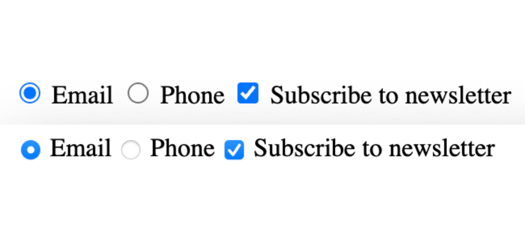
Why are radio buttons and checkbox inputs so complicated? The complexity is partly due to the limited CSS available for styling them, and partly due to inconsistent browser styling. The following comparison image demonstrates how different browsers render radio buttons and checkboxes differently, with the inputs rendered first in Chrome, then in Safari:
The newish CSS property, accent-color, lets you change the color of these inputs with one line of code. Unfortunately, Safari and most mobile browsers don’t yet support accent-color. If you want complete customization, you can circumvent this issue with the common hack of hiding the input and replacing it with a stylable pseudo-element.
In this guide, we cover the basics of styling radio buttons and checkboxes, demonstrating how to:
- Make basic color changes using the simple
accent-colormethod (which hopefully more browsers will support in the not-too-distant future) - Implement a full style reset using
appearance: nonefor complete control
We also show you how to perform both methods using either vanilla CSS or Tailwind, the popular utility-first CSS framework that lets you style with predefined classes.
Styling radio button and checkbox color and size with vanilla CSS
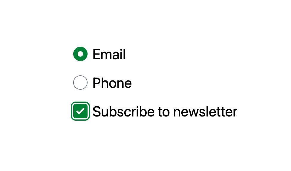
The simplest method for styling radio buttons and checkboxes uses vanilla CSS and the accent-color property to change the size and color of their inputs.
The following code styles the inputs to look like this:
See the Pen Styling radio buttons and checkboxes | color and size | vanilla CSS by bryntum-snippets (@bryntum-snippets) on CodePen.
Change the input’s width, height, and accent-color as follows:
*,
*:before,
*:after {
  box-sizing: border-box;
}

form {
  display: grid;
  place-content: center;
  min-height: 100vh;
  gap: 1rem;
  font-family: system-ui, sans-serif;
  font-size: 2rem;
}

label {
  display: block;
  cursor: pointer;
}

label input,
label span {
  vertical-align: middle;
}

input[type="radio"],
input[type="checkbox"] {
  width: 2em;
  height: 2em;
  accent-color: green;
}
Wrap the inputs in labels to increase the click area (the larger area is useful for mobile devices):
<form>
  <label>
    <input type="radio" name="contact" />
    <span>Email</span>
  </label>
  <label>
    <input type="radio" name="contact" checked />
    <span>Phone</span>
  </label>
  <label>
    <input type="checkbox" name="newsletter" />
    <span>Subscribe to newsletter</span>
  </label>
</form>
Notice how aligning the labels and inputs vertically requires some trickery using extra span elements.
For an alternative approach, see Pure CSS Custom Styled Radio Buttons. Stephanie Eckles handles multiline labels without spans by using CSS Grid and a small transform offset instead.
While this method works well in browsers that support accent-color, the only way to ensure consistency across browsers is to perform a full style reset.
Resetting radio button and checkbox styles for cross-browser consistency
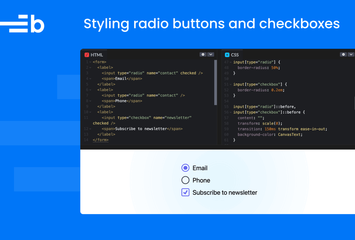
If you need consistent styling across all browsers, or want custom checkmark shapes, animations, and other modifications, you need to remove the native styling from your form elements entirely by setting appearance: none. This removes browser-specific styles and makes the inputs stylable using CSS.
The demo code below creates radio buttons and a checkbox with the following size, shape, and animation styling:
See the Pen Styling radio buttons and checkboxes | style reset | vanilla CSS by bryntum-snippets (@bryntum-snippets) on CodePen.
First, use CSS custom properties to define colors once, and reuse them later:
:root {
  --color-primary: #28602b;
  --color-border: #5c5c5c;
  --color-fill: #000;
}
Add the following properties to the inputs:
input[type="radio"],
input[type="checkbox"] {
  -webkit-appearance: none;
  appearance: none;
  margin: 0;
  font: inherit;
  color: var(--color-border);
  width: 1.25em;
  height: 1.25em;
  border: 0.12em solid currentColor;
  display: grid;
  place-content: center;
}

input[type="radio"] {
  border-radius: 50%;
}

input[type="checkbox"] {
  border-radius: 0.2em;
}
Here, we set the appearance property to none to reset the styles, and use display: grid and place-content: center to make it easier to center the ::before pseudo-element inside the inputs.
Now, add the ::before pseudo-element as follows:
input[type="radio"]::before,
input[type="checkbox"]::before {
  content: "";
  transform: scale(0);
  transition: 150ms transform ease-in-out;
  background-color: var(--color-fill);
}

input[type="radio"]::before {
  width: 0.7em;
  height: 0.7em;
  border-radius: 50%;
}

input[type="checkbox"]::before {
  width: 0.7em;
  height: 0.7em;
  clip-path: polygon(14% 44%, 0 65%, 50% 100%, 100% 16%, 80% 0%, 43% 62%);
}

input[type="radio"]:checked::before,
input[type="checkbox"]:checked::before {
  transform: scale(1);
}

input[type="radio"]:checked,
input[type="checkbox"]:checked {
  border-color: var(--color-primary);
}

input[type="radio"]:focus,
input[type="checkbox"]:focus {
  outline: 2px solid var(--color-primary);
  outline-offset: 2px;
}
Here, we use ::before to create a dot visual indicator for the radio button and a checkmark visual indicator for the checkbox.
To create a smooth animation, we start with ::before at scale(0), then transition it to scale(1) when the input is checked.
We use the clip-path polygon to create the checkmark shape without needing images or icon fonts. Using em units means the controls scale with font-size.
Styling radio buttons and checkboxes with Tailwind
Tailwind uses utility classes – small, single-purpose classes that each do one thing – to compose styles directly in HTML instead of writing CSS rules.
The code in the following demos styles the inputs to look like this:
Using the forms plugin
To get started, install Tailwind and the @tailwindcss/forms plugin, which provides a basic reset for form styles, similar to the vanilla CSS style reset we did earlier.
With Tailwind and the forms plugin installed, style your radio buttons and checkboxes as follows:
<form class="grid place-content-center min-h-screen gap-4 text-2xl">
  <label class="flex items-center gap-2 cursor-pointer">
    <input type="radio" name="contact" class="h-6 w-6 text-green-700 focus:ring-green-700" />
    <span>Email</span>
  </label>
  <label class="flex items-center gap-2 cursor-pointer">
    <input type="radio" name="contact" checked class="h-6 w-6 text-green-700 focus:ring-green-700" />
    <span>Phone</span>
  </label>
  <label class="flex items-center gap-2 cursor-pointer">
    <input type="checkbox" name="newsletter" class="h-6 w-6 rounded text-green-700 focus:ring-green-700" />
    <span>Subscribe to newsletter</span>
  </label>
</form>
Here, we use the following utility classes to change the size, shape, and color of the inputs:
Tailwind uses utility classes: small, single-purpose classes that each do one thing. Instead of writing CSS rules, we compose styles directly in HTML. The classes used include:
h-6 w-6sets the height and width to 1.5rem (24px)text-green-700sets the checked state color (the forms plugin maps this to the fill)roundedadds a border radius to checkboxesflex items-center gap-2aligns the input and label text vertically
Using manual Tailwind styling (no forms plugin)
If you’re not using the @tailwindcss/forms plugin, you need to reset the native appearance and build the styles from scratch. This process is similar to the vanilla CSS approach, but it uses Tailwind utility classes:
<form class="grid place-content-center min-h-screen gap-4 font-sans text-2xl">
  <label class="flex items-center gap-2 cursor-pointer">
    <input
      type="radio"
      name="contact"
      class="appearance-none w-6 h-6 border-2 border-gray-400 rounded-full
             grid place-content-center
             before:content-[''] before:w-3 before:h-3 before:rounded-full
             before:scale-0 before:transition-transform before:duration-150
             before:bg-green-700
             checked:before:scale-100 checked:border-green-700
             focus:outline-2 focus:outline-green-700 focus:outline-offset-2"
    />
    <span>Email</span>
  </label>
  <label class="flex items-center gap-2 cursor-pointer">
    <input
      type="checkbox"
      name="newsletter"
      class="appearance-none w-6 h-6 border-2 border-gray-400 rounded
             grid place-content-center
             before:content-[''] before:w-4 before:h-4
             before:scale-0 before:transition-transform before:duration-150
             before:bg-green-700
             before:[clip-path:polygon(14%_44%,0_65%,50%_100%,100%_16%,80%_0%,43%_62%)]
             checked:before:scale-100 checked:border-green-700
             focus:outline-2 focus:outline-green-700 focus:outline-offset-2"
    />
    <span>Subscribe to newsletter</span>
  </label>
</form>
This code works, but notice how verbose the class strings become. The clip-path for the checkmark requires Tailwind’s arbitrary value syntax [clip-path:...], which is essentially writing CSS inside a class name.
We can reduce the repetition by combining these utility classes into a custom class using @apply:
@layer components {
  .custom-radio {
    @apply appearance-none w-6 h-6 border-2 border-gray-400 rounded-full
           grid place-content-center
           before:content-[''] before:w-3 before:h-3 before:rounded-full
           before:scale-0 before:transition-transform before:duration-150
           before:bg-green-700
           checked:before:scale-100 checked:border-green-700
           focus:outline-2 focus:outline-green-700 focus:outline-offset-2;
  }
}
This makes our HTML much “cleaner”:
<input type="radio" name="contact" class="custom-radio" />Some say @apply defeats the purpose of utility-first CSS, since we go back to maintaining separate CSS files with custom class names. However, it may be a reasonable compromise for complex, repeated patterns.
For styling complex pseudo-elements like this, vanilla CSS is more readable. If you’re already using Tailwind, you can mix both approaches: Use utility classes for layout and simple styling, and write vanilla CSS for the fiddly bits like custom checkmarks. This is a matter of personal preference.
Plain CSS vs Tailwind: which is best?
For styling radio buttons and checkboxes, plain CSS is generally cleaner than Tailwind. Here’s why.
Readability
CSS is easier to scan and understand. For example, consider the checkmark clip-path in CSS:
input[type="checkbox"]::before {
  clip-path: polygon(14% 44%, 0 65%, 50% 100%, 100% 16%, 80% 0%, 43% 62%);
}
Compared to Tailwind’s arbitrary value syntax, clip-path is more readable:
before:[clip-path:polygon(14%_44%,0_65%,50%_100%,100%_16%,80%_0%,43%_62%)]The Tailwind version requires replacing spaces with underscores and wrapping everything in brackets. It’s CSS inside a class name.
Pseudo-elements
CSS handles ::before and ::after naturally. In Tailwind, you need the before: prefix on every property, which makes class strings long:
<input class="before:content-[''] before:w-3 before:h-3 before:rounded-full
              before:scale-0 before:transition-transform before:duration-150
              before:bg-green-700 checked:before:scale-100" />
That’s a lot of repetition for what CSS expresses more concisely.
Maintainability
Changing the checkmark color in CSS means editing one custom property:
:root {
  --color-primary: #28602b;
}
In Tailwind, we have to search through class strings to find and replace bg-green-700 everywhere it appears.
When Tailwind works well
The @tailwindcss/forms plugin makes basic customization simple:
<input type="checkbox" class="h-5 w-5 rounded text-indigo-600" />This is cleaner than either of the manual approaches. The plugin handles the appearance: none reset and provides sensible defaults. The trade-off is that you’re limited to the form plugin’s styling options.
Tailwind styles are scoped to the element – changing one checkbox doesn’t accidentally affect others. With vanilla CSS, global selectors like input[type="checkbox"] require careful organization to avoid unintended side effects.
Tailwind also functions as a built-in design system. You pick from predefined spacing, color, and sizing values (gap-4, not gap: 17px) rather than arbitrary numbers. This promotes consistency across teams without needing to establish custom design tokens. Styles are also visible directly in the markup, so you can see what’s applied without needing to check the CSS file.
The verdict
For basic styling, such as changing the color or size of radio buttons and checkboxes, it’s easiest to use the @tailwindcss/forms plugin. For full custom styling, using plain CSS is more practical.
However, the choice also depends on your app. If you’re already using Tailwind with something like shadcn/ui, stick with it. Use vanilla CSS when needed for complex styling.
For future projects, it’s worth considering how writing vanilla CSS becomes less tedious as AI-assisted coding improves, and the web platform is a more stable dependency than any library.
Using Bryntum’s Checkbox and Radio widgets
Bryntum creates a suite of web components for project management and resource scheduling. These include a Calendar, Gantt, Scheduler, Grid, and Kanban board.
These products come with helper widgets, such as charts, date pickers, file pickers, and form elements.
The Checkbox, CheckboxGroup, Radio, and RadioGroup widgets provide basic functionality and support nested items:
See the Pen Untitled by bryntum-snippets (@bryntum-snippets) on CodePen.
These widgets are battle-tested, accessible, and themeable, making them easy to integrate into Bryntum apps. They’re styled using Bryntum’s six CSS themes, each of which comes with a light and a dark variant. To customize a Bryntum widget, set the widget’s CSS variables or target specific elements.