Three ways to style radio buttons with modern CSS in 2026
Styling native radio buttons across browsers has always been more painful than it should be. Even in 2026, there’s no way to style the native radio dot directly. The go-to approach is still to use appearance: none to strip the native look, then rebuild from scratch. The good news is that browser support has improved a lot since we first published this article in 2022.
In this article, we’ll walk through three approaches, updated for today’s browsers, each with its own accessibility considerations.
Setting up the HTML
Every radio input needs a label. The simplest way to add one is to wrap the input inside a <label>, which gives you a bigger click target without extra attributes. Use the same name attribute on each input, so only one can be selected at a time:
<label class="radio-label">
  <input type="radio" name="demo" />
  Option A
</label>

<label class="radio-label">
  <input type="radio" name="demo" checked />
  Option B
</label>
Three ways to style radio buttons
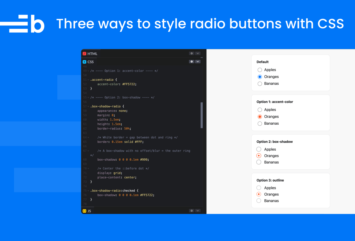
With some modern CSS, we can style radio buttons without JavaScript or extra markup. Below are three options with different trade-offs. Try them out in the CodePen:
See the Pen 3 ways to style radio buttons by Bryntum (@bryntum-snippets) on CodePen.
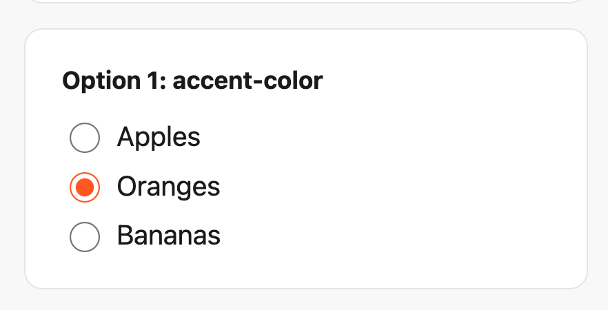
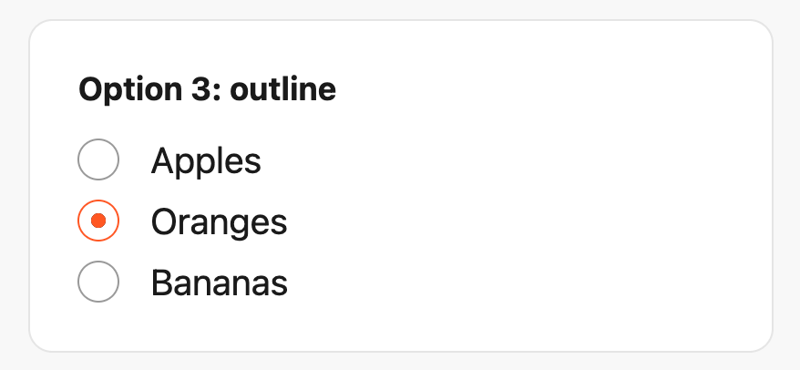
Using accent-color
This is the simplest option. The accent-color property tints native form elements with a single line of CSS. It’s supported in Chrome, Edge, and Firefox, with partial support in Safari.
.radio-label input[type="radio"] {
  accent-color: #FF5722;
}
You keep all default browser behavior, accessibility, and focus styles for free. The trade-off is that you can only change the color, nothing else.
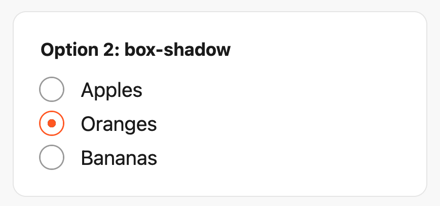
Using box-shadow
The fix below adds a few extras worth knowing about:
- Smooth animation: The dot uses a
::beforepseudo-element withtransform: scale(), so it scales in when selected instead of just appearing. - Printer-friendly: The dot is filled with
box-shadow: insetinstead ofbackground-color. Browsers tend to strip backgrounds when printing, but thebox-shadowcomes through. - Keyboard accessible: A
:focus-visibleoutline shows up when someone tabs to the radio, but not on mouse clicks. - Scalable: Everything is in
emunits instead ofpx, so the radio grows and shrinks with the surrounding font size.
First, we hide the native radio button with appearance: none, then rebuild its look with CSS. We use a white border as spacing between the dot and the outer ring, and use box-shadow for the ring itself. A ::before pseudo-element handles the checked dot, animated in with transform: scale().
Here’s the complete box-shadow solution with comments explaining each part:
.radio-label input[type="radio"] {
  appearance: none;
  margin: 0;
  width: 1.15em;
  height: 1.15em;
  border-radius: 50%;

  /* White border = gap between dot and ring */
  border: 0.15em solid #FFF;

  /* A box-shadow with no offset/blur = the outer ring */
  box-shadow: 0 0 0 0.1em #999;

  /* Center the ::before dot */
  display: grid;
  place-content: center;
}

/* Checked: recolor the ring */
.radio-label input[type="radio"]:checked {
  box-shadow: 0 0 0 0.1em #FF5722;
}

/* The checked dot (hidden by default) */
.radio-label input[type="radio"]::before {
  content: "";
  width: 0.55em;
  height: 0.55em;
  border-radius: 50%;
  transform: scale(0);
  transition: 120ms transform ease-in-out;

  /* Using box-shadow instead of background so it prints */
  box-shadow: inset 1em 1em #FF5722;

}

.radio-label input[type="radio"]:checked::before {
  transform: scale(1);
}

/* Keyboard focus ring */
.radio-label input[type="radio"]:focus-visible {
  outline: max(2px, 0.1em) solid currentColor;
  outline-offset: max(2px, 0.1em);
}
Using box-shadow works in all modern browsers. One thing to watch out for is that the box-shadow can get clipped by a container’s overflow. If that happens, add a small margin around the input to fix it.
Using outline
Nearly identical to the box-shadow method, this approach also uses appearance: none to hide the native button and adds a white border as spacing directly around the dot. Here, however, we use outline for the outer ring instead. When we first published this article in 2022, outlines didn’t follow border-radius in Safari. That long-standing WebKit bug was fixed in Safari 16.4, making this the cleanest option of the three.
Here’s the complete outline solution:
.radio-label input[type="radio"] {
  appearance: none;
  margin: 0;
  width: 1.15em;
  height: 1.15em;
  border-radius: 50%;
  border: 0.15em solid #FFF;

  /* Outline for the ring (doesn't affect layout) */
  outline: 0.1em solid #999;
  outline-offset: -0.05em;

  display: grid;
  place-content: center;
}

.radio-label input[type="radio"]::before {
  content: "";
  width: 0.55em;
  height: 0.55em;
  border-radius: 50%;
  transform: scale(0);
  transition: 120ms transform ease-in-out;
  box-shadow: inset 1em 1em #FF5722;
  background-color: CanvasText;
}

.radio-label input[type="radio"]:checked {
  outline-color: #FF5722;
}

.radio-label input[type="radio"]:checked::before {
  transform: scale(1);
}

/* Since outline is taken, use box-shadow for the focus ring */
.radio-label input[type="radio"]:focus-visible {
  outline-color: currentColor;
  box-shadow: 0 0 0 max(2px, 0.1em) currentColor;
}
The outline approach has full cross-browser support (including Safari 16.4 and later), scales with font size, and doesn’t affect layout.
Theming with currentColor
All the approaches above use em units, so they scale with font size. You can take this further by replacing hardcoded colors with currentColor, which lets you theme a whole group by changing one color value:
.radio-label {
  color: rebeccapurple;
}

.radio-label input[type="radio"] {
  outline: 0.1em solid currentColor;
}

.radio-label input[type="radio"]::before {
  box-shadow: inset 1em 1em currentColor;
}
Keep it accessible
Whichever approach you choose:
- Use
:focus-visiblefor a keyboard focus ring. Never remove focus styles without an alternative. - Maintain a contrast ratio of at least 3:1 between the ring and the dot (WCAG 2.1 SC 1.4.11).
- Add
background-color: CanvasTexton the::beforedot so it stays visible in Windows High Contrast Mode. - Use
appearance: noneto hide the native radio button. Never usedisplay: none, which removes the native radio button from the accessibility tree.
What about the future?
The Open UI initiative is working toward making all form controls natively styleable. Their first result shipped in late 2024: customizable <select> elements in Chrome. That work hasn’t extended to radio buttons yet, so the techniques in this article remain the standard approach.
Which one should you use?
Now that Safari supports outlines following border-radius, the outline approach is the best default choice. It’s fully customizable, doesn’t affect layout, scales with font size, and works everywhere.
The box-shadow approach is still good if you need to support browsers before Safari 16.4, or if you want to keep the default focus outline.
If you just need a quick brand color tweak, accent-color gets the job done in one line.
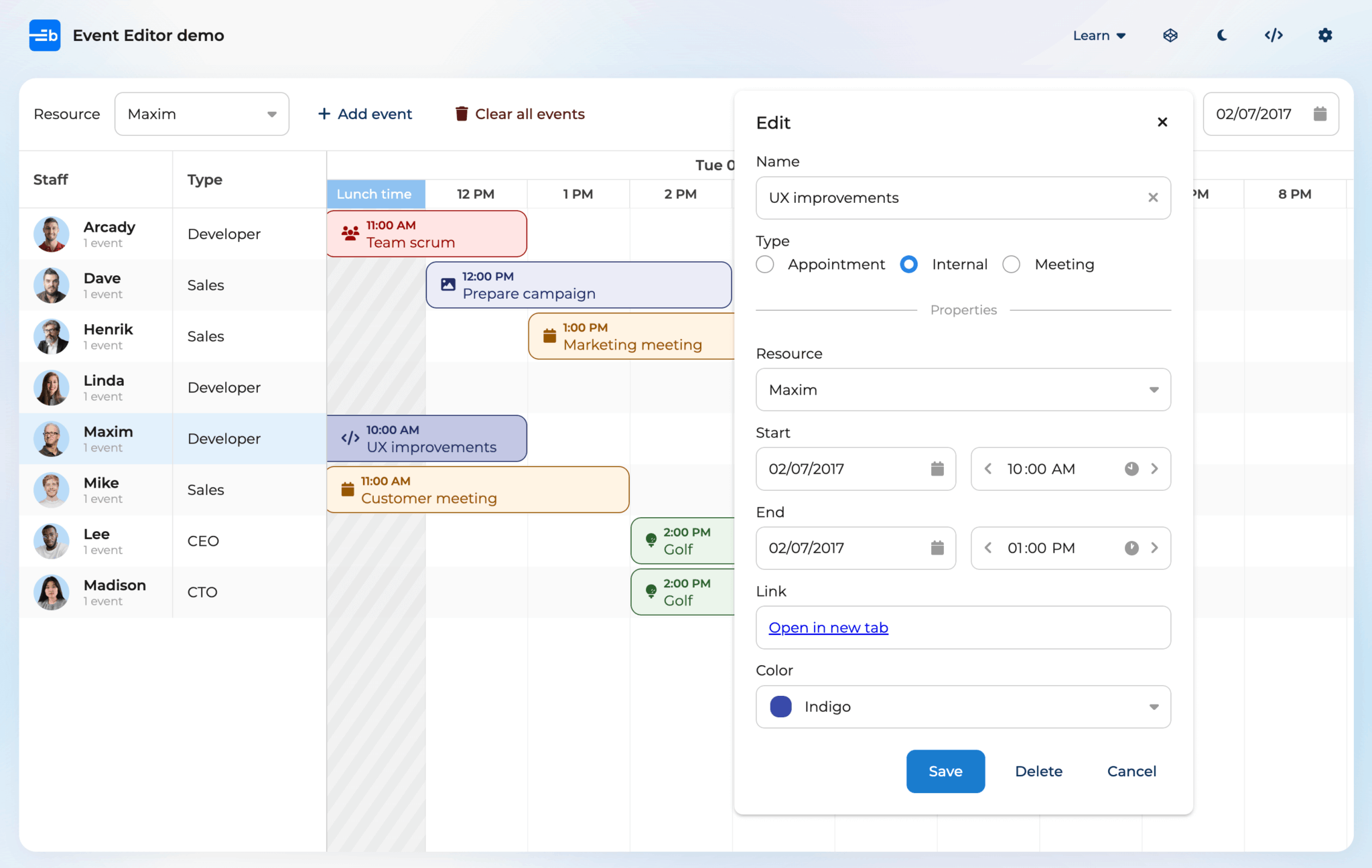
At Bryntum, we use the box-shadow technique in our Radio button widget for its reliable cross-browser appearance. You can see it in action in the Scheduler Pro Event Editor dialog.