Integrating Bryntum Calendar with Highcharts

The Bryntum Calendar is a modern, high-performance calendar component offering multiple views out of the box. Built with pure JavaScript, it integrates seamlessly with React, Angular, and Vue applications.
In this guide, you’ll learn how to integrate Bryntum Calendar with Highcharts, a powerful JavaScript charting library for building interactive, responsive, and accessible data visualizations. We’ll combine both libraries to create a unified view where calendar data is visualized in dynamic charts, enabling deeper insights directly from your scheduling data.
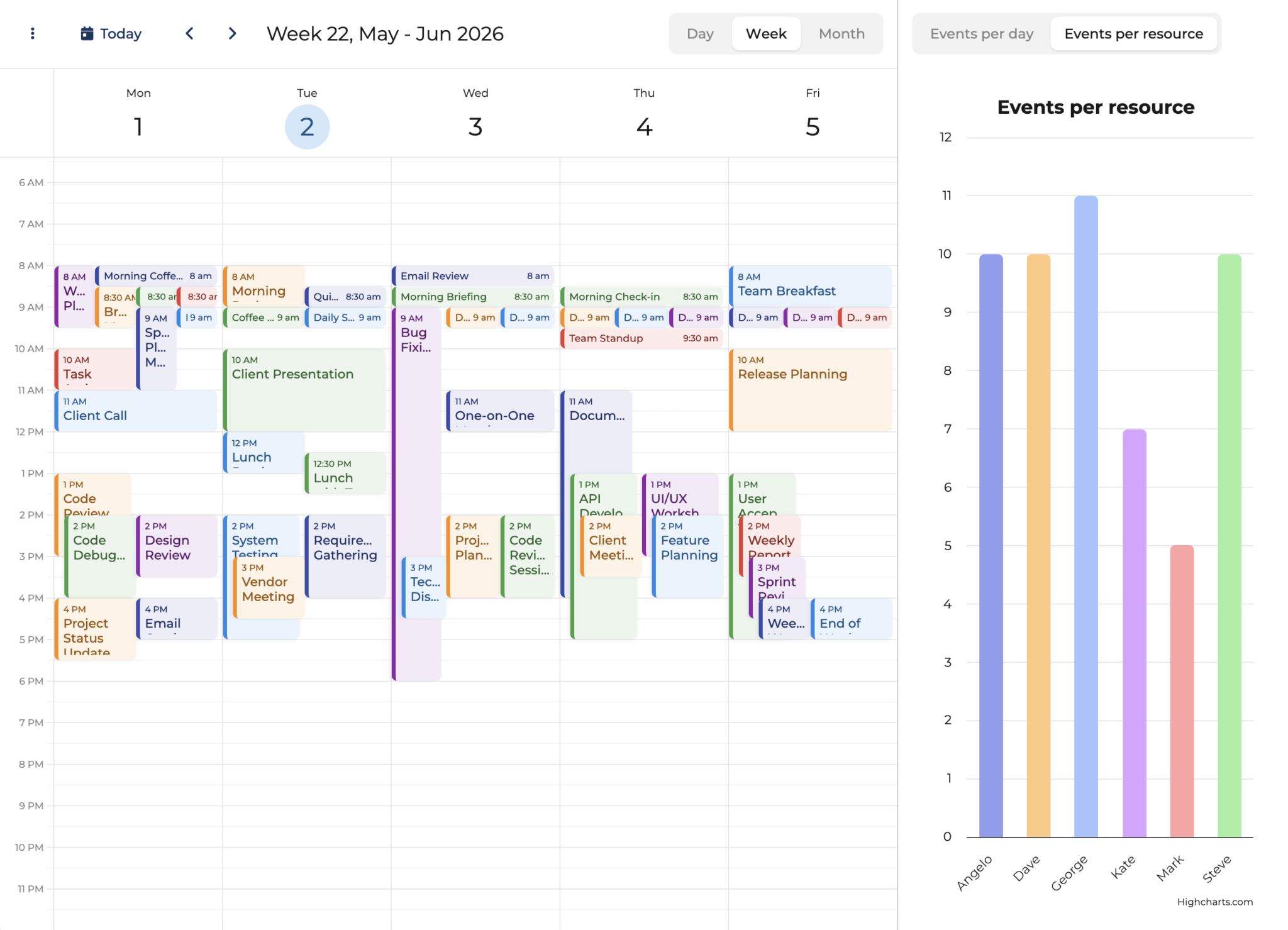
By the end of this tutorial, you’ll have a Bryntum Calendar with an interactive chart panel beside it, similar to the following:
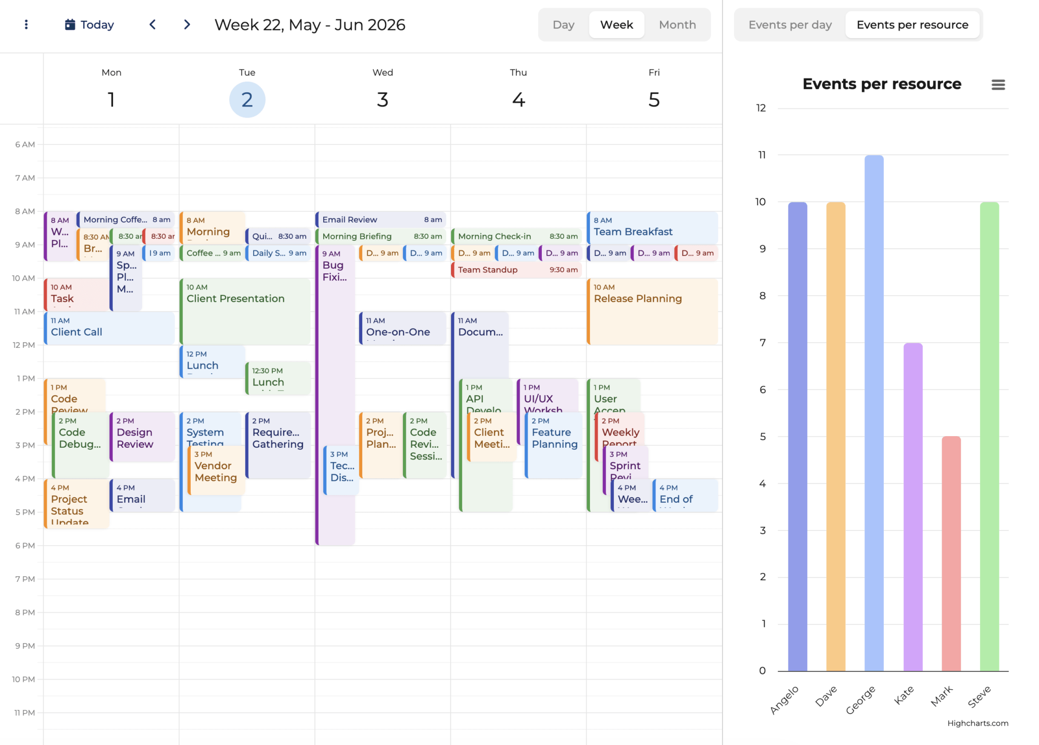
The application provides:
- Dual visualization: Calendar view for scheduling, chart view for analytics
- Real-time synchronization: Charts update automatically when calendar data changes
- Rich tooltips: Detailed event information directly in chart hovers
- Theme compatibility: Seamless adaptation to light and dark modes
- Export capabilities: Print and download charts in multiple formats (via the hamburger menu)
- Responsive layout: Resizable panels with a splitter for optimal viewing
You can explore the complete, working demo on the Bryntum website: Calendar with Highcharts. This demo showcases the final result of the integration you’ll build in this guide.
Getting Started
We’ll begin by creating a vanilla JavaScript project. While Bryntum Calendar works excellently with React, Angular, and Vue, we’ll use vanilla JavaScript to keep the focus on the integration itself.
Clone the Starter Template
We’ve prepared a starter template based on Vite that includes the basic project structure and configuration. Clone it from GitHub:
git clone https://github.com/bryntum/bryntum-calendar-highcharts.git

cd bryntum-calendar-highcharts
This starter template includes:
- Vite configuration for fast development
- Project structure with proper folders (
lib/,data/,resources/) - Sample calendar data
- HTML template with the required container element
Install Dependencies
First, install the project dependencies including Highcharts:
npm installNext, install Highcharts
npm install highchartsInstall Bryntum Calendar
Bryntum components are licensed commercial products, but you can use the free trial version for this tutorial.
For the trial version:
npm install @bryntum/calendar@npm:@bryntum/calendar-trialFor licensed users:
npm install @bryntum/calendarRun the Development Server
Start the Vite development server:
npm run devYour application will be available at http://localhost:5173/.
Create the Custom Highcharts Widget
First, we’ll create a custom Bryntum widget that wraps Highcharts. Create lib/HighchartsWidget.js:
import { Widget } from '@bryntum/calendar';
import Highcharts from 'highcharts';

export default class HighchartsWidget extends Widget {
    static $name = 'Chart';
    static type = 'chart';

    static configurable = {
        chartOptions : null
    };

    compose() {
        return {
            class    : 'b-chart',
            style    : 'width:100%;height:100%;',
            children : {
                chartElement : {
                    tag   : 'div',
                    class : 'b-highcharts-container',
                    style : 'width:100%;height:100%;'
                }
            }
        };
    }

    renderChart() {
        if (!this.chartElement) {
            return;
        }

        const options = this._chartOptions || this.chartOptions || {};
        this.chart = Highcharts.chart(this.chartElement, options);
    }

    changeChartOptions(options) {
        this._chartOptions = Highcharts.merge(
            this._chartOptions || {},
            options || {}
        );
        if (this.chart) {
            this.chart.update(options, true, true);
        }
        else {
            this.renderChart();
        }
    }

    doDestroy() {
        if (this.chart) {
            this.chart.destroy();
            this.chart = null;
        }
        super.doDestroy();
    }
}

HighchartsWidget.initClass();
This widget extends Bryntum’s Widget class and provides:
- A container element for the Highcharts chart
- Methods to render and update the chart dynamically
- Proper cleanup when the widget is destroyed
Creating the Calendar and Chart Panel Component
Set Up the Main Container
First, create the container with a horizontal box layout in main.js:
import { DateHelper, Container, Splitter } from '@bryntum/calendar';
import Highcharts from 'highcharts';
import './lib/HighchartsWidget.js';
import './style.css';

const container = new Container({
    appendTo : 'app',
    cls      : 'outer-container',
    flex     : 1,
    layout   : {
        type : 'hbox'
    },
    resourceImagePath : '/users/',
    items : {
        // Calendar and chart panel will go here
    }
});
This container uses an hbox layout to position the calendar and chart side by side. The resourceImagePath points to user avatar images for display in tooltips.
Configure the Calendar
Add the calendar configuration inside the items object:
calendar : {
    type    : 'calendar',
    date    : '2026-06-02',
    flex    : 2.5,
    sidebar : {
        collapsed      : true,
        resourceFilter : {
            filterResources : true,
            onChange        : ({ value }) => {
                updateChart(value);
            }
        }
    },
    crudManager : {
        loadUrl       : 'data/data.json',
        autoLoad      : true,
        resourceStore : {
            fields : ['barColor']
        },
        listeners : {
            load() {
                updateChart();
            },
            hasChanges() {
                updateChart();
            }
        }
    },
    modes : {
        year   : false,
        agenda : false
    },
    hideNonWorkingDays : true,
    listeners          : {
        dateChange({ source }) {
            source.eventStore.count && updateChart();
        }
    }
},
Key calendar features:
- Data loading: Uses
crudManagerto load calendar data fromdata/data.json - Resource filtering: Triggers chart updates when filtering resources
- View modes: Disables year and agenda views, keeping only day, week, and month
- Event listeners: Updates the chart when data loads, changes, or when navigating dates
- Flex sizing: Uses
flex: 2.5to take up more space than the chart panel
Configure the Chart Panel
Add the chart panel configuration after the calendar:
chartPanel : {
    type     : 'panel',
    flex     : 1,
    minWidth : 400,
    layout   : 'fit',
    items    : {
        chart : {
            type         : 'chart',
            chartOptions : {
                chart : {
                    type  : 'column',
                    style : {
                        fontFamily : 'inherit'
                    }
                },
                legend : {
                    enabled : false
                },
                yAxis : {
                    title : {
                        text : ''
                    }
                },
                tooltip : {
                       useHTML : true,
                       style   : {
                           fontSize   : '14px',
                           lineHeight : '1.6'
                       },
                       borderRadius : 10,
                       padding      : 20,
                       shadow       : {
                           color   : 'rgba(0, 0, 0, 0.12)',
                           offsetX : 0,
                           offsetY : 1,
                           width   : 5,
                           opacity : 1
                       }
                },
                plotOptions : {
                    column : {
                        borderWidth  : 2,
                        borderColor  : 'transparent',
                        borderRadius : 5,
                        animation    : {
                            duration : 500
                        }
                    }
                },
                series : [{ name : 'Events' }]
            }
        }
    },
    tbar : {
        items : {
            datasetButtons : {
                type        : 'buttongroup',
                toggleGroup : true,
                rendition   : 'padded',
                items       : {
                    perDay      : { text : 'Events per day', value : 'perDay' },
                    perResource : {
                        text    : 'Events per resource',
                        value   : 'perResource',
                        pressed : true
                    }
                },
                onToggle({ pressed }) {
                    if (pressed) {
                        updateChart();
                    }
                }
            }
        }
    }
}
Add a Splitter
To allow users to dynamically resize the calendar and chart panels, add a splitter between them. Place this in the items object between the calendar and chart panel configurations:
splitter : {
    type : 'splitter'
},
The splitter provides:
- Interactive resizing: Users can drag the splitter to adjust the relative sizes of the calendar and chart
- Visual indicator: A clear divider line that shows where users can click and drag
- Flexible layout: Works seamlessly with the horizontal box layout to maintain proper proportions
With all three components configured (calendar, splitter, and chart panel), your container is now complete and ready to display the integrated calendar and chart visualization.
Implementing the Chart Update Logic
The chart needs data from Calendar on the load. It also needs to refresh the data on any changes. To make it easy, we will write a function that we can call on different actions.
Add the following function before the Container :
const updateChart = filteredResources => {
    const
        { datasetButtons, chart, calendar }       = container.widgetMap,
        { resourceStore, eventStore, activeView } = calendar,
        { startDate, endDate }                    = activeView,
        days                                      = DateHelper.diff(startDate, endDate, 'day'),
        datasetName                               = datasetButtons.value;

    let data,
        chartTitle,
        accessibilityDescription,
        tooltipFormatter;

    switch (datasetName) {
        case 'perResource':
            chartTitle = 'Events per resource';
            accessibilityDescription =
                'Column chart showing the number of events per resource for the current calendar view.';

            // Count events per resource and store event references for tooltips
            data = (filteredResources || resourceStore.records)
                .map(resource => {
                    const resourceEvents = resource.events.filter(
                        event => event.startDate >= startDate && event.startDate <= endDate
                    );
                    return {
                        label  : resource.name,
                        value  : resourceEvents.length,
                        color  : resource.barColor,
                        events : resourceEvents
                    };
                })
                .sort((a, b) => a.label.localeCompare(b.label));
            break;

        case 'perDay':
            chartTitle = 'Events per day';
            accessibilityDescription = 'Column chart showing the number of events per day for the current calendar view.';

            data = [];
            for (let i = 0; i < days; i++) {
                const from = DateHelper.add(startDate, i, 'day'),
                    to   = DateHelper.add(from, 1, 'day');
                const dayEvents = eventStore.getEvents({
                    startDate : from,
                    endDate   : to
                });

                data.push({
                    label :
                        DateHelper.format(from, 'ddd') +
                        (activeView.isMonthView ? ' ' + DateHelper.format(from, ' D') : ''),
                    value : dayEvents.length,
                    color : '#a3eea3',
                    fullDayName :
                        DateHelper.format(from, 'dddd') +
                        (activeView.isMonthView ? ' ' + DateHelper.format(from, 'D') : ''),
                    dayEvents : dayEvents
                });
            }
            break;
    }

    const
        categories = data.map(d => d.label),
        seriesData = data.map(d => ({
            y           : d.value,
            color       : d.color,
            fullDayName : d.fullDayName,
            events      : d.events,
            dayEvents   : d.dayEvents
        }));

    chart.chartOptions = {
        title : {
            text : chartTitle
        },
        xAxis : {
            categories
        },
        tooltip : {
            formatter : tooltipFormatter
        },
        series : [{
            data : seriesData
        }],
        accessibility : {
            description : accessibilityDescription
        }
    };
};
This function:
- Retrieves references to the calendar, chart, and button group widgets
- Switches between two visualization modes: per-resource and per-day
- Processes calendar events and creates data arrays for Highcharts
- Stores additional event metadata for rich tooltips (we’ll implement these next)
- Updates the chart with the new configuration
Adding Rich Tooltips
Let’s implement a rich and informative tooltip for both chart views (per day and per resource).
Resource View Tooltip
Add this tooltip formatter in the perResource case block (after accessibilityDescription) in the updateChart:
tooltipFormatter = function() {
    const
        imagePath    = container.resourceImagePath +
                        this.point.category.toLowerCase() +
                        '.png',
        events       = this.point.events || [],
        totalMinutes = events.reduce((sum, e) =>
            sum + DateHelper.diff(e.startDate, e.endDate, 'minutes'), 0
        ),
        hours        = Math.floor(totalMinutes / 60),
        minutes      = totalMinutes % 60,
        timeDisplay  = minutes > 0 ? `${hours}h ${minutes}m` : `${hours}h`,
        totalEvents  = eventStore.getEvents({
            startDate, endDate
        }).length,
        eventList    = events.slice(0, 3).map(e =>
        `<li style="margin: 2px 0">${e.name} <span style="color: var(--b-neutral-40); margin-inline-start: 4px;">(${DateHelper.format(e.startDate, 'MMM D')})</span></li>`
        ).join('');

    return `<div>
        <div style="display: flex; align-items: center; gap: 10px; margin-block-end: 8px;">
            <img class="b-resource-avatar b-resource-image" style="background-color:${this.point.color}" src="${imagePath}"></img>
            <b>${this.point.category}</b>
        </div>
        <div>
            ${this.series.name}: <b>${this.point.y}</b> <span style="color: var(--b-neutral-40)">of ${totalEvents}</span><br/>
            <span style="color: var(--b-neutral-30);">Total hours: ${timeDisplay}</span><br/>
            ${events.length > 0 ? `<ul style="margin: 8px 0; padding-left: 20px;">${eventList}</ul>` : ''}
            ${events.length > 3 ? `<i style="color: var(--b-neutral-40);">...and ${events.length - 3} more</i>` : ''}
        </div>
    </div>`;
};
This tooltip displays:
- Resource avatar with their assigned color
- Event count with context (e.g., “5 of 20”)
- Total hours worked in human-readable format (e.g., “15h 30m”)
- List of first 3 events with dates
- Indicator for additional events
Day View Tooltip
Add this tooltip formatter in the perDay case block:
tooltipFormatter = function() {
    const
        fullDayName       = this.point.fullDayName || this.point.category,
        dayEvents         = (this.point.dayEvents || []).sort((a, b) => a.startDate - b.startDate),
        uniqueResources   = new Set(dayEvents.map(e => e.resourceId).filter(Boolean));

    let timeRange = '';
    if (dayEvents.length > 0) {
        const
            earliest = new Date(Math.min(...dayEvents.map(e => e.startDate))),
            latest   = new Date(Math.max(...dayEvents.map(e => e.endDate)));
        timeRange = `<span style="color: var(--b-neutral-30)">${DateHelper.format(earliest, 'HH:mm')} - ${DateHelper.format(latest, 'HH:mm')}</span>`;
    }

    const eventList = dayEvents.slice(0, 3).map(e =>
        `<li style="margin: 2px 0">${e.name}</li>`
    ).join('');

    return `<div>
        <b style="margin-block-end: 8px; display: inline-block;">${fullDayName}</b><br/>
        ${this.series.name}: <b>${this.point.y}</b><br/>
        ${uniqueResources.size > 0 ? `<span style="color: var(--b-neutral-30)">${uniqueResources.size} resource${uniqueResources.size > 1 ? 's' : ''}</span><br/>` : ''}
        ${timeRange ? `${timeRange}<br/>` : ''}
        ${dayEvents.length > 0 ? `<ul style="margin: 5px 0; padding-left: 20px;">${eventList}</ul>` : ''}
        ${dayEvents.length > 3 ? `<i style="color: var(--b-neutral-40);">...and ${dayEvents.length - 3} more</i>` : ''}
    </div>`;
};
This tooltip shows:
- Full day name (e.g., “Monday 8” in month view)
- Number of events on that day
- Count of resources involved
- Time range spanning from earliest to latest event
- List of first 3 events
- Indicator for additional events
The tooltips use Bryntum CSS variables (var(--b-neutral-30), etc.) to ensure they adapt correctly to light and dark themes.
Styling for Theme Compatibility
To ensure Highcharts looks great in both light and dark Bryntum themes, we need to add custom CSS that bridges the two libraries’ styling systems. Append the following to style.css file:
html, body {
    --highcharts-background-color : var(--b-neutral-100);
}

.highcharts-title,
.b-highcharts-container text {
    fill: var(--b-neutral-10) !important;
}

.highcharts-menu {
    background: var(--b-menu-background) !important;
    border-radius: var(--b-menu-border-radius) !important;
}

.highcharts-menu-item {
    color: var(--b-neutral-10) !important;
}

.highcharts-menu-item:hover {
    color: var(--b-neutral-30) !important;
    background-color: var(--b-primary-80) !important;
}

.highcharts-exporting-group rect {
    fill: var(--b-neutral-100) !important;
}

.highcharts-tooltip > span {
    color: var(--b-neutral-10) !important;
}

.highcharts-tooltip-box {
    fill: var(--b-neutral-100);
}

.highcharts-background {
    fill: var(--b-neutral-100) !important;
}
This CSS:
- Maps Highcharts elements to Bryntum CSS variables
- Ensures backgrounds, text colors, and UI elements adapt to theme changes
- Maintains consistent styling for tooltips, menus, and chart elements
- Works automatically with both light and dark themes
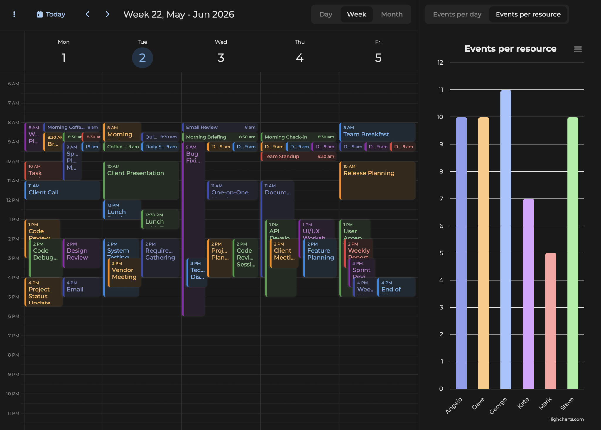
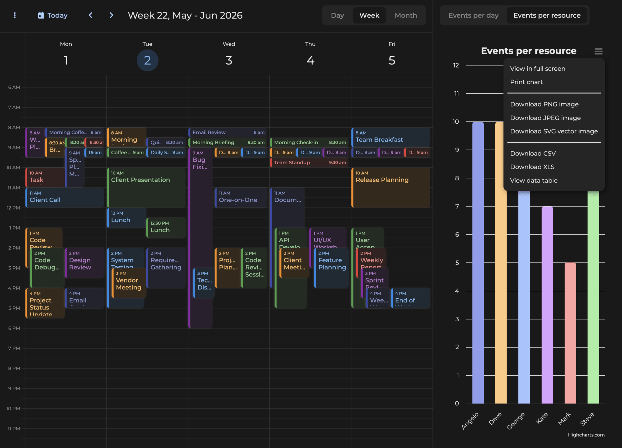
Testing Dark Mode: To see the theme compatibility in action, open style.css and change svalbard-light.css to svalbard-dark.css. You’ll notice that the chart background, text colors, tooltips, and export menu all adapt seamlessly to match the Bryntum theme, providing a cohesive user experience.
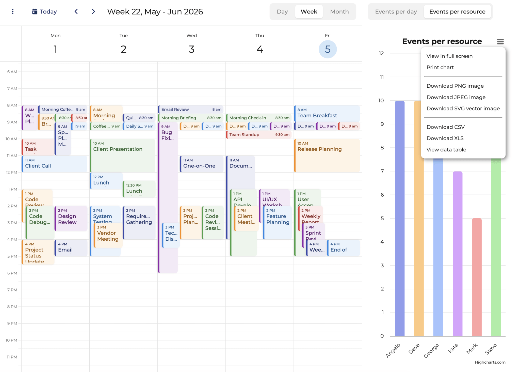
Print and Download Charts
To enable print and download functionality for your charts, you’ll need to add additional Highcharts modules. These modules provide a hamburger menu in the top-right corner of each chart, allowing users to export charts in various formats.
Add the following imports to your HighchartsWidget.js file (after the main Highcharts import):
// Import Highcharts modules as needed
import 'highcharts/modules/exporting.js';
import 'highcharts/modules/accessibility.js';
This will result in a hamburger menu appearing in the top-right corner of the charts, providing options to:
- Print the chart
- Download as PNG, JPEG, PDF, or SVG
Configure Highcharts Export Settings
To ensure proper font inheritance when exporting charts, add this event handler to lib/HighchartsWidget.js:
// Event handler to ensure font family is inherited for export
Highcharts.addEvent(Highcharts.Chart, 'init', function(e) {
    if (e.args[0].chart?.forExport) {
        e.args[0].chart.style = {
            fontFamily : window.getComputedStyle(
                document.getElementById('app')
            ).fontFamily
        };
    }
});
This event listener ensures that when charts are exported (as images or PDFs), they maintain the same font family as displayed in the browser, providing consistent typography across all output formats.
Running the Complete Application
With all the pieces in place, your application should now be running at http://localhost:5173/. If you stopped the dev server earlier, restart it:
npm run devConclusion
You’ve successfully integrated Bryntum Calendar with Highcharts using Vite and npm! If you’re new to Bryntum, we offer a 45-day free trial so you can fully explore our components and all their features before making a commitment. This gives you plenty of time to build and test your integration in a real-world environment.