Build a location-based scheduler with Bryntum Scheduler Pro, TanStack Table, Shadcn UI, and Mapbox
We strive to keep posts updated, but code samples may sometimes be outdated. Humans, see the Bryntum documentation; agents, https://mcp.bryntum.com for the latest info.
Bryntum Scheduler Pro is an advanced scheduling JavaScript UI component for the web. In this guide, we’ll show you how to integrate Bryntum Scheduler Pro with TanStack Table, a headless UI for building feature-rich JavaScript tables, and the map library, Mapbox GL JS.
You’ll learn to do the following:
- Add a map-view panel to a task scheduler, using Mapbox GL JS as an example map library to create an interactive map showing each task’s address.
- Add a TanStack Table, styled with Shadcn UI React components, to display unplanned tasks.
- Add drag-and-drop functionality so that tasks can be moved from the unplanned tasks table to the scheduler timeline.
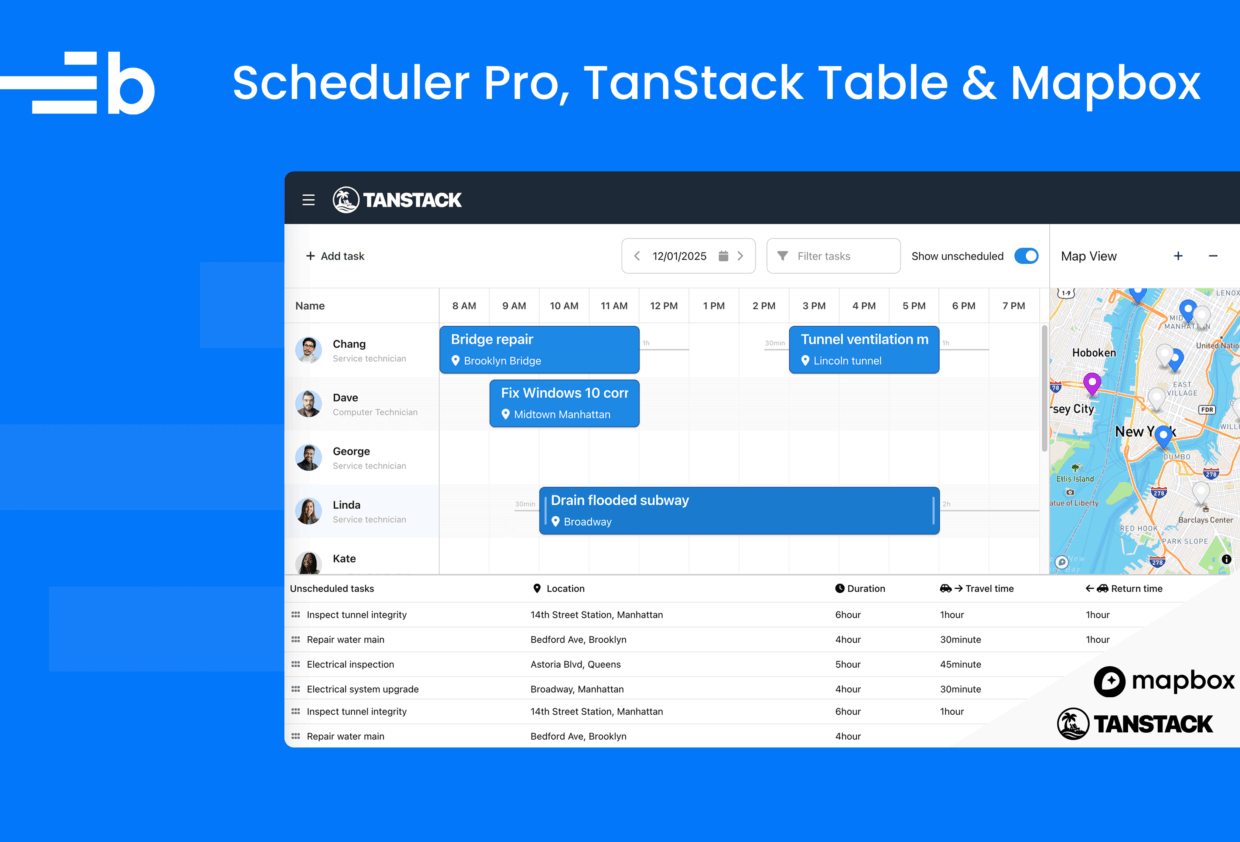
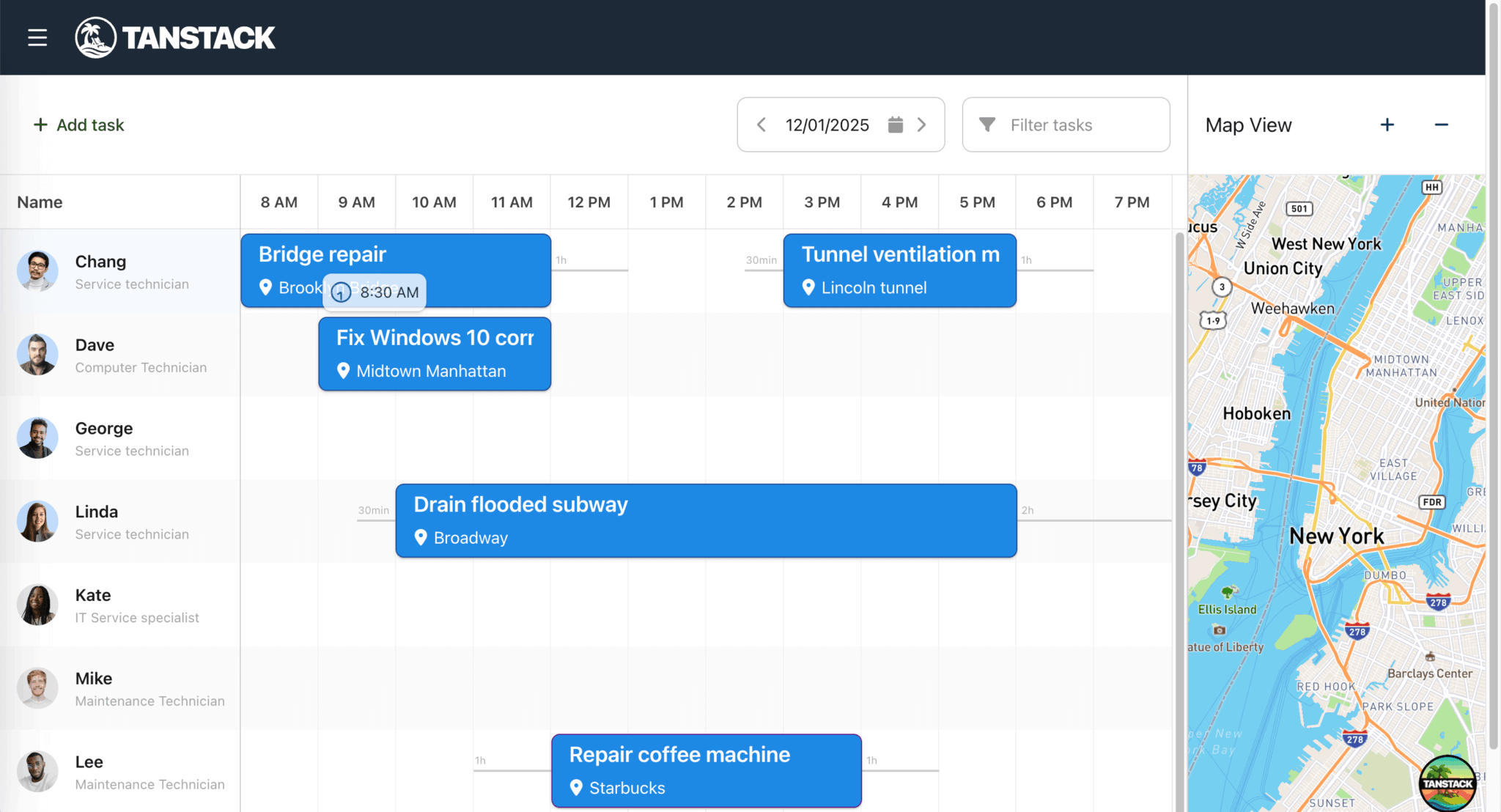
By the end of the tutorial, you’ll have a location-based task scheduler that looks like the image below:
This scheduler is similar to our maps integration demo, except it uses TanStack Table instead of Bryntum Grid.
You can find the code for the completed app in our GitHub repository on the completed-app branch.
Getting started
We’ll start by cloning the Scheduler Pro, TanStack Table, and Mapbox integration starter GitHub repository.
This starter app was created using the TanStack Start CLI with the following options:
- React
- TypeScript
- Tailwind CSS
- ESLint
- Deployment adapter: Nitro (agnostic)
- Add-ons: TanStack Table and Shadcn UI
The app also contains:
- Example data and resource images in the
publicfolder - A
schedulerTanStack Router route and error page - A link to the
schedulerroute in the navigation header (insrc/components/Header.tsx) - A Shadcn UI Table component (in
src/components/ui/table.tsx) - A TanStack Router route for the scheduler (in
src/routes/scheduler.tsx)
Install the dependencies using the following command:
npm installRun the development server using the following command:
npm run devOpen http://localhost:3000 and navigate to the Bryntum Scheduler Pro with TanStack Table route using the navigation header at the top left of the app. You’ll see a blank page with the text, TODO: Add Scheduler Pro.
Create a Bryntum Scheduler Pro React component
First, we’ll install the Bryntum Scheduler Pro component, add a custom event model, configure the component, and style it.
Install the Bryntum Scheduler Pro React component
If you’re using the free trial, install the public Bryntum trial packages:
npm install @bryntum/schedulerpro@npm:@bryntum/schedulerpro-trial @bryntum/schedulerpro-reactIf you have a Bryntum license, refer to our npm Repository Guide and install the licensed packages:
npm install @bryntum/schedulerpro @bryntum/schedulerpro-reactConfigure the Scheduler Pro component
Let’s configure the Scheduler Pro component, which defines the appearance, behavior, and features of the task scheduler.
Create a schedulerProConfig.ts file in the src folder and add the following lines of code to it:
import { StringHelper } from '@bryntum/schedulerpro';
import type Task from './lib/Task';
import type { BryntumSchedulerProProps } from '@bryntum/schedulerpro-react';

export const schedulerproProps: BryntumSchedulerProProps = {
    startDate    : new Date(2025, 11, 1, 8),
    endDate      : new Date(2025, 11, 1, 20),
    flex         : 8,
    minHeight    : 0,
    rowHeight    : 80,
    barMargin    : 4,
    eventStyle   : 'bordered',
    collapsible  : true,
    header       : false,
    allowOverlap : false,

    viewPreset : {
        tickWidth         : 20,
        displayDateFormat : 'LST',
        shiftIncrement    : 1,
        shiftUnit         : 'day',
        timeResolution    : {
            unit      : 'minute',
            increment : 30
        },
        headers : [
            {
                unit       : 'hour',
                dateFormat : 'LST'
            }
        ]
    },

    resourceImagePath : 'users/',

    columns : [
        {
            type           : 'resourceInfo',
            text           : 'Name',
            width          : 230,
            showEventCount : false,
            showRole       : true
        }
    ],
    stripeFeature      : true,
    eventBufferFeature : true,
    taskEditFeature : {
        items : {
            generalTab : {
                items : {
                    resourcesField : {
                        required : true
                    },
                    preambleField : {
                        label : 'Travel to'
                    },
                    postambleField : {
                        label : 'Travel from'
                    }
                }
            }
        }
    },

    eventRenderer({ eventRecord }) {
        const task = eventRecord as Task;
        return [
            {
                tag       : 'span',
                className : 'event-name',
                html      : StringHelper.encodeHtml(task.name)
            },
            {
                tag       : 'span',
                className : 'location',
                children  : [
                    task.shortAddress
                        ? {
                            tag       : 'i',
                            className : 'fa fa-map-marker-alt'
                        }
                        : null,
                    task.shortAddress || ' '
                ]
            }
        ];
    }
};
This code configures the component as follows:
- The
startDateandendDateset the visible time range for a single day (8 AM to 8 PM). - The
rowHeightandbarMargincontrol the visual size. TheallowOverlap: falsesetting prevents tasks from overlapping. - The
viewPresetconfigures the time axis headers to show the hours of the day in one-hour intervals. - The
columnsarray defines the resource information column with role icons. - The
resourceImagePathis set to theusersfolder in thepublicfolder. - The
stripeFeatureis enabled for row striping. - The
eventBufferFeatureis enabled to show travel time between tasks. - The custom
eventRendererdisplays the task, location icon, and the shortened address name on the task’s event bar.
It also imports a custom event model, Task.
Create a custom event model
Let’s create the Task custom event model we imported in the Scheduler Pro component.
Create a Task.ts file in src/lib and add the following lines of code to it:
import { type Duration, EventModel } from '@bryntum/schedulerpro';
import type Address from './Address';

export default class Task extends EventModel {
    declare address: Address;
    declare preamble: Duration;
    declare postamble: Duration;
    declare duration: number;

    static get fields() {
        return [
            { name : 'address', type : 'object' },
            { name : 'duration', type : 'number', defaultValue : 1 },
            { name : 'durationUnit', defaultValue : 'h' }
        ];
    }

    get shortAddress() {
        return (this.address?.display_name || '').split(',')[0];
    }
}
This custom Task model extends the base Bryntum EventModel, imports a custom Address model, and adds a custom address field. It also adds duration and durationUnit fields to set the default duration for tasks to 1 hour and the default duration unit to hours. The shortAddress() method returns the first word of the address’s display_name.
Create a custom address model and address-search field
Now, let’s create the custom Address model.
Create an Address.ts file in the src/lib folder and add the following lines of code to it:
import { Model } from '@bryntum/schedulerpro';

// The data model for a task address
export default class Address extends Model {
    declare place_id: string;
    declare display_name?: string;
    declare lat: number;
    declare lon: number;

    static override idField = 'place_id'; // The identifier Mapbox uses for its places

    static get fields() {
        return [
            { name : 'place_id', type : 'string' },
            { name : 'display_name', type : 'string' },
            { name : 'lat', type : 'number' },
            { name : 'lon', type : 'number' }
        ];
    }
}
Here, we create a custom Model to define the data fields of the custom Address field that we’ll add to the task editor.
In the src/lib folder, create an AddressSearchField.ts file and add the following lines of code to create a custom address-search field input:
import { type AjaxStoreConfig, type CollectionFilter, Combo, type ComboConfig } from '@bryntum/schedulerpro';
import Address from './Address';

// A custom remote search field, querying OpenStreetMap for addresses.
export default class AddressSearchField extends Combo {
    // Factoryable type name
    static override type = 'addresssearchfield';

    static override $name = 'AddressSearchField';

    static get configurable(): ComboConfig {
        return {
            clearWhenInputEmpty : true,
            clearable           : true,
            displayField        : 'display_name',
            // Setting the value field to null indicates we want the Combo to get/set address *records* as opposed to the
            // id of an address record.
            valueField          : null,
            filterOnEnter       : true,
            filterParamName     : 'q',
            store               : {
                modelClass : Address,
                readUrl    : 'https://nominatim.openstreetmap.org/search',
                encodeFilterParams(filters: Array<CollectionFilter>) {
                    return filters[0].value;
                },
                params : {
                    format : 'json'
                },
                fetchOptions : {
                    // Please see MDN for fetch options: https://developer.mozilla.org/en-US/docs/Web/API/WindowOrWorkerGlobalScope/fetch
                    credentials : 'omit'
                }
            } as AjaxStoreConfig,
            // Addresses can be long
            pickerWidth    : 450,
            validateFilter : false,
            listCls        : 'address-results',
            // Custom list item template to show a map icon with lat + lon
            listItemTpl    : (record) => {
                const address = record as Address;
                return `<i class="fa fa-map-marker-alt"></i>
                    <div class="address-container">
                        <span class="address-name">${address.display_name}</span>
                        <span class="lat-long">${address.lat}°, ${address.lon}°</span>
                    </div>
                `;
            }
        };
    }
}

AddressSearchField.initClass();
This custom AddressSearchField is a customized Combo (dropdown) widget that uses the Nominatim API to query location data using an address. In it, we apply CSS classes for styling the address field (which we’ll soon define in the src/style.css file).
We use the listCls property to style the returned address results that users can select from and the listItemTpl template string to render each list item of those returned address results.
In src/schedulerProConfig.ts, import the AddressSearchField.ts file to add the custom address-search field to the scheduler task editor:
import './lib/AddressSearchField';In the taskEditFeature config, add the following address field right below the resourcesField:
addressField : {
    type   : 'addresssearchfield',
    label  : 'Address',
    name   : 'address',
    weight : 100
},
The weight property determines the order of the fields in the task editor. We set it to 100, so that it is displayed below the nameField. You can see a table of the weights of the default fields in the general tab of the task editor.
Create a Scheduler Pro React component
In the src/components folder, create a SchedulerPro.tsx file and add the following lines of code to it:
import { forwardRef } from 'react';
import { BryntumSchedulerPro } from '@bryntum/schedulerpro-react';
import { schedulerproProps } from '@/schedulerProConfig';

const SchedulerPro = forwardRef<BryntumSchedulerPro, any>((props, ref) => {
    return <BryntumSchedulerPro ref={ref} {...schedulerproProps} {...props} />;
});

SchedulerPro.displayName = 'SchedulerPro';

export default SchedulerPro;
Render the Scheduler Pro in the scheduler route
Next, we’ll render the Scheduler Pro in the scheduler route.
Replace the content in the src/routes/scheduler.tsx file with the following lines of code:
import { useRef } from 'react';
import { createFileRoute } from '@tanstack/react-router';
import { type BryntumSchedulerPro,BryntumSchedulerProProjectModel } from '@bryntum/schedulerpro-react';
import SchedulerPro from '@/components/SchedulerPro';
import Task from '@/lib/Task';

import '@bryntum/schedulerpro/fontawesome/css/fontawesome.css';
import '@bryntum/schedulerpro/fontawesome/css/solid.css';
import '@bryntum/schedulerpro/schedulerpro.css';
import '@bryntum/schedulerpro/svalbard-light.css';

export const Route = createFileRoute('/scheduler')({
    component : Scheduler,
    // Disable SSR for this route since Bryntum is a client-side component
    ssr       : false
});

function Scheduler() {
    const schedulerproRef = useRef<BryntumSchedulerPro>(null);
    const projectRef = useRef<BryntumSchedulerProProjectModel>(null);

    return (
        <>
            <BryntumSchedulerProProjectModel
                ref={projectRef}
                autoLoad={true}
                loadUrl="data/data.json"
                eventModelClass={Task}
                validateResponse={true}
            />

            <div className="demo-app">
                <div id="content" className="b-side-by-side">
                    <SchedulerPro
                        ref={schedulerproRef}
                        project={projectRef}
                    />
                </div>
            </div>
        </>
    );
}
In this code, we import the Bryntum Scheduler and the CSS for the Svalbard light theme (one of the four available themes with light and dark variants).
You can also create custom themes. The structural CSS and themes have separate imports. You can read more about styling the Scheduler Pro in our docs.
There are several ways to populate the project data stores. Here, we bind the example data.json data in the public/data file to a standalone BryntumSchedulerProProjectModel using the loadUrl property. This approach is suitable for more complex applications that use two or more Bryntum components with a common project, or in our case, that share the same project instance data between a Scheduler Pro and a TanStack Table.
Style the Scheduler Pro
In the src/styles.css file, add the following styles for the Scheduler Pro layout, event bar, and address-search field:
.demo-app {
    display: flex;
    flex-direction: column;
    height: 100vh;
}

#content {
    display: flex;
    flex-direction: row;
    flex: 1 1 100%;

    .b-resource-header {
        height: 100%;
    }
}

/* Ensure Bryntum resource images are visible - hidden by Tailwind image baseline styles - https://tailwindcss.com/docs/preflight#images-are-block-level
Changing display: block back to display: inline-block so images work within the grid layout
Removing the max-width: 100% constraint with max-width: none so images don't get squeezed
The !important is needed because Tailwind's preflight applies to all img elements globally, so we need to override it specifically for Bryntum's grid cells.
*/
.b-grid-cell img,
.b-resource-info img {
    display: inline-block !important;
    max-width: none !important;
    vertical-align: middle;
}

.b-sch-event-wrap {
    --b-sch-event-box-shadow: var(--b-elevation-1);

    .b-sch-event-content {
        flex-direction: column;
        justify-content: center;
        align-items: flex-start;
    }

    &.b-style-bordered {
        --b-sch-event-background: var(--b-primary-50);
        --b-sch-event-hover-background: var(--b-primary-45);
        --b-sch-event-selected-background: var(--b-primary-40);
    }
}

.b-sch-event-content {
    display: flex;
    height: 100%;
    flex-direction: column;
    justify-content: space-evenly;
}

.event-name {
    font-size: 1.3em;
}

.location {
    display: block;
    margin-top: 0.3em;
    font-weight: normal;
}

.fa-map-marker-alt {
    margin-inline: 1px 0.4em;
}

.address-results .b-list-item i {
    font-size: 1.5em;
    margin: 0 0.7em 0 0.2em;
}

.address-container {
    display: flex;
    flex-direction: column;
}

.address-name {
    flex: 1;
    margin-bottom: 0.4em;
    font-size: 1.1em;
}

.lat-long {
    flex: 1;
    color: #bbb;
    font-size: 0.9em;
}
Run the local development server:
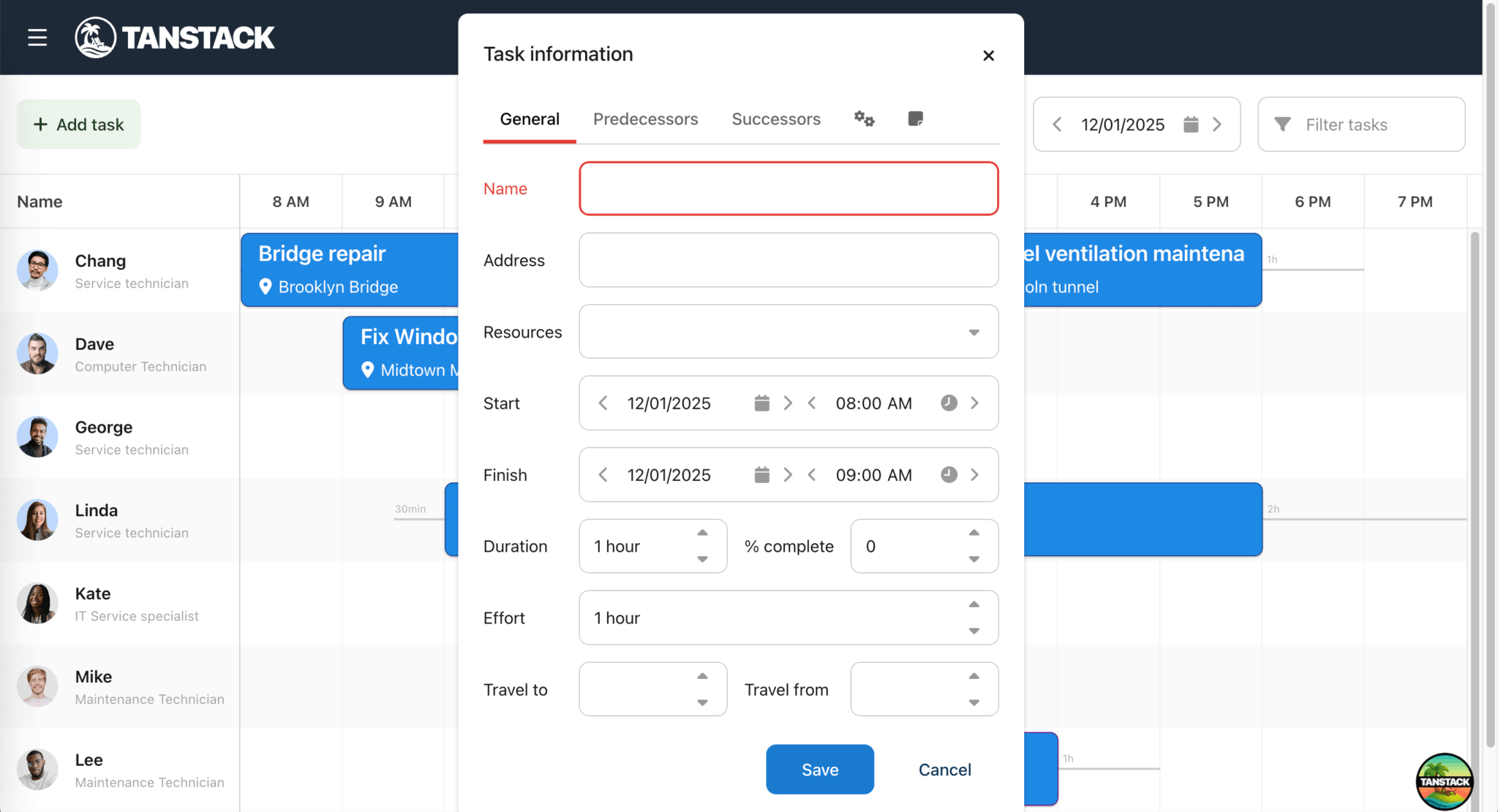
npm run devYou’ll see the Scheduler Pro with the example data. When you click on a task’s event bar to edit that task, you’ll see the custom address-search field with a dropdown input:
Add a toolbar for adding, filtering, and editing tasks
Let’s add a toolbar to the Scheduler Pro, so that the user can add and filter tasks and alter their time spans.
Add the following toolbar config to the schedulerproProps object in the src/schedulerProConfig.ts file:
tbar : [
    {
        text  : 'Add task',
        ref   : 'newEventButton',
        color : 'b-green',
        icon  : 'fa fa-plus'
    },
    '->',
    {
        type     : 'datefield',
        ref      : 'dateField',
        width    : 200,
        editable : false,
        step     : 1
    },
    {
        type                 : 'textfield',
        ref                  : 'filterByName',
        placeholder          : 'Filter tasks',
        clearable            : true,
        keyStrokeChangeDelay : 100,
        triggers             : {
            filter : {
                align : 'start',
                cls   : 'fa fa-filter'
            } as any
        }
    }
]
In this code, we add three toolbar items:
- A
newEventButtonfor adding a new task - A
dateFieldfor changing the time span - A
filterByNamefield for filtering tasks by name
To add the event handlers for the toolbar items (and make them functional), insert the following imports at the top of the src/routes/scheduler.tsx file:
import { useEffect } from 'react';
import { type DateField, DateHelper } from '@bryntum/schedulerpro';
Add the following event-handler functions to the Scheduler component:
const onDateFieldChange = ({ value, userAction }: { value: Date; userAction: boolean }) => {
    const scheduler = schedulerproRef.current?.instance;
    if (userAction && scheduler) {
        const startTime = DateHelper.add(value, 8, 'hour');
        const endTime = DateHelper.add(value, 20, 'hour');
        scheduler.setTimeSpan(startTime, endTime);
    }
};

const onFilterChange = ({ value }: { value: string }) => {
    const scheduler = schedulerproRef.current?.instance;
    if (scheduler) {
        const escapedValue = value.replace(/[.*+?^${}()|[\]\\]/g, '\\$&');
        scheduler.eventStore.filter({
            filters : (event: Task) => new RegExp(escapedValue, 'i').test(event.name),
            replace : true
        });
    }
};

const onNewEventClick = () => {
    const scheduler = schedulerproRef.current?.instance;
    const project = projectRef.current?.instance;
    if (scheduler && project) {
        const newTask = new (project.eventStore.modelClass as typeof Task)({
            startDate : scheduler.startDate
        });
        scheduler.editEvent(newTask);
    }
};
Add the following Effect hook to the Scheduler component to wire the event handlers to the toolbar items:
// Initialize components when both scheduler and project are ready
useEffect(() => {
    const schedulerPro = schedulerproRef.current?.instance,
        project = projectRef.current?.instance;

    if (schedulerPro && project) {

        // Wire events to widgets
        const widgetMap = schedulerPro.widgetMap;

        (widgetMap['dateField'] as DateField).value = schedulerPro.startDate;
        widgetMap['dateField'].on('change', onDateFieldChange);
        widgetMap['newEventButton'].on('click', onNewEventClick);
        widgetMap['filterByName'].on('change', onFilterChange);
    }
}, []);
This Effect hook initializes the toolbar widgets (components) when both the task scheduler and project are ready. When a user changes the date field or the filter field, or clicks the new event button, it calls the corresponding event-handler function.
In the src/styles.css file, add the following styles to the #content selector to style the toolbar:
> .b-panel .b-toolbar {
height: 6em;
border-bottom: 1px solid var(--b-grid-header-border-color);
--b-toolbar-background: var(--b-grid-header-background);
.widget-title {
display: flex;
align-items: center;
font-size: 1.2em;
}
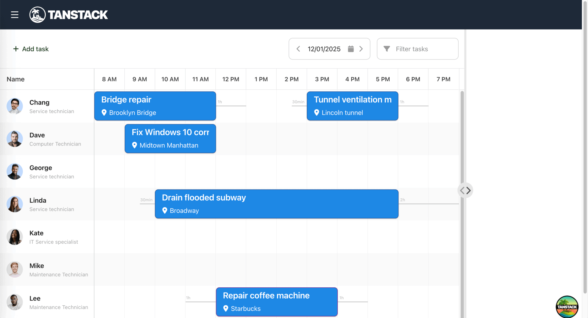
}When you run the local development server, you’ll see the toolbar with the new event button, date selector, and event name filter:
Create a custom map panel widget and check for browser WebGL support
Next, we need a custom Panel widget to contain our Mapbox map.
Create a new file called MapPanel.ts in the src/lib folder and add the following lines of code to it:
import { Panel, Toast } from '@bryntum/schedulerpro';
import type { constructParams } from './Types';

const detectWebGL = () => {
    try {
        const canvas = document.createElement('canvas');
        document.body.appendChild(canvas);
        const supported = Boolean(canvas.getContext('webgl'));
        canvas.remove();
        return supported;
    }
    catch (e) {
        return false;
    }
};

// A simple class containing a MapboxGL JS map instance
export default class MapPanel extends Panel {
    // Class properties
    static override type = 'mappanel';
    static override $name = 'MapPanel';

    // Lifecycle methods
    override construct(...args: Array<constructParams>) {

        super.construct(...args);

        if (!detectWebGL()) {
            Toast.show({
                html    : `ERROR! Can not show maps. WebGL is not supported!`,
                color   : 'b-red',
                style   : 'color:white',
                timeout : 0
            });
            return;
        }
    }
}

// Register this widget type with its Factory
MapPanel.initClass();
The detectWebGL function returns true if the browser supports WebGL and false if it doesn’t. The Mapbox GL JS library requires WebGL. If the browser doesn’t support WebGL, the widget displays an error message in a toast notification.
The MapPanel widget is a custom Panel widget class with additional methods. The static type property is the alias that can be used to reference the widget. The initClass() method registers the custom MapPanel widget with the Widget base class, which allows it to be created by type. We’ll add more methods to the MapPanel class when we add the Mapbox GL JS library.
Create a Types.ts file in the lib folder and add the following lines of code to it:
import type { EventStore, PanelConfig, PanelListeners, ResourceModel, TimeAxis } from '@bryntum/schedulerpro';

import type Task from './Task';

// MapPanel types
export interface MarkerConfig {
    color: string;
}

export interface PopupConfig {
    offset: [number, number];
}

// Bryntum types
type constructParamsListeners = PanelListeners & { markerclick: (params: { eventRecord: Task }) => void };

export type constructParams = PanelConfig & {
    appendTo: string;
    eventStore: EventStore;
    flex: number;
    listeners: constructParamsListeners;
    ref: string;
    timeAxis: TimeAxis;
};

// Extend Bryntum types
export type DragDropContext = {
    // Base DragHelper context properties
    element: HTMLElement;
    target: HTMLElement;
    grabbed: HTMLElement;
    relatedElements: Array<HTMLElement>;
    valid: boolean;
    newX: number;
    newY: number;

    // Custom properties
    task: Task;
    totalDuration: number;
    resourceRecord?: ResourceModel;
};
In the src/routes/scheduler.tsx file, add the following import so that you can add an instance of MapPanel and place it next to the scheduler timeline:
import { useState } from 'react';
import MapPanel from '@/lib/MapPanel';
import { BryntumSplitter } from '@bryntum/schedulerpro-react';
In the Scheduler component, add the following state variable:
const [mapPanel, setMapPanel] = useState<MapPanel>();In the useEffect, create a MapPanel instance within the if statement and save it in the state variable:
// Create MapPanel with 20% width (flex: 2 vs scheduler's flex: 8 = 20%)
const mapPanelInstance = new MapPanel({
    ref         : 'map',
    appendTo    : 'content',
    flex        : 2,
    collapsible : true,
    header      : false,
    eventStore  : schedulerPro.eventStore,
    timeAxis    : schedulerPro.timeAxis
} as any);

setMapPanel(mapPanelInstance);

// Cleanup function
return () => {
    mapPanelInstance.destroy?.();
};
This code appends the MapPanel to the div with an id of 'content', which contains the SchedulerPro component.
Add the following splitter widget directly below the SchedulerPro component:
<BryntumSplitter showButtons={true} />The Splitter widget allows us to resize the map panel.
You’ll now see a resizable custom MapPanel widget on the right-hand side of the scheduler timeline:
Create a Mapbox account and get a public key
To use any of the Mapbox tools, APIs, or SDKs, you need a Mapbox access token.
First, sign up for a Mapbox account if you don’t have one already. You can start using it for free, as Mapbox offers a generous free usage tier. You only pay for what you use with usage-based pricing. You can learn more about Mapbox invoicing and billing in their docs.
Log in to your Mapbox account and go to your Account overview in the Home tab. Your Tokens are on the right. Your account always has at least one public access token.
Copy the access token string, which starts with pk.. We’ll use it to make requests to Mapbox GL API endpoints.
Create a .env file in the root folder and add your access token string to it:
VITE_MAPBOX_ACCESS_TOKEN="pk.eyJ1Ijoi...."Install the Mapbox GL JS library and add a Mapbox map to the map panel
First, install the Mapbox GL JS library using npm:
npm install mapbox-gl- Import the Mapbox GL JS CSS styles in the
src/styles.cssfile:
@import 'https://api.mapbox.com/mapbox-gl-js/v1.12.0/mapbox-gl.css';- In
src/lib/MapPanel.ts, add the following imports:
import mapboxgl from 'mapbox-gl';
import { type ButtonConfig, type ButtonGroupConfig, type EventStore, type PanelConfig, TimeAxis, type WidgetConfig } from '@bryntum/schedulerpro';
import type Task from './Task';- Add the following
CustomTimeAxisclass below the imports and set the Mapbox access token:
class CustomTimeAxis extends TimeAxis {
    declare isTimeSpanInAxis: (eventRecord: Task) => boolean;
}

mapboxgl.accessToken = import.meta.env.VITE_MAPBOX_ACCESS_TOKEN;
The CustomTimeAxis class extends the TimeAxis class to add a custom type declaration. We set the Mapbox access token from the environment variable.
- Set the types for the variables at the top of the
MapPanelclass, below thestaticproperties:
declare map: mapboxgl.Map;
declare popup: mapboxgl.Popup;
declare lon: number;
declare lat: number;
declare zoom: number;
declare eventStore: EventStore;
declare timeAxis: CustomTimeAxis;- Next, add the following
configurable()Panelproperties to set the default map display (the map coordinates are for New York City):
// Configuration
static get configurable() {
    return {
        monitorResize : true,
        // Some defaults of the initial map display
        zoom          : 11,
        lat           : 40.7128,
        lon           : -74.006,
        textContent   : false,

        // Toolbar buttons
        tbar : [this.createTitleWidget(), this.createZoomButtonGroup()]
    } as PanelConfig;
}

constructor(args: constructParams) {
    super(args);
}- Add the following static methods for the toolbar widgets:
// Initialization methods
private static createTitleWidget = (): WidgetConfig => ({
    type : 'widget',
    cls  : 'widget-title',
    html : 'Map View',
    flex : 1
});

private static createZoomButtonGroup = (): ButtonGroupConfig => ({
    type        : 'buttonGroup',
    ref         : 'zoomGroup',
    toggleGroup : true,
    items       : [
        {
            icon    : 'fa fa-plus',
            onClick : 'up.onZoomIn'
        },
        {
            icon    : 'fa fa-minus',
            onClick : 'up.onZoomOut'
        }
    ] as Array<ButtonConfig>
});
The createTitleWidget displays the Map View title text and createZoomButtonGroup adds buttons for zooming in and out.
- Add the following zoom methods to the
MapPanelclass:
onZoomIn() {
    this.map.zoomIn();
}

onZoomOut() {
    this.map.zoomOut();
}- In the
constructlifecycle method, create amevariable set tothis(theMapPanelinstance) and call the parent constructor to initialize the panel:
const me = this;- Then get the panel’s content element and create the Mapbox map instance:
const mapContainerEl = me.contentElement;

me.map = new mapboxgl.Map({
    container : mapContainerEl,
    style     : 'mapbox://styles/mapbox/streets-v11',
    center    : [me.lon, me.lat],
    zoom      : me.zoom
});
This code initializes a new Mapbox map and adds it to the Map property of the MapPanel.
The map requires a map style. There are various Mapbox-owned styles to choose from, as you can see in the Mapbox styles table. The example above uses the Mapbox Streets style.
Feel free to change the map style by pasting in a different style URL. You can also follow the Mapbox tutorial to create your own map style using the Mapbox Studio style editor.
Restart the app. You can now see the Mapbox map displayed in the map panel:
Users can click and drag to pan across the map, use the mouse wheel scroll to zoom in and zoom out, or change the rotation and pitch of the map by clicking and dragging the cursor while holding down the right mouse button or the control key. You can also customize these user-interaction events. To learn more, see the User interaction handlers section in the Mapbox docs.
If you resize the map panel, it doesn’t resize the Mapbox map. To fix this, add the following method to the MapPanel class:
override onResize = () => {
    // This widget was resized, so refresh the Mapbox map
    this.map?.resize();
};
Now when a user resizes the map panel widget, the Mapbox map is also resized.
Add map markers for tasks
Let’s add map markers to the map to show the locations of different tasks. (In Bryntum Scheduler Pro, tasks are a type of event.)
In the src/lib/MapPanel.ts file, add the following event listener with a callback function in the construct() method:
// First load the map and then set up our event listeners for store CRUD and time axis changes
me.map.on('load', async() => {
    // code editor destroys created Widgets on editing code
    if (me.isDestroying) {
        return;
    }

    mapContainerEl.classList.add('maploaded');

    // await for the project commit to complete to have all data normalized before adding the markers
    // otherwise the `this.timeAxis.isTimeSpanInAxis(eventRecord)` check may fail in the
    // `addEventMarker()` method, because of the missing end date in the record
    await me.eventStore.project.commitAsync();

    me.onStoreChange({
        action  : 'dataset',
        records : me.eventStore.records,
        source  : me.eventStore,
        record  : me.eventStore.records[0],
        changes : {}
    });
    me.eventStore.on('change', me.onStoreChange, me);
});
Once the map has loaded, a change in the task scheduler’s event data causes it to call the onStoreChange method. We’ll define this method soon.
The object argument of this method includes an action property and a records property. The action is the name of the action that triggered the event. The possible action names are:
"remove""removeAll""add""updatemultiple""clearchanges""filter""update""dataset""replace"
Next, define the onStoreChange() method by adding the following lines of code below the construct() method:
// When data changes in the eventStore, update the map markers accordingly
async onStoreChange(event: Parameters<NonNullable<Exclude<StoreListeners['change'], string>>>[0]) {
    // await for the project commit to complete to have all data normalized before adding the markers
    await this.eventStore.project.commitAsync();

    switch (event.action) {
        case 'add':
        case 'dataset':
            if (event.action === 'dataset') {
                this.removeAllMarkers();
            }
            event.records.forEach((eventRecord) => this.addEventMarker(eventRecord as Task));
            break;

        case 'remove':
            event.records.forEach((eventRecord) => this.removeEventMarker(eventRecord as Task));
            break;

        case 'update': {
            const eventRecord = event.record as Task;

            if (!eventRecord) return;
            this.removeEventMarker(eventRecord);
            this.addEventMarker(eventRecord);

            break;
        }

        case 'filter': {
            const renderedMarkers: Array<Task> = [];

            this.eventStore
                .query((rec: Task) => rec.marker, true)
                .forEach((eventRecord) => {
                    if (!event.records.includes(eventRecord as Task)) {
                        this.removeEventMarker(eventRecord as Task);
                    }
                    else {
                        renderedMarkers.push(eventRecord as Task);
                    }
                });

            event.records.forEach((eventRecord) => {
                const task = eventRecord as Task;
                if (!renderedMarkers.includes(task)) {
                    this.addEventMarker(task);
                }
            });

            break;
        }
    }
}
This method updates the map markers when the tasks event store changes. The "dataset" action occurs when the event store is populated with the initial tasks from the data.json file.
Add the following addEventMarker(), removeEventMarker(), and removeAllMarkers() methods to the MapPanel class, below the onStoreChange() method:
addEventMarker(eventRecord: Task) {
    const { lat, lon } = eventRecord.address;
    if (!lat || !lon || (!this.timeAxis.isTimeSpanInAxis(eventRecord) && eventRecord.isScheduled)) return;

    const marker = this.createMarker(eventRecord, lat, lon);
    this.attachMarkerToEvent(marker, eventRecord);
}

private createMarker(eventRecord: Task, lat: number, lon: number) {
    // Get color from event, or first assigned resource, or default grey
    const resource = eventRecord.resource;
    const color = eventRecord.eventColor || resource?.eventColor || '#f0f0f0';
    return new mapboxgl.Marker({ color } as MarkerConfig).setLngLat([lon, lat]);
}

private attachMarkerToEvent(marker: mapboxgl.Marker, eventRecord: Task) {
    marker.getElement().id = eventRecord.id.toString();
    eventRecord.marker = marker;
    (marker as any).eventRecord = eventRecord;
    marker.addTo(this.map);
}

removeEventMarker(eventRecord: Task) {
    const marker = eventRecord.marker;
    if (marker) {
        if ((marker as any).popup) {
            (marker as any).popup.remove();
            (marker as any).popup = null;
        }
        marker.remove();
    }
    (eventRecord as any).marker = null;
}

removeAllMarkers() {
    this.eventStore.forEach((eventRecord: Task) => this.removeEventMarker(eventRecord));
}
The addMarker function gets the event’s latitude and longitude coordinates from the event’s address property. Each event in the data.json file has an address property. The function then creates and attaches a marker to the event.
The removeEvent function gets the marker from the eventRecord argument and removes the marker as well as its popup (we’ll add map marker popups later in the tutorial). The removeAllMarkers function loops through each task event and calls the removeEventMarker() method for each of them.
Add the following imports to the top of the file:
import { type StoreListeners } from '@bryntum/schedulerpro';
import type { MarkerConfig } from './Types';
In the src/lib/Task.ts file, declare the marker in the Task class:
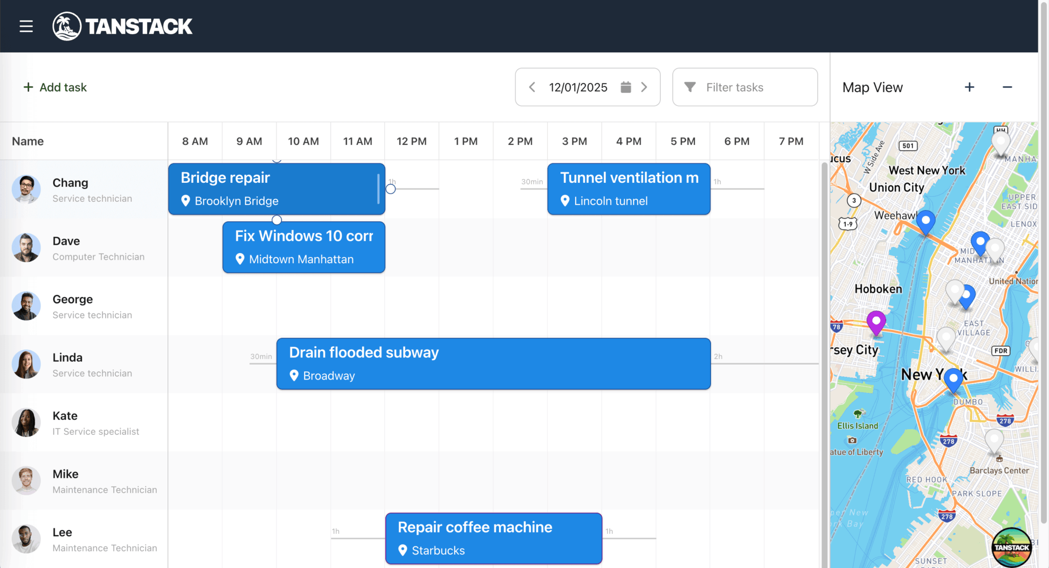
declare marker: mapboxgl.Marker;On your local development server, you’ll see map markers for different tasks displayed on the map:
Configure the map to show only the map markers for tasks in the currently viewed time axis
If we change the date on the task scheduler to a date with no scheduled tasks, the map panel still displays map markers for other tasks. Let’s configure the map to display a task’s map marker only if the task is unassigned (without a resourceId) or visible in the current scheduler timeline view.
In the construct() method in the src/lib/MapPanel.ts file, add the following line of code below the me.eventStore.on('change', me.onStoreChange, me); line:
me.timeAxis.on('reconfigure', me.onTimeAxisReconfigure, me);Add the following onTimeAxisReconfigure() method below the onResize() method:
onTimeAxisReconfigure() {
    this.eventStore.forEach((eventRecord: Task) => {
        this.removeEventMarker(eventRecord);
        this.addEventMarker(eventRecord);
    });
}
The scheduler’s time axis reconfigure event fires when the time axis is changed. Then whenever the reconfigure event occurs, we call the onTimeAxisReconfigure() method to remove or add map markers depending on which tasks are visible on the scheduler’s time axis.
Now, if you change the date on your scheduler, only the map markers for the current date will be displayed.
Add popups to map markers and center the map marker on a task click
Let’s add popups to the map markers that show the task name and a shortened address.
Add the following method below the me.timeAxis.on('reconfigure', me.onTimeAxisReconfigure, me); line in the construct method:
EventHelper.addListener(mapContainerEl, 'click', me.onMapClick, {
    delegate : '.mapboxgl-marker',
    element  : mapContainerEl,
    thisObj  : me
});
Add the following method to the MapPanel class:
onMapClick({ target }: { target: mapboxgl.Marker }) {
    const markerEl = (target as any).closest('.mapboxgl-marker');
    if (!markerEl) return;

    const eventRecord = this.eventStore.getById(markerEl.id) as Task;
    this.showTooltip(eventRecord, true);
    this.trigger('markerclick', {
        marker : eventRecord.marker,
        eventRecord
    });
}
When a user clicks on a map marker, these methods find the event record for the clicked marker by its id. The onMapClick() method then calls the showTooltip() method (which we’ll define next) and the trigger method, which triggers a custom "markerclick" event to scroll the task’s event bar into view.
Add the following methods to the MapPanel class:
showTooltip(eventRecord: Task, centerAtMarker: boolean) {
    const marker = eventRecord.marker;
    this.popup?.remove();

    if (centerAtMarker) {
        this.scrollMarkerIntoView(eventRecord);
    }

    this.createAndShowPopup(eventRecord, marker);
}

scrollMarkerIntoView(eventRecord: Task) {
    const marker = eventRecord.marker;
    this.map.easeTo({ center : marker.getLngLat() });
}

private createAndShowPopup(eventRecord: Task, marker: mapboxgl.Marker) {
    const popup =
        (this.popup =
        (marker as any).popup =
            new mapboxgl.Popup({
                offset : [0, -21]
            } as PopupConfig));

    popup.setLngLat(marker.getLngLat()).setHTML(this.createPopupContent(eventRecord)).addTo(this.map);
}

private createPopupContent = (eventRecord: Task) => StringHelper.xss`
    <span class="event-name">${eventRecord.name}</span>
    <span class="resource"><i class="fa fa-fw fa-user"></i>${eventRecord.resource?.name || 'Unassigned'}</span>
    <span class="location"><i class="fa fa-fw fa-map-marker-alt"></i>${eventRecord.shortAddress}</span>
`;
The showTooltip method removes any existing popups and creates a Mapbox popup. The scrollMarkerIntoView method moves the map to center the marker for the event passed in. We use the Mapbox GL JS library’s easeTo() method to animate the map’s positioning movement.
We sanitize the HTML set inside the popup using the Bryntum StringHelper xss() method.
Add the following imports to the top of the file:
import { DomHelper, EventHelper, GlobalEvents, StringHelper } from '@bryntum/schedulerpro';
import type { PopupConfig } from './Types';
In the src/routes/scheduler.tsx file, add the following event handlers to the Scheduler component:
// Event handler: clicking an event should show its marker on the map
const onEventClick = ({ eventRecord }: { eventRecord: any }) => {
    const task = eventRecord as Task;
    if (task.marker && mapPanel) {
        mapPanel.showTooltip(task, true);
    }
};

// Event handler: after saving an event, scroll its marker into view on the map
const onAfterEventSave = ({ eventRecord }: { eventRecord: any }) => {
    const task = eventRecord as Task;
    if (task.marker && mapPanel) {
        mapPanel.scrollMarkerIntoView(task);
    }
};

// Event handler: marker click from map
const onMarkerClick = async({ eventRecord }: { eventRecord: Task }) => {
    const scheduler = schedulerproRef.current?.instance;
    if (!scheduler) return;

    if (eventRecord.resources.length > 0) {
        await scheduler.scrollEventIntoView(eventRecord, { animate : true, highlight : true });
        scheduler.selectedEvents = [eventRecord];
    }
};
In the useEffect hook, add the following property to the mapPanelInstance constructor config:
listeners : {
    markerclick : onMarkerClick
}
Add the following properties to the SchedulerPro component:
onEventClick={onEventClick}
onAfterEventSave={onAfterEventSave}
When a user clicks on an event, the onEventClick event handler is called, which calls the showTooltip() method of the mapPanel instance. When an event is saved, the onAfterEventSave event handler is called, which calls the scrollMarkerIntoView() method of the mapPanel instance.
Add the following styles to the styles.css file:
.mapboxgl-popup-anchor-top {
    .mapboxgl-popup-tip {
        border-bottom-color: var(--b-neutral-100);
    }
}

.mapboxgl-popup-anchor-right {
    .mapboxgl-popup-tip {
        border-inline-start-color: var(--b-neutral-100);
    }
}

.mapboxgl-popup-anchor-bottom {
    .mapboxgl-popup-tip {
        border-top-color: var(--b-neutral-100);
    }
}

.mapboxgl-popup-anchor-left {
    .mapboxgl-popup-tip {
        border-inline-end-color: var(--b-neutral-100);
    }
}

.mapboxgl-popup.mapboxgl-popup-anchor-top {
    margin-top: -1.2em;
}

.mapboxgl-popup-content {
    padding: 1em;
    box-shadow: 0 1px 3px rgba(0, 0, 0, 0.5);
    pointer-events: none;
    background: var(--b-neutral-100);

    transition: background 0.2s;
}

.mapboxgl-popup-close-button {
    display: none;
}

.mapboxgl-popup .event-name {
    display: block;
    margin: 0 0 1.5em 0;
    font-size: 1.4em;
    font-weight: bold;
}

.mapboxgl-marker {
    cursor: pointer;
}

.mapboxgl-canvas:focus {
    outline: none !important;
}
When you click on a task in the scheduler timeline, its map marker scrolls into view in the map panel, with a popup showing the task’s name and address. Similarly, if you click on a map marker in the map panel, the corresponding task scrolls into view in the scheduler timeline.
Create a TanStack Shadcn Table to display unplanned tasks
We’ve already installed the Shadcn UI Table component in the starter app. Now let’s create a custom hook to filter unscheduled tasks from the Bryntum Scheduler Pro’s event store and display them in a TanStack Shadcn Table.
Create a hooks folder in the src folder. In the hooks folder, create a useUnplannedTasks.ts file and add the following code to it:
import { useEffect, useState } from 'react';
import type { SchedulerPro } from '@bryntum/schedulerpro';

export interface UnplannedTask {
    id: string | number;
    name: string;
    address?: {
        display_name?: string;
        lat?: number;
        lon?: number;
    };
    duration: number;
    durationUnit: string;
    preamble?: string;
    postamble?: string;
}

export function useUnplannedTasks(scheduler: SchedulerPro | null | undefined) {
    const [tasks, setTasks] = useState<Array<UnplannedTask>>([]);

    useEffect(() => {
        if (!scheduler) return;

        const { project } = scheduler;

        // Events without assignments are unscheduled
        const filterUnplannedTasks = () => {
            const unplanned = project.eventStore.records.filter(
                (eventRecord: any) => !eventRecord.assignments || eventRecord.assignments.length === 0
            );

            setTasks(
                unplanned.map((event: any) => ({
                    id           : event.id,
                    name         : event.name || '',
                    address      : event.address,
                    duration     : event.duration || 0,
                    durationUnit : event.durationUnit || 'h',
                    // Convert Bryntum Duration objects to any (to handle in component)
                    preamble     : event.preamble,
                    postamble    : event.postamble
                }))
            );
        };

        // Initial filter
        filterUnplannedTasks();

        // Listen to store changes (same pattern as maps-demo)
        // When assignments change, refresh the filtered data
        const eventStoreListeners = {
            change : filterUnplannedTasks
        };

        const assignmentStoreListeners = {
            change : filterUnplannedTasks
        };

        project.eventStore.on(eventStoreListeners);
        project.assignmentStore.on(assignmentStoreListeners);

        // Cleanup listeners
        return () => {
            // Check if stores still exist before removing listeners (they may be destroyed during navigation)
            project.eventStore.un(eventStoreListeners);

            project.assignmentStore.un(assignmentStoreListeners);
        };
    }, [scheduler]);

    return tasks;
}
This custom hook syncs unplanned tasks from the Bryntum Scheduler Pro’s event store to the TanStack Table. The filterUnplannedTasks function filters the event store to find events without assignments. Event listeners for the event and assignment stores update the Table data when tasks are scheduled, unscheduled, or modified. The hook returns the filtered tasks array.
In the src/components folder, create a UnplannedTasksTable.tsx file and add the following code to create a TanStack Table that displays unplanned tasks:
import { useEffect, useMemo, useRef } from 'react';
import { rankItem } from '@tanstack/match-sorter-utils';
import {  type ColumnDef,  type FilterFn,flexRender, getCoreRowModel, useReactTable } from '@tanstack/react-table';
import type { SchedulerPro } from '@bryntum/schedulerpro';
import { type UnplannedTask, useUnplannedTasks } from '@/hooks/useUnplannedTasks';
import { Table, TableBody, TableCell, TableHead, TableHeader, TableRow } from '@/components/ui/table';

interface UnplannedTasksTableProps {
    scheduler: SchedulerPro | null | undefined;
    collapsed?: boolean;
}

const fuzzyFilter: FilterFn<UnplannedTask> = (row, columnId, value) => {
    const itemValue = row.getValue(columnId);
    const search = typeof value === 'string' ? value : String(value ?? '');
    return rankItem(String(itemValue ?? ''), search).passed;
};

export function UnplannedTasksTable({ scheduler, collapsed = false }: UnplannedTasksTableProps) {
    const tasks = useUnplannedTasks(scheduler);
    const tableContainerRef = useRef<HTMLDivElement>(null);

    // Initialize drag-and-drop
    useEffect(() => {
        const tableElement = tableContainerRef.current;

        if (!scheduler || !tableElement) return;

    }, [scheduler]);

    // Define columns matching the demo's Bryntum Grid columns
    const columns = useMemo<Array<ColumnDef<UnplannedTask>>>(
        () => [
            {
                accessorKey : 'name',
                header      : 'Unscheduled tasks',
                cell        : ({ row }) => (
                    <div className="flex items-center unscheduledNameCell">
                        <i className="fa fa-fw fa-grip mr-2 text-gray-500 hover:text-gray-700"></i>
                        <span>{row.getValue('name')}</span>
                    </div>
                )
            },
            {
                accessorKey : 'address.display_name',
                header      : () => (
                    <div className="flex items-center">
                        <i className="fa fa-fw fa-map-marker-alt mr-1"></i>
                        <span>Location</span>
                    </div>
                ),
                cell : ({ row }) => {
                    const address = row.original.address?.display_name;
                    return <div className="text-sm">{address || ''}</div>;
                }
            },
            {
                accessorKey : 'duration',
                header      : () => (
                    <div className="flex items-center">
                        <i className="b-icon fa-clock mr-1"></i>
                        <span>Duration</span>
                    </div>
                ),
                cell : ({ row }) => {
                    const duration = row.getValue<number>('duration');
                    const unit = row.original.durationUnit;
                    return (
                        <div className="text-sm">
                            {duration}
                            {unit}
                        </div>
                    );
                }
            },
            {
                accessorKey : 'preamble',
                header      : () => (
                    <div className="flex items-center" title="Start trip">
                        <i className="b-icon fa-car-side mr-1"></i>
                        <i className="b-icon fa-arrow-right mr-1"></i>
                        <span>Travel time</span>
                    </div>
                ),
                cell : ({ row }) => {
                    const preamble = row.original.preamble as any;
                    // Handle Bryntum Duration objects or strings
                    const displayValue = preamble
                        ? typeof preamble === 'object'
                            ? `${preamble._magnitude}${preamble._unit}`
                            : preamble
                        : '';
                    return <div className="text-sm">{displayValue}</div>;
                }
            },
            {
                accessorKey : 'postamble',
                header      : () => (
                    <div className="flex items-center justify-center" title="Return trip">
                        <i className="b-icon fa-arrow-left mr-1"></i>
                        <i className="b-icon fa-car-side mr-1" style={{ transform : 'rotateY(180deg)' }}></i>
                        <span>Return time</span>
                    </div>
                ),
                cell : ({ row }) => {
                    const postamble = row.original.postamble as any;
                    // Handle Bryntum Duration objects or strings
                    const displayValue = postamble
                        ? typeof postamble === 'object'
                            ? `${postamble._magnitude}${postamble._unit}`
                            : postamble
                        : '';
                    return <div className="text-sm text-center">{displayValue}</div>;
                }
            }
        ],
        []
    );

    const table = useReactTable({
        data      : tasks,
        columns,
        filterFns : {
            fuzzy : fuzzyFilter
        },
        getCoreRowModel : getCoreRowModel()
    });

    return (
        <div
            className={`w-full b-unplanned-grid ${collapsed ? 'b-collapsed' : ''}`}
            ref={tableContainerRef}
            style={{
                flex       : collapsed ? '0 0 0px' : '0 1 400px',
                minHeight  : 0,
                transition : 'flex 0.3s ease-in-out',
                overflow   : collapsed ? 'hidden' : 'auto'
            }}
        >
            <Table>
                <TableHeader>
                    {table.getHeaderGroups().map((headerGroup) => (
                        <TableRow key={headerGroup.id}>
                            {headerGroup.headers.map((header) => (
                                <TableHead key={header.id}>
                                    {header.isPlaceholder
                                        ? null
                                        : flexRender(header.column.columnDef.header, header.getContext())}
                                </TableHead>
                            ))}
                        </TableRow>
                    ))}
                </TableHeader>
                <TableBody>
                    {table.getRowModel().rows.length ? (
                        table.getRowModel().rows.map((row) => (
                            <TableRow
                                key={row.id}
                                data-state={row.getIsSelected() && 'selected'}
                                data-row-id={row.original.id}
                                className="cursor-grab active:cursor-grabbing hover:bg-gray-50"
                            >
                                {row.getVisibleCells().map((cell) => (
                                    <TableCell key={cell.id}>
                                        {flexRender(cell.column.columnDef.cell, cell.getContext())}
                                    </TableCell>
                                ))}
                            </TableRow>
                        ))
                    ) : (
                        <TableRow>
                            <TableCell colSpan={columns.length} className="h-24 text-center">
                                No unscheduled tasks
                            </TableCell>
                        </TableRow>
                    )}
                </TableBody>
            </Table>
        </div>
    );
}
The UnplannedTasksTable component uses TanStack React Table with Shadcn UI Table components to display unscheduled tasks. The useUnplannedTasks hook provides the filtered tasks data.
The UnplannedTasksTable component defines five columns:
- Name: The task name with a drag handle icon
- Location: The address
- Duration: The task duration
- Travel time: The preamble (travel time preceding the task)
- Return time: The postamble (return travel time after the task)
The useReactTable hook initializes the table with the data and columns. The component uses flexRender to render headers and cells, and wraps table rows with data-row-id attributes for drag-and-drop functionality. The table collapses, using CSS styles, based on the collapsed prop controlled by the splitter toggle.
In the src/routes/scheduler.tsx file, add the following imports:
import { type SchedulerPro as SchedulerProInstance, type SlideToggle, type Splitter } from '@bryntum/schedulerpro';
import { UnplannedTasksTable } from '@/components/UnplannedTasksTable';
In the Scheduler component, add the following state variables to manage the scheduler instance, splitter, and table-collapse state:
const [schedulerInstance, setSchedulerInstance] = useState<SchedulerProInstance>();
const [unplannedSplitter, setUnplannedSplitter] = useState<Splitter>();
const [tableCollapsed, setTableCollapsed] = useState(false);
Add the following event-handler functions to manage the table-collapse state and splitter toggle:
const onToggleUnscheduled = ({ value }: { value: boolean }) => {
    setTableCollapsed(!value);
};

const onUnplannedSplitterToggle = ({ eventName }: { eventName: string }): void => {
    const newValue = eventName === 'splitterCollapseClick';
    const slideToggle = schedulerproRef.current?.instance?.widgetMap['toggleUnscheduled'] as SlideToggle;
    if (slideToggle) {
        slideToggle.value = newValue;
    }
    setTableCollapsed(!newValue);
};

useEffect(() => {
    if (unplannedSplitter) {
        unplannedSplitter.on({
            splitterExpandClick   : onUnplannedSplitterToggle,
            splitterCollapseClick : onUnplannedSplitterToggle
        } as any);
    }
}, [unplannedSplitter]);
In the other useEffect hook (the one with the scheduler ready callback), add the following code to initialize the slide toggle widget and store the scheduler instance:
(widgetMap['toggleUnscheduled'] as SlideToggle).value = true;
widgetMap['toggleUnscheduled'].on('change', onToggleUnscheduled);
setSchedulerInstance(schedulerPro);
Add a BryntumSplitter component below the div with an id of "content" to separate the scheduler timeline from the unplanned tasks table. When the splitter is first painted, we store its instance in state:
{schedulerInstance && (
    <BryntumSplitter
        showButtons="end"
        onPaint={({ firstPaint, source }) => {
            if (firstPaint) {
                setUnplannedSplitter(source as Splitter);
            }
        }}
    />
)}
Add the UnplannedTasksTable component below the splitter to display unscheduled tasks:
<UnplannedTasksTable scheduler={schedulerInstance} collapsed={tableCollapsed} />In src/schedulerProConfig.ts file, add the following property to the tbar object of the schedulerproProps object:
{
    type   : 'slidetoggle',
    ref    : 'toggleUnscheduled',
    label  : 'Show unscheduled',
    height : 'auto'
}
Add the following styles to the src/styles.css file to style the unplanned tasks table:
.b-unplanned-grid {
border-top: 1px solid var(--b-splitter-color);
.unplannedReturnTrip {
.fa-car-side:before {
transform: rotateY(180deg);
}
}
t .unscheduledNameCell i {
margin-inline-end: 0.5em;
}
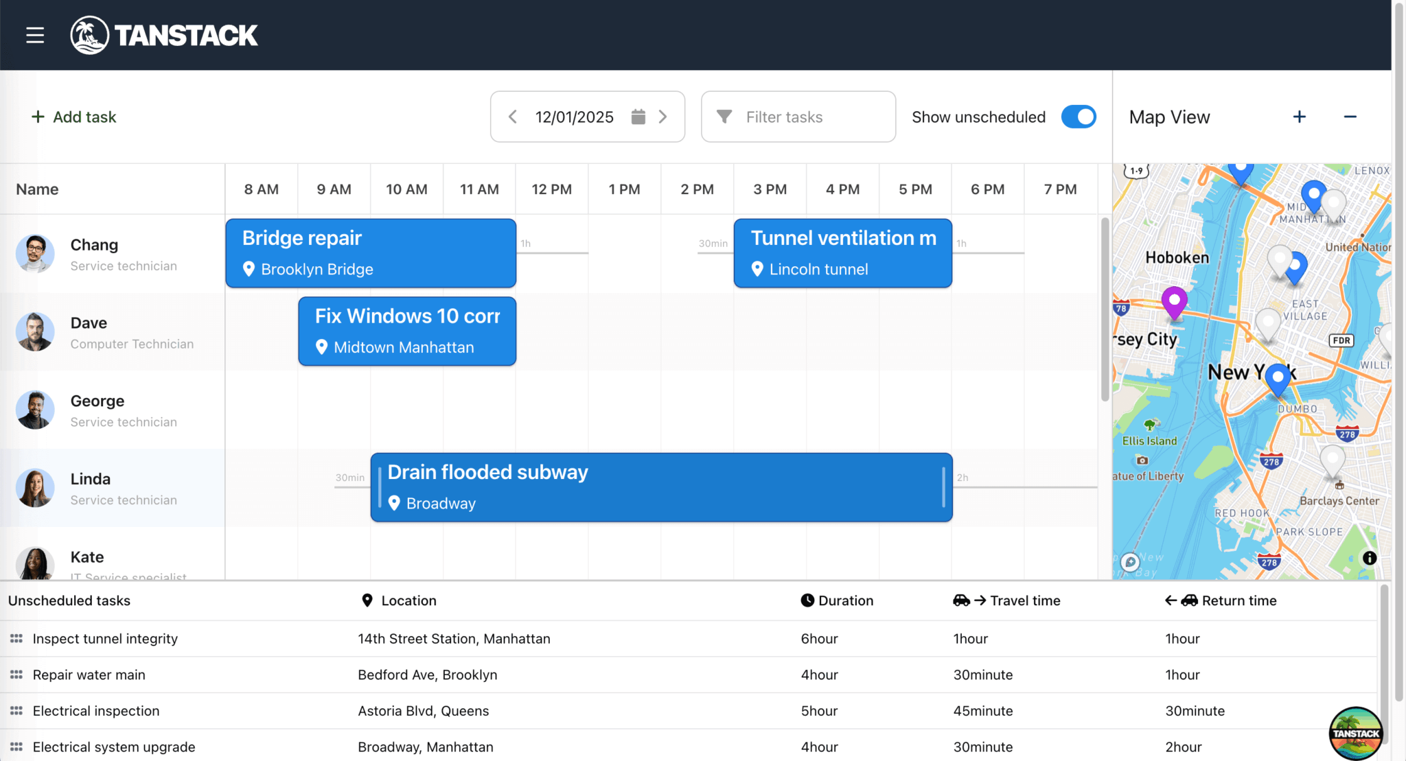
}In your local development server, you’ll see the TanStack Shadcn Table is now displayed below the Bryntum Scheduler Pro. You can show and hide the table by clicking the Show unscheduled toggle button in the Scheduler Pro toolbar:
Add drag-and-drop for moving unplanned tasks from the TanStack Table to the Bryntum Scheduler Pro
Next, we’ll add a custom drag helper to extend Bryntum’s DragHelper class, so that users can drag tasks from the unplanned tasks table and drop them on the scheduler timeline.
In the src/lib folder, create a TableDragHelper.ts file and add the following code:
import { DomHelper, DragHelper, StringHelper } from '@bryntum/schedulerpro';

export class TableDragHelper extends DragHelper {
    scheduler: any;
    tableElement: any;

    // Use static configurable without 'get'
    static configurable = {
        callOnFunctions      : true,
        autoSizeClonedTarget : false,

        unifiedProxy : true,

        // Don't remove proxy on drop, we reuse it in the Scheduler
        removeProxyAfterDrop : false,

        // Clone the row element
        cloneTarget : true,

        // Drop zone is the scheduler timeline
        dropTargetSelector : '.b-timeline-sub-grid',

        // Draggable rows (using data-row-id attribute from TanStack Table)
        targetSelector : '[data-row-id]',

        // Don't constrain drag to container
        constrain : false
    };

    // Use constructor instead of construct
    constructor(config: any) {
        super({
            ...config,
            outerElement : config.tableElement
        });

        // Manually assign custom properties after super()
        this.scheduler = config.scheduler;
        this.tableElement = config.tableElement;
    }

    /**
     * Create visual proxy during drag
     * Creates a fake event bar that will be adopted by the Scheduler
     */
    override createProxy(grabbedElement: HTMLElement): HTMLDivElement {
        const scheduler = this.scheduler;
        const context = (this as any).context;

        // Safety check - scheduler should be set during construct
        if (!scheduler) {
            console.error('TableDragHelper: scheduler is undefined in createProxy');
            return document.createElement('div');
        }

        // Get task ID from data attribute
        const taskId = grabbedElement.getAttribute('data-row-id');
        if (!taskId) return document.createElement('div');

        // Get task from scheduler's event store
        const appointment = scheduler.project.eventStore.getById(taskId);
        if (!appointment) return document.createElement('div');

        // Store appointment in context for later use
        context.appointment = appointment;

        // Calculate widths for event and buffers (maps-demo-react pattern: Drag.ts:40-43)
        const durationInPixels = scheduler.timeAxisViewModel.getDistanceForDuration(appointment.durationMS);
        const preambleWidth = scheduler.timeAxisViewModel.getDistanceForDuration(
            appointment.preamble?.milliseconds || 0
        );
        const postambleWidth = scheduler.timeAxisViewModel.getDistanceForDuration(
            appointment.postamble?.milliseconds || 0
        );

        // Create proxy element (maps-demo-react pattern: Drag.ts:45)
        const proxy = document.createElement('div');
        proxy.classList.add('b-sch-horizontal', 'b-event-buffer');

        // Create inner HTML with event buffers (maps-demo-react pattern: Drag.ts:48-59)
        proxy.innerHTML = StringHelper.xss`
    <div class="b-sch-event-wrap b-colorize b-color-gray b-style-bordered b-unassigned-class b-sch-horizontal b-event-buffer ${scheduler.timeAxisSubGrid.width < durationInPixels ? 'b-exceeds-axis-width' : ''}" role="presentation" style="width:${durationInPixels + preambleWidth + postambleWidth}px;max-width:${scheduler.timeAxisSubGrid.width}px;height:${scheduler.rowHeight - 2 * (scheduler.resourceMargin as number)}px">
        <div class="b-sch-event-buffer b-sch-event-buffer-before" role="presentation" style="width: ${preambleWidth}px;"><span class="b-buffer-label" role="presentation">${appointment.preamble?.toString() || ''}</span></div>
        <div class="b-sch-event-buffer b-sch-event-buffer-after" role="presentation" style="width: ${postambleWidth}px;"><span class="b-buffer-label" role="presentation">${appointment.postamble?.toString() || ''}</span></div>
        <div class="b-sch-event b-has-content b-sch-event-with-icon">
        <div class="b-sch-event-content">
            <span class="event-name">${appointment.name}</span>
            <span class="location"> <i class="fa fa-map-marker-alt"></i>${appointment.shortAddress || ''}</span>
        </div>
        </div>
    </div>
    `;

        return proxy;
    }

    /**
     * Called when drag starts
     * Enables edge scrolling and disables tooltips
     */
    override onDragStart = () => {
        const { scheduler } = this;

        // Enable edge scrolling
        scheduler.enableScrollingCloseToEdges(scheduler.timeAxisSubGrid);

        // Disable tooltips during drag
        if (scheduler.features?.eventTooltip) {
            scheduler.features.eventTooltip.disabled = true;
        }
    };

    /**
     * Called during drag
     * Validates drop location and provides visual feedback
     */
    override onDrag = ({ context }: { context: any }): void => {
        const { scheduler } = this;
        const { appointment } = context;

        if (!appointment) {
            context.valid = false;
            return;
        }

        // Get date from mouse position
        const newStartDate = scheduler.getDateFromCoordinate(context.newX, 'round', false);

        // Get resource from drop target
        const doctor = context.target && scheduler.resolveResourceRecord(context.target);

        if (!newStartDate || !doctor) {
            context.valid = false;
            return;
        }

        // Calculate end date
        const endDate = new Date(newStartDate.getTime() + appointment.durationMS);

        // Check if time slot is available
        const isAvailable =
            scheduler.allowOverlap || scheduler.isDateRangeAvailable(newStartDate, endDate, null, doctor);

        // Check calendar working hours if available
        const calendar = doctor.calendar;
        const isWorkingTime = !calendar || calendar.isWorkingTime(newStartDate, endDate, true);

        // Mark valid/invalid for visual feedback
        context.valid = Boolean(newStartDate && doctor && isAvailable && isWorkingTime);
        context.doctor = doctor;
    };

    override onDrop = async({ context }: { context: any }): Promise<void> => {
        const { scheduler } = this;

        if (context.valid) {
            const { appointment, element, doctor } = context;

            // Get drop date from element position (more accurate than context.newX)
            const coordinate = DomHelper.getTranslateX(element);
            const dropDate = scheduler.getDateFromCoordinate(coordinate, 'round', false);

            if (dropDate && doctor) {
                try {
                    // Suspend animations for better performance (maps-demo-react pattern)
                    scheduler.suspendAnimations();

                    // Hand over data + existing element to Scheduler
                    // This reuses the proxy element for better performance
                    await scheduler.scheduleEvent({
                        eventRecord    : appointment,
                        startDate      : dropDate,
                        resourceRecord : doctor,
                        element        : element // Reuse the proxy element
                    });

                    // Explicitly set event color from resource if event doesn't have its own color
                    // This ensures the event bar and map marker get the correct color
                    if (!appointment.eventColor && doctor.eventColor) {
                        appointment.eventColor = doctor.eventColor;
                    }

                    // Resume animations
                    scheduler.resumeAnimations();

                    // The task will automatically disappear from the table because:
                    // 1. scheduleEvent() creates an assignment
                    // 2. assignmentStore fires a 'change' event
                    // 3. useUnplannedTasks hook detects the change
                    // 4. Hook filters out tasks with assignments
                    // 5. Table re-renders without the task
                }
                catch (error) {
                    console.error('Failed to schedule event:', error);
                    scheduler.resumeAnimations();
                }
            }
        }

        // Re-enable scrolling and tooltips
        scheduler.disableScrollingCloseToEdges(scheduler.timeAxisSubGrid);
        if (scheduler.features?.eventTooltip) {
            scheduler.features.eventTooltip.disabled = false;
        }
    };
}
The TableDragHelper class configures drag behavior through the configurable object. The createProxy method creates a visual representation of the task being dragged that matches the scheduler’s event bar styling. The onDrag method validates drop locations by checking whether the time slot is available and within working hours. The onDrop method uses the scheduler’s scheduleEvent method to create an event when a task is dropped on a valid resource and time.
In the src/components/UnplannedTasksTable.tsx file, add the following import:
import { TableDragHelper } from '@/lib/TableDragHelper';In the useEffect hook, create a drag helper instance and clean it up on unmount:
// Create drag helper instance
const dragHelper = new TableDragHelper({
    scheduler,
    tableElement
});

// Cleanup on unmount
return () => {
    dragHelper.destroy();
};
Add the following styles to the src/styles.css file to style the drag proxy (the visual element that appears when dragging a task from the table to the scheduler timeline):
.b-drag-proxy .b-sch-event-wrap {
    position: static;
    opacity: 0.6;
}
You can now drag and drop unplanned tasks from the TanStack Shadcn Table to the Bryntum Scheduler Pro.
Add an unassign button to the Bryntum Scheduler Pro to unschedule a task
Let’s add an Unassign button to the Bryntum Scheduler Pro to unschedule a task and move it back to the unplanned tasks table.
In the src/schedulerProConfig.ts file, add the following eventMenuFeature property to the schedulerproProps object to add an Unassign item to the event context menu:
// Context menu for events
eventMenuFeature : {
    items : {
        // Add custom "Unassign" menu item
        unassign : {
            text   : 'Unassign',
            icon   : 'fa fa-user-times',
            weight : 200,
            onItem : ({ eventRecord }: { eventRecord: Task }) => {
                // Remove all assignments from the event
                eventRecord.assignments.forEach((assignment: any) => {
                    assignment.remove();
                });
            }
        }
    }
},
The eventMenuFeature adds a custom Unassign menu item to the event context menu. When clicked, the onItem handler removes all assignments from the event by calling remove() on each assignment. This unschedules the task and moves it back to the unplanned tasks table.
Right-click on a task in the Bryntum Scheduler Pro to open the event context menu. You’ll see the Unassign menu item. Clicking it unschedules the task and moves it back to the unplanned tasks table.
Next steps
We created a Bryntum Scheduler Pro with a TanStack Shadcn Table and Mapbox GL JS. The scheduler displays scheduled tasks in a timeline, with map markers showing task locations in the map panel. The unplanned tasks table displays unscheduled tasks that can be dragged to the scheduler timeline. Here are some ideas for improving the app:
- Persist data to a database: Add a backend server to save the scheduler data to a database. Take a look at our AG Grid and Bryntum Scheduler Pro integration tutorial to see an example backend using Express.js and SQLite.
- Add multi-assignment support: Assign tasks to multiple resources using the
resourceIdsfield or by adding multiple assignments. You can see example code in the multi-assignment and multi-assignmentresourceIdsdemos. - Add task dependencies: Create dependencies between tasks to enforce task-ordering and scheduling constraints. Take a look at our multi-assignment with dependencies demo to see a code example.